Every company that suffers from high cart abandonment, and they constitute the majority of e-commerce companies, are deeply frustrated about this issue. Your potential company is just a few clicks away, but they decide, last minute, to abandon, and it may very well be a result of something not sitting right with them ON YOUR CART PAGE!! At this point, you may want to consider some UX and conversion optimization tips to lower that abandonment and raise those conversion rates:
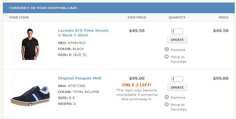
1. Provide images, short descriptions and links for the items in the cart
Everyone wants to make sure that the item they have put in the cart is the right item before they click on the checkout button. Listing the title only won’t give sufficient info to the end customer. Adding images, short description, sizes and details if applicable of the item is important. Also linking to the actual product page would be helpful as well.
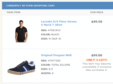
Mentioning stock availability would make impact on user conversion and will create sense of urgency to finalize the order.
Meijer not mentioning the color and size of the selected item that can confuse the user that they have selected the right item.
2. Be aware of competing and unclear CTAs
One of the major problem in cart pages is the unclear CTA (Call to Action) and there are competing CTAs present alongside the main CTA.
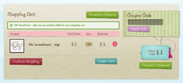
Above is a very good example where the main CTA is very clear and distinguished in color.
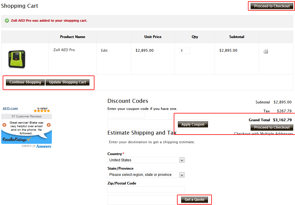
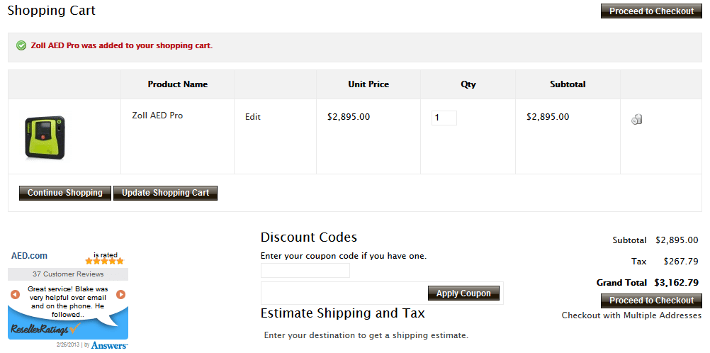
AED.com showing too many same style of CTA on the cart page to make user confuse. The Proceed Checkout CTA should have been in distinguishing color.
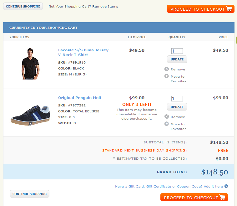
In the above example the caption is not clear and there are 4 competing CTAs on the cart page.
3. Display best offers that eager user to buy.
If someone asks me to give one piece of advice regarding conversion rate optimization, it would be to add your best offer that makes your customers eager to buy the product on the cart page. This seems simple but many businesses get it wrong. We should sell benefits instead of features. People are always looking for offers that can save their few bucks.
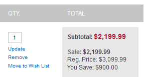
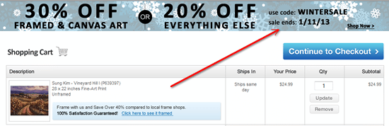
Few examples of displaying the offers on cart page.
Above the company shows the offer on their cart page that cut $-25 from the final amount.

One of our customers shows this message that results in more conversion.
The above example shows discounted price, free product offers and free shipping message jut underneath the price where user focuses most.
aed.com show free shipping on their hompage but on cart they do not.
4. Easily Order Modifications
Problem: without modification options, your user gets frustrated if they want to order 10 items of the same product or to delete an item from the cart.
The solution is to make it easy to modify (and very obvious to customers). This in turn can lead to a bigger a purchase possibly, or help get the customer to come back because your site is so easy to use and purchase from.
5. Free Shipping
Additional costs, such as shipping cost are at the root of many cart abandonment. Forrester research shows that it is the number one reason to leave the cart and it has been for very long time.
Many companies providing free shipping and successfully increase the conversion. You can offer free shipping by simply adding shipping costs to the current product fees. Another research conducted by Compete stated that about 93% of online buyers are encouraged to buy more when there is no shipping costs attached to the purchase. Additionally free shipping can result in more satisfaction comparing to ones who paid for same kind of product.
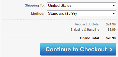
However, what’s key is stating it on the cart page! The cart page is one of the best places to let customers know that there are no additional costs
We have recently did this with one of our customer.
6. Coupon Codes
Coupon codes are very tricky to handle on the cart page. They can very easily distract your potential buyer to look out for more coupons which can lead them to leave the site. We conducted cart pages test with and without coupon code and have these suggestions for you to increase the conversions.
- Do not show coupon code field unless you don’t have coupon for products added in cart or if you are not actively publish coupons.
- Automatically provide coupon as a discount to the customers where applicable.
- Show your coupon code on cart page as well prominently to ensure customer can use it and doesn’t leave the page to look it back and find it.

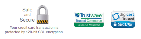
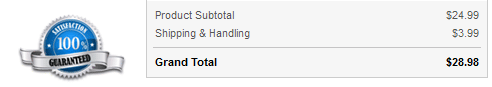
7. Customers Want to Feel Safe and Secure
It is very common to see on news media stories about identity theft and hacking of personal information. This gets people to think twice about entering credit cards information. One of the conversion framework principles is the principle of FUDs which translates into Fears, uncertainties, doubts. You’re responsible to help people overcome that fear and give them a sense of safety and security. There are few things we can do on our websites and increase conversions:
- Use https secure checkout process
- Show your trust logos and seals
- Customer testimonials
- Show satisfaction guarantee logo/icons if available

8. Eliminate Hidden Charges.
As we mentioned before with the shipping costs, customers hate hidden charges and this is one of the top reasons for abandonment. Added tax and other charges on the cart page can be a deal breaker.
We recommend to show the customers final price with all the charges involved with the product prior to getting to the cart page, and on the cart page as well (or on the product page atleast have an indicator that the price is “without” tax).
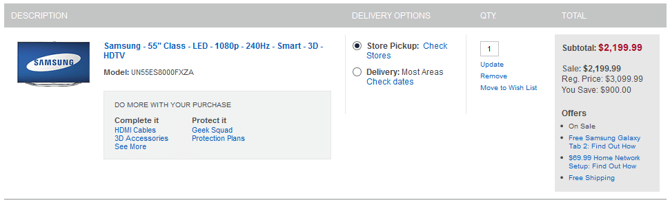
BestBuy shows estimated sales tax calculator on their cart pages.
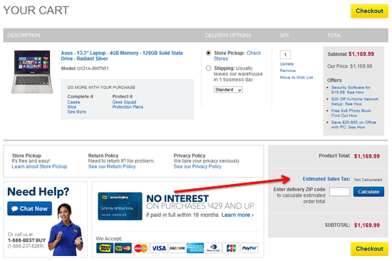
We have recently tested with our customers as well and found that tax estimation calculators are actually welcomed.
Nobody likes to see high cart abandonment rates. Following some easy tips can help you experience a drastic change.
Conclusion:
By implementing these tips on your cart pages of your website will help to ensure that customers have a better purchasing experience and you can lower abandonment rates, thus converting more customers.