Not all pages are created equal. Each type of page in an e-commerce website has a unique impact on the store revenue.
Optimizing bottom of the funnel pages boosts profits of e-commerce sites. For example, increasing conversion rate on product pages or the checkout process produces a greater impact on your bottom line compared to increasing the conversion rate of the home page or category pages.
The conversion framework elements which influence visitor action differ based on the type of page you are optimizing. Visitors who navigate through your website and get all the way to the product pages are more committed than visitors who just landed on an entry page for the website.
On an entry page, the visitor (subconsciously) is asking:
- Did I land on the right website?
- Can I trust this website?
- Do they have what I am looking for?
As the visitor navigates through, his trust in your website gradually increases. On your product pages, the visitor asks a different set of questions:
- Is this the right product for me?
- Is this the right price for this product?
- Am I going to be satisfied with this product?
When optimizing an e-commerce product pages for conversion, you must:
- Add clarity to the page (in terms of product specifications, including pricing).
- Reduce any FUDs (fears, uncertainty, and doubts) visitors might have.
- Provide information that supports different stages of the buying process.
Find in the case study below some of the elements you should keep in mind when optimizing online retailers’ product pages.
The company
Established in 1995, the client is one of the largest and most recognized online retailers for Indian ethnic wears. Based in India, the company services customers worldwide with over 50% of its customers in North America.
Background
When reviewing the website analytics, the Invesp team noticed that over 60% of website visitors navigated to the product pages. This percentage indicated most visitors did not struggle with trusting the website.
On product pages, visitors were presented with several options to customize the product they were viewing:
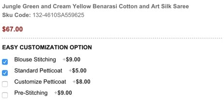
Each of the options had a specific price next to it.
Trying to stay competitive, the client’s team decided product price would not update even as visitors clicked on the different options. While this seemed strange to our team, it appeared to be standard practice for online retailers of this segment.
None of the clients’ competitors were updating their product price as visitors chose or changed options. If price increased as visitors added more options, the product would look costly compared to competitors.
Our team felt this was an area we should test to validate the client’s assumption.
The client was hesitant. Adjusting the product price would make them appear more expensive to visitors. They could lose sales as a result.
The test hypothesis
By reducing anxieties of how customization and sizing will be captured, as well as adjusting the price of customization on the product page, conversions will increase.
Original product page design vs. new product page challengers
Here is the original product page design:
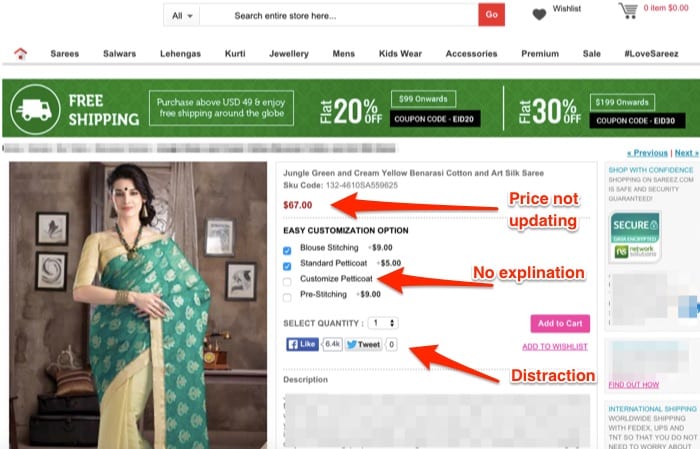
The A/B test focused on four problems of the product page:
- The price of the product did not update as visitors added or changed the customization options.
- The website unique value proposition was not emphasized on the product pages.
- The product customizations were not explained well through copy.
- The social media icons placement was a distraction from the page primary conversion goal.
The team introduced two challengers to run against the original design:
1st Variation:
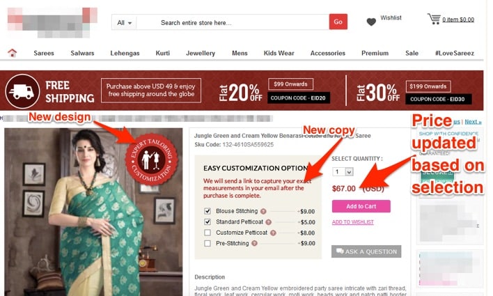
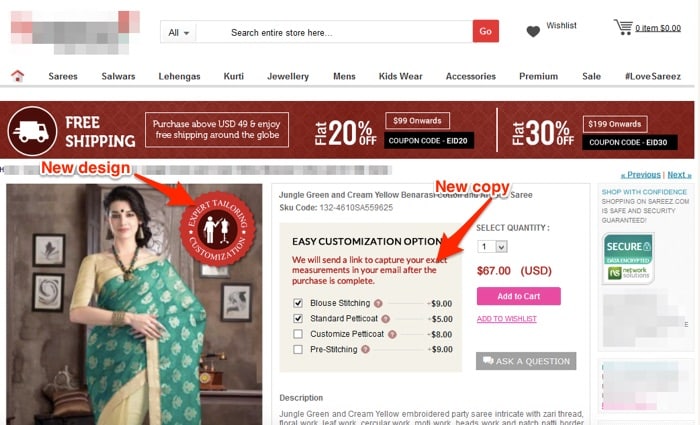
In this first variation, the team introduced several new elements:
- When visitors clicked on the different product options, the product price updated accordingly.
- A new emblem appeared on the product image, focusing on the custom tailoring offered by the website (unique value proposition).
- Social media share icons were removed.
- New copy was added around the product customization.
2nd Variation:
In terms of design, variation 2 was identical to the first one:
- Over the image, a new emblem of a logo focusing on the custom tailoring provided by the website (unique value proposition)
- No social media share icons
- New copy around the product customization
When it came to product pricing, variation 2 behaved the same way as the original product page. As visitors clicked on the different customization options, the product price did not update.
The results
Simply put, trying to trick visitors will not work. Online shoppers are savvy and do not appreciate it when an online retailer lacks clarity in pricing.
Variation 1 (with the price updating) was the clear winner of the test with a 34% uplift in conversions.