Trust is one of the most important factors that impacts conversions. However, too many visitors will overlook lack of trust, if incentives are present.
There is an art and science behind how incentives can best impact visitors, whilst saving you a lot more in the process, and maintaining the integrity and trust on your site.
For one of our clients, a poorly placed incentive as well as difficult to locate trust elements on the cart page became an obstacle to increase conversion. But by recognizing the opportunity, it eventually allowed us to achieve a 6.89% increase in conversions for a billion-dollar company.
Incentives
“Buy 2 get 1 with 70% discount” or “free shipping” are some examples of incentives you may have experienced. The goal is to boost sales because everyone likes free or almost free things. Thus, when visitors see a great incentive, they consider the opportunity to save, which may transform an otherwise uninterested visitor into someone interested.
Using urgency with these incentives prompts a greater response for visitors. If you decide to run a free shipping campaign, consider to run it for only 24hrs. This will give user a sense of FOMO (Fear of Missing Out). The more FOMO users have, the more persuaded they will be. However, you must use these tactics sparingly, otherwise they lose their luster and impact with your site visitors.
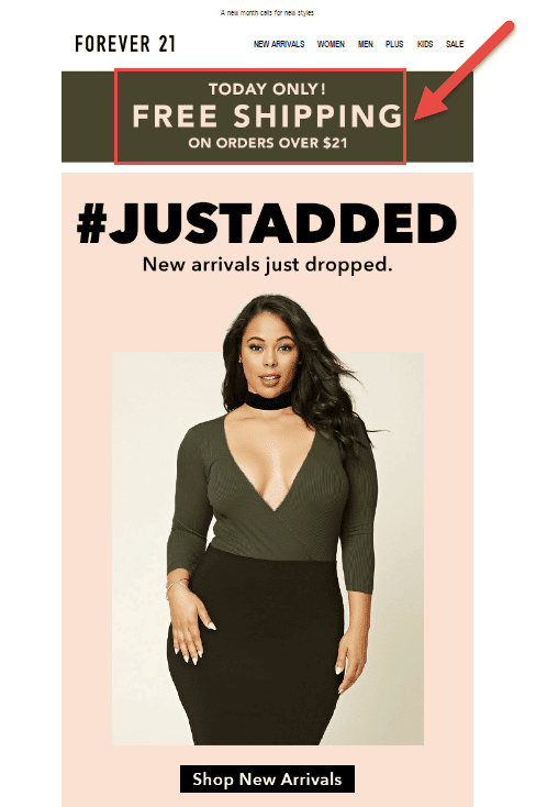
Look at an email below. Forever 21 reduces free shipping limit (normally you can get a free shipping if you buy for more than $50), but only for one day:
In a brick-and-mortar store, incentives and sales are usually advertised using big banners or labels so that they grab the attention of the customer.
But what about an online store?
Incentives are only powerful and impactful, if they actually grab visitor’s attention. So online, they must be located and designed in such a way that visitors can notice them easily.
However, in brick-and-mortar stores, in most of the cases, for customers it is obvious what to do next, in an e-commerce store, the challenge is to provide them with as clear as possible instructions. In other words, you must have a CTA near to your incentive.
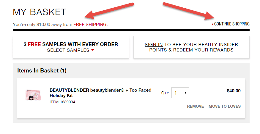
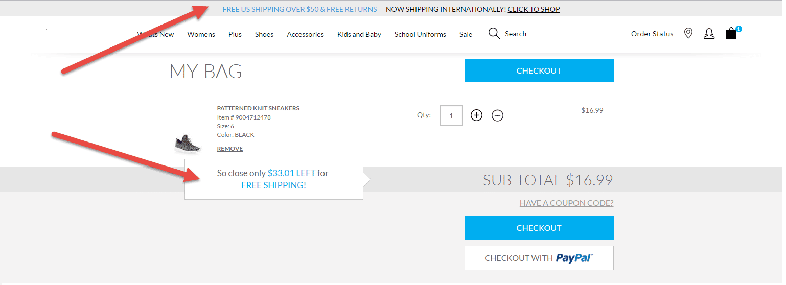
On the example below, Sephora informs its customers how much is it left till they can get free shipping and immediately offers them to continue shopping:
A call to action button can be one of the significant elements on any e-commerce website page because people don’t want to spend much time on thinking what to do next,they want to understand immediately what is next. If they have to make an effort to understand what is the next step towards what they want from your website, most likely, they will move on to another website which doesn’t make them think
Thus, if your incentive has no CTA it becomes useless for your website visitors and only irritates them more. Those, who are committed (minority) will attempt to find how to use the incentive, but the large majority will simply ignore it (best case scenario) or just leave.
Also, adding some unrelated images or texts near the incentive area can be a distractor for your visitors. Customers may relate those images or texts with your incentive.
Therefore, they can be misled about the conditions of your incentive.
On the image below Wayfair put two incentives too close to each other which may be confusing to some of the visitors:

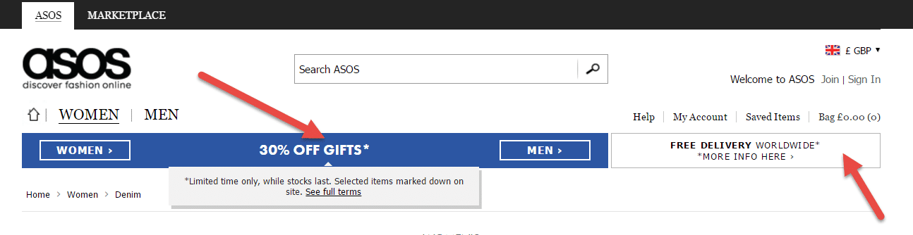
To avoid that, incentives should be placed separately. For instance, if you want to place two incentives in the same page, make sure that two of them have a distance so people can focus each of them at a time. Here Asos.com separates two offers from each other by adding some distance and using different colors:
Trust
Everyone wants to deal with trustworthy websites but even a tiny detail can destroy the trust. So, you have to care about building trust on your website.
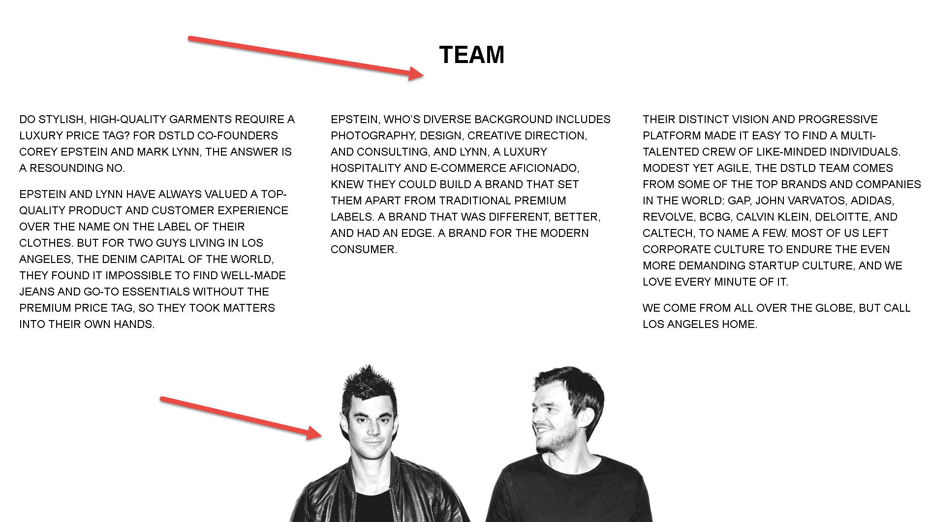
There are many ways for establishing trust. One of them is telling people who you are. People want to know there is a person behind your website. They want to feel it. To do that, you can give your contact information and describe your team in casual and welcoming way like DSTLD did it:
But how can you establish trust on a cart page where people are almost ready to commit and buy something from you?
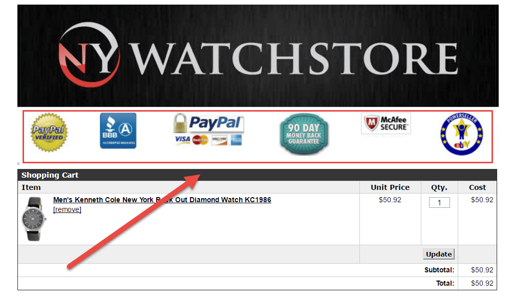
There you can add a security seal stating that your checkout process is protected and safe. NY Watchstore place the security seals in such a manner that it would be hard not to notice them:
Another way to communicate that your website is trustworthy is by displaying credit card logos that increase buyer’s confidence and reduce cart abandonment:
With these steps, you can build your trust and make people buy from you.
Case Study
The Billion Dollar Company
Established in 1935, our client is an USA-widefast-fashion retailer. The bulk of their business comes from brick-and-mortar stores. Several years ago the company decided to expand its business and start an e-commerce website, and rest is history.
The website visitors are mostly young females who went to college and have a job. They are fashion-conscious and in the market for moderately-priced “junior-size” or “plus-size” clothing reflecting the latest design trends.
Background
After reviewing site analytics, conducting heuristic evaluations on the desktop and mobile versions of the website, and discussing the results with our client, we were able to draw a number of conclusions about the site visitor and what appeals to them.
- Site visitors tend to wait until the 15th and end of the month before making a purchase on the site (those times are when sales on the site peak).
- Most of the website visitors use the cart on our client’s site as a wish list to save items they like and comeback to buy them later.
- The functionality of the cart however, doesn’t allow for a clear continue shopping.
- Additionally, usability studies suggest that some visitors believed that they could get free shipping only when they had a special coupon.
- Another challenge was less obvious. The brand of our client was well -known in urban areas and big cities; however, it had almost no presence in suburban environment and malls. Because of this, visitors unaware of the brand may have trust issues.
Clearly, there were items lost and unclear on the website. What is the best way for a visitor to continue shopping? How could we clarify that free shipping is applied to all orders over $50? How can we help our client appeal to a broader audience through design?
Hypothesis
We assumed that if we address the following issues in the test, it will lead to increase in conversions:
- Color of the top banner: making it more prominent on the page will force more visitors to pay attention to the free shipping incentive.
- Position and copy of the second free shipping incentive on the page: again, our goal is to make it to draw more attention to it.
- Call to action in the second free shipping incentive on the page: we should provide users with easier way to continue shopping immediately after they see the incentive.
- Trust icons: we want to make the page and the website more trustworthy by putting them closer to the CTA.
Original design vs. challengers
This image shows the original design of the checkout page:
The A/B test focused on the following problems of the checkout page:
- Pale grey banner didn’t attract enough attention to the free shipping option which was a very important incentive for customers.
- It was not clear what are the conditions of free shipping. The banner and the free shipping incentive below the product image mentioned that you had to buy for $50, but some of the visitors thought that they needed a coupon to be able to utilize free shipping incentive.
- The free shipping incentive under the product description didn’t have a continue shopping button.
- Trust and security elements (Norton security icon) were at the very bottom of the page. Visitors could have doubts about the page and checkout, if they didn’t see those elements.
The team introduced three challengers to run against the original design:
1st Variation:
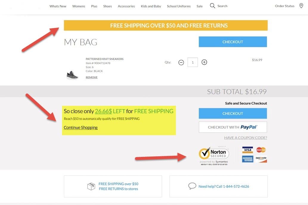
In the first variation, the team presented several new elements:
- The banner is now brighter and grabs visitors’ attention.
- Free shipping incentive is moved closer to the main CTA. It now has explanation that visitors don’t need a coupon to qualify for free shipping: “Reach $50 to automatically qualify for free shipping”. Also, “Continue shopping” CTA is added to make the overall user experience better.
- The trust elements such as security and payment system icons are moved closer to the main CTA and become visible in the above-the-fold area.
2nd Variation:
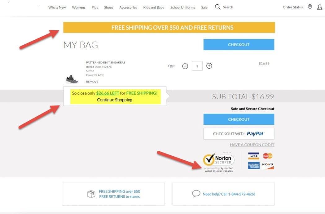
Variation 2 is almost identical to the first one except the free shipping incentive area. The shape of the incentive area is the same as in the original design, but it has a call to action button that makes next steps clearer for the visitors.
3rd Variation
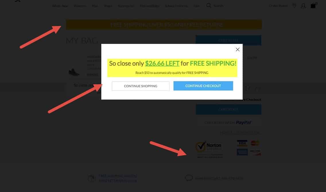
This variation has the same new orange banner and trust icons under the main CTA as in variation 1 and 2. However, the free shipping incentive area only appears when visitors press on the checkout button on the cart page. It is a popup informing them how much is left to qualify for free shipping and offering to continue shopping or go to checkout.
The results
The test had been running for 16 days. Variation 1 won by showing 6.89% increase in conversions with 97.4% confidence.