According to e-commerce researchers, an average 65.23% of potential customers abandon their shopping cart. In this blog I have outlined some comprehensive steps that can help reduce cart abandonment.
Add Description for Fields Labels
Form field labels without an explanation could cause confusion regarding the information being asked of the customer. Most customers need extra help, so for example, instead of showing a “?” or having a mouseover effect that shows details of what’s being asked, you can simply display the information below the form labels.
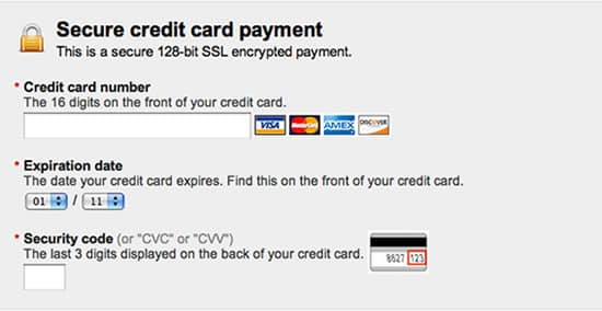
Highlight Credit Card Fields with Security Icons
Study shows that users are actually more concerned about security while entering the credit card information. Consider placing security icons in close proximity to the credit card fields.
Also, highlighting the payment input fields with different color or border and icons make them feel more secure and highlight the sensitive fields too.
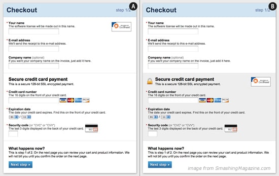
Use Clear CTA Captions
CTA descriptions such as: “Next Step, Back, Apply ” do not describe the next step customers will be redirected to. It’s always important to consider the state of mind customers may be and anticipate what they understand from a specific description or command. Use descriptions such as: “Complete Order, Continue Shopping, Proceed to Checkout and/or Apply Coupon” to make it clear to user where they will be being redirected after pressing the button.
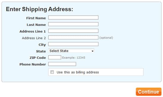
User Shipping Address as Billing Address by Default
Reduce the time it takes customer’s to fill in information. One easy way to achieve this is by making it easy for them to copy, as in the below example, billing just by checking a box. Of course not all customer’s share the same shipping and billing address, so it is important that having an option to keep them separate is clearly identified as well.
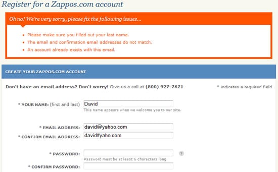
Use clear error indicators
We should expect input errors, and alert customer’s of them effectively to avoid checkout abandonment. Studies show that when users do not understand errors, this creates FUDs (Fears, Uncertainties, Doubts), and as a result they will abandon.
On Zappos website a wide orange color box is displayed to show the errors.
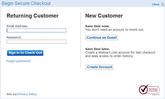
Option to checkout as guest
A study conducted by Webcredible’s shows that “29% of online shoppers do not like proprietary registration forms during check out. In fact, one respondent stated that because of their existing number of passwords, they feel inconvenienced when yet another service requires them to create an account.” Again, consider reducing “FUDs” by offering a guest checkout option for cutomers.
Reduce Unnecessary Fields
Always ask for necessary information only. Of course, you must ensure you gather sufficient information to complete an order. However, when asking customers to fill out lengthy forms this increases the chances to make mistakes, or overwhelms the customer which leads to more abandonment.
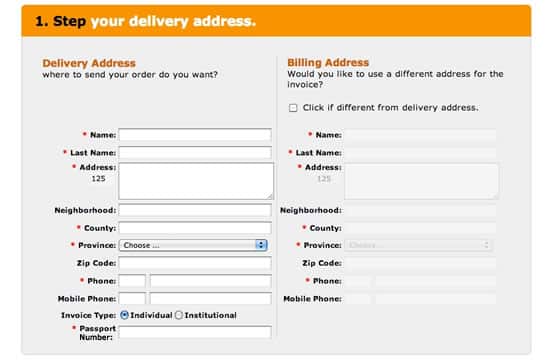
In the example above, customers were asked to enter the passport number. Making this compulsory was causing abandonment from the checkout because anyone will think many times before entering this kind of information. Reducing that field alone resulted in a substantial uptick in conversion.
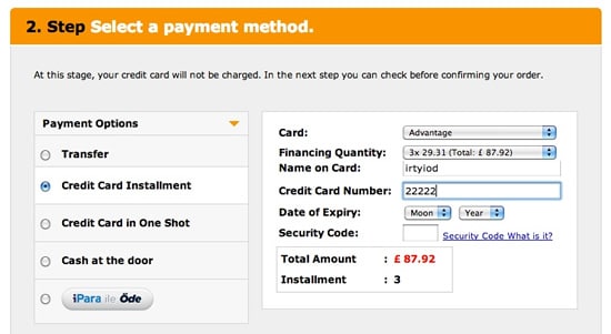
Have a wide variety of payment options
According to Walmart representative Cynthia Lin, check payments helped Walmart reach more customers: “Initial data show we’re reaching customers who have not bought from us before”.
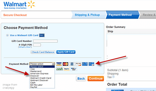
Below is another example where, because of the nature of the site and the market, the company offered many payment options to maximize conversions. What’s key to remember is HOW the information is displayed to the customer, and how convenient and easy it is to understand the options.