The following case study was conducted to increase a website conversion rate through improving site navigation and helping customers locate the products they are looking for. The test was designed to result for an increase in conversion, as well as of course, overall customer satisfaction with regard to navigation and site experience.
The Company
PrintGlobe was founded in 1995 in Texas to enable clients to design, quote and order a wide range of graphic and printing products. Today, PrintGlobeis the default destination for many for printing products and services.
PrintGlobe believes in providing the most comprehensive range of printing services and products to its online customers. The company has gained several big and small customers worldwide owing to its exemplary customer service and diligent vendor partnership. PrintGlobe prides itself on being an equal opportunity employer to its employees and a fair service provider to its clients.
The Test
PrintGlobe approached Invesp because they noticed that their website was not converting as expected. Invesp created a site roadmap which targeted the lowest performing pages, and identified key areas to test. One of the pages was the top level category pages. While reviewing the page, Invesp noticed that customers were not navigating throughout the category pages, and the Pre Product Page Abandonment Rate was quite high. Thus, the team concluded that site navigation could use mass improvement there by improving customer experience and helping customers arrive to the product they desire to see. The idea behind the test was to see which view would be most customer-friendly. The three views under consideration were: Grid Only, Grid with Navigation Pane, and Grid, Navigation Pane and Carousel. Three different variations of product pages were tested using different parameters and three different results were obtained.
The Result
Sample Size – 15000 Visitors
The three results obtained in the test are elaborated as follows:
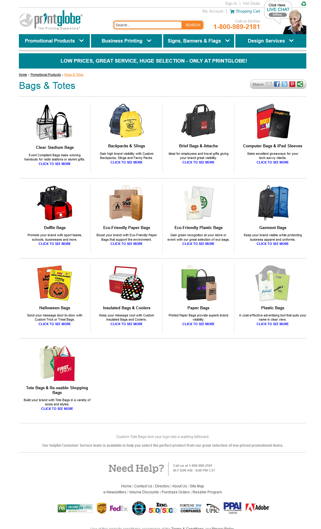
Variation 1: Grid View Only
This result shows the products in a grid view, with descriptions printed below the products listed. This result does not display the navigation tabs, which makes it tough for the customer to navigate elsewhere on the website.
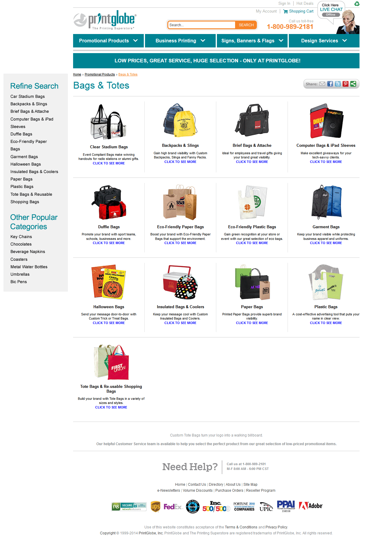
Version 2: Left Nav and Grid View
This result presents the items in a grid format and also displays the navigation pane to the left. This view makes it possible not only to see the items on the page but also to navigate from the page to any other location on the website.
Version 3: Carousel, Left Nav, and Grid View
This result shows the items in a grid view along with the navigation pane. That apart, the carousel option allows the customer to click the right arrow from the grid to view more items within a particular category.
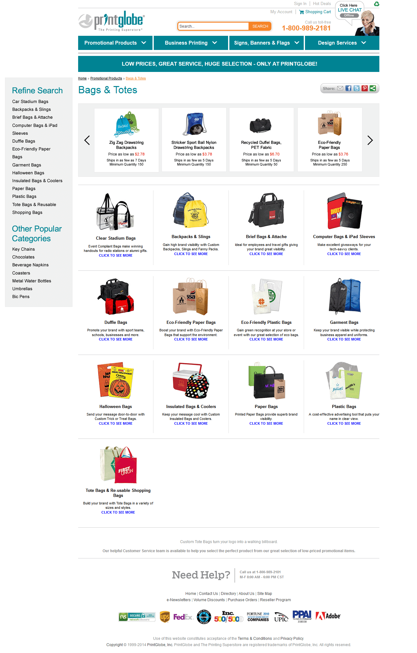
The Winner:
Result number 3 was declared the winner. The test resulted in an 18.5% increase in conversion rates when navigation option number 3 was used.
Related Articles: What Is Conversion Rate Optimization and Why Is It Important