Strap on your CRO gear, we’re going in for an ambush.
A lead generation conversion might not mean cash in the bank in the same way as an ecommerce conversion, but for those companies whose goal it is to get sales leads online, the lead generation form is where the rubber hits the road.

What you do with the lead after potential customers give you their info is an entire sales science unto itself, but until you get them to submit the lead gen form form, you don’t get to practice any science, or sales, or anything else.
Speaking of “Submit”, Let’s Start the Ambush on Our First Victim, er…Lead Gen Page
NEC Display Solutions. If an optimized lead generation form is critical to the success of your lead gen program, why would a multinational corporation like NEC, the parent company of NEC Display Solutions, which in 2013 saw $255,000,000 in profit from $25,000,000,000 in sales, let their form be anything but highly optimized?
If your form is the main weapon in your lead gen arsenal, the call-to-action button is the trigger that fires another lead into your customer database.
While you need to test to see which button design, shape and copy produces the best results, if there is one rule about developing CTA buttons that is widely accepted, it is that you employ every possible means to avoid using the word “Submit” on the button.
5 years ago – an eon in conversion optimization terms – Hubspot released a study that showed a 21% increase in conversions when “submit” was not used anywhere in the CTA button copy. And there have been many more studies since with similar results.
So what’s the copy on the NEC lead gen CTA button? If you visited the page, you might not be able to answer that question because, in another severe CRO faux pas, NEC chose to put the CTA button below the fold. Tsk tsk tsk.
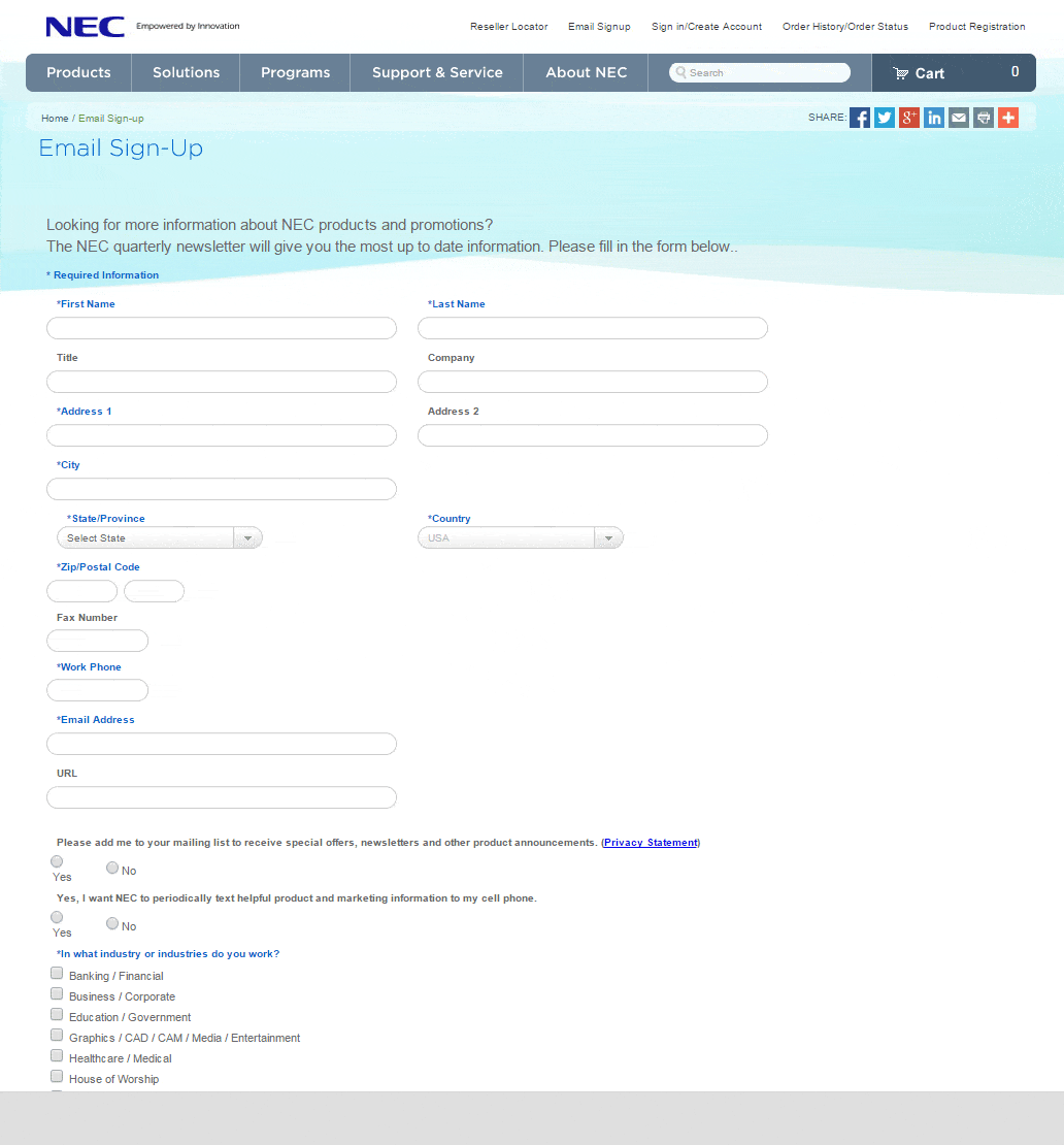
There’s lot’s more to complain about on the NEC page, including too many form fields. They could eliminate three (city, state, country) right now because they get all that info from the Zip code. And how many prospects for their high-tech products still use a Fax number? Oy.
Let’s move along.
How about Uber?
Are there any companies more on the leading edge of business models than those who are disruptors in their respective sectors, including Uber and Airbnb? So their landing pages should be on the “leading edge” of conversion optimization.
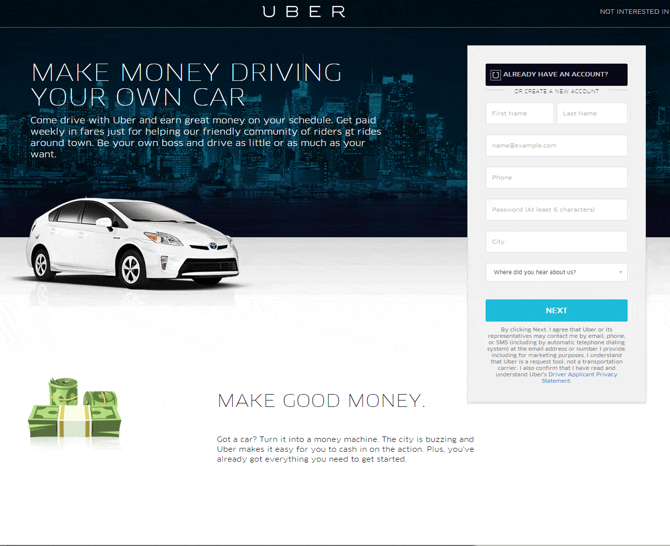
And Uber doesn’t disappoint (entirely), showing us some good practices, including:
> Clean overall design with lots of whitespace
> Benefit-driven headline copy that lends itself well to the ad copy that brings customers to the page. And the body copy offers more benefits
> Hip hybrid vehicle in the signature image
> Short and sweet sign-up form that outlines what happens when you take the call to action and includes a link to Uber’s Privacy Policy
> Clean and clear CTA button that quite niftily tells you in one word what will happen when you click it
> Attractive icons highlighting more benefits
So is this a really well optimized lead gen page? Only their conversion rates can say for sure. But considering how well they execute on most elements, it’s surprising how far short they fall on others.
> Spelling errors?!???!! Are you kidding me? Simply unacceptable on a lead gen page
> Why are most of the benefit icons and copy below the fold? Whitespace is good, but when it drops conversion-driving content from the page, and offers no indication that there’s more stuff below, it’s bad.
> See below for one more CRO blunder on this page, under “Mobile Lead Generation Forms”
Candid
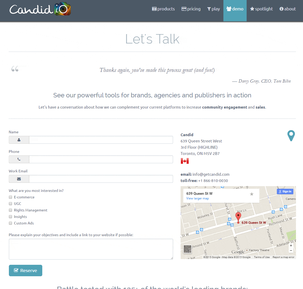
If there’s a winner in this very random ambush, it’s the lead generation page at getcandid.com.
Let’s jump straight to the stroke of brilliance.
A testimonial.
The main hurdle between you and online leads are the questions customers have about giving you their private info and doing business with you. Do they want to get a call/email from you? Is your solution the right one for them? Who are you?
Many of those questions are quickly and easily answered by placing a testimonial prominently on the page. It tells the potential lead that, if Candid is good enough for the CEO of a fashionable and respected business, then they are worth a try.
But there’s lots more to learn from the Candid page:
> The Ask: You can feel the “begging” for data on some lead gen pages. But not on the Candid page, which really sounds like Candid isn’t looking for a lead, they just want to talk about your business and its goals … but they’ll talk the lead info that comes with that
> Very few form fields and the info they seek is quite reasonable
> The CTA button copy gives an air of exclusivity
> Yes, there’s more info below the fold, but at least the page is structured in a way that let’s you know it’s there
Let’s Not Forget Mobile Lead Generation Forms
Companies that depend on online lead generation know that more of it happens on mobile devices every day. But those same companies are still perfecting the craft of mobile lead gen, and they have a long way to go. In the mean time, it’s safe to say that you should at very least have a responsive lead gen page, if not one specifically built for mobile.
So have all our ambushees done the very least they could do to accommodate mobile leads?
Nope.
Curiously, it is again the company with the most resources, NEC, that makes the least effort, which is none. And perhaps more curiously, it is the company that might rely most on mobile customers, Uber, that fails in their efforts to optimize for the format.
NEC’s site is simply unresponsive. And, for some unknown reason, the element of Uber’s site that displays the first icon and the “Make More Money” benefit copy, does not fit their mobile site, though the rest of the site does.
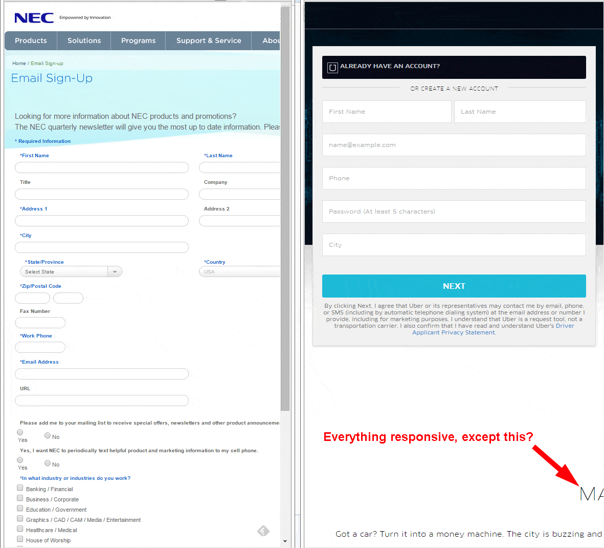
It’s worth noting that, with the two exceptions listed above, all the lead gen pages we looked at for this ambush were at least responsive design.
Your lead generation pages are critical to your business. So why don’t you optimize them?