Landing pages have become a must have for all digital marketing campaigns. They are designed to compel your website visitors to convert on the campaign that drove them there, by collecting information that is vital for a business’s growth. Be it simply generating leads by asking for email addresses or asking them to sign up for a free trial of a product, a landing page has a direct impact on the performance of a campaign.
While a good landing page is bound to get you a lot of conversions, an ill-planned landing page will have the exact opposite effect. It will not just lower your chances of getting customers, but also work negatively for the reputation of your business online.
Even though there are hundreds of tips, tricks and tools available on the internet to guide marketers for creating converting landing pages, there are still a few mistakes that often end up costing them customers.
Here’s taking a look at the 11 deadly sins that marketers need to avoid making on their landing pages:
1. Your visitors don’t understand what you’re offering
Let’s face it, most internet users are seeking for information that they can easily consume and get value from. If your landing page isn’t able to convey its point in 5 seconds, you’ve lost a possible customer.
Look at this landing page. Can you get in 5 seconds what it offers you?
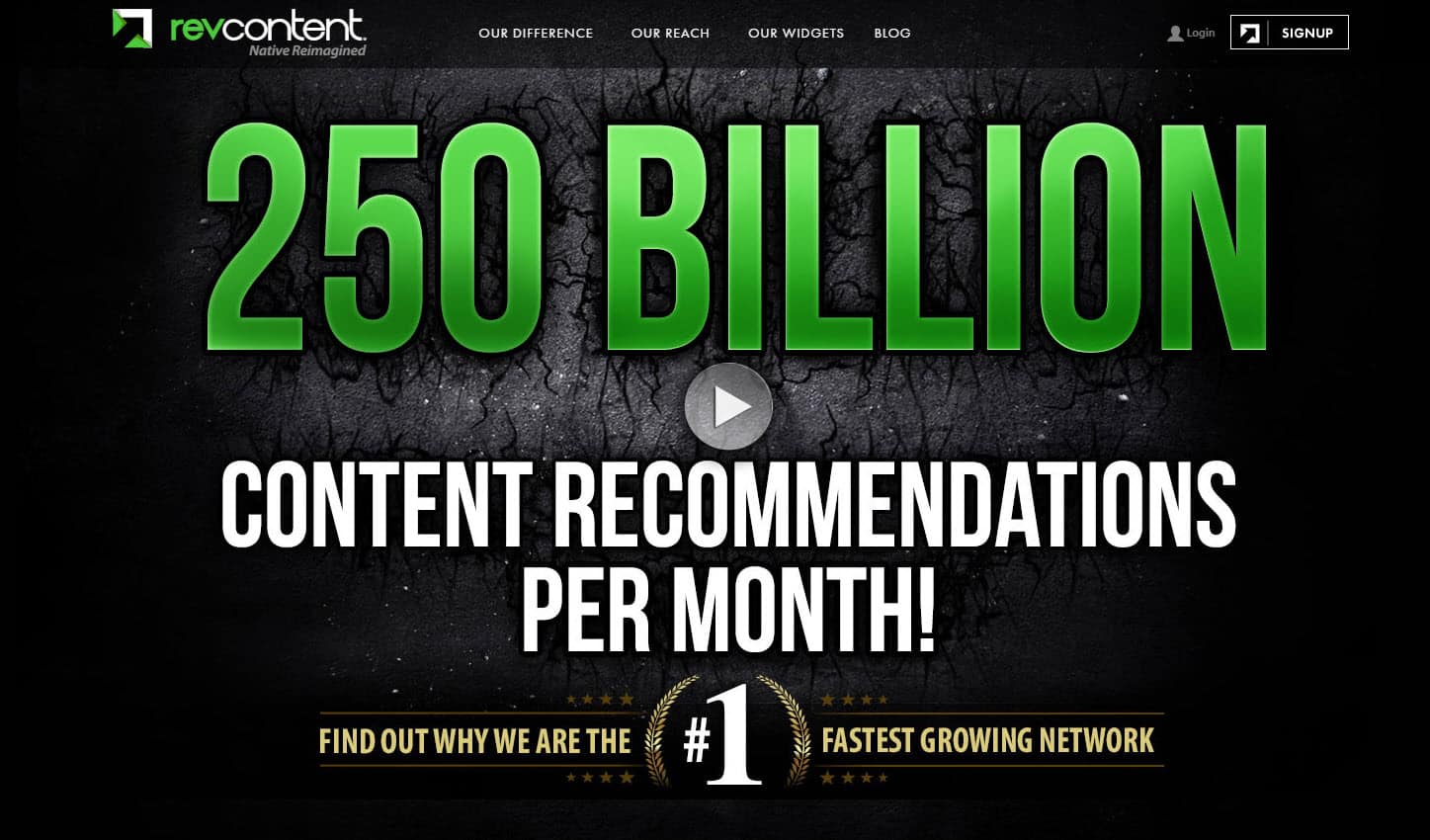
Actually, it is the landing page of Revconvert, a content-discovery platform that recommends content form other websites based on the content users already viewed.
Compare it to the landing page of their competitor Taboola:
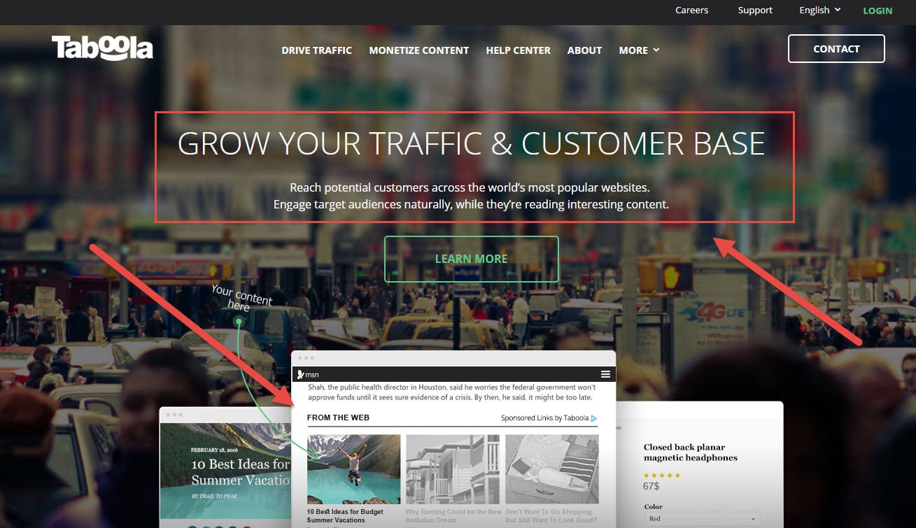
Isn’t is more clear what the company offers to you?
This landing page has almost all the elements of a good value proposition:
- Headline that describes the end benefits: “Grow your traffic & customer base”.
- Subheadline explaining what they offer: “Reach potential customers across the world’s most popular websites. Engage target audience naturally, while they’re reading interesting content”.
- Visual supporting the value proposition statement: an image that show how native ads look like on the page.
Creating a value proposition is not as easy task as it may seem. It requires a bit of groundwork: competitive analysis, target audience research, and creating personas. Only after that you can start writing a compelling value proposition statement using, for instance, G. Moore model:
For (target customer) who (need statement), the (product/brand name) is a (product category) that (key benefit statement/compelling reason to buy).Unlike (primary competitor alternatives), (product/brand name) (primary differentiation statement).
To validate your value proposition, you can use “grandma approach”, i.e. if you grandma would understand what you offer to people, other people will understand it too. Of course, using your grandma to validate your value proposition statement is a bit too much, but it will never hurt to ask a person who hasn’t probably heard of your value proposition before to answer a few questions before you take it live:
- what does the landing page seem to offer;
- what do they seem to get out of it;
- what action would they take on it.
And least, but not the last: make sure your value proposition is highlighted and easily understandable. Don’t forget that your landing page visitor will evaluate your page and your offer only in 5-second blink.
This will help you create a value proposition that resonates with the customer on a psychological level, yet conveys the product highlights
2. Your visitors are not sure about what they need to do
While it is important for customers to know who you are and what you’re offering, it is also important for them to understand what they need to do after reaching your landing page: What are they supposed to takeaway from the information you offer and what is the action that is desired of them from the page.
When creating a landing page, it is important to highlight only the vital aspects of your product or service- what they are getting out of your business and what they are supposed to do. This is the reason why CTA is an integral part of the conversion trinity. Your landing page visitor should know what to do next and have enough confidence to take the action.
In the Revconvert example above, the absence of clear CTA adds extra confusion as well as in the example below where there is no obvious call to action in the above the fold area asking visitors to fill in the form to get a quote; this may lead to confusion and increase visitors’ fears, uncertainties and doubts. However, the actual CTA button is located almost at the bottom of the page, at the end of the form. So, visitors have to scroll all the way down to see it.
Aligning the landing page elements to the intersection of the gridlines create more tension and energy at the page. Look at the landing page of GoToMeeting:

The sign-up form is off-centered in such a way that eyes of the girl looking at the form, header and CTA are located at the intersection of the gridlines.
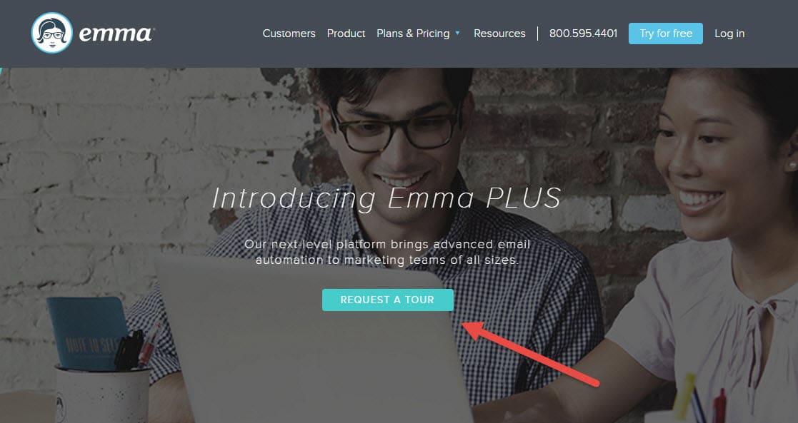
Another good place for the main CTA is closer to the center of the page, like it was done by Emma. Don’t forget to make it slightly bigger than the other elements on the page, as the famous Nielsen study suggest that users focus more attention on larger elements and larger fonts.
3. Your landing page is loading way too slowly
The loading time of your landing page has a direct effect on its conversion rates. Pages that take more than 2 seconds to load don’t just lose the interest of the visitors, but also possible conversions.
Improving loading speed of your website is usually a quite easy task to tackle.
If you’re not sure how optimized your landing page is for load time, use tools like Google’s PageSpeed Insights. It helps you identify the elements that are taking longer to load.
Here are three quick fixes that could help you to improve the loading speed drastically:
- Use a content delivery network (CDN) and distributed DNS, like Cloudfare, Incapsula, or CDNIFY. CDN moves static content closer to your website visitor which significantly increases the loading time.
- Use image optimization software like Kraken.io to make your images lighter and their loading speed faster.
- Use cloud storage service for storing static content like images and free your server resources. One of the biggest cloud storages is Amazon S3 which is used by many startups and Amazon itself.
4. You’re building your landing pages for mobile only
While mobile internet users have exceed those using the conventional desktop, it is also important to keep in mind that the desktop audience still constitutes about 42% of your website traffic.
So don’t just focus on creating a mobile friendly landing page, also keep in mind that those who are accessing it via the conventional desktop might be looking for more information on your offerings.
5. You’re not A/B testing your landing pages
There are no hard and fast rules when it comes to creating a converting landing page. While a certain aspect might work beautifully for another business, it might make yours lose customers. This is why it is important to A/B test your landing pages.
Split testing refers to the process of creating different variations of a landing page and tracking conversions for each in order to improve the overall effectiveness of the campaign. The process includes changing various website elements that are likely to grab the visitor’s attention or make him convert. Some of the elements that you definitely must split test on your landing page include:
- Background colour
- Page headline
- Type of offer made
- Offer text
- Call-to-action text
- Web form copy
- Images and other visuals
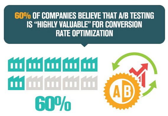
It is not surprising that 60% of companies believe that A/B testing is “highly valuable” for conversion optimization.
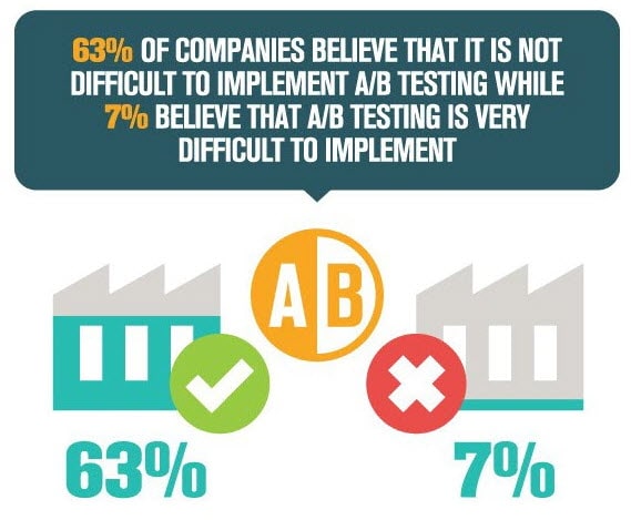
At the same time, 63% of companies believe that is it not difficult to implement A/B testing while 7% believe that A/B testing is very difficult to implement.
Here is a simple example why A/B testing is so important.
Vidyard conducted a survey on video content. Over 70% of respondents claimed that video performs better than other content for producing conversions. So, the majority of marketers shares the belief that videos is very good for conversions. it really so for every website?
We had a client whose landing page had a video in the above-the fold area and looked like this:
There were several issues with this landing page, but we decided to focus on a since hypothesis: “Removing the video and replacing it with benefits and a CTA will increase sign-ups.”
The modified landing page looked like this:
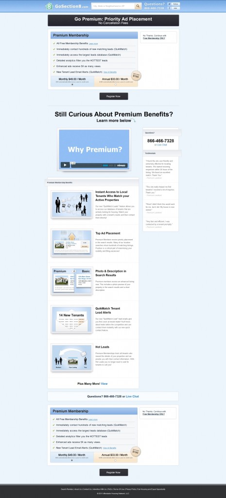
As a result, our client saw more than 88% uplift in conversions:
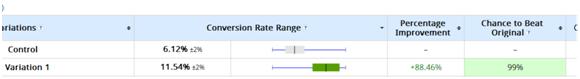
Why video was bad for conversions on this landing page?
- Video had no added value for the visitors of this landing page as they came to it already knowing what was the offer.
- Call to action gave visitors a clear instruction of what to do next.
- The video had no added value for the visitors, so it simply occupied “prime real estate” of the landing page and could be replaced with other more persuasive elements.
Lesson learned: you should not make blunt assumptions on what might work for your website visitors, you should test it to confirm your assumptions.
6. Your campaigns lead to the same landing page
You have narrowed down who your business is targeting in the consumer market. But let’s take into account who actually constitutes that target audience. Dig deeper into consumer behavior and you’ll understand how each individual is different from the other in the same target market. Then how do you expect them to convert on the same landing page?
Segment your target audience further based on insightful data points like their interaction with your business or industry, what they’re looking for and their previous purchase triggers. The more contextual your landing page is to their needs, the higher will be the conversion rates.
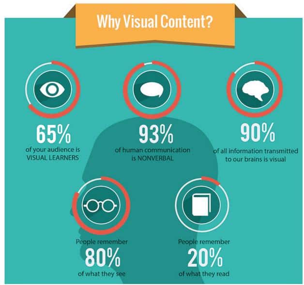
7. Your landing page lacks visuals
According to a study by Zabisco, our brain processes 90% of the information in visual format. For that matter, visuals are processed 60,000 times faster in the brain than textual content. If your landing page hasn’t been able to convey its value proposition effectively, then you need to incorporate visuals that would do the same for you.
Be it a few product images, how-to videos or quick gifs, make it easy for the visitor to understand what your business does and what value he is going to gain out of it.
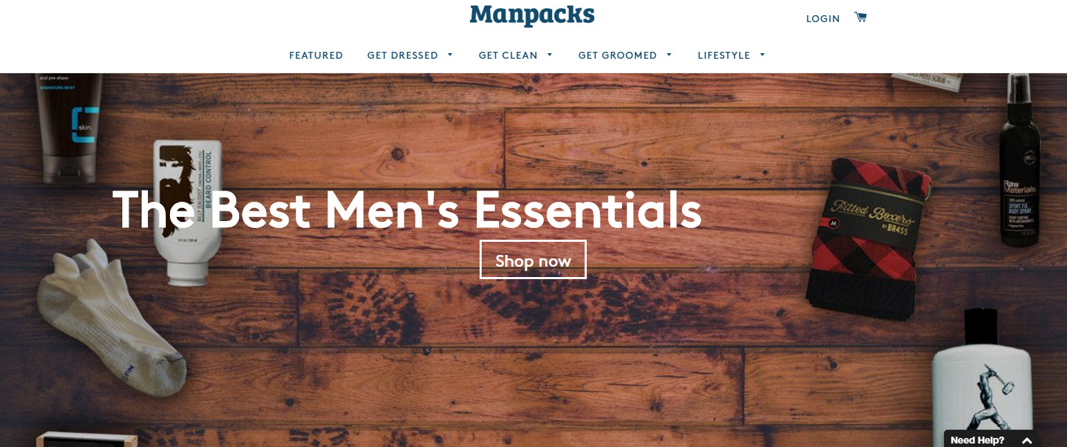
This is how Manpacks, a quarterly subscription to men’s essentials, uses the visual to underline the nature of the subscription services it provides:
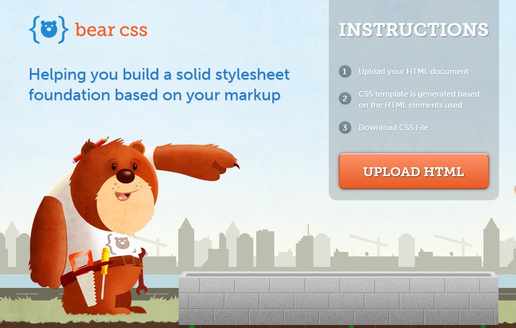
And here Bear CSS uses this cute bear to point out into the CTA direction to focus visitors’ attention on it:
8. Your landing page demands a bigger commitment
It is important to keep in mind that not all your landing page visitors are at the same level in the sales cycle. While some might readily share their contact information and convert with your business, there are also those who might be interested and need a little more nurturing.
Most landing pages offer a conversion that demands a bigger commitment from the visitor, resulting in overwhelming and losing him. So offer a micro conversion like a demo, free trial without credit cards, simply subscribing to your newsletters or following you on social media – of course, you need to keep in mind what your business goals are and how these micro conversions add up to the bigger picture.
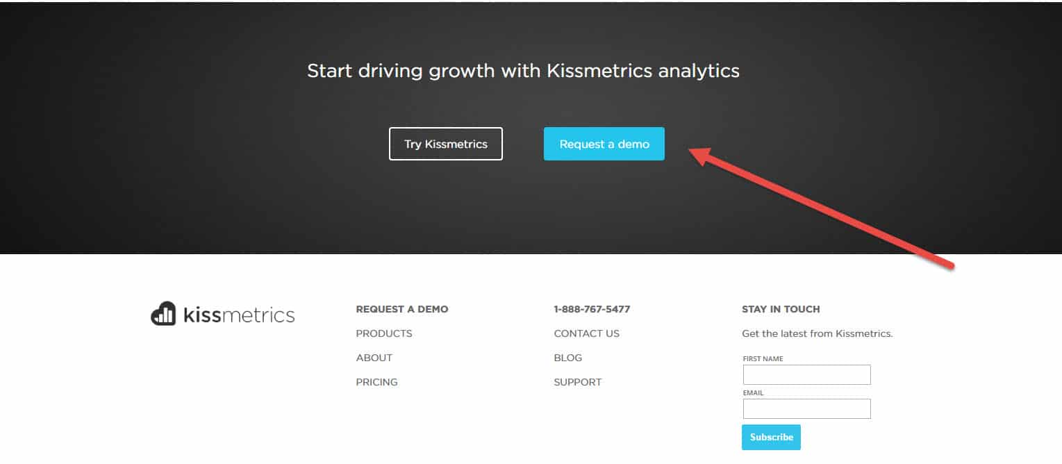
This is how Kissmetrics added a micro conversion, “Request a Demo”, to their landing page since there are a lot of businesses who aren’t sure how analytics can contribute to their growth. They probably won’t click on the “Try Kissmetrics” CTA; however, they may consider watching a demo.
9. Your landing page design is way too cluttered
While we say offering micro conversions is sometimes important, it is also vital that your landing page leads the visitor to one goal and not overwhelms him with multiple offers. But the sad news is, about 48% of the landing pages contain multiple offers and call-to-actions. This clutters the entire design of the landing page and confuses the visitor.
Look at this page of DAZ 3D, a software company offering 3D software. It is landing page of their shop selling various add-ons for 3D modelling:
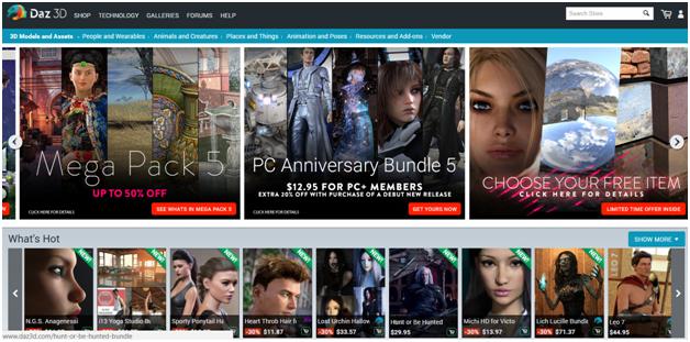
Too overwhelming, isn’t it?
So make sure your landing page is laser focused on only one action. Get rid of all other navigation or elements that might lead the visitor to another aspect of what your business offers. The cleaner the design is, the better the visitor is able to consume the information you’re offering.
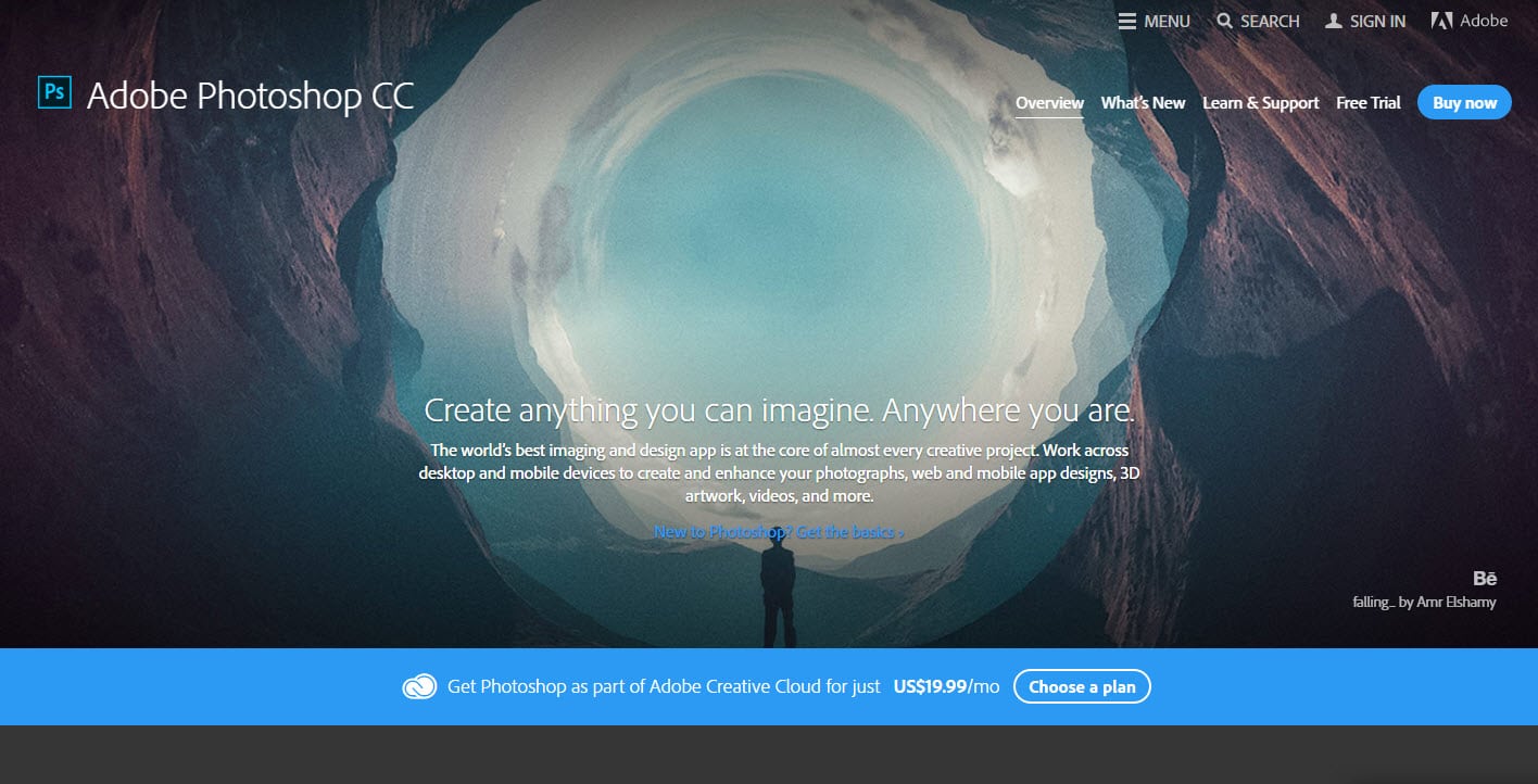
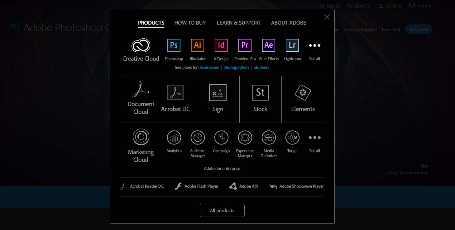
Compare the landing page of DAZ 3D to Adobe Photoshop CC landing page, which is crisp and clean:
Even menu of this landing page looks extremely visually clear:
10. Lack of trust elements
There are multiple businesses who are offering similar products and services in the digital space today. While some are considerably old in the industry, there are a few that have just begun and are building their reputation in their target audience.
As an end consumer, I don’t want to be associated with a product that is half made, is in beta or doesn’t guarantee any kind of results. Most visitors to your website don’t convert, if they can’t see any trust signals.
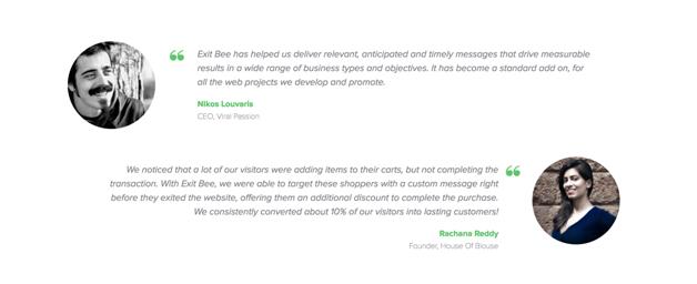
Trust signals or elements are usually social proof of what your business delivers and what your existing customers are gaining out of it. A simple way of adding these trust elements to help your visitors make quicker decisions, is to include a few testimonials, feature in popular publications or ratings shared by customers.
For instance, Exit Bee has a fairly new technology that helps boost the conversion rates of eCommerce websites. Now it is hard to convince online store owners that it actually works with on-site retargeting. So it has included two testimonials from customers, whose case studies are featured on their website too.
11. Disconnect between the ad and the landing page
One of the most important and a common reason for businesses to lose conversions on their landing page, is a disconnect between the ad and the web page copy.
In simpler words, promising your target audience something to draw them to your landing page, and then offering something else altogether, is only going to make you lose business. There has to be a consistency between what you use to draw their attention and what you’re going to use to convert them.
For instance, see the ad on the left and then the landing page copy on the right. There is a consistency in what Optimizely is promising, as well as the design they have used to make it look familiar to the visitor.
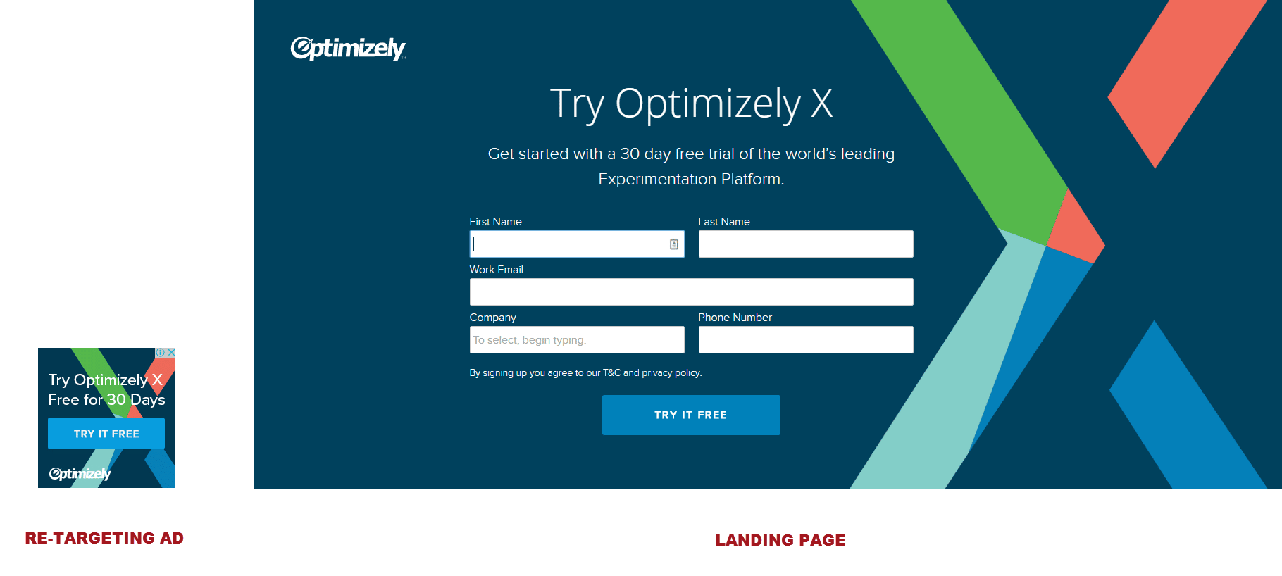
When you don’t maintain a consistency between your website or landing page and advertisements, you end up losing the opportunity to even generate leads.
Takeaway
Landing pages take more than just a good design to create. They need to be well strategized based on data of what your target market looks like, what they are looking for and how you can get your value proposition across the best.
A/B test your possibilities before you settle down on one landing page for your marketing campaign.
What other tips do you have for creating a high converting landing page?