“No credit card required.”
“Never shared, never spammed.”
“Change your profile whenever”
These are some great examples of microcopy. They are short, to the point, and placed right where they will be seen by tons of users.
When done right, microcopy can persuade customers, clear doubts and reassure users of your product’s value.
In this post, I’m going to show you 8 ways you can use microcopy to boost your site’s conversion rates.
What is microcopy?
In a nutshell, microcopy is any small bit of text/copy that helps address user concerns, clarify product value, or convince customers.
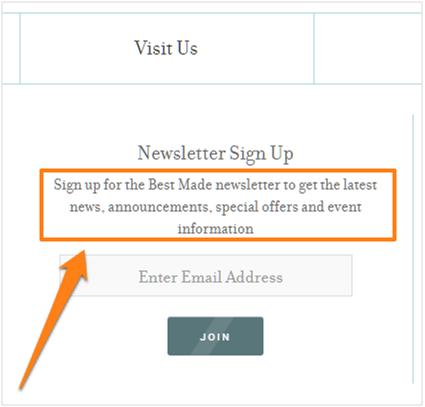
This, for example, is simple microcopy that describes a newsletter subscription form:
Microcopy may be small in size but it can have a big impact on the user experience. When done right, it has the ability have a profound effect on your content performance
Microcopy needs to be short, snappy and user-oriented.
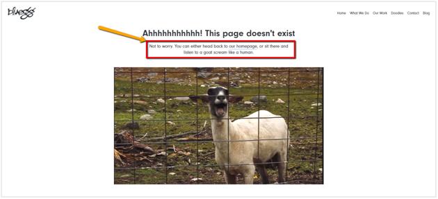
BlueEgg’s 404 page is a great example of microcopy. They do not stop at “This page doesn’t exist”. The copy further says, “you can either head back to the homepage, or sit there and listen to a goat scream like a human.”
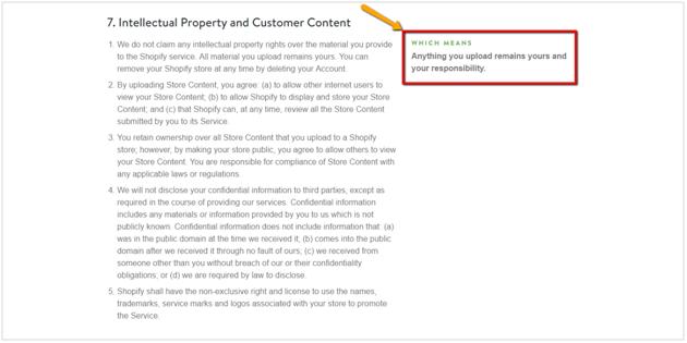
Look at Shopify’s “Terms of Service” page where they give a Tl;dr version of every point.
Tumblr uses microcopy to tell new users when their password isn’t long enough:
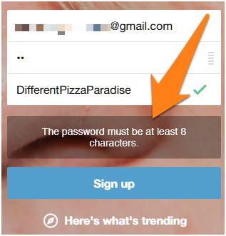
Essentially, microcopy can be anything – a 404 error page, a “password safety” disclaimer, a form description, etc.
How can microcopy boost conversion rates?
Remarkable microcopy makes you realize there are real humans behind a website or product. You feel a kind of connection.
But can microcopy boost your conversions?
It certainly can.
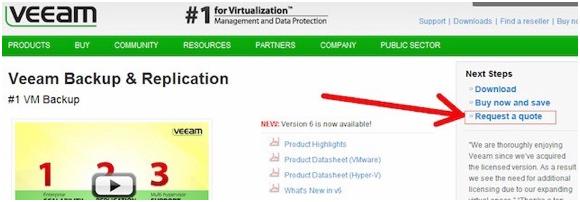
For example, Veaam conducted a survey for user feedback on their lead generation form. They found that many visitors wanted to know the price of their services.
They decided to change the phrase from “Request a quote” to “Request pricing”.
Before:
After:
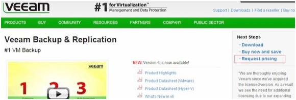
When they measured results with a A/B test, they saw a whooping 166.66% increase in conversions.
Here are some techniques you can use it to boost conversion rate on your website:
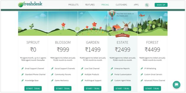
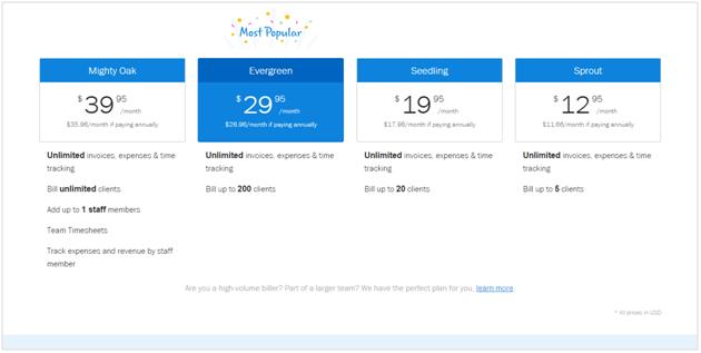
1. Use more “fun” and evocative names for your pricing plans
Instead of using standard pricing plan names such as “Starter”, “Professional” etc. Experiment with more evocative names that stick out.
For example, FreshDesk’s pricing page uses Sprout, Blossom, Garden, Estate, Blossom
Freshbook also does a good job at their pricing page
2. Change your email sign-up disclaimer
This is the copy you see right below the sign-up button.
You could either write down all the benefits of your product or be a little fun and try to let your target audience connect with your brand.
Needless to say, latter will likely give you better conversions.
Tumblr tries this on their homepage but letting you see what’s trending and explore tumblr before signing up.
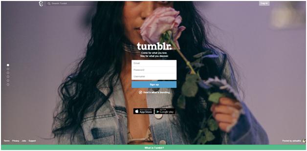
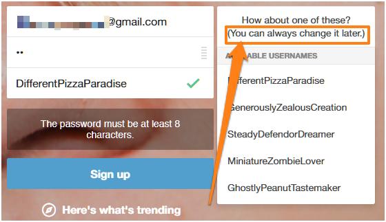
When you sign-up, Tumblr will tell you that you can “always change” your username later. Plus, you’ll also see suggested username alternatives to save you time when signing up.
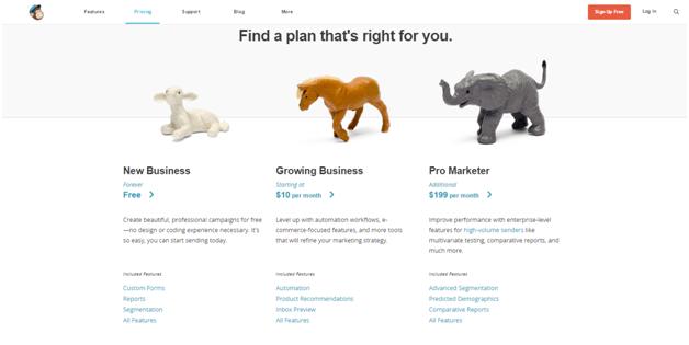
3. Describe your pricing plans with short, crisp copy
Simply giving your pricing plans fancy names doesn’t really tell the readers enough about the plan or who it is aimed at. Add a bit of copy to explain the plan’s target audience and how it can be used.
Mailchimp’s pricing plan does this best:
4. Reassure customers of your billing practices
When it comes to online payments, a lot of users are skeptical about giving out their credit card information.
In fact, according to one study, 80% of shoppers are concerned about credit card fraud.
You can remove this fear somewhat by adding a microcopy on the sign-up page to reassure them of your billing practices. The is particularly effective when you’re offering a free trial or use recurring billing.
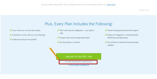
For example, Freshbooks pricing page says, “No credit card required, cancel anytime” just below the ‘start your free trial’ CTA.
5. Explain a concept or idea with microcopy
Microcopy does wonders when you want to explain an idea or a concept. If you can think of something quirky, funny or memorable, it will likely stick with your users for a long time.
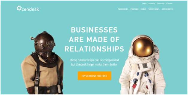
Take example of Zendesk, their microcopy on the homepage says, “Businesses are made of relationships”, “Those relationships can be complicated, but Zendesk helps make them better”. This short copy explains their whole business, what they do and how can they help you.
Something as simple as encouraging users with quirky copy after completing an action can go a long way towards establishing your brand image.
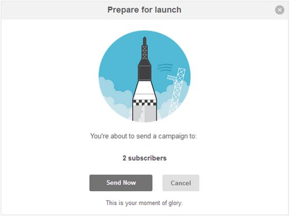
For example, see how MailChimp uses microcopy (“moment of glory”) to encourage user action:
6. Make pop-ups more persuasive
Pop-ups don’t get a lot of love from users but as a marketer, you know they are extremely effective for generating leads and sign-ups.
Microcopy can help here by making your pop-ups funnier, clearer and more persuasive.
For example, On SocialTriggers.com, Derek Halpern uses clever microcopy to make a persuasive case for pressing the “yes” button:
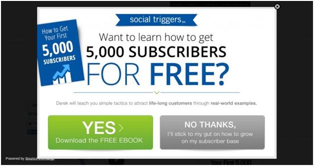
Notice how the “yes” button has a massive “YES” while the font in the “no” button is smaller.
This is one great way to use microcopy to boost conversion rates.
7. Be clear and say what you expect
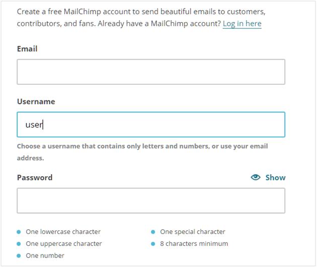
Your microcopy will do well if it is clear. Guide your users to what exactly you expect from them. This is particularly true when you’re asking for passwords and usernames.
MailChimp is the perfect example of this. When you start typing in, MailChimp will tell you how to select a username.
Similarly, as you enter a password, MailChimp will visually indicate in real-time which of its password rules it meets:
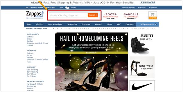
8. Add suggestions in the search text box
In a study of 27 different websites, it was found that users who use site search convert 2-3X more than those who do not.
Giving suggestions to users in the search box goes a long way to compel them to look for those products. It is advised to take the most popular search terms or categories and pre-populate the search bar with recommendations.
Zappos makes good use of this technique:
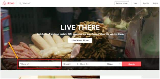
Another great example of this is Airbnb. They could have left the search field blank or written an explanation on the side but, instead they use microcopy asking you, “Where to?”
Over to you
Microcopy is a powerful tactic to add a dash of personality to your brand, improve conversion rates, and clarify your offerings. Start by using one of these 8 tactics to make your site more persuasive and conversion focused.
Lastly, remember that great microcopy comes from knowing your users. For instance, if you’re catering to a tech savvy customer base, you might not need to hammer in username and password requirements heavily.
Get user feedback before you go about making any changes. Figure out where they are facing problems and keep A/B testing to get the best results.