The web is a great place to learn because you can quickly access a lot of information from a variety of sources. The reason it’s easier to learn about something even as difficult as Einstein’s Theory of Relativity online is that you can have it explained in so many different ways that you’ll eventually find bits and pieces that you can understand; bits and pieces you can cobble together into a comprehensive explanation.
What if you want higher conversion rates? Again, the web delivers truckloads of information, advice, examples, case studies, AB test results, – you get the idea – that guide you towards better rates.
Or you could just learn while you surf. The only downside to the amount of info the web presents is the time it takes to filter through it all. But just by paying attention to your experiences and impressions as you surf, whether holiday shopping or finding a new supplier, you can still get lots of information and insights about what works, what makes you click and what doesn’t.
Web Surfing to Increase Your Conversion Rates
It’s simple really. While you’re surfing, start thinking of yourself as a conversion optimization expert. Assess the sites and landing pages you come across for their optimization tactics. You can start by asking yourself a few simple questions about each site:
- How does the site make me feel?
- Is the design up to date?
- Does the site deliver what I expected when I clicked on the link to get there?
- What tools or tactics does the site use to get me to convert?
- Can I navigate the site comfortably and sensibly?
You can develop your own “questionnaire” as you go. In any case, whether yours is an ecommerce site, lead generation site, B2B or B2C, you’ll soon develop a keen eye for what works and what doesn’t work.
Let’s take a look at a few sites to see what we can learn about conversion optimization just from visiting their homepages.
If it’s not too immodest, we’ll use the Invesp homepage as a starting point, if only because it’s about what we’re looking for – optimized conversion rates:
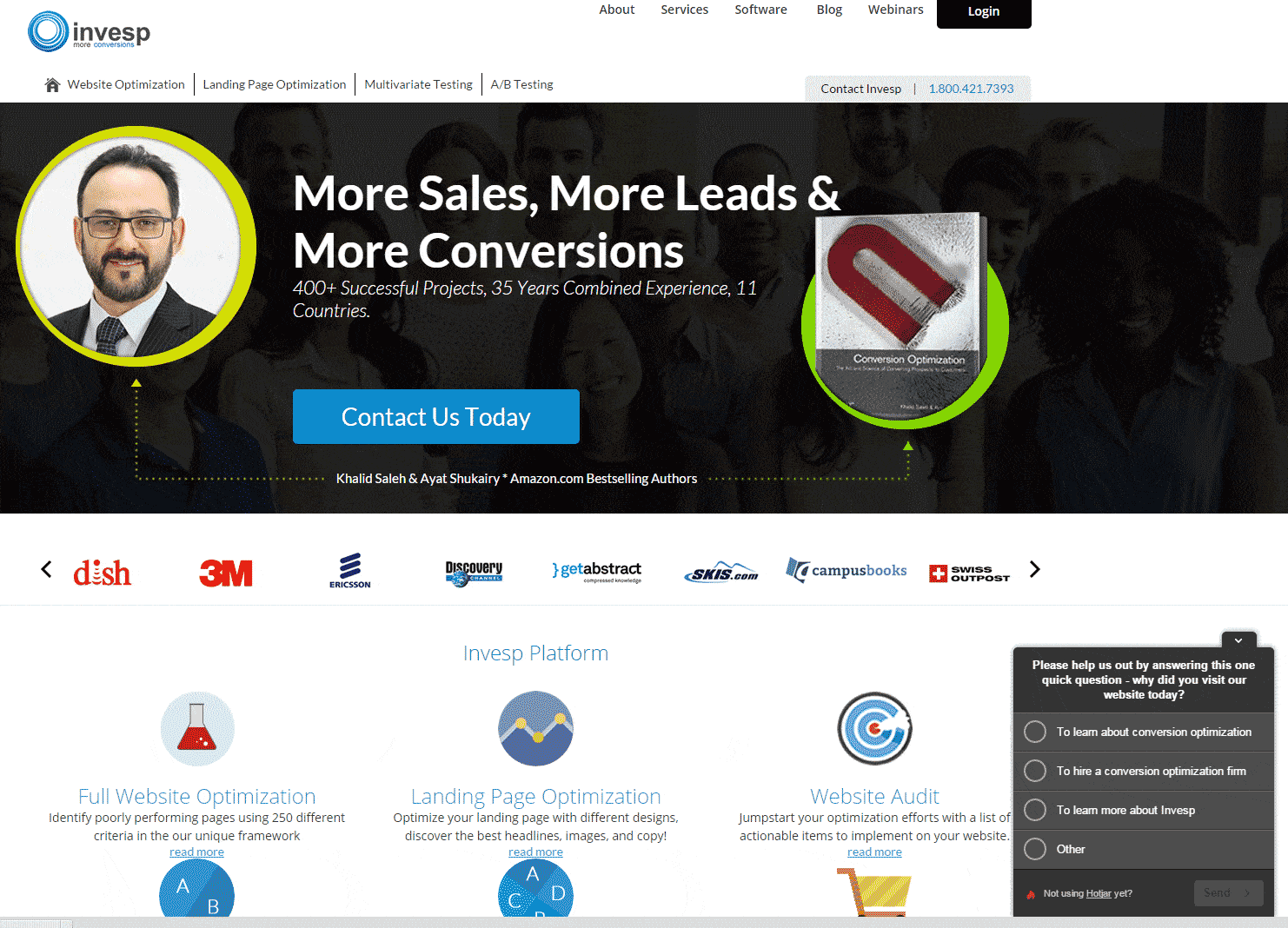
Needless to say, the Invesp homepage has it going on when it comes to conversion tactics. In addition to using the headline to quickly and boldly deliver the value proposition in the form of customer benefits – “More Sales, More Leads, More Conversions” – Invesp plays a number of other conversion-boosting aces:
- Establishes Credibility & Trust – Who wouldn’t want to work with a company that has over three decades of combined international experience; one that is lead by best-selling authors on precisely the subject we’re interested in?
- Provides Social Proof (more trust and credibility) – If Invesp is good enough for the likes of dish, 3M, Ericsson, Discovery Channel, etc., then they are doing something right.
- A Good User Experience – Want to optimize your entire site? A landing page? Or find out where your site needs help? In a clean design with lots of whitespace, links to the information visitors want most are clearly presented with icons, simple text and a “read more” call to action.
- Clear Call to Action – You don’t have to look for to find out how to get in touch with Invesp.
Surfing the web to get conversion tips gives you access to the biggest marketers on the planet – and their conversion tactics.
As one of the world’s top brands, Apple.com doesn’t have to get its visitors over the hurdle of trust and credibility. So what do they do instead?
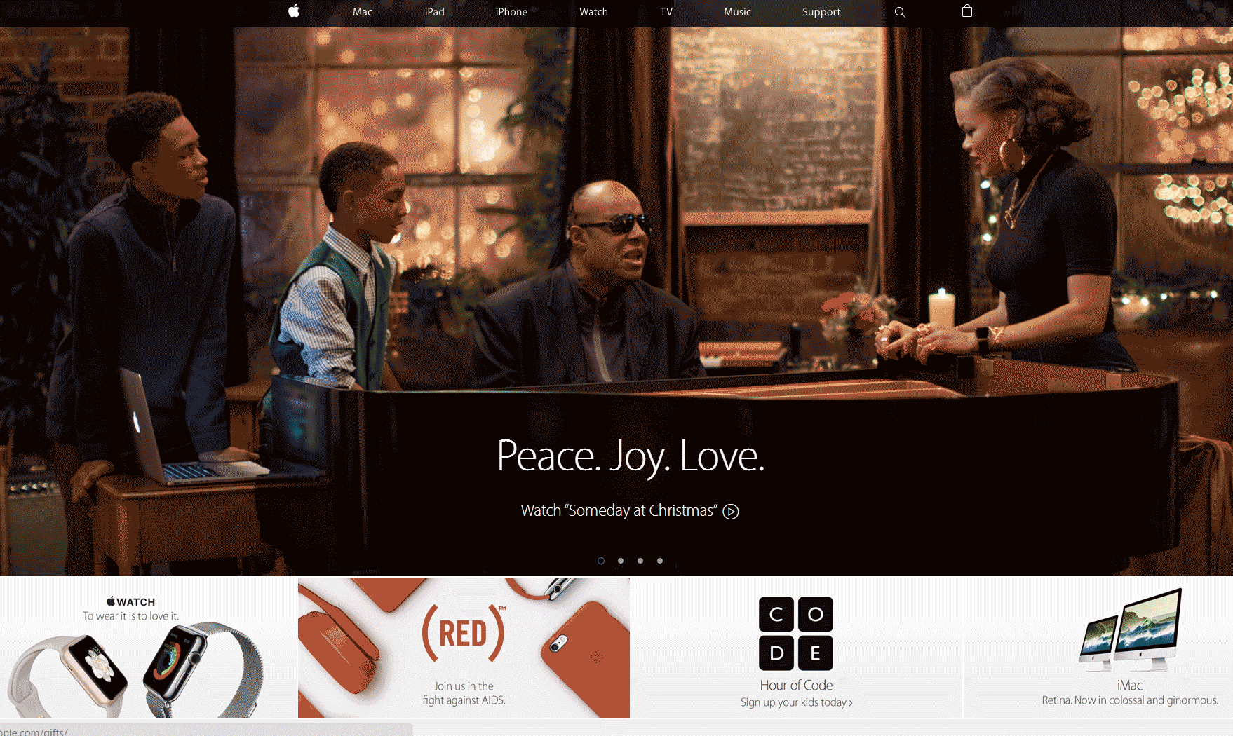
- Features Seasonal Content – This might be obvious, but notice that Apple doesn’t just decorate their site with some graphics and highlight sale items. From the headline on down, they appeal to the emotions of the season. The word “Love” appears twice above the fold. And family and children are prominent, not just in the image, but in the “Hour of Code” CTA.
- Fulfills the Customer’s Path to Purpose – Consumers increasingly want to identify with and buy from brands who are in line with their personal purposes and passions. In addition to the overtones of family, Apple invites visitors to join them in the fight against Aids.
- Uses Simple Navigation – Regardless of all the other elements at play, you can quickly find what you want
Walmart is doing to ecommerce what it did to bricks and mortar – becoming dominant. While they’re not yet in top spot, number three isn’t bad. So what does their homepage tell us about conversion?
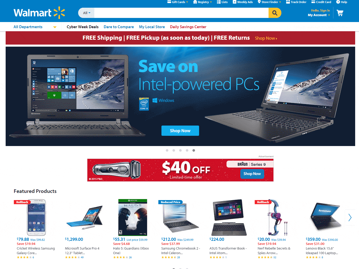
- Shows Customer Ratings – Word-of-mouth is a prime influencer of all retail sales. Online, word-of-mouth can be expressed through testimonials, user-generated content and/or customer ratings. Notice that Walmart includes average user ratings on every one of its Featured Products.
- Uses Co-Op Advertising – Here’s one you don’t see too often. In almost the dead center of their homepage above the fold, Walmart sports a labelled “advertisement” that is co-sponsored by P&G. It’s smart to get your suppliers to help you offer the discounts your customers seek.
And Now for Something a Little Different
All of the sites we’ve reviewed so far use a variety of conversion tactics. But check out CrazyEgg.com, where the homepage has, by comparison, just one conversion tactic.
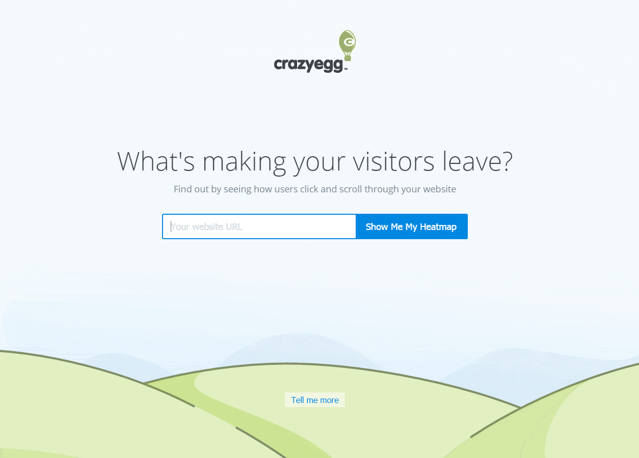
CrazyEgg uses a Google-style of web design – and conversion technique. Ever since it first hit the web, you could really only do one thing at Google.com – enter a search term.
It’s a case of “we do one thing and one thing really well”. By focusing the entire page on a single conversion goal, and offering a clear benefit of taking the call to action, the visitors are left with just two choices, leave or take the call. (Yes, there is a second “Tell Me More” CTA – more on that in a minute.)
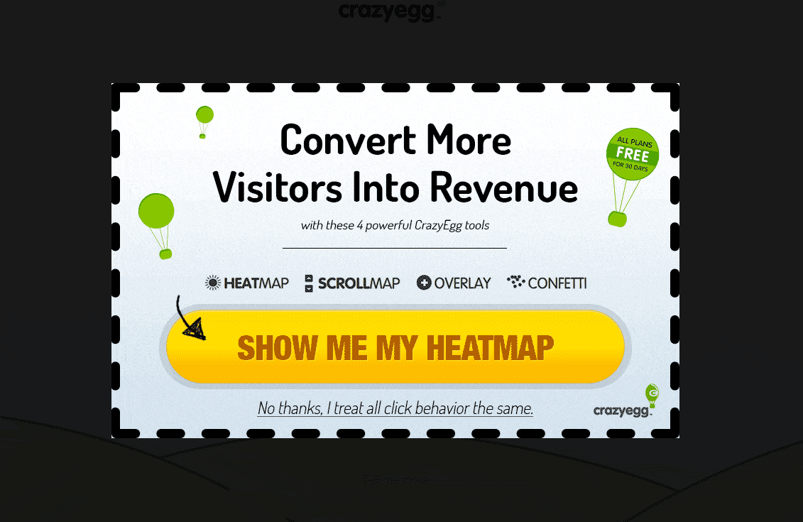
It could be argued that CrazyEgg has created a page where they have a 50% chance of the customer taking the CTA. But is putting all your (crazy) eggs in one basket worth the risk? While there is the secondary “Tell Me More” CTA, CrazyEgg really would like you to try their heat map. Even if you want to leave, when you mouse-over the back button or search engine URL window, the following pop-up appears before you’re allowed to go.
We’re barely scratching the surface here. The overall takeaway is that any time you spend on the web can be another step in your conversion rate optimization learning curve. There’s lot to see and discover, especially on the websites of large businesses like Walmart and Apple, where little or nothing is left to chance and every element has a purpose: to guide the customer along the path to conversion.