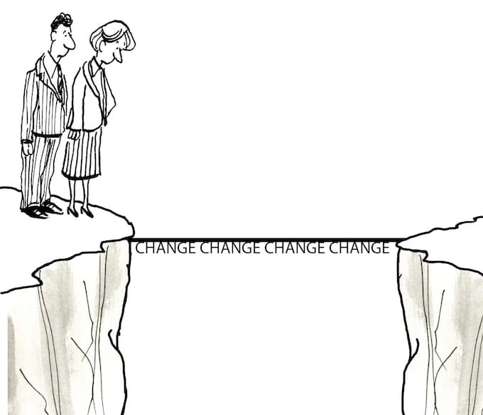
The question of website redesign vs. conducting conversion optimization is familiar to companies with a strong online presence. In some instances, a gradual conversion optimization effort is the way to go. Sometimes, a redesign is inevitable.
However, there is a dilemma here.
Although getting new customers to convert remains to be a challenge, once they do convert, returning customers love the site and experience. Would you disrupt and invest in something loyal customers seem pretty okay with?
To go the full site redesign route, you have to know your numbers to determine whether or not the disruption a redesign may cause to loyal and returning customers is worth it.
How can you juggle between a redesign and keeping all visitors satisfied?
Humans are creatures of habit.
Within a short period, website visitors choose a way of working around your website and form habits to these familiar paths. As you conduct A/B testing on your website or consider rolling out complete new redesigns, these habits can be detrimental.
Consider what happens every time Facebook releases an update to the site. Many platform users complain, although the changes that Facebook is bringing forth may be superior to the previous design. Yet, a few weeks later, these same users create new habits and get things done.
Find out in this article what visitor momentum behavior is, how it affects your conversion rates, and how you can prevent it from decreasing conversions on your site or application.
What Is Visitors’ Momentum Behavior on a Website?
Momentum behavior relates to the routine patterns (or habits) visitors take when completing tasks on your website. Any returning visitors adhere to specific successful paths they like to use around a website and interface, such as apps, software, ATM screens, you name it. Learning new paths or routines to complete old tasks requires an investment that users are not willing to make.
I recently had a conversation with some girlfriends about their shopping behaviors on mobile devices. One girl mentioned that she loves to shop on apps, although she always checks out as a guest user. I asked her: “So what’s the point if you aren’t storing your info on the app because ultimately that’s what they are there for.” She said that she really doesn’t like to store her information anywhere, and she periodically clears her mobile browser cookies, which is why she cannot use the mobile browser. Otherwise, she would lose her cart. She uses the mobile app primarily to store the items, and when she’s ready, she goes to the app and checks out anonymously.
This behavior could never be guessed by any of the stores she shops from, but it’s valuable information on the habits she has formed. The stores she purchases from would lose out on her business if they start requiring in-app purchases to sign in.
These are the three main features of momentum behavior:
- Visitors intuitively select a preferred way of accomplishing tasks on an interface.
- Visitors rapidly stick to the way they first found it, no matter if this is the fastest or best way of using the interface.
- Visitors do not want to go through the trouble of learning a new way of accomplishing tasks on the same website. The perceived cost of learning seems higher than the benefit of performing the same task in a faster, better way.
For instance, if you wanted to buy a new kettle, how would you go about the process on a familiar site like Amazon.com?
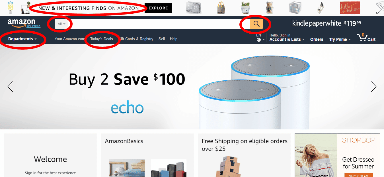
Any path you choose will (hopefully) lead you to your new desired kettle. Some paths might take longer, more time, and more clicks to find the product you want, but if you are a regular Amazon buyer, you probably already have your go-to routine for buying there.
If you like to use the search bar, you probably land on the Amazon homepage and instantly move your cursor to click on the bar. If you like to use the department’s option on the left navigation menu, you probably already position your cursor on the far left as soon as the page loads.
Which of these ways gets you faster to the right product page? Which of these paths is the easiest one?
It doesn’t matter. Really.
If you are a firm bar searcher, you will not switch to department category pages just because a study found out that navigation menus lead visitors to product pages faster.
You won’t try new ways of shopping each time you visit Amazon. That’s time-consuming. You just stick to one way of finding the products you want on-site. This one way feels fast and accurate to you.
Kara Pernice, Senior Vice President at Nielsen Norman Group, defines momentum behavior below:
Momentum behavior occurs when people look at but do not choose an option that could help them because they have already selected a course and are sticking to it. Even within moments, users can become loyal to the route they have chosen and oblivious to other interface elements.
Amazon spends a lot of time on understanding visitors’ behaviors, including momentum behavior. And think about it: when was the last time we saw a major redesign (full redesign, not just single elements) for the Amazon.com site? Conversion rates for Prime subscribers (returning and reoccurring customers) are more than 70%.
So, certainly, a redesign for Amazon can have a tremendous negative impact due to momentum behavior.
If you’d like to follow someone searching for a kettle on Amazon, you can check this eye-tracking video. It takes less than three minutes for this shopper to accomplish the task, from the homepage to category pages to the product page.
This usability case study on Amazon.com shows us that:
- 80% of regular Amazon shoppers are able to accomplish the task of completing a purchase in less than three minutes, as 60% of window shoppers and 40% of surfers.
- Between regular shoppers, surfers, and window shoppers, it takes around two minutes to over five minutes to accomplish the task of choosing a product on Amazon.
- Regular shoppers predominantly use links over the search bar.
- It takes window shoppers or what we describe as browsers (visitors at an earlier buying stage) more clicks to get to the product page and make a decision.
Note: both this case study and the eye-tracking video were conducted in previous designs of Amazon.com and Amazon.co.uk. But these designs already featured the department navigation menu on the left and the prominent search bar. If you’d like to check, here is the evolution of Amazon’s website through the years.
Let’s recap how momentum behavior works.
These are the three main features of momentum behavior:
- Visitors intuitively select a preferred way of accomplishing tasks on an interface.
- Visitors rapidly stick to the way they first found, no matter if this is the fastest, best way of using the interface.
- Visitors do not want to go through the trouble of learning a new way of accomplishing tasks in the same website. The perceived cost of learning seems higher than the benefit of performing the same task in a faster, better way.
Does Visitors’ Momentum Behavior Impact Conversion Rate Optimization?

illustration of image of scattered skittle and bowling ball on wooden floor
Yes!
If you are running a conversion rate optimization program on your website, you have at least 500 conversions a month, so you likely have a good traffic to your site and committed users who are already familiar to the interface and design.
Any change on the interface, design, and structure of your website is going to be disruptive to the routine, familiar experience of using your site.
Even when you introduce a better redesign, with a better interface and better UX, your loyal visitors will need to go through the learning phase of using your website again.
Momentum behavior will make it seem like a daunting effort, because users grew accustomed to the previous, maybe inferior, paths around the website.
How to Prevent Visitors’ Momentum Behavior from Decreasing Your Conversion Rates
When conducting a CRO program, you can take a few steps to make sure your loyal customers habits won’t get affected by the redesigns you want to implement.
Let’s see the three main procedures that can help you prevent a redesign disaster and ensure an increase in conversion rates.
1. Examine Usability Metrics to Determine the Quality of New Designs
 Usability studies are powerful when you are discovering your visitors’ patterns of behavior.
Getting to know how visitors currently use your website will give you insights on issues to solve and navigational paths to maintain.
When conducting a usability study, make sure you define a scenario and assign a task to participants.
During this step, keep track of the task completion ratio by registering:
- How many participants are able to accomplish the task
- How long it takes participants to complete the task (in seconds or minutes)
- How many clicks it takes participants to complete the task
When you roll out a new design, conduct the same usability study to compare usability metrics for both the old and the new designs.
By comparing the task completion ratio, time to complete a task, and number of clicks to complete a task of your current design to with the new ratio, you can evaluate if the changes you made are positive and will lead to a better user experience.
You can use additional metrics to assess the quality of your new designs, including:
- Mouse movement patterns
- Click maps
- Answers to questions pre-task and post-task
This experimental study for improving the interface of the Amazon iOS app shows step-by-step usability testing for detecting issues and validation testing for the proposed solutions.
This is the scenario of the study:
“You’re in a bookstore, and you see this book that you want to buy. However, the price looks a little steep, and you’re wondering if you could find a better deal online.”
These are some of the tasks participants had to perform:
- Search for this book
- Now search for this book using a different method
- Read the good reviews
- Read the bad reviews
- Check the shipping address
By observing users during the task completion and interviewing them afterward, the researcher detected three major pain points in user experience.
For each pain point, the researcher created a solution that was also tested. Here is an example of the issue detected and the solution proposed:
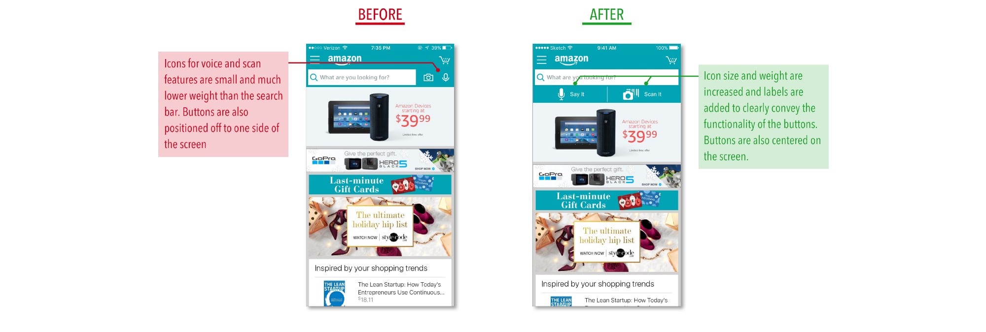
Image source: Finding My Way Through the Amazon
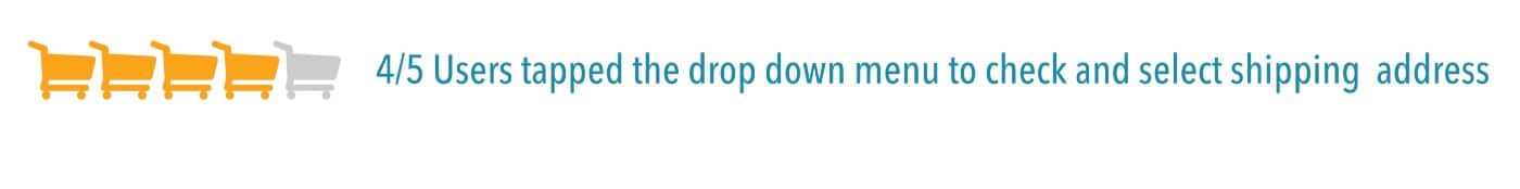
When comparing the results of both tests, the new design outperformed the original.
1. For sorting and filtering reviews, the original design was not clear to participants.
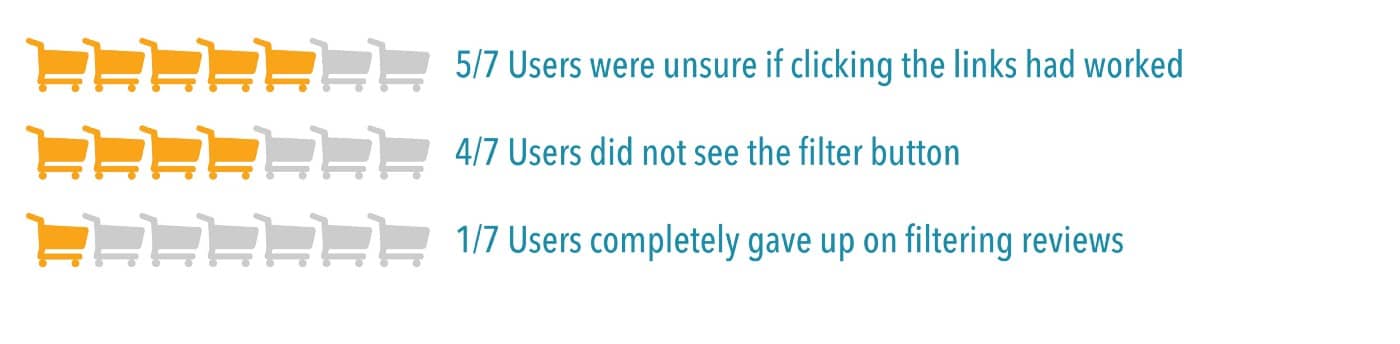
The redesign achieved a better outcome.

2. For checking the delivery address, the original design confused participants.
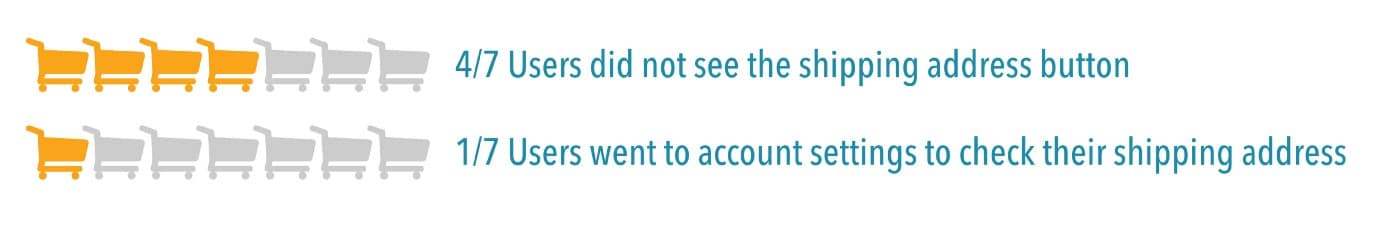
The redesign offered a helpful solution.
3. For using the scan and voice search features, the original did not perform well.

The new design tackled the issue.

Images source: Finding My Way Through the Amazon
Note: for this study, all participants had previous experience with shopping on Amazon on a desktop but were not familiar with shopping on the mobile app.
When the Aldo Group took on redesigning the complete omnichannel e-commerce experience for their customers, they relied heavily on research.
Grégoire Baret, Aldo’s general manager of omnichannel experience, points out that, through research, they found out 70% of their customers go online to prep for in-store purchases. Their website is used by visitors more as a tool to discover products than a place to buy the products.
Knowing that visitors’ ultimate goal on-site was not to complete the purchase, the Aldo Group worked on a redesign that honored the visitors’ goal. So, now, visitors can find a product online, check in-store availability, and connect with the store.
Through usability research, the redesign team at the Aldo Group also found out that their first beautiful design was confusing and complex to visitors. The final approved redesign looks more practical than the more abstract first option they created.
With this project, we did usability testing and invited consumers to give a very early visual reaction. We researched consumer reaction to the actual structure of the website, making sure the way we were naming the categories made sense to shoppers.
I think the consumer is our source of objectivity. Research has to be part of the development process; the consumer has to be part of the development process.
2. Do Not Launch to Everybody
While optimizing your site for conversions, keep in mind that new design usually performs better with new visitors.

We learned this firsthand at least 10 years ago.
We were conducting a major CRO program for an IRCE-500 online retailer. All usability metrics indicated that the new designs were better. Yet, our A/B testing program showed that the new designs consistently lost to the original website designs.
The particular e-tailer had a very strong following, and over half of its traffic was returning visitors. When we segmented the data, it became very clear. New designs beat the original designs with the new visitors segment. However, the same winning designs would be lost when we look at the returning visitors segment.
When you consider momentum behavior, you should expect returning visitors to convert less than new visitors through the implementation of a new, better design.
While there are many data segments that you should look at, it is imperative to segment your data between new and returning visitors.
Returning visitors might hate the new page layout, structure, or message because they are used to the old version. They have learned how to find their way of accomplishing tasks on the website and might not approve the changes you made. Even if the changes are true improvements.
With 1.94 billion monthly active users, Facebook is a great example of a platform that carefully tests and introduces redesigns, to make sure the new experience is not disruptive for long-time loyal users. The overall design and features of Facebook changed a lot over the years, but both minor and huge changes were implemented gradually.

Image source: PCMag
For the Home redesign to introduce the News Feed, the Facebook UX team combined different methods of research with a group of regular users.Marco de Sa, Facebook’s UX researcher at the time, assigned to Home, explains that this research was unique in terms of following up with users:
One of the things that we did as research was running a bunch of diary studies; so we had people providing feedback over time, quite frequently, every week. I’d interview or get feedback through surveys, questionnaires by a bunch of people that were using the product, and that helped us understand how people would get interested more in some types of content or less over time. It also helped fine-tune the algorithm that actually provided levels of content that shows up on cover feed. The product actually changed a lot.
Being a platform that deals with many frequent returning visitors, Facebook is careful in testing new features with loyal users. For Home redesign, they closely followed the interaction of participants over the course of a month. As Marco de Sa points out:
Because people are absolutely fascinated the first time they see cover feed; and it’s just a surprising experience. We were trying to understand how would that change over time after the first experience; so for that, we used a diary study.
The Home redesign was a major change to Facebook. To make sure the change addressed users’ behavior, the researchers chose to test the new features with regular users, who could better give insights on how the interaction with the redesign would take place over time, from first impressions to getting used to the News Feed.
3. Be Aware of the Time of Adjustment
So, you tested and selected a winning new design to implement on your site. The testing showed a promising increase in conversion rates. The changes were carefully considered by researchers, designers, and engineers.
You did all the due diligence to ensure there was no A/B test data pollution or that you had a false positive in your data.
Now, it is time to launch the new website redesign for ALL of your website visitors.
But during the first week, conversions decrease. And you don’t see any improvement during the entire first month.
As scary as this sounds, be prepared to endure a beginning period of lower conversion rates.
As your loyal, returning visitors need some time to adjust to the new design, momentum behavior may play along and decrease conversions.
No matter how better the new design is, always consider a one to two-month adjustment period to let your visitors get used to the redesign.
The higher the percentage of returning visitors to your site, the more you have to worry about decreasing conversion rates in the first two months after launching your redesign.
You can check in the video below the first few months of decrease in conversions during a conversion rate optimization project, followed by a significant increase in the subsequent months:
What If, After All These Steps, Your Redesign Is Still Failing to Increase Conversions?

What if you did everything right, tested the new design, and everything in it looked good, but when you roll it out, your conversion rates (or revenue) tank?
This is a complex problem that some clients suffer from and come to us to find a solution for.
The first step is to examine your analytics and determine how the new design is performing for new versus returning visitors. Are we seeing lower conversion rates across all visitor segments? Or are they just returning visitors?
If you are seeing lower conversion rates across all visitor segments, then you are NOT dealing with momentum behavior anymore.
You most likely have rolled a false positive design, or you have introduced technical problems during the new design rollout.
You have to determine the reason for the lower revenue. Is it momentum behavior, or is it something else? In the end, this does not become a conversion optimization question. It is a business decision question.
At what point do you pull the plug on the new design?
Should You Conduct an A/B Test for a New Website Design?
I often hear this question from clients. And it might be a bit strange to include it in this article. But there are a few things you should consider:
- There is a chance that the new website design will do worse for returning visitors. The decrease in revenue will depend on the percentage of returning visitors in your website traffic.
- There might be technical challenges in implementing the A/B test across a new website design versus an old design. Our recommended approach in this case is to conduct the test as a split URL test. So, if the old website resides at www.mysite.com, then the new website design should reside at www.mysite.com/new-design.
- How will you handle the business question if the A/B test reveals that the new website design performs worse? Let’s say you invested a few months in creating the new design (technical and design hours and the cost associated with that). Are you willing to pull the plug on the new design? That is the real question that should be considered.
Conclusion
Momentum behavior is a pattern visitors stick to when using your website. This familiar route is sometimes responsible for a decrease in conversion rates after you launch a new design on your site.
When you are conducting a CRO program on your website, you must be aware of:
- Carrying usability studies to uncover problems on your site and to validate the solutions you come up with.
- Segmenting new and returning visitors when carrying out research studies and A/B tests.
- Allowing one to two months for visitors to adjust to the new design you implement (expect lower conversion rates in this period).
For the new designs you implement, here are a few tips to help you out in addressing visitors’ momentum behavior:
- Pay attention to users’ pattern behaviors.
- Design for beginners, intermediates, and experts.
- Notify users about the changes you will implement.
- Be careful not to hurt loyal users.
- Consider launching a beta version.