
Six months and a six‑figure budget later, your brand‑new website goes live, but conversions stay frozen. The redesign gave your brand identity a visual refresh, but it never tackled the real obstacles: the headline still ignores the keyword visitors searched, the primary benefit hides halfway down the page, and multiple CTAs fight for attention.
The new site polished the surface without fixing the friction points hidden in your data, or improving your key conversion metrics.
Now imagine a different approach: same layout, but you make a few laser‑focused tweaks guided by scroll maps, heatmaps, and search intent. You’ll see better conversions, that too, without an expensive overhaul.
This article breaks down how to uncover and execute these high‑impact micro‑tweaks—where to mine your data, what to fix first, and how to measure gains—all without tearing up your existing design.
Understand Why Micro‑Tweaks Outperform Costly Redesigns
Building a redesign strategy can feel like the solution when conversions stall. But they’re often expensive, time-consuming, and based on assumptions rather than real user behavior of site visitors.
In contrast, micro-tweaks—small, targeted changes to key elements based on user behavior and concrete data rather than changing the entire website—can deliver faster, more measurable results with far less risk.
Here’s why micro-tweaks are better for your current website (most of the time):
- They’re faster to implement and test. Redesigns can take months. A headline rewrite, CTA shift, or content restructure can go live in a day—and you can track results immediately. This lets you iterate quickly and build on what’s working, rather than waiting months to see if an overhaul pays off.
- They respond to actual user behavior. Redesigns are often based on internal preferences, not user data. Micro-tweaks, on the other hand, let you react to what real users are doing on your site—where they scroll, what they ignore, and where they drop off. You can leverage conversion optimization tools like FigPii to spot where users are dropping off, skipping, or hesitating. For example, if users are missing your CTA, simply move it higher. If they’re pausing on a testimonial block but not clicking, add a CTA there.
- They preserve what already works. Redesigns often break things that weren’t broken—SEO rankings, intuitive flows, or trust signals that took time to build. Micro-tweaks let you keep your high-performing assets and only improve the weak spots.
- They’re easier to A/B test. You can’t easily split-test two entirely different designs. But you can A/B test a new CTA, headline, trust badge placement, or even an exit popup, so you know exactly what’s driving results.
You don’t need a full web design makeover to fix website performance. Start by identifying small, high-impact changes based on real user behavior. Micro-tweaks protect what’s working, fix what’s not, and get results faster without the cost or risk of full website redesigns.
So what should you actually change? Let’s look at proven, practical ways to improve website conversion rates without touching your overall design.
Proven Ways to Improve Website Conversions Without a Redesign
Improving your website’s conversion rate doesn’t always mean tearing everything down and starting fresh. In fact, some of the most effective wins come from small, targeted tweaks—backed by data, not guesswork.
Here are proven, low-effort plays that drive results without a full redesign.
1. Match Search Intent to Website Copy
As Backlinko puts it, “satisfying search intent is the most important part of SEO.”
But here’s the kicker—it’s also one of the fastest ways to increase conversions. When users land on your page and instantly feel understood, they’re more likely to stay, trust, and act.
That’s precisely how the Senior SEO Strategist at ClockShark, a time-tracking app, approaches conversion lifts. He explains, “I focus on turning website traffic into real leads through smart, intent, and data-driven content and UX tweaks—no redesign needed.”
One of their pages ranked well for “time tracking for electricians,” but conversions were flat. Instead of scrapping the design or rebuilding the layout, he fine-tuned the messaging to mirror the audience’s intent:
- Added a CTA written specifically for electricians
- Dropped in a testimonial from a real electrician customer
- Embedded a mini explainer video that walked through the tool from an electrician’s POV
The result? That minor content tweak, which took about two hours, doubled the conversion rate on that post.
This is where SEO and CRO also work together synchronously. When your page matches what the visitor searched and guides them to the next best step, you’re not just getting traffic but converting it.
So, how do you do it? Here’s how to align your SEO efforts with conversion goals without any major redesign:
- Start with your top organic pages. Run a quick audit using Google Search Console and GA4. Which pages get traffic but fail to convert? Prioritize those with strong search visibility and weak engagement.
- Segment by intent type:
- Informational: Teach first. Add soft CTAs (like resource downloads).
- Comparative: Add “Why Us” sections or use-case breakdowns.
- Transactional: Make your value prop + CTA visible within the first scroll.
- Mirror the user’s language. Swap out vague headlines for intent-matching phrases. If they searched for the “best time tracker for electricians,” make sure your H1 says something close, not “Next-gen workforce management.”
- Personalize with role-specific proof. Include testimonials, screenshots, or mini-explainers tailored to that audience. It creates a sense of “This was made for me.”
A great example of this is ClockShark’s electrical industry landing page. If you land there after Googling “time tracking for electricians,” everything from the headlines to the subheads reassures you that you’re in the right place.
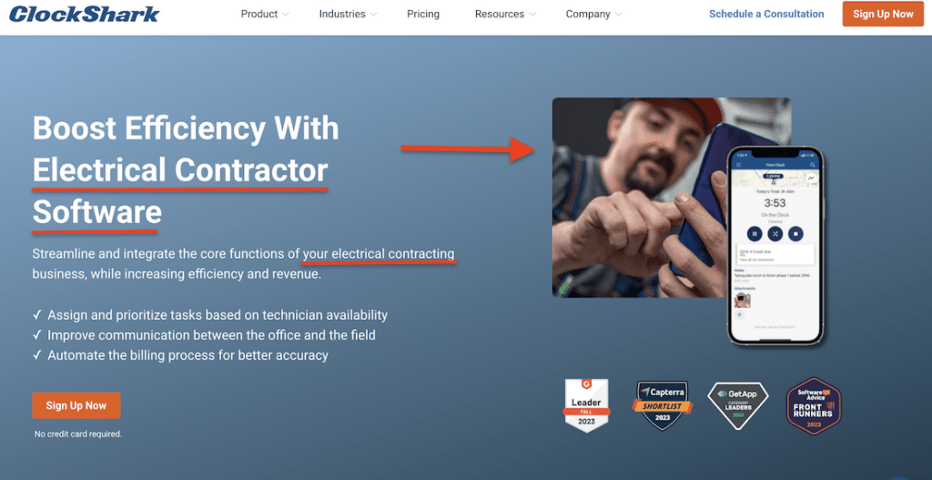
Instead of a generic copy, the page speaks directly to electricians:
- “What Are the Benefits of Software for Electricians?” answers a key question right upfront.
- “Boost Efficiency With Electrical Contractor Software” reframes the product around the user’s day-to-day pain points.
- Even the callouts and images feature scenarios electricians face, making it instantly relatable.
2. Surface the Value Prop Higher
It’s not just about good UX—it’s about psychology. Visitors arrive on your site with a question: “Can this help me?” If your page makes them hunt for the answer, they’ll leave.
When you raise the core benefit—whether that’s time savings, cost efficiency, or peace of mind—you reduce decision fatigue and drive faster action.
The Head of Content and Analytics at Improvado, a marketing data platform, shared a great example. Their solutions page was getting solid traffic, but users bounced before reaching the part explaining the tool’s biggest strength.
Instead of a complete redesign, they used scroll-depth tracking and heatmaps to diagnose the problem: users were losing interest before they hit the primary CTA and value prop.
So they made one simple change: they moved the core benefit and CTA higher on the page, right where engagement peaked.
According to the Improvado team, “That one change lifted our conversions by over 30%.”
You don’t need to rethink your design to surface your value proposition—you just need to understand where users are dropping off and how to guide them back to your offer. Here’s how to put this into practice right away:
Pinpoint the drop-off line with scroll data:
Before you move anything, you need to know where users lose interest. Use heatmap tools like FigPii to track scroll depth and on-page behavior. For example, FigPii’s scroll heatmaps show how far visitors get before bouncing.
If your value proposition or CTA falls below that engagement line, move it up. Even shifting it by a few hundred pixels can make a measurable difference.
Bring your “why it matters” message above the fold:
Your headline doesn’t have to be clever—it needs to be clear. Use the prime real estate at the top of the page to highlight your product’s core outcome or benefit.
Pair it with a soft, supportive CTA—something like “See how much time you could save” instead of a hard “Buy Now.” This builds interest without overwhelming new visitors.
Also, consider adding social proof here. For example—something like “Trusted by 2,500 contractors across USA—to build instant credibility, especially for users arriving cold from organic search.
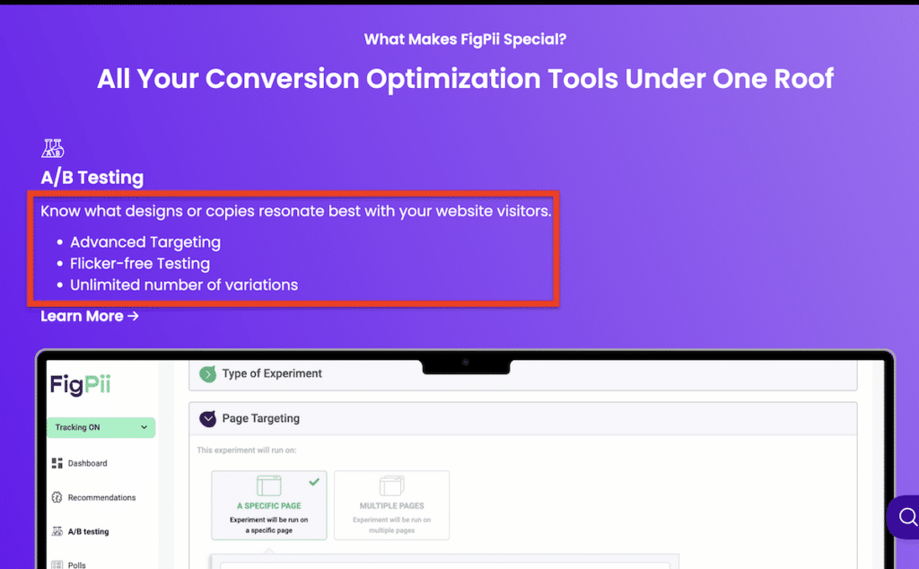
Take FigPii’s—an all-in-one CRO tool—homepage as a great example. The very first thing you see is:
“More Conversions. Higher Revenue. Better Customer Experiences.”
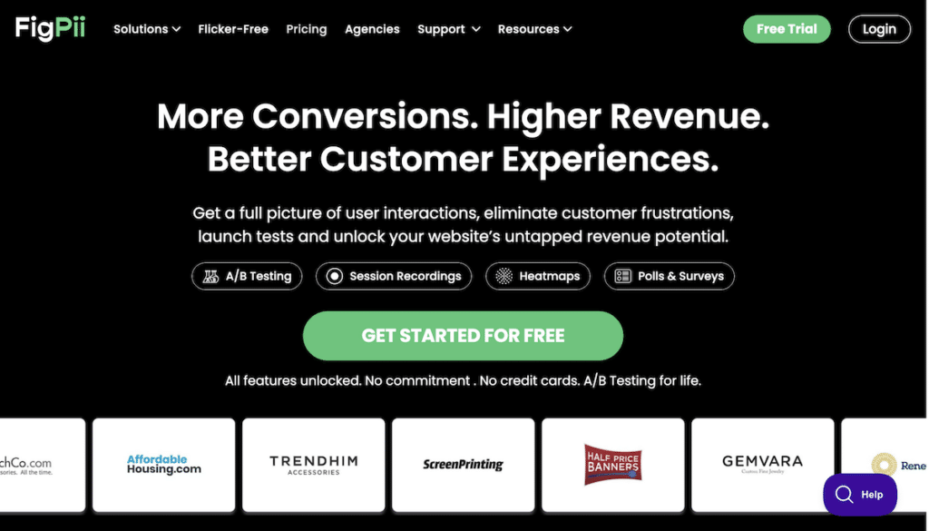
It speaks directly to outcomes that matter. The subheading below explains precisely what the tool does: “Get a full picture of user interactions, eliminate customer frustrations, launch tests…”—which further answers the user’s core question: What’s in it for me?
Right below is a soft, friction-free CTA: “Get Started for Free.” It invites action without pressure, which is ideal for users still exploring. FigPii also adds instant credibility by featuring logos from brands like Gemvara and Trendhim right under the CTA.
By placing the core benefit, a low-commitment CTA, and social proof front and center, you give visitors every reason to stay without making them scroll to find out if your solution is relevant.
Use sticky headers to keep your CTA always visible:
On longer pages, don’t expect users to scroll all the way back to act. Add a sticky header with a persistent CTA like “Start Free Trial” or “Get a Custom Demo.” This is particularly important on mobile, where return scrolls are clunkier.
Let’s take FigPii again as an example. As you scroll through the site, all the way to the bottom of long-form content or product features, the top navigation bar stays locked in place, keeping the “Free Trial” CTA and Login link visible at all times. It’s clean, doesn’t interrupt the browsing experience, and quietly nudges action whenever the visitor is ready.
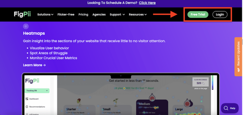
On mobile, especially, persistent access to the CTA reduces friction and boosts click-throughs because it makes it easier for users to convert the moment they feel convinced.
Use bullet points or short paragraphs for fast scanning:
Don’t assume people will read whole paragraphs. Boil your top 3–4 differentiators into snappy, outcome-focused bullets that make them nod “yes.” Think:
- Save 10+ hours/week with automation
- Understand customer behavior with session replays
- Run unlimited A/B tests, no code needed
3. Sprinkle Micro‑Conversion Checkpoints
When visitors aren’t ready to take a significant action, like starting a trial or booking a demo, it doesn’t always mean they’re not interested. It just means they need smaller, lower-commitment ways to engage first.
The Head of Content at Improvado shared another effective tactic they use:
“We created micro-conversion checkpoints—like downloading a PDF, starting a product quiz, or subscribing to a use-case-specific newsletter. These gave visitors more chances to engage without needing to be ‘demo-ready.”
Adding these soft conversions into long-form content and solution pages increased engagement and built a pipeline of leads that matured over time without changing the page design or flow.
Why does this work?
Micro-conversions help you capture interest early in the user journey. Instead of forcing a hard CTA too soon, they give visitors options that feel more relevant to their current state. This is especially helpful for cold or top-of-funnel traffic.
These smaller actions—downloading a resource, subscribing to a relevant series, taking a quiz—offer value while moving visitors one step closer to becoming a customer.
Here’s how you can incorporate micro-conversions into your conversion optimization strategy effectively:
Insert in-line content upgrades within blog posts or guides:
Instead of only using a CTA at the bottom, offer a downloadable version or checklist midway. For example, “Prefer this in checklist form? Download the free version here.” This gives engaged readers a clear next step before they drop off.
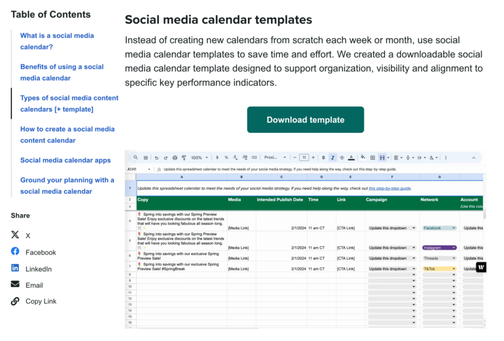
Sprout Social does this effectively in its blog post “A Complete Guide to Creating a Social Media Calendar.” Midway through the article, it offers a free downloadable calendar template before explaining how to build one. This allows readers to immediately take action without having to scroll to the bottom or figure it out themselves.
Use interactive tools like quizzes or calculators:
If your product helps save time, increase ROI, or improve efficiency, let the visitor explore that benefit in real time.
For example, you could incorporate your micro-conversion elements by saying something like:
- “Calculate how much time your team wastes on manual reporting.”
- “Is your workflow optimized? Take the 2-minute quiz.”
These tools help users visualize the outcome before committing to a demo.
Gate long-form or high-value content selectively:
Not all content should be freely accessible, especially if it delivers outsized value or speaks directly to high-intent users. Think industry reports, ROI calculators, benchmark data, or deep-dive case studies. These assets work well behind a light gate (just name and email) because the perceived value justifies the ask.
But gating only works when the content feels essential, not generic. It should solve a specific problem or offer an insight that the visitor can’t easily find elsewhere.
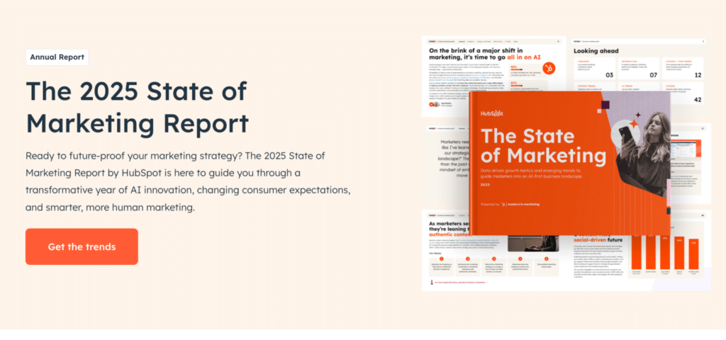
For example, HubSpot does this well with its annual State of Marketing report. It’s packed with stats, expert commentary, and data-backed benchmarks. Users are asked for just a few details when they click to download it.
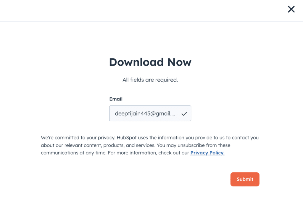
As soon as you hit the “Get the trends” CTA…
HubSpot prompts you to enter your email and phone number, which gives HubSpot leads context while keeping the barrier low.
The follow-up email sequence then shares complementary blog posts, product features aligned to the report’s insights, and a soft CTA to try HubSpot’s tools, making the experience feel helpful, not salesy.
This approach turns one valuable content piece into a full, intent-aware nurture funnel without changing the design of the original page.
4. Deploy Intent‑Based Exit Popups
Popups get a bad rap, but if you do it with precision, you can recover high-intent users right before they leave. The key is relevance. Instead of interrupting every visitor with the same generic offer, trigger targeted popups based on what the user engages with and where they are in the funnel.
In fact, statistics suggest that exit-intent popups can recover 10–15% of abandoned visitors. But again, the key is to align with page content and user intent. When you tailor the message to what the user is already interested in, the chance of conversion increases dramatically.
Here are some ways to implement intent-based popups without annoying visitors:
- Trigger popups only on high-intent pages. Skip homepage or blog-level popups. Focus instead on pages like Pricing, Product features, Comparison pages, Checkout flows, and the like. For example, Skates.co.uk launched a discount code pop-up triggered after 25 seconds of inactivity on the cart or checkout page—helping them convert over 10% of abandoned visitors, simply by timing the offer to match intent and behavior.

- Personalize the message based on the page content. Instead of a generic “Get a demo” pop-up, tie the language to what the user was reading. For example:
- If someone is on your A/B testing features page: “Want to see how marketers run tests without coding? Watch a 3-minute walkthrough.”
- Or on a pricing page: “Still comparing? Get a full ROI breakdown to see if it’s worth it for your team.”
- Offer value, not just a form. Think of the pop-up as an opportunity to give the user something to soften the ask and give them a reason to stay connected. You could offer something like:
- A quick demo video
- A downloadable comparison sheet
- A limited-time discount
- A case study tailored to their role
- A/B test popup timing and messaging. Use CRO tools like FigPii to test different versions of your exit popups—messaging, format (slide-up vs. modal), delay time, and CTA.
5. Reframe Content by Intent Tier
Not every visitor is ready to buy, so why talk to all of them like they are?
That’s the mistake the team at MobiSystems, a software development company, almost made.
One of their top-ranking product pages was getting excellent organic traffic, but conversions were flat. On the surface, nothing seemed broken, but something was off.
“We realized the page was too technical for most users landing on it,” explained their Head of Content Marketing and SEO. “They weren’t product-ready—they were still comparing options.”
Instead of redesigning the page, they made a few targeted content changes:
- Softened the opening tone
- Added a short “why it matters” section at the top
- Linked to a comparison page for visitors still evaluating
The result? A 40% increase in time on page and a clear lift in trial signups, with zero design work.
That shift in performance came purely from reframing the content to match intent tiers—a tactic anyone can apply using just copy and structural tweaks.
Why does reframing content by intent tier work?
Search visibility doesn’t always equal conversion. A page might rank well, but it loses the user if it speaks to the wrong intent or tries to close too soon.
By structuring your message around where the visitor is in their decision journey (awareness, comparison, or decision), you reduce friction and build trust. In short, you give people what they need when they need it, not before, not after.
Here’s how to put intent-tiered messaging into action:
Step #1: Determine the page’s dominant search intent:
Before you start rewriting anything, you need to understand what your visitors are actually looking for when they land on a page. That starts with the search query and what stage of the journey it maps to:
- Awareness intent (e.g., “What is document management software?”): Visitors are still learning. Your content here should educate without pitching. For example, explainer blog posts, definitions, or overview guides.
- Comparison intent (e.g., “Best document management tools for small teams”): These users are closer to choosing a solution, so they want product breakdowns, feature comparisons, pros and cons, or real-world examples. This is where you introduce your offering more directly, but still through a helpful lens.
- Decision intent (e.g., “[Brand] pricing” or “Start [tool] free trial”): These visitors already know you. Prioritize trust signals, benefit-heavy copy, concise feature lists, and a strong CTA. They’re here to evaluate and act.
How do you determine which type of visitor is landing on your page? Start by looking at:
- Primary keywords driving traffic (via Search Console or SEMrush). For example, if the keywords include terms like “what is”, “how to use”, or “best tools for”, that signals early- or mid-funnel intent. If it’s branded or pricing-focused, it’s likely bottom-of-funnel.
- Top referral sources: Check if traffic comes from educational blog posts, product roundups, affiliate sites, or branded ads. Users coming from listicles or comparisons are usually still evaluating. Visitors from branded ads or email campaigns tend to be closer to deciding.
- Behavior signals: Use tools like GA4 or FigPii to look at scroll depth, time on page, and bounce rate. For example:
- Short time on page + high bounce could mean the content doesn’t match search intent.
- A long scroll and no conversions might indicate they’re interested but not ready, suggesting a mid-funnel user who needs more guidance or soft CTAs.
Further reading: Customer Journey Mapping: How to Create Complete Customer Journey Maps.
Step #2: Refocus your intro and headers:
Your first few lines set the tone. If you jump straight into a product pitch, you might lose users who aren’t ready to buy yet. Instead, shape your introduction to match their mindset.
For example, if the keyword is “best time tracking software for agencies,” the visitor is still comparing options. A better opening might be:
“Still exploring agency-friendly time tracking tools? Here’s what to look for—and how [Product] stacks up.”
This type of messaging acknowledges where the user is in their decision process. It positions your brand as a helpful guide, not a hard sell. It’s especially useful on blog posts, feature pages, or even landing pages targeting high-intent but undecided visitors.
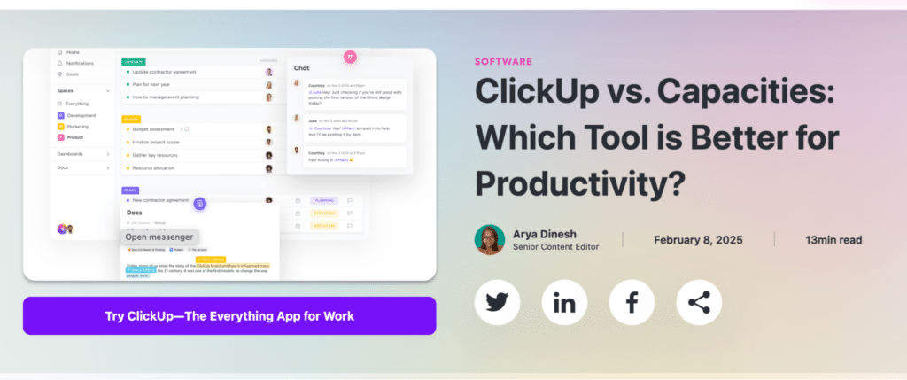
You can see this in action on tools like ClickUp’s comparison pages, where their headers start with things like: “ClickUp vs. Capacities: Which Tool is Better for Productivity?”
It’s helpful, non-threatening, and immediately relevant.
Step #3: Bridge tiers within the same page:
Visitors don’t always arrive with clear buying intent and don’t all scroll the same way. That’s why it helps to structure your content to guide different intent tiers from top to bottom.
Here’s one structure that works well:
- Start with a relatable challenge. Speak to a pain point they’re likely facing (e.g., “Managing multiple tools slows down your team”).
- Introduce use cases or success outcomes. Show how others solved that challenge using your product.
- End with a focused CTA and trust signals—testimonials, client logos, or a short form for the next steps.
This layered approach lets early-stage visitors gather information while still giving decision-ready users an easy path to convert.
Step #4: Bring use-case language closer to the top:
One of the fastest ways to build trust is to show your product was made for someone like me. Too often, pages wait until halfway down to mention who their tool is for.
Instead, introduce that context early. For example:
- “Built for IT teams managing hybrid setups across departments”
- “Trusted by finance teams juggling multi-entity accounting”
These lines aren’t just filler—they quickly show the reader that the page is meant for someone like them. Within seconds, they know they’re in the right place, which keeps them reading.
6. Continuous Heatmap + Scroll Audit Loop
Conversion issues aren’t always apparent from tools like Google Analytics alone. A page might show a decent average session duration or traffic numbers. But that doesn’t tell you where people are dropping off, what they’re skipping, or why they’re not clicking.
That’s where a consistent heatmap and scroll-depth audit comes in for continuous improvement.
Behavioral data like scroll maps and click heatmaps show how visitors use your page, not how you think they are. You’ll often find key insights like:
- A key CTA that no one sees because it’s too far down
- A feature section users keep skipping entirely
- High attention on a particular block that could use a supporting CTA
Identifying these drop-off points or “hot spots” can help you tweak layout order, move messaging up, or insert a soft CTA—all without touching the design structure.
How to do this in practice? Here are some quick ways:
- Use a tool like FigPii to run ongoing heatmap and scroll audits. We’ve already talked about how conversion optimization tools like FigPii can help you generate scroll maps and click heatmaps on your key pages to see:
- Where users stop scrolling
- What elements do they interact with (and ignore)
- If they’re clicking on things that aren’t links (a sign of confusion)
- Prioritize high-traffic, low-converting pages for audit. Start with pages that are ranking well but underperforming on conversions. For example, a pricing page with lots of traffic but few demo requests, or a blog post with great time-on-page but no clicks to product features.
- Tip: Use FigPii’s scroll-depth visualizations to see if users reach your CTA or trust section. If not, you know what needs to move up.
- Look for “false bottoms” or missed CTA opportunities. If heatmaps show many users lingering on a specific section, like a customer story or a benefit list, but not taking any action, add a relevant CTA right there. You don’t need to redesign the whole page; just meet users where their attention naturally is.
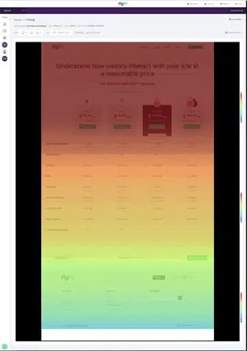
For example, this FigPii’s scroll map below shows that most visitors see only the top half of the page. They don’t scroll far enough to reach the CTA or deeper content. If you place key messages too low, people won’t see them.
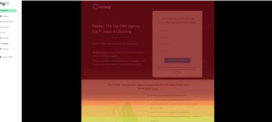
What do we determine from this scroll map? Move your most important content higher on the page—where users are still paying attention. That small change can directly improve conversions.
Conclusion: Improve Website Conversions Without a Redesign Process
True conversion rate optimization rarely comes from a complete website redesign project. It comes from removing the friction points your data keeps flagging. Start by mining scroll maps, clicking heat maps, and searching query reports to see what real website visitors are doing, not what you assume they are doing.
Then act quickly on those insights:
- Align copy with intent. Mirror the phrases people type in search engines so they feel understood when they land.
- Surface value early. Put your core benefit, clear CTA, and a trust signal in the first screenful, especially on mobile devices.
- Offer small next steps. Drop lightweight actions (checklist download, ROI calculator, two‑minute quiz) along the scroll path to warm up hesitant visitors.
- Keep auditing. Revisit heatmaps after every change so each new tweak builds on proven wins instead of guesswork.
Done in sequence, these micro‑adjustments raise conversions and improve SEO signals like dwell time and engagement without touching your overall design.
Need help spotting what’s slowing down your conversions—and knowing exactly what to fix first? The team at InvespCRO can dig into your data, find the friction points, and make targeted changes to improve conversions.
Start with a conversion audit or A/B testing strategy session to see what’s possible without changing your website’s design.


