Most teams don’t set out to over-rely on A/B testing. It usually starts with a small win.
Someone tests a headline. Conversions go up a little. Then they test a button. Then a product image. Over time, that becomes the team’s default way of making decisions: pick one thing, run a test, wait for a winner.
That’s not a bad thing. A/B testing is useful. It helps teams reduce guesswork and make better decisions based on real behavior instead of opinions.
The problem starts when teams use A/B tests for everything.
A/B tests work well for clear, focused questions. But they’re much less useful for bigger problems like unclear messaging, weak product pages, confusing navigation, or pricing decisions that affect profit and repeat purchases. In those cases, teams can run many tests and still miss the real issue.
That’s where over-reliance becomes a CRO maturity problem.
This article explains why teams default to A/B testing, where it falls short, and what high-maturity teams do differently to achieve better results.
How A/B Testing Became the Default
A/B testing has become the default method for digital teams because it’s fast, simple, and provides a clear yes/no answer. Anyone on a marketing or product team can launch a test without needing a statistician, a researcher, or a complex analysis pipeline.
Experimentation platforms like FigPii reinforced this behavior. Their workflows make it effortless to spin up a test: pick a goal, create a variant, and hit launch. That convenience shaped an industry culture in which “experimentation” means “run an A/B test,” even when other methods might yield deeper insights.
Industry surveys show this clearly.
According to statistics, 77% of all experiments are simple A/B tests (two variants), not multivariate or multi-treatment designs. This shows how strongly teams default to the simplest possible approach, regardless of whether it’s the most informative.
Big tech helped normalize this mindset. Microsoft’s Bing team famously ran an experiment in which merging two ad title lines into a single longer headline increased click-through rate enough to generate over $100M in additional annual revenue. Successes like these made A/B testing a cultural norm.
Today, Microsoft runs 20,000+ controlled experiments a year across Bing alone, using tests to validate everything from minor UI tweaks to major ranking updates.
The Core Problems With Over-Reliance on A/B Tests
A/B testing is a useful tool, but it has limits. The problem is not the method itself. The problem is using it as the answer to every kind of conversion problem.
A/B Tests Answer Narrow, Small Questions
A/B tests are practical for micro-changes, such as headline tweaks, button styles, and minor layout shifts. But that’s also precisely why they limit teams. They are effective only for small, isolated decisions, not for meaningful shifts in product, pricing, or experience.
For example, A/B testing works well for small questions like:
A/B tests are great for small questions like:
- “Does this headline perform better than that one?”
- “Will placing reviews higher on the page increase add-to-cart?”
- “Does a shorter checkout form reduce drop-off on that step?”
- “Does a different product image improve clicks?”
- “Which CTA wording gets more taps?”
These are small questions because they focus on a single element on a single page, and the potential outcome is usually a modest lift (1–2% at best).
The problem is that teams try to use A/B tests to answer big questions, the kind that decide whether the business actually grows:
- “Is our value proposition clear enough for first-time visitors?”
- “Is our navigation structured the way customers think?”
- “Are we pricing and discounting in a way that improves profit, not just conversion?”
- “Does our PDP tell a convincing story about why the product is worth the price?”
- “Should we redesign the checkout flow entirely?”
These questions involve multiple aspects of the experience, including pricing, messaging, navigation, and product mix. You cannot answer them by changing a single UI element.
Most Companies Lack Traffic for Statistical Power
Most ecommerce brands simply don’t have enough traffic to run reliable A/B tests. A/B tests only work when you have statistical power, i.e., enough visitors and conversions to tell whether the difference between Variant A and Variant B is real or just noise.
If the difference you’re testing is small (like a 1% or 2% lift), you need hundreds of thousands of visitors per variant to detect it reliably.
Most ecommerce sites don’t come close. Even brands doing 1-2 million sessions per month often can’t detect a small UI lift without running a test for 6-12 weeks, which slows the team’s ability to learn what works and make confident decisions.
This leads to three standard failure modes:
- False positives: A test looks like a “winner” when the effect is actually random noise.
- False negatives: A test shows “no difference,” even though the change might actually be better, but the site lacked sufficient data to detect it.
- Teams shipping inconclusive results: Because they can’t wait 8–10 weeks, they roll out whatever “looked good,” which creates a cycle of guesswork disguised as data.
They Tell You What Happened, Not Why
You see the result that one version “won,” but you don’t know what actually drove that behavior.
Was the page clearer?
Did users feel more confident?
Were they confused but nevertheless proceeded?
Did something unrelated happen at the same time?
Without knowing the real reason, teams start making decisions based on guesswork. You miss hidden UX problems, you repeat changes you don’t fully understand, and you end up trusting numbers that don’t tell the full story. That’s how A/B tests create blind spots and a false sense of certainty.
This problem is similar to the classic World War II survivorship-bias story.
When the military examined bullet holes in planes returning from missions, the fuselage appeared riddled with hits while engines seemed untouched. The initial instinct was to reinforce the areas with the most holes until statistician Abraham Wald pointed out the obvious: you only see the planes that survived. The ones hit in the engine never returned. The real insight was hidden in what wasn’t visible.
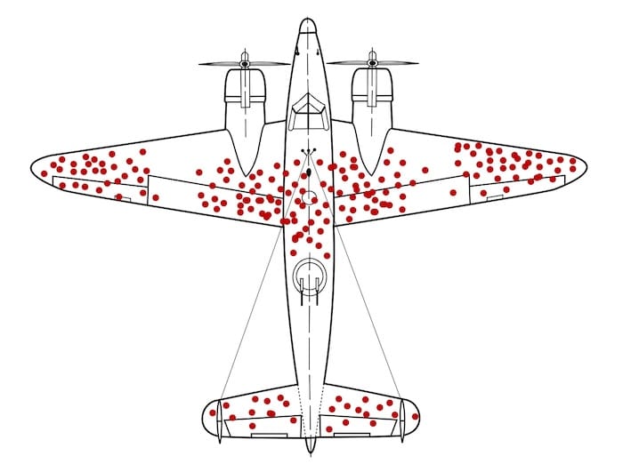
WWII aircraft with bullet holes mapped on returning planes, showing how A/B tests only show data from users who ‘survived’ the funnel, not those who dropped off. A/B tests work the same way. (Source)
They show you the behavior of people who made it through the funnel, the “survivors.” But the most important information is often in what you can’t see:
- Why people hesitated
- Where they got confused
- What they didn’t understand
- What made them abandon the experience altogether
The test result tells you Variant B won, but it doesn’t tell you whether it won because:
- The value proposition became clearer
- Users felt less anxious
- The layout reduced cognitive load
- The change accidentally nudged people forward
- Or, a completely unrelated variable influenced the outcome
You only see the outcome, not the mechanism.
And just like the WWII aircraft analysis, focusing only on the visible data (the converters) can lead you to reinforce the wrong parts of the experience. Without diagnosing why something worked or failed, you end up optimizing the bullet holes instead of fixing the real vulnerabilities.
To understand why a variant won or lost, you need more than the test result itself. A/B tests tell you what happened, but not what caused it. To find the reason, pair the result with behavior data and customer feedback.
Teams Run Tests on Fundamentally Broken Experiences
Many companies run A/B tests on pages that are already flawed (think, slow load times, confusing navigation, weak product information, unclear value propositions). With these issues, even a “winning” test doesn’t fix the real problem. It simply identifies the least harmful version of a bad experience.
You’ve probably seen this in your own funnels:
- The page loads in 4–6 seconds on mobile, but the team is testing button text.
- Users can’t understand the product, but the team is testing hero images.
- The navigation doesn’t match how customers actually shop, but the team is testing CTA color.
- Product pages lack clear sizing information or reviews, but the team is testing layout modifications.
This is why you only see small wins. The base experience is already weak, so no matter what you test, the improvement will always be tiny. You’re polishing something that actually needs to be rebuilt.
They Optimize Short-Term Uplifts, Not Long-Term Metrics
A/B tests measure immediate actions, such as clicks, add-to-cart, and purchases, within the same session.
But ecommerce businesses care about long-term outcomes:
- Customer lifetime value (LTV)
- Repeat purchases
- Margin and profitability
- Subscription retention
And these long-term outcomes often clash with what looks like a “win” in a short-term A/B test. In other words, something that lifts conversion today can easily hurt your profit, repeat purchases, or customer loyalty later, even though the test result looks positive in the moment.
Here’s what this looks like inside most ecommerce teams:
- A large discount often wins an A/B test because it increases immediate conversion. However, the company makes less money on each order, so overall profit declines even though the test “won.”
- A simplified checkout can increase purchases, but it may also make it easier for impulse buyers, fraudulent orders, or accidental purchases to slip through. None of these problems shows up in the A/B test results.
- Urgency or scarcity messages can boost short-term conversions, but they often reduce repeat purchases because customers feel pressured. The test looks successful, but loyalty drops.
- Showing more products on a page can increase clicks, but also overwhelm customers. This is the classic “choice overload” effect, demonstrated in the famous jam experiment by Iyengar and Lepper, where a larger assortment attracted more interest but led to fewer purchases. More options feel exciting in the moment, but they often reduce decision confidence and long-term value.
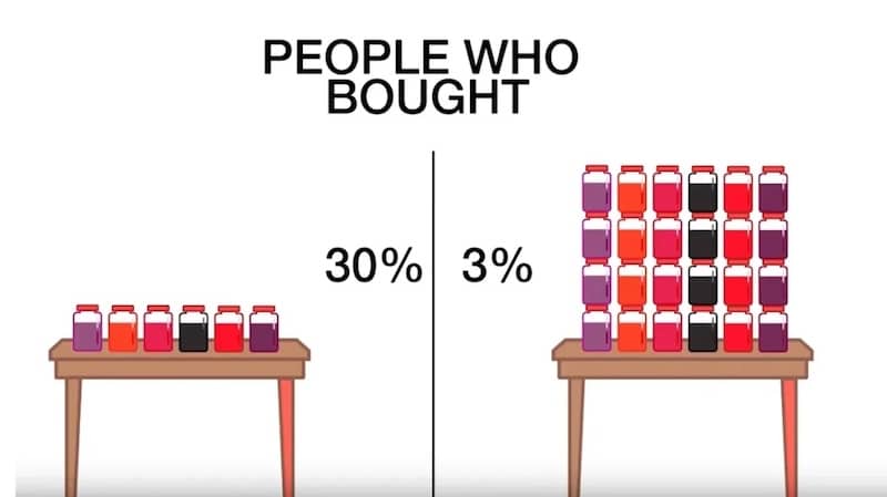
Jam experiment showing 30% purchases with 6 options vs. 3% with 24 options, showing how a variant that increases engagement can still reduce conversions, just like misleading A/B test ‘wins.’ (Image Source)
What High-Maturity Teams Do Instead
1. Use a Broader Experimentation Toolkit
A/B tests are not enough to answer many real business questions. In “Trustworthy Online Controlled Experiments,” Kohavi, Tang, and Xu show that many digital experiments produce tiny effect sizes and low statistical power, meaning a simple A/B test often can’t detect a meaningful impact.
This is why mature organizations routinely combine A/B tests with sequential tests, holdout groups, switchbacks, and quasi-experiments to get reliable answers.
Here’s how this plays out in practice:
- Sequential tests: Instead of splitting traffic, you run one version for a period of time, then the other. This helps when traffic is low or when you need to track what happens weeks later. For example, subscription companies often test onboarding flows in this way to determine which version retains more customers after 30 days.
- Holdout groups: You leave a small group of users on the old experience even after launching the new one. This shows whether the change actually improves long-term outcomes.
- Quasi-experiments: Helpful when clean randomization isn’t possible. Retailers often test pricing or merchandising by region or channel because splitting by user session would create noise.
- Switchback tests: The system alternates between Version A and Version B over time (e.g., hourly or daily) rather than splitting users. This is used when people affect one another’s experience. Ride-sharing and food-delivery companies use switchbacks to test matching and pricing systems because A/B tests are prone to breakdown under network effects.
Don’t force every decision into a binary A/B test. Match the experiment design to the nature of the problem.
Start with the business question, then choose the experiment that can truly answer it.
For example, if you want to know which onboarding flow retains more subscribers after 30 days, a sequential test works better than a short A/B test.
If you need to understand whether a new pricing model improves profit rather than just conversions, a holdout group will show the long-term impact.
If you’re testing merchandising or pricing by market, a quasi-experiment avoids the confusion of showing different prices to the same users.
And if you’re testing algorithms in systems where users interact with one another (like matching, ranking, or recommendations), a switchback test gives cleaner results than a normal split.
Improve Hypothesis Quality Through Research
Many experiments fail before they even start because of a weak hypothesis. If your idea comes from a random backlog item or internal opinion, your test is basically a coin toss. High-maturity teams reduce that risk by grounding hypotheses in real user evidence first.
Here’s what it looks like in practice.
Before launching a test, collect inputs from sources like:
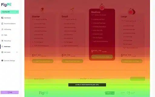
- Session recordings and heatmaps: These tools show how users actually behave on key pages. Recordings let you watch real sessions (scrolling, clicks, pauses, backtracking, rage clicks). Heatmaps show where attention clusters and where users ignore important elements. For example, in the FigPii heatmap below, attention is concentrated around plan cards, helping identify what users see, skip, and where to place high-impact decision content.
- Funnel step drop-off data: This tells you where users abandon the journey between key steps (PDP → cart → shipping → payment → order confirmation). The best way to proceed is to define a single clean funnel, segment by device and traffic source, and compare where the drop-off is highest. Then, inspect only that step deeply before testing.
- On-site search logs: Search logs reveal what users want but cannot find quickly through navigation. This is high-intent data straight from the customer. To discover search logs, pull top search terms for the past 30–60 days, identify “high-frequency + low-result-click” queries, and map them to missing products, weak labels, or poor synonym handling.
- Customer support tickets and chat transcripts: Support tickets and chat logs show where customers are confused in their own words. If people repeatedly ask, “Will this arrive by Friday?” or “Can I return sale items?”, your delivery and returns information is insufficiently clear. Review the last 4–8 weeks of tickets, group them by theme, and prioritize the most frequent, revenue-impacting issues. Then test clearer delivery and returns messaging near the CTA and at checkout, and track checkout completion plus support-contact rate.
- Review mining and post-purchase feedback: Reviews tell you what customers expected versus what they actually experienced after buying. Extract recurring phrases from reviews, especially 3-star reviews (often balanced and diagnostic), and compare themes with PDP copy claims.
- Quick user interviews or usability tests: These explain the “why” behind behavior that analytics alone cannot explain. You hear intent, uncertainty, and decision criteria directly. Recruit 5–8 users from your target segment, give them realistic tasks (“Find a jacket under $150 and checkout”), ask them to think aloud, and note hesitation points and trust concerns.
Once you collect these inputs, the next step is to convert them into testable, evidence-led hypotheses.
A good hypothesis has four parts:
- Problem: What friction are users facing?
- Evidence: What data proves this friction exists?
- Change: What are you changing to solve it?
- Expected impact: Which behavior should improve if you’re right?
Here’s a format you can use when creating your hypothesis:
Because [evidence from research],
we believe [specific user problem],
so we will [specific experience change],
and expect [metric + direction + segment] to improve.
Here’s what it will look like in practice:
Because support tickets and session recordings show users hesitate at checkout when delivery timing is unclear, we believe uncertainty about arrival dates is reducing order completion.
We will show delivery-date estimates on PDP, cart, and checkout.
We expect checkout completion rate for mobile users to increase and delivery-related support tickets to decrease.
This is much stronger than vague ideas like “test CTA copy” or “try a new layout.”
Test Bigger Levers
Most teams keep testing easy things (button text, colors, tiny copy edits) because they’re quick to ship. That keeps the testing calendar full, but it rarely changes revenue in a meaningful way.
If you want bigger results, test changes that affect actual buying decisions, including what users understand, trust, compare, and choose.
Here’s what to test instead of micro-tweaks:
- Clarity of offer: Can a first-time visitor understand what you sell, who it’s for, and why it’s worth the price in 5 seconds? Test: hero copy, PDP headline/subhead, benefit framing, proof placement.
- Decision information on PDP: Are price, delivery timeline, returns, size/fit, and reviews easy to find before users scroll too much? Test: reorder PDP blocks so top objections are answered earlier.
- Findability (navigation + collection pages): Can users reach the right product in 2–3 clicks? Test: category labels, filters, sort defaults, collection structure.
- Offer design (pricing + bundles): Are you helping users choose the best-value option without forcing discounts? Test: bundles, quantity breaks, “most popular” anchoring, subscription framing.
- Checkout friction: Where do people pause or abandon because of uncertainty or effort? Test: guest checkout, fewer fields, clearer shipping/returns near CTA, upfront total cost.
This is also what you see in well-known experimentation programs.
For example, In Trustworthy Online Controlled Experiments, Kohavi, Tang, and Xu describe a Bing experiment where the team changed the ad layout in search results.
Instead of showing a short blue headline on one line and the first description line separately below it, they merged them into one longer, more informative headline. This made the ad easier to scan and helped users decide faster which result to click. The test produced a reported 12% increase in revenue (estimated at over $100M annually in the US at that time), and the effect was repeated in follow-up runs.
Although this example is from search ads, the same principle applies to ecommerce: changes to how users evaluate options (message clarity, information order, comparison cues) usually outperform cosmetic UI tweaks.
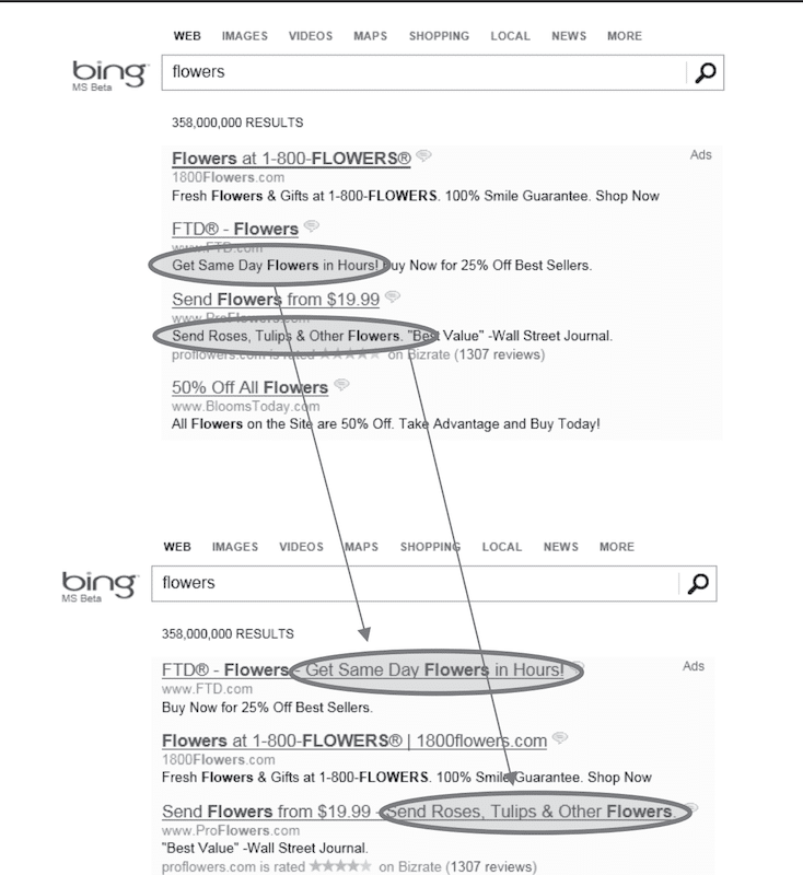
This Bing experiment shows that even small UI changes can create an outsized impact when they improve a core decision moment rather than a peripheral design detail (Source)
Tie Experiments to Business Outcomes
Many teams don’t pick metrics based on business value. They pick whatever is easiest to measure and easiest to move.
Data make this visible: over 90% of experiments focus on just five primary metrics, including CTA clicks, revenue, checkout, registration, and add-to-cart. In fact, CTA clicks alone account for 34.8% of primary metrics, followed by revenue (28.2%) and checkout (16.2%).
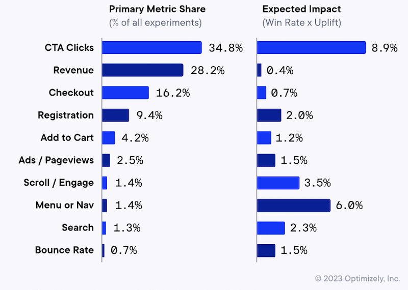
But the same chart shows the trap, i.e., the most commonly targeted metrics don’t necessarily have the highest expected impact (expected impact being defined as win rate × uplift).
For example, revenue and checkout show low expected impact (0.4% and 0.7%), despite being among the most common goals. Meanwhile, metrics tied to how people find and evaluate products, such as menu/navigation (6.0%) and scroll/engagement (3.5%), show higher expected impact but are rarely selected as the primary goal (menu/nav is only 1.4% of experiments).
The goal is to avoid this exact scenario—aiming at metrics that are common, not necessarily the ones most likely to move the business.
So what do high-maturity teams do differently? They make the experiment answer the business question first, then select metrics that align with that outcome.
Here are some best practices to align your experiments with business outcomes:
- Pick one north star outcome (OEC), not 20 random metrics. Don’t judge a test by 10 different numbers. If you look at enough metrics, something will go up, and you’ll call it a win even if the business didn’t improve. Choose one primary metric that matters to the business, like revenue per visitor, profit per visitor/order, or renewal/retention (for subscriptions). Track clicks and add-to-cart only as supporting signals to explain why the main metric moved, not to decide the winner.
- Add guardrails so you don’t “win” the wrong way. Add 2–4 guardrails you will not allow to worsen—typically profit/margin, returns/refunds, fraud/chargebacks, cancellations, and support tickets (use NPS or complaint rate only if you trust the data). Write a clear decision rule in the test brief, such as “Ship only if the primary metric improves and margin does not drop, and return rate does not rise.” Then check guardrails during the test (margin/fraud show up fast) and again 14–30 days later (returns and support issues lag).
- Design tests to capture longer-term impact. If the thing you care about happens later (like repeat orders, retention, profit, or customer lifetime value), a short A/B test won’t give you the full picture. It only shows what happened right away. A simple fix is to keep a small group of customers on the old version even after you roll out the new one. This gives you a clean comparison a few weeks later, so you can see whether the new version actually improved the business or just created a short-term spike. This is especially useful for pricing changes, discount rules, loyalty programs, personalization, subscription onboarding, and free shipping thresholds, as these often boost conversions quickly but can affect profit, repeat buying, and customer behavior over time.
- Use high-leverage metrics when the experience is fundamentally broken. If your site has basic problems (slow pages, confusing navigation, unclear shipping/returns, missing size info, or reviews), small A/B tests won’t help much. You can test button text all day, but people still won’t buy if they don’t trust the page or can’t find what they need. In this situation, focus your testing on fixing the big problems first, then measure results using business metrics like revenue per visitor, profit per order, or checkout completion (not just clicks).
- Use the same test template every time. Don’t decide how to judge a test after the results come in. Before the test starts, write down the same four things every time: (1) the main result you want to improve (for example, revenue per visitor or checkout completion), (2) the numbers you do not want to worsen (for example, returns, fraud, cancellations, support tickets, or profit margin), (3) the rule for what counts as a win (for example, “Ship only if checkout completion goes up and profit/returns do not get worse”), and (4) when you will check again after launch (usually 14–30 days later, or longer for subscriptions). This keeps teams from calling a test a success just because one number went up.
If you do just this, your program stops shipping “wins” that hurt profitability, loyalty, or customer experience, and your experimentation starts compounding.
Beyond A/B Testing Mistakes: Build a Stronger Experimentation Program
A/B testing is still one of the most useful tools in CRO. It helps you test ideas, reduce guesswork, and make decisions based on real user behavior.
Most “A/B testing mistakes” happen when teams try to use A/B tests for everything, even when the real problem is bigger than a page tweak. If you’re running lots of tests but seeing only small wins, it usually means you’re testing low-leverage changes, starting with weak hypotheses, or measuring success with the wrong metrics.
To strengthen your program, focus on a few basics:
- Define a primary business metric plus guardrails before you launch
- Start with user research (recordings, funnels, search logs, support tickets)
- Write hypotheses tied to a specific user problem
- Test higher-impact changes (messaging clarity, templates, IA, pricing/bundles, checkout friction)
If you want help spotting what’s holding your testing program back, Invesp can run a CRO audit of your experimentation process. We review your recent tests, pipeline, research inputs, and metrics, then deliver a prioritized list of the highest-leverage opportunities, so your next tests are more likely to drive meaningful growth.
FAQs about building a complete experimentation program
A/B testing vs. multi-armed bandits: which should I use and when?
Use A/B testing when you want a clean, reliable answer and you care about learning (what worked and why). Use multi-armed bandit tests when your main goal is to maximize results during test runs (for example, by sending more traffic to better-performing variants). Bandits are best for ongoing optimizations, while A/B tests are better for decisions you’ll roll out long-term.
What should we test first if our program isn’t producing wins?
If your program isn’t producing wins, the issue is usually not A/B testing itself. It is that your team is testing small changes or guessing instead of solving real buyer problems. Start by choosing one step in the journey where you lose the most people, such as product page to cart, cart to checkout, or shipping to payment. Watch 10 to 20 session recordings from that step and read recent support tickets to see what customers are confused about. Pick one or two clear blockers, such as unclear delivery timing or hard-to-find return information, and run a test to fix them. Measure the result using revenue or profit per visitor, not clicks.
How many experiments should we run per month at our traffic level?
Run as many experiments as your traffic can support without forcing short, unreliable tests. In practice, that means fewer, higher-quality tests (meaning tests based on a clear user problem, a specific hypothesis, and a change that can realistically move revenue), not small cosmetic tweaks. If you cannot reach enough conversions per variant in a reasonable time, run fewer tests at once and focus on bigger levers. Use a sample size calculator and a cap test duration, often 2 to 4 weeks, to avoid slow, misleading results.
Do we need multivariate testing, or is A/B/n enough?
Most teams do not need multivariate testing. It requires very high traffic because you are splitting users across many combinations, so tests often take too long or become unreliable. A/B/n is usually enough: test a few strong variants that reflect different ideas, then iterate based on what you learn. Use multivariate only when you have massive traffic, and you are specifically trying to measure how multiple page elements interact.