
One of the unwritten laws governing UX’s world is that designers have to borrow insights from the established field of psychology during their creative process.
An understanding of the principles of human
- behavior,
- aspirations,
- and motivations
are instrumental in making users perform the actions they are expected to.
When we talk about simplicity for novel vs. routine tasks, we’re actually referring to the paradox of human behavior in web design.
Users are accustomed to specific routines – behaviors on a website that they don’t need to think twice about. The novel task, on the other hand, requires a deeper consideration and cognitive load.
To break down this paradox and know how to optimize for human behavior, you need to know and understand how the human brain makes decisions.
This is where Daniel Kahneman’s two-system principle comes in.
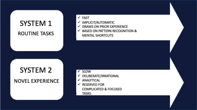
It explains how the two operating systems (systems 1 and 2) in our brain work, and it gives ideas on how to increase conversions on your website, regardless of the human behavior you’re trying to trigger.
After reading this article you will have an understanding of how to optimize for routine behaviors in your design. We have listed 10 different ideas that can help you achieve this.
Let’s get straight into it:
Optimizing for Routine Experience
In the realm of UX design, routine tasks refer to a series of actions regularly followed by users when interacting with a site. The process of routine formation happens when a behavior, through constant repetition, becomes automatic or habitual. It can be slow.
Optimizing a design that reinforces routine behavior is not as challenging as optimizing for novelty experience. Why? Because routine tasks designs appeal to System 1 of the brain– that part of the brain that makes irrational decisions, and is always on, fast and associative. System 1 is also known as the reptilian brain.
There’s a danger in appealing to System 2 in a design that is reinforcing routine behavior –because system 2 triggers users to analyze facts, and when this happens, you risk losing them because of cognitive overload for an otherwise simple routine task.
But if you’re optimizing for routine tasks behavior, as the case here, then your copy and design have to focus on these factors of system 1:
Measure and test
System 1 is swift in decision making.
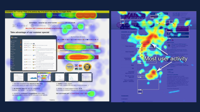
When optimizing routine tasks, make sure you measure and use an AB testing tool like Figpii to validate your design.
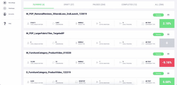
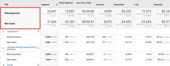
So when measuring and testing, you should consider doing the following:
- Segment data between new and returning visitors,
- monitor changes from day to day on Google Analytics
- Launch video recordings to observe how visitors interact with the new change
- Launch Heatmaps for the test
Remove abundance of choice in your design
As the number of choices you present in your redesign increases, system 2 is triggered which can defeat the purpose of the change you have in mind. You want to keep this routine and seamless – so keep system one in play.
When a design has too many choices, this leads to a paradox of choice and people may find it difficult to decide. In most cases, this results in a drop in conversions:
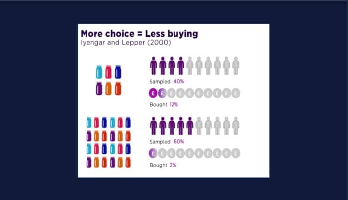
In the world of UX design, less is always said to be more. Once a user is overwhelmed with choice, the focus is lost. In Nora Popova‘s words:
“Feeling overwhelmed by a number of potential options often leads to inertia.”
In the same vein, the Hobson’s+1 Choice Effect says:
“Do not offer the alternative second option when a customer is ‘goal-directed’ (i.e. return visitors?), as there might be a counter-effect: distraction of his conscious ‘system 2’ behavior!”
For example, having multiple calls to action on a single page distracts potential leads from conversion. See the example below:
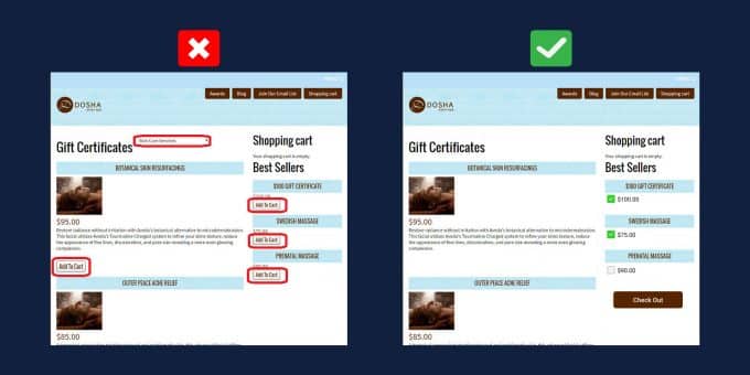
They have an excessive amount of CTAs that use different phrases and do not accomplish the same goal, which can be overwhelming.
So, how do you get rid of distractions in your new design?
Ensuring the design is not complicated through review, evaluation, and prototyping is critical for a seamless launch.
Present facts and stats
Copy changes can be subtle to the eye and will not change from the routine tasks or experiences, yet really appeal to that psychological component in the brain.
Of course, we are able to retrieve most of our copy from customer’s themselves that describe that “struggling moment” and the reason they “Hired” a solution or a product.
In reality, people don’t care about your product features, they only care about how your product will make their life better:
But I have to mention that emphasizing the benefits of your products doesn’t mean you should completely stop saying something about features – it’s just a simple matter of priorities.
Make the design intuitive
Web design is said to be Intuitive when it makes users know exactly what to do the moment they land on it.
The steps that steer users to make conversions have to be simple and straightforward. All the FUDs (fear, uncertainty, and doubts) that customers have should be addressed in both the copy and design.
In an intuitive design, visitors don’t have to wonder:
- If they are on the right page or not?
- What does the CTA button mean?
- How to add an item to the cart?
- Where to click next?
- What to do on the page?
If visitors’ FUDs are not addressed, System 1 will get depleted and the chances of the customer making a purchase will be evaporated. So if you have designed for a routine behavior, you can make your website intuitive by doing the following:
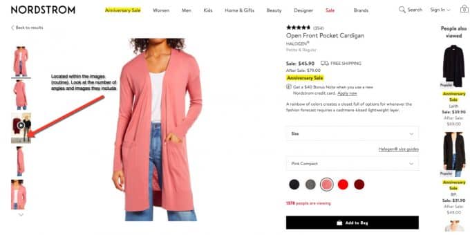
Using visual or directional cues. These directional elements – arrows, images of people gazing, etc– literally point visitors towards your conversion goal.
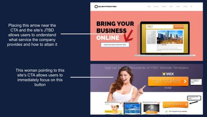
The cues help visitors navigate your page and maintain a visual hierarchy.
Use contrast to demand attention. Your most important CTA has to have a color that is different from the rest of your site for easy identification.
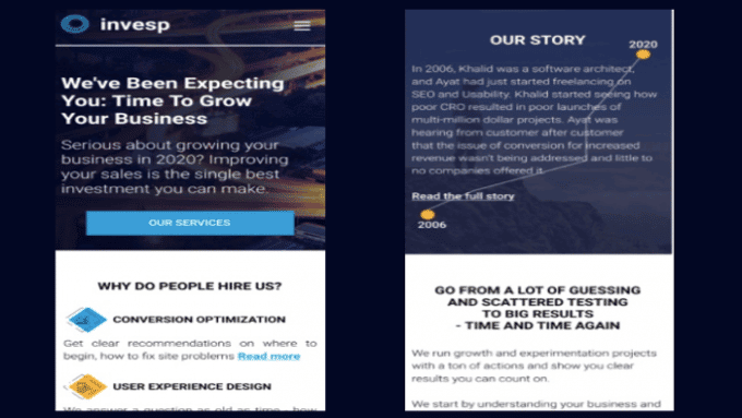
You can also use contrast as a way of separating blocks of text on a long home page and so as to encourage visitors to continue scrolling downwards. As you can see from our Invesp homepage, different block sections are separated by colors:
Attach emotion in the design
Unlike system 2 which operates on logic and rationality, system 1 has an emotional charge. To hook your audience’s emotions, it’s not enough to just say it through your copy – you have to make the customer feel it through your design.
Again, this goes back to those JTBD customer interviews that can really help you build a copy that will appeal to their emotional and social state.
Attaching emotion to your design means taking different factors into account: color, image, and visuals, trigger pain, reduce cognitive load, use the right message, powerful storytelling, and personalization.
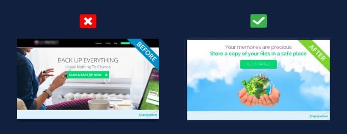
Address the pain point
You easily awaken System 1 if you frame your offers in terms of avoiding loss, instead of framing them in terms of gains.
System 1 is about avoiding pain (frustration of playing golf wrongly) rather than gaining pleasure (becoming a pro golf player).
In the design above – through a change of image we addressed the pain point of boring date nights, lack of intimacy with the before image – and then the after image of that same couple dancing in the kitchen because of the product.
So if your design emphasizes solving pain over benefits, you’ll be able to appeal to system 1. Insurance copywriters use this tactic all the time…
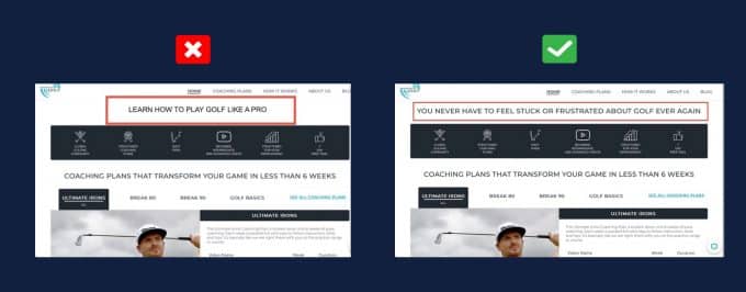
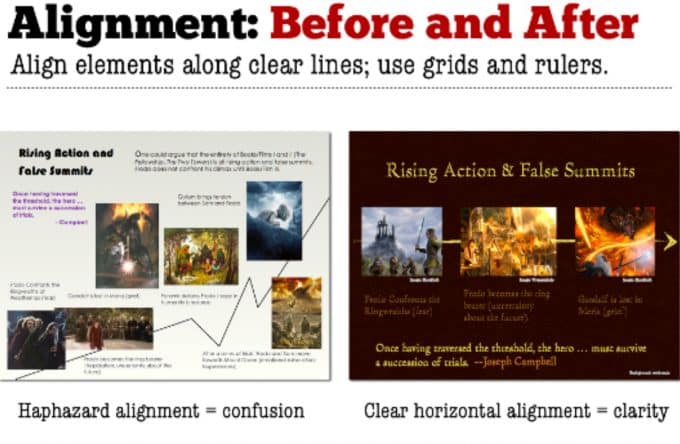
Include Comparisons
The system 1 part of our brain gets easily hooked by comparisons. Comparison is a fundamental human impulse, there’s no shutting it down. Check out the difference between these two headlines:
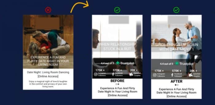
Another way of going about comparisons in design is by using before and after images, as seen in the example below:
Use images and videos!
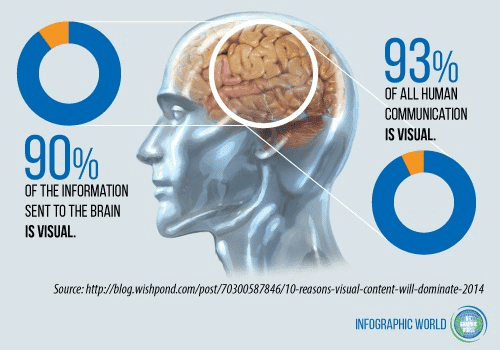
System 1 is visual-oriented because our optic nerve is directly connected to that part of the brain. You depend on system 1 to see visuals long before other areas of the brain have deciphered any visuals.
So visual aesthetics in a design that reinforces a routine behavior have to be simplified as much as possible. Visuals have to be positioned in areas that make users skeptical.
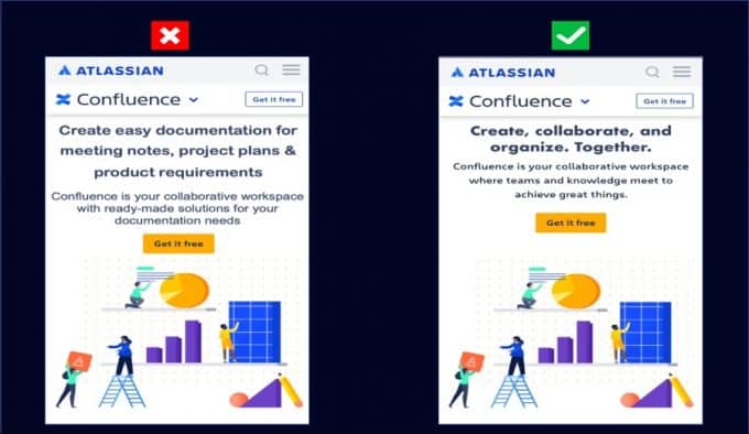
Make the copy scannable
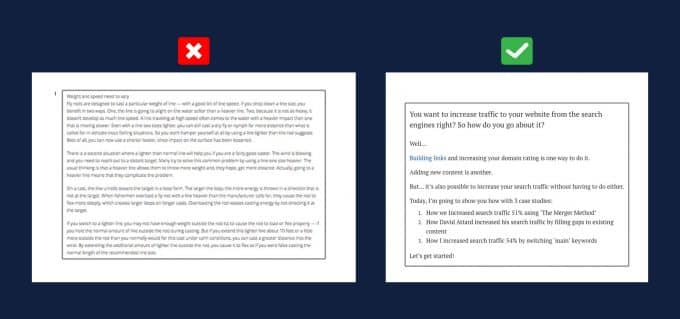
This is important when your landing page is long. System 1 is designed to be so attentive, so it’s best if you can place the most important elements of your copy above the fold. Suppose your system 1 lapses middle way through a long landing page, at least you’d have indicated the most important stuff above the fold.
Data shows that when your copy is scannable, it boosts readability by 57%.
For the best results, optimize for the four pillars of scannable copy:
- Short sentences or paragraphs
- Subheadings or Content Blocks
- High cognitive fluency
- The large and clear font
Add Social Proof
As mentioned above, system 1 is that part of our brain that is protective and doubtful –so to have it convinced, you need to provide proof of how your product made someone’s life easier. One way of doing this is by adding real customer testimonials:

All this can be done using visuals such as demos, before and after photos, video testimonials, and more. System 1 isn’t logical if you show it a great source of proof, it is more likely to trust your claim that there is more value than the cost.
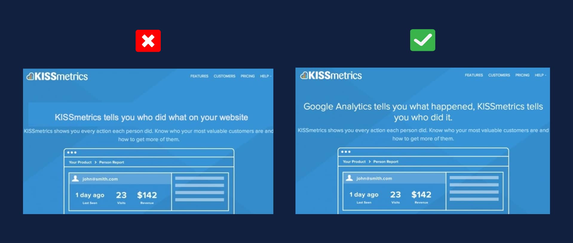
Simplicity is key
The simpler your copy and design are, the easier it is for system 1 to comprehend it alone without the assistance of system 2. Decision points such as CTAs also have to be reduced because they lead to logical thinking which is system 2.
Make it easy for the user to automatically move towards the conversion goal without much thought. A combination of little copy and apparent images and visualization spells out simplicity.
Conclusion
Whether you’re pushing to reinforce or disrupt a certain behavior, the design and the copy should always be optimized for system 1. Why? Because it is that part of our brains that is always active and it is responsible for more than 98% of decisions we make. In fact, it’s much easier to optimize for a system that is awake than to activate one that’s sleeping.


