
“When should we expect to see results after starting conversion optimization? Two weeks? Three weeks?”
That’s a question we hear all the time.
But the problem is that it assumes that conversion optimization is a silver bullet you use on a website, and then boom…conversions skyrocket.
But that couldn’t be further from the truth.
Conversion rate optimization is complicated; even seasoned optimizers can’t always guarantee results. Not because they are not good at what they do, but because some factors that impact conversions on a site are beyond their control.
So, if you’re to go down the CRO route, prepare for a marathon and not a sprint. There’s a lot of research that has to be done before you can see returns on your investment.
Two or three weeks will never be enough.
However, in some instances, some (not all) websites might have easy fixes and quick tasks that can make an immediate impact on a website’s conversion rate. We call these simple tasks: low-hanging fruits.
In essence, low-hanging fruits are all about reducing FUDs and making it more comfortable for customers to make quick purchase decisions.
This article will identify 10 CRO low-hanging fruits that can instantly have a significant positive impact on your conversion rate. But before we delve into that, we will start by looking at how to spot these low-hanging fruits on a site.
Disclaimer: All of the CRO low-hanging fruits mentioned in this article will only work if you have a good product/service, sold at a fair price, for a specific audience who can’t wait to make progress in their lives, and spread the word about it.
How to spot CRO low-hanging fruits
To optimize low-hanging fruits on your site, you have to spot them first. So, where should you start looking for these low-hanging fruits?
According to a Data and Analytics Strategist, Anil Batra:
“Look at the areas where you can have the biggest impact, where people are dropping off the most. Find the worst performing page, and do a radical change, that’s going to show a big impact.”
Rich Page, a conversion expert, also suggests looking at key metrics on your analytics tools:
“If you’ve got many products, you should also start by looking at some of your eCommerce reports that have buy-to-detail metric, this will tell you the percentage of people who are looking at your product page and then buying. Look at the cart-to-detail as well, which is the amount of people who are adding to cart after viewing your product page.
If you see a particular product with a low buy-to-detail rate, this tells you that there is something that customers don’t understand about that product. May be it’s too expensive.
One other important thing you should do is look at your percentage visits on mobile vs desktop. You may be spending most of your time looking at the desktop trying to improve that, but if 80% of your traffic is mobile, you have to focus on the mobile experience first.”
Another CRO expert, Alex Harris also recommends researching before you begin any conversion optimization work:
“If it’s not blatantly obvious that it’s a problem, then you have to go and do the research to make sure that it actually is a problem. What we have learned from testing is we can’t use assumptions or guessing because a lot of times what we think will actually move the needle tends to not. Try and take an unbiased view, don’t look for problems based on the fact that you’ve been testing for a long time.”
He also suggests that you have to know the 3 Ws:
“Where: Where is your site leaking conversions? Where is the highest bounce rate happening? Look for answers in your analytics tool.
What: What’s causing the leakage in conversions? What’s causing a high bounce rate? What’s creating friction or a barrier to conversions? To answer this, you’ll have to delve into a Heuristic evaluation, watch session replays, and analyze heatmaps (you can find these tools in FigPii) to figure out what is causing these issues.
Why: Why is it happening? You’d also have to look at qualitative research such as user testing, surveys, live chat transcripts, etc.”
After you have gone through this process, chances are you will have a long laundry list of potential factors. The next logical question to ask is how do you identify low-hanging fruits from your list of conversion opportunities?
You can read more about how to prioritize conversion problems on your website?
Remember that low-hanging fruits are conversion opportunities that will impact the bottom line while requiring the least amount of effort.
On your long list of conversion opportunities, are there any issues relating to bugs or usability? If yes, then you need to fix them right away without having to craft a hypothesis.
Once you have fixed what’s broken on your site, you have to focus on opportunities at the bottom of the funnel. Why? Because that’s where conversions happen, and any uplift there means more money. Alex adds:
“The end of the funnel usually has the most opportunities for improvement. But you shouldn’t ignore the beginning of the funnel, just make sure that the user is persuaded to move forward. You have to reduce the amount of time it takes for people to take action at the end of the funnel.”
With that said, now let’s take a detailed look at what low-hanging fruits look like on a website:
1. Set up a Quick Survey
If you want a fast way to increase conversions, Alex also adds:
“Most companies work in silos, and they think they know it all. But you just have to talk to your customers and ask them what they think about your site. It’s actually an easy way of getting to understand what your customers really want.”
Rich Page echoes the same sentiments, as he suggests that you do this:
“Set up a very short visitor survey that will appear a minute after a visitor lands on a page. This survey should asks one particular question:
Is there anything stopping you from purchasing today?
The answers you get from that will form a great goldmine of insights and ideas that will help you find low hanging fruits to quickly improve your website. The whole idea of this survey is to find out what is stopping your visitors from converting on your site.”
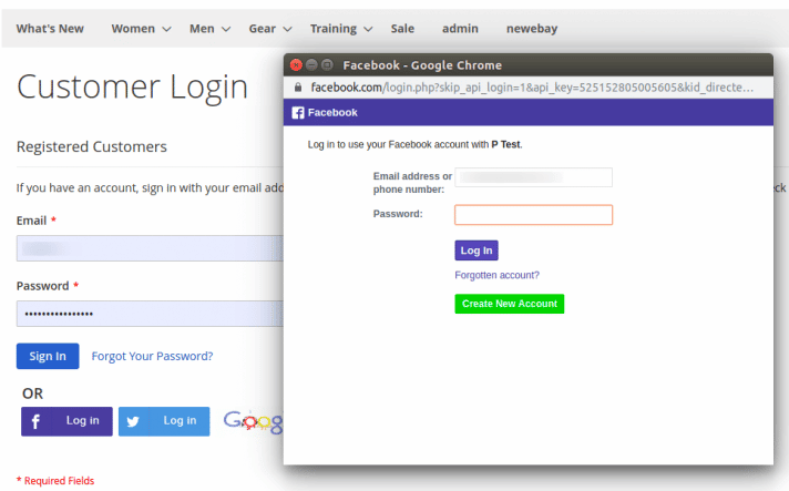
2. Complicated login requirements
If you rub your visitors the wrong way when they are trying to log into their accounts on your website, you are giving them a reason to leave your site. Complicated login requirements that require much information are usability pitfalls that can get users frustrated.
A secure password doesn’t have to look complicated. It doesn’t need to have eight different characters, one uppercase letter, one number, and a symbol.
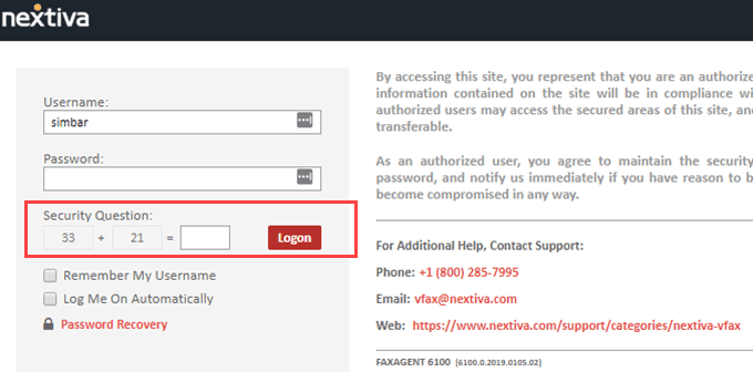
As you can see from the above image, Nextiva used to make the registration process so complicated to the extent that a user would have to pull out a calculator to answer one of their security verification questions.
Making your security verification this complicated ends up causing a usability pitfall. There’s no need to make users burn calories trying to log in to their accounts.
This section can also be regarded as a low-hanging fruit on the checkout process. In fact, according to Forrester Research, retailers with $200m ARR could be missing a further $22m due to a complicated registration process in their checkout pages.
3. Not Optimized for Multiple Browsers/Devices
Users access your website using various devices, browsers, and operating systems. If you don’t give them a seamless and flawless experience on all browsers and devices you might be losing a lot of conversions.
Many websites are only optimized for browsers – Chrome, Firefox, and Safari – that cover maximum market share. Chrome, Firefox, and Safari count for 86.9% of the total browser market share.
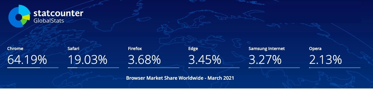
The remaining 13,1% shouldn’t be ignored. If your site is making millions in sales every, catering for that 13,1% can significantly increase your revenue.
Delve into your analytics tools, look at the browsers with the lowest conversions, and make sure you optimize those for conversions.
As you optimize for browsers, conversion expert, Rich Page, also suggests that you make sure that your website is compatible on different screens:
“Another low-hanging fruit you should look for is an issue regarding what your website looks like on particular mobile devices. one of the most important ones to do is to check for the smallest screen sizes. Always check on 320 width which is the iPhone 5 and the iPhone SE probably because 5% to 10% of users still use those. You’re losing money if you’ve got a broken website for those audiences. Also, check on Chrome vs. Safari doesn’t just presume that it will work on all browsers.”
4. A message mismatch between ads and landing pages
If you drive tons of traffic to your website but do not see a significant change in conversions, there might be a message mismatch between your ads and landing pages.
A disconnect between ads and the web pages happens all the time: the ads carry one headline, but the landing page has an entirely different one. When this happens, it doesn’t just block conversions, but it scares the heck out of a visitor when they land on your site.
According to Anil, closing this gap should be priority number one:
“If your ad promotes a 14-day free trial of your product, your landing has to run with the same message or offer. There has to be a consistency between what you use to draw your audience to your landing page and what you’re going to use to make them convert.“
Doing so also makes your audience trust you, helps generate leads, and can, therefore, keep the reputation of your brand intact.
5. Too Many Offers/CTAs
Not so long ago, marketers used to subscribe to the theory that more choices are better for customers. The belief was that more options would eventually translate into more sales.
Even to this day, we still come across landing pages that have too many offers. Having many offers sounds like a good idea on paper, but it can negatively affect conversions on a site.
If you have too many offers, visitors will have to decide which offer to go with; then they have to decide whether or not they want to act on that offer. That requires more decisions, and it can easily overwhelm them, which will ultimately lead to fewer sales.
“People have a paradox of choice, too many options can cause them not to take action,” continues Alex:
“All you have to do is to take your best-selling item and put it first. The majority of people are probably going to click on that and buy it. This will help you reduce the amount of time that it takes for customers to purchase something. On Shopify stores, it’s actually easy to do this – it takes no time at all.”
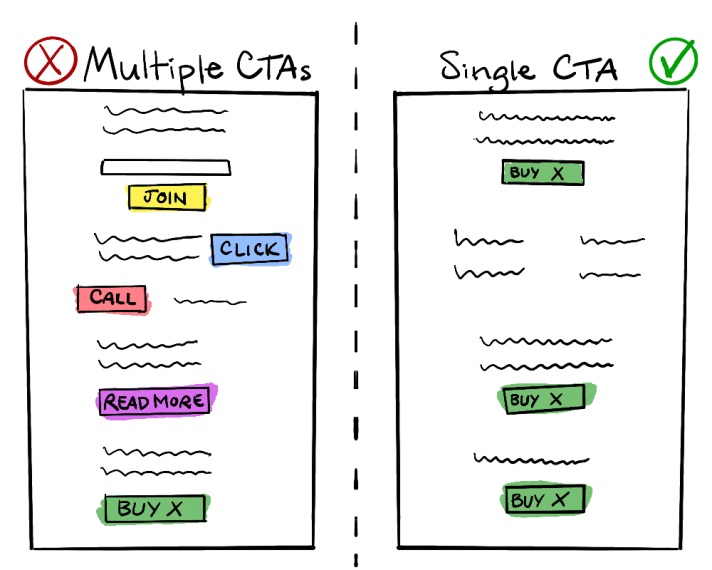
When it comes to landing pages, you’re trying to convince visitors to take one action. Having one offer is better than multiple. One offer asks visitors to make one decision: “Do you want to try it for free?” That’s a matter of yes or no.
If you need to have more than one CTA on your landing pages, make sure you highlight the most important one.
The takeaway here is simple: less is more.
Less options, less distractions, less CTAs…more conversions.
6. Long Registration Forms
Registration forms are a common friction point within landing pages.
The more information you ask, the more FUDs your visitors experience, and the more hesitant they become. We refer to this state as a psychological resistance.
You can shrink this friction by making the registration form by making it short. You don’t have to ask for unnecessary information. Some of the information can be compressed into one field. For instance, instead of asking for a visitor’s Name and Surname on separate fields, you can use one field: Full Name.
Less work = less friction = more conversions.
If collecting detailed prospect information is necessary, you can reduce friction on long registration forms using multi-step forms. A multi-step form is a longer form broken down into smaller chunks. Here’s an example of a multi-step-form:

However, some marketers argue that size does not matter when it comes to registration forms. Longer forms can help screen qualified leads from unqualified ones. So, the best way of going about this is testing and seeing what works for your visitors.
7. Lack of credibility on Checkout pages
Every visitor that lands on your website have specific doubts and fears. They do not want to be ripped off; they want to feel like they are getting value for their money. Once they land on your site, they can either trust you or decide to exit without converting.
But guess what? You have the power to influence their choice. You can do so by creating a sense of credibility on your website.
According to BJ Fogg, website credibility is:
“Simply put, credibility can be defined as believability. Credible people are believable people; credible information is believable information. In fact, some languages use the same word for these two English terms.”
Lack of credibility has killed many conversions on different websites. And it still does even up to this day.
As an end customer, I need to see proof of what your business is promising. Even better, I want to see what your previous customers have gained from using your product/service.
Adding testimonials, customer ratings, security seals, or even trust signals can confirm to customers that a website is legit and safe to purchase from.
So which trust elements are the best to use? Well, the best trust elements to use are those that your target audience is already familiar with.
8. Limited Payment Options
You are leaving a lot of money on the table if you’re only providing card payment options on your eCommerce site. Nowadays, there’s a wide range of payment methods available to online shoppers.
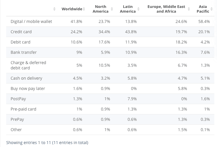
As you can see from the above table, mobile wallets, credit and debit cards are the most popular worldwide.
Providing a variety of payment methods matters because it’s a way of appealing to as many customer preferences as possible, and avoiding one of the reasons why people abandon their shopping carts.
9. No Guest checkout option
I understand that it’s a hassle for many businesses to initiate returns, exchanges, and refunds without a mandatory registration system in place. But you have to be extra careful; a compulsory registration system on a checkout page can cost you many conversions.
Mandatory registration on the checkout page is one of the many reasons why customers abandon their shopping carts.
In a study conducted by the Baymard Institute, 35% of respondents chose a mandatory account as the reason why they abandon their carts.
Presenting a sign-up form during the checkout process increases the number of fields covered before making the payment.
Some e-Commerce websites even go as far as asking prospective customers to verify their accounts, leading to friction in the checkout process.

Fortunately, this can simply be avoided by adding a guest checkout option. Guest checkout makes it easy for new customers to make a quick checkout without the need for registering.
So if you really want to make account creation mandatory, at least allow customers to sign-up using their social media accounts. This way they can simply create a new account without having to fill a registration form.
10. Slow-loading website
Site speed matters. No one loves waiting. Studies have shown that users/visitors are happier when the website loads faster.
A slow-loading website is a usability issue that should be fixed right away—no need to craft a hypothesis for this kind of problem.
An ideal website load time should be 3 seconds. Another study polled internet users and concluded that 40% of them get frustrated and bounce if a site takes longer than 3 seconds.
The speed of your site doesn’t only matter for the user experience, but it’s also essential for the search engine ranking.
So how can you make a website load faster?
Good question. Here’s what you can do:
- There are tons of free online speed and performance testers. The most common ones are Pingdom and GTMetrix.
- Reduce image file sizes with a plugin like WP Smush for your existing images or use Optimizilla before you upload them.
- Compress your content
- Limit external requests
- Get rid of unnecessary plugins
Conclusion
It takes a lot of time and research to uncover conversion opportunities on a site. However, it only goes to show that finding the right opportunities is paramount to the growth of your business. So, while you plan and work towards long-term CRO goals, you should take notice that you might have several low-hanging conversion opportunities helping to drive significant impact for the least amount of effort. Keep an eye on those and have fun picking fruit.


