If you’ve spent time and resources to get visitors to your site, you obviously want to turn them into leads and paying customers.
Yet, almost half of all businesses take their visitors to the site’s main home page where they get lost.
Instead, if you send your visitors to a targeted landing page, you can convert leads and customers at a much higher rate.
Landing pages are the heart of any marketing campaign. The quality of your landing pages will often impact the quality and quantity of your customers and leads.
However, before you can design a conversion-oriented landing page, there are a few questions you need to answer.
Question 1. What is your conversion goal?
The conversion process begins with the end in mind. What you’re trying to accomplish on a landing page will deeply affect its eventual design.
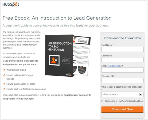
For example, a landing page for downloading a free eBook in exchange for an email will likely be short. This is because the ask itself – an email address – isn’t huge when compared to the value on offer (a free eBook).
Hence, you can use a simple design that emphasizes the eBook’s value:
If you’re selling a $97/month SaaS product, however, you need a lot more content to convince visitors. Your landing page will be much longer with multiple points of persuasion.
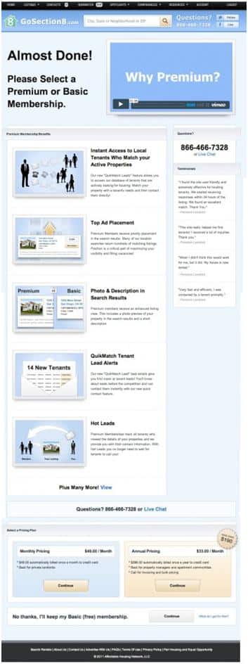
Depending on the conversion goal, you can divide landing page designs into two categories:
1. Lead-generation page: Lead generation landing pages contain an opt-in form and call-to-action to get contact information out of a visitor.
Here is an example of a lead generation landing page:
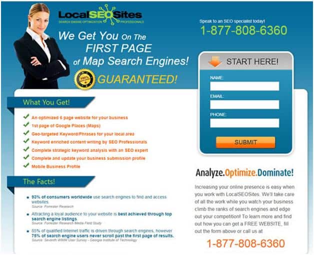
2. Click-through landing page: Click-through landing pages are effective to warm visitors up for a sale. These pages often lead to another page with more information about the offer.
Here is an example of a click-through landing page
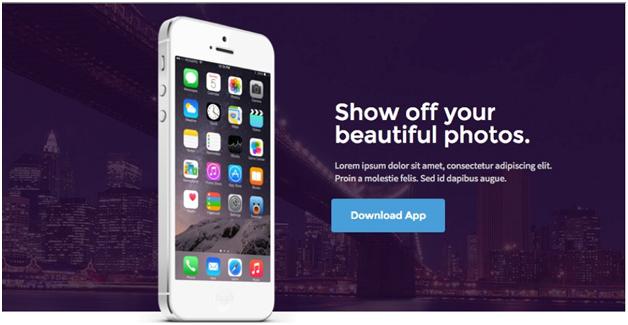
If you’re trying to convert visitors into leads, you’ll use the former. If you’re just warming up raw visitors or inform existing leads about a new offer, you’ll use click-through landing pages.
Question 2 – Who is your target audience?
There is no such thing as a “generic” landing page. Every successful landing page targets a very specific audience.
For example, if you’re pitching a white paper to CXOs, you’ll need to emphasize new findings, industry insights, and specific high-level solutions that appeal to C-level executives. You might also want to capture more than just emails in exchange for the download.
Take a look at this landing page from Salesforce as an example:
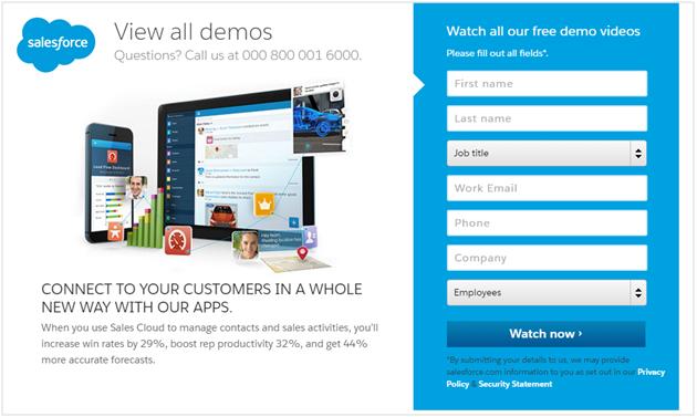
On the other hand, if you’re pitching a “how-to” guide to complete beginners to a topic, you’ll need to break down jargon into simpler terms and use more persuasive copy. Your form will likely ask for just a name and email instead of things like company size, current role, etc.
See this page from Groupon as an example:
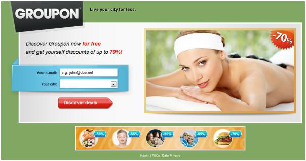
Before you start the landing page design process, clearly identify your “ideal customer” for that landing page. This should be as specific as possible. Instead of saying that your customer is a “Person in his/her 40s who works in IT”, say, “40-year old man who lives in California, works in a large tech company, and reads TechCrunch regularly”.
This will help you design much more targeted (and hence, better converting) landing pages.
Question 3 – How easy is it to consume your landing page?
You need to ask yourself if your landing page is inviting and easy to read. If it isn’t, people won’t bother to stick around.
What makes a landing page easy to read?
Bullet points
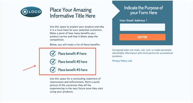
Bullet points allow you to concisely summarize the benefit of your offer . As a result, a visitor can quickly scan and consume your page without getting discouraged by lengthy paragraphs.
Whitespace
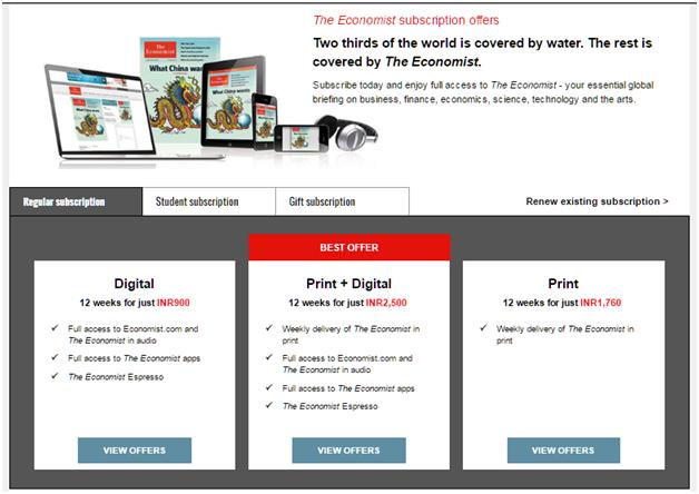
Do you have ample white space which ensures a visitor’s focus goes to where you want it to go?
Lack of whitespace can confuse a visitor as many elements demand their attention.
For example, see how The Economist uses lots of whitespace to make its subscription page easy to read:
Persuasive images
Images not only add visual flair to your landing page but also help persuade users.
For example, this landing page shows the product you’re about to download with a high quality image:
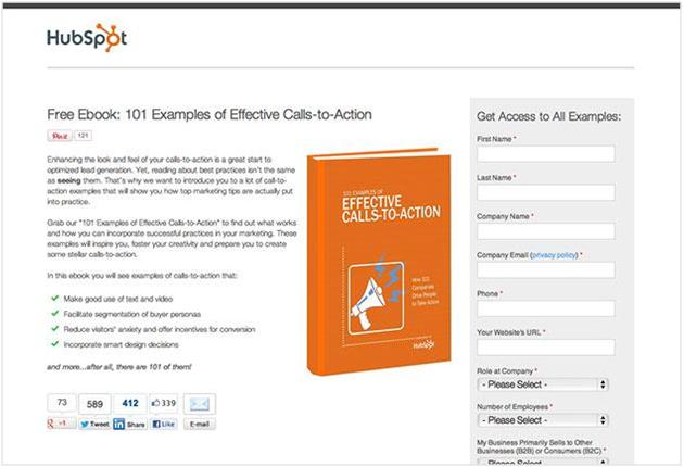
On the other hand, this landing page shows off an emotion you want your users to feel.
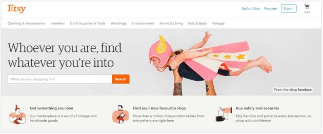
This image is purely for persuasion; it doesn’t offer any actual insight about the product.
Question 4 – How trustworthy are your landing pages?
With widespread fraud and security lapses online, gaining trust of a customer on your landing page can make or break a lead.
How do you demonstrate trustworthiness and reliability on a landing page?
Here are a few tactics:
1. Social proof
Social proof is a natural force that compels people to follow what others are thinking or doing. If you don’t have social proof on your landing page, your visitors might second-guess themselves and drop off.
However, if their peers (friends, experts, other customers) are using and recommending the product or service, they will be more compelled to take action.
The thought process goes like something like this: “If so many other people are using this, it surely can’t be bad.”
There are many ways to social proof your landing page, such as:
- Customer testimonials
- Influencer/expert reviews and quotes
- Share/view count
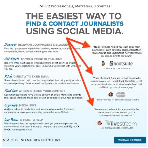
Here’s a landing page which uses expert quotes as social proof:
2. Security credentials and assurances
Your customers are naturally wary of giving away their personal details. They want to know that you won’t use abuse their privacy or hand over sensitive data to third-parties.
Reassuring users through security credentials and messages can go a long way towards improving conversion rates.
For example, this page clearly notes that the user’s private details will not be abused:
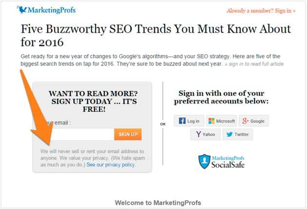
Also note the “SocialSafe” security badge.
These are just two ways you can make your landing pages more trustworthy.
Question 5 – Is your call-to-action clear?
Your CTA has a simple goal: to show users what’s on offer.
For example, if you’re offering a free eBook download, your CTA shouldn’t say “SUBMIT”. Instead, it should say what you’re offering (“FREE DOWNLOAD”).
A short, action-oriented and targeted CTA copy which is specific to the offer on your landing page will convert better. Call-to-actions which describe exactly what your leads are agreeing to will receive more responses than those which are vague.
Here is an example from CanaDream who fixed their CTA copy.
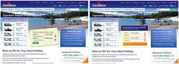
By changing the CTA button copy from “GO” in the image on the left to “Get RV Rental Pricing and Availability Now!” CanaDream increased their conversion by 106%.
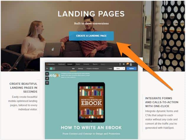
Similarly, this landing page simply says “Create a Landing Page” instead of a generic action such as “Submit” or “Get Started”:
Conclusion
The more landing pages you create for your different products and target audiences, the more opportunities you’ll have to convert visitors into leads.
However, before you create each landing page, ask yourself the questions discussed above so that you design pages which actually convert and don’t drive away visitors.

