
Have you ever felt overwhelmed by the multitude of options when making a purchase? I certainly have, particularly during a recent search for the perfect jogger.
The truth is the abundance of choices(data points) can actually hinder our decision-making process rather than help it.
Behind the scenes, businesses often believe that offering various options and styles will cater to every customer’s needs.
However, the reality is far different.
When faced with various choices, site visitors tend to take longer to make a decision, leading to potential frustration and decreased conversion rates.
This is where Hick’s law comes into play.
In this article, I’ll define Hick’s law, its benefits to ecommerce businesses, look at different pages where it can be applied, and give tips to apply Hick’s law as a non-designer.
Let’s get started.
What is Hick’s Law?
Hick’s Law, also known as the Hick-Hyman law, named after British and American psychologists William Edmund Hick and Ray Hyman, suggests the time it takes for a person to decide increases with the number of options they have to choose from.
This can lead to analysis paralysis, which is a state of overthinking or over-analyzing a situation to the point where a decision cannot be made.
This law is represented by this formula; RT = a + b log2 (n)
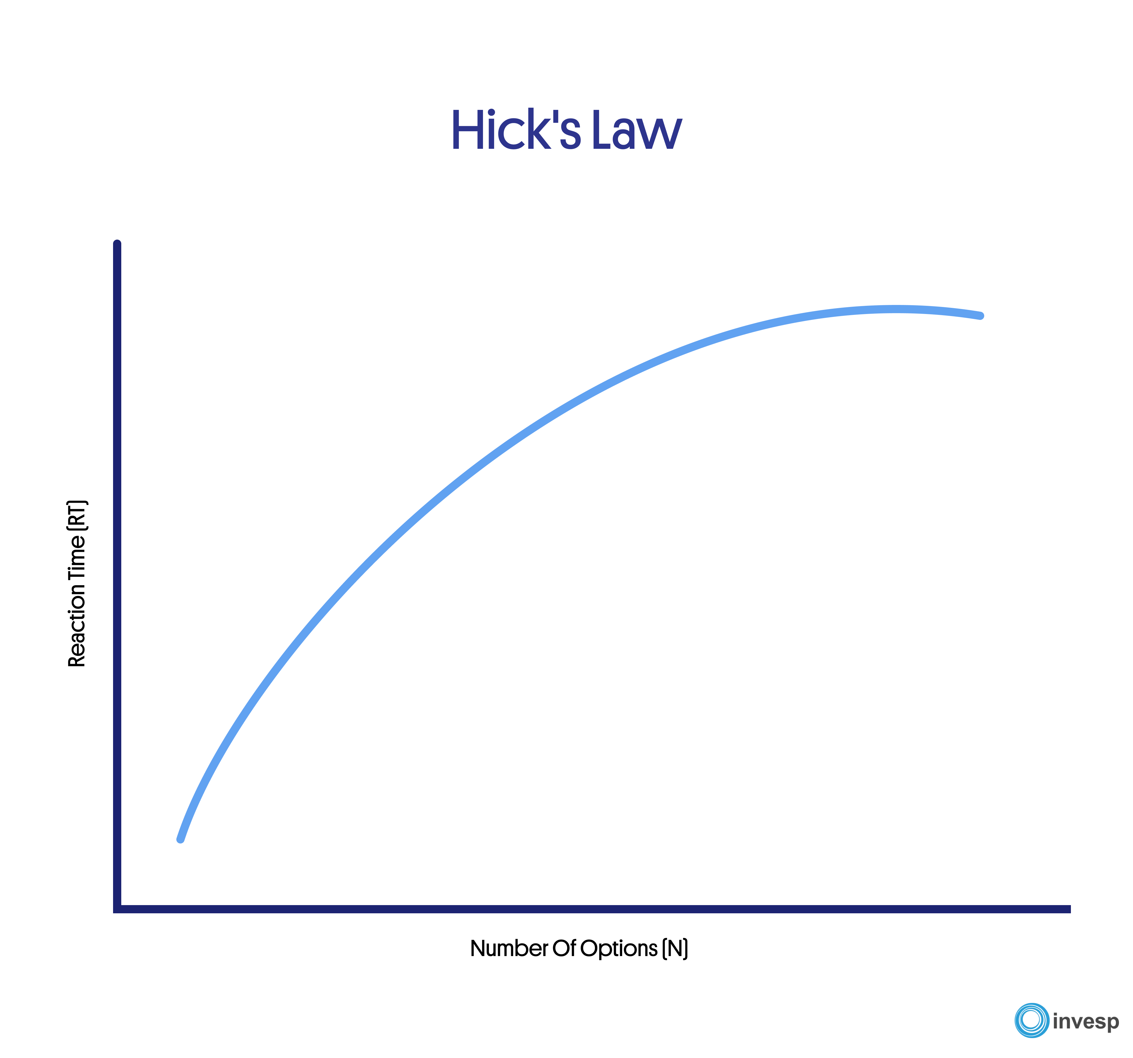
Here’s the breakdown of the formula;
- RT = reaction time
- a = the time that is not involved with decision making
- b = an empirically derived constant based on the time it takes to cognitively process each option (approximately 0.155 seconds for humans)
- log2 = logarithm function
- (n) = the number of equally probable alternatives
Here’s a scenario to consider;
Your phone’s alarm takes you about 5 seconds to recognize it’s ringing. To set it off, you need 4 buttons (power, snooze, volume, and home buttons).
Now, inputting this detail into the formula, we have RT = 5 + 0.155log2(4) = 5.18 secs.
Now, every detail remains the same; imagine waking from sleep and having 10 buttons to choose from to put out the alarm or 24 buttons. This increases the reaction time of the person concerned.
Benefits Of Hick’s Law In Web Design
Hick’s Law has several benefits when it comes to web design. Here are some of the key advantages:
Simplifies decision-making:
By limiting the number of options on a website, designers can make it easier for users to make decisions. This can improve the user experience and increase the likelihood of conversions.
Reduces cognitive load:
A website with too many options can overwhelm users, leading to cognitive overload. By following Hick’s Law and limiting options, designers can reduce the cognitive load on users, making it easier for them to process information and make decisions.
Improves website speed:
A website with too many options can slow down the loading speed, leading to a poor user experience. By simplifying the design and limiting options, designers can improve the website’s speed, leading to a better user experience.
Enhances user satisfaction:
Designers can improve user satisfaction by applying Hicks law as a design principle, not featuring too many links and text on a page which simplifies the design and engages the user, making it easier for users to navigate a website and find what they are looking for. This can lead to higher engagement, increased conversions, and repeat visits.
When Should You Use Hick’s Law?
When presented with too many options, site visitors enter into overdrive (information overload).
This is bad for user experience because many end up not purchasing, which is bad for your bottom line.
With Hick’s law, web designers and UX designers can design better-looking pages and sites, which leads to better UX, which impacts conversion rate and revenue.
In this section, I’ll highlight several important pages on a website, showing you the good and bad examples.
Navigation Menus
Website navigation menus refer to site elements that allow visitors/ new users to access specific pages faster.
They’re usually located at the top or side of the web page. They are either text-based or icon-heavy.
As the name implies, navigation menus are like shortcuts for users to move between pages easily.
This is one of the cleanest and simplest menus I’ve seen. It features just two items (men and women), so this reduces the strain on where I should start from and makes it easier.
Website Forms
Website forms are interactive elements on a webpage that allows users to input information or interact with the website. They can be used for various purposes, such as signing up for a service, submitting a contact or support request, or purchasing.
Forms can be designed to be simple or complex and can be customized to meet the specific needs of the website or business.
Here’s an example of a website form that requires many details before booking a consultation.
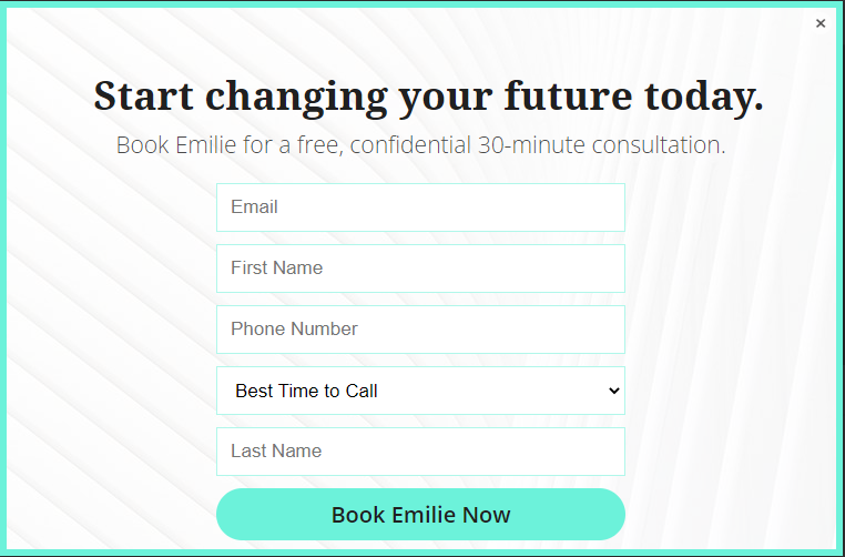
I don’t have the conversion figures for this pop-up form, but it can be better.
According to a study conducted across 300 eCommerce retailers, 84% percent only ask for an email address during the subscription process. That particular study also concludes that your conversion rate may drop anywhere from 8% to 50% for each additional field you add.
The fact is when you reduce the hoops your site visitors have to jump through, you increase the chances of signups.
Also note it’s a consultation form where the site visitor has to input their email, phone number, and best time to call. It looks like the phone number is more important than the email address option, and that will make the design look less cluttered.
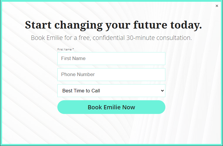
With this improved look, when a site visitor inputs their name and phone number and chooses the best time to call, then someone from the consultant’s office can reach out to them. This provides a far better user experience.
Note: the excuse businesses give for having sign-up forms with many form fields is that they want to personalize their messaging. You can collect those details later on after establishing a relationship with your subscribers, and it doesn’t have to be at the beginning.
Category pages
Also known as collection pages, there are pages on a website that group together similar items or content based on a common theme or category. They are often used in e-commerce websites to group products by categories, such as clothing, electronics, or home goods.
Category pages typically provide an overview of the items or content within that category, often displaying thumbnail images or brief descriptions of each item or post. They can be accessed through navigation menus or search functions on a website, allowing users to find and browse related content easily.
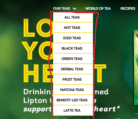
Here’s an example of a simple category page, which is also well-named and aids the user experience in choosing their type of tea.
Product Pages
These pages on a website provide detailed information about a specific product.
They are typically used in e-commerce websites to display product information, such as price, features, specifications, images, and reviews.
Product pages can also be used on other websites to provide information about a specific service, such as a consulting or subscription service. Product pages are usually accessed through a category page or search results page, and provide users with more detailed information about the product they are interested in.
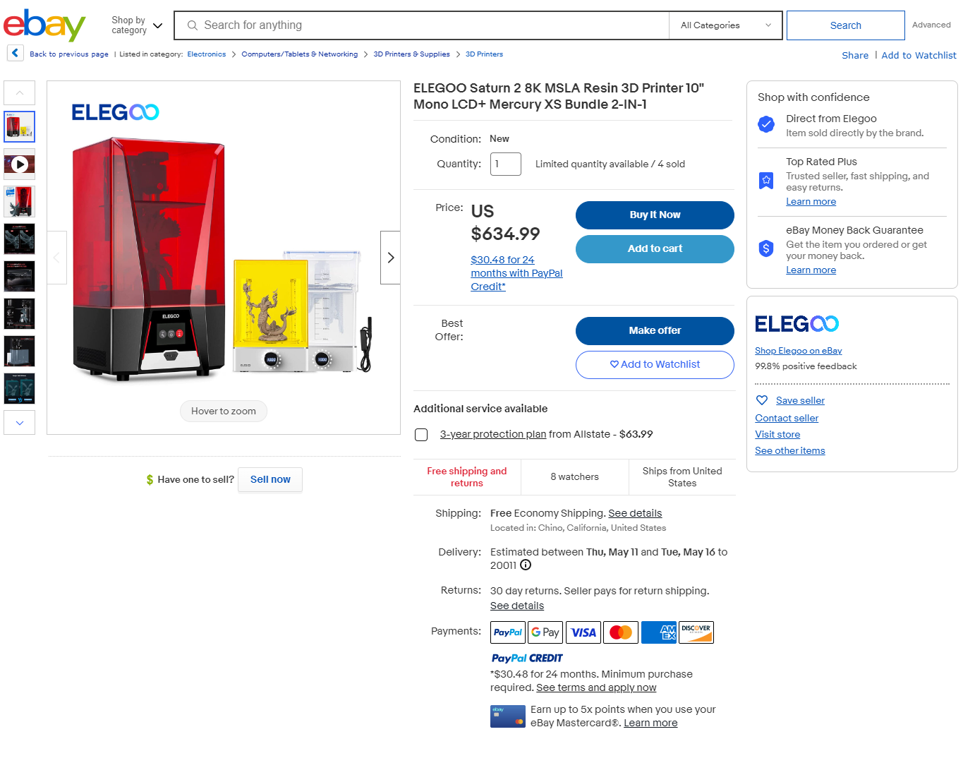
eBay gets a lot of visitors, but their product page experience is nothing to write home about (features complex processes). The details are scattered everywhere and can be confusing for new visitors.
On the other hand, Buffy has a nice product page layout that’s easy on the eyes and great for the customer experience.
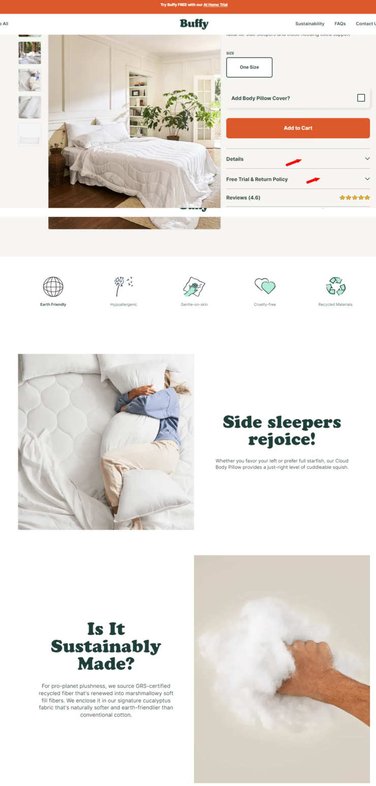
Notice the red arrows on the more detail option and free trial option aren’t open; you need to click through to see the information there, and the way other details (copy and design) are sprinkled on the page makes it amazing.
Note: To improve the user experience on eBay’s product pages, the sections (item description from seller and item specifics) will have a dropdown menu option. This way, interested site visitors will click on them to get more details.
The section on (items customers also bought), I’ll include that in the shopping cart details page and not the PDP. The reason is that site visitors have yet to decide whether they want the item on the product description page. Showing them frequently bought items adds more options to the list, which we’re trying to prevent.
Homepage
A home page is the main or introductory page of a website.
It is the first page users typically see when they visit a website and serves as a gateway to the rest of the site.
The purpose of a home page is to provide an overview of the website’s content or purpose and to help users navigate to the specific pages or sections they are interested in.
A home page often includes a navigation menu that links to other pages on the website and an overview of the website’s content, such as featured products, recent posts, or popular categories.
Home pages can also be designed to showcase the website’s branding, style, and visual identity and to provide a positive first impression for users.
Here’s an example of a homepage that’s jampacked with too much detail that in itself is confusing.
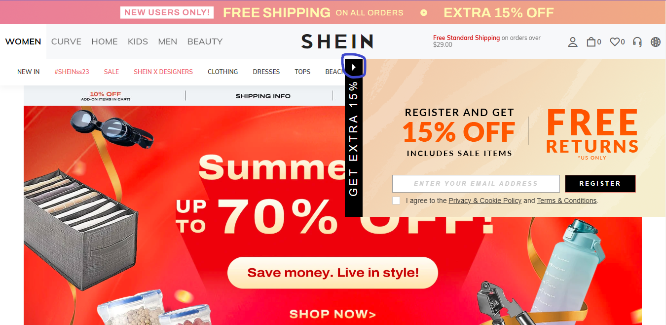
On this homepage, this sticky popup refuses to leave unless you click on that arrow (circled blue). Now, what many users will be looking for is that X button to close the pop-up, or they’re forced to input their details or leave the site entirely.
When you scroll down, you’ll see sections about daily drops, categories, trending brands, etc.
This makes this homepage look busy.
Check out Asos, a direct competitor that features a minimalist design.
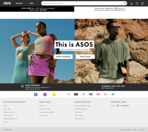
What you notice right off is that it’s easy on the eyes.
Placed side by side, I’m sure many users will prefer the Asos interface.
Checkout Pages
A checkout page is a page on an e-commerce website where a user can complete their purchase of one or more products or services.
It is the final step in the online shopping process, where users enter their payment information and shipping address to finalize the purchase.
A checkout page typically includes a summary of the user’s order, such as the items, quantities, and prices, and a form for entering payment and shipping information.
The checkout page may also include additional features, such as the ability to apply discount codes, select shipping options, or leave comments or instructions for the seller.
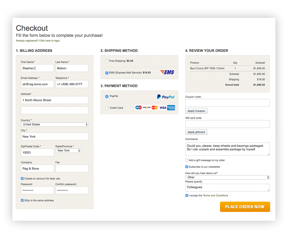
Some businesses have a cluttered approach to their checkout process, and they dump everything on one page. This makes it look scary and can lead to checkout abandonment.
See this example. This design isn’t good for the user experience.
On the flip side, see this clean design from Crate and Barrel.
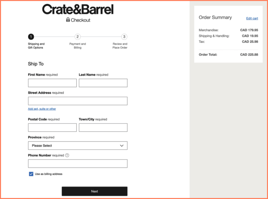
No cramming of every detail on one page, instead broken into steps with titles to let you know what’s in steps 2 and 3.
The layout is clean and easy on the eyes, and breaking these details into steps helps manage user expectations.
Tips To Implement Hick’s Law As A Non-Designer
The fact that you’re not a designer doesn’t mean your website, app, or landing pages should be cluttered or provide horrible experiences for your users.
Here are some tips you can implement to improve the user experience on your site.
1. Reduce Options So As To Maximize Conversions
Always remember the lesser time users spend on a task, the faster their response time. This means you have to critically evaluate every design and ask yourself if there’s a way to reduce the time spent.
Many product pages are lengthy and filled with a lot of information that could lead to information overload and a lack of interest in going further.
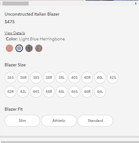
Bonobos implemented a design – quick shop (where the site visitor sees a minimal version of the product page and can quickly make a decision).
All you need to do is click move your mouse to the design you’re interested in, and it shows you the quick shop option.
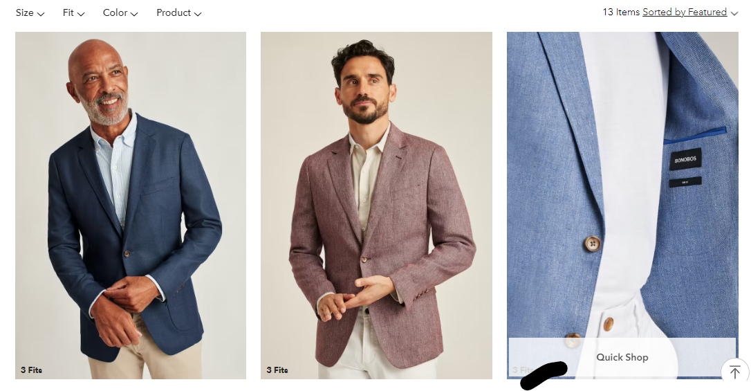
When you click on it, here’s what it looks like;
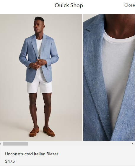
It shows the size, blazer fit, some details, and that’s all.
2. Simplify processes.
Many checkout pages have the checkout process broken into several steps, or all details needed from the site visitor are on one page, like the example below.
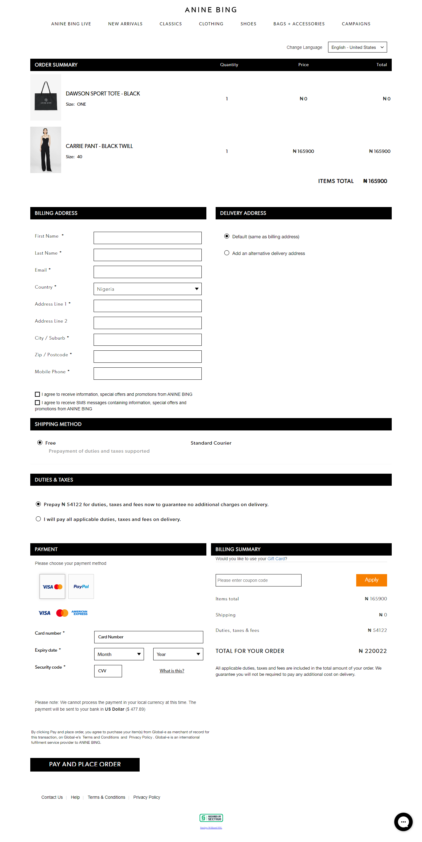
But there’s a better way to do this.
Shopify is releasing one-page checkout across several online platforms built on their platform. Here’s how it looks compared to other checkout designs that are cluttered and overly lengthy.
As a site visitor seeing this and no extra pages or cluttered design, I’m incentivized to complete my checkout.
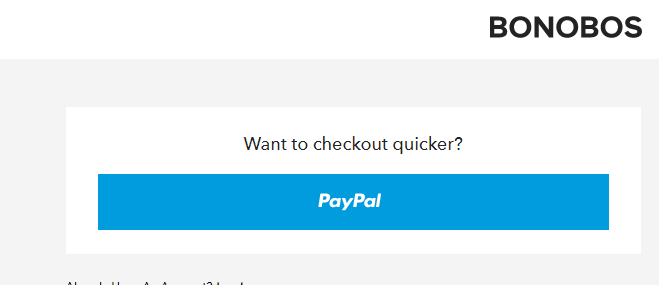
3. Highlight Recommended Options.
Another way to reduce the time it takes your site visitors to decide on your site is to highlight options you’ll love them to choose.
See this checkout example from Bonobos. They highlight the Paypal option as the faster checkout option.
How To Use Analytics To Keep An Eye On User Experience.
There are two metrics to look out for when using Google Analytics to track how Hick’s law affects your site visitor experience.
1. Time on site:
Every site has a sweet spot regarding the average time spent on site. You must have launched your site to discover your site’s sweet spot.
Too little time, and the user has likely left without purchasing or registering. Too much time and they may get caught up in information consumption and again fail to make a purchase or register. Just enough time and the majority of users who will make a purchase and register will do so.
Note: While simplifying decision-making can extend the time spent on site, it might also reduce it. Suppose the decision-making is so simple that users make little progress toward their objectives each time they decide. In that case, they‘ll be as likely to leave as users who find a decision-making process impossibly confusing because they’ve seen too many options at once.
2. Page views
The second metric to track is pageviews. If the navigation menu on your site is complex and full of options, this will only frustrate your site visitor and lead to lesser pages visited.
Simplify the navigation menu, and see your page views go up.
Designing a menu system where your visitors have to jump through several hoops before they get to the page they want will lead to them abandoning your site in droves.
Here’s how you can find pageviews and average time on site, making use of Google Analytics.
On GA >>>> Behavior >>>> Overview >>>>
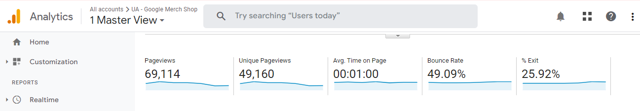
You can drill down into specific landing pages on your site to determine the user experience on those pages.
Final Thoughts
Implementing Hick’s Law in your site’s design can significantly enhance user experience, reduce user frustration and boost conversion rates.
Through the strategic application of Hick’s Law on various website pages, such as navigation menus, forms, category pages, product pages, homepages, and checkout pages, businesses can provide a seamless, simplified user experience that drives engagement and conversions.


