
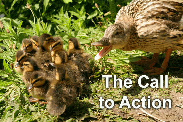
This is it. The big show. It’s what we all came here for. It’s the entire reason you designed and built a web site and landing page. It’s the focus of your conversion optimization and the raison d’etre of your digital marketing program.
It’s time for you to reach the conversion goal of your page and “make the sale”.
It’s time for web visitors to take your call-to-action.
As we mentioned in Part 2 of this series about writing Headlines, the oldest rule of selling is that you must ask for the sale. It’s not enough to think your visitor will convert purely because of the brilliance of your web design or the clever wit in your copy.
The Most Important Rule of Call-To-Action Copy
The “Ask” rule of selling really applies to those situations, like face-to-face sales, where you have time to ask. But you don’t have the luxury of time on your landing page.
Instead of an ask, calls-to-action should be viewed more in terms of a barter; a negotiation; an exchange of a benefit for the visitor’s click.
In Part 3: Body Copy, we learned that customers arrive on your page looking for what’s in it for them, so your copy must let them know the benefit(s) of your offer – or your unique value proposition.
The same is true for your call-to-action. Your call-to-action (CTA) copy should convey the benefit of taking the CTA.
That’s why buttons or links labelled “Register” or “Submit” do not get optimal conversion rates. What motivation exists to click a button marked “Submit”? Again, even if you have a wonderful offer, and you’ve expressed the benefits of it in your copy, it’s not enough reason to think that any old call-to-action will get the conversion.
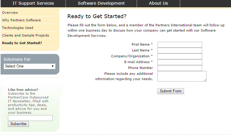
Check the copy on the CTA buttons below. “Subscribe”? “Submit Form”? Yikes!
Call-To-Action Button Copy
So what exactly is benefit-driven call-to-action button copy? Before we look at examples, the first step in developing good CTA copy is to boil down the benefit of your offer, or taking the CTA, into as few words as possible.
Basecamp is a great product, but redundant copy (“free” an “it’s on us” mean the same thing) on one of their CTA buttons makes it too wordy and less effective.

To keep your CTA button copy to a minimum, it helps to understand exactly what visitors perceive as a benefit. Again, they are on your page to find out what’s in it for them, and there are certain “common” benefits, those that will motivate most people, to which they will respond in higher numbers than the “Submit” and “Register”-type copy.
We all want to “learn”, or “save” (time or money); or “get” (whatever is in it for us). From something as basic as “Learn More”, to something very specific, like “Save 12% on Electricity”, expressing those common benefits tells visitors what’s in it for them.
The examples above are meant to get you thinking about what your CTA button copy must do. Of course, you are not limited to those three words, and you are also not limited to using them literally. In other words, the possibilities are endless and here are a few examples.
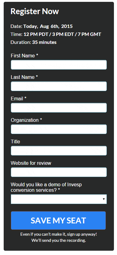
With all the benefits of attending one, Invesp’s webinar registration page could easily have gotten away with simply telling you to “Register”. But instead the CTA copy gives you the peace of mind of knowing that you have no worries of missing the webinar.
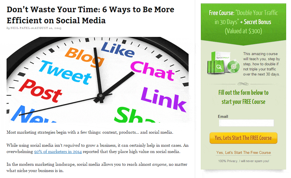
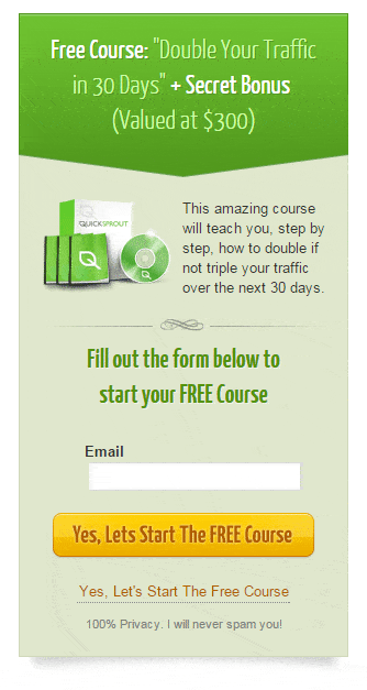
On the CTA button below, Quicksprout cleverly starts it off with a very positive “Yes” and delivers two benefits: “start the course” and “free” – “free” being the most effective and universal benefit ever.
Hubspot goes the straight, plain language route, with benefits clearly stated.
To get a better idea of the importance of your call-to-action button copy, check these examples and case studies assembled by ContentVerve.com. Many of them show double-digit conversion rate increase from changing/adding just a single word.
CTA Copy Goes Beyond Benefits and Beyond the CTA Button
Expressing the benefits to be enjoyed by taking your CTA is a good way to improve your click-through rates. But taking things a step further and using copy outside of the CTA button or link opens up endless opportunities to optimize conversions. The following may not apply to every CTA, but they are all worth considering as a way to increase clicks.
1. Add Urgency Now! Whether there is real urgency, like in a limited-time offer, or you use urgent words like “now” or “today”, a sense of urgency helps to trigger clicks.
Check the buttons below, which one do you think would have a higher click-through rate?

2. Off-Button Copy – We mentioned that your button copy should be kept to a minimum. But sometimes there are ancillary benefits that you know will encourage clicks but you can’t express in a few words on your button.
So add a line above the button like Amazon does:

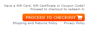
If yours is an ecommerce site, “Add to Cart” and especially “Proceeding to Checkout” causes certain fears, uncertainties and doubts in the shopper, like how easily she can return the product or what happens to her personal information. Notice how Zappos uses link copy around the CTA button to alleviate those fears:
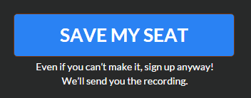
Invesp uses copy below their “Save My Seat” CTA to encourage even those people who can’t attend the webinar to click the button.
3. Copy for an Interruptive or Stand-Alone CTAs – Forgive me for using so many Invesp examples, but as a company that helps its customers with conversion optimization, we have some good examples of CTA copy.
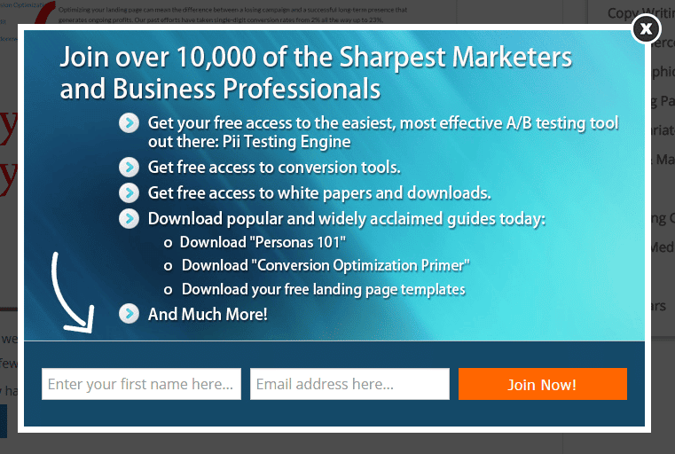
None of those are better than the copy on a pop-up CTA that viewers get early in their visit to the site. With so many benefits to express about joining Invesp, not only do they use copy outside the CTA button, but they create a entire CTA window.
Quick Sprout does the same with an on-page CTA that, more than just a button, is a separately defined element of the page.
The importance of your call to action cannot be overstated. And while there are other elements of it that are crucial, like the color and shape of your CTA button, no other element influences conversions more than the copy.
Source:
http://www.wordstream.com/blog/ws/2015/02/20/call-to-action-buttons


