
If in the past year there’s been an ecommerce topic hotter than the disruption caused by mcommerce, well, let us know in the comments below. Other issues may have enjoyed their 15 minutes, but mobile commerce has been somewhere on the podium for the past few years.
E-retail specialists, conversion rate optimizers and web site designers tout the advantages of mobile optimization because shoppers increasingly use their mobile devices to buy. Many (at least those sounding the death knell for desktops) go so far as to say you should optimize your site for mobile first, then convert your mobile site for desktop use.
Why all the attention and focus on mcommerce? Sales growth.
Here are some of the numbers: In 2013, the U.S. saw 4.2% growth in overall retail sales and 16.9% growth in ecommerce retail sales. Very healthy numbers, yet they look decidedly feeble compared to the 2013 U.S. sales growth numbers for mcommerce:
- 70% increase in retail mcommerce sales
- 45% increase in mcommerce’s share of all ecommerce sales
- 50% increase in mcommerce’s share of all retail sales
And the forecasts are for high growth, versus overall retail sales and ecommerce sales, into the foreseeable future.
Are you ready for your first shot of perspective? Despite the impressive growth numbers, at $42 billion, mcommerce accounted for 0.9% of all retail sales in 2013. (Total U.S. retail sales 2013 – $4.53 trillion)
Let’s make it a double-shot. ‘Mobile’ sales figures, including those quoted above, include sales from smartphones and tablets. While an impressive 25% of all online retail traffic on Black Friday 2013 came from smartphones and only 14.2% from tablets, tablets accounted for twice the dollar sales of smartphones.
Average order value on tablets, $132.75, also eclipsed the average smartphone order by 13%.
So what’s all ‘perspective’ about the smartphone vs tablet numbers for mobile website optimization?
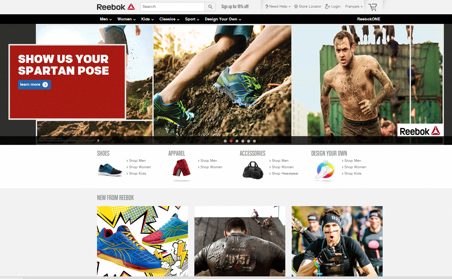
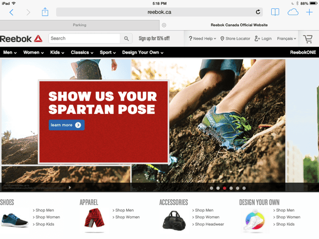
Next time you’re on a tablet, check out some ecommerce sites. Visit the big ones: Amazon, or Zappos,. Look for the differences between the site you see on the tablet and the site you get on your desktop.
In the vast majority of cases, there isn’t any difference. The major ecommerce players serve their desktop sites to tablet browsers.
On their ‘Checklist for Mobile Website Optimization’ even Google tells you to “serve tablet users the desktop version”.
In the Neilsen Norman Group study cited by Google on the checklist, the conclusions include:
“This (the work and issues around tablet optimization), combined with the popularity and ease of using (desktop) websites on tablets, begs the question of why companies would have a tablet app in the first place. In fact, we advise most companies to stick to their website and invest the resources in improving web usability, which still suffers badly in most companies.”
If you’re keeping score, with advice against tablet-optimizing coming from on high, it means that, if you do optimize for mobile, you should optimize purely for smartphones. That means you are doing all your mobile optimization just to capture 0.4% of all retail sales.
Why You Still Must Optimize for ‘Smartphone’ Commerce
First, if yours is a purely ecommerce business, you better optimize for smartphones because they represent 7.2% of your sales and they are growing fast.
If you have ecommerce combined with bricks and mortar locations, you’ll have to determine what percentage of your sales come from smartphones and if it justifies mobile optimization or a mobile-first site.
But even if yours is mainly a bricks and mortar business, like Best Buy (whose online sales in Q1 2014 were 8.2% of total domestic revenue – forbes.com), you still must optimize for smartphones and here’s why:
According to research done by QuickSprout:
- 58% of consumers with smartphones use them for store-related shopping
- 88% of consumers agree that a mobile device makes them more spontaneous with online shopping
- 90% of people move between devices to accomplish a goal, including buying online
How should these numbers affect your perspective on mobile optimization? It’s folly to think of online shopping as device exclusive. An online shopper doesn’t say to herself “right, I think I’ll go shopping on my desktop today.”
Broadcast messages on television, radio and print combine with digital marketing messages, content and ecommerce sites on desktops, tablets and smartphones, to each play a role in the decision to purchase.
Think about it. How many times have you seen or heard an interesting advertising message and immediately grabbed an online device to check it out?
SP-Commerce
Mcommerce on smartphones, let’s call it sp-commerce, is not a monolithic sales medium, but part of this three- or four-screen sales process. Indeed, sp-commerce’s role in the multi-screen process may be more important than its share of your retail sales.
The QuickSprout numbers show that shoppers use their smartphones to research products in-store. While show-rooming is popular on smartphones, have you ever seen a shopper use a tablet in-store to research a purchase?
That fact, combined with the very high spontaneity factor highlighted by the QuickSprout numbers, give smartphones the unique potential of being your sales associate and impulse aisle.
One More Perspective on Mobile Optimization
If you accept that mobile optimization is really sp-commerce, and that sp-commerce’s benefits for many businesses go far beyond the actual sales it generates, then responsive design, by far the most popular way to optimize for mobile, falls short for and might cost you more in lost sales than the cost a creating a site specifically for smartphones.
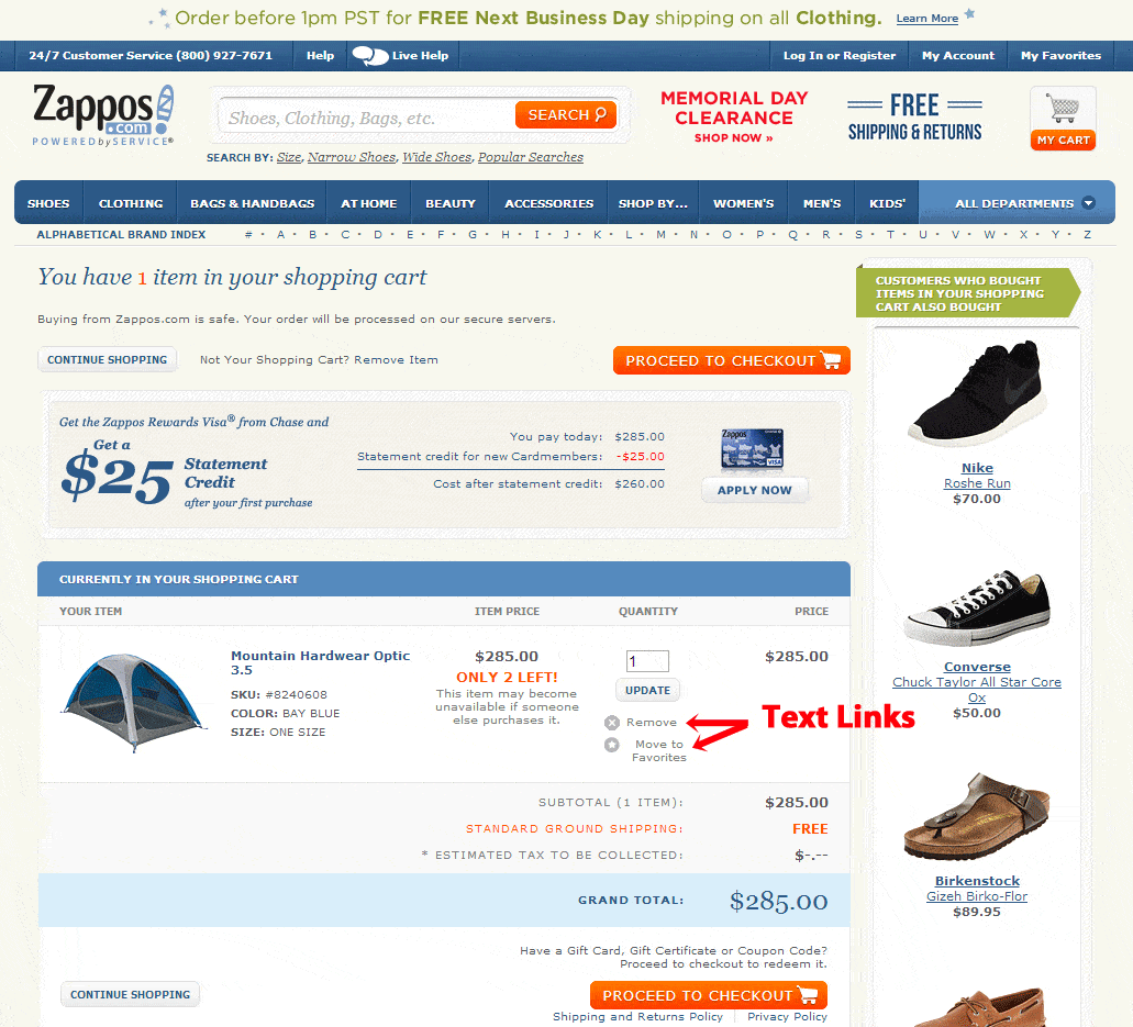
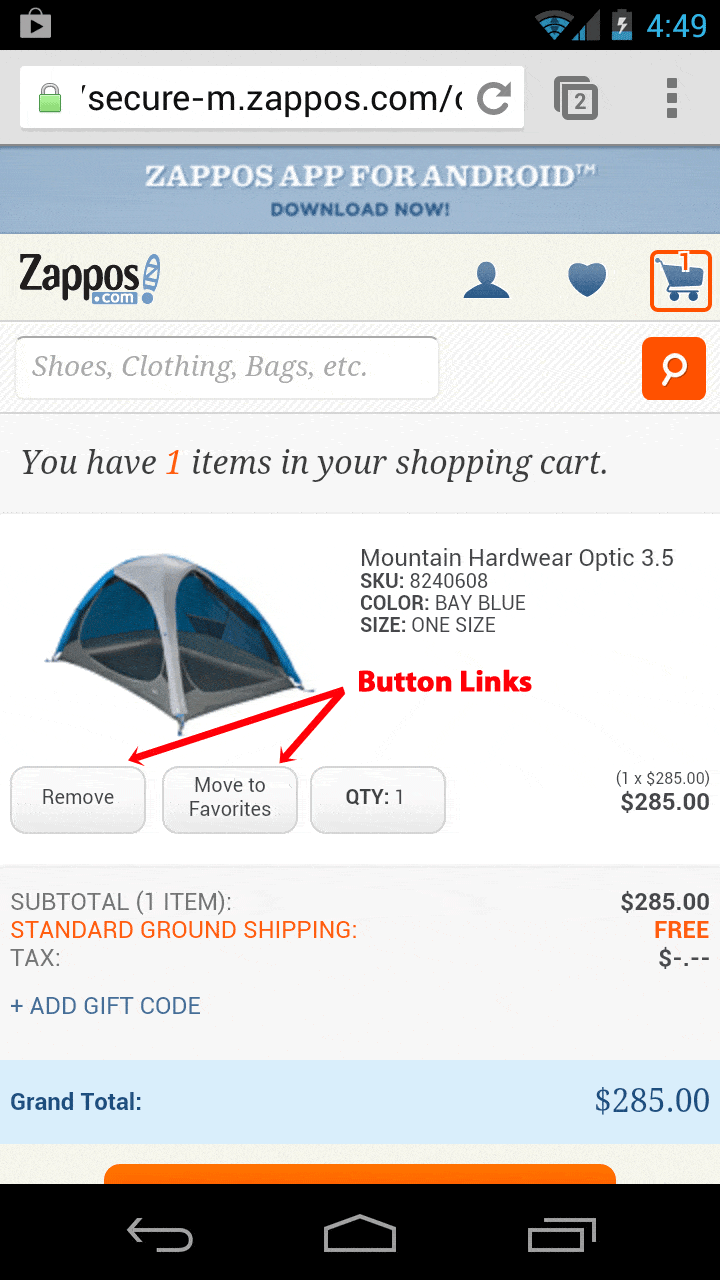
One of the biggest problems with responsive design is that it does not compensate for many desktop site features that don’t work on smartphones, including text links, mouse-over effects like drop-down menus and graphic effects like zooms and sliders.
Check out how text links on the Zappos desktop/tablet site turn to buttons on their sp-commerce site.

