
Before we start talking about what to do when your landing pages are underperforming, let’s start talking about the average landing page conversion rate.
Recent studies have shown that an average landing page conversion rate should fall around 2.35%. So, if your landing page conversion rate is below that number, then it is definitely underperforming.
But some top landing pages convert way above 2.35%. This indicates that there’s a possibility for your landing page to do more than well.
One thing to note here is that conversion rates are always subjective, What is considered to be good for one business may be below average for another.
Think of a good conversion rate as the one that is always improving.
Having said that, now let’s take a look at things you can do to improve the performance of your landing pages.
Clear Value Proposition
When visitors get to your landing pages, why should they keep scrolling or click your CTA button? What’s in it for them?
You probably know the answer to this question, but is the answer clear enough to your visitors? Is it convincing enough? Do they get it the exact way you’d want them to?
It doesn’t matter how good your offer or landing page design is, if your value proposition is not articulated well, your visitors are more likely to go to move on to your competitor.
The best way to create a killer landing page value prop? Start by asking yourself the following questions:
- How does your brand or your product solve your target customers’ pain points?
- What tangible benefits are associated with your offer?
- What makes your brand different from other competitors?
The answers to the above questions will give you directions on how you can then craft that value proposition statement on your landing page.
Strong Call to Action
When people visit your landing page, there must be directional signs telling them where to go and what to do.
This is where CTAs come in.
Your landing page CTAs have to communicate with your visitors and help them move toward achieving a goal of that particular page.
That means the message on the CTA buttons has to be short, obvious, clear, and easy to understand. Here are some of the CTAs message/copy examples:
- Buy Now
- Download
- Subscribe
- Request A Demo
- Download the eBook
- Buy It Here
- Save My Spot
Take a look at the CTA on Shopify’s landing page:

The CTA is clear and easy to understand: Start free trial. Looking at that CTA, visitors know what to do and how to take the next steps to do it.
Most people despise the idea of testing CTA colors. But, we can’t deny the fact that visual hierarchy matters even when it comes to CTAs. One thing to remember here is that your CTA button’s color doesn’t work in isolation.
It would be wrong to suggest that orange is better than green or black is better than white. The CTA color depends on where you will position it and the background of the page is also a determining factor.
To pick the right color of your CTA button, here’s what you have to remember:
- High contrasting colors attract users’ attention. For instance, the Shopify CTA stands out because of the CTA color.
- CTAs should have a consistent palette. However, this doesn’t mean that you have to create a rainbow on your landing page.
- 8% of the male population in the United States is color blind, so, think about their experience as you design your CTAs.
- Always remember to have a CTA button above the fold. When users land on your page, before they even scroll, you want to answer the question in their minds: “where should I click?”
- Multiple CTAs are better than one – especially on longer pages. It has to be the same CTA placed on different areas of the landing page. The idea here is to make it easy for visitors to take the next step.
- You can use tools like FigPii heat maps to see where people are clicking and how far they are scrolling in order to determine where to place your CTAs.
Expert Tip: To build brand awareness and improve engagement, stick to your brand’s color for the primary CTA button on your landing page.
Remove Navigation
When users visit your landing page, it simply means that you now have their attention. All you have to do here is to make sure that your landing page keeps them on track and focused on what you want them to do.
Now the question here is, how do you do that?
Well, you give them landing page experience, not a full-scale website experience. This often means removing elements like navigation. Having navigation on your landing page will dilute their attention and they end up focusing on something other than what you intend them to do on your page.
Another thing to remember here is that every element – copy, visuals, CTAs, social proof, etc. – you add on this page has to propel visitors towards taking the action you want them to do.
Going back to that Shopify example, you’d see that the page is navigation free and every element placed on that page is designed to make convince visitors to start a free trial.
Images, Videos, and GIFs are your friends
Visuals bring more than just aesthetics to your landing pages.
They set the emotional foundation for your landing pages – meaning images, videos, and even GIFs have the power to make your landing page visitors feel convinced, informed, or reassured.
In the example below, you see a sad dog. The image is unique enough to capture the attention of visitors. And the look in the dog’s face aligns with the sadness emotion:
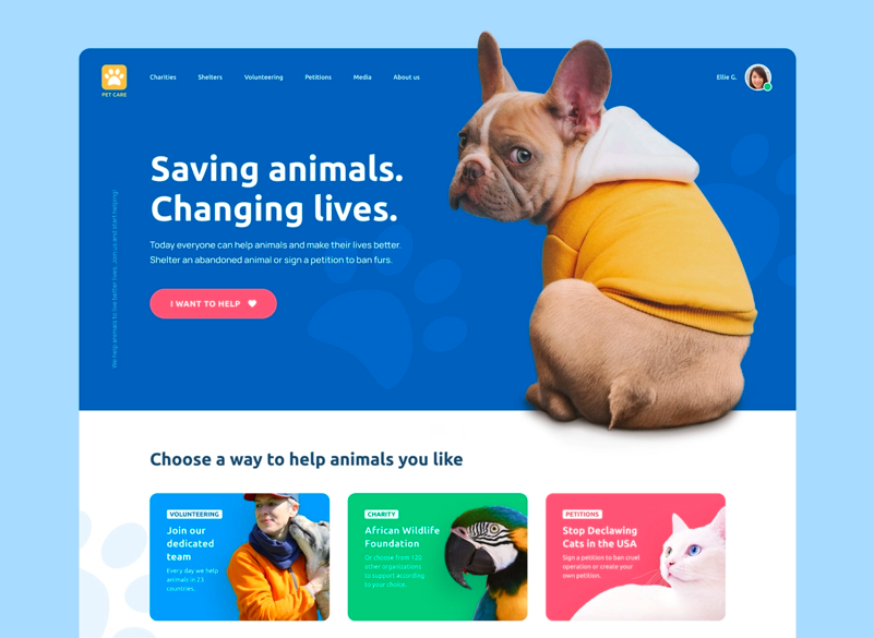
Original images such as the one above can easily capture the attention of visitors before they even process your content, thus helping improve the landing page experience.
One other thing to remember when it comes to landing pages visuals is to avoid using stock photos. Why? They make your landing page appear generic, untrustworthy and that kills conversions.
When you intend to show your product on your landing page, here are some ways you can go about it:
- Show the product in use (you can use user-generated content)
- Show the product by itself
The idea here is to show visitors how the product looks from different angles and how it works.
Related Article: How To Optimize Product Pages On A Shopify Website
Social Proof
Nowadays, just talking about how great your product is doesn’t cut it anymore. You have to start showing it.
Enter social proof.
Think about the last time you were considering trying a new restaurant. What made you choose one over all the others?
If you’re like most people, your decision was likely based at least in part on what others had to say. Social proof is one of the oldest and most powerful persuasion techniques out there, and it is something that you can also incorporate on your landing pages today.
The strategy of injecting social proof on landing pages is to prove to potential customers or visitors that your product is worth their money. And it is extremely important if you want to:
- Build trust
- Increase credibility
- Guide the customer’s buying decision
Potential customers are motivated to take them a step forward if they are convinced that your product has been used by others to solve similar problems to theirs.
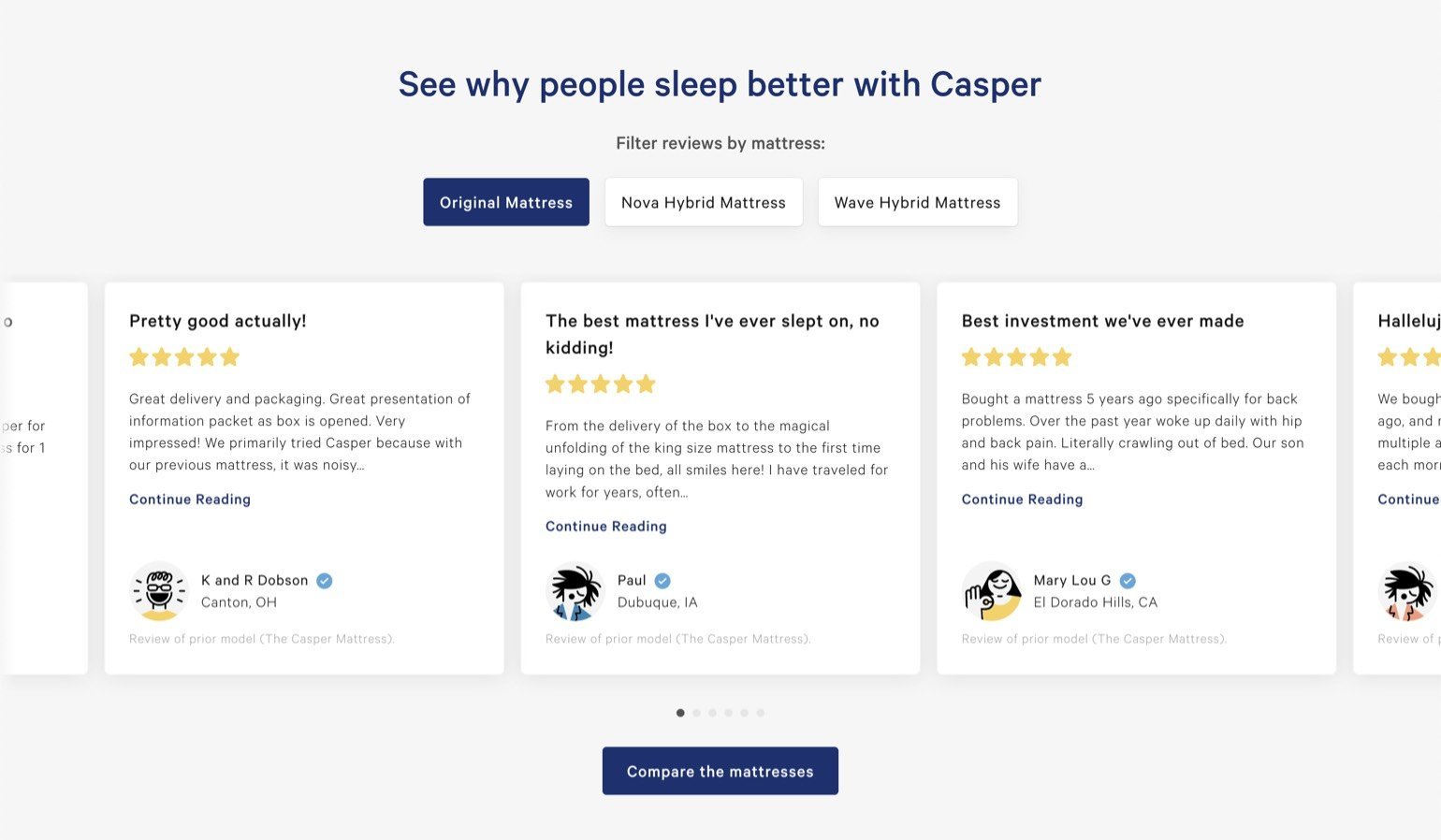
If your landing page is for a specific product, it makes sense to showcase specific customer reviews about that product. Casper does this well on their landing page:
Here are smart ways you can use to show social proof on your landing page:
- Number of downloads
- Testimonials
- Trust badges
- Case Studies
- Expert social proof
- Celebrity social proof
Page Speed
The length of time it takes for your landing page to display content is something you should take seriously. If a site takes more than 3 seconds to load, then it likely has usability issues that should be addressed right away.
50% of users expect websites to load and show all the content on a page in less than 2 seconds. The longer it takes for a landing page to load, the higher the bounce rate. And if your landing speed is slow, that will also affect your rankings on search engines.
. At some point, Walmart discovered that for every second of improvement in load time, their website conversion rate increased by 2%.
Don’t know how fast your landing page is? Use tools like WebPageTest, YSlow, Uptime, Google Chrome DevTools, Uptime, GTmetrix, Website Audit, etc.
About Forms
If you don’t need a landing page form, just don’t use it. If you only need a visitor’s email address, don’t add any other unnecessary fields. People like to separate First Name and Last Name fields on their fields, instead of just combining the two fields into Full Name.
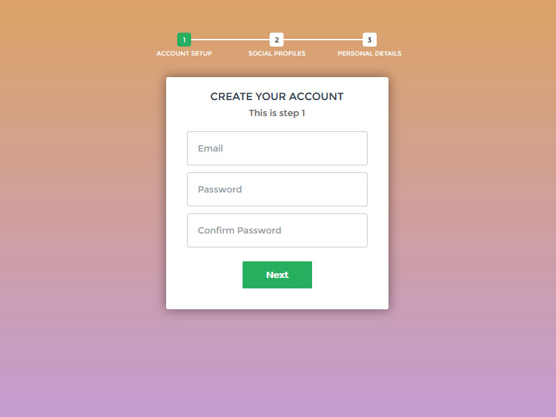
If your product is pricey, it makes sense to have a long-form. But you can also make a multi-step form so that it doesn’t look daunting to fill out. Here’s an example of a multi-step form:
And if you are adding a long-form to your landing page, make the benefit and rewards of filling out the form very clear. And we always recommend placing the form above the fold just like what Marketo does:
Check your Ad Campaigns Messaging
One of the things that can affect your landing page conversions is the disconnect between the page itself and the ad campaign you’re using.
All I’m saying here is that your ad campaign messaging has to be aligned with that of your targeted landing pages. If the messaging or the offers used on the ad campaign and landing page are different, this will cause some credibility issues.
Mobile Experience
If 51% of shoppers purchase products using mobile devices, then you can’t afford to ignore the mobile experience of your users.
One good practice to keep in mind when designing a landing page is to do quality assurance on different browsers and devices to make sure that it’s working the way you want it. That is a must-do before you publish your landing pages.
Another thing to keep in mind is to make sure that your landing page or web page appears to have a single-column layout. This is important considering that mobile devices do not have room for multiple columns. The official Alaska state website used to have the same look on their desktop and mobile devices, and this made it difficult for mobile users to use the website:

Every landing page elements you include in your desktop version of your landing page has to be optimized for mobile devices. This means that you should avoid using images that take up a lot of space, make sure that the form loads fast, and implement drop-down menus where it is necessary.
Final words… Get in the Habit A/B testing
Landing page optimization is tricky. What works for one business may not work for another. This is why we recommend that you get in the habit of A/B testing. Test all of the above-mentioned elements to see which helps boost your conversion rate. You can also use landing page optimization tools like Figpii to launch heat maps, session recordings and get better insights into how your website visitors are interacting with your page.


