
If you plan on running a successful e-commerce company in 2022 and beyond, your website’s checkout experience has to be optimized for the mobile experience.
Why the checkout experience, I hear you ask?
Because that’s where the money is at.
Compared to desktop, mobile usage continues to skyrocket year after year, with no signs of slowing down:
- 79% of smartphone users shop online using their mobile devices.
- 83% of users use some shopping app on their smartphones while shopping inside the store.
- 54% of visitors came from mobile devices during last year’s Cyber Monday.
- 33% of all eCommerce purchases during 2021 Cyber Monday were made on a smartphone.
All these statistics reflect that you can’t afford to ignore mobile optimization.
So, if you’re an e-commerce manager, marketer, or CRO specialist, planning to improve mobile conversions on an e-commerce website, I have one question for you:
How do you make your mobile checkout flow convert better?
I know you already have some ideas on how you can go about it, right? In this article, we will share with you 12 more best practices that can help you improve your mobile checkout experience.
Disclaimer: Not all best practices mentioned in this article will improve your mobile checkout flow conversions. We recommend that you test and see what works best on your site.
With that being said, now let’s dive in.
Why Should You Optimize Your Mobile Checkout?
It’s an open secret that most e-commerce websites have more traffic coming from mobile usage than the tablet or desktop. According to techjury, in 2021:
- Mobile phones generated 54.25% of the traffic, while desktops generated 42.9% of traffic.
But what is not commonly known is that the conversions on mobile are lower than the traffic gotten from desktop users.
According to Statista:
- The conversion rate as of the 3rd quarter for online shoppers on mobile was 2.2%
- That of tablet users was at 3.3%
- Desktop users were at 3.7%
This shows that there were fewer conversions, though there was more mobile usage in 2021.
This is why mobile checkout practices are so critical. If your e-commerce checkout page is not optimized, your cart abandonment rate will only go up despite the huge traffic you get year in year out.
How Important Are Mobile Checkout Best Practices
Best practices are a buzzword in the e-commerce world, and I’m sure you have heard of the phrase several times.
Even though best practices are not always best for every website, there can be a good starting point for your conversion optimization efforts if you don’t have the budget to bring in a CRO agency or an in-house CRO team.
These best practices, though not exhaustive, help you tick off the right boxes and improve your conversions.
As any conversion optimization specialist worth their salt will let you know, it’s better to run a test before you permanently implement any so-called best practice. Because not all best practices universally work wonders on every eCommerce checkout flow.
What Is A Good Mobile Conversion Rate?
A recent study of 3,565 stores in April 2022 shows the average mobile conversion rate at 1.0%.
According to Littledata, a conversion rate of 2.4% puts you in the best 20% of stores they benchmark for mobile conversion rate. More than 3.7% puts you in the best 10%.
Now, I have to reiterate an important point. The whole idea of conversion rate optimization is to see incremental changes on your website and not a massive leap because many factors are beyond the control of the conversion expert.
When you begin to implement the best mobile checkout practices for your e-commerce website, do well to A/B test the changes you make after a while, document your results, and make further changes if necessary.
Remember, a good mobile conversion rate for your site is one that’s constantly improving, not static or regressing.
Moving on, we’ll be looking at 12 mobile checkouts best practices you can implement immediately to see an increase in conversion.
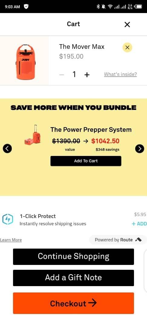
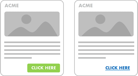
1. Make The Checkout Button Stand Out.
As an e-commerce website, the last thing you want is buyers getting to your checkout page and abandoning their cart because they can’t seem to find your checkout button.
This is a pain many of us can relate with. A checkout button that blends with the background is below the fold/not sticky (this means shoppers have to scroll to look for it), which is a significant turnoff for shoppers when they have to look for the checkout button to complete their order.
This is major friction for online shoppers, and it leads to an increase in cart abandonment.
How to remedy this is simple:
- Your checkout button should be above the fold/sticky. When it’s above the fold, when shoppers get on your checkout page with the intent to complete their purchase, they see the button. You can take this a step further by making the checkout button sticky, so if they scroll, it always moves with them.
- The button color of the checkout button should contrast the page background. This way, it’s visible and stands out.
Here’s an example from the brand Judy.
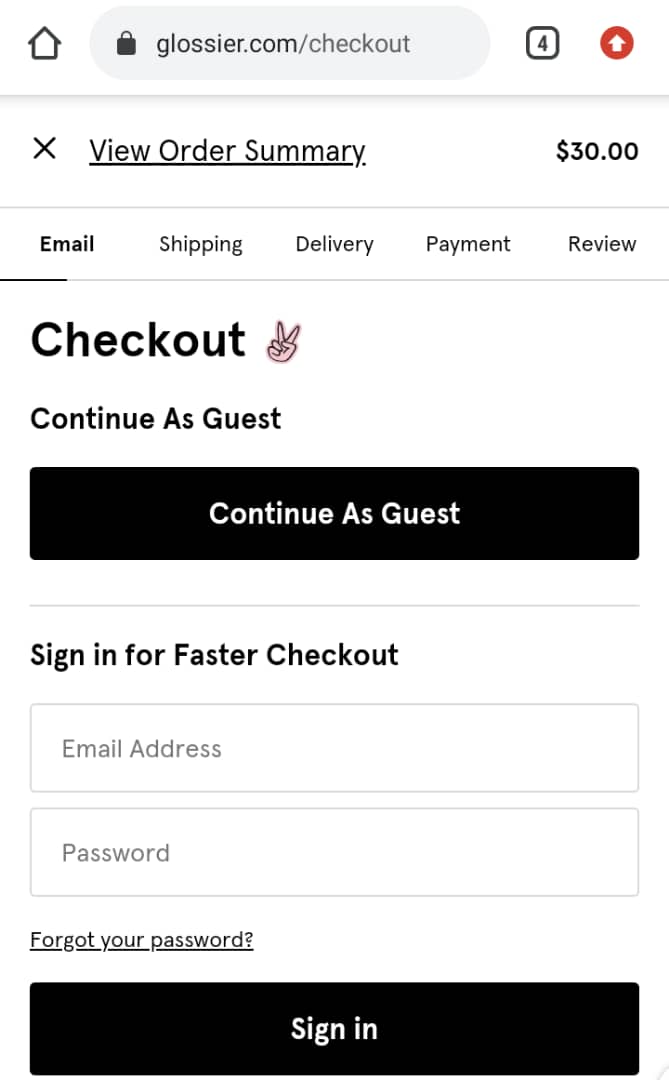
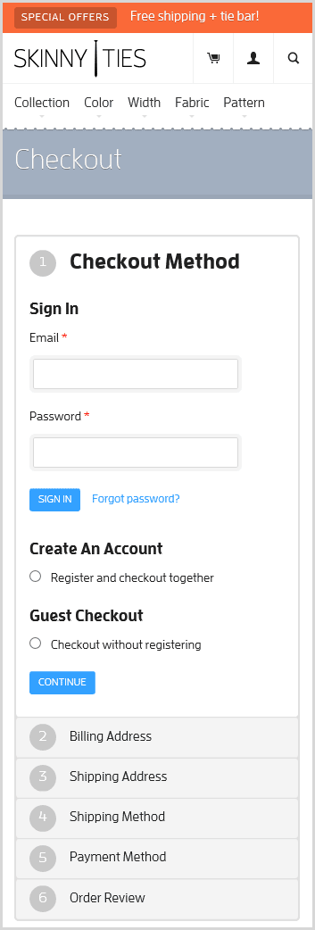
2. Provide A Guest Checkout Option.
Many purchasers are hesitant to give out their details, especially if it’s their first time shopping with you.
If your e-commerce website requires filling out a long-form or signing up, you’re leaving a lot of money on the table.
But this is a low-hanging fruit situation that can be easily remedied. Provide a guest checkout option where your shoppers put their email address and shipping address to get their order.
This helps shoppers who are careful about giving out their details online, and it reduces cart abandonment on your checkout page.
See Glossier’s checkout page, it makes the guest option visible, and it’s the first element the shopper sees if they’re not interested in creating an account.
3. Allow users to use Google or other social media channels to log in.
The bulk of friction with mobile checkout is entering information online. The more fields your checkout form has the more steps and complex procedures it has, and the more friction it creates, which leads to an increase in cart abandonment for your e-commerce website.
A different approach to take with hesitant shoppers to prevent the abandoned cart rate from going up on your site is to allow them to use Google or other social media channels to log in. These are the problems it solves.
- Some shoppers are lazy and don’t want to start creating a new account with your website. Using their Google profile helps them solve it; with one click, they connect their social media profile, and it auto-fills for them. With this, they can also keep tabs on previous purchases made from your store.
- For the sensitive shopper, when they see the option of connecting a social media profile to your website, it occurs to them that this is a detail they already share with others; it doesn’t hurt to share that information with you.
- Then the last benefit is for you, the site owner, with the profiles connected to your store, you can retarget shoppers with targeted ads based on previous shopping tastes and what they might like. You can also create lookalike segments you can use to target an audience that looks like someone that has shopped with you before.
4. Eliminate Distractions.
When shopping on a desktop, the user has a large amount of space to play around with. On mobile, the case is different.
It’s a sign of poor user experience when a shopper arrives on your mobile checkout page and all they see is a pop-up telling them to sign up for email or social media icons asking them to follow you on social media or a big coupon field asking them to input a code for reduced fees.
All these distractions are a significant reason for shoppers abandoning their carts.
Let’s look at the coupon field: A shopper gets to your checkout page without a coupon code and is ready to pay, but when they see that coupon field above the checkout button asking for a discount code. They decide to pause on completing their purchase and hunt for a discount code.
This leads to cart abandonment, intentional or not, but the harm has been done.
This is what happens many times. To prevent this, eliminate these distractions by removing them.
You can remove the coupon field or make it unnoticeable by including a minimize and expand option, remove the social media icons, disable any pop-up notifications on the checkout page and see your conversions go up.
5. Display The Most Important Product Information In The Cart.
Depending on the time spent on your website, most shoppers want to review what they have in their cart before completing their purchase.
They don’t want to go back and forth to different product pages (if they ordered several items) to confirm what they have in their cart.
Make sure your cart is optimized on the checkout page to display;
- The product name.
- The options they chose (size, colors, model, etc.) and quantity.
- Clear professional images (showing different angles if possible).
Remember, the less friction a shopper has on your website, the less cart abandonment you’ll record.
Professional tip: make it easy for a shopper to update their cart from within the cart (adding more of the items they already picked or removed from it). This makes their shopping experience a lot better.
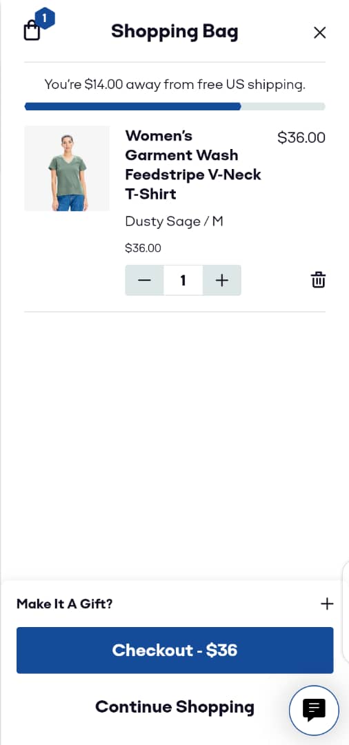
6. Be Clear About The Shipping Information.
Nothing sets off distrust alarms bells in the mind of potential buyers as much as getting on your mobile checkout page and seeing additional charges to your shipping information.
From the product page, be upfront about how much it will cost to ship the product or if there’s an order threshold to qualify for free shipping. Not being upfront about these things can erode trust.
Professional tip: to increase AOV, if there’s a threshold to activate free shipping, including a progress bar to indicate that. Everyone loves free shipping.
See this example from Bombas; it tells the shopper they’re $14.00 away from getting free shipping. For some subscribers, this detail will motivate them to add another item to the cart, increasing your AOV.
7. Answer all questions on the checkout page; never link outside.
Shoppers will always have questions that they need answers to during the checkout process. We’ve all been there. But answer me this question real quick: how many times have you been sent out of the checkout page by a link to find the answer to your question (internally within the website or outside the site), and you came back to complete your purchase? Not many times, yea? I thought as much.
It’s OK to have an FAQ section on your checkout page. The mistake many websites are making is to link out the answers of the FAQ to a different webpage.
This increases friction and leads to increased cart abandonments because some shoppers get distracted by other items on the page they’ve been linked to, and they don’t come back to complete their purchase.
To remedy this is easy. Use the accordion-style site design used on some sites and apply it to your mobile checkout page; it pulls up more information on the same checkout page using the dropdown menu style.
The accordion style used on some websites.
When applied to a mobile checkout page.
You’re providing more details on the checkout page instead of linking outside. This reduces the cart abandonment rate and improves successfully placed orders.
8. Showcase your security badges.
Online shoppers are careful when it comes to making payments online. Concerns over payment security for fear of hacks and thefts are a top reason for cart abandonment.
Showing off your security badges and SSL certificates helps them rest assured that the online payment gateway is safe and trustworthy.
The more obvious your store is secured, it increases the chances you make that sale and reduce friction.
Give cautious buyers the peace of mind they seek by letting them see your badges.
Here’s an example from Bluenile with extended validation. It shows your website name with a lock symbol in front, and it means you’ve put stricter security measures in place.

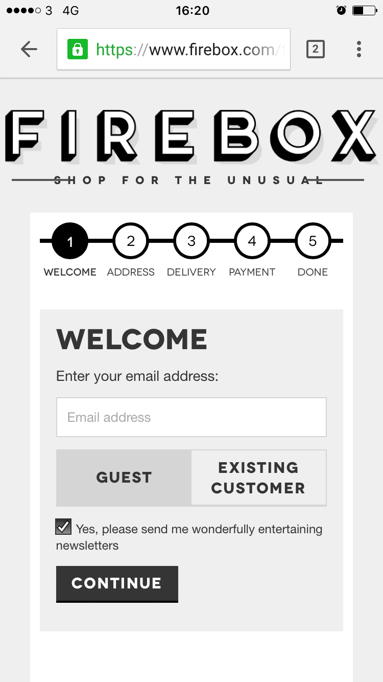
9. Include A Checkout Progress Bar.
One crucial reason shoppers abandon their cart is complicated processes with no ending in sight.
A checkout bar is a conversion optimization tool that helps reduce this element of friction.
It works by an indicator at the top of the mobile screen that shows shoppers the progress they’re making. Nobody wants to spend time going through the maze of unending checkout processes.
With an ending in sight, shoppers are motivated to finish what they started.
Here’s an example from Firebox that works.
10. Offer Different In-App Payment Options.
Online shoppers are more likely to buy from you if you have more payment options on your mobile checkout page.
With the increase in innovations, different services now offer faster checkout options.
Including the popular options in your mobile checkout page improves the chances of a shopper not abandoning their cart because they’re subscribers of said platform.
Apple pay has a record 507million users, Amazon has 300 million+ accounts, and they have their payment gateway.
Having these popular options alongside Klarna, and Paypal on your checkout page should improve users placing their orders and not abandoning the cart.
Remember, with in-app payment options; users don’t have to leave your checkout page to complete their payment; it’s just one click away and done on the page.
11. Use Buttons To Indicate The Next Step.
If you want a shopper to take the next step in the checkout process, use a button to get their attention with the specific CTA.
When users have completed a step in their checkout process and are to go to the next step, using a text link is not the best UI approach.
You have to assume for some users that clicking a link on a screen will be a difficult target because it’s smaller than a button which occupies more space.
Professional Tip: make the button occupy the entire width of the mobile checkout page, let the font be bold, and the button color contrasts its background. This way, it can be seen easily, covers more area, and has more chances of a faster response.
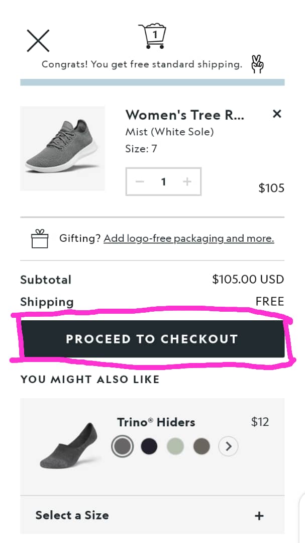
Here’s an example from Allbirds with their checkout button covering the bottom canvas of the mobile screen.
12. Optimize Checkout Page For Speed.
To rank organically on Google, you need to optimize your site load speed. We’re talking about a few seconds here; no web visitor has minutes to wait around for your website to load correctly.
The big question to you is, are you optimizing your checkout’s page load experience?
Recent stats show that 85% of mobile users expect a website to load faster than the desktop experience.
Here’s how to optimize your checkout page to load faster to increase successfully placed orders.
- Install Google’s page speed module to optimize load time.
- Don’t use image-intensive interfaces.
- Regularly test your checkout page to see how it performs under heavy traffic.
Conclusion:
To get the best out of your mobile checkout experience, every listed best practice in this blog can be summarised in this simple sentence, getting your shoppers to the end of the checkout journey with minimum clicks and less friction.
If you follow the best practices we’ve touched on, you should see lesser cart abandonment and more placed orders.
Get value from this blog? Share with your friends, and leave a comment on what your e-commerce mobile checkout experience is like.

