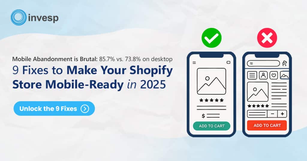
In today’s world where focus is shifting from computers to smart devices, like tablets and phone, we can no longer ignore the fact that transactions are being made from these devices and the user’s preference is shifting. Ignoring only amounts to lost potential revenue.
Responsive web design is a way to design the website that can provide optimal viewing experience, better user experience in term of reading, navigation, and image sizes with least resizing, panning, and scrolling the pages across different devices. For example computers are different platform tablets and mobile phones.
“Responsive web design is the approach that suggest design and development should respond to the user’s behavior and environment based on screen size, platforms and orientation. The practice consists of a mix of flexible grids and layouts, images and an intelligent use of CSS media queries. As the user switches from their laptop to iPad, the website should automatically switch to accommodate for resolution, image size and scripting abilities. In other words, the website should have a technology to automatically respond to the user’s preferences. This would eliminate the need for a different design and development phase for each new gadget on the market.”
– Responsive Design By Smashing Magazine
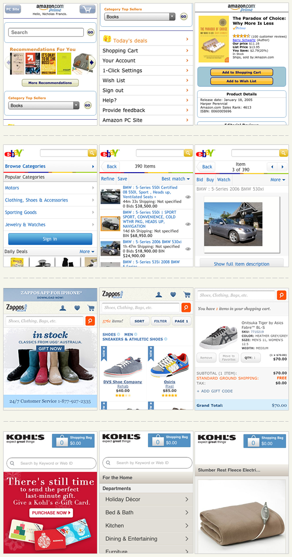
Below are a few examples of responsive web designs:

Some facts on mobile usage in 2012
- $241 billion amount of purchases made from mobile phones in 2011.
- Today, smart devices sale is bigger than PC sale.
- 28% of Internet usage comes from smart devices.
- 19% of search queries in the travel industry come from mobile Internet usage. In 2011, it was only 11%.
- 16% of the search queries in the retail industry come from mobile web usage. In 2011, it was 10%.
- eBay receive sale from smart devices every 2 seconds.
- 50% of the Mother’s Day sales were from mobile phones in 2012.
- Search queries from tablet increased by 23% after Christmas day.
- 86% of adults own tablets/smart phones.
- 53% of adult tablet/smart phone owners use it to access the Internet.
- It is very common to use tablet/smart phones devices to access internet since it is more continent and easy to carry wherever they go.
Yet the fact remains that there are many businesses which haven’t yet considered creating a smart device presence for their business, although a solution is available that requires a considerably low amount of development time.
How to configure Mobile Analytics
You can setup Google Analytics for mobile traffic to see how many people are using your site from mobile devices to plan accordingly.
To learn more on how to configure please click on this link http://www.google.com/analytics/features/mobile.html
How to design responsive web design?
Thanks to W3C for creating media queries as part of CSS3 specifications. Media queries have become a popular client-side technique delivering a tailored style sheet to the iPhone and Android Phones. There are two ways to incorporate a query for your website.
Linking the external file to detect the screen size request is coming from:
<link  rel="stylesheet" type="text/css"
  media="screen and (max-device-width:  480px)"
href="shetland.css" />
OR
Adding it to your existing style sheet and style the elements accordingly
@media screen and (max-device-width: 480px) {
.mainContainer {
width: 480;
float: none;
}
}
OR
As part of an @import directive:
@import url("style.css") screen and (max-device-width: 480px);
To read more in details how please follow below links:
http://www.w3.org/TR/css3-mediaqueries/
http://googlewebmastercentral.blogspot.com.au/2012/06/recommendations-for-building-smartphone.html


