
More than half of Shopify store traffic now comes from mobile devices and that share is only growing.
That means that you’re missing out on many potential customers if you don’t optimize your Shopify site for mobile users. A clunky mobile checkout, slow load times, or hard-to-tap buttons can push customers away in seconds.
The good news? Shopify makes it easier than ever to deliver a fast, seamless experience on phones and tablets. With the right settings, design choices, and mobile-friendly features, you can turn your store into a frictionless shopping experience that works beautifully on every device.
In this Shopify mobile optimization guide, we’ll look at how you can optimize your eCommerce store to make it mobile-friendly:
1. Speed up your Shopify checkout for mobile
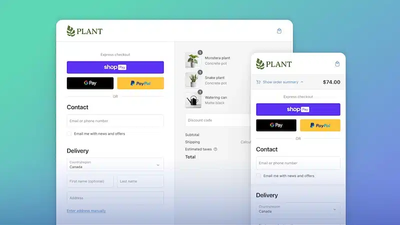
The fastest way to lose a mobile shopper is at checkout. Long forms, extra clicks, or missing payment options are all friction points that send customers bouncing. In fact, Shopify’s own benchmarks show that mobile checkout abandonment is still 85.7%, much higher than desktop’s 73.8%. Closing that gap is where the biggest revenue wins lie.
Shopify has made this easier in recent years with its one-page checkout, rolled out globally in late 2023. Instead of forcing shoppers through three separate steps (information > shipping > payment), everything now lives on a single, fast-loading page designed for mobile screens.
2. Pick a mobile-optimized Shopify theme (and when to consider a PWA)
A bloated or outdated theme can kill conversions by slowing page load, breaking layouts on small screens, or making navigation clunky.
A March 2025 UXIFY study found Bullet (97.1% CWV pass rate), Exhibit (96.7%), and Taiga (95.4%) among the fastest Shopify themes on mobile. These pass Core Web Vitals (CWV) almost every time, meaning your store loads quickly, feels stable, and keeps shoppers engaged. On the other hand, heavier themes like Flex or Motion fail CWV up to a third of the time, proving that design alone isn’t enough.
Here’s what to do to pick a mobile-optimized Shopify theme:
-
Choose a performance-first theme like Bullet, Exhibit, or Taiga.
-
Test your current theme in Shopify’s Performance Dashboard—if it fails CWV, consider switching.
-
Avoid over-customizing with too many apps or scripts, which can cancel out a fast theme.
Pro Tip: Consider a PWA (Progressive Web App)
Once your theme is fast and mobile-friendly, the next step is making your store feel like a native app without paying for a custom iOS/Android app. That’s where a Progressive Web App (PWA) comes in.
A PWA is your Shopify store wrapped in an app-like experience. Customers can “install” it to their home screen, open it in one tap, and even browse offline thanks to cached content. PWAs also allow push notifications, so you can remind shoppers about new drops or abandoned carts, just like big retail apps do.
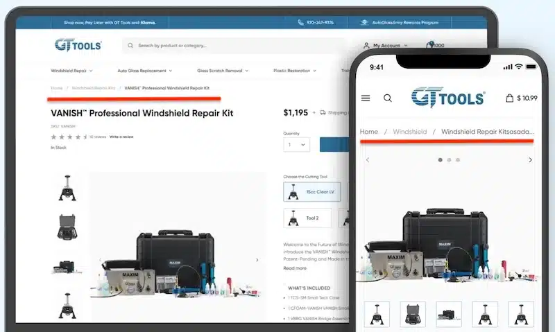
3. Pay attention to UX design and navigation.
The navigation bar is one of the most important parts of any website or app, and it’s even more critical on a mobile device where screen real estate is limited.
For example, a case study of a Shopify-based e-commerce website found that redesigning the UX and UI – including navigation – enabled the site to offer enhanced accessibility.
The site’s navigation had several categories, which users could use to narrow down their choices. They changed the category navigation to allow users to switch between categories quickly.
(Source)
After the redesign, users could more easily find products and learn about them, answer potential queries before others asked, and access support resources quickly.
To enhance your site’s navigation, consider how easy it is for customers to navigate through it. Is there a clear way for users to get back home? Do they need to click through several pages before they can find what they’re looking for?
Here are some more tips for creating a better user experience on your Shopify site:
-
Make buttons tap-friendly. Use large, thumb-sized buttons and avoid tiny text links. Where space is tight, icons can replace text without losing clarity.
-
Keep design consistent. Maintain a uniform look across all pages so users feel oriented, even on their first visit.
-
Adapt layouts for all screens. Ensure columns (like text + image) resize neatly and remain readable on smaller devices.
-
Use a mobile-optimized theme. Choose a Shopify theme built for mobile (like Dawn or Sense) and keep your navigation bar light, visible, and easy to use.
In addition, make sure that all of your images are optimized for mobile devices as well. This includes ensuring the image size is large enough to prevent pixelation when viewed on smaller screens, such as smartphones or tablets.
4. Optimize typography for readability and speed on mobile
Your font’s choice for your mobile store can directly impact whether customers can read your product details, trust your store, and complete a checkout. If text is too small, too light, or slows the page down, you’re going to lose shoppers.
Here are some tips for choosing the right font for your Shopify store:
-
Stick to web-safe or Shopify-optimized fonts. Shopify themes like Dawn and Craft ship with lightweight, mobile-optimized system fonts (e.g., Helvetica, Arial, Inter). These load instantly and don’t add extra requests to your site. Every custom Google Font or uploaded font adds load time, especially if you pull in multiple weights (regular, bold, italic, etc.).
-
Use one or two fonts max. Using too many different fonts or weights slows down performance and creates a messy look. Limit yourself to a single primary font for body text and one accent font for headings. Shopify recommends avoiding more than two active font families to keep load times lean.
-
Focus on size and spacing more than style. On mobile, clarity beats creativity. Keep body copy at a minimum 16px font size with at least 1.5 line spacing. This ensures customers can read descriptions and checkout forms without zooming or squinting. For product titles and CTAs, stick to bold, tap-friendly sizes (18–20px or larger).
- Choose a font with rounded edges. This will allow users to read without straining their eyes or getting tired from having to focus on each letter individually until they understand what it says.
5. Simplify product pages for faster mobile decisions
On mobile, every extra block of text or oversized image slows customers down. Shoppers aren’t here to read essays. They want the essentials: what it is, what it looks like, how much it costs, and how fast they can get it. Anything beyond that should support the sale without overwhelming the page.
For example, Vital Proteins’ Matcha Collagen page nails the basics: the hero section immediately shows the product image, flavor, size, price, subscription toggle, and Add to Cart button.
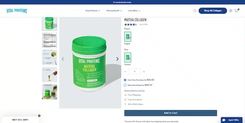
Clear, concise product page design from Vital Proteins (Source)
Benefits like “Caffeine” and “Skin Hydration” appear as quick icons instead of long descriptions, while extra details (nutrition facts, lifestyle shots) sit neatly in the image carousel. Shoppers get the trust-building context if they want it, but nothing clutters the buying flow.
Here’s how to replicate that clarity in your own store:
- Prioritize above-the-fold essentials. Make sure name, price, options, and a clear CTA are visible without scrolling.
- Use visuals instead of walls of text. Replace long paragraphs with bullets, icons, or infographics so details are easy to absorb on a small screen.
- Keep secondary info collapsible. Use carousels or accordions for nutrition details, FAQs, and extra images—available if needed, but not in the way.
- Optimize your media. Stick to a clean set of product shots (hero, alternate angle, lifestyle, packaging) and compress them for fast load times.
6. Enable Apple Pay, Google Pay, and other payment options for mobile users (if it makes sense for your store).
A big part of mobile optimization is making it easier for people to make purchases from your store. While many people browse on their phones and tablets before buying a product or service, others browse from their desktop computers.
One way to make it easier for consumers to buy from your Shopify store is by enabling them to use Apple Pay, Google Pay, or other payment options on their phones. This allows customers to pay with just a few taps rather than having to enter all of their information manually or log into their accounts from another device.
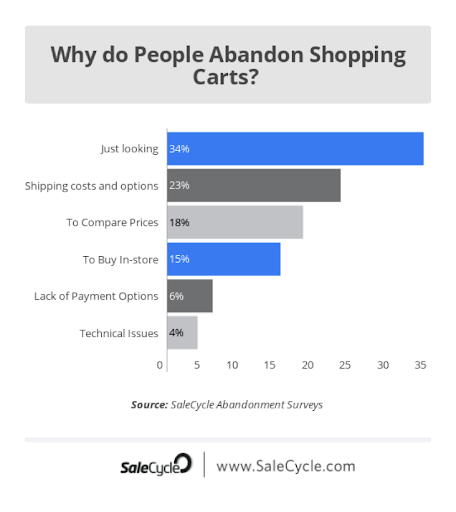
If you look at the stats, 92% of all the mobile wallet payments in the US were done with Apple Pay in 2020. Another study suggested that 6% of shoppers said they abandoned shopping carts because of a lack of payment options.
(Source)
To tackle this issue, you can also set up custom payment methods so that you can use them on mobile devices as well.
For example, suppose you’re selling tickets to an event or membership badges to an organization. In that case, you could create a new payment method called “Event Ticket” or “Membership Badge” and then accept payments using it from your Shopify POS app or website.
You can also do this with gift cards if you want people to be able to use them when they’re shopping for gifts for other people.
7. Use autofill to make the checkout process easier.
If you’re selling products on your Shopify store, your customers need to be able to easily and quickly check out.
That means you don’t want them to have to fill out a lot of information to make a purchase.
Thankfully, Shopify has an autofill feature that can help with this problem.
The basic idea behind autofill is that it allows visitors to your store who have previously made a purchase from you to enter their email address and password once again when they return. This saves time for returning visitors and reduces the amount of data entry needed by new ones.
For instance, FLO Living, a women’s health brand, simplifies the checkout process for shoppers with autofill boxes.
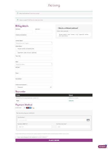
(Source)
Shoppers can fill out their addresses and other details quickly by filling in data from their saved addresses.
8. Mobile-first email marketing
Mobile-first email marketing allows you to create a seamless experience across all platforms — desktop, tablet, and mobile — that is designed to fit into the limited-screen real estate of mobile devices.
Here’s how to ensure your Shopify email marketing campaigns have high-performance open rates on mobile devices:
Use responsive design and breakpoints. Responsive design is a simple way to ensure that your emails look great on any device they’re viewed on. Responsive design uses CSS media queries to detect the size of a user’s screen and adjust the layout accordingly so that it looks good no matter what device it’s being viewed on.
In addition to responsive design, breakpoints allow you to specify specific dimensions at which point content will change based on screen size. Using breakpoints can help you avoid having too much content appear on any one screen size so as not to overwhelm users; instead, it allows them to scroll down through different sections as needed.
Here’s an example from ASOS. Since they are a fashion brand, visuals are essential. However, because of the nature of email marketing, this poses a problem regarding including large images.
If the sender of an email gives less space to a hero image, it leaves less room for the text in the body of the message.
Here’s the web version of the email campaign:

(Source)
To solve this problem, they enlarged the size of the email copy on mobile. This way, even with a small screen, users can still read what’s written in the email.
Here’s the mobile version of their email marketing campaign:

(Source)
Also, notice how they used black text against a white background. It ensures the copy is legible regardless of where it is positioned on the screen.
9. Remember to test your site on different mobile devices and browsers.
Testing your Shopify store on different devices and browsers is a great way to ensure your store is mobile-friendly. It will help you identify potential issues and make the necessary changes before impacting your sales.
Some people might use their iPhone or Android phone, while others might use their laptop or desktop computer.
You need to ensure that your site looks good on all these platforms. You can also test your website on various browsers such as Chrome, Internet Explorer, and Safari.
Pro Tip: Use an emulator. You can use a browser emulator to see your site’s appearance in different browsers. A browser emulator is a program that simulates the experience of using a specific browser on your computer, even if you don’t have that particular browser installed.
For example, you can use a Firefox or Safari emulator to test your Shopify store’s appearance on those browsers.
You also need to ensure that the text is readable when you’re zoomed in or out of the page using pinch-to-zoom gestures (iOS only). The text should be easy to read because zooming out makes everything smaller, including fonts.
Take advantage of the booming mobile market!
While there are plenty of Shopify-specific design issues, using these Shopify mobile optimization tips will help you get a better mobile experience out of the gate.
The list isn’t exhaustive, but following it diligently will help improve your mobile conversion optimization.
Another important thing you can do is check Google Analytics or any analytics tool for your online store to find out which product page has low visitors and sales (it’ll be good for your business to conduct some research around these pages and test your ideas).
When optimizing your Shopify online store or mobile site, remember to make navigation easy, improve page and overall site speed, optimize image and media file sizes, and use scripts efficiently.
In the end, online shoppers will thank you for a smooth mobile user experience.

