
If you run an e-commerce business, you must be aware of Shopping Cart Abandonment Statistics of your website. For those who have never heard of this term before, Shopping cart Abandonment rate is the percentage of shoppers who placed products in the Shopping Cart but did not complete the check-out process
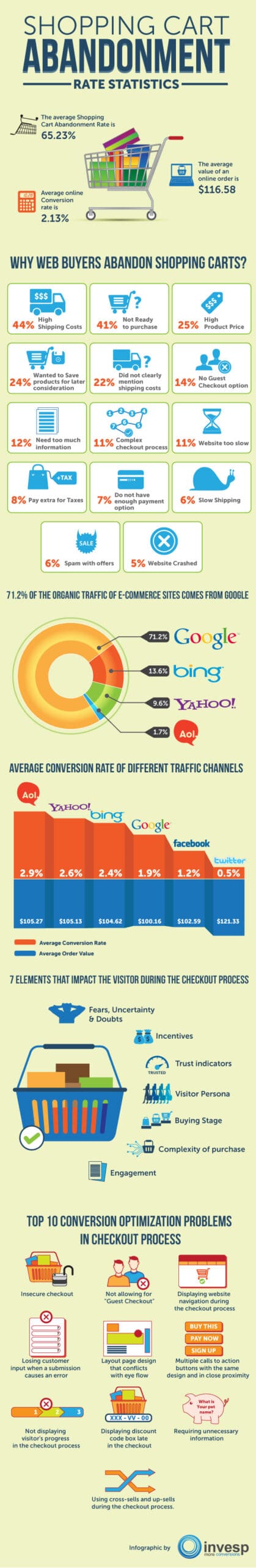
According to researchers, the average Shopping Cart Abandonment Rate of e-commerce websites is 65.23%, which means that shoppers didn’t complete the checkout process 65 times out of 100.
Our infographic on “Shopping Cart Abandonment Rate Statistics” covers some interesting facts about the following:
- Shopping cart abandonment
- Online conversion
- Major reasons why shoppers never complete the checkout process
- What you should do to reduce the shopping cart abandonment rate of your website to increase your sales
Infographic by- Conversion Optimization Company Invesp
To Publish this Image on your Blog or Website . Copy this code
The average online conversion rate is 2.13%
The average value of an online order is $116.58
Why Web Buyers abandon Shopping Carts
| Reasons | %age |
| High Shipping Costs | 44% |
| Not Ready to purchase | 41% |
| High Product Price | 25% |
| Wish To Review Selected Products Later | 24% |
| Shipping Costs Not Clearly Mentioned | 22% |
| No Guest Checkout Option | 14% |
| Being Asked Too Much Information | 12% |
| Complex Checkout Process | 11% |
| Website Too Slow | 11% |
| Additional Costs Charged Towards Taxes | 8% |
| Insufficient Payment Options | 7% |
| Slow Shipping | 6% |
| Spam With Offers | 6% |
| Website Crashed | 5% |
81% of the organic traffic of E-commerce sites comes from Google
| Search Engine | Organic Traffic Percentage |
| 71.2 | |
| Bing | 13.6 |
| Yahoo | 9.6 |
| AOL | 1.7 |
Average Conversion Rate of Different Traffic Channels
| Channel | Average Conversion Rate | Average Order Value |
| AOL | 2.9% | $105.27 |
| Yahoo | 2.6% | $105.13 |
| Bing | 2.4% | $104.62 |
| 1.9% | $100.16 | |
| 1.2% | $102.59 | |
| 0.5% | $121.33 |
7 Elements Of The Checkout Process In Terms Of The Importance
1. Fears, Uncertainty & Doubts
2. Incentives
3. Trust indicators
4. Visitor Persona
5. Buying Stage
6. Complexity of purchase
7. Engagement
Top 10 Conversion Optimization Problems In The Checkout Process
1. Insecure checkout
One of the most important things you can do online today is ensure that your customers’ information is secure. These days, the internet is inundated with different scams that are aimed at compromising personal information, therefore you must ensure that your customers are aware that they will not fall prey to such scams.
The easiest way to do this is to ensure that you place trust and security seals strategically within your checkout funnel to show your customers that their information will not be misused in any way. There are a multitude of different seals you can choose from, so you are going to have to test out the ones that work best for you.
2. Not allowing for “Guest Checkout”
There is currently a disturbing trend on the internet of websites forcing customers to create accounts so that they can buy goods and services from them. The problem with this is that there are some customers that genuinely would like to make a purchase but are not willing to create accounts. In fact, it has been found that at least 23% of people will abandon a purchase if they are forced to make a purchase.
Forcing people to create an account before they can make a purchase is akin to forcing someone to obtain a point card at a retail store before they can make a purchase. Large retail stores do not do this as they know that not all customers would like to get one of these cards, and the same practice should be carried out by websites. If you would like to get people to create an account, it is much better to give them the option to do so after they have made their purchase, not force them to do so beforehand.
3. Displaying website navigation during the checkout process
During the checkout process, the one thing that you would like is to ensure that your customer’s attention is focused on making the purchase. This means getting rid of everything on the page that may distract them from doing just that, including website navigation components.
They may seem like a good thing to have during your checkout process, but navigation components could confuse a customer, leading to them abandoning their purchase. Unlike in the real world where retailers place “impulse buys” near the till, online, should you allow your customers to see other items before they checkout, there is nothing that is stopping them from abandoning their purchase completely to go hunting for them.
4. Losing customer input when a submission causes an error
One of the most irritating things that can happen to a potential customer is to lose all the information that they have entered during the checkout process. This forces them to begin the process all over again, something that many people do not have the time or the patience to do.
Therefore, it is important to ensure that the coding of your website does not allow for the loss of information should anything go wrong during the submission process. This includes ensuring that the information is still accessible if the customer needs to go back to modify their purchase, or to add another item to their cart.
5. Layout page design that conflicts with eye flow
The layout of the pages that you use during the checkout process is very important, as a good layout could help determine whether they make a purchase or not. You need to ensure that all the information that you would like your customers would like to know is in their line of sight, and conforms with the way that the eye tracks information on webpages. This will save them time and increase their chances of completing the purchase because they will not have to be worried about having to search through your webpages to find the information that they need.
6. Similarly designed multiple calls to action buttons in close proximity
Having multiple call to action buttons on one page is not necessarily a bad thing. This is especially true when the calls to action are not crammed close together, where they can compete with each other for your customer’s attention. Having multiple call to action buttons in the same space, and with the same basic design will confuse your customers and may even confuse them so much that they take their business elsewhere. To stop this from happening, make sure the different buttons have a different design, that they are not all crammed in the same space.
7. Not displaying visitor’s progress in the checkout process
There are some customers that could get lost in your website, especially if there are thousands of items to choose from. To stop this from happening, one of the things you should have on your webpage is a progress bar to ensure that they know exactly where they are in regards to the checkout process.
You can even go one step further and include a timer that shows your customers how much longer it will be before the checkout process is complete. This can act as a powerful motivation tool, and can go a long way to ensuring that they complete the checkout process.
8. Displaying discount code box late in the checkout
One of the most important things you can have on your checkout page is a discount code box. Having a discount box on your checkout page will help to motivate your customers to complete the purchase, and may even sway some visitors to your website to make a purchase they had not intended to make. One of the best strategies that has been employed so far is to show the discount that visitors can get on the call to action buttons. If you already have a discount code box set up on your website, make sure that you disable it when there are no offers available.
9. Requiring unnecessary information
There are some websites that ask their visitors for a wealth of information that is not really relevant to the purchase that is being made. This tends to work against these websites, as there are very few people that have the time, or that are willing, to spend more time than necessary on their online shopping. The easiest way to ensure that you get the best conversion rate possible is to ensure that your visitor’s shopping experience is quick and easy. One way you can help to do this is to remove any steps that are unnecessary to the process.
10. Using cross-sells and up-sells during the checkout process
Providing your customers with a multitude of choices before they can confirm their purchase could prove to be disadvantageous to your business, as many customers may end up abandoning their purchase in the hopes that they can get something better. For this reason, if you do want to upsell anything, then you should do so before they begin the checkout process, not before.
For instance, upselling a custom iPhone cover with an iPhone may bring in more revenue, but it must be done before the checkout process is initiated and not in the middle of the process. This will help keep your customer focused on the purchase, and not what else they think they would like.


