
Like most eCommerce store owners, optimizing conversion rate of your e-commerce website is probably high on your list. The problem, however, is figuring out what exactly you need to optimize on your e-commerce website to improve its conversion rate. From copy and design to social media and checkout process, there are so many things you can test that can add to your bottomline.
In this detailed post, we’ll give you a long list of ecommerce conversion rate optimization ideas you must try increase the conversion rate of your e-commerce website.
Design Testing Ideas
Changing your e-commerce website design to make it easier for customers to buy your products can have a strong and immediate impact on your conversion rate. Unfortunately, design testing is also very open-ended and can be tricky to get it right.
To make your job easier, we’ve compiled a few A/B design testing ideas you can try out right now:
1. Use pictures of people
Human beings are naturally drawn to images of people. In one study, sites that had images of people with clear facial features scored substantially higher than sites without any human photos in terms of trustworthiness. This effect was strong across cultures and regions.
In another study, eCommerce stores that used videos and images of actual people were deemed ‘more trustworthy’.
For example, in one test for an online art gallery, showing the artist’s face instead of their paintings increased conversion rate by 95%.
Before:

After:

2. Direct users to your CTA with images
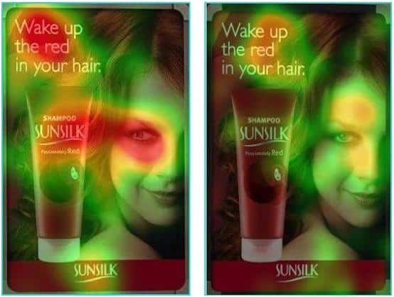
Eye tracking studies show that your users will focus attention on wherever the people in your images are looking.
For example, in this popular test, when the model looks at the product, the product gets maximum attention. When the model looks at the user, the model herself gets more attention.
In another study, when a picture of a baby was used on a page, users focused on the baby, not the text surrounding it.
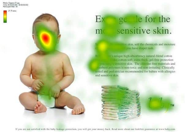
When this picture was changed to direct the baby’s gaze on the surrounding text, more people looked at the text than the baby:
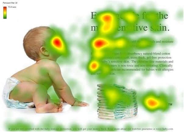
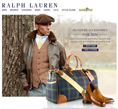
You can use this to your advantage by using images where the models are looking directly at key areas of the site you want your users to focus on (such as a CTA).
For example, on RalphLauren.com, the model is looking directly at the CTA on the homepage:
3. Make better use of above-the-fold area
Most of your users will see only the ‘above the fold area’ (i.e. the area within view without scrolling down a page) before bouncing off your site.
According to tests conducted by Nielsen, users spend 80% of their time looking at information above the fold. Even if they scroll, they give only 20% of their attention to anything below the fold.
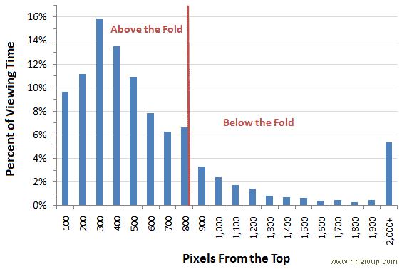
In your design, it’s crucial that you make better use of your above the fold area. Unless it’s absolutely necessary, this area should focus exclusively on selling your products.
In one test, removing an annoying banner from above the fold led to a 43% increase in conversions.
Try doing something similar for your own site.
4. Design each page with one conversion goal
Design clarity is the foundation of customer trust and loyalty online.
As soon as a customer lands on a page, he should know three things immediately:
- Where he is on the website. Using navigation menus, breadcrumbs, page titles, and descriptive URLs helps in this regard.
- What action he is expected to take on the website. This is your primary conversion goal.
- What will happen when the visitor takes the target action.
Consider this example: on the original homepage for Zen Windows, a window replacement company, the page’s purpose is obscured by multiple offers and CTAs.
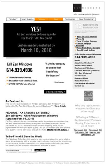
It is also difficult to figure out where the visitor is on the website. Two tabs in the navigation menu are highlighted (“Windows” and “Doors”). It is also not clear whether the visitor is expected to “Email Dan Directly” (first CTA), give the business a call (phone number given in sidebar), or “Tell-a-Friend & Save the World” (bottom of page CTA).
This led to a paltry conversion rate of 0.75%.
Here’s the updated design:
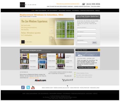
In contrast to the original design, this page:
- Shows the visitor where he is on the site. “Home” in the nav menu has a different color than the other tabs.
- Shows the visitor what he is expected to do. The form at the top of the page has a descriptive title (“Get a Free Window Quote Now”) and easy-to-understand fields.
Changing the site design to focus on the main purpose of the page improved conversion rates to 2.95%!
5. Use visual hierarchy to control user flow
According to the Gestalt psychological theory, human beings have an innate tendency to organize information based on its size and where it appears in any document. This means that the bigger the element, the more attention it will get from users.
Studies conducted by the Poynter Institute show that users tend to focus on the largest text on any page. They read smaller text only if the larger text holds their interest.
You can use this concept of ‘visual hierarchy’ to control what your users focus on. Give the most important elements on any page (usually the headline or a CTA) the largest font-size. Elements that don’t require as much focus, such as footer text, can be given a smaller size.
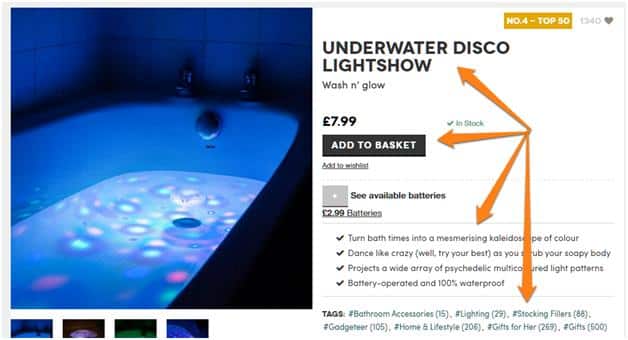
For example, on Firebox.com’s product pages, the product name has the largest font size. The CTA (‘Add to Basket’) has the second largest font size. The product description font size is small, while the font size for the ‘tags’ is even smaller.
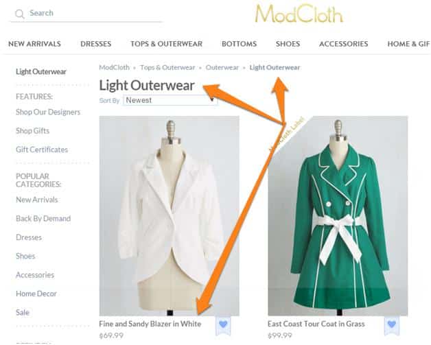
On the ModCloth.com product page, the product category has the largest font size (since this tells customers where they are on the site), while the products have a smaller font size. The font size for the breadcrumbs is even smaller.
6. Emphasize the CTA before everything else
Before you design any page, ask yourself: What is the purpose of this page? What is the primary conversion goal that I am trying to accomplish?
More often than not, it is to get users to take some action, such as clicking a CTA.
Obscuring the call-to-action button with unnecessary information can negatively impact conversion rates.
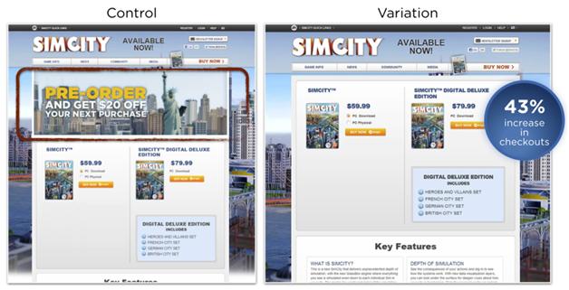
For example, on the original homepage for the Sims 3 game, the site offered readers news, trending items, and offers from the store.
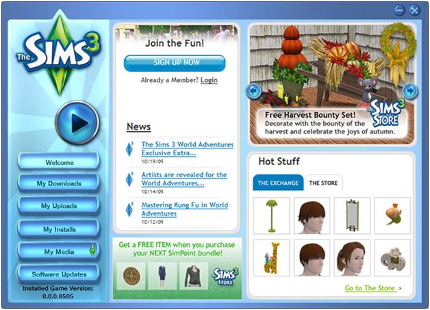
The goal of the page, however, was to get users to register for the website.
A new site design removed all unnecessary elements and focused entirely on the purpose of the page: to get users to sign up.
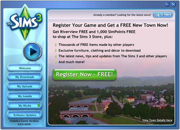
This new design improved the sign-up rate by 128%
7. Make CTA more visible
Since we are on the subject of CTAs, making it the most prominent and visible element on any page should be a top priority.
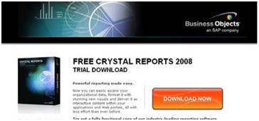
For example, on the SAP BusinessObjects landing page, the original CTA was a blue link.

This could be easily missed since it blended in with the other text.
By changing the CTA to a bright orange button, the page increased its conversion rate by 32%.
Some methods to make CTA more prominent include:
- Changing CTA color.
- Using CTA with square/rounded edges.
- Changing CTA button size.
- Changing CTA location (below/above fold).
8. State the purpose of CTA in CTA button copy
A common mistake eCommerce stores make is to use generic copy such as ‘Learn More’ in every CTA. This has two problems:
- It blends in with other buttons and elements on a page.
- It does not tell the user exactly what the button does.
According to Nielsen Research, such CTAs have “poor information scent” and makes for bad user-experience. These buttons don’t really tell readers what page they lead to unless they are actually clicked.
The solution is to state the purpose of each CTA in the CTA copy. A button that takes the user to the checkout page, for example, should say “Checkout” instead of “Continue”. A button that lets users download an eBook after form submission, on the other hand, should say something like “Get My Free eBook!” instead of “Submit”.
Check out this post for more information on how to create more effective CTAs.
9. Remove all unnecessary design elements
Customers make decisions whether to buy or skip a product within seconds of landing on a page (2.5 seconds or less, according to one study). If they can’t fully understand what you’re selling within this time, they’ll likely skip to another page.
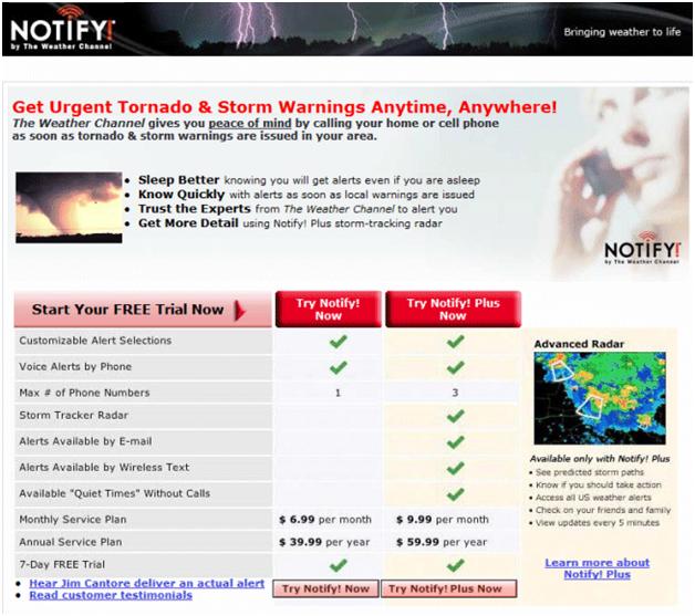
For example, the Weather Channel wanted people to sign up for its ‘Notify’ service. This service tells users via email and SMS when there is a weather emergency in their location.
The original homepage for this service did not do a very good job of telling readers what exactly the service was about. While it ticked the right boxes in terms of copy, it didn’t really tell readers how the service worked. Plus, the multiple columns and images confused the users.
A redesign removed all unnecessary columns from the page. It also simplified the design by telling readers exactly how the service worked in a single header image. Plus, it removed the pricing table and replaced it with a single CTA.
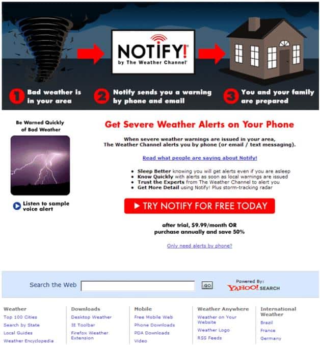
This simpler, clearer design helped the Weather Channel increase conversion rate by 225%!
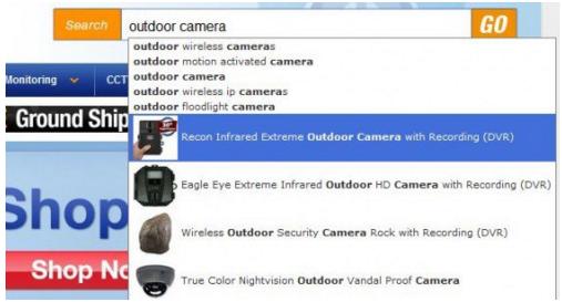
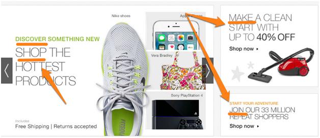
10. Use images in navigation menu and search results
Here’s an idea that’s becoming more and more popular: including images in navigation menu and search results.
In one instance, adding product images to site search results led to a 15% lift in site search conversion rates for BrickhouseSecurity.com.
With the popularity of ‘Mega Menus’, it has become easier to include images in navigation menus as well.
Shopping Cart & Checkout Page Testing Ideas
In CRO, it’s a good practice to start the optimization process from as “close to the money” as possible. For most stores, this means the checkout page, since this is where their revenues come from.
Getting the checkout page right is absolutely crucial. A good checkout page can significantly reduce shopping cart abandonment rates (which hover between 59% to 80% depending on what study you follow). Even a small reduction in cart abandonment rates can add thousands of dollars to your bottomline.
Try these ideas to help you improve the checkout experience.
1. Clarify prices upfront (including shipping costs)
According to Jakob Nielsen of the Nielsen Group, one sure shot way to build up trust on any site is through “upfront disclosure”. That is, you should tell your visitors exactly what they can expect from your store, and what it will cost them (including shipping prices, if any).
Nielsen writes
“Reveal shipping charges immediately rather than waiting until after the user has placed an order. You may cheat a few people into ordering by hiding the shipping costs, but many more will abandon the site at an early stage of the process”
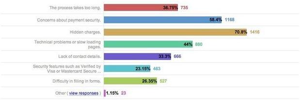
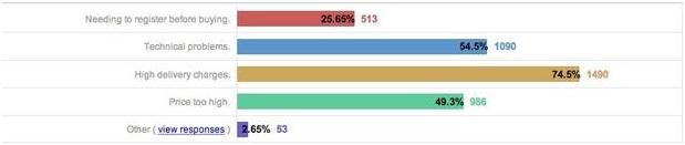
One study conducted by eConsultancy and TolunaQuick revealed that the biggest reason for shopping cart abandonment was “hidden charges”, such as shipping costs.
Test this out on your checkout page this year.
2. Use trust markers
Your customers are a nervous bunch. They don’t know whether they’ll get the products they want, or a brick wrapped in shiny packaging when they hit the ‘Buy’ button.
How can you make your checkout page more trustworthy?
Simple: by using trust markers – security seals, guarantees, and badges.
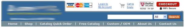
You’ve seen them on your favorite sites. Here’s a bunch of security badges on NewEgg.com:

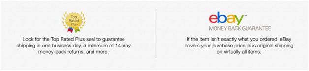
Here’s eBay offering a money-back guarantee at the bottom of its home page:
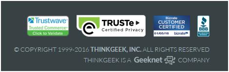
And here are some more security badges on ThinkGeek.com:
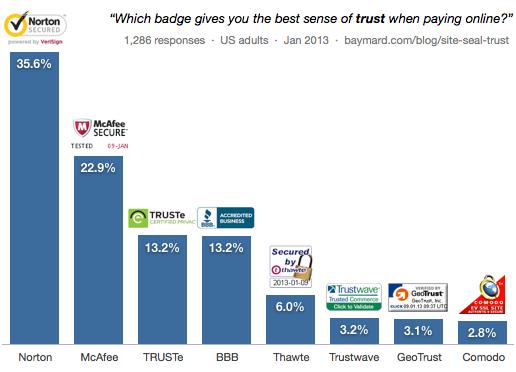
Most retailers say they report a jump in conversions in profits after adding these trust markers. For example, Petco.com added a ‘Hacker Safe’ seal to its checkout page and added $2.6M in additional revenue. OrientalFurniture.com saw a 7.6% jump in conversion rates by adding a guarantee seal to its checkout pages.
Adding McAfee security certificate on another website led to a 4-6% increase in conversion rates (note that the site already had other trust markers such as Visa/Mastercard icons).
Before:

After:
This study from Baynard Institute shows which trust markers have the biggest impact on your site’s trustworthiness. Use it to understand what trust markers to focus on.
3. Consider removing navigation
Your checkout page has a single purpose: to turn visitors into customers. Every step in the checkout process should be carefully designed to achieve this goal. Any links, images or site elements that don’t support this goal should be culled away.
A big culprit is navigation bars. It’s very easy for shoppers to get distracted by all the shiny links and guides in your nav bar, leaving the shopping cart behind.
In testing landing page layouts, HubSpot found that removing the navigation can lead to a significant bump in conversions. Another website, YuppieChef, increased conversion rates by 100%, while SparkPage saw its conversion rate nearly double from 9.2% to 17.6%.
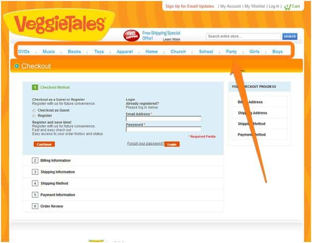
In another study, revenue per visitor for the popular children’s website, VeggieTales, increased by 14% simply by removing navigation from the page.
Before:
After:
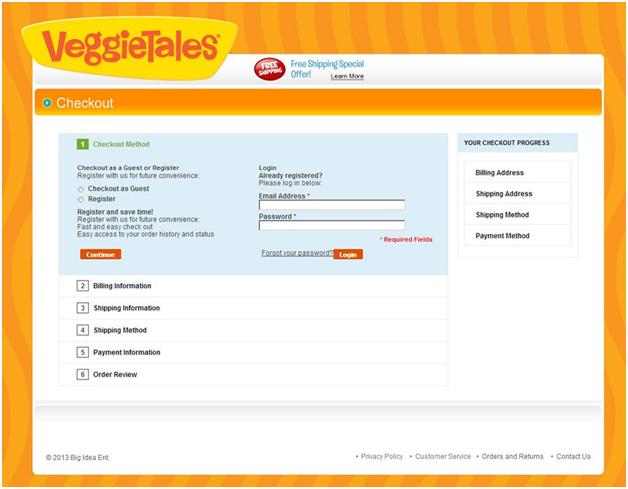
Experiment with this idea: remove all navigation from your checkout pages. In fact, remove all external and internal links on the checkout pages. Simplify the design so that it focuses completely on the checkout process itself.
4. Experiment with one-page vs. multi-page checkout
The jury is still out on whether one-page or multi-page checkouts perform better. There are plenty of pros and cons to each approach. What works for one site might not necessarily translate to yours.
In one test conducted on the 2010 Vancouver Olympics website, a single-page checkout increased conversion rates by 21.8%.
(It must be noted that the website in the test did not have a fully-optimized multi-page checkout process).
However, multi-page checkouts are more persuasive for higher priced products and help you get more information from customers. You also get a chance to offer upsells (something GoDaddy does very effectively).
Invesp conducted a multi-page vs. single page checkouts test for a large furniture retailer (average order value close to $2,000). In this test, the multi-page checkout increased conversions by 38%.
Experiment with both approaches and see what works better.
For an example of a single-page checkout, try Macys.com. For an effective multi-page checkout, see BrooksBrothers.com.
5. Consider removing login requirements
The eConsultancy and TolunaQuick study referenced above revealed something else about shopping cart abandonment: that 26% users bail out because they don’t want to register for yet another website.
This seems reasonable enough. After all, your customers just want to buy a product, not build a relationship with you. While having more sign-ups might make for a nice vanity metric, it actively hurts your conversion rates.
In fact, ASOS decreased its cart abandonment rate by more than 50% by making user registration entirely optional.
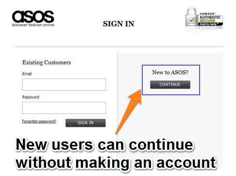
Give this a shot on your checkout pages. Make two versions, one with a mandatory login, another with login optional and see the results.
6. Add live chat support
Adding live chat support is a low hanging fruit that can quickly add to your conversion rate without extensive redesign. This is particularly true for eCommerce stores where email is too slow and phone support just gets in the way of the purchase process.
Live chat support on checkout pages is particularly effective since it gives hesitant customers who are on the verge of buying an easy way to get answers to their questions.
According to a study by Forrester Research, adding live chat to Wells Fargo website resulted in double-digit improvements in conversion rates.
Another study by Forrester shows that for 44% of customers, having proactive chat (i.e. where customer support assists customers with a purchase) is one of the “most important features” a website can offer.
For example, adding live chat support to Wasteland Skip Shop’s shopping pages helped the company generate 1,020 leads and decrease bounce rate on booking pages by 1,000%.
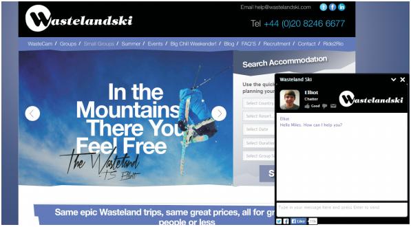
Consider adding this to your site since it doesn’t require huge upfront expenses and the ROI can be measured quite easily.
Product Page Testing Ideas
The product page is where customers will see and decide whether to buy your products or not. These are some of the most important pages on your site. Using CRO tactics on these pages will have a big impact on your conversion rates.
Try out these product page testing ideas to improve your conversion rate today:
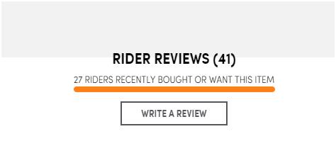
1. Emphasize user reviews
Reviews are the glue that holds e-commerce together. They are the foundation of social proof online, telling customers what other actual users think about the product.
This is why all top-performing eCommerce stores go out of their way to procure and show reviews on their product pages.
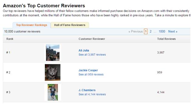
The best example, of course, is Amazon, which shows ‘Best’ and ‘Most Critical’ reviews for each product:
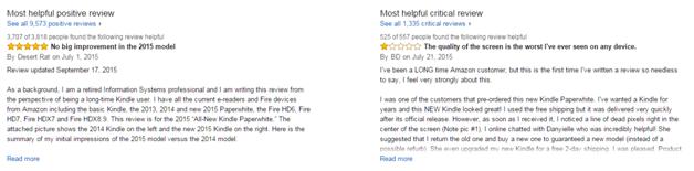
It also maintains a leaderboard of reviewers to help encourage customers to review their purchases.
Adding reviews can persuade customers to buy more. For example, when online fashion store FigLeaves added reviews to its product pages, it increased customers’ likelihood to buy by 35%.
Here are a few strategies to get more user reviews:
- Offer incentives and loyalty rewards to customers for adding reviews.
- Follow up after each purchase with a review request.
- Create leaderboards like Amazon to encourage reviewers.
2. Use testimonials from social media
Your customers will likely have some nice things to say about your products. If they are active on social media, they probably share it publicly as well.
Using these “testimonials” on your product pages is a great way to show the value of your products. Nothing says “social proof” like an actual public endorsement from an enthusiastic customer.
Take a look at this tweet from a customer for Littlewoods, an Irish-based clothing store:
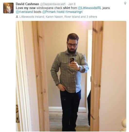
Adding such testimonials to your product pages will go a long way towards addressing customer concerns. Wikijob, for example, improved conversion rates by 34% by adding testimonials to its product page.
You can also create a separate page for showcasing customer testimonials. One great example of this is the testimonial page for Saddleback leather bags.
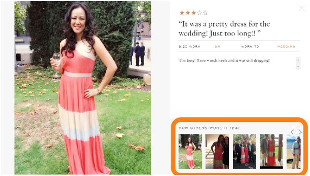
3. Show products in actual use through user-generated photos
Images are the heart of the shopping experience online. It’s the only way customers can get an idea of how your product will look or feel.
However, even the highest quality product photos fail in one aspect: they don’t show how the product is used by actual customers.
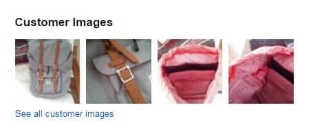
One way to fix this is to curate user-generated photos.
Amazon does this extensively by letting people add pictures to their reviews. These pictures help potential buyers see how the product looks like in real life, increasing trust.
RentTheRunway did the same thing and saw a 200% increase in customer purchases.
UrbandOutfitters, meanwhile, saw a 5-7% increase in conversion rates by incorporating user-generated images into product pages.
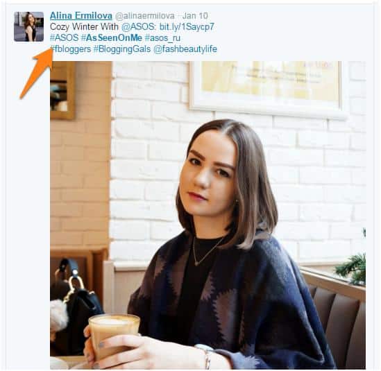
One way to source such images it so promote a hashtag on social media that asks users to share their pictures. For example, ASOS promotes the #AsSeenOnMe hashtag on Twitter and Instagram, featuring the best images on its own site
Try doing this for your store as well. Create a separate section on each product page to showcase images from users and measure the impact on conversion rates.
4. Use videos and 360 degree views
Videos and 360 degree views give customers a far more holistic view of the product than simple product images. Retailers have been increasingly using them on product pages to add interactivity and to stand out from the competition.
For example, Zappos creates videos for most of its products. These videos not only show the product in action, but often give additional details about the product such as its build quality, size, etc.

According to eConsultancy, Zappos increased sales of each product by 6 to 30% through such videos.
For clothing retailer Ariat, every time a customer viewed a video of a product, its conversion rates increased by 160%.
Granted, the costs associated with making videos and 360 degree views is higher, but the returns are worth, especially if you’re in a crowded market and want to stand out.
5. Add a FAQ
A FAQ on each product page helps address common FUDs and push customers towards making a decision. It’s not necessary, but it’s an easy way to answer common customer questions and boost conversion rate.
For example, Amazon usually has a list of questions and answers for most of its products:
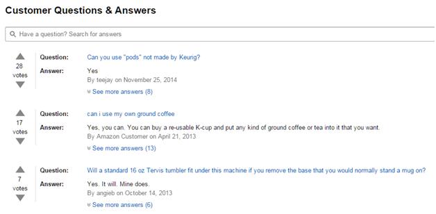
These answers are even more compelling since they are sourced from users themselves. Plus, they address FUDs in a human “Q&A” manner. This is why adding a FAQ section to RollerSkateNation.com increased their conversion rate by 69%.
NewEgg has a separate tab for aggregating questions and answers about each product:
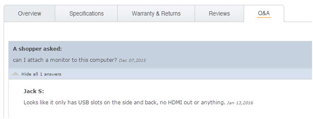
Depending on your platform, there are multiple plugins to create such FAQ sections on each product page. For Shopify, there’s the Product FAQ plugin. WordPress users can choose SpiderFAQ, while WooCommerce users can select WooCommerce Products FAQ.
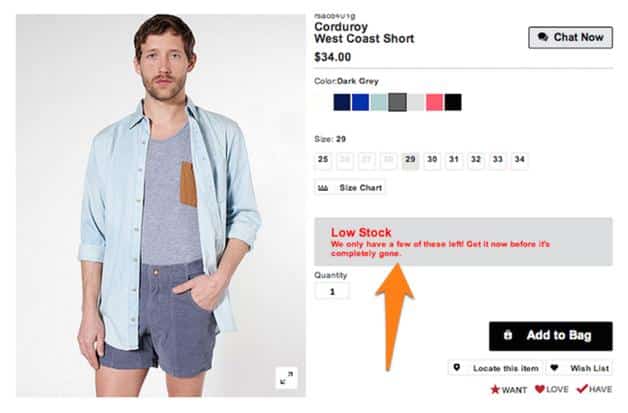
6. Use scarcity based incentives
One quick way to get users to take action on your product pages is to show customers that there are only a limited number of items available. If the item is running out of stock, the customer is more likely to take action.
American Apparel, for example, alerts customers if stocks of an item are running low (and tells them to buy the product before it becomes unavailable).
In fact, according to Robert Cialdini, author of the book Influence, scarcity (or perceived scarcity) is one of the six pillars of persuasion.
Try this on your site – alert customers when stocks are running low to get them to take action.
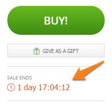
7. Use urgency-based incentives
Urgency-based incentives focus on driving customer action by offering discounts or deals for a limited time only.
For example, on Groupon, each deal is available for a limited time, as shown with a counter:
ThinkGeek.com offers customers steep discounts for a limited time only:
Amazon has an entire section for deals available for a limited time only:
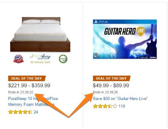
Try doing something similar for all promotions on your site. Use a countdown timer to show people that the promo will be available for a limited time only. This can push customers who are on the fence to take action.
Copy Testing Ideas
Effective CRO is a combination of copy, design, and analytics. Far too many e-commerce stores focus on design and analytics and completely skip copy, even though copy is faster to tweak, especially on unique pages.
On any eCommerce site, you’ll have two types of pages:
- Unique Pages: Homepage, About page, FAQ, company info, checkout page, etc. These pages are all unique and have little in common with each other.
- Product & Category Pages: These pages usually follow a template. Each product page, for example, will have a similar design and copy format.
You’ll have only a handful of unique pages on your site, but hundreds, thousands, even millions of product pages. Tweaking copy on all these pages is hard. This is why we recommend that you start by focusing on unique pages, followed by the top 10 or 100 product pages (in terms of popularity of contribution to revenue).
Let’s take a look at some copy optimization ideas you can use on both these page types.
Unique Page Copy
1. Use action-oriented words
Every page on your site exists for one reason: to get your users to perform an action. This can be anything – click ‘Add to Cart’ on a product page, hit ‘Buy’ on the checkout page, and select ‘Sign-up’ on a landing page.
One way to do this is to use action-focused verbs in your copy. As you might expect, these words compel passive users to take some action.
Some commonly used action words are:
- Put
- Turn
- Get
- Show
- Push/Pull
- Follow
- Deliver
- Choose
- Give
- Start
- Add
- Take
You can get a longer list of common action words here.
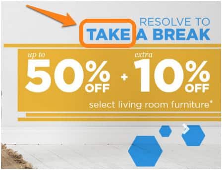
Most eCommerce stores already use action words all across their sites. For example, Overstock uses ‘Resolve’ and ‘Take’ on its homepage images:
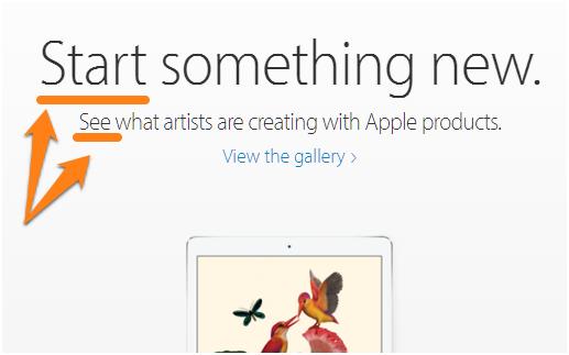
Apple uses ‘Start’ and ‘See’ on its homepage:
eBay peppers its homepage with tons of action words:
In one test, changing copy to action words increased conversion rate by 93%:
Before:
After:
This is an easy hack to put into action, so make sure to test it out in 2016.
2. Use numbers frequently
Using numbers in your copy does two things:
- It quantifies your product quality – if 10,052 customers buy from you every month, surely, your products can’t be bad.
- It appeals to caring persona-type. These are people who are concerned about others and want to know how (and if) your products help others. Showing the number of people who buy from you every month shows them that others have already benefited from your products.
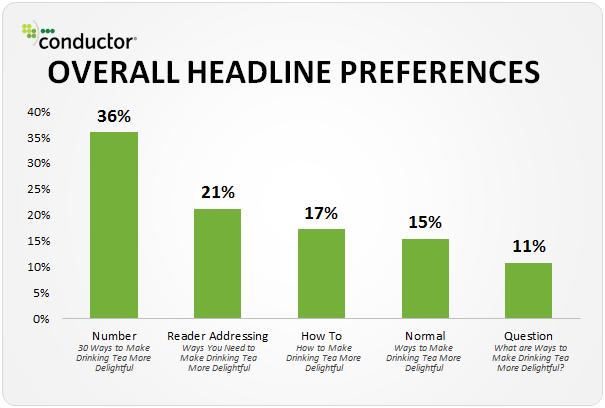
Numbers work very well when used in headlines or product copy. For example, when it comes to page headlines, research shows that a majority of people (36%) prefer headlines with numbers in them.
Take a look at how eBay assures customers that their store is popular with others. Note the word ‘repeat’, which shows that people are willing to come back to their store over and over again.

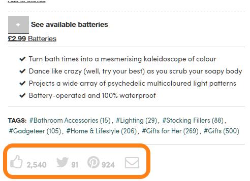
AlwaysRiding.com shows how many customers purchased an item recently:
Firebox.com uses social proof numbers by showing how many customers liked or recommended a product on social media:
Generally speaking, you should strive to use exact numbers whenever possible. Instead of saying that your products are loved, show them how many likes each product receives on Facebook. Instead of telling them you’re trustworthy, show people how many customers you’ve successfully served.
3. Focus on benefits, not features
People buy products for their benefits, not their features.
Think about how differently Apple and Samsung sell their products. Apple almost never talks about the number of cores, or RAM in its phones. Instead, it focuses on the entire experience of owning an iPhone, and its benefits.
Samsung, on the other hand, focuses on the number of cores in its processor and the resolution of its camera.
Of course, we know which of these two companies is more profitable.
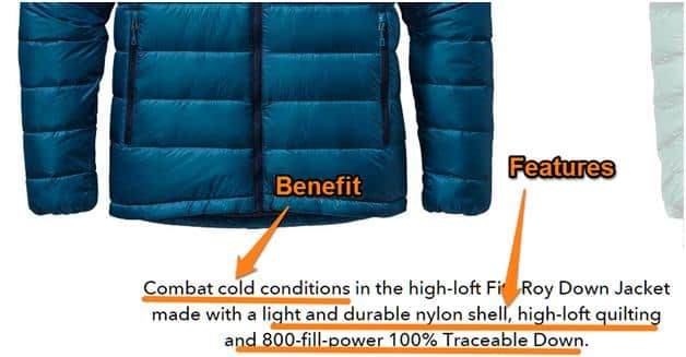
Patagonia does a wonderful job of turning features into benefits. Each of its products uses high quality materials and unique technology for better comfort and warmth. Instead of focusing on these features, however, its copy emphasizes how these features benefit the user.
4. Use copy that appeals to emotion
In the book Neuromarketing: Understanding the Buy Buttons in Your Customer’s Brain, the authors claim that our decision making is heavily affected by the amygdala or the ‘reptile brain’. This is a primitive part of the brain that heavily favors emotion over logic.
Using emotion in eCommerce copy has its rewards. In one study of online shoe stores, researchers found that stores that emphasized interactivity and evoked emotion grew faster than those that appealed purely to logic.
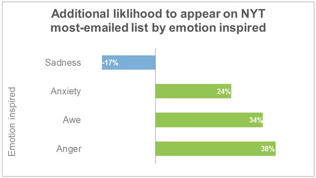
In another study of the most heavily shared content on the NYT website, researchers found that articles that evoked strong emotions (awe, anger, etc.) received the highest number of shares.
Adding emotion to your eCommerce copy is a big topic and outside the scope of this article, but a few things that can really help are:
- Leveraging power words: These are words that evoke emotion in readers. See a list of power words here.
- Use your customers’ language: Speak like your customers speak. Don’t use the same copy for baby boomers as you would for 20-something millennials.
- Use second-person copy: Address the reader directly by using ‘You’ in your copy.
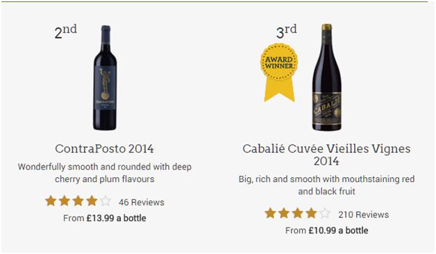
For example, take a look at the wine descriptions on LaithWaites.co.uk. All the words used here are highly descriptive:
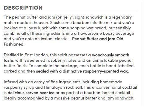
Or take a look at the copy used on Firebox.com – it is full of highly descriptive, evocative words (“flavoursome”, “wonderously smooth taste”, “hand-labelled”, etc.)
5. Tell a story
Storytelling is one of the most powerful weapons in a copywriter’s arsenal. A good story can hook readers in and create a narrative around your brand and its products.
In one memorable example, the founders of SignificantObjects.com bought cheap products from thrift stores and crafted stories about them to give them a sense of heritage and history. Each of these products was then sold off on eBay.
By leveraging the power of storytelling, SignificantObjects.com was able to sell thirft store goods worth $128.74 for $3,612.57. Which is to say, storytelling helped them increase the value of their products by a whopping 2700%.
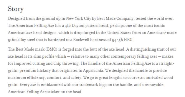
An easy way to use storytelling in your product copy is to tell readers how your product came into being. BestMade does this wonderfully well by telling readers why and how they designed each of their products.
LaithWaites.co.uk takes stories and comments from wine creators to craft a very effective narrative about each wine.

The J Peterman Catalog creates fictional stories for its products, imbuing them with a rich history.
Try doing something similar for your own top 10 or 100 products and see the results.
Pricing Testing Ideas
Pricing is one of the trickiest things you’ll tackle as an eCommerce store owner. Finding a balance between profitability and affordability is hard work. Moreover, you also have to keep in mind psychological pricing – i.e. how customers perceive your prices – before deciding on a strategy.
Thankfully, CRO can help here as well. By testing out different pricing strategies, you can get actionable insight into what price is best for your bottomline.
Try these pricing tactics on your store this year.
1. Test pricing patterns
A common tactic store owners use is to reduce the right-most digit in the price by 1, 3 or 5. That is, instead of a product costing $10, it would cost $9.99, $9.97 or $9.95.
Pretty much every store does this, from Apple:

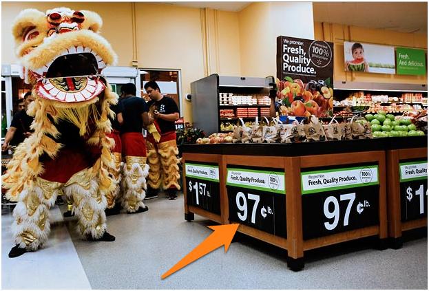
To your local grocery store:
This is called “charm pricing” and it can have a small, but measurable impact on your sales.
Gumroad tracked the conversion rate for products sold on its store. It found that creators who used charm pricing regularly had better conversion rates than those that used rounded pricing.
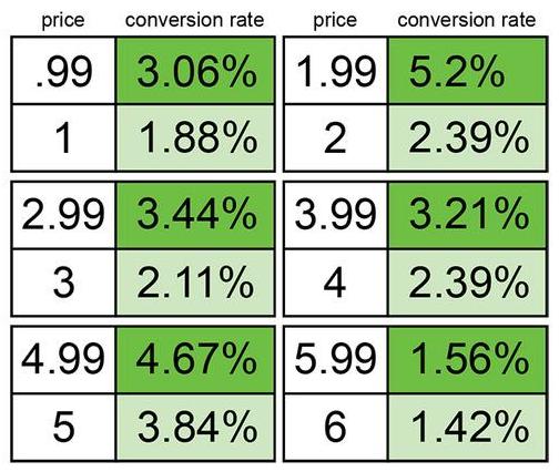
This is one strategy you should definitely adopt in 2016 if you haven’t done so already.
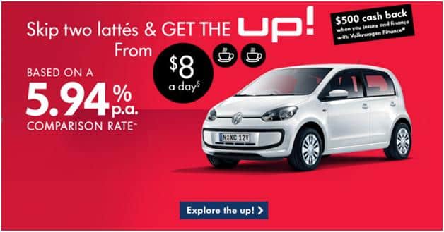
2. Reframe price in terms of time or a common commodity
One way to help customers overcome their resistance to buying your products is to frame the price in a way that’s easy for them to understand.
For instance, instead of saying that your product costs just “$5”, you could say that it costs as much as two Starbucks lattes or a Subway sandwich.
This helps customers understand the price in context. Instead of an abstract figure, the price becomes something see and use everyday.
Take a look at this ad for example:
Another pricing strategy is to reframe price in terms of time saved. Instead of telling customers that your product costs $200, you can tell them how they can save 20 hours every month using your product.
3. Quote high price, then offer discounts on pricing pages
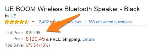
One way to get people to pay more for your products is to use the psychological phenomenon known as “price anchoring”.
Pricing is often a matter of perception. Quoting a high price upfront, then offering a discount does three things:
- It subtly prepares customers to pay more for the product.
- It reinforces the value of your deal. A $100 product sold for $55 sounds like a “steal” with a 45% discount.
- It reinforces the price-quality relationship in the customer’s mind (i.e. the higher the price, the better the product).
Amazon, for example, frequently does this by showing the list price and the actual price on its product pages.
Key Takeaways
Conversion rate optimization can be a confusing process. There are too many things to test and too little time to test them out. Some tests might add thousands of dollars to your bottom line, while others will just waste your time.
These testing ideas should give you a strong framework to start conversion rate optimization in 2016. Try them out one by one and measure how they affect your revenues.
- Design: Use pictures more effectively, control user flow with visual hierarchy, and organize your design around your CTA.
- Product Pages: Use better quality images and videos, use reviews, and leverage social proof.
- CTA: Make your CTA stand out through color, button shape or design.
- Checkout: Experiment with one-page or multi-page checkout, use trust markers, and address FUDs.
- Copy: Use action words, appeal to emotion and be as specific as possible when writing copy.
- Pricing: Offer discounts, use charm pricing and reframe price in terms of time or commodity.
We will continue updating this article, so please share your suggestions in the comments area!
