
I recently wrote the post about 5 UX and Conversion Tops on Product Pages. Here are 5 MORE tips to help you convert more at the product pages level.
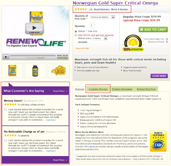
Customer Reviews Ratings
People are more inclined to be swayed about a product by other consumers rather than what you have mentioned on the product page. Customers reviews give other customers an unbiased perspective on a product.
However, the problem for many companies is getting customers to add reviews. You can ask the customer post product purchase and delivery to give feedback of the product that you can display on the product page
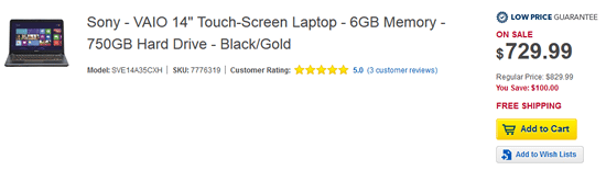
Quantity Option
Problem: without quantity option, users get frustrated in case want to order 10 items of the same product, rather than just one.
The solution is to use the quantity option, which ultimately takes up a small amount of the screen, but can lead to a larger purchase and maximize average order value. Today’s many of the website including BestBuy do not show the quantity option.
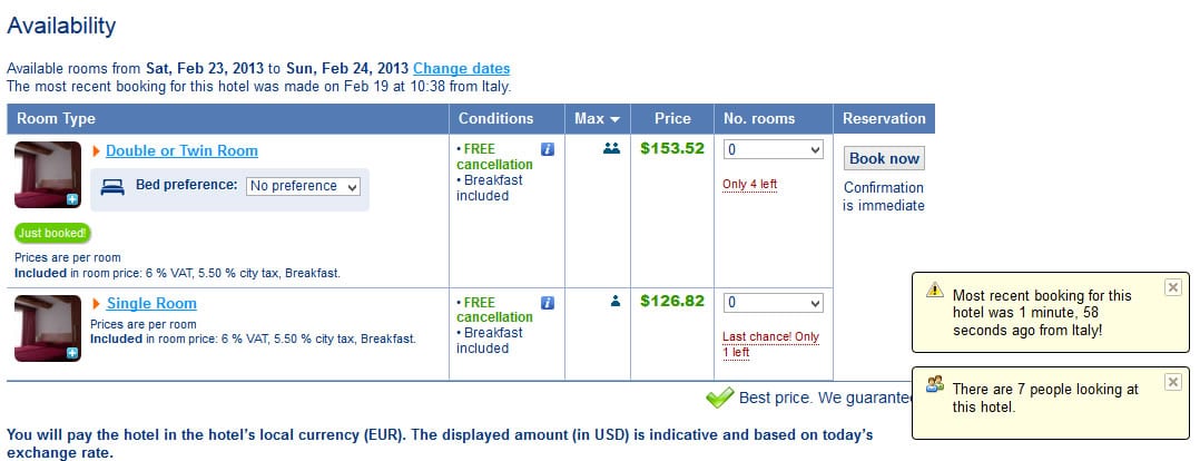
Available in stock
It is very important to let the user know, on the product page, that an item is available in stock or out of stock. Recently, I was traveling to Amsterdam and was looking to reserve a room in a hotel. I went to booking.com and they had a live updates on availability including: how many rooms were available, the last booking that took place for the same hotel, and how many people were currently looking at the same hotel offer. Displaying the amount you have left creates a sense of urgency, which can play on a buyer’s impulse.
Why This Product / List Benefits
It is hard to convince customers to purchase a product with only a product name and product price, especially if the product is not well known, or there is an overabundance of options (why yours not theirs?).
Listing benefits is a useful way of conveying the message that why this is best for the customer. It is always better to list the benefits in an area of the page where customers can see it without scrolling the page.
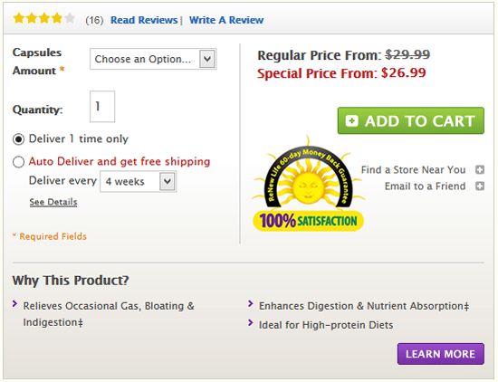
This is the example of what one of our customers did; we had conducted the CRO test with several different options and the winning design was where we listed the product benefits
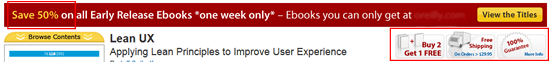
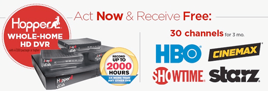
Display Promotions and offers.
It is very important to display promotions and offers on every page level of the website and most importantly on product pages upfront where users want to know all the details, benefits, costing related information. It seems simple, however many businesses miss this opportunity.
Below are a few examples of displaying promotions and offers at product page level.


Ecommerce businesses don’t want to see the users that come to the site abandon at any point in time. By implementing these 5 tips at the product page level, you will help to ensure customers have a better information of the product, which will persuade them further on their buying decision, resulting in more conversions.
