It is very frustrating for businesses to see visitors arriving to the site and abandoning before conversion. Here are 5 tips to better engage customers at the product page level:
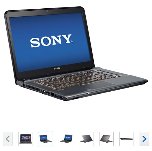
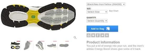
Multiple product images
The problem with using a single product image is that it does not show the all the important features of the product, nor the different angles, which in turn opens up a series of questions and doubts from the potential customer. Using multiple images helps showcase your product from different angles, colors and features. Research shows that using multiple images result increase in conversion in comparison to using product description text to feature the product features, which makes sense since people tend to buy with their eyes.
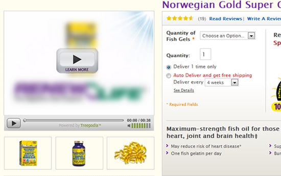
Use of video
Product videos are rising in popularity these days. Most of the shoppers go to product review sites such as cnet.com in order to get a good feel for how the product functions. However, many companies are still hesitant to use videos on their websites. Research shows that adding videos can actually uplift conversions. Zappos sales increased 6% to 30% after featuring videos on their product pages. Also it is a best way to tell your product description and features.
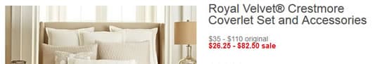
Price and Savings
It is very important to list the price but more important to display the savings or promotion going on the particular product. It builds user psychological interest toward the product and study also shows that listing the saving and promotions leads to more conversion.
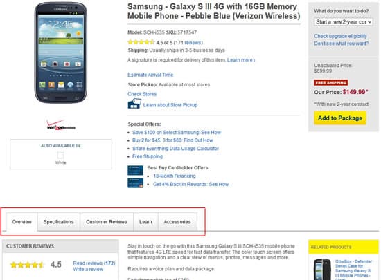
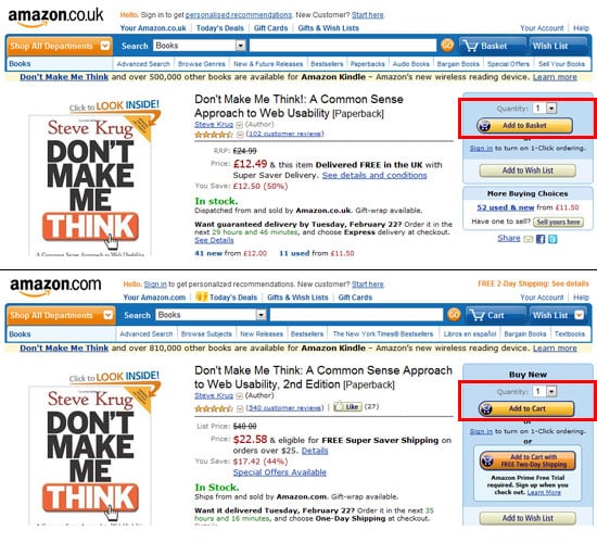
Buy Button
Once you have the product title, images, and price. But the most important thing is to add buy button. The buy button should be largely in size, attentive color and text. These will be different depending on the site.
One more thing is to use the buy button caption according to the various cultures. For example, in United Kingdom, having “add to basked” button is more appropriate and to American “Add to Cart”. The below example of amazon.com and amazon.co.uk shows the difference in wordings.
Product Description (tabbed if possible)
One of the biggest concerns for the designers is to make product pages clutter free with lots of product details. The most popular solution is the “tabbed product details”. It allows the product page more usable space to have for marketing and promotional efforts. And you have the opportunity to expand upon the description, technical details, reviews, and guarantees etc. to the product.