Subscription pages are the gateway for many service providers. But instead of propelling visitors to move forward, unfortunately, they are many times characterized as a “bottle-neck.” What stops a visitor in their tracks after being initially hooked by your service? The following are 5 techniques you can use on to get visitors to sign up on subscription pages :
1. Avoid Clutter and Too Much Information Most people have a tendency to provide “too much information” on one page, in hopes of explaining all the great things about their product or service. However, this can have a very negative effect on your conversion and your ability to perused that visitors to remain on your website. If the information on a page becomes overwhelming and isn’t organized in a way that helps visitors quickly understand, they will bounce at the site. You need to prioritize the very top information your visitor need. Consider these questions:
- What are visitors expecting to see? In other words, what have you displayed to the visitor on a previous page (internal or external) and how would maintain continuity for the visitor?
- What do they absolutely “need” to know? There are things you may want them to know, but do they need to know it to make a decision and to move forward?
- What action are they expected to take? At this point, making sure you aren’t asking too much of them, or too little of visitors is essential.
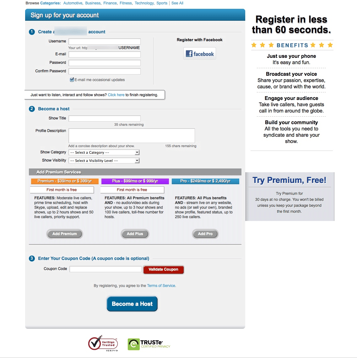
This website was not meeting visitors expectations. It presented information which it thought visitors needed to make the subscription decision. The site also expected visitors to take too many actions on the page (i.e. complete the entire subscription process on a single page).
2. Avoid Too Little Information (and too much whitespace) Well this is awkward. We just said don’t give too much unnecessary information in the previous point? How do you know when it’s too much or too little? There are a few considerations.
- If visitors are not continuing to the next logical step in checkout process, if they are bouncing, if they are going back and forth between steps, you have a problem. Understand what your visitor is saying. Take the following subscription page:
The page provides little information for the visitor, and isn’t expecting the visitor to take a binding action just yet. But why? Why make visitors take one extra step to a page where you can include subscription options as well as the information already listed on that page?
- Your conversion rate. For a service that provides a free subscription option and a fairly cheap price, you expect a 10 – 15% conversion rate. However, when it’s hovering much lower than that, then you need to question some of the choices you’re making.
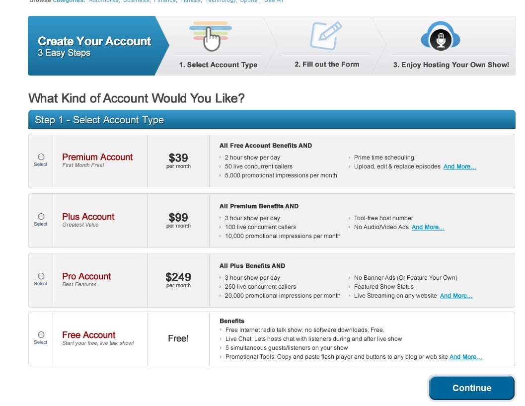
- Use visual indicators to let visitors know where they are in the process. Setting your visitor expectation correctly will save both of you a lot of headaches. Using a visual indicator, the visitor is now aware of the full process with the “3 Easy Steps”. Don’t hesitate in making your visitors go through multiple steps if you need to present them with additional information as opposed to cramp everything into a single page.
They also have “more steps” to take vs. the first design since the subscription options are now clearly displayed with all their benefits, and the form is now on the next page in the process.
- Display all product benefits clearly. The subscription options are now clearly displayed with all their benefits, and the form is now on the next page in the process.
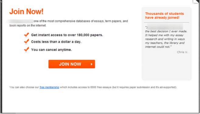
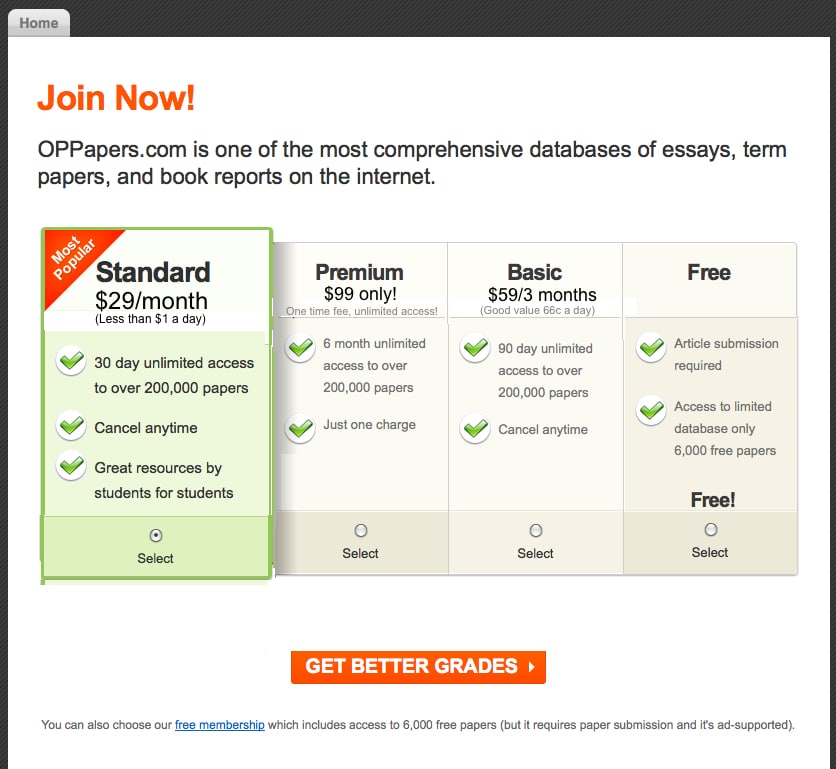
3. Free subscriptions In this blog, the example we showed you on point number 2: providing too little information; was transformed into the example you see below. Subscriptions soared after the release of this new design. Now, many of our service or SAAS customers offer many subscription options to their site visitor, and more than likely, they provide a free subscription option. We test this free subscription in many forms: link, a panel just like the other options, a right nav detail, etc. But what’s important to consider is the conversion of free subscribers to actual paying customers. If it’s high, we recommend flaunting that free subscription and getting as many people as possible to join. If it’s low, the process of converting free subscribers to paying subscribers needs to be reviewed, but in the mean time, not clearly displaying it may be a good option until you’ve got that process squared away.
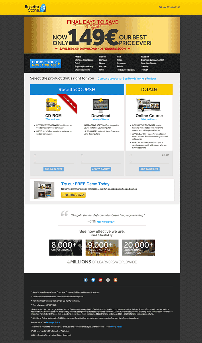
4. Don’t make me think!Sometimes we expect way too much of your site visitors. But we need to make the decision to proceed quite easy for our visitors. In the example below, the page may seem harmless, but there are quite a few expectations that aren’t “clearly defined” for the visitor. The language section, although it highlights “choose your language” doesn’t clearly define that in order to proceed, you must choose the language otherwise you can’t continue. We had a usability test of this page, and many users attempted to Add to Basket not realizing that if they didn’t select a language first, they couldn’t proceed. This is problematic. We always recommend adding language like “Step One: Choose a Language, Step Two: Select A Product.” Little changes like this can really help people that are in a hurry, and get frustrated along the way. We also recommend coloring that supports that process. Having the languages in black impacts the how the visitor views them. They may completely “miss” seeing that box if they are quickly scanning the page.
5. Targeted Banners We have had great success with banners. If the message is targeted enough, and successfully addresses personas, it has always had a positive impact (of course depending on the page it is displayed. We tested a number of banner designs, colorings, and wordings for one of our customers. The 30 day trail, the one below it, one that just had Cancel, upgrade, or downgrade at any time, and one that just had Join 188,000 Satisfied Customers. The one that ended up winning was actually the join dual messages. However, the construction, design (color) and wording of these banners is very key in order to see great gains from it.
![]()