
Despite their importance for the success of your ecommerce sites, usability and user experience (UX) suffer identity crises. Each one is often confused for the other.
There’s no denying the two are related, but not paying attention to their differences can be disastrous for your conversion rates.
The International Organization for Standardization (ISO) defines the two as follows:
- Usability: the effectiveness, efficiency and satisfaction with which specified users achieve specified goals in particular environments.
- User Experience: a person’s perceptions and responses that result from the use or anticipated use of a product, system or service.
A Case of Good Usability & Bad User Experience
Here’s a simple example that shows the difference between usability and user experience on an ecommerce site:
A customer arrives on the landing page for a product she wants to buy. She is able to add the product to her shopping cart quickly and easily, and checkout without minimal effort. The page would score high on a usability scale.
But the shopper was hoping to get a better sense of the product by looking at images taken from different angles and reading customer reviews, and she wasn’t sure that the retailer was reputable. Without the images, reviews and credibility assurances, the customer was left with certain fears, uncertainties and doubts (FUDS) about buying from this particular site. This page would score low on a user experience scale
Usability Comes First
The example above highlights another fact: you can have good usability without good UX.
But, just as importantly, you can’t have it the other way around.
If your site isn’t efficient and easy to use, it will never provide good UX.
So usability takes priority over UX in ecommerce web development.
With that basic principle in mind, the following are ways to improve the usability of your ecommerce landing pages and checkout.
Landing Page Usability
1. Minimize Content – Regardless of the ease and speed at which your visitors can accomplish their goals on a landing page, it will be diminished by crowding your page and doing so with information that does not help to convert customers.
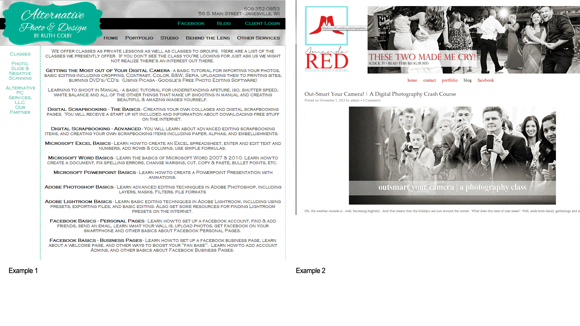
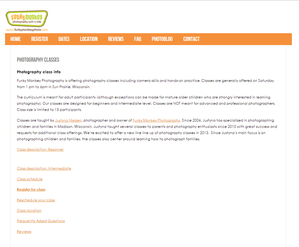
The images below show two of the results from a Google search for “photography classes in Wisconsin”.
A simple glance at the two pages shows the effect of too much content and irrelevant content. The first example is a mass of text – imagine not having at least one photograph on a landing page for “photography classes” – that includes irrelevant information about Excel classes and Facebook Basics.
2. Organize Content – Even with minimal content, usability suffers if the content is disorganized.
In the first example above, not only is there too much content, but the information relating to the original search for photography classes is not grouped together and identified. Instead, it is interspersed before and after information for MS PowerPoint and Word.
Imagine the improvement to the page’s usability that would happen by simply grouping the photography related information together with a headline that identifies it..
3. Design for Usability – Neither of the examples above are particularly good examples of great usability design. For that, we usually need to go to the leading etailers on the web, including Amazon.
Their Kindle Paperwhite landing page has lots of information, but it is designed to maximize how quickly and easily the visitor can accomplish what they set out to do.
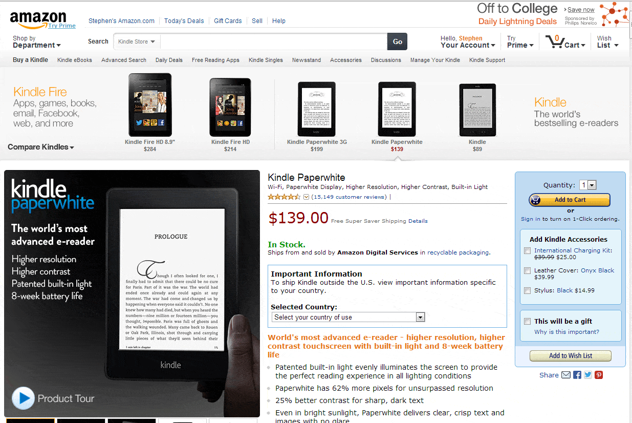
All of the correct design elements are in place:
- Headline – to confirm that the visitor is in the right place
- Image – to reinforce what the page is about and quickly highlight the product benefits
- Pricing – Every shopper wants to know the bottom line
- Availability – Every online shopper wants to know if the products is in stock
- Additional Information – In case it is needed to help the shopper make the decision to purchase
- The Call to Action – Every landing page must ask it’s visitors to take the action that the page is designed to encourage. Oddly, in Example 1 above, there is no call to action.
4. Clear Calls to Action – Merely having a call to action is not enough. Your page should have a single, or at least main conversion goal, toward which your call-to-action leads, and the main CTA must be clearly visible.
In Example 4 below, the “photography classes” page has no single or main conversion goal, but calls-to-action for everything from Registration to Rescheduling. (although the “Registration” CTA is in a bold font!)
The Amazon example above, while having far more CTA’s than the example below, it is still very clear what is the main CTA, and goal of the page.
Checkout Usability
5. Simplify Your Checkout Process – Want more customers to use your checkout? Make it simple and easy to do so.
According to Invesp’s infographic “Shopping Cart Abandonment Rate Statistics”, 11% of surveyed shoppers abandoned their carts because the checkout process was too complex.
6. Get Only the Information You Absolutely Need to achieve Your Goal – Usability implies efficient use and asking for the same information twice, or redundant information – like asking shoppers to list the state they live in after you have their zip code – makes your checkout process less efficient and less usable.
7. Have a Save Cart Function – While this is a usability feature more than a guideline, one of the main problems throughout the history of ecommerce usability and site design is that it began by imitating the bricks and mortar experience.
So the guideline is that ecommerce and street-level retail are two different and distinct practices and the more we focus on what makes them so, the sooner we will improve ecommerce’s appalling conversion rates.
If you visited a store in your local mall, you would not expect to be able to fill a shopping cart, leave it in the store while you go elsewhere, and expect to find it just as you had left it if/when you returned.
But that’s exactly what many ecommerce shoppers expect as part of the nature of online shopping. Going from one site to another takes seconds. Very often, with different discounts, promotions and shipping charges, the only way to compare the price of a basket of goods is to add the products to the ecommerce cart and get a total price, then go to the next site and do the same.
Usability suffers when the shopper returns to the site from which they want to buy and they are forced to refill their cart.
In the Invesp Shopping Cart Abandonment infographic, 24% of respondents abandoned their cart because they wanted to save it for later and they could not.
