There is no such a thing as a perfect website.
No designer, developer, or marketer can alone spot the entire range of problems on a website.
Why? One direct reason is that only real users can identify some of these problems.
The market nowadays is a fierce battlefield, as everyone is striving to provide the best they can for their users. At the frontline, marketers need techniques to better understand websites’ visitors and customers.
There are many articles that tackle usability testing and its benefits. But most of these articles deal with usability as a broad and theoretical term. Most fail to suggest concrete steps to detect usability problems and to come up with possible solutions.
One of the very first steps when implementing the 12-steps conversion optimization system to increase a website conversion rate is to conduct a website assessment. This article will provide 7 concrete techniques used by UX experts and CRO specialists to uncover problems within your website.

1. The Guerilla Testing -In Person Usability Testing
Some VPs of marketing and CMOs are unable to understand that guerilla testing can take place throughout the entire life cycle of a website.
The term usability, according to Nielsen, stands for the quality attribute that assesses how an interface is easy to use for both novices and experts. The ease of use is a goal for designers, developers, and marketers all along.
These usability tests are usually described as laboratory-based studies in which users perform tasks in a set similar to their environment, while observers take notes.
With more than 80% of subject matter experts using it as their first and primary resort when it comes to problem detection, guerilla testing is one of the most commonly used methods for a better user experience, as you can see in the graph below.
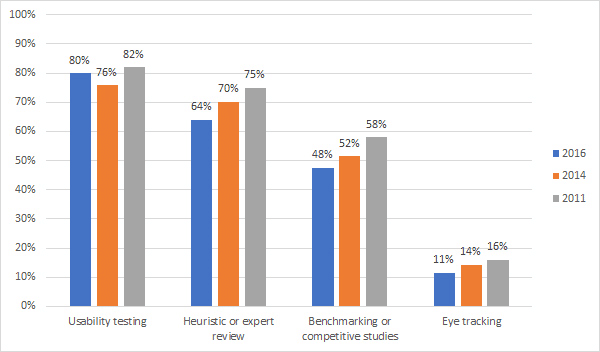
Image source: measuringu
How to Conduct a Usability Testing?
Our detailed guide on conducting usability testing broke the process into 3 stages:
- Step1: Planning the Test
- Identify the Goal of the Research
- Select the Research Method
- Design Your Research Questions
- Recruit Participants
- Step 2: Conducting Your Research
- Step 3: Analyzing Research Results
- Transcribing Your Data
- Data-Mining: Looking for Insights
- Defining Themes & Looking for Patterns
The Usability Testing in Action
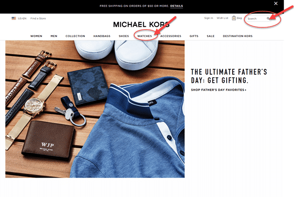
Let’s take a look at this case study of an usability testing for an e-commerce website, where three users were recruited to accomplish the tasks using the existing web-services.
The main objective of this testing was to identify some of the pain points users faced while browsing the website with its current design and determine if users are able to find their way around easily, no matter what they were looking for.
Scenario and Tasks:
Tasks were presented in a contextual scenario for users to complete, as the one below:
‘’Christmas is coming and you want to buy presents for your family. Your mother has always wanted a Michael Kors watch in rose gold, so you want to purchase it for her.”
The aim of having a scenario was to keep the tasks between users as coherent as possible, so the results could be efficiently compared in the analysis.
Tasks:
1. Browse and find Michael Kors watch in rose gold and its details, as price, warranty, the material used for production.
2. Add the product to the cart, and proceed to checkout.
3. Find the information on the company’s policies including its delivery and return practices.
Execution and Observation:
First, participants were asked to browse the website to find the “Michael Kors watch in rose gold.” When being asked to find one specific product using the navigation, two out of the three participants couldn’t locate it right away, and they started questioning whether there was that option at all.
Concerning the second task, the participants had no problem adding the product to the cart and complete the checkout process.
As for the third task, all participants in the usability study had difficulties finding information about the delivery and return policies on the website.
Advantages of Usability Testing
- Help you identify and uncover problems; as user testing can help in clarifying any issue you noticed during analysis of analytics data or heatmaps/video recording.
- Test the validity of a certain feature on a page or on a site.
- Uncover unexpected problems within your website that you may not have picked up on earlier.
- Help you inform the design process.
- Quick and easy to conduct, and it doesn’t require much effort to deal with.
Disadvantages of Usability Testing
- Data contamination: it’s a bit scripted and controlled, so, of course, that contaminates the data to a certain extent.
- Subjectivity: the person conducting the user test can make prompts or suggestions the can impact the validity and compromise the test further.
- Users awareness of the test: because it isn’t a normal online experience but rather a test, users skew their behaviors.
2. Heuristic Evaluation: Critique Expertise and Feedback
Heuristic evaluation relies on using subject matter experts (SMEs) to predict problems in an interface (website/mobile/mobile app) and rate these problems. It’s still one of the most used methods by the majority of experts.
Different CRO companies approach heuristic evaluation in different ways. But all heuristics are rooted in the same principals.
At Invesp, we combine the conversion framework, a form of qualitative data, with our heuristic evaluation process to make sure that we cover as many problems as possible.
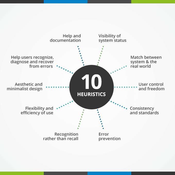
Nielsen uses 10 basic heuristics as broad rules which cover many of the possible user interface problems. You can work your way around these rules, by adding anything that works for your website, as well as by eliminating whatever does not apply to your situation.
So, how many experts should be conducting the evaluation? You need more than one expert to uncover heuristic problems. The more experts you add, the more problems you will be able to uncover.
We usually recommend conducting the heuristic evaluation with 3 to 5 experts. Having more than 5 experts conducting the evaluation does not seem to add a lot more value.
Severity Rating in Heuristic Evaluation
As we go through the process of evaluating a website, there are two things that happen. We uncover problems with the website. These problems receive a rating as follows:
- P1: Catastrophic and nearly unusable for all users, imperative to fix
- P2: Major problems are present but users are still able to perform tasks
- P3: Minor problems are present from some users
- P4: Cosmetic issues only
These items are then sent to client or development team to fix. At the same time, the team will uncover research opportunities. These are items that we need to investigate further, come up with better designs or visitor flow. Research opportunities discovered during heuristic evaluation are one of the basis for our CRO work.
How to Conduct Heuristic Evaluation?
The knowledge and experience of reviewers are crucial for heuristic evaluation, because they can affect the findings drastically.
You go through three fundamental steps when conducting a heuristic evaluation:
The Preparation phase:
- Agree on who will do the review.
- Determine the key principles or guidelines of the evaluation.
- Select the key content areas for evaluation that will cover a wide range of evaluation type.
The Execution phase:
- For each heuristic, experts, individually or in a group, determine how severe each problem is, and provide a severity rating from 0 to 4.
The Consolidation phase:
- Discuss the aggregated findings and point out the problem areas; these problems can be either details or a more general pain point.
- Look for patterns.
- Suggest appropriate recommendations and allocate resources to fix those problems throughout realistic solutions.
The Heuristic Evaluation in Action
The following case study is a user interface evaluation of the Gateway to Electronic Media Services (GEMS) system.
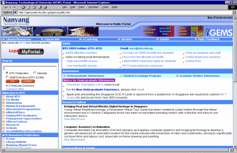
Image source: GEMS
The focus of the study is to determine problem areas of the website and make informed decisions about the areas which need improvements.
For these purposes, a questionnaire was designed based on Nielsen’s 10 heuristics and conducted across a sample of 25 students of NTU.
The evaluation included four different tasks for the users to complete:
- Finding the title of a book.
- Finding the author(s) of the book.
- Finding title of the book using the ISBN.
- Finding the ISBN number of a book with the help of a title.
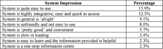
The overall impression of the users:
The users were asked to give their impressions of the GEMS system, as you can see below:
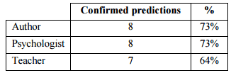
This case study poses an interesting question. Who should conduct the heuristic evaluation? Should CRO/usability experts conduct the review or should we recruit users of the system? If you have the budget and time, do both. If you have to absolutely choose one, then we believe that conversion experts are better than non-specialist when it comes to conducting heuristic evaluation.
Advantages of Heuristic Evaluation
- Obtain feedback in the early stages of the design.
- Obtain more accurate and detailed results.
- Easily obtain meaningful results in a very short time.
- Evaluate and examine potential issues in your website.
Disadvantages of Heuristic Evaluation
- Based on personal inferences made by experts, which makes it subjective to some extent.
- The evaluation may identify minor issues along with some of the major ones.
- The fact that only experts can undertake this evaluation makes it obligatory for you to assign and hire experts, in case you lack the needed knowledge, which requires resources.
3. Cognitive Walkthrough
Cognitive walkthrough is based on suggesting how users would accomplish tasks by tracing the mental processes expected from them.
This technique’s primary focus is the ease using of a certain website, and it’s based on a theory arguing that users learn through a series of exploration and not through a formal way of training.
After choosing a certain task from the suit of tasks that the website supports, the expert’s main objective is to determine one or more sequences of actions that will be actually followed by the users.
How to Conduct a Cognitive Walkthrough?
The process of conducting a cognitive walkthrough evaluation can be done through three major steps:
Step 1. Preparation
- Define an assumed user background and their knowledge of your website.
- Choose a task sample: it should be both realistic and important.
- Specify correct action subsequences for the task.
- Determine interface states along the sequence(s).
Step 2. Analysis
- For each correct action, come up with a successful story that can explain and give reasons why a user would choose to take that action, or a failure story on why a user wouldn’t choose to take that action.
- Record problems, reasons, and assumptions.
- Suggest alternatives and solutions for the defined problems.
Step 3. Follow-up
- Modify your website based on the findings, to eliminate the problems.
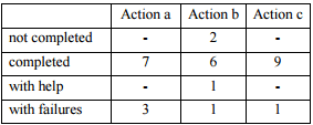
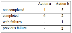
The Cognitive Walkthrough in Action
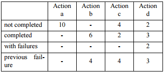
This case study was conducted using the “História do dia,” a children’s website.
The method used to validate the cognitive walkthrough for children included five main steps:
1. Performing the cognitive walkthrough on all the tasks available on the website (performed first by an expert).
2. Creating a list of typical tasks that children perform on the website.
3. Getting two other experts to perform the cognitive walkthrough on the same list of tasks.
4. Testing the tasks with children, and recording their results.
5. Comparing the difficulties experienced by the children and the problems predicted on steps 1 and 3.
Users:
Children aged 5 to 7, with a certain knowledge of using the mouse and keyboard. The users can read as well and know the basics of web navigation.
List of Tasks:
Read the daily story:
- Click the picture associated with the story.
- Click the icon to start the story.
- Click the and icons to navigate through the story.
- Results:
Hear the daily story:
- Click the picture associated with the story.
- Click the icon to start the narration.
- Results:
Read a story from the archive:
- Click the “Arquivo” icon.
- Click the desired month.
- Click on the period within the chosen month, in which the story was first made available.
- Click the picture associated to the story.
- Results:
Vote on the daily story:
- Click the “Votar” icon.
- Choose how many stars will we awarded to the story.
- Results:
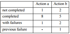
Conclusion:
As shown in the table below, the cognitive walkthrough is a reliable source for usability problems prediction and can provide insightful information about improvement areas within an interface.
Advantages of Cognitive Walkthrough
- It’s an effective method to identify and uncover problem spots, if there are any, and suggest the possible reasons behind these problems.
- it uses a more detailed and more complete procedure with more practical instructions for the experts and it uncovers almost 40% of the problems and hurdles revealed by user testing.
Disadvantages of Cognitive Walkthrough
- Requires expert’s knowledge to be conducted.
- It provides no quantitative data, because it’s mainly based on theory.
- Time consuming at the level of conducting a complete and thorough analysis.
- Depends on analysis and theory rather than user testing.
4. Checklist Review (Guidelines Review)
The checklist review is similar to the heuristic evaluation, but more detailed, based on concrete test statements and a set of best practices and principles.
How to conduct a Checklist Review?
In his book, “Designing Web Navigation: Optimizing the User Experience,” James Kalbach states that the checklist evaluation or the guideline review is conducted throughout three main stages:
- Preparation: this stage involves recruiting the subjects once they become familiar with the key pages of the site, and determining which items need evaluation.
- Execution: at this stage, there are only major steps; you review the test statements, and rate both those checkpoints and how they are met.
- Consolidation: this stage is fully devoted to a thorough analysis to allocate patterns within the findings and how each key page works, what are the main identified problems and what are the appropriate recommendations to address them.
Because of their detailed nature, these statements and guidelines tend to grow over time to cover all the areas where there might be a problem within the website, which requires more attention and focus when being executed.
These statements are time consuming, but still easy to conduct. They can replace usability tests in case there are any budget constraints.
| Evaluation Point | Rating | Comment |
| Navigating | ||
| All the major parts of the website are accessible to the home page | ||
| Critical content is located high in the structure of the site | ||
| Content is within three clicks of the home page | ||
| Alternative navigation mechanisms are available | ||
| An exit point appears on every page | ||
| Further navigation suggestions on every page apart from a global navigation | ||
| Related information is linked together | ||
| Navigation links behave consistently and predictably | ||
| Labelling | ||
| Links are labeled accurately with mutually exclusive terms | ||
| The language used is simple and in terms that the site visitors can understand | ||
| The meaning of navigation is clear, consistent, and useful | ||
| The destination of navigation links is predictable | ||
| Abbreviations are not used; or, when they are used, they are clear and obvious to target audiences | ||
| Each page has browser title that is coordinated with the navigation and page title | ||
| Each page has a clear page title, related to other labels around it | ||
| If the site supports multiple languages, the navigation is flexible to accommodate translations | ||
| Visual Designs | ||
| Navigation options are clear and visible | ||
| Navigation options are readable and quickly scannable | ||
| There is a clear hierarchy of options, labels and headers on each page | ||
| The navigation mechanisms are pleasing and attractive | ||
| The layout is clear with a sufficient amount of white space | ||
| Colors are used effectively to prioritize and organize navigation | ||
| Browser | ||
| Back buttons and other assumed browser functions are operable | ||
| Each page has a human readable URL | ||
| The URL is related to the name of the company and shows a predictable structure within the site via directory structure | ||
| There are no broken navigation links |
Advantages of the Checklist Review
- Quick feedback to designers with relatively direct answers
- The detailed nature, which limits the scope of interpretation and guessing
- Relatively inexpensive
- Doesn’t require knowledge and expertise to be conducted
Disadvantages of the Checklist Review
- Time consuming due to its detailed nature
- Requires a lot of intention and focus when being conducted
5. The PURE Method: A Substitute for Usability Testing
The term PURE stands for “Pragmatic Usability Rating by Experts.” This new method, according to Christian Rohrer, is used to estimate the amount of ‘friction’ a typical user is likely to experience when using an interface. The focus is on examining the ease of use.
To estimate this friction, the method provides a type of scoring, and the experts’ job is to rate it in conformity with to a set of predefined rubrics and criteria.
To simplify scoring, Christian Rohrer came up with colored bars heights. Each bar and color has a significance.
Keep in mind that the numbers and colors shown in the scorecard represent the level of friction; the more friction there is, the higher the number and the ‘’hotter’’ the color becomes.
| Bar heights | Significance |
| The green bar stands for steps that can be easily accomplished by the target users due to the low cognitive loads and mainly because the patterns are known. | |
| As for steps that fall in the yellow range, they require some efforts from the users’ part to be accomplished as well as having a significant cognitive load. | |
| The red is bar indicates steps that users would be able to accomplish, but require a humongous cognitive load. However, most of the steps in this stage are challenging. The majority of users is likely to fail. |
As the name suggests, with the PURE method experts first quantify the ease of use of a website by aggregating rates, according to a set of criteria. Next, they provide qualitative insights on how to fix the issues they rated.
The PURE method combines both behavioral and attitudinal measures. In this sense, it enables you to fill the gaps left by the traditional methods, which can be either behavioral or traditional.
You can find below a scorecard demonstrating the aggregation of scores in every task.
The numbers and colors also indicate an overall rate for the task, usually determined by the worst score.
For instance, in the following example, a single step rated (3) on ‘browser extension’ led the entire task to be labelled red, indicating failure points in a fundamental task.
At the scorecard, green and yellow indicate tasks easy to fulfill, with less friction.
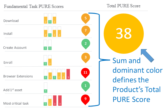
Image source: app.box
How to conduct the PURE evaluation?
The PURE evaluation is quick, cheap, and reliable. However, it takes around ten detailed and specific steps to receive valid results.
Identify target users profiles: defining your type of users profiles will help the experts keep the rating consistent. For this task, we usually recommend our panel reviews the website personas.
Defining fundamental tasks: identify tasks that are fundamental to your evaluation by asking questions as:
- “What are the critical tasks for the business to succeed?”
- “What kind of steps allow the target users to meet their core needs?”
Uncover your users’ happy paths: the name happy paths refer to the most desired way in which your users wish to accomplish their tasks.
Having more than one path sounds reasonable especially when you have more than one user but it will result in loads of work and data analysis in latest stages.
- Setting your steps’ boundaries: this stage is dedicated to setting your steps’ beginnings, where users are provided with a set of options, as well as the endings, when they are expecting a response from the interface.
- Review by 3 expert raters: A panel of 3 CRO specialists gathers in a room to conduct the PURE review. We try to select experts that does not have previous involvement in the design in hand or any other product professionals to avoid bias and subjectivity when rating. The lead in the panel starts performing each of fundamental tasks. The rest of the panel will observe and record a score. Each member of the panel will record his score silently without sharing it with others. Again, each task will be rated on a scale of 1 (easy) to 3(challenging).
- Determine PURE score for each task: In this step, the panel goes though the tasks and each member reveals his score for the different tasks. The panel must agree on the score for the task.
The panel might have different opinions and rate differently, which will lead into having the following cases:
- Case 1: all three decide on the same individual score: in this case the decided score is obvious and the marge of disagreement is absent.
- Case 2: 2 out of 3 agreed on a certain score; it’s obvious that the score represents the majority, unless the discussion revealed opposite insights that the majority have missed and the panel decided to choose the less popular score as their decided score.
- Case 3: all three experts have different scores, in this case, the discussion will clarify any wrongful assumptions or misunderstandings to the method or interface.
Summing up the PURE scores: in the final step, the score for each task is added up. just as mentioned earlier, these numbers, bar heights, indicate the simplicity or the complexity of the task in hand. Knowing where your users encounters hurdles help give you more space for improvement and enhancement within your product.
Advantages of the PURE Method
- Easy to conduct and cost effective.
- You can use it on user experiences that haven’t been completely built yet.
- Provides regular assessment and tracks improvement over a long period.
Disadvantages of the PURE Method
- Requires knowledge and expertise to be conducted.
- Time consuming and requires a lot of effort and planning.
6. The Navigation Stress Test
The navigation stress test was first introduced by Keith Instone. This test asks tough questions about your website, helps focus on navigation issues, and forces you to make conscious design decisions.
These questions revolve around three basic points:
- Where I am?
- What’s here?
- Where can I go?
How to Conduct a Navigation Stress?
The stress test method is quite easy and simple:
- The first step is about randomly choosing a webpage.
- After removing the URL from that page, print it in black and white.
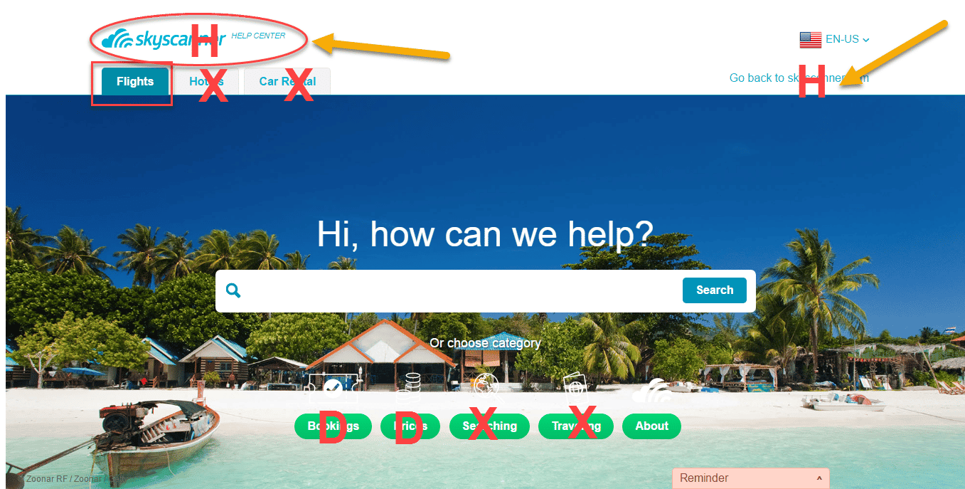
- Pretend to be a first-time visitor or you can ask someone who has never seen the site before to participate in the test, and try to answer the questions included in the chart below:
| Navigation Questions | Mark up on the paper |
| What is this page about? | Draw a rectangle around the title of the page or write it on the paper yourself |
| What site is this? | Circle the site name, or write it on the paper yourself |
| What are the major sections of this site? | Label with X |
| What major sections is this page in? | Draw a triangle around the X |
| What is one level up from here? | Label with U |
| How do I get to the home page? | Label with H |
| How do I get to the top of this section of the site? | Circle the major groups of links and label:D: More details, sub-pages of this one
N: Nearby pages, within same section as this page S: Pages on same site, but not as near O: Off-site pages |
| What does each group of links represent? | Write the set of selections as:Choice 1 > Choice 2 > … |
Chart source: instone
- Start marking up the question you answered with the symbols in the chart.
- Prepare recommendations and solutions for the questions you didn’t answer based on the findings.
Applying the Navigation Stress Test
Advantages of the Navigation Stress Test
- Among the cheapest methods to evaluate your website.
- One of the quickest techniques to apply.
- No need to hire experts to conduct the test.
Disadvantages of the Navigation Stress Test
- The major problem with this method is the limitation to the specific page you are evaluating. It is hard to generalize the findings for the other pages of the website.
7. UX Benchmarking Studies
UX Benchmarking studies, also called summative studies, help you position your website features in comparison to industry standards.
With benchmarking, you can test, measure, and track how well your website is doing in correlation to user’s experience metrics over time.
These studies combine both quantitative and qualitative data to measure and quantify the user experience.
Benchmarking studies can be divided to two categories:
Stand-alone Benchmarking: this type of benchmarking is an extremely effective method to help you establish your own best practices, identify problem areas through comparing evolution of your website over time.
Competitive analysis: this type of analysis is based on adding another component to the equation, usually your most important competitor, to help compare your site key performance indicators, such as:
- success rates of revenue driven tasks
- efficiency metrics such as time on tasks
Net Promotor Scores (NPS) with competitors to recognize and see the areas that they need more focus in comparison to them.
How to conduct a Benchmark in 4 steps?
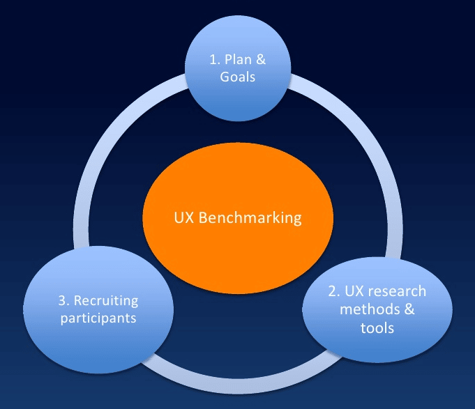
Image source: Slideshare
1. Set a plan:
- Determine and define your comparators or what do you want to benchmark and why. For instance, it could be all your Key Performance Indicators (KPIs) or just some of them.
Examples of KPIs:
- Satisfaction
- The average number of errors
- Task success rate
- The average time of tasks
- Define your target audience.
- Select competitors to benchmark against.
2. Conduct research using task-based testing:
- the rationale behind choosing a task-based testing is to make sure that your based line metrics are available for later measurements.
3. Gather both quantitative and qualitative data:
- Use the quantitative data for testing.
- Use the qualitative data to support your findings and support the why.
4. Re-test and research at least twice a year: to measure and track the changes and see if your expectations are met.
UX Benchmarking Studies in Action
In the following case study, you can check an UX Benchmarking conducted between American Airlines and Delta Airlines.
The plan
The plan for this study included pre-task questions, two tasks to be performed, and follow-up questions:
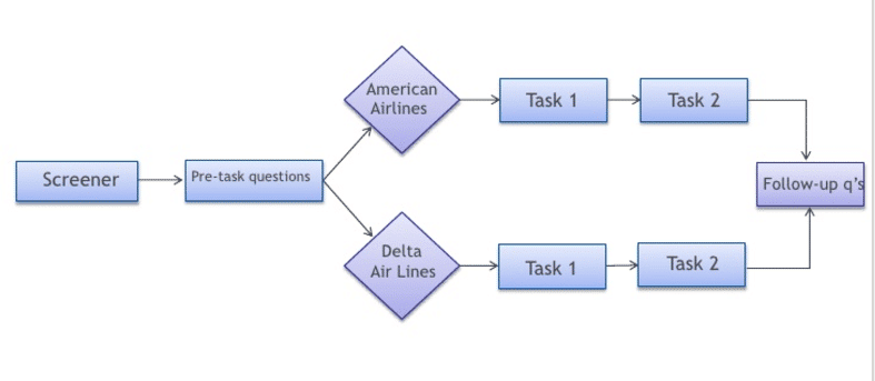
Image source: How to conduct UX Benchmarking
The tasks
The two tasks users had to perform were:
- Go through the entire process of booking a flight.
- Locate the total price for checking in two bags.
The post-tasks included:
- Self-reported success
- How satisfied were you with the process of booking a flight?
- Ease of use
- Ease of navigation
- Clear where to start
- Satisfaction with amount of time to complete the task
The wrap up included:
- Overall rating
- Post-task branding attributes
- What did you like the most about the airline website?
- What did you like the least about the airline website?
- Likelihood to recommend
The results
For the first task, the majority of participants reported being able to successfully complete the entire purchase process.
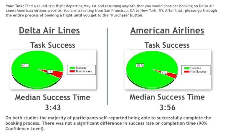
Image source: How to conduct UX Benchmarking
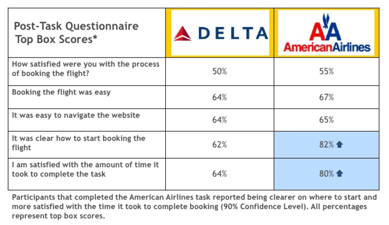
Image source: How to conduct UX Benchmarking
For the second task, the majority of participants reported not being able to find the total price for checking in two bags.
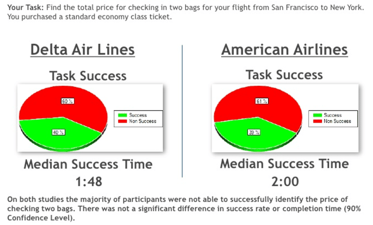
Image source: How to conduct UX Benchmarking
These are the heatmaps of users’ paths when trying to complete the second task:

Image source: How to conduct UX Benchmarking
Both websites had negative scores for recommendations. Most participants reported they would not recommend the sites to family and friends.
Advantages of Usability Benchmarking
- Puts you in continuous improvement mode.
- Helps you to understand how much improve you need to achieve significant performance.
- Enables you to outperform your competitors.
Disadvantages of Usability Benchmarking
- Enable to measure the overall effectiveness.
- Puts your business at risk in case you choose the wrong type of competitors.
Over to You
Choosing the most trusted and adequate method to enhance the user experience within your website is indeed an overwhelming process.
Taking into account the large numbers of methods out there, keep in mind that no matter which one you conduct, at the end of the day, you need to make sure that you have chosen the most feasible for your situation.
Test for the right reasons and you’ll have a good chance of achieving great outcomes. Do the opposite and you’ll end up with some misleading insights, wasting hours, resources, and putting your whole business at risk.