
Let’s do a mental throwback, shall we? Think of every time you’ve had to sign up to take a course, download an application or input your email to get a lead magnet.
Can you picture those times perfectly? I’m sure there was a button you had to click on to either download, signup, or buy something.
Now, let’s flip it. Think of the times your marketing campaigns, emails, and landing pages have successfully performed.
Can you remember? I’m sure most (if not all) of your campaigns had a button that people had to click on to get something they wanted.
Well, that button has a name. It’s called a call to action or CTA button.
Marketers commonly know that the call to action button on a website, email, landing page, or ad is an important web element that impacts conversions.
It is one of those web elements that directly impact conversions.
If you want to understand the importance of CTA’s better, how to come up with winning CTA’s that boost conversion, call to action best practices, where to place your call to action, and how to use calls to action to boost your CRO marketing efforts, then keep on reading.
P.s: there’s a difference between being pushy with a call to action button and convincing your customers/web visitors in a friendly way to take action; this article will show you how to get your customers to take action with examples.
What Is A Call To Action?
A call to action (CTA) is an instruction that encourages the reader to take the desired action on your marketing campaign. CTA buttons can be found on websites, adverts, landing pages, or within blog posts.
Think of the call to action as a door that your web visitor clicks on and opens up to the other side of your website. Your CTA button lets your web visitors know you want them to take the desired action.
This desired action often will be the next stage in the customer journey. This leads the prospect further down your funnel.
Unlike the popularly believed notion that the call to action button is used to get purchases, there are other uses for the CTA like;
- Get site visitors to sign up for your email list.
- Getting site visitors to download a free resource.
- CTA buttons can be used to incentivize customers to refer your brand to their friends.
- Calls to action can be used to get customers/web visitors to leave you a review.
A call to action typically includes clicking on a button or a link. Web visitors rely on them to know what’s next or what’s on the other side of the website waiting for them.
The Importance Of A Call To Action.
Let me paint a scenario here for you. Your target audience lands on your website for the first time; they’re still a prospect, and they’re still at the top of your marketing funnel.
It’s part of your plan to convert them to paying customers within the shortest possible time.
You’ve optimized your website and your content; what’s left is for your potential customers to click on that CTA button.
That all shows that your potential customers won’t know what you want them to do on your landing page without an appropriate CTA button.
To help you understand better, here are three reasons that reflect the importance of having a call to action button;
- In many cases, the call to action button is the determining factor between a web visitor remaining as a lead or turning to a conversion, which many businesses want.
- Calls to action act as signposts, telling your leads what to do next. Without an identifiable call to action button on your website, advertisement, and content, your web visitor will be clueless about what next to do.
- Without having a visible call to action, whatever message you’re trying to convey will fall flat on its face.
Remember, as a marketer or business owner, if your call to action is poorly worded, you risk leaving conversions and money on the table that can positively impact your bottom line.
Here is an example of a poorly worded call to action from Verve Coffee:
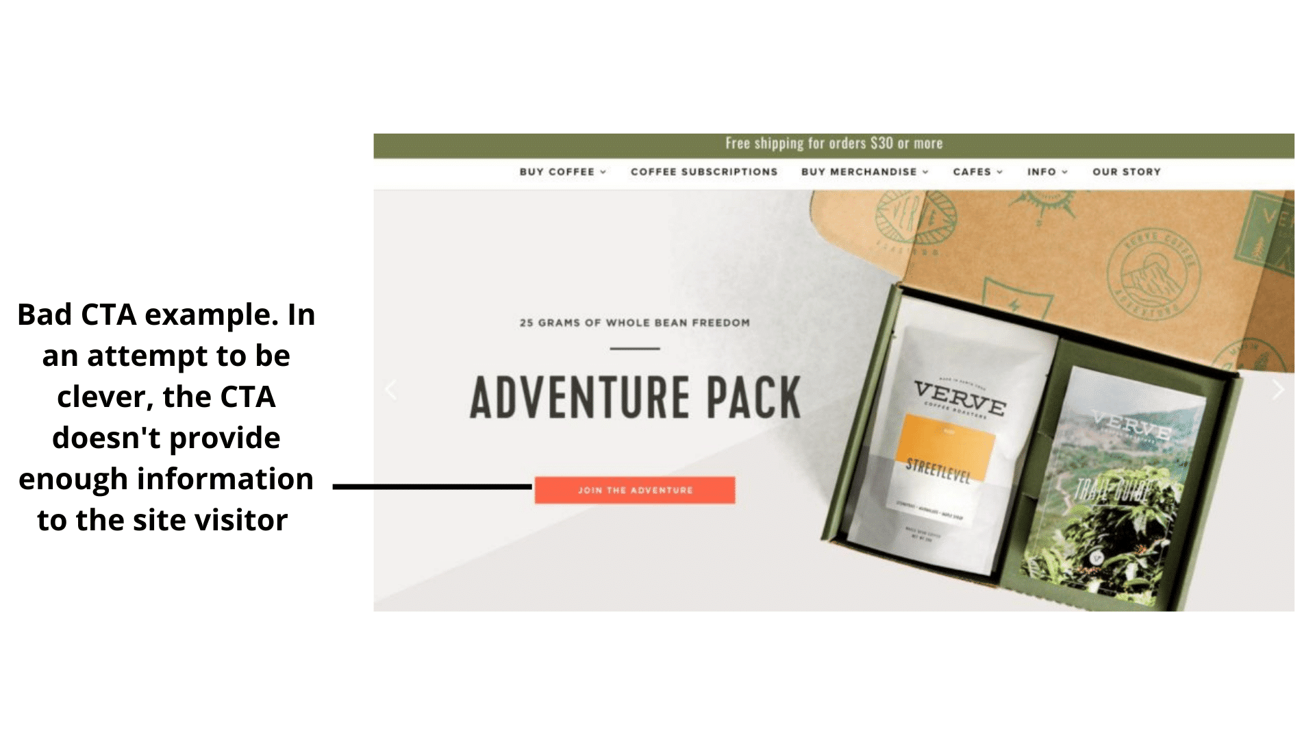
The website Verve coffee sells coffee. People who visit this website want to get coffee. But as soon as they land on this site, the call to action asks them to join an adventure. What adventure?
Your guess is as good as mine. This feeble attempt to be clever will cost the brand some conversions.
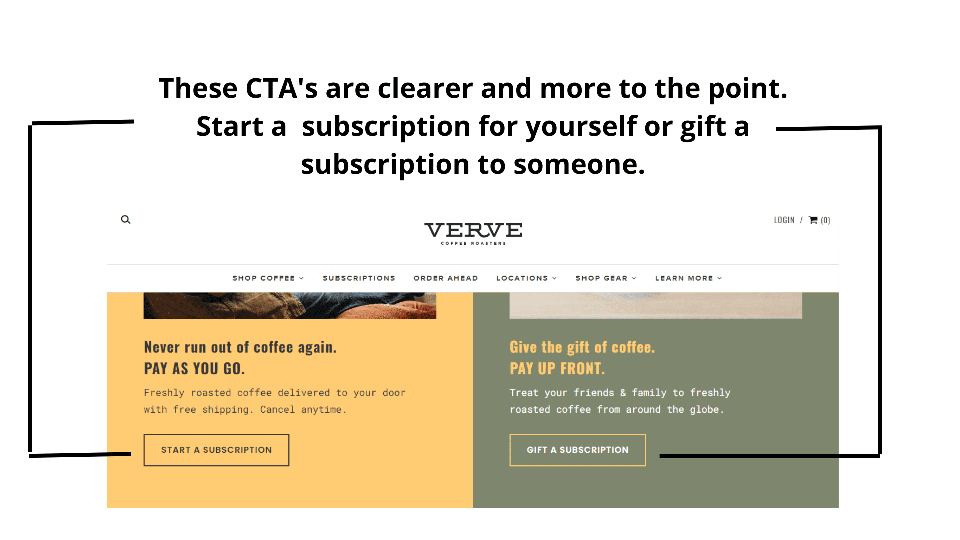
Now, these CTA buttons are much better. There’s no attempt to be creative; the copy surrounding the call to action button talks about coffee, and the CTA button supports the sales pitch.
This alignment of thought is not confusing to the web visitor – she knows if she clicks the button on the right, she’s starting a subscription. If she clicks the button on the left, she’s gifting a subscription to someone special.
The following section shows you how to create a compelling call to action.
Five Tips To Creating An Effective Call To Action.
The first thing to note is that there’s no one-size-fits-all out there for writing effective calls to action.
Many websites, ads, emails, and blog content have call-to-action buttons sprinkled around them, yet they do not see as many conversions as they want.
What could be wrong? I’ll tell you.
Many marketers use templates to come up with CTAs on their websites. And this is a problem because most CTA buttons are not showing any value to prospects.
This leads to your next question.
Is there a way to write calls to action that stokes people to take the desired action on a website? Yes, and in this section, I’ll show you how.
1. Tailor To The Platform
Calls to action are not specific only to websites. The way you write the call to action used in email and social media ads is different from how you write CTA for websites.
Here is what I mean.
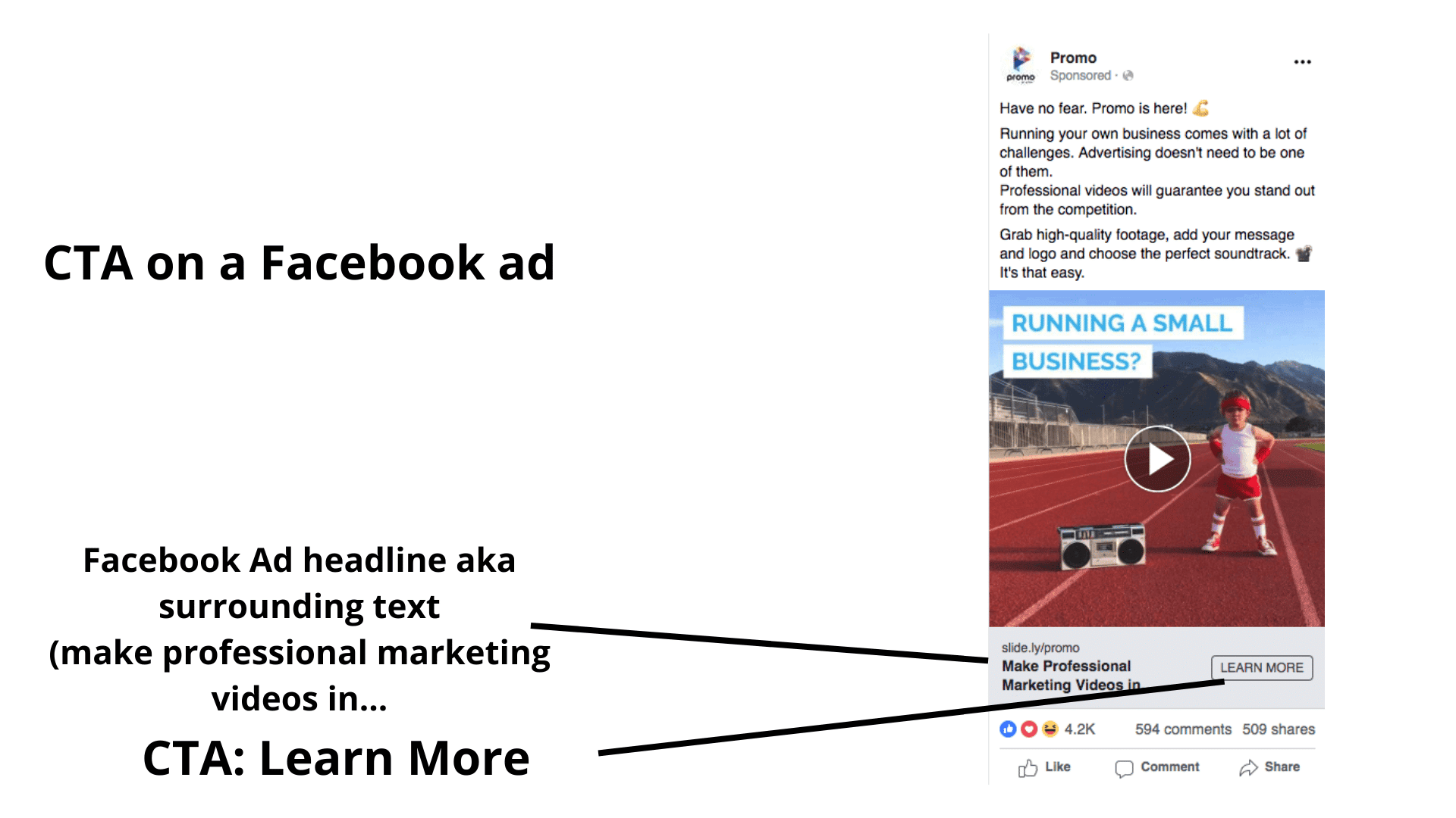
The CTA’s on social media advertisements are short, but they always have supporting statements like headlines; this makes the call to action fit in with the platform. Here’s an example;
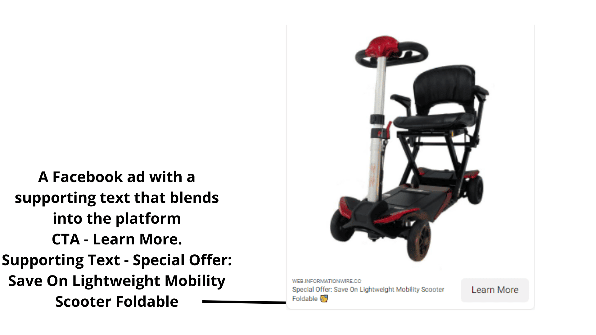
As you can see in this example, the CTA button on this Facebook ad is ‘learn more,’ but attached to it is this headline – Special Offer: Save On Lightweight Mobility Scooter Foldable. That is a mouthful, but it blends perfectly with the social media channel.
On the other hand, writing the call to action for emails is generally short and straight to the point, not a mouthful. Here’s an example of a call to action for email;
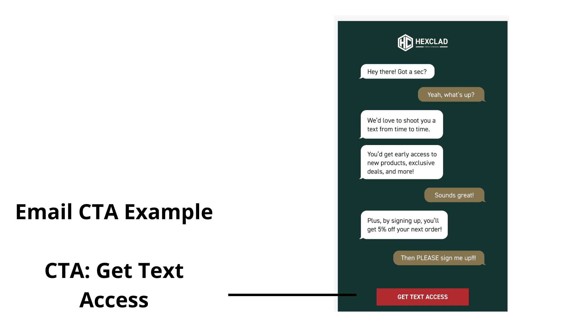
Get Text Access. Simple, short, straight to the point.
2. Tell People What They Will Get
Everyone is busy. According to a study by Microsoft Corp, people are easily distracted; the average attention span is 8 seconds.
So, when a lead lands on your website, it must be clear what they stand to gain by clicking through on your CTA button, or you might lose a potential conversion.
Look at two examples below about a fragrance brand, and tell me which one you think will motivate the lead to take the desired step.
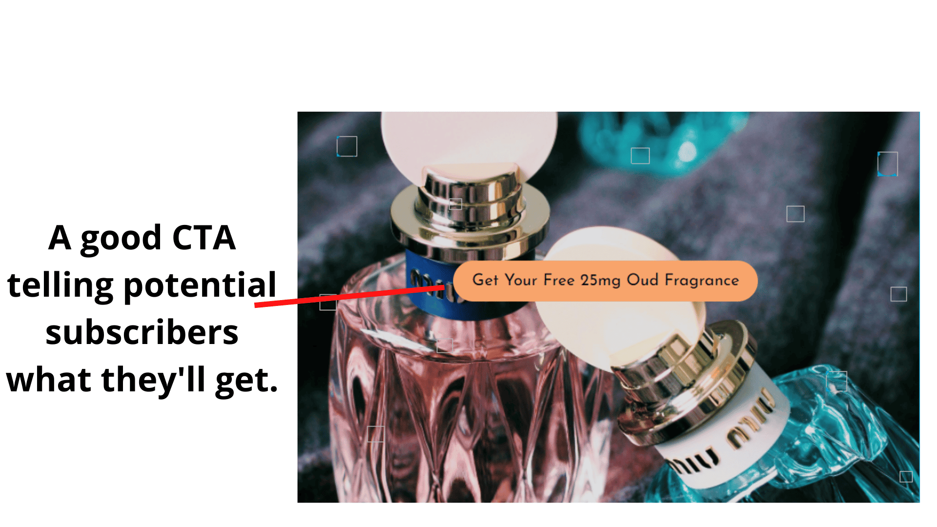
- Get your free 25mg Oud fragrance.
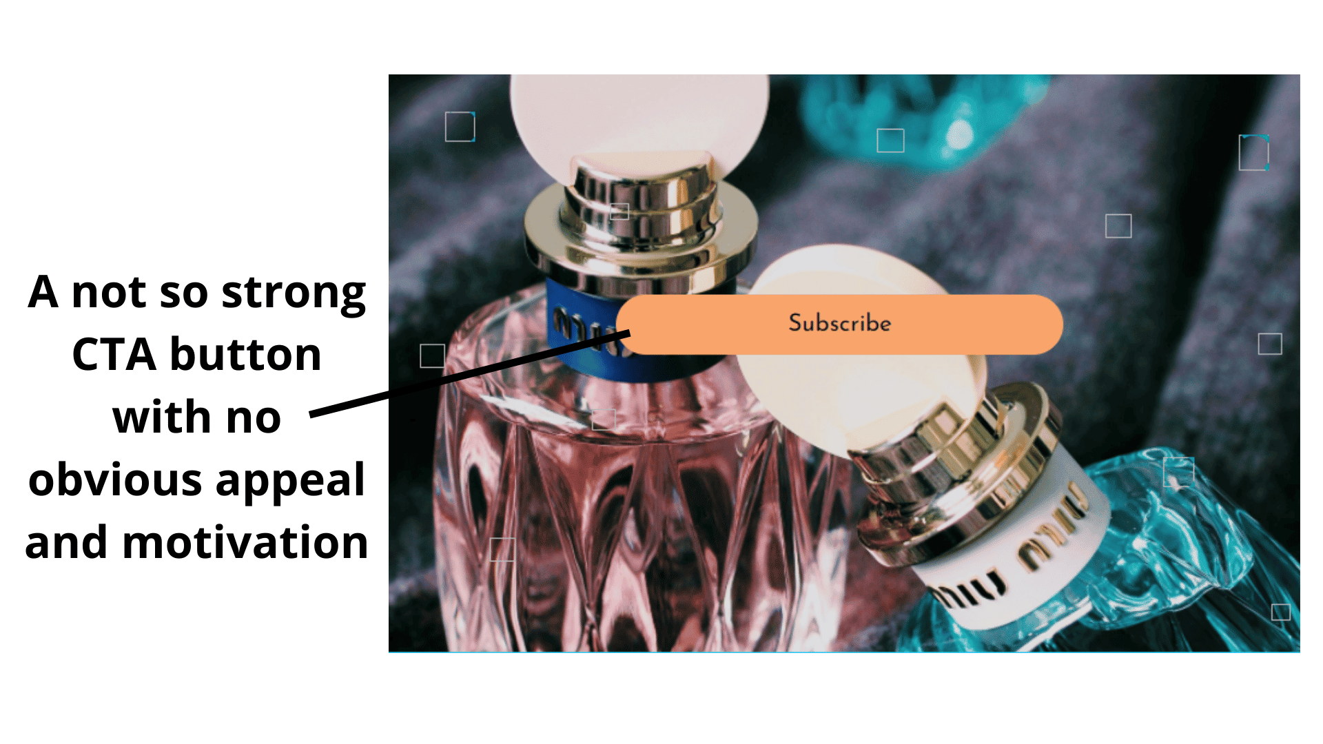
2. Subscribe.
At first glance, the first CTA uses a freebie tactic and tells the potential subscribers what they will get. This action alone will motivate more site visitors to sign up to get the ‘free fragrance’ (more on this tactic later).
The second CTA is one that’s usually seen all around the internet. Marketers who’re not putting enough thought into crafting an appealing offer. Compared to the first call to action, the second one pales; it does not give a compelling reason why your potential customer should become a subscriber.
Sure, some of your website visitors will hit that plain subscribe button, but you’re better off using a CTA button that looks like the first one.
3. Enhance call to action copy with trigger words
Many CTA’s fall flat on their face because their copy does not contain trigger words.
Here’s an example of driving home my point;
1. Download
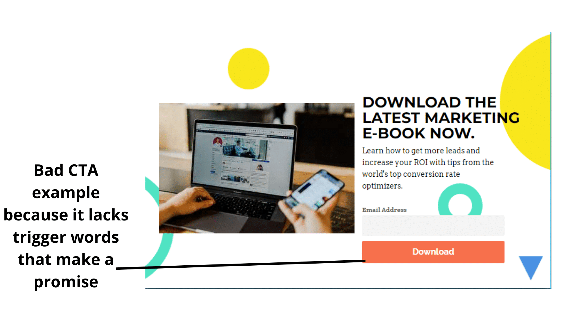
2. Get More Buyers
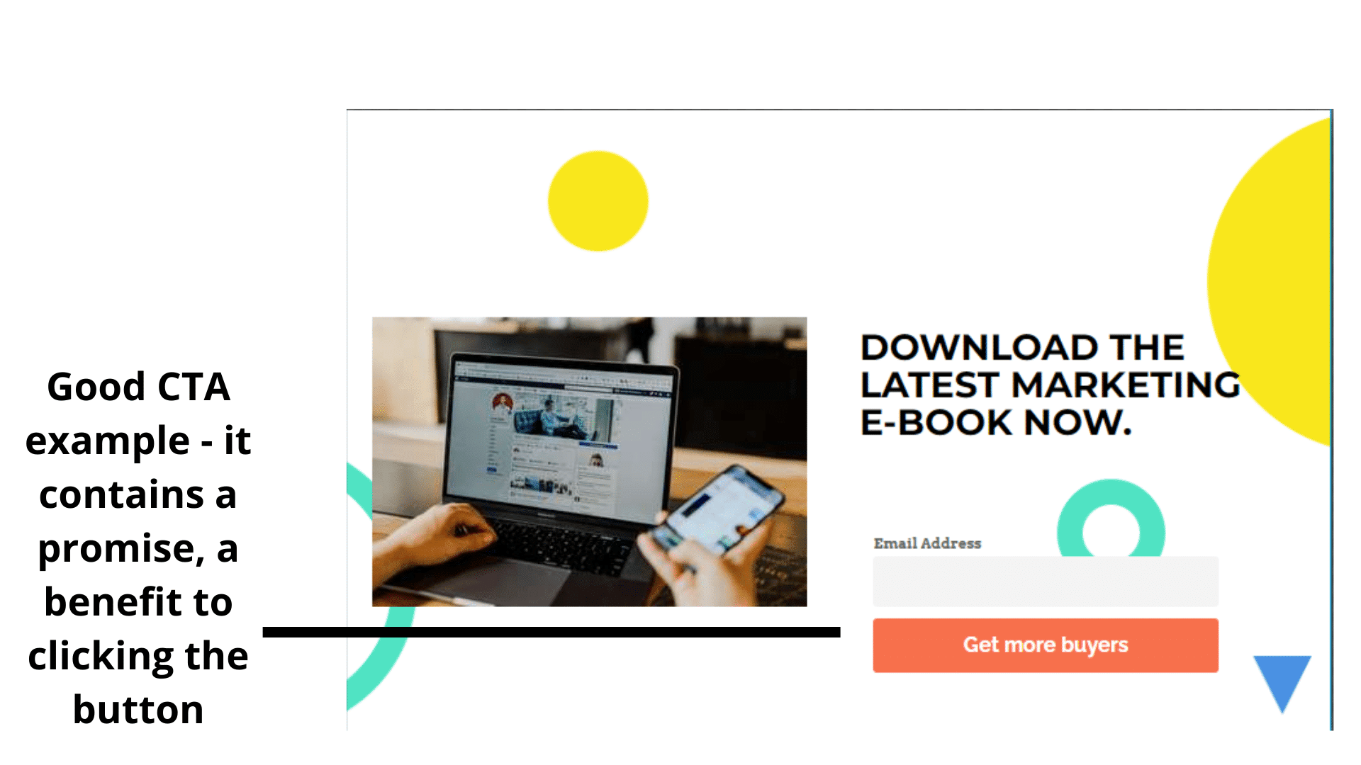
Note these CTA’s are not the standard for CTA’s, just illustrations.
Now, analyze with me. The first CTA will appeal to some web visitors if we were running an A/B test and our focus was on just the calls to action.
The second call to action is where my money is on. Take note of the choice of words ‘Get More Buyers’ these are words that will push marketers to click on the CTA button because it promises them what they’re about to download will help them get more buyers.
These are just illustrations, not definites from an A/B test.
Moving on.
4. Foster Curiosity and Anticipation
Calls to action that foster curiosity will always get more clicks.
If you craft your CTA message to create desire in your prospects to know what’s on the other side, they’ll be more likely to click it.
Here’s an example from Crazyegg; Show Me My Heatmap
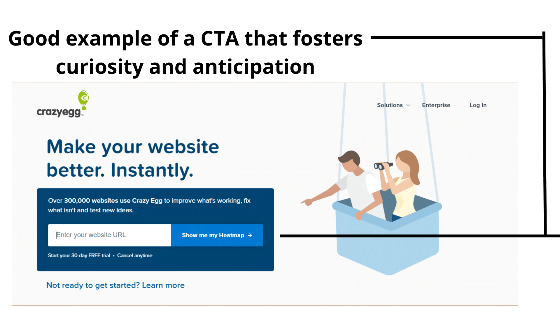
What makes curiosity-driven CTA compelling is that you’re revealing the result in the call to action copy, but you’re not showing how to get there unless the web visitor clicks the button.
5. Let Your CTA Standout
Web visitors become blind to CTA buttons majorly because of two things;
- The same CTA is used across competing websites (templated call to action with no variation in creativity and copy).
- Calls to action that blend into the background (the CTA button color and website background color are the same.) Here’s an example.
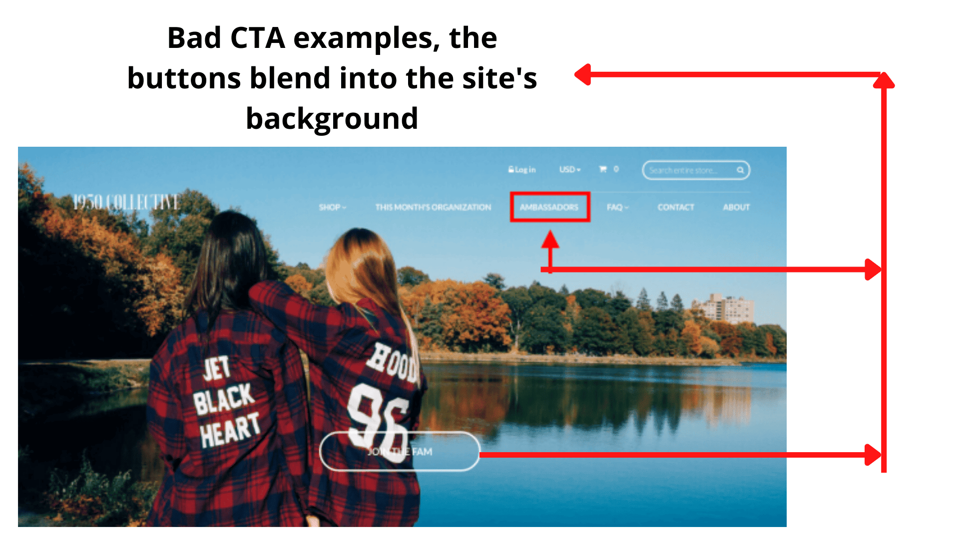
The ‘AMBASSADORS’ and ‘JOIN THE TEAM’ are supposed to be calls to action, but you have to squint hard to see them.
The first point deals with the issue of the sea of sameness. Because the CTA button reads alike across a niche, it becomes difficult for you to stand out and motivate the potential customer to action.
The second point touches on using colors to make your CTA button stand out from your website to draw attention to itself. As visual creatures, humans will notice a color contrast.
Think of a blue-colored button on an ash background. No need to picture it; here’s an example from Copyblogger.
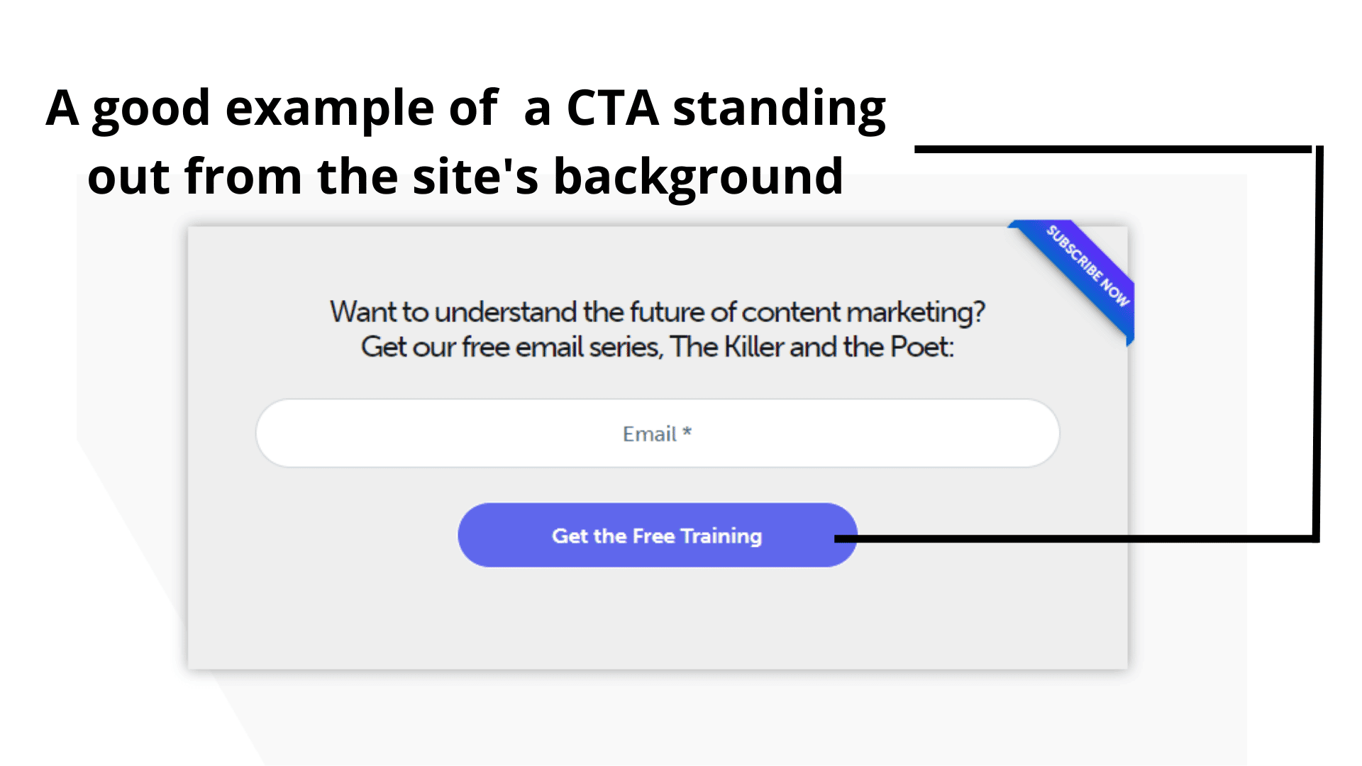
This contrast will stop scrolling eyes and draw attention to what’s written on the button (more on this in its section).
Next section deals with where you can creatively include a call to action as a marketer or business owner.
Where To Include Your Call To Action.
Are calls to action only meant to be included on websites and landing pages? No.
There are other places you can include a call to action. This section seeks to address that.
Let’s start from the most popular;
CTAs on Websites
When first-time web visitors and returning customers come to your website, there should be a call to action button above the fold for web visitors who want to take immediate action.
Here’s an example from Mixpanel.
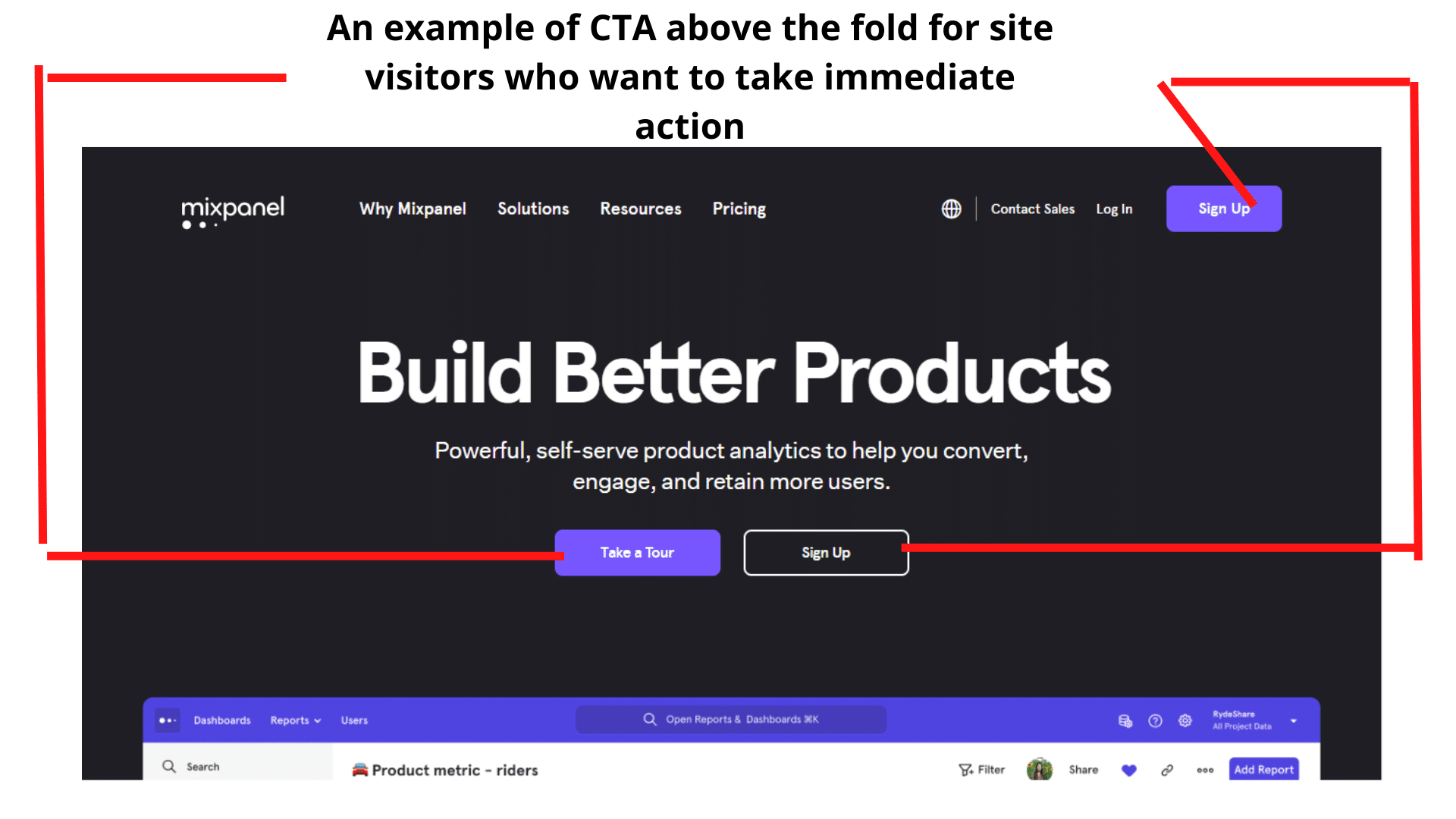
Above the fold, you can immediately see three buttons, ‘take a tour’ and ‘sign up.’
Each button serves two different purposes depending on what the visitor wants at the moment.
Now, if a lead decides to scroll down, the header is fixed, and it has the signup button, which the lead can click on anytime to sign up for this service.
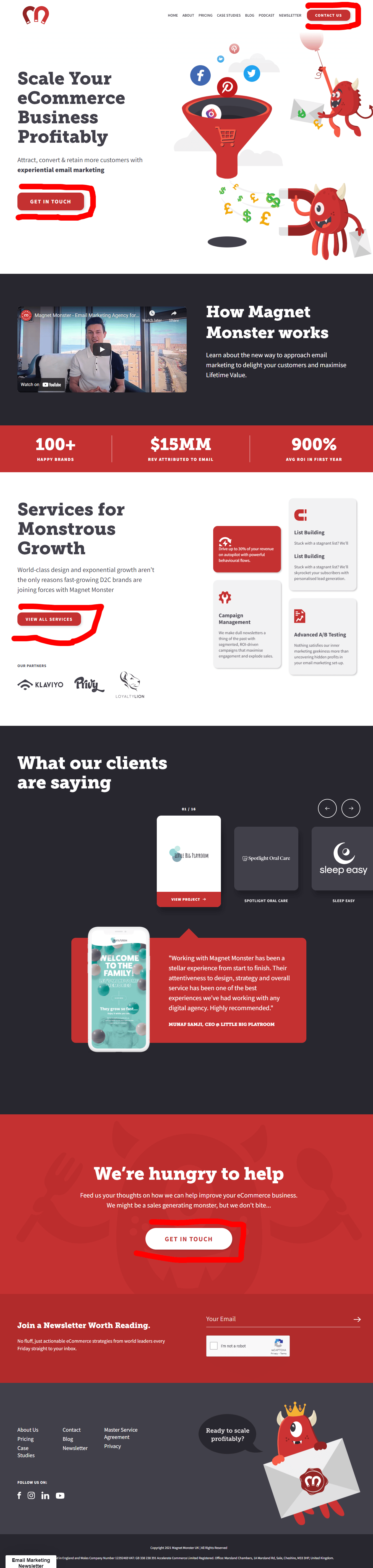
If your landing page is long, you can decide to have multiple CTA buttons at different portions of their homepage; that also works. Here’s an example from Magnetmonster.
To know what works for your brand regarding the number of calls to action you should have on a page, run an A/B test, and view the heatmaps of the result to see how users interacted with the CTA elements.
Professional tip: on your website, it’s best practice to put your CTA button above the fold. This is because when a prospect lands on your website, they don’t have to look for your CTA in case they want to take immediate action.
Also, note that you could set up your CTA button so that it moves when the web visitor scrolls so they can always see it to take action when they’re ready.
Another solid point to note is that having more than two call-to-action buttons on your mobile landing page is advisable. This improves the customer experience because it prevents the site visitor from scrolling up or down looking for your CTA.
A final note on this section.
Eye-tracking studies have shown people scan web pages, emails, blogs in different patterns, and heatmap sessions have helped us identify the reading patterns, some of which are the Z and F reading patterns.
Use a tool like Figpii to analyze the heatmap sessions of your web pages, identify your audience’s reading patterns, and put your CTA where they’re most likely to see it.
To understand reader user patterns and how they can improve user experience, see this article by the NN group.
CTAs on Emails
Emails these days are sent with the intent that the receivers take action. The call to action button lets the reader know where to click and what they will be expecting.
You can place your CTA button at the bottom of the email, the middle, or the top.
See some examples below.
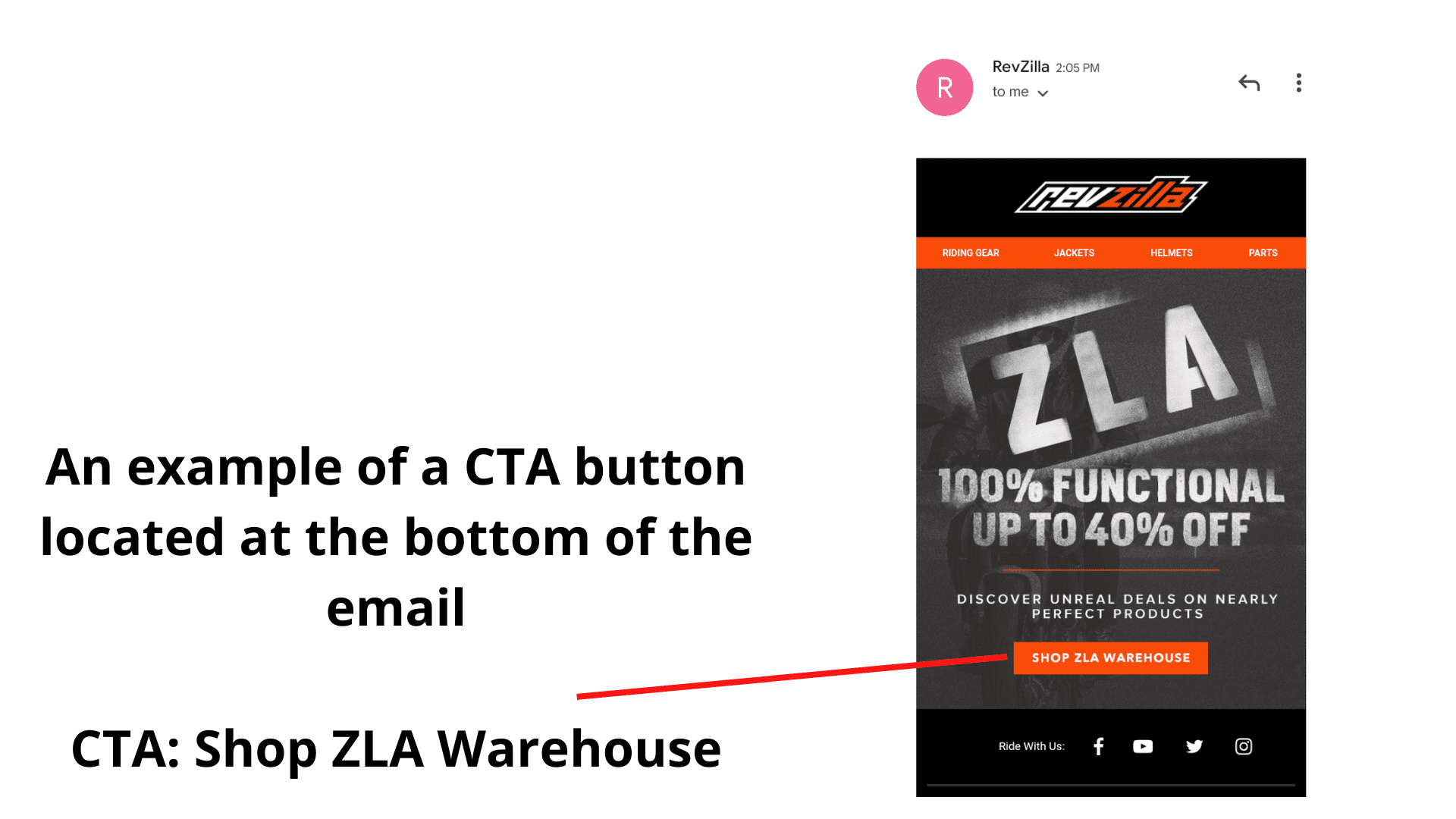
This CTA button is at the bottom of the email.
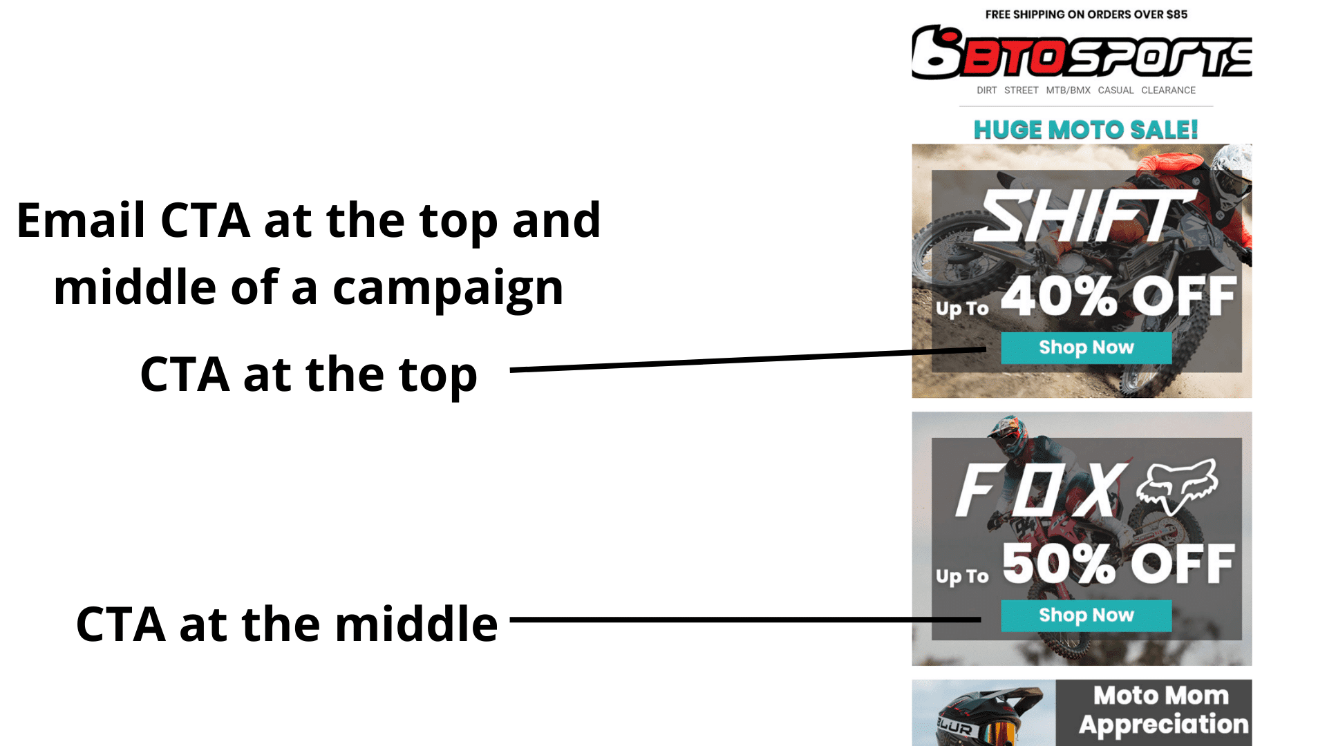
We’ve got several call-to-action buttons for this brand, one at the top and another in the middle.
You have to run A/B tests for the email channel to see which CTA position your audience prefers.
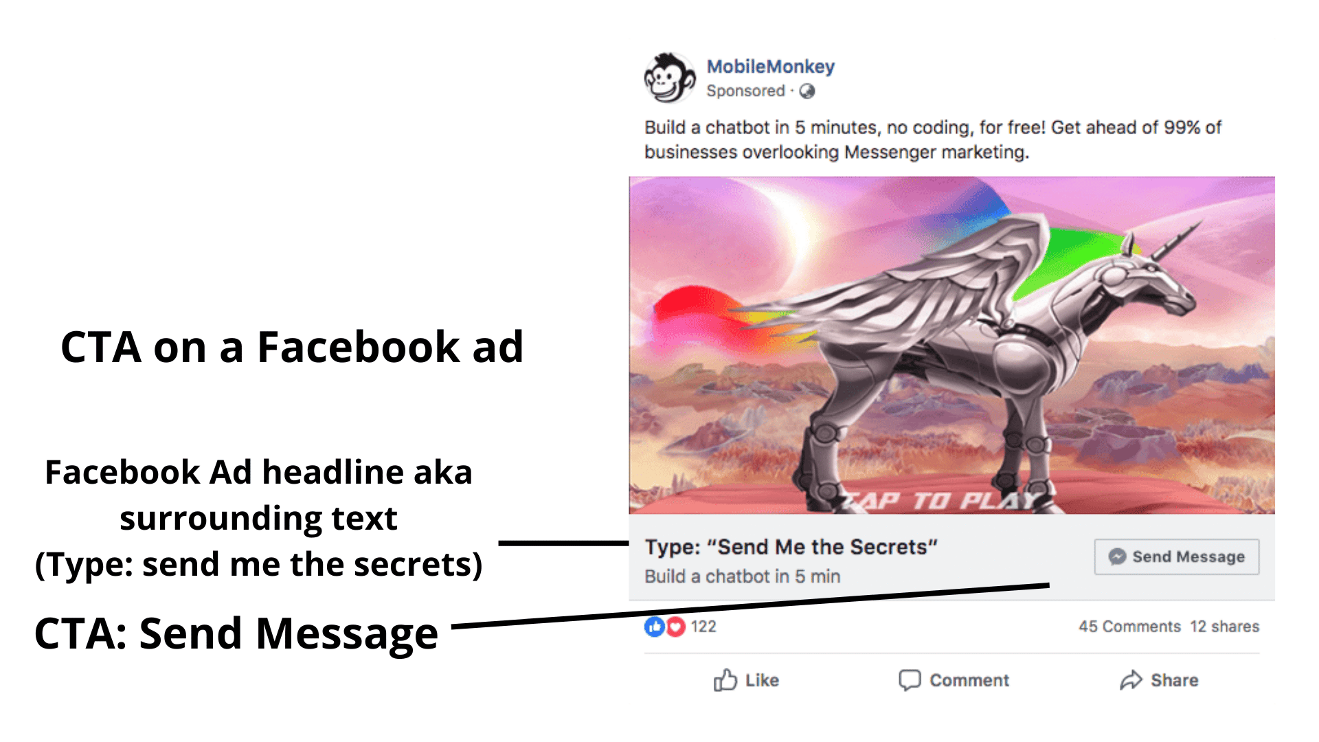
CTAs on Social Media Ads:
Ads on Facebook and Instagram let your target audience know you want them to take specific actions. If you leave this out, you will be leaving conversions and revenue on the table.
Next section deals with the ways to creatively use a CTA button.
3 Ways To Creatively Use A Call To Action.
The idea some marketers have of a call to action is that it can only be used as a button to encourage sales, and nothing could be farther from the truth.
Here are other ways to use the CTA button on your website, content, and advertisements.
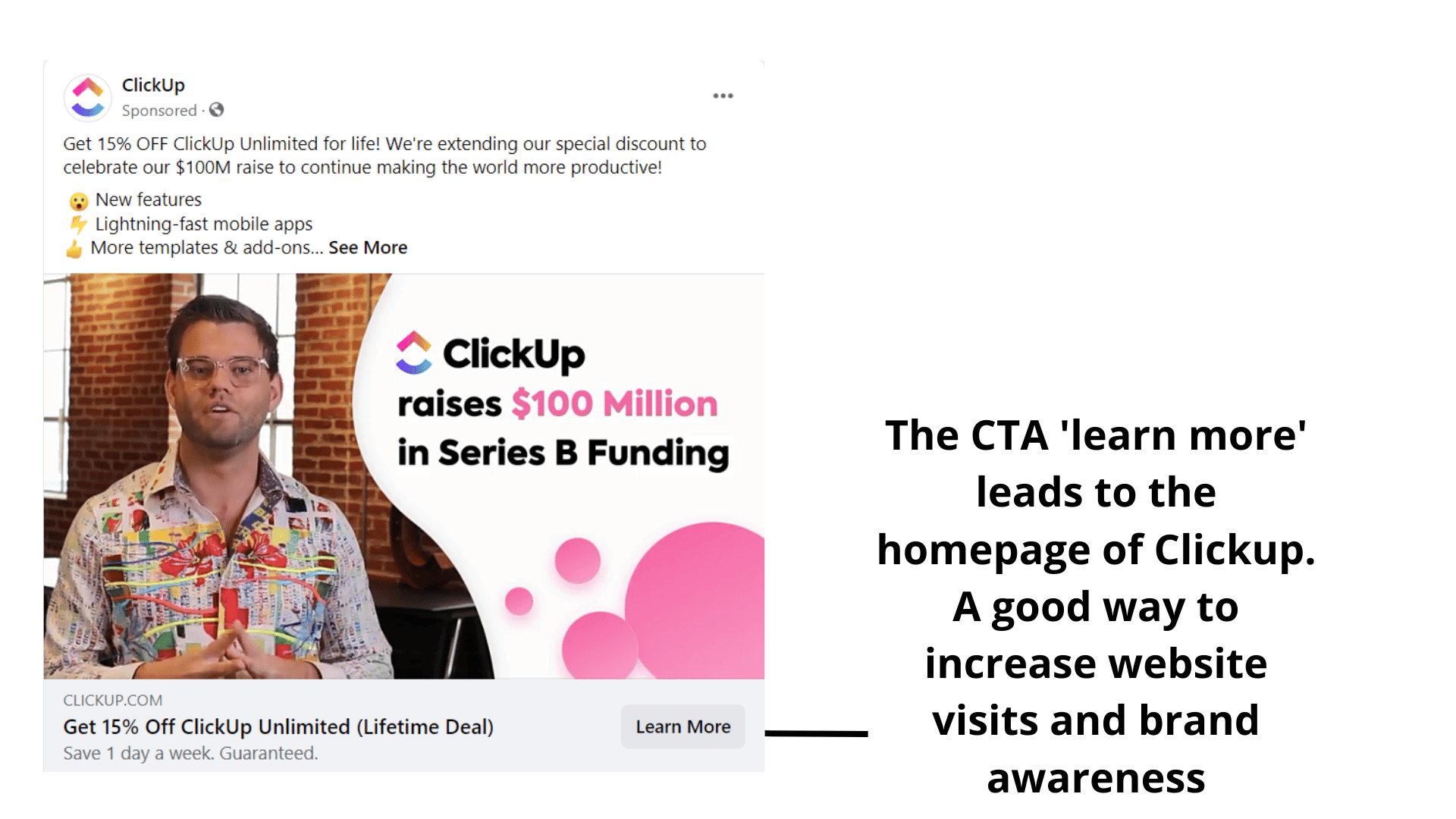
1. Brand awareness
When a brand uses paid media to send traffic to their website, a landing page, or a content page, they’re getting more eyes on their digital real estate, which means more brand awareness.
Here’s an example of an ad from Clickup with a CTA leading to a homepage.
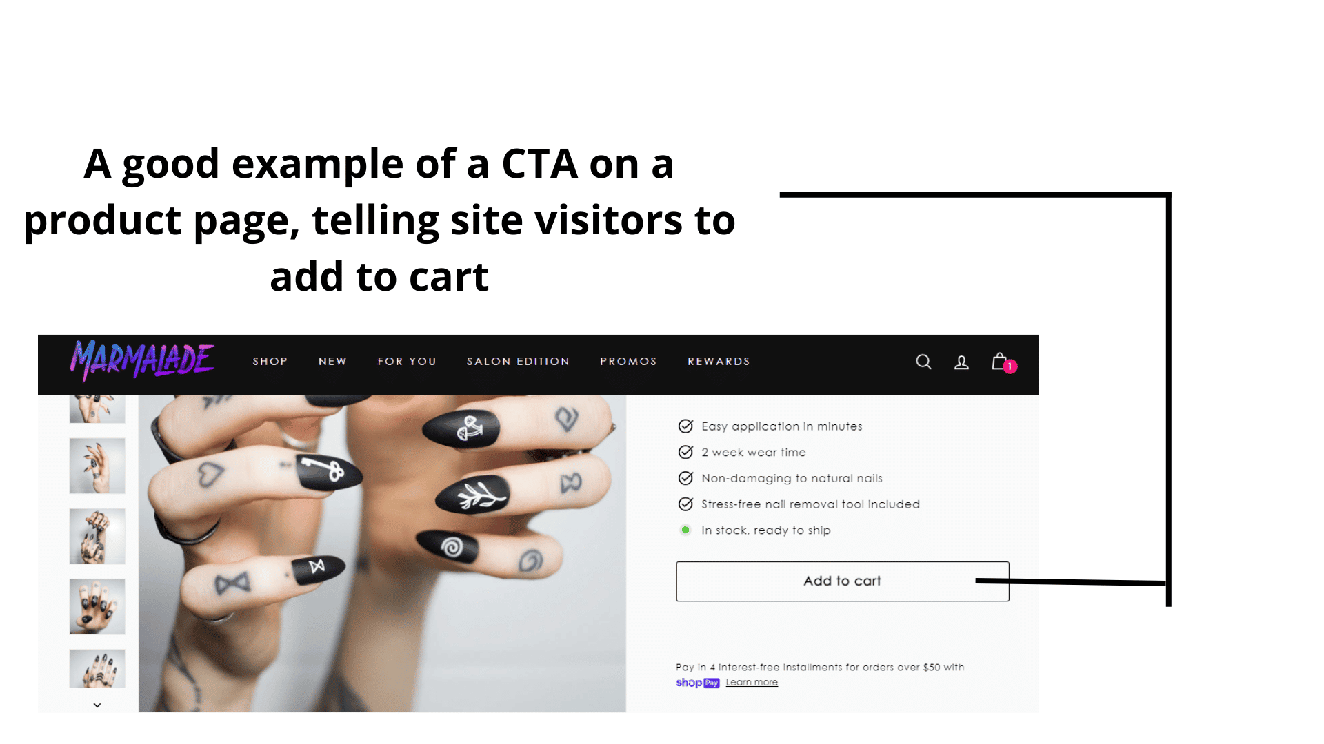
2. To make a sale
This is self-explanatory. The call to action is strategically placed on the website, the product description page, where the web visitor is not confused about what next step to take to get the item/service.
Without a CTA, it’ll be impossible to make a sale.
Here’s an example of a call to action button on Marmalade nails product description page that tells the web visitor what to do/next step.
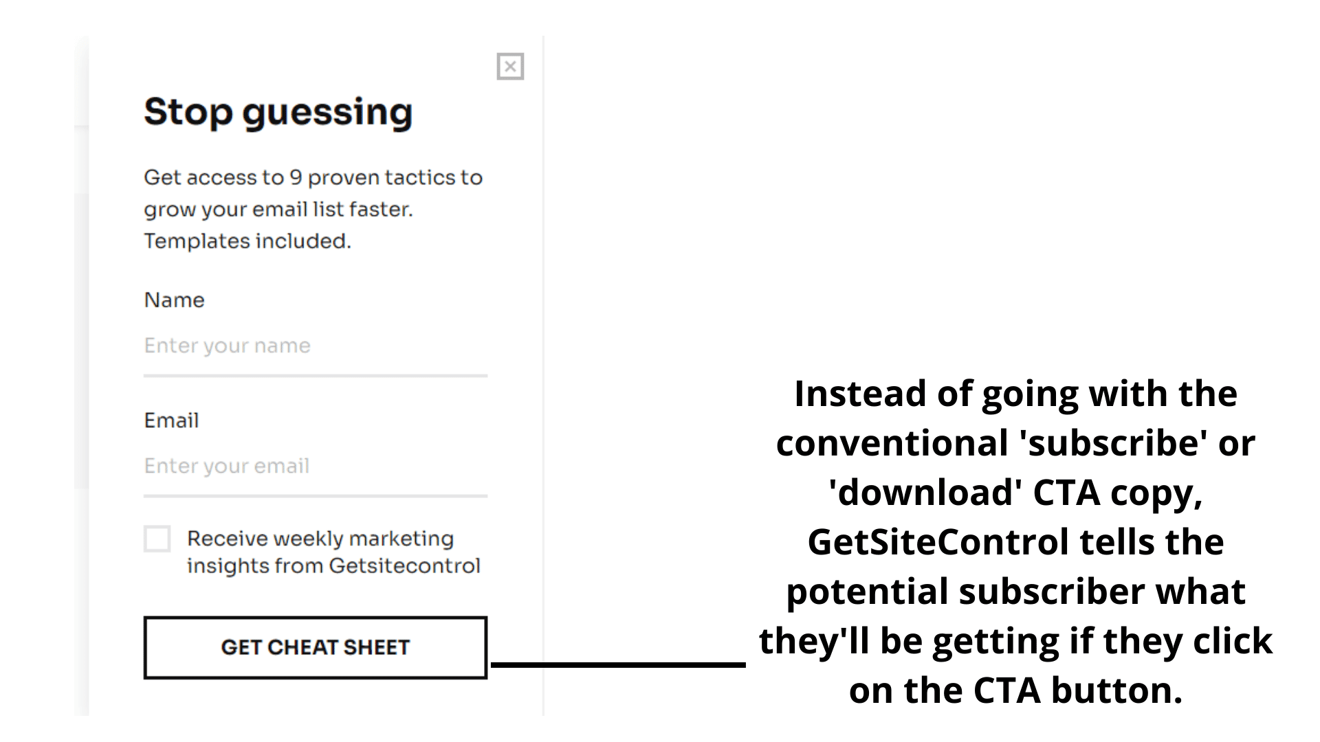
3. To signup for an email list:
CTA’s are very effective in getting web visitors who have an interest in a brand’s offering to sign up for their newsletter.
This is done with the long-term in view. This way, the brand stays in touch with subscribers, announce new product offerings, and sees them convert once, twice, or many times over.
Here’s an example from Getsitecontrol.
Which is the best CTA color to use?
It’s a known fact that humans are visual creatures, and colors affect how we experience the world.
Another fact is this; there are no universal best CTA button colors to use that are guaranteed to give you the conversions you seek.
What matters is how much a call to action button color contrasts with the area around it.
Here are some examples from brands whose CTA button contrasts with the website background.
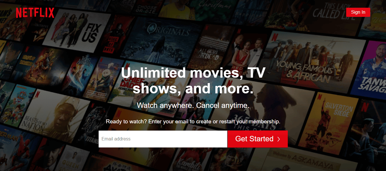
1. Netflix. Their call to action button is red, and it stands out against the website background.
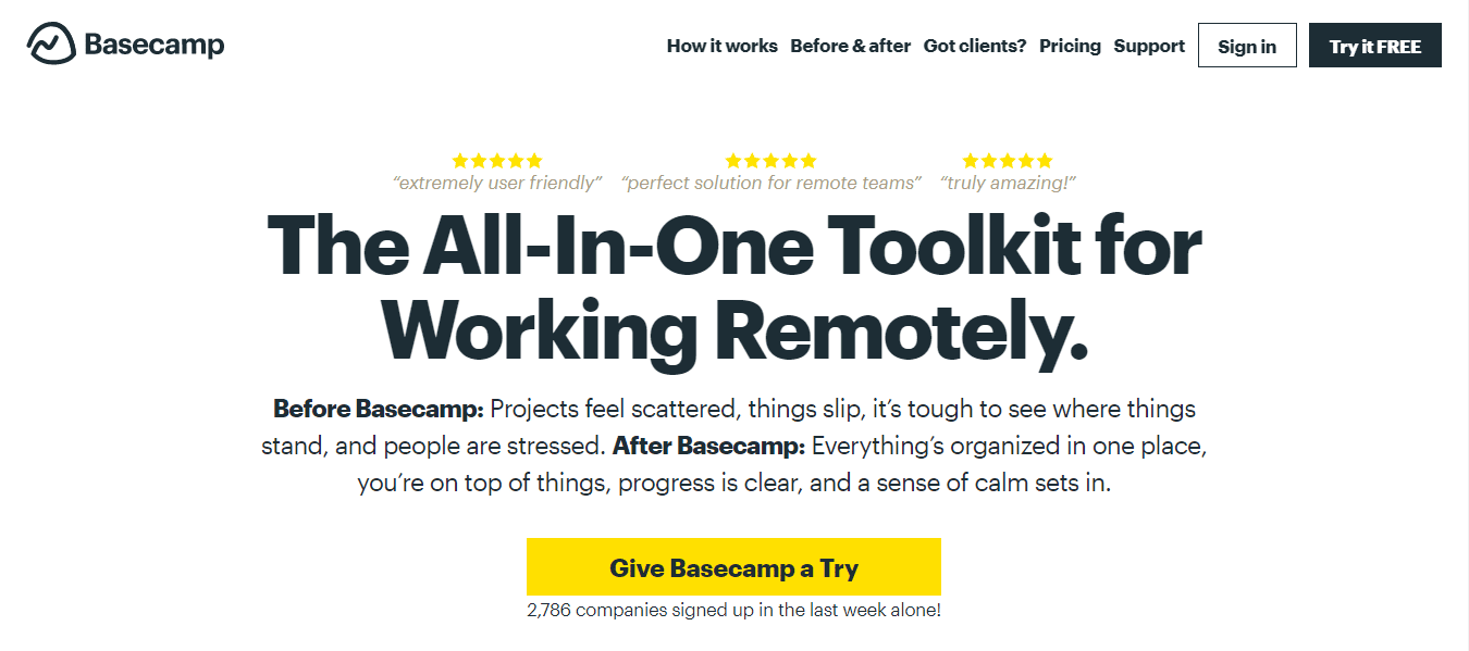
2. Basecamp. They have a white background and a yellow-colored CTA button.
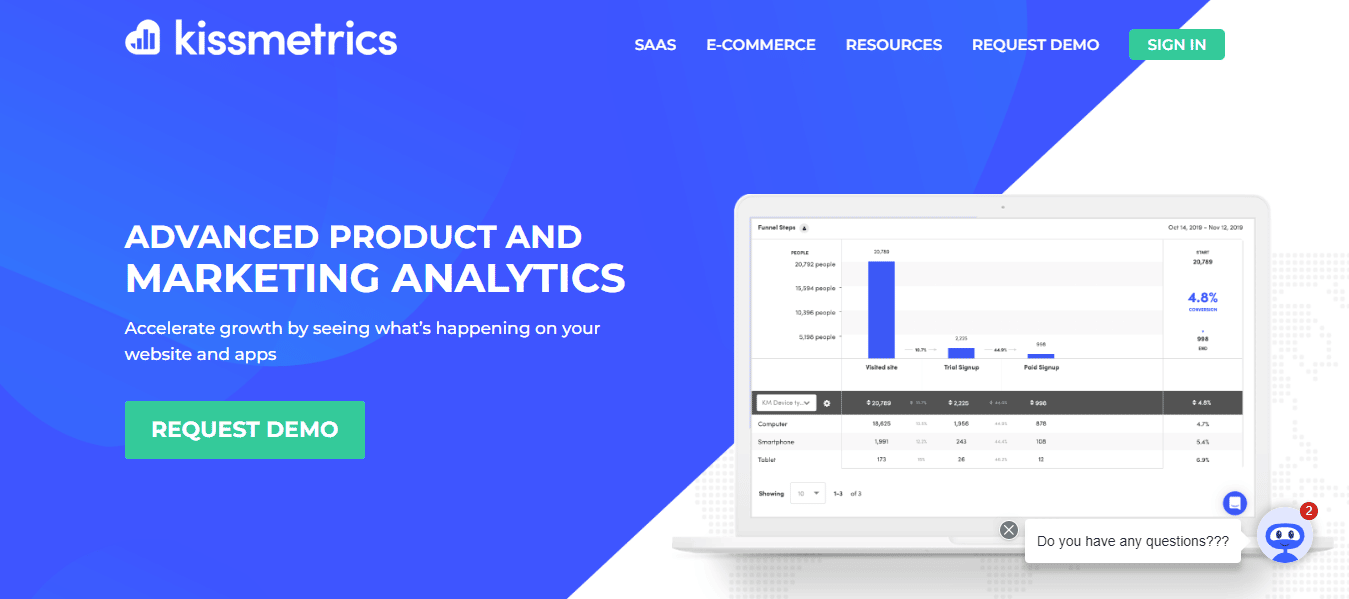
3. Kissmetrics. Their call to action button is colored green and it stands out as against their blue background.
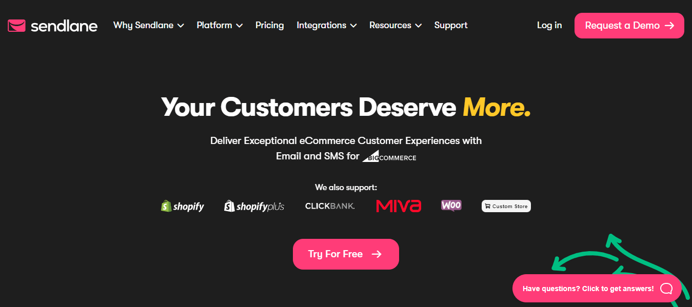
4. Sendlane. Their pink-colored CTA button stands out against their dark website background. This makes it easier for the site visitor to see their CTA.
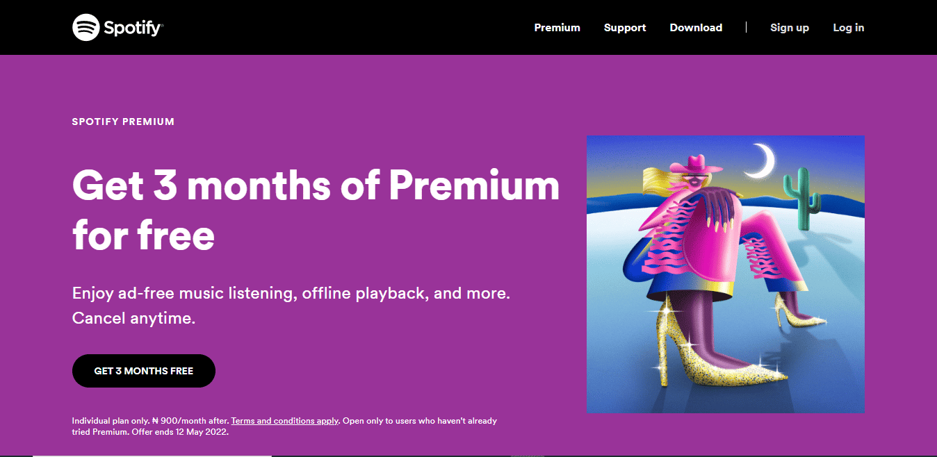
5. Spotify. They have a black-colored call to action button that contrasts their site’s purple background.
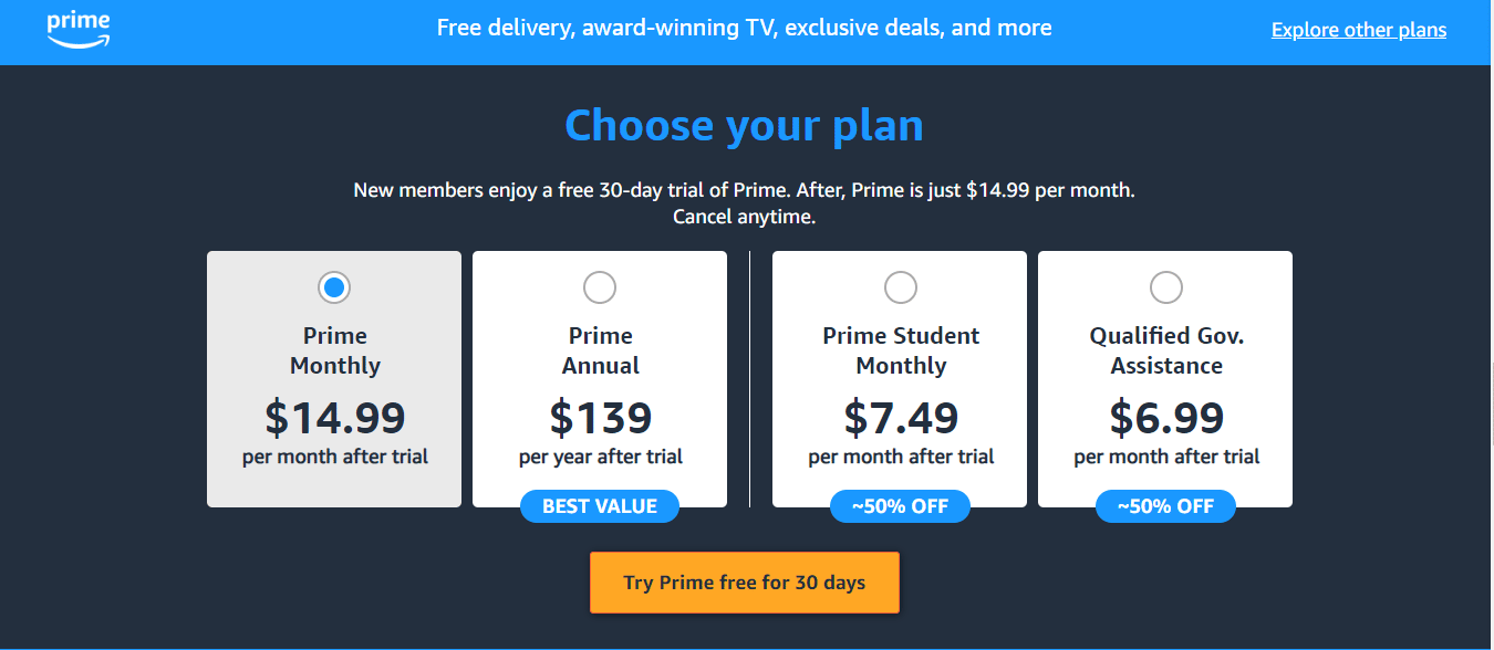
6. Amazon Prime. Their CTA button is dark yellow and it contrasts well with the site’s dark purple background.
P.s: a professional tip is to test contrasting colors against your brand colors.
A/B Test Ideas for E-Commerce Call to Action Buttons.
All the best practices in the world will fail at some point because you can’t predict how customers will behave.
The way forward is to run A/B tests to see your audience’s preference.
Below are some examples of tests you can start running immediately.
Best CTA Placement
The location of a button on a product page in relation to the product image and product descriptions largely impacts conversions.
Here are some examples from different websites and the location of their CTA button.
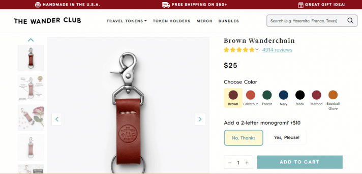
The Wander Club puts their CTA button on top of the fold, with the product description and other details below. This way, the site visitor doesn’t have to go and look for the CTA button.
A former version of their product page, Nordstrom.com puts its call to action button at the bottom of the page. This way, the site visitor scrolls all the way down to add their item to the cart. The reason for this is that there are a lot of product elements and details that push the call to action down to the bottom.
Their CTA button is above the fold in more recent versions with more of the product details below the fold. it’s safe to assume they ran an A/B test and found this version to work best.
Here is the more recent version.
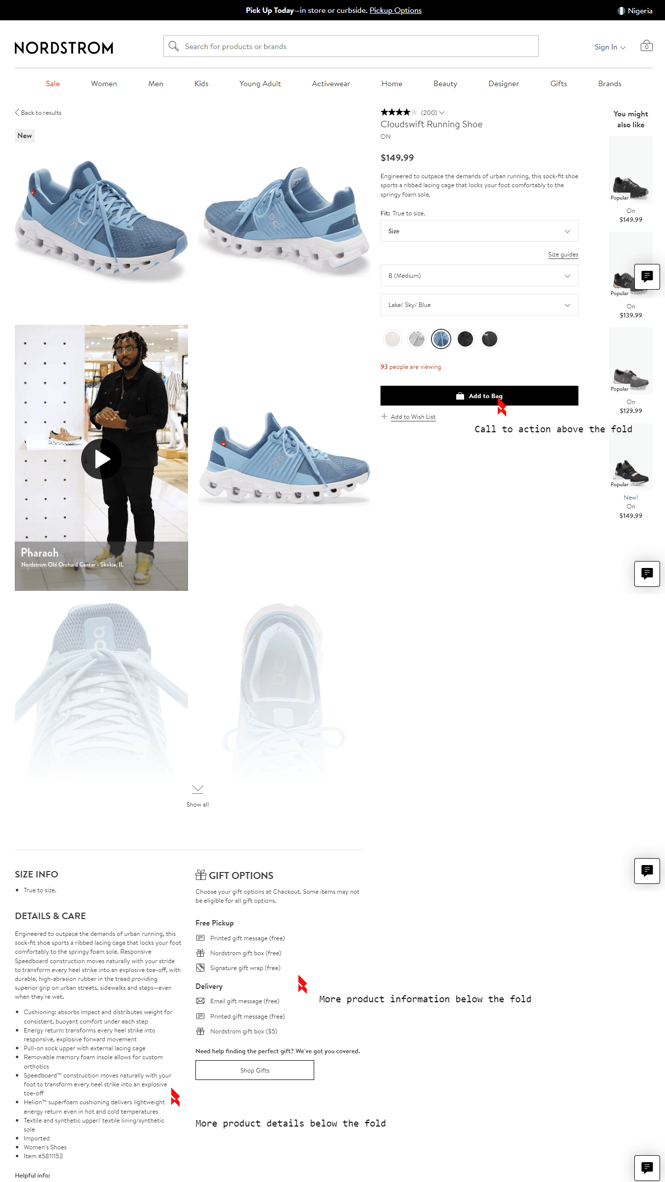
If you’re wondering which location is best for your CTA button on your website, know this; It’s best practice to have your CTA button above the fold, but if your landing page is long, it’s okay to have more calls to action button along the way. The definite way is to run A/B tests to know which call to action button position on your website converts best.
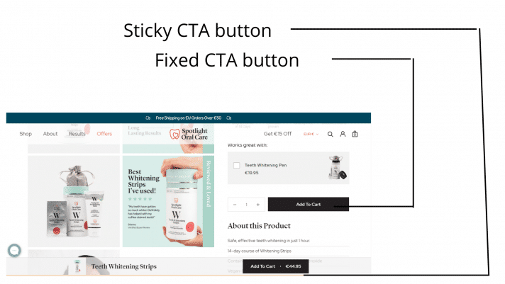
Button Quantity
Another test to carry out is how many ‘proceed to checkout/add to cart buttons you have on a page and if it affects conversion.
Spotlightoralcare has one button at the top of the fold; then, you notice another button sticking to the bottom of the page as you scroll down.
Casper has only one checkout button in their funnel.
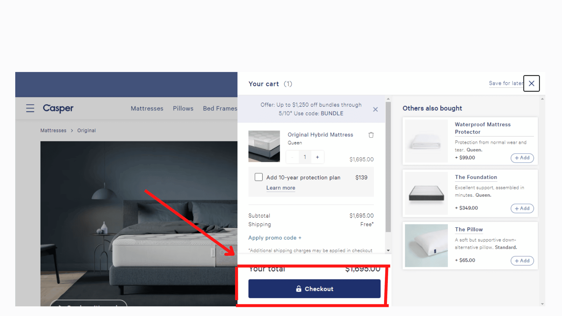
For each brand example used, they’re making tons of sales. For your own company, you’ll want to A/B test the number of buttons on a checkout page to be sure which your audience prefers; but keep in mind the paradox of choice.
Also, note that with heatmaps, you can see if your site visitors are interacting with multiple buttons or if a sticky button works best for you.
In theory, a lot more call-to-action buttons on a page look good, but in reality, site users might find the abundance of choices frustrating.
See the article here; the paradox of choice to learn more.
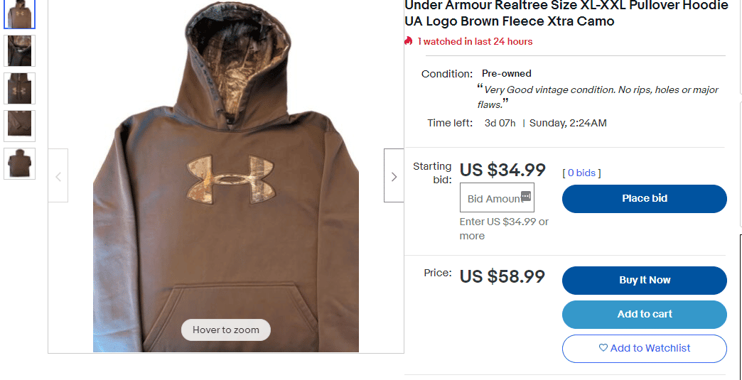
Button Size
In web pages, the size of the call to action button, when compared to surrounding elements, shows how relevant it is.
If you have two or more call-to-action buttons for a product on your web page, test the position and size of each button to see how it impacts conversions.
Here’s an example from eBay with multiple CTA buttons for one product (the place bid button, buy now button, add to cart, and add to watchlist).
It can be safely assumed that eBay sees more user clicks on the bid button considering its placement at the top.
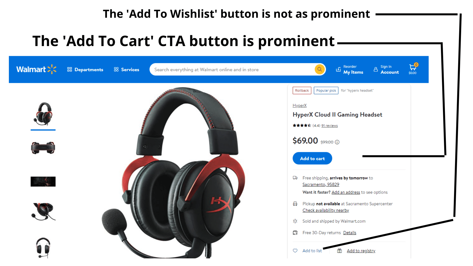
Here’s another example from Walmart, they made the ‘Add to Wishlist’ almost not noticeable, and it’s not in button format, but a plain-text link.
Here is an A/B test idea for you.
If you’ve only got one call to action button on your product description page and you want to see more conversions, test adding more buttons like ‘add to wishlist’ and see if it will increase visitor interest in your products.
Conclusion
A compelling call to action that gets you the conversion you seek is more than just writing words on a button and expecting web visitors to trip over them.
Following simple copywriting and optimization tactics, a well-written call to action could be the difference between the same level of conversions you’ve seen and a significant boost.
If you learned something from this article, share it with your friends and comment below on how you’ve tried to optimize the call to action button on your projects.
FAQs On Call To Action
1. How do you create an effective call to action?
To create an effective call to action, consider the following steps:
- Clearly define the goal: Determine the specific action you want your audience to take, such as signing up for a newsletter, making a purchase, or requesting more information.
- Use strong and compelling language: Craft concise and persuasive text that motivates your audience to take action. Incorporate action verbs and emphasize the value or benefits they will gain by following through.
- Make it visually prominent: Ensure your call to action stands out on the page. Use contrasting colors, larger fonts, or eye-catching buttons to draw attention. Position it strategically, typically above the fold or at the end of your content.
- Create a sense of urgency: Encourage immediate action by including words or phrases that convey a time limit, limited availability, or exclusive offers. This can prompt a fear of missing out (FOMO) and increase conversions.
- Provide clear instructions: Make it easy for your audience to understand what they need to do. Use simple, concise language and incorporate visual cues, such as arrows or buttons, to guide them.
- Optimize for mobile devices: With a growing number of people accessing the internet through mobile devices, ensure your call to action is mobile-friendly. Use responsive design techniques to maintain visibility and functionality on smaller screens.
- Test and iterate: Continuously monitor and test your call to action’s performance. Experiment with different variations, such as different colors, wording, or placement, and analyze the results to optimize its effectiveness.
2. What 3 elements should be in a call to action?
An effective call to action typically includes the following three elements:
- Clarity: Clearly state the desired action you want your audience to take. Use concise and direct language to avoid confusion. For example, “Sign up now,” “Buy now,” or “Learn more.”
- Value proposition: Highlight the benefits or value your audience will receive by taking the desired action. Explain what they will gain, such as access to exclusive content, discounts, or solutions to their problems.
- Compelling design: Use visually appealing and attention-grabbing design elements to make your call to action stand out. This can include contrasting colors, larger fonts, or prominent buttons. Make sure it is easily noticeable and distinct from other elements on the page.
3. How long should a call to action be?
The length of a call to action should be concise and to the point. Generally, shorter and more straightforward calls to action tend to be more effective. Limit your call to action to a few words or a short phrase that conveys the desired action clearly. Lengthy or convoluted calls to action may confuse or overwhelm your audience, reducing their likelihood of taking action. Remember, the primary goal is to capture attention and motivate immediate response, so brevity is key.


