
Heat maps.
They have come a long way and have been used in different industries.
Being used in different industries is a clear sign that heat maps can be rewarding. You just have to know how to interpret raw data and turn it into insights.
If you have a Shopify store and need a conversion research tool that can help you understand your users better, guess what you can use?
Yes, you are right…heat maps.
As a website tracking tool, heat maps can help open the lid and let you see your visitors’ behavior on your website.
And once you know how your visitors interact and engage with your website, conversion optimization becomes much less complicated.
In this article, I will:
- define heat maps,
- explain how they work,
- show you the different types of heatmaps,
- show you the various benefits of heat maps,
- and show you how to create one using Google Analytics.
Without further ado, let’s get started…
What is a heat map, and how does it work?
A Shopify heat map is basically a color-coded representation of how your visitors interact with a web page on your Shopify store.
They help you understand areas that are getting more and less interaction on your website.
Knowing where people click on, ignore, or scroll through can help you optimize your website for more engagements and conversions.
Now that you know what a heat map is, how do they work?
Heat map tools usually capture visitor data this way:
- When a visitor clicks on any page on your website, a heat map tool records that.
- Heat map tools record the cursor positions and scroll depth of your visitors at regular short intervals. The frequency of these captures also determines the accuracy of the heat map.
- Once your heat map tool captures this data, it sends it to the heat map processing server using either XHR or WebSockets requests.
Heat maps capture the movement, clicks, and scroll depth of the visitor’s mouse, and they present this data in a color-coded form.
Here’s is one of the ways how a heat map can display data in a color-coded form:
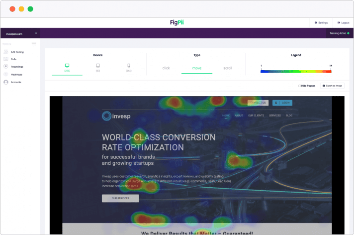
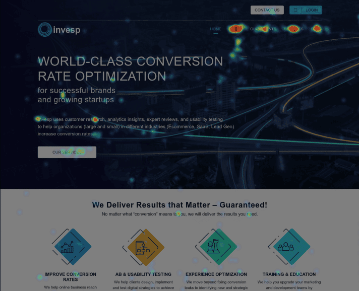
As you can see from the above image, heat maps collect data from a web page and use different colors to show which web page content gets more attention and gets ignored.
Although this might vary from the heat map tool you use, most softwares present heat as a dark color and light colors for web areas with less intensity.
Using the above image as an example – the areas where visitors click on the most are dark orange.
Why you should use heat maps on your Shopify stores
Launching heat maps on your Shopify website is very rewarding. It comes with many benefits that can help enhance user experience, improve engagements, and store design. Being able to turn heat maps data into insights will ultimately help you improve your conversion rate.
Having said that, let’s take a deeper look at the benefits associated with heat maps:
Direct overview of crucial web performance
One of the main advantages of heat maps is that they spotlight critical issues that should be addressed in your website design.
You don’t have to be a conversion rate expert to see the web areas ignored by your visitors.
Heat map tools give you a vivid picture of the clicking patterns of your users and how far they are scrolling down on your web pages.
Some of the data you can get from a heat map can be used to inform some of marketing efforts, such as Facebook Ads and Google Ads.
For instance, Geo heat maps show you the location (in terms of cities or countries) of where most of your conversions are coming from.
Equipped with this kind of data, you can know which locations to target your ads and marketing campaigns.
Learning from your users
If you ask anyone in conversion optimization, they will tell you that learning from users is critical.
Based on your heat maps data, you can learn a lot about the behavior of your users.
What are website areas more critical to the users? Where are they from? How far are they scrolling on this web page? Heat maps can track and provide you this information.
The behavioral patterns of your users on your website can be regarded as unfiltered feedback.
A combination of heatmaps and other conversion research techniques such as session recordings, Jobs-to-be-done customer interviews, polls, and surveys will help you learn more about your users.
Make data-driven decisions
The process of data-driven decisions is all about making decisions backed up by data rather than guesswork.
Such kinds of decisions help you avoid mistakes since the decisions you make are based on facts.
Using heat maps data to make decisions is one way that leads to constant improvement.
And as you continue to track user behavior using heat maps, you can make further changes based on the outcome of the data.
How to create a heatmap with Google Analytics
Creating a Google Analytics heatmap is relatively easy. It only takes three steps. But before we delve into that, let’s start by defining a Google Analytics heat map.
Google’s official heat map is known as Page Analytics (by Google). This heat map platform is offered as a Chrome browser extension:
Once you have installed it to your Chrome, it can show you web page areas where your visitors click.
Using Google’s heat map extension, you can expect to enjoy the following benefits:
- There’s no limit to page views, and it works on any web page with a GA tracking code installed.
- Page Analytics uses your existing GA data, and it works retroactively.
- It allows you to segment visitors, and you can also view heat maps using real-time traffic.
Judging from the reviews for this platform, you can tell that Google’s heat map Chrome extension also comes with a ton of issues:

Although the tool has hundreds of thousands of users, it only received an update in 2017. And one of the significant disadvantages of using Google’s heatmap is that it doesn’t have support.
But some users are still using it in 2021 even though there are no guarantees that it will continue working.
Well, with that said, now let’s look at the three steps of setting up Google Analytics heat map in Chrome:
Step 1: Install the Page Analytics Chrome Extension
First things first, open your Chrome browser and go to the Chrome Web Store.
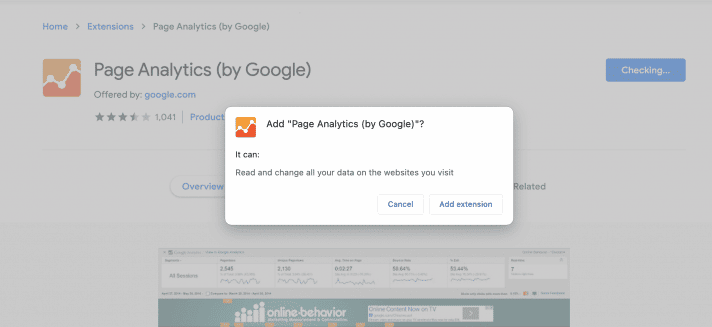
Once there, search for the Page Analytics (by Google) extension and click on the “Add to Chrome” button and then click on the “Add extension” button:
Immediately, the extension will begin to install to your browser.
Step 2: Log into your GA account
Once you have installed this Google heatmap, the next step is to make sure that you are logged into your Google Analytics account.
After logging into your GA account, you will have to click on the Page Analytics icon displayed on the top right side of the Chrome toolbar.
If you are logged incorrectly, you will see a green tick next to “Connected to Google Analytics.”
Step 3: View click data
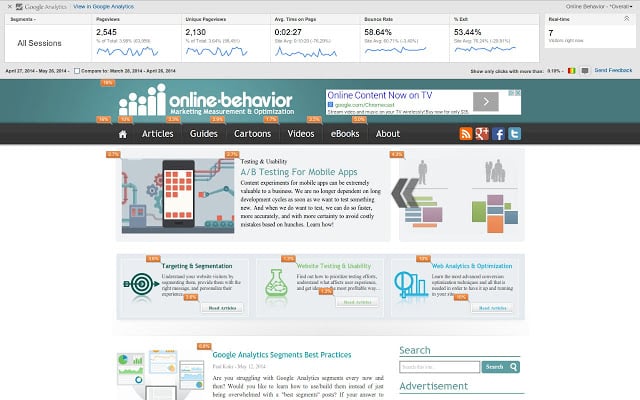
The next step is to go to your website’s homepage. Once there, you will see a Google Analytics overlay that shows the pageviews, session durations, bounce rates, and other metrics.
If you click on the “show bubble” icon, you can see a bubble that shows the percentages of users who clicked on a particular area of your web page:
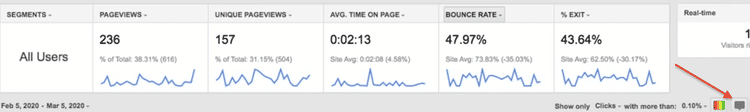
Using Page Analytics, you can click on any bubble on your website page, and you will see a box that shows the number of clicks to that element.
If you want to view the click metrics of a specific page, you can just open that page on your site. Click on the dropdown date area if you’re going to change the time frame.
How to create a Shopify heat map using FigPii
Using FigPii to create a heat map for your eCommerce site is as easy as ABC.
All you have to do is follow the five steps below:
Step 1: Log in to your FigPii account.
Step 2: At the bottom of your dashboard, you will see the FigPii tracking code:
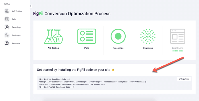
Step 3: Click on the copied code on the right side of the FigPii code box.
Step 4: Open your website and paste the FigPii tracking code on your website’s head section. FigPii integrates well with eCommerce websites – this means that your website performance, in terms of speed, won’t be affected.
Step 5: Go back to FigPii and verify the code installation. You will see an indicator that your code is active if the tracking has been successfully installed on your website. Sometimes it can take up to an hour for the tracking indicator to turn active.
Different types of data that can be tracked in a heatmap
Heat maps are not the same. There are different types of heat maps that track different kinds of data. Here are 4 main types of website heatmaps:
- Eye-tracking heatmaps;
- Click maps;
- Mouse tracking heatmaps;
- Scroll maps.
Here’s how they work:
Eye-tracking heatmaps
Eye-tracking heatmaps record every visitor’s gaze as they look at different parts of your website – whether it be an image, a video, or just text. A lot of detailed statistical data can be gathered from Shopify eye-tracking heat maps:
- Information about how long users look at a specific section of your page;
- Frequency of returning to particular areas on your page;
- Details about types of products that seem to catch visitors’ attention.
As you can tell, this information is beneficial for identifying parts of your site that need improvement.
Click maps

Click maps track every single click that each of your visitors made while visiting your page. This allows you to see which parts of your site are most popular, where users tend to get stuck, etc. All this information helps you understand how users navigate your website and make improvements based on actual user data.
Gathering clicking data on CTA buttons and navigation is only one use case of click heatmaps. You can also see clicks on objects that are not, in fact, clickable. If there’s an image or text that people think or expect to link, they’ll click on it. And you can see that on a click map.
If you discover something (image, sentence, e.g.) that people want to click on, but isn’t a link, then the best ways to go are i) make it into a link OR ii) redesign it to make it not look clickable.
Mouse Tracking heatmaps
Sometimes known as hover maps, mouse tracking heat maps can show you how many times users hover over a particular section of text – whether it be an image or just plain text. In simpler terms, they can show you areas where visitors hover their cursor the most on your Shopify website.
Using mouse-tracking heatmaps, you can find helpful information like:
- Seeing where people tend to get stuck while reading your content;
- Figuring out which images catch more viewers’ attention;
- Determining whether specific sections of your website have been optimized well enough (maybe they could use some more images?).
Scroll maps
Scroll heatmaps record every visitor’s scrolling behavior as they are browsing different parts of your page. They are pretty similar to mouse-tracking heatmaps, but with one significant difference: scroll maps track the vertical movement of a user’s cursor instead of only horizontal movement.
You can rely on scroll maps if you want to see how far down the page your visitors have scrolled.
As in the case of click and mouse-tracking heatmaps, you can find lots of helpful information about how visitors interact with your Shopify website by looking at a scroll map report. For example, you can find out which images capture users’ attention longer than others; whether specific sections or paragraphs on your Shopify website have been well-optimized.
How to make sense of the data captured by a heatmap
First of all, heatmaps will not give you any exact figures for how many people have visited your Shopify website.
Instead, it gives you a visual representation of where users look and decide what to click on or where to scroll while browsing different pages of your Shopify store.
Such kind of information gives you a starting point of where you should optimize for more engagement. Combined with other conversion research techniques, you will have a clear picture to begin your optimization efforts.
Making sense of the data captured by a heatmap shouldn’t be difficult. Once you know what the colors stand for, then you are good to go.
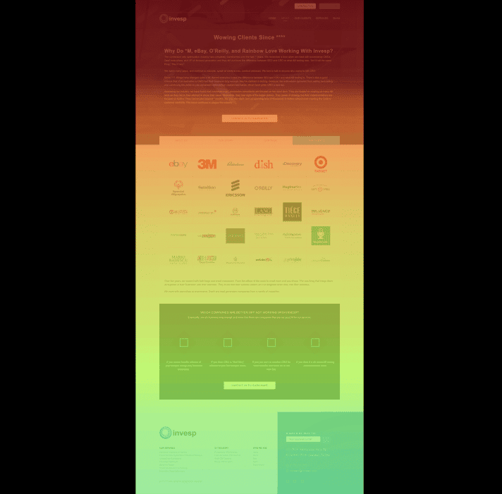
Let’s use a click map as an example:
Click maps show you exactly where people are clicking on your landing page.
Looking at the above click map, you can see that most people are clicking on different menus on the menu bar.
As you scroll down, the number of clicks also decreases. What kind of insights can be drawn from the data shown in this click map?
Well, you might need to place the most essential web information above the fold since that’s where most visitors are engaging with your page.
Next, let’s look at a scroll map for the same page:
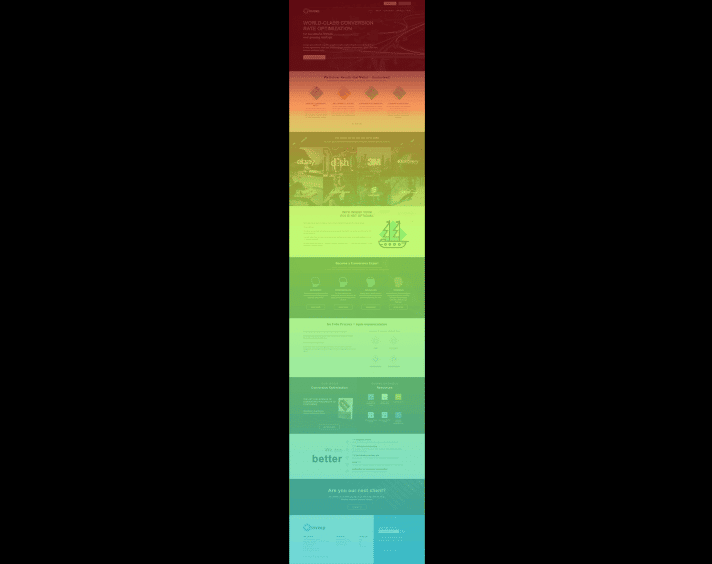
Remember, a scroll map shows how far your visitors are scrolling down on your page. And they also use different colors to display the most and least viewed areas of your web page.
Looking at the above example, red(ish) and yellow(ish) colors show the most viewed sections of the page. On the other hand, the bluish colors show the areas that had lesser views.
Using tools like FigPii, you can go beyond colors and get to view the percentages so that you may know how many visitors scrolled down to the bottom of the page:
Basically, you can use scroll maps on your Shopify website to find out:
- Where you’re losing visitors.
- False bottoms or the illusion of completeness.
- Whether visitors see what’s above the fold.
- Whether users are finding what they are looking for.
- If your page offers an excellent cross-device user experience.
Conclusion
There are various conversion tools that can help you know more about visitor behavior on your website. But if you want to learn more about the areas that your visitors click on, or even ignore – you should consider using heat maps. Over the years, heat maps have proven to be effective when it comes to helping optimizers make better web design choices.
