A common misconception is that you only have to perform a conversion audit when something seems wrong on your website.
But when you think about it, a CRO audit is very similar to a health check-up.
Regular medical check-ups can help you stay on top of your health.
Likewise, regular conversion rate optimization audits can help your website perform better in terms of conversions.
Just like you don’t have to see a doctor when sick, you also don’t need to perform conversion audits only when your cart abandonment rate is high.
You can also conduct CRO audits when you want to uncover revenue opportunities, improve the visitor’s online experience, and when you want to keep your CRO strategy up to date.
Take this as a friendly reminder: If you are not regularly performing conversion audits, you’re leaving money on the table.
In this post, we are going to take a deep dive into:
- What a conversion audit is,
- Where should you perform it,
- What you need to perform it,
- And when you should perform it.
Let’s get into it…
What is a CRO Audit?
A Conversion Rate Optimization (CRO) audit is like a health check-up for your online store. Instead of measuring blood pressure or cholesterol, it examines the key parts of your site that influence conversions—things like your product pages, checkout flow, navigation, page speed, and analytics setup.
These are the areas that determine whether visitors move smoothly from browsing to buying, or abandon the process along the way.
Step-by-Step CRO Audit Framework
Step 1: Gather Quantitative Data
Before you dive into fixing pages, you need hard numbers. A CRO audit should start with quantitative data: the “what” of user behavior.
Numbers won’t tell why people drop off, but they’ll tell where and how much revenue you’re losing.
To get that clarity, you’ll want to start with the following three essentials:
- Analytics setup: Making sure tools like GA4 record what shoppers do: which pages they visit, when they add to cart, and if they buy. Without this, you’re guessing where people drop off.
- Conversion goals and benchmarks: These metrics tell how well your site is performing compared to your past numbers and industry standards. For example, if 2 out of every 100 visitors buy something from you (a 2% conversion rate), but the industry average is closer to 3%, you know you’re leaving sales on the table.
- Page performance metrics (Core Web Vitals & speed): This measures how fast your site loads and how smooth it feels when people interact with it.
Analytics Setup (GA4 events)
The first step in your CRO audit is to see how people move through your store. That’s what analytics setup is all about: configuring your tools so you can track every stage of the shopping journey, from browsing a product to completing a purchase. Without this, you’re just guessing where drop-offs happen.
The most common tool for this is Google Analytics 4 (GA4). Out of the box, GA4 tracks page views and some engagement, but for ecommerce, you need to go further by capturing shopping-specific actions (called events).
At a minimum, these four shopping-specific actions or events should be:
- view_item: fires when a visitor lands on a product detail page.
- add_to_cart: fires when they click “Add to Cart.”
- begin_checkout: fires when the checkout process starts.
- purchase: fires when payment is completed.
These events tell how many people progress from one step to the next and where they drop off.
For example, if 10,000 people view a product, 3,000 add it to cart, 1,200 begin checkout, and 600 complete purchase, you instantly know:
- Your product pages are strong (30% add-to-cart rate).
- But your checkout process is leaky (only 50% of users who begin checkout complete it).
That insight tells you where to focus your audit efforts.
But how do you set up these events?
There are two common ways to get GA4 ecommerce events working:
1. Directly in your platform (easiest):
If you’re on Shopify, WooCommerce, or BigCommerce, GA4 integrations are usually built in. Setup is simple:
- Get your Measurement ID. GA4 will generate an ID that looks like G-XXXXXXXXXX.
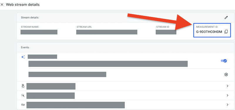
GA4 Web Stream details page showing Measurement ID (G-XXXXXXXXX) (Source)
- Add it to your platform. For example, if using Shopify, go to Settings → Customer Events → Google Analytics and paste in the ID. WooCommerce and BigCommerce have similar fields.
- Enable Enhanced Ecommerce. This makes sure product views, add-to-cart actions, and purchases are tracked automatically.
Note: You can follow these steps for a detailed step-by-step GA4 setup.
2. Use Google Tag Manager (GTM) for custom setups:
If your platform doesn’t have built-in support, or you want to track additional “micro-conversions” (like clicks on size guides or coupon use), you’ll need Google Tag Manager (GTM). GTM is a free tool that sits between your site and GA4, letting you control exactly what gets tracked.
Here’s a simplified setup flow:
- Install GTM on your site. Add the GTM container snippet to your site’s <head> and <body>.
- Create a GA4 Event Tag. In GTM, go to Tags → New → GA4 Event. Give it a name like add_to_cart and enter your GA4 Measurement ID.
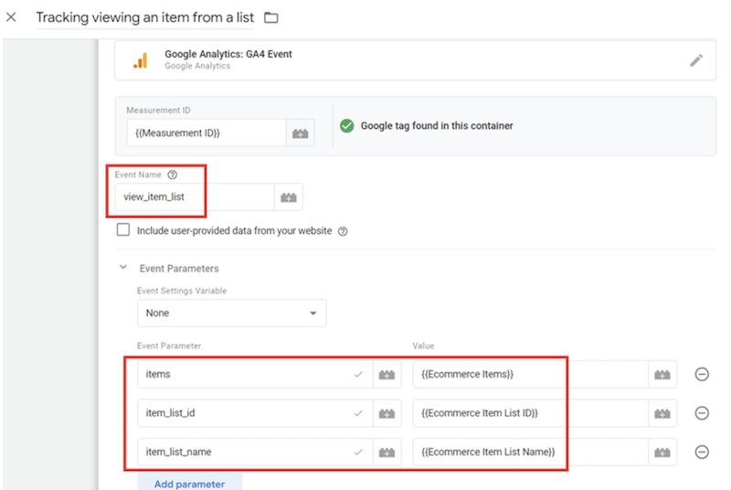
Example of a GA4 Event setup in GTM (here for view_item_list). You’d do the same for add_to_cart, begin_checkout, and purchase (Source)
- Set a Trigger. A trigger tells GTM when to fire the event. In the screenshot example, the event is view_item_list, which fires whenever a shopper views a product list (like a category page).
- Repeat for Other Events: For example: view_item → trigger when a product page loads. begin_checkout → trigger when the checkout page loads. purchase → trigger when the order confirmation page loads
- Test in Preview Mode. GTM lets you simulate actions to make sure each event fires properly.
- Publish the Container. Once tested, publish it, so your events now flow into GA4.
Note: For a full walkthrough, check out this GA4 Ecommerce Tracking Guide.
Conversion goals and benchmarks
Once your tracking is in place, the next step is knowing what “good” looks like. Conversion goals and benchmarks help determine whether your site is underperforming or overperforming compared to both your historical performance and industry standards.
Here’s how you can set up your conversion goals and benchmarks:
- Calculate your current conversion rate. Divide the number of purchases by the total number of visitors, and then multiply the result by 100. For example: 200 purchases ÷ 10,000 visitors = 2% conversion rate.
- Compare with industry benchmarks.
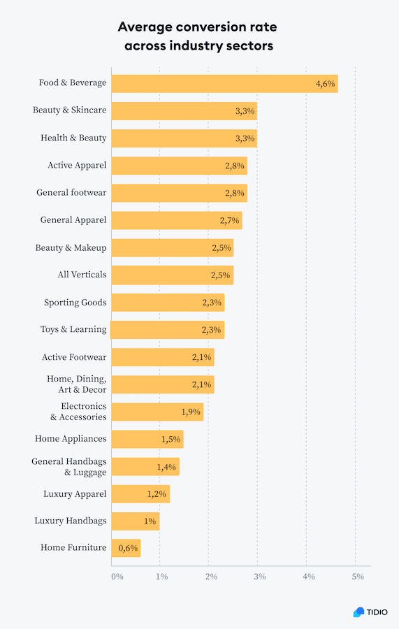
Average conversion rates vary dramatically by industry—from just 0.6% in home furniture to 4.6% in food & beverage (Source).
- Set realistic goals. If you’re at 2% today, aim for 2.5% in the next quarter instead of shooting for 5% overnight.
Pro tip: Don’t just track the final purchase. Also set goals for micro-conversions, such as add-to-cart clicks, email sign-ups, or checkout starts. You can capture these the same way you set up purchase events earlier (through your platform’s GA4 integration or GTM). Tracking them provides early signals of progress and reveals exactly where shoppers drop off.
Page performance metrics (Core web vitals and speed)
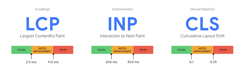
The third piece of your quantitative audit is site performance. Even if your offers are strong, a slow or unstable site will deter shoppers. Google refers to the key measures of performance as Core Web Vitals, and they’re now both a ranking factor and a conversion driver.
When you audit performance, focus on three Core Web Vitals:
- Largest Contentful Paint (LCP): how quickly the main product or hero image or headline loads. Target: < 2.5s.
- Interaction to Next Paint (INP): how fast the site responds to clicks, taps, and input across the page. Target: under 200ms.
- Cumulative Layout Shift (CLS): how stable the page is as it loads (no buttons shifting mid-click). Target: < 0.1.
Google’s core web vitals (Source)
You can check these using free tools like PageSpeed Insights or Search Console’s Core Web Vitals report. Always test mobile first, since that’s where most users drop off.
These tools show you exactly how fast your site loads (LCP), how responsive it feels (INP), and whether the layout shifts while loading (CLS).
These numbers will make the problem concrete. For example, PageSpeed Insights might indicate that your product pages have an LCP of 3.8 seconds on mobile, which is well above the 2.5-second target. That’s a clear signal that those pages are costing you sales.
Once you know which metric is failing, you can act: compress images if LCP is too high, remove heavy scripts if INP is slow, or fix shifting elements if CLS is poor. Then rerun the test to confirm improvements.
Step 2: Collect Qualitative Insights
Step 1 provided you with the data: how many people add items to their cart, start checkout, complete their purchase, and whether slow site speed is hindering them along the way.
But numbers alone can’t tell you why people abandon a product, leave the cart, or bounce from checkout.
That’s where qualitative insights come in.
Qualitative insight tools show you the human side of the story, including what visitors see, think, and feel as they interact with your store. Combined with quantitative data, they provide a comprehensive picture of conversion barriers.
Here are the core methods to focus on to collect qualitative insights:
Heatmaps, session replays, and scroll tracking
Heatmaps are one of the most useful tools in a CRO audit, as they show you how visitors actually interact with your site’s elements. While analytics (Step 1) told you how many people dropped off between product views and purchases, setting up heatmaps helps you uncover why that happens.
Heatmaps visualize visitor behavior using color codes:
- Red / Orange = high engagement (lots of clicks, taps, or attention)
- Yellow / Green = moderate engagement
- Blue = little or no engagement
This helps you instantly see what captures attention and what gets ignored.
There are three main types of heatmaps you’ll use in a CRO audit: click heat maps, scroll heat maps, and movement heat maps.
-
Click heat maps:
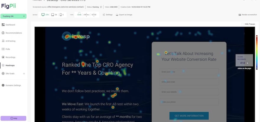
Click heat maps show you where people click or tap on a page.
For example, in the click map below, you can see strong red clusters on the brand logo and form fields, while the body copy stays blue. This indicates that visitors are paying more attention to the form than the messaging—a sign that your copy may need to be shorter or placed closer to the CTA.
-
Scroll maps:
Scroll-based heatmaps reveal how far down the page people scroll.
Take this scroll map below, for example.

The bright red at the top means everyone sees the hero, but the fade to yellow and green further down shows most users never reach the reviews section. If your social proof is buried here, you’ll want to bring it higher.
-
Movement heatmaps:
Movement heatmaps track where users hover their mouse (on desktop).
It’s not perfect, but it often indicates where people are paying attention.
In the move map below, clusters around the headlines and form are expected, but the scattered red hot spots on plain text signal confusion, which means people tried clicking on text that wasn’t clickable. Turning that into links or clarifying the design can remove friction.

Finally, if heatmaps are the snapshot, session replays are the movie. Setting up session replays lets you watch real visitor journeys in real-time, showing where someone hovered, clicked repeatedly, or gave up.
For instance, a replay might show a shopper rage-clicking a broken “Apply Coupon” button, or zooming in and out on mobile because the text is too small. These are frustrations you’d never spot from numbers alone.
Now, the question is: how do you set up heatmaps and session replays?
Luckily, setting up heatmaps and session replays is straightforward. All-in-one CRO tools, such as FigPii, make it easy to track clicks, scrolls, and movements, and also record session replays, allowing you to watch real user journeys.
The setup typically involves adding a small tracking script to your site, after which data collection begins automatically.
You don’t need to configure every detail yourself. Most platforms, like FigPii, offer step-by-step guides that walk you through the process of installing heatmaps, enabling scroll tracking, and turning on replays.
Once set up, you’ll start seeing exactly how users interact with your store, and those insights become the foundation for spotting usability issues and testing ideas in your CRO audit.
Customer surveys & exit polls
Heatmaps and replays show you what people do on the page. But they can’t tell you what’s going on in the shopper’s head, including the doubts, questions, or reasons they didn’t complete a purchase.
That’s where surveys and exit polls come in.
- On-page surveys help you capture feedback while users are still browsing. For example, you can ask: “What’s missing on this page?” or “What information would help you make a decision?”
- Exit polls trigger when someone is about to leave (like moving the mouse toward the browser’s close button). A simple question like “What stopped you from completing your order today?” can surface issues you’d never see in analytics.
The key is to keep surveys and polls short and respectful of the user’s time. Instead of a 10-question form, ask one or two questions that get straight to the point.
For example:
- On a product page: “What’s stopping you from adding this product to your cart?”
- On a checkout page: “What nearly stopped you from completing your order today?”
- Post-purchase: “What almost kept you from buying, and what made you decide to go ahead?”
These single-line questions are quick for shoppers to answer, but they provide highly actionable insights. If 20% of respondents say “I wasn’t sure about the sizing,” you instantly know your size guide needs to be more visible.
A great example comes from our own Invesp CRO case study. Faced with a high abandonment rate, the team combined customer interviews and expert reviews to identify areas of friction in the checkout flow.
This qualitative research revealed that users required additional reassurance to complete their purchases. Based on these insights, our team added urgency elements (such as “free shipping” and “only a few items left” prompts) and conducted an A/B test.
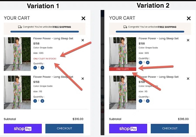
This image shows a checkout variation shaped by user interviews, where urgency cues (“Only 3 left”) boosted conversions by 17% (Source: Invesp CRO case study)
The results were striking:
- Conversion rate improved by 17%
- Average order value rose by 4%
- Engagement with key elements (gift wrapping, quantity, CTA) increased significantly.
This demonstrates how a couple of well-placed questions or interviews can uncover blockers that heatmaps alone would miss, directly leading to improved conversion rates.
Pro tip: Leverage tools like FigPii or Qualaroo to run polls and surveys. They make the setup simple: you choose the page, set the timing or exit intent, and start collecting responses.
User testing and interviews
While surveys and exit polls capture quick, in-the-moment reactions, user testing and interviews go deeper. Instead of asking a single question at checkout, you’re watching or talking to customers as they interact with your site in real time. This provides context that you can’t get from a pop-up survey.
Here’s how they work in a CRO audit:
In user testing, you recruit real shoppers (or people who fit your audience) and ask them to complete tasks like “find a product under $50 and check out”—and observe where they struggle.
Even a handful of tests can reveal patterns: Nielsen Norman Group found that testing with just five users often uncovers 85% of usability issues, making it a high-impact method that requires a modest budget.
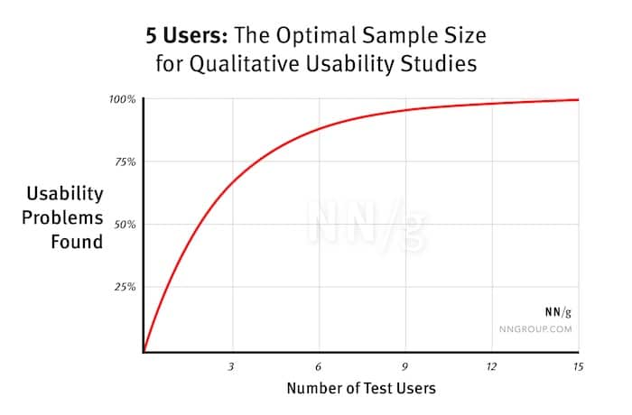
Tools like UserTesting.com, Maze, or Useberry make this simple to run remotely.
Customer interviews go further by uncovering the thoughts behind the clicks. These are one-on-one conversations where you ask open-ended questions such as:
- “What almost stopped you from buying from us?”
- “How do you usually decide between two similar products?”
- “What information would make you feel more confident ordering?”
Unlike surveys, interviews capture tone, hesitation, and context. For example, a shopper might say, “I was ready to buy but wasn’t sure I could return it if it didn’t fit,” which directly highlights the need for a clearer returns policy.
That said, the key is to talk to the right people. Prioritize the following when recruiting people to interview:
- Recent customers: ask why they chose you and what nearly stopped them.
- Cart abandoners: If you can reach them via email or remarketing, ask what held them back.
- Target audience lookalikes: Use tools like UserInterviews.com or social groups and ask what they’d need to see to make a purchase.
Recruitment can be as simple as emailing recent buyers with a $20 gift card offer for a 20-minute call, or letting a testing platform handle it. Either way, ensure that participants resemble your actual customers, as insights from the wrong audience won’t help you optimize.
Step 3: Prioritize High-Impact Pages
By now, you’ve got two powerful layers of insight:
- Step 1 (the numbers): where people drop off and how many make it through to purchase.
- Step 2 (the reasons): what trips them up, from missing info to confusing layouts.
The next step is focus. You can’t fix everything at once, so you need to prioritize the pages and flows that will make the most significant difference to revenue.
How to Run a CRO Audit on Product Pages
The product page is the stage in the customer journey where visitors make the decision to purchase or not. This means whatever you do on product pages can make or break conversions. This is something to consider when conducting conversion audits on product pages.
When it comes to product pages, there are four elements that you should focus on in order to make them convert more visitors into customers:
- The product
- The brand
- Page design and user experience
- Product page copy
The product is the main center of attraction and the reason why people visited your website. It should be presented in a that alleviates fears and concerns that visitors might have. Using high-quality images and featured videos that show how to use the product may help answer questions that your potential customers have before they purchase your product.
The brand is fundamental and it shouldn’t be an afterthought, even on product pages. Not everyone who purchases from you will go through your homepage, so its important to use your product pages to show your customers who you are and what you stand for.
The page design and user experience can also impact conversions on your product pages. Visitors expect product pages to have a certain layout and features – if you arrange things in a different way, this might cause trust issues, and this will ultimately affect conversions.
The product page copy is important because it is always the power of words that compel people to make a purchase. The more complex the product you’re selling, the more you need to have a product page copy that alleviates the fears and doubts that visitors might have.
So, how do you assess your product page to make sure that these four elements are helping you convert more visits into sales? Here’s what you should look at…
Product Images
How many product images do you have per product page?
One or two images are not enough.
Are your product photos giving customers enough visual information about the product? Are they showing the product from different angles?

Another thing to look at when it comes to product images is linking the photos to product variants. This applies when the product has multiple variants (different colors, scents, etc).
According to the Founder of ICEE Social, Mark Perini,
“My experience as a web designer has taught me that when it comes to ecommerce, people DO judge a book by its cover, so invest in solid product photography.”
Product Descriptions
Product descriptions are probably one of the most underutilized or overlooked elements on product pages.
Over and over again, we’ve seen plenty of eCommerce sites that copy the product descriptions from their suppliers. This is a mistake you should avoid at all costs.
A product description is an opportunity for you to show your potential customers how the product benefits them. So, we often recommend that you connect your product features to your benefits as this will influence a customer to buy.
Here’s an example of how Apple connects iPod features to the iPod benefits:

There are many ways you can make your product descriptions compelling. Another way of going about it is storytelling – you can talk about the history of your product in a captivating way that shows how unique your product is. Great product descriptions that incorporate storytelling anticipate the customer questions and they provide as many details as possible.
- What materials is the product made from?
- What are the care instructions?
- Where was the product made?
- What is the weight of the product?
– weave the answers to these questions to make your product descriptions more useful. Even if you’re telling a story about your product, you should always be thinking about the customer and not the product.
Clear Call-to-action (CTA)
Is your CTA button prominently displayed and working on different screen sizes and browsers? This is something you should always check before you publish your CTAs.
The general rule of thumb is to place the CTA button above the fold, right under the product description.
If a visitor lands on your product page, and your CTA button is not one of the first things they notice, then there’s a problem. Although your CTA button goes under your product descriptions, it shouldn’t be pushed to below the fold area. Another thing to remember is to avoid surrounding it with lots of distracting elements, and also use contrasting colors to make it stand out.
Don’t try to be wordy or clever with CTAs. Keep your text short and sweet and straight to the point. The goal of your product pages is to get customers to press buy, short texts like ‘Add to Cart or Submit Order’ will do.
When a visitor clicks on your CTA, where does it take them? Check that all links are working properly and they are taking your visitor to the cart page.
Social Proof
When people can’t physically engage with your product, they will more likely have pre-existing fears and doubts about your product. Fortunately, social proof can help you overcome customer objections.
Featuring social proof on your product pages can help move potential customers from inspiration to consideration and from consideration purchase. In fact, customers are six times more likely to buy a product if the page has social media pictures.
There are different ways you can inject social proof into product pages:
- Indicate how many people have already purchased the product.
- Display customer testimonials, reviews, and ratings.
- Display user-generated visuals of your product.
- Highlight product awards and expert reviews.
It is also important to think of where you will place these social proof elements. You want them to position in areas where customers can view them.
We recommend that you place elements like ratings and the number of reviews above the fold. Customer testimonials and reviews can be positioned right under product descriptions.
How to Run a CRO Audit on Cart Pages
The ultimate goal of a cart page is to make customers complete a purchase.
But from what we have seen over the years, customers also use cart pages as a tool for price comparisons, a wishlist, and also a place to refine selections of a product.
So, how do you maximize the number of conversions on this page? First of all, you start by ensuring that your cart page has these 3 elements:
- Clear
- Simple
- Fast
Clear means that there are no other distracting elements on your cart page that may deflate the focus of your customers. Every piece of information or element you add on this page should be clear enough to propel visitors into making a purchase. Be clear about your shipping and return policy.
Simplicity often leads to success in eCommerce. Why? Because a confused user won’t make a purchase. Great cart pages have a simplified copy and design so there’s no room for confusion.
Fast cart pages translate to a better user experience. And slow cart pages kill conversions. Stats show that 40% of customers will abandon a site if it takes more than 3 seconds to load.
With that said, here are some of the questions you should seek to answer when auditing the cart page:
- When you offer one mode of payment, a high cart abandonment rate is inevitable. So, how many different payment options have you made available to your users?
- If anything, customers hate hidden shipping costs. So, is the information regarding shipping costs and return policy clear enough for customers to understand?
- Remember, online customers have pre-existing concerns about the product. Do you have a live chat feature that will provide answers right away when a potential customer is on the cart page?
- Many users than before are now using their mobile devices to browse and shop on eCommerce sites. So, have you checked to see if your website is responsive on mobile? How does your text appear on mobile devices? Are your product images clear on mobile devices?
- How easy is it to checkout? How long does it take for users to complete the checkout process? The longer it takes, the higher the abandonment rate will be.
- Another unnecessary barrier common in cart pages is asking customers to sign up before they complete their purchase. Do you do the same or do you have a guest login option on your cart checkout process?
- Since you’re asking users about their card details, is there anything on your cart pages that will make them trust you?
Conclusion
Let’s suppose you want to improve your conversion rate, user experience, reduce your cart abandonment rate, or explore revenue opportunities on your eCommerce website.
In that case, you will significantly find value in conducting a conversion audit, no matter when you do it. But if you want the long-term success of your eCommerce website, you will have to perform a CRO audit regularly.
Think of a CRO audit as a health check of your website. It can be done anytime to identify current problem areas, conversion leaks, and revenue opportunities on your website.