
Quick questions: Do you know who your most loyal customers are? And do you have a crystal clear idea about how your conversions are taking place?
As a marketer, you want to increase your conversion rate.
But in order to do so, you must understand your audience better and track your conversion.
The good news is you can accomplish both by looking at the Google Analytics dashboard. Google Analytics offers two reports: (1) Multi-channel function (MCF) and (2) Recency and Frequency. With these two you can see your whole conversion path, interactions between channels, and the visiting behaviors of your audience.
These insights can later be used to offer better customer experience and improve your funnel.
Are you using these two? No? Wanna know more?
Without further ado, let’s jump in.
Recency and frequency
Loyal customers are the lifeblood of any business. After all, 65% of a brand’s business comes from existing customers.
To serve them well (and convert those that are on the fence) first you need to spot who your loyal customers are, from the long list of your customers.
Recency and frequency report helps you do that.
What is Recency and Frequency Report?
In Google Analytics, frequency refers to the number of times a visitor visits your website within a set time frame. (This time frame is easily adjustable).
Think about it this way: the more frequent a visitor is, the higher the odds of him/her being a loyal customer. (Though you can tell only after the RFM evaluation which I will come to later).
Recency is defined as the number of days that have passed since the visitor last landed on your website.
Allow me to give an example to demonstrate how Recency and Frequency work.
Suppose, you have a visitor who landed on your website twice in the last week: first on Monday then Friday using the same device. If you open Google Analytics report on Saturday (and set the time frame to” last week”) you would see the count of sessions (Frequency) is 2 and Days since last visit (Recency) is 1.
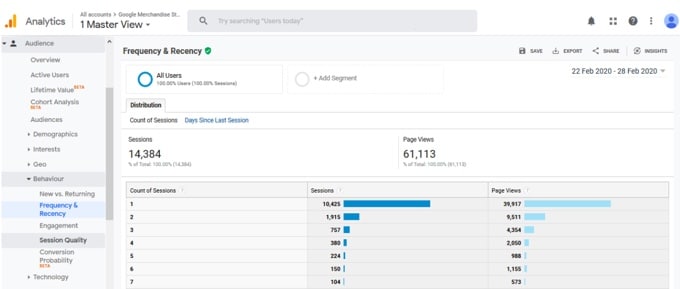
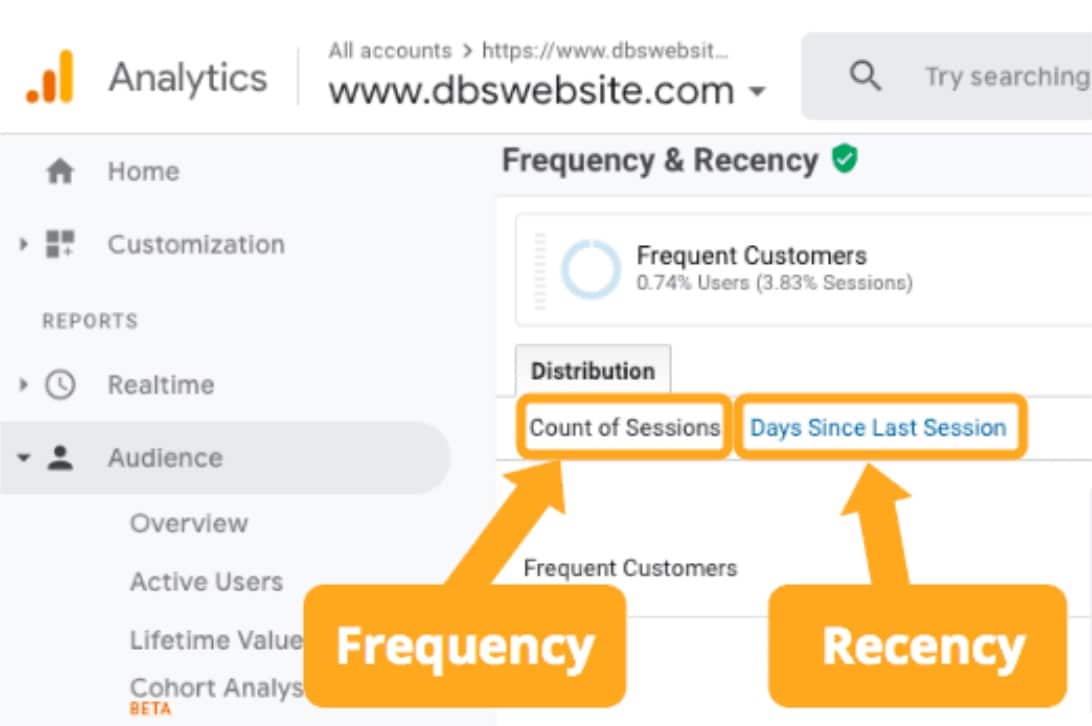
It’s pretty easy to find the Recency and Frequency report on Google Analytics. Go to audience-> Behaviour-> Frequency and Recency report.
You find Frequency (count of sessions) and Recency (Days since the last session) by clicking the links shown in the images.
Source: DBS interactive
Google Analytics offers the flexibility of comparing frequency and recency data of multiple audience segments.
How to use Recency and Frequency reports for more conversions:
One of the most used real-life applications of the Recency and Frequency report is RFM analysis.
RFM analysis is a method of customer segmentation based on their purchase value and regularity. The acronym of RFM is recency, frequency, and monetary value.
- Recency: The time since the customer completed a goal. It’s a great predictor of who would be warmer towards new offers and promotions. Usually, those who have purchased recently would more likely purchase again compared to someone who went cold for several months.
- Frequency: The regularity of the customer. If someone purchases frequently, the person is more likely to be a loyal customer or could be easily converted into one. High frequency indicates the high lifetime value of a customer.
- Monetary value: The amount of money customers spend. Anyone who spends higher is more likely to continue spending more if given better offers or loyalty benefits.
In order to do RFM analysis, each customer is assigned a score for recency, frequency, and monetary value. If you use a 1-4 scale, score 4 would be assigned to the highest monetary value, frequency, and lowest recency. Create a range for subsequent scores for each factor. While assigning a monetary value score, you can take account of either total spending or spending per visit, depending on your business model.
Now, a 1-5 scale offers better accuracy as you can split your audience into more number of groups. However, most businesses usually don’t need that many segments.
The perfect customers (who spend the highest, shop frequently, and purchase recently) would get a score of 444 on this 1-4 scale. One time, long disengaged customers would be at the bottom with a 111 score. Everyone else would be in between.
Here is an example to demonstrate how the RFM analysis looks like.
In table 1, you have the audience data straight from your CRM. Table 2 holds the recency score. Tables 3 and 4 are for frequency and monetary value range subsequently. The Final scored will be in table 5. Table 1: Original customer data
| Customer ID | Number of days passed since last purchase | Total numbers of purchases in last month | Average spending per purchase |
| Cid 1 | 2 | 1 | $20 |
| Cid 2 | 1 | 12 | $35 |
| Cid 3 | 10 | 1 | $90 |
| Cid 4 | 5 | 7 | $23 |
| Cid 5 | 13 | 17 | $77 |
| Cid 6 | 15 | 1 | $37 |
| Cid 7 | 4 | 5 | $62 |
| Cid 8 | 18 | 2 | $25 |
| Cid 9 | 12 | 4 | $51 |
| Cid 10 | 7 | 8 | $44 |
Table 2: Recency value table
| Number of days passed since last purchase | Recency score |
| 1-5 days | 4 |
| 5- 9 days | 3 |
| 10- 15 days | 2 |
| 15+ | 1 |
Table 3: frequency table
| Total number of purchase | Frequency score |
| 1-5 | 1 |
| 6-10 | 2 |
| 11-15 | 3 |
| 15+ | 4 |
Table 4: Monetary value
| Average spending per purchase | Monetary value score |
| $1- $25 | 1 |
| $26-$50 | 2 |
| $51-$75 | 3 |
| $75+ | 4 |
After reassigning RFM scores you will get something like this
| Customer_id | RFM score |
| Cid 1 | 4-1-1 |
| Cid 2 | 4-3-2 |
| Cid 3 | 2-1-4 |
| Cid 4 | 4-2-1 |
| Cid 5 | 1-3-4 |
| Cid 6 | 2-1-2 |
| Cid 7 | 4-1-3 |
| Cid 8 | 1-1-1 |
| Cid 9 | 2-1-3 |
| Cid 10 | 3-2-2 |
Here is how you interpret and use the RFM analysis data in your marketing:
- Customers with an overall high RFM score belongs to “loyal” or “potentially loyal” customers category. In this example, Cid 2 and Cid 7 come closest to being loyal customers.
- Customers who have a high overall RFM score but a frequency score of 1 are new. The company can provide special offers for these customers to increase their visits.
- Customers who have a high-frequency score but a low recency score belong to the “cold customer” category. They used to visit quite often before but no longer visits now or maybe their interest is dwindling. These customers might rekindle the “relationship “ if they get lucrative offers and discounts. Sometimes highly personalized heartwarming gratitude emails could do the trick. Even when they don’t come back, they can point out why they left, if asked.
RFM scores can be analyzed together with the results of the campaigns to eliminate non-responsive customers and further improve the campaigns. Apart from that, this score can be analyzed together with the products they purchase to design highly targeted offers for each customer segment.
Once you have your segments planned, go to the Analytics dashboard, select “admin” and create new customer segments. Please note, the RFM segment may not always be the best segmentation method but it is a powerful tool in your CRO toolbox.
Multi-channel Funnel
Chances are, you have a list of goals you want users to complete on your website. If you study the intricacies of their consumer habits, preferences, and engagement, you can improve conversions significantly.
This is where MCF (Multichannel Funnel) assists.
It eliminates every scope of guesswork by displaying detailed data about conversions, right on your Google Analytics dashboard.
In order to find this report, go to Conversions->multi channels funnels.
Multi-channel Funnel report offers 5 different sub-reports. Let’s have a brief overview.
Understanding different MCF reports:
1. Overview report:
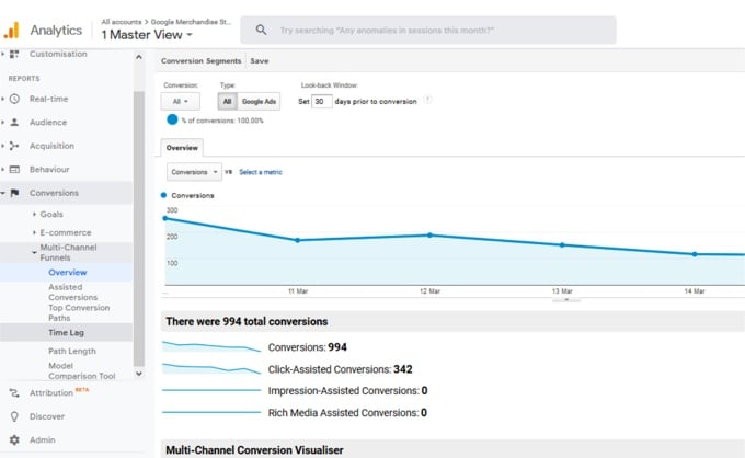
This is the first report you see when you click on the Multi-channel Funnels section link. It’s a summary page that compares the number of conversions and assisted conversions over the selected time period. (Note* For any of these reports, you have the flexibility of changing the date range to whatever time period you want to analyze. However, as of right now Google is only planning on expanding the data in these reports back to January. )
The overview report also has a feature called the Multi-channel Conversion Visualizer, which displays the percentage of total conversions by channels( and channel combinations).
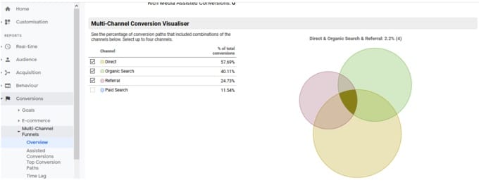
This is an MCF overview conversion report for the goal “entered checkout”. According to this report, direct search is responsible for 57.69% of total number conversions, organic search is 40.11%, referral search is behind 24.74% conversions and paid search fueled 11.54% of total conversions.
In this particular case, Direct, organic, and referral — all of these three channels combined contributed to 2.24% of total conversions.
2. Assisted conversion report:
Not all channels contribute equally to conversions. The Assisted conversion report provides in-depth information on the role of each of your channels and their performance— when and how many conversions each channel initiated, completed, and assisted.
Having a clear idea of the following terms is important for understanding the full extent of this report:
- Assisted Conversion: this shows the number of conversions in which a specific channel assisted. In other words, this report captures channels that are part of the conversion path, but not the final conversion point.
- Assisted Conversion Value: The net value of the conversions, assisted by a specific channel.
- Last Click or Direct Conversions: Think of this as the opposite of assisted conversion. The direct conversion column counts only the number of conversions where a specific channel acted as the final conversion interaction point.
- Last Click or Direct Conversion Value: the value of the direct conversions.
- Assisted / Last Click or Direct Conversions: This is a ratio of assisted and direct conversions. A value close to 0 indicates a specific channel functioned primarily as the final conversion interaction. A value close to 1 means the channel equally participated in both assist roles and final conversion role. More this value shifts towards 1, more the channel in question assumes the assist role.
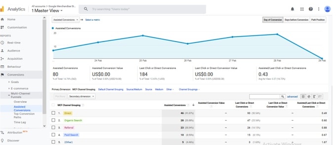
If you look into the report, each default channel is shown with a score in all the above-mentioned columns. Take the example of “Direct “. For any given conversion, it assisted in 46 conversions. It’s assisted the last click or direct value is 0.49 which denotes direct channel functions as both final as well as an assisted touchpoint.
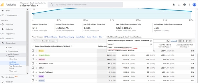
Now, Assisted conversion reports use pre-defined channel grouping to display how conversions are taking place. These channels provide valuable insights.
However, sometimes you might need more than that. For instance, Suppose you have 65% organic traffic. This organic traffic can come in various ways– brand terms, SEO content, product, or even by users typing your name. Default channel “organic” just roll them together and keep them in the same basket. There is no way to distinguish details unless you go for customized channel grouping.
Custom channel grouping is a unique combination of channels that uncover the insights you seek.
You can create those custom grouping on your analytics dashboard. There are two ways to do it: either by creating from the admin interface or doing it directly from the assisted conversion report page.
Here is how to do it from the Assisted conversion report interface:
Click on “Channel grouping”. A drop-down will appear. Scroll down and select “Create a custom channel grouping”.
Once you click on it, a new window will open, where you can create your unique channels and make a grouping with those channels.
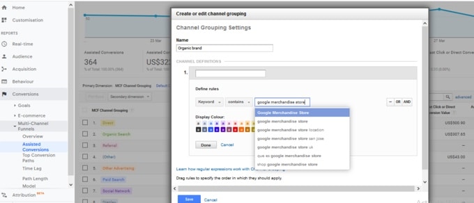
Alternatively, you can take existing templates, tweak them according to your requirement and use.
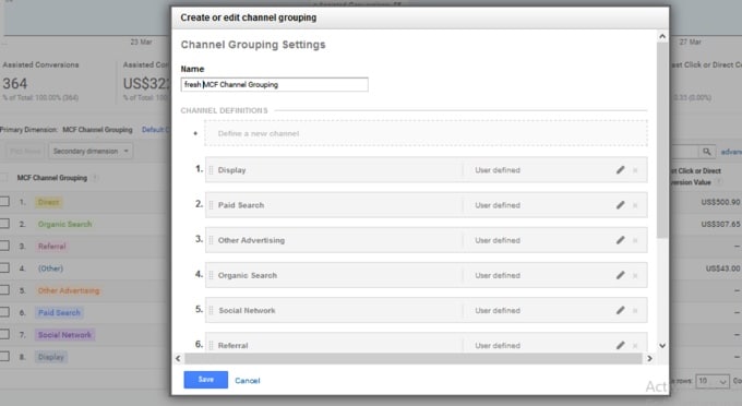
Once you set your custom channel grouping, you can navigate to new grouping by clicking on the primary dimension dropdown. Here is what your Google Analytics dashboard looks like with custom channel grouping.
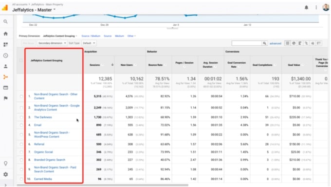
Source: Jeffalytics
Please note, it’s possible to alter default channel grouping if you want. However, tread lightly if you don’t know what you are doing. Editing default channels can alter data permanently. Even if you reverse it later, some data will be lost anyway.
In case you are determined to do it, head back to the Channel grouping option as Admin, select the default channel, and update the channel rules.
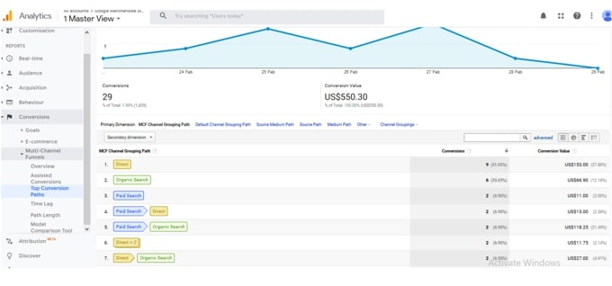
3. Top conversion path report:
The top conversions path report allows you to quickly visualize how people reach your site, which channels are creating a first-touch interaction that converts well, and which channel combinations work best.
By searching on a particular channel you get more insights into the role of that channel and where the channel occurs on the path to conversion.
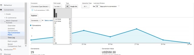
On top of the report, you can set the length of the path. In this way you can look for reports based on your choice of path length:
4. Time lag report:
The time lag report reveals how long a certain user takes to convert counting from his/her first session.
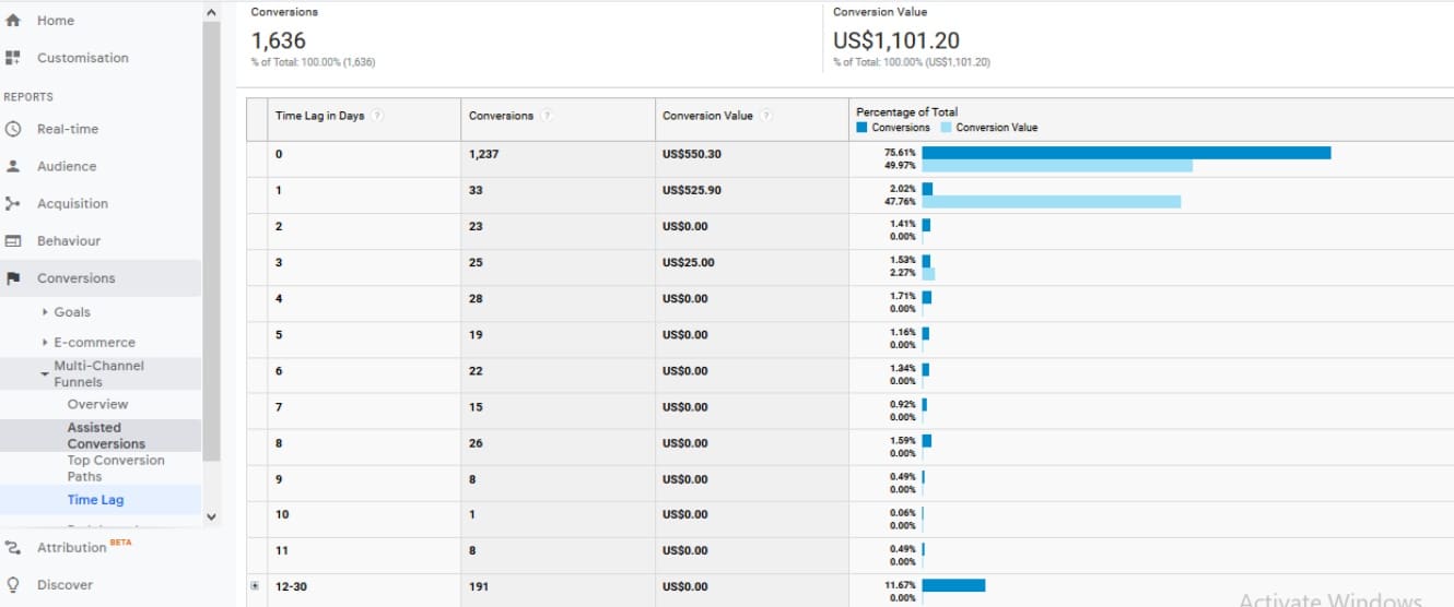
Notice the pattern here. Most of the conversions take place either within three days from the first session or after 12-30 days.
How do you use this info? Re-target users if they ejected midway, within three days.
If you change your conversion goal, this report would vary accordingly. Another point to remember, depending on the value of look back window results may vary for the same conversion goal.
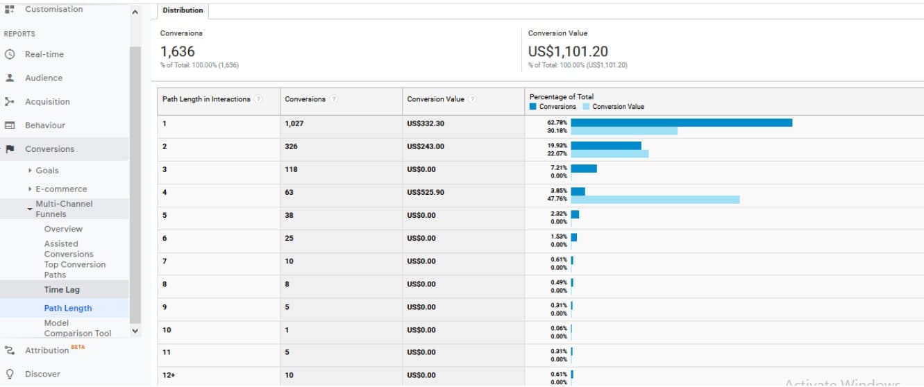
5. Path length report:
Path length report shows the actual number touchpoints or path length required for each conversion. For example, suppose a visitor came across your ad on Facebook, landed on your website, and sign up for the newsletter. Later he purchased it through a link sent in your email newsletter. In this case, the path length would be 3.
How to use MCF report insights for better conversion:
By now, you should have a basic understanding of what insights MCF has to offer and where to look for those insights.
In this section, I would share some actionable tips to use those reports.
Reallocate your Adword spending for better results: It’s easy to slip into the mistake of investing only in campaigns with the highest revenue generations. Think branded campaigns for example. Great numbers, high ROI.
However, it could be possible other Adword campaigns influencing many conversions but high revenue/ high ROI campaigns are taking credit. Instead of spending on high revenue campaigns, you would be better served by spending on those assisted campaigns.
Here is how you can approach this:
1. Toggle to “Google Ads” ( instead of all channels ) and observe how well your campaigns perform using “Assisted conversion” reports. Then compare your Adword spending with both direct conversion value and assisted conversion value of your campaigns.
Invest more in the campaigns that convert better, direct or associated — either way.
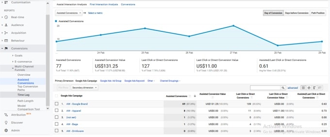
In this example, you can see the branded campaign brings home some decent assisted conversion value but zero direct conversion value. In other words, that campaign is worth spending on though it doesn’t convert directly.
2. Also, examine the top conversion path report. If any campaign is contributing to many conversions, it deserves your attention.
Find out how your paid search interacts with other channels:
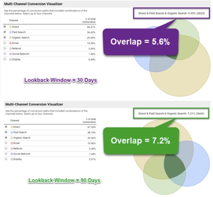
Knowing how your channels interact with others is key to smart investing and getting the max ROI. MCF overview reports are perfect for understanding inter-channel interacting.
Here is how you understand mutual interaction between paid and other channels.
- Conversions->multi channels->overview
- Go to conversion tab and select the only transaction
- Select direct, paid search and organic search
Source: Online metrics
Challenges of MCF reports:
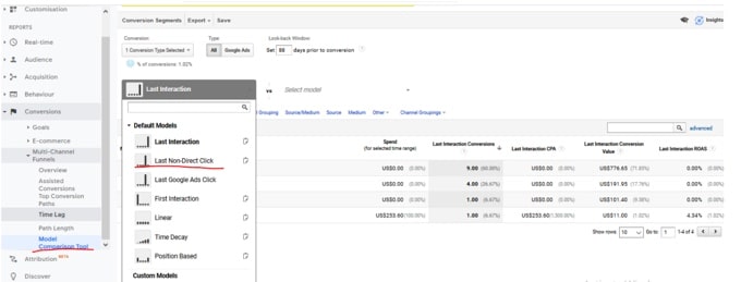
- A mismatch between standard and MCF reports: MCF reports sometimes don’t match with standard reports. The reason is that by default MCF reports and standard reports use different attribution models. In MCF if direct traffic converts, the direct channel gets the credit. In the case of standard reports, the conversion is assigned to a previous non-direct campaign or source.
You can easily fix this by selecting a non-direct click attribution model. Go to the Model comparison tool and select the attribution model of your choice.
2. Lookback window in only 90 days: In MCF, the maximum lookback window span is 90 days. It was 30 before, so it’s a big improvement.
Still, for some businesses 90 days is too short considering the length of their sales cycle.
3. No reports on non-converts: Unfortunately you won’t find any reports on non-conversions. It’s a major drawback in my opinion as by analyzing users who dropped midway, you can fix your marketing efforts.
Conclusion
There you have it, the marketers guide to MCF and frequency and recency. Google analytics provides various insights that you can use. The actionable tips shared in this article barely scratch the surface. Depending on your business, go creative, and get the best insights from the analytics dashboard.


