People believe that the key ingredient to making an attractive and useful webpage lies in its design quality. But the real underlying current that drives a visitor forward is the site’s usability and navigation. User satisfaction significantly depends on the informational architecture of a website and how it delivers the necessary information.Unfortunately, the ability to easily navigate through a page, and find the necessary information is often prioritized lower than aesthetics. For the best user experience and visitor satisfaction, optimizing a webpage’s navigational capability is imperative. And to quantitatively determine just how well a page can do that, we rely on the navigational stress test. This blog will highlight the significance of user navigation and how we can capitalize on it.
The navigational stress test is just one quantitative measure of a website’s overall user-friendliness. Approaching Conversion Rate Optimization is done through refining many parameters on a site. We do this via the SHIP method: Scrutinize, hypothesize, implement, propagate.
The SHIP method

The SHIP methodology is a 12 step comprehensive approach to evaluating a website’s conversion rate and how it can be optimized. One of the parameters that affect these conversion numbers is the navigational ease or “scent” of a webpage. Getting visitor A and B who may have different motivations and interests means providing them with the necessary elements that will allow them to find the adequate information they were seeking without frustration.
The navigational stress test is one of the key areas of Invesp’s SHIP (scrutinize, hypothesize, implement, propagate) process. Each part of this process is designed to elevate a marketer’s understanding of the visitors, their behaviors, and how to design for them.
Scrutinizing and best practices
The basic concept of the navigation stress test is to examine a webpage based on its intended purpose and establish how well the webpage can convey its information. A page should effortlessly display essential information to its visitors regarding where they are and where they need to go. A visitor should have to put minimal effort to get answers to these questions.
To better understand how much of an impact information architecture and navigation of a site can have, we use the example of skinnyties. The site originated in 1997, but over the years, the site required revamping.
Below is a screenshot of their home page before they reinvented their layout.

Off the bat, the range or scale of the products offered isn’t clear. Links such as ‘My Account’, ‘My Cart’, and ‘Login’ are relatively of lesser importance but are placed at the top of the page. This ends up compromising on good special utilization, which is important for a site like this which emphasizes on visuals a lot. Contact information should be provided at the end of the page after the visitor has viewed the variety of the products. This is because the visitors’ attention deviates to the center image directly. This makes it difficult for them to find relevant links.
Irrelevant content about swatches, just below the image doesn’t help the visitor orient himself. Also, space utilization is poor in the initial bracket of the page.
Now let’s consider the redesigned page of skinnyties that launched in October 2012:
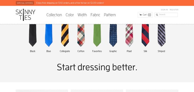
With minimum content, the page conveys its intention – A wide selection of ties to dress better. Redefining how the ties are characterized, a visitor finds it easier to discover a tie of his liking. Filtering based on the collection, color, width, fabric etc. proved to be more effective than 1 ½’’, 2’’, specials, etc. Also, these filters are strategically placed and more easily accessible.
The developer rebuilt the store’s information architecture (IA) from the product-level outward. Brendan Falkowski explains:
“Every tie has structured attributes for width, length, color, fabric, and pattern. Open-ended navigation creates multiple entry paths for every product and enables refining by any attribute at any time.”
The website experienced a 42.4% revenue increase after the new design was launched.
Cluttering the webpage with too much content can disorient a customer. Clear-cut and straightforward information provided at the right places proves to be far more effective.
The Navigation Stress Tests Expert reviews
One of the parameters that are used to define a sites navigational performance is by tree testing or card-based classification. This defines the find-ability of a product or a page on the overall website. The information architecture of a site dramatically depends on the classification or assortment of information. Easily understood subheadings and titles allows a visitor to make his way through a website without getting lost.
 A large percentage of your audience doesn’t visit a page via the home page. Indirect traffic is common as users get redirected to specific pages via, links, blogs, advertisement or URL. Keeping this in mind, it is essential to make each page understandable to the users. If a user is not able to acclimatize to a specific page, they will eventually lose interest and abandon the site. Information architecture plays a vital role in preventing this. Nathaniel Davis explains:
“Information architecture’s interest in structure runs wide and deep, and that is why it is hard to separate an environment’s structural concerns from broad, strategic factors such as business objectives, user insights, and technology.”
An unbiased opinion brings a fresh perspective to the table and identifies issues that one wouldn’t usually notice. A team of experts, without any bias, evaluate a list of factors including content strategy, technical writing, interaction design, space utilization and card sorting capability. Kevin Parker explains:
“IA improves findability. So much content is created but never found, which is a waste of time and resources. Better IA helps connect related content and surface it to the right customers at the right times”
How Navigation Stress Tests work
The primary function of any web page is to convey information. For this to happen, it becomes necessary to ask three fundamental questions regarding your page; that is:
- Where am I?
- What is this about?
- Where can I go?
The three questions mentioned above are relevant in both the scenarios. When a user visits your page, he requires answers to these questions.
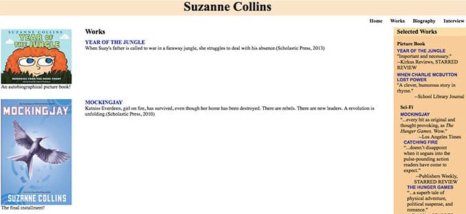
Let’s consider an example to wrap our heads around this concept better. We’ll use Below is a link to Suzanne Collins’ web page to drive the point better across. Suzanne Collins is the author of the ‘Hunger Games’ book trilogy. The link to her webpage is provided below.
Where am I?
It’s necessary to know your location on a map to use it. Similarly, a user needs to know his position or location within the webpages to better navigate himself. Considering the link above, a shortcoming of the page is that a visitor finds it difficult to understand which of the four subcategories he/she is visiting. Is it ‘Home’, ‘Biography’, ‘Works’, or ‘Interview’? The user should not have to decipher his location by reading or decoding the URL. Furthermore, the subcategory list is poorly placed.
What is this about?
This question is an obvious one. The page should communicate the information efficiently and simplistically. The link in question doesn’t explain the purpose of the page. Not providing links to the book’s icons shows rigid navigation pathways. And of course, having good quality content is paramount.
Where can I go?
For improving the conversion ratio of our page, we need the visitor/user to complete specific actions. The execution of this series of steps needs to be a streamlined process. If the user is required to put in more effort than he wants to, he’ll end up abandoning the task. Therefore, presenting the following steps in an attractive, yet accessible manner is crucial. The link doesn’t provide a direct path to purchasing any books and doesn’t indicate a direct link to the home page at the top left corner or at the center where the name ‘Suzanne Collins’ is displayed.
While these questions are the major factors affecting the Navigational Stress Test, they are not the only ones. But we’ll talk about them a little later on.
What kind of data does Navigation Stress Tests provide?

To put it simply, tangible data.
The concept of the navigational stress test is to employ a method of validating the navigation elements of a web page without the need for testing it with users. Instead, using the insights provided by experts to conclude the page’s capabilities.
How can that data be used?
Now that the Navigation Stress Test has been conducted, and we have acquired the insights that are needed, there are a few approaches that can be followed regarding utilization of this data. If the test suggests that the page passes every criterion, you’re good to go. But let’s be practical, nothing’s perfect on the first try. So, if the test reveals problems, here’s what we do next:
- We can either redesign some of the erroneous navigational elements based on the results of the test. And maybe repeat the NST process to confirm the iterated design’s performance; or
- Implement user testing to either validate the results or to understand better/refine the results obtained in the NST.
While these are the usual options, a third route does exist where you may feel the test results are not relevant enough and decide to continue with the present page design and navigational elements.
How to perform a Navigational Stress Test
1. Where am I?
Draw a rectangle around the title of the page.

2. What site is this?
Circle the name of the site.

3. What are the main sections of this site?
Mark those sections with an X.

4. Which section is this page in?
Draw a triangle around the X.

5. How do you raise a level from this page?
Mark with U.

6. How do you get to the site’s homepage from this page?
Mark with an H.

7. How do you get to the homepage of the section to which this page belongs?
Mark with T.

8. What does each of the link sets represent?
Mark the main sets of links and labels.
- D: Subpages of the current one.
- N: Pages of the same level as the current and the same section.
- S: Pages from the same site, but not from the same section.
- O: Off-site pages.

9. How would you get to this page from the homepage?
Enter the set of selections you would have to do.

These steps help surface certain usability issues that can go unnoticed.
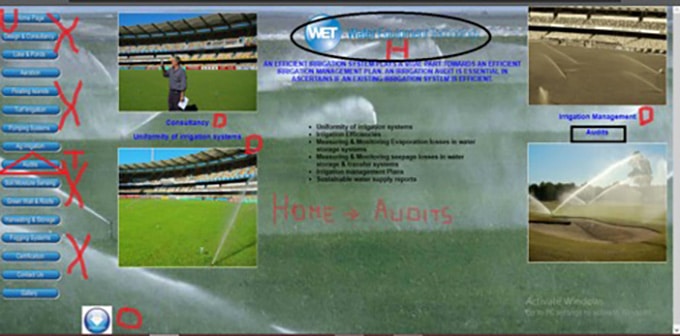
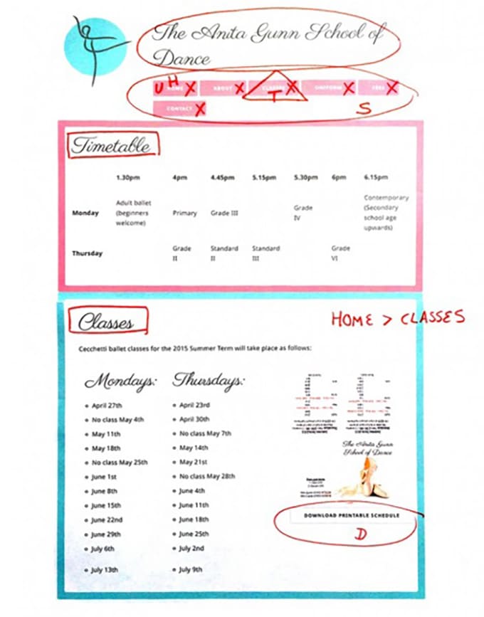
Below are screenshots of the carried out exercise for better understanding.
How to interpret the resulting data
Based on the navigational stress test we conduct, specific elements on a page can be defined as unessential, essential or requiring modification. The inessential information and links need to a . This leads to better presentation of information when a visitor lands on any page.
Essential elements need to be given priority and presented in an accessible manner since they obtain the most number of clicks.
The elements that require modification need to be altered such that they provide a clear indication of their intent and contribute to the page in an impactful manner.
One of the best practices to optimize a page’s navigation is to follow these steps:
- Remove items that rarely get clicked, if they aren’t critical.
- Rename or relabel that rarely get clicked, if they are important.
- Move items that often get clicked to the beginning.
Conclusion
The Navigational Stress Test was developed in 1998 when the internet was still in its infancy. That doesn’t make it any less relevant today. In a world where websites can make or break a company, the NST has become increasingly significant for quantifying user interactions.
Information architecture is greatly influenced by a website’s navigation capabilities.

