
The psychology of color is one of the most powerful instruments you can use in conversion optimization. You can use it to influence people’s emotions and feelings, create a stronger visual hierarchy, and even make your site more usable.
Color psychology has been used by marketers for years to influence customer behavior subtly. But you don’t need to be an expert in marketing to use color psychology in your designs.
In this article, we’ll talk about how to use the psychology of color effectively, whether you’re using it for branding purposes or just want to make your site more appealing.
The Psychology Of Color: How Harnessing the Power of Hues Drives Conversion Optimization
Color psychology is the study of how colors can influence human thoughts and feelings. It recognizes that colors have the power to evoke desired emotions in your target audience, create impressions, and influence actions.
Using color effectively in your marketing strategy is an important part of creating brand awareness. It communicates your message to consumers in a way that resonates with them on an emotional level.
The Impact of Color Psychology on Conversion Optimization:
Here’s an overview of how color psychology helps you bolster conversion optimization:
- To grab attention of your target audience: Certain colors, especially high-contrast colors, help you catch users’ attention and guide them to key web elements like CTA buttons or product listings.
- To build trust and credibility: Trust-building colors like blue and green can help you establish credibility and reassure users, particularly on websites where trust is paramount, such as ecommerce or financial platforms.
- Creating a sense of urgency: Colors like red can help you create a sense of urgency, encouraging users to take immediate action. For example, you could use a red CTA button for a limited-time offer.
- Emotional resonance: Brands often use emotionally relevant colors to evoke desired emotions in their target customers. For example, you can use warm colors like red and orange can convey excitement, while cool colors like blue and green to inspire the feelings of calmness and trust.
- Branding and Recognition: Consistency in color choices across a brand’s identity, website, and marketing materials helps in building recognition and reinforcing the brand’s personality and values.
- Accessibility and Inclusivity: Considering color contrast and accessibility ensures that all users, including those with visual impairments, can access and interact with a website. This helps in creating a positive user experience for a wider audience.
Mastering The Psychology Of Color: Proven Strategies to Supercharge Your Conversion Rates
Now that we’re aware of what color psychology is and how it affects conversion rates, let’s explore some unique and tested tips. These strategies will help you leverage its power to crank up your conversion rates.
1. Understand Your Audience
As with anything, before using color psychology effectively, you have to know your target audience.
Different people respond differently to different colors. It’s important to know what kind of reaction you want from your audience before choosing the right shade for your visual content.
And it’s not that simple. People from different cultures also respond to colors differently. Before you build your branding or campaigns, you’ll have first to understand your audience’s backgrounds and interests.
Start by collecting audience demographic data, including age, gender, location, and interests.
You can use tools like Google Analytics and social media insights to get this information.
Another way is to conduct psychographics analysis, which includes understanding their values, lifestyles, and attitudes. It also entails identifying what emotions, values, and beliefs drive their buying decisions.
For example, Starbucks uses color psychology to evoke feelings of calmness. They employ a palette of fresh, relaxing colors like green and white to create a sense of comfort, aligning with their brand’s mission of “to inspire and nurture the human spirit.”
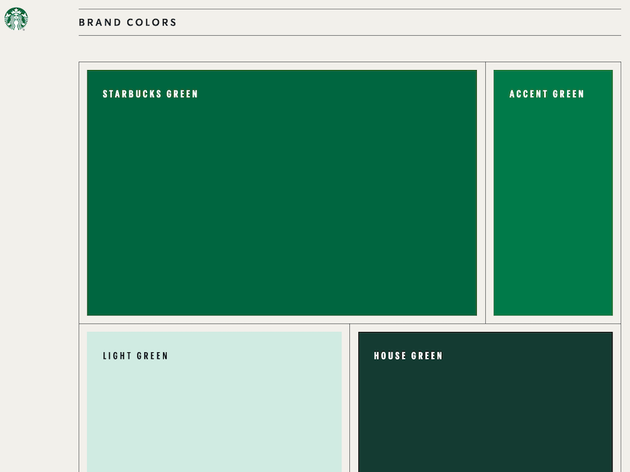
(Source)
Here are some more ways to understand your audience and use relevant colors in your branding and marketing campaigns:
- Color Preference Surveys: You can directly reach out to your audience using surveys and interviews to get insights into their color preferences. Ask them about their favorite colors and the emotions associated with those colors.
- Competitor Analysis: Study your competitors’ color choices and how they resonate with their target audience. But rather than simply replicating them, identify gaps in their color palette to differentiate your brand through color.
- Cross-Cultural Considerations: If your audience has a worldwide presence across different cultures, be mindful of color symbolism variations. Colors can have different meanings in different regions, so adapt your color choices accordingly.
For example, after Disney experienced success with their purple signage and marketing material in the US, they used the palette for its Euro version. However, due to cultural associations in Catholic Europe, where purple symbolizes death and crucifixion. Disney eventually abandoned the purple scheme for its European market.

(Source)
- Data-Driven Decision-Making: Conduct A/B tests to identify for sure which colors are resonating more with your customers.
2. Create a Cohesive Color Scheme
Now that you’ve recognized how different colors invoke different emotions for different types of audience, using color effectively can be tricky.
Creating a cohesive color scheme can be the difference between an engaging website and a confusing one.
There are many different ways to approach color schemes and there are no hard-and-fast rules about which colors go well together.
The easiest way to create a cohesive look is by choosing two or three colors and sticking with them throughout your site. This creates consistency and prevents your site from looking too busy or overwhelming.
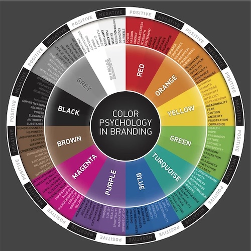
At the same time, make sure you’re picking complementary colors. These colors are directly across from each other on the color wheel.
You can use Canva’s Color Wheel to identify which color combination looks easy:
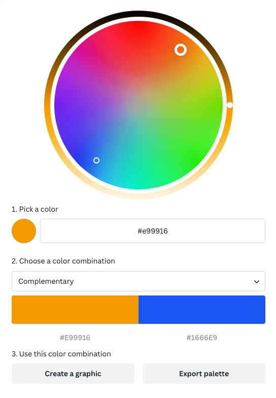
By pairing complementary colors you create contrast that really draws attention to specific elements on your page (like headlines).
For example, the global shipping giant FedEx, uses a complementary color scheme of purple and orange to create a sense of balance and dynamism in their branding.
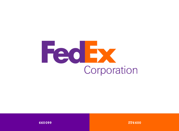
(Source)
You can start by picking your primary color first.
Your primary color will represent your brand prominently. This color should be the one most closely associated with your brand.
Next, choose your secondary colors to complement the primary one and for accents and highlights.
For instance, Facebook uses blue as its primary color, symbolizing trust and reliability. Then they use complementing secondary shades of white and gray for a clean and professional appearance.

(Source)
While you’re working on creating a cohesive color scheme for your brand, don’t forget to make it as accessible as possible to accommodate users with visual impairments.
The easier it is for folks to access your content and website, the more conversions you’re gonna rack up. So, make sure you’re using color contrast tools as well for readability.
Most importantly, maintain consistency in your color scheme across all platforms, including your website, mobile app, and marketing materials.
Google, Facebook, Pinterest – you name it, all the big-name brands out there stick to the same colors over and over again to make sure you always recognize ’em.
3. Use High-Contrast CTAs
CTAs are, without a doubt, one of the biggest driving forces for conversion rates on your site. These nifty buttons are what compel them to take the final action, whether it’s subscribing to a newsletter or making a purchase.
CTA buttons are clearly one of part of your website you can’t afford neglecting.
One way to make them stand out is by using high-contrasting colors against the background, making them easily noticeable. This ensures that users don’t miss the action you want them to take.
At the same time, don’t overlook the emotional impact of colors when selecting your high-contrast CTA color.
For instance, red can create a sense of urgency, while green may convey safety or action.
Pro Tip: Besides color, pay attention to the size and placement of your CTAs. Ensure they are appropriately sized, well-spaced, and strategically positioned to maximize visibility.
4. Leverage Emotionally Relevant Colors
Every color has an innate emotion attached to it.
For instance, when you think of red, you instinctively think of passion, romance, or urgency.
When you think of blue, clear skies and sea comes to mind, which represents trust and calmness.
Once you know your target audience, you can tap into their emotions by understanding the common emotional triggers associated with various colors.
There’s a reason the dating app Tinder uses the color red for its logo and interface elements.
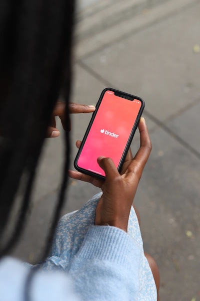
(Source)
Since the color red is associated with excitement and passion, it aligns perfectly with the app’s goal of facilitating connections and sparking romantic interest.
Here are some tips to help you leverage emotionally relevant colors:
- Pay attention to color gradients: Picking a color isn’t enough, you have to take color gradients into consideration as well. For example, lighter shades may evoke feelings of purity or innocence, while darker shades can suggest luxury or sophistication.
- Create emotional journeys: Utilize a sequence of colors to guide users through emotional journeys on your website. For instance, use calming colors for introductory content and more vibrant ones for calls to action.
- Test and Optimize: Conduct A/B tests to evaluate how different color variations affect user engagement and conversion rates. Continuously refine your color choices based on data-driven insights.
5. Incorporate Trust-Building Colors
Trust is essential in convincing users to take desired actions, such as making a purchase or providing personal information.
If your audience doesn’t even trust you, why would they part with their money for your products or services?
While there are various ways to inspire trust in your audience – including using trust badges and customer reviews – incorporating trust-building colors also play an important role.
Trust is typically associated with cool, calm, and neutral shades like blue, green, and gray. These colors are also associated with qualities like reliability, stability, and professionalism.
(Source)
That’s why you’ll notice platforms like IBM, PayPal, and the like, predominantly using shades of blue on theirs websites.
These color palettes convey a sense of security and trustworthiness, both of which are crucial for financial transactions.
On the other hand, use green if you want to invoke emotions like safety and growth.
Green is associated with safety, growth, and harmony. It can be used to convey a sense of environmental responsibility or financial security.
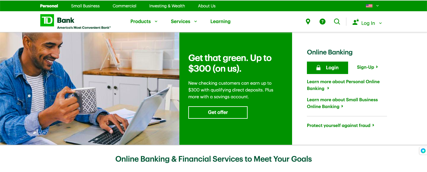
For example, TD Bank, a North American bank, utilizes green in its branding to signify financial security and growth, which are important factors for a bank’s trustworthiness.
(Source)
Use these trust-building colors primarily in prominent website elements like headers, footers, navigation menus, and trust signals like security badges and testimonials.
And as usual, continuously test and analyze user responses to trust-building colors, and refine your color choices based on data-driven insights and user feedback.
6. Use Color in Visual Hierarchy
Visual hierarchy is the order in which people look at your web page layout.
It’s what makes it possible for website visitors to scan a web page without having to read every word individually or look at every picture.
It’s also what allows them to identify what’s most important and what’s least important on a page – allowing them to find relevant information quickly.
For example, you can use high-contrast colors to draw the eye to your most important headlines, CTAs, or any other critical information.
You can see how Netflix uses high-contrast red CTA buttons against a mostly black background to make the primary action stand out.

(Source)
Conclusion: Leveraging Color Psychology for Conversion Optimization!
Color psychology helps you tap into your target audiences’ subconscious emotions and, leading to improved user engagement and higher conversion rates.
From understanding audience preferences to incorporating trust-building colors and guiding users through visual hierarchy, every aspect of color implementation plays an important role in the user experience.
Think about it – the Coca-Cola red, the PayPal blue, and the Netflix red “Watch Now” button are all-star examples of how colors can send a message without saying a word. They create trust, urgency, and an irresistible urge to take the intended action.
So, put on your artist’s hat, grab your color wheel, and let’s keep the conversion party going!


