It would be great to simply change some copy, a headline, a button on your site to see massive improvements. But you and I know, that’s not the reality. In the early 2000s, when websites were still growing and developing, those slight changes could highly influence the user. However, now, because of the variety of well-designed sites, sticking out by having better usability really doesn’t move the needle.
SHIP (Scrutinize, Hypothesize, Implement, and Propagate), is our CRO methodology. The 4 phases represent the overall CRO process we follow at our organization. Ultimately, the research you collect during the scrutinize phase gets classified as an item that needs to be fixed right away, investigated further, instrument, or research opportunity. Typically, UX fixes are classified under “fix right away” as it simply doesn’t make sense to test something like that.
On the other hand, research opportunities are basically “test ideas.” Typically, these are areas where you are pushing the envelope to try new things on the site that will draw more attention and create more buzz and engagement.
There are no best practices or easy ways to do CRO. Everyone is always looking for that silver bullet that is going to transform their conversion rates. But it simply doesn’t exist. Research, understanding visitors, and creativity are components to help you come up with research opportunities, which can be launched as experiments through AB testing.
“Regardless, UX is one of the most integral parts of making sure your e-commerce runs smoothly and is converting your users into customers. “
One important aspect of the SHIP method under the “S” for Scrutinize is competitive analysis. We strongly believe in gaining inspiration on marketing and advertising initiatives from other websites. We don’t believe in copying, however, keeping an eye on the competition and validating if an idea they deploy would work for you is all fair game. Those inspirations enrich our own perspectives and allow us to venture and research other possibilities that can engage site visitors.

Online competition is fierce in every vertical, however, in particular, when it comes to e-commerce, it becomes more challenging to provide a unique, buzzworthy experience that’s user-friendly and useful.
Thinking, fast and slow by Daniel Kahneman delves deep into the psychology of the mind, explaining how people think and process items. He describes two systems, system1 where thinking and processing are fast, intuitive, and emotional, and system 2 which is much slower, methodical, deliberative. There are biases to keep in mind with fast thinking, however, when designing sites, things should be intuitive and easy to understand (System 1). Visitors shouldn’t have to think about how to navigate and find items. It should be intuitive (based on experiences visitors don’t have to “think” about).
“Modern users expect every site to be mobile-friendly. If your site is not responsive, many users will bounce as soon as they see your site.Just as importantly, mobile-friendliness is a ranking factor.“
So there is that balance one must strike: create a unique experiencing, without veering off the rails from adhering to System 1 thinking.
Ultimately, the goal for most sites is to improve usability and increase revenue. But is that enough? In such a competitive space such as e-commerce, how does a site truly stick out and capture hearts and minds?
In the following post, I’ve come across a few ideas on how to optimize the experience. However, the disclaimer for all who read this, these are not by no means implementation ideas. These are merely ideas to consider. You still are responsible to validate whether or not this is something that would resonate with your visitors.
1. State your purpose with flair
We all know the importance of a strong value proposition. But what if it can be stated through your design? Everything on your site does a great job conveying your value.
“Having great e-commerce website design can make all the difference when it comes to attracting customers.“
The start of experience optimization is not to forget the basics, but rather, amplify and have fun with them. Take for example Asos:
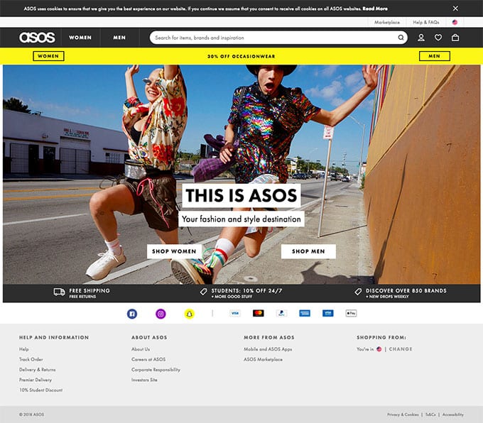
They aren’t shying away from bold images because that is what their site is all about: fashion and style destination. That is the value they offer, with the great incentive of free delivery worldwide as well as over 850 brands!
They offer the visitor two paths – Shop Women or Shop Men. The label-like CTAs are a part of their brand, clearly making a statement and giving the visitor, from the very beginning, an experience as well meeting expectations.
As you click through to the category pages:
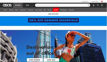
Again, the vivid imagery, unique positioning, and clothing styles are all stating the value without them actually having to state it.
Finally, the product pages:
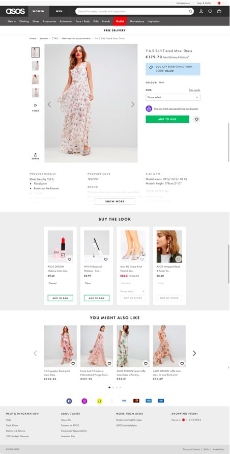
They offer a catwalk video, several unorthodox model positions, and a bundling “Buy the look” section that rings true of a fashion destination.
The value proposition is always proposed as some statement – but when every element reiterates the value in a fun and innovative way, it provides for more than a regular e-commerce shopping transaction, but rather, a full-on experience.
Here’s another site that does a good job: The Sill
I’ve included a video to display all the “growing” that happens when you hover on a given link.

From the homepage logo shrinking and growing to the categories to the product images – everything emphasizes growing, which is equal to plants, which, according to The Sill, makes people happy.
2. Make use of visual cues to direct the user
Visual cues help visitors navigate around your web page, maintain a visual hierarchy, and point them to strategic areas of your landing page.
According to Christopher Meloni
“Visitors to websites don’t prefer to remain on sites with poor navigation, so it helps to make them comfortable using your site with good navigational techniques.“
Most often, visual cues directly to the call to action.
From bright banners to pointing fingers, visual cues come in many different forms. But the four main categories of visual cues are as follows:
- White-space
- Eye-direction
- Arrows/Linear
- Encapsulation
Generally, there are two types of visual cues or landmarks that help your visitors find their way around your site and content fast:
1. Explicit visual cues
These kinds of cues are direct and can easily be pointed out on the page. Using arrows, lines, pointing fingers and human line of sight are a few ways explicit visual cues can be used on landing pages.
Explicit visual cues quickly influence where a visitor looks on a page. For example, you can use arrows or lines to guide visitors to where you want them to go on the page.
Many websites use progress indicators to help visitors understand where and what to do next. On barkbox.com they simply a direct visitor to the main CTA “Get Started” and are taken through a process of building the box the way they prefer, allowing little to no distractions for leaving that funnel.
I will say, however, that by forcing visitors through a specific funnel, those who are curious to learn more won’t be happy about that, so it is a fine line prior to making that decision.
2. Implicit visual cues:
Implicit visual cues are not straightforward like arrows and pointing. These are design elements that don’t directly point to a particular object. Rather, they rely on a more subtle approach to imagery to persuade visitors to fulfill the conversion goal.
An example of this is placing the filtration, opened and this format very explicitly (as to grab visitor’s attention: USE THIS)
Or the way Bellroy displays images of its products, providing a cue for them to select the category of their choice: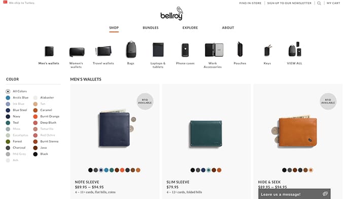
How to use visual cues to boost your conversions
- Use arrows to point viewers to where you want them to go on the page.
- Use animation to keep the user on the page.
- Try different navigation styles to encourage people to continue scrolling or navigating the page
- Make your CTA stand out with encapsulation by creating a color contrasting box.
- Combine different visual implicit and explicit cues with a compelling copy to create a high-converting landing page.
- Be sure to split test different landing pages to see which visual cues resonate with your customers.
3. Provide contrast, vivid imagery, and illustration
Of course, stay true to your brand.
But capturing attention via vivid visuals and imagery can really keep your brand top of mind.
“There’s no denying that user experience plays a huge role in any companies success. After all, you can’t retain customers if they get turned off by your first impression.“
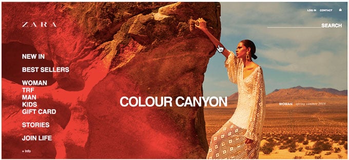
Take Zara.com for example:
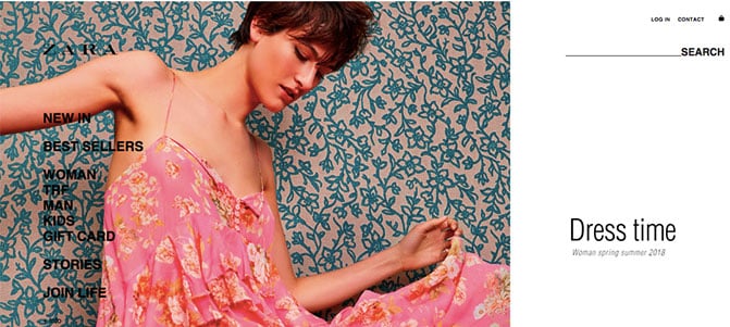
Look at the contrast they use here – the vivid image then the white highlighting the category. Talk about an interesting use of whitespace.
But Zara doesn’t have a single static homepage – the image changes within a carousel to display more vivid imagery.
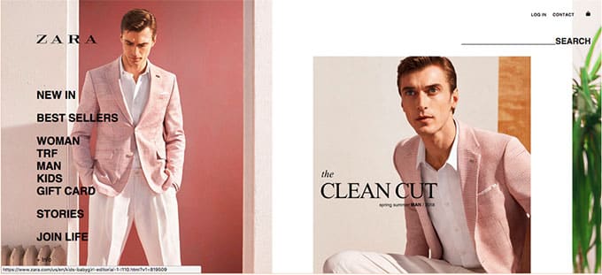
And it goes on for a couple of other screens.
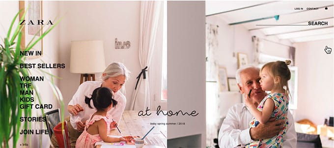
This imagery keeps the visitor engaged, offering them that experience we keep talking about rather than just a casual visit to an ecommerce store.
According to Christopher Meloni
“It doesn’t matter how much time you spend on beautiful design, product images and landing page optimization; the customer’s overall eCommerce experience will falter if foundational elements such as the category taxonomy aren’t rock solid.“
It doesn’t stop on the homepage – but continues through until the product page.
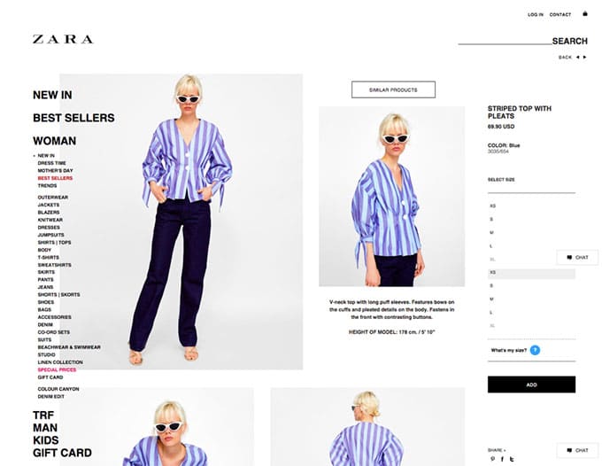
Notice the strong presence of the left navigation and, at the opposite end, the add to cart. For me, as a conversion optimizer, I’d say they aren’t highlighting the CTA – however, for their purposes, they’d rather engage their visitor and give them all the product views they need, convincing them to move forward with the purchase.
The website OWL does the same thing, but using video rather than images:
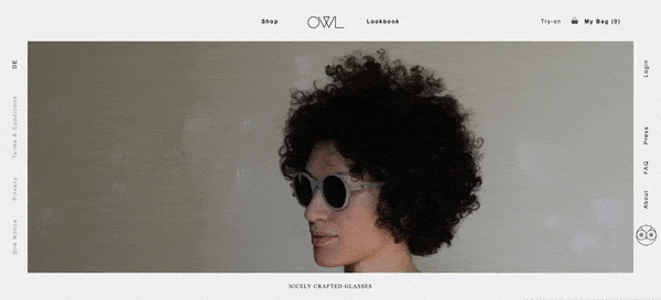
If you navigate to the category pages on this site, you’ll find that they make very interesting use of whitespace. There’s an overabundance of it, but it can’t be by accident.
4. Video and interactivity
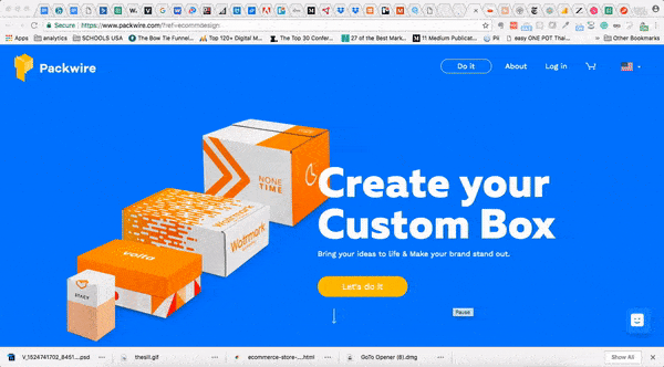
Creating an experience should involve elements of video and interactivity. Packwire.com uses interactivity to bring its website to life.
Another example is Mulberry. The interactivity of their categories, as you hover over a product, reveals the image of the product with a model carrying it.
The key to each of these sites is the ability to provide an experience like no other. Each stays true to its branding and value in the process.
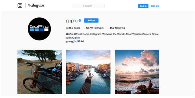
5. UGC on overdrive
On a daily basis, GoPro posts one customer picture using the #gopro hashtag. That commitment has garnered lots of support and, ultimately, 13.7M followers on their Instagram account alone.
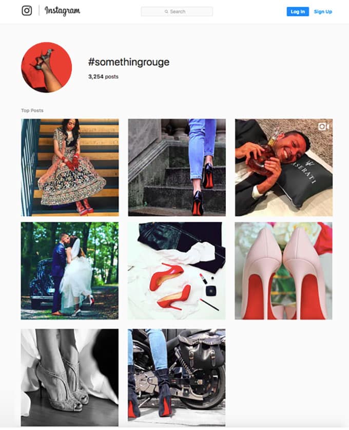
Louboutin got in on the UGC action by launching their “Something Rouge” campaign. Customers started using the hashtag posting images that you’d think the brand itself conjured.
User-generated content (UGC) is any content that a site user or visitor generates like a comment, review, uploaded photo, or
UGC garners engagement and brings a site to life. It gives visitors to a site social proof that the brand is tried and trusted.
Many companies are taking advantage of user-generated content to expand their reach and increase conversions.
Starbucks created a ‘White Cup Contest’ where customers drew their own designs on a white Starbucks cup and submitted their pictures. Almost 4,000 people participated and generated new, engaging content for the brand.
User-Generated Content Establishes Credibility and Trust
According to research from marketing startup Crowdtap and the global research company Ipsos – Millennials and other generations trust user-generated content 50% more than other types of media.
“84% of Millennials report that user-generated content on company websites has at least some influence on what they buy and where.”
“43% of people are more likely to purchase a new product when they have learned about it through social channels or from friends and family.”
Facebook ads with UGC have a 300% higher click-through rate (CTR), 50% lower cost per click (CPC), and 50% lower cost per acquisition (CPA).
UGC can build credibility, increase online reach, and build brand awareness. It’s a great way to increase engagement and interactivity with real fans of the brand, ultimately creating the perfect brand ambassador.

Here are some tips for making UGC work for your brand:
- Find relevant content by searching popular hashtags and inviting people to engage with you.
- Make sure you get people’s permission to use their content.
- Create a platform for customers to share their content.
UGC can come in many forms:
1. Product reviews
Positive or negative reviews speak directly to all incoming customers, explaining the good or bad aspects of a product. Either way, it’s a win-win.
“Happy customers are your best marketers! Make a big impact and use your earned media to amplify engagement and optimize e-commerce experience. So why wait, make your customers the crowned star and your biggest advocate by making your e-commerce customer-centric.“
2. Contests
People love winning things. Running a photo contest through FB or Instagram can garner excitement and support. Marc Jacobs ran a contest, offering the winner not just any prize but a job at the company. #Castmemarc was an attempt to find models and vloggers for the brand. In a short 24-hour span, the hashtag was used at 12,000.
3. Videos
Don’t limit yourself to just text-based reviews. Encourage your fans and followers to submit videos showcasing how they use your products in their everyday lives. Amazon.com displays customer videos of the product, which gives a real feel for what the product is like.
4. Specifically, Product Videos
We’ve talked about video on the homepage, but what about product video? The reality remains that video is pretty darn engaging – and actually, if done right, you can’t get more engaging. It helps showcase products, explain their uses and benefits, and makes shopping less ambiguous.
Consumers are anywhere from 64-85% more likely to buy a product after watching a video about it. But it’s preferred that the video be “conveniently” close to the call-to-action button.
However, your goal when creating product videos is to educate your customers in making the best buying decision.

If you’re looking to make the experience of your online store more intuitive, then you can’t go wrong by going down the road of visual commerce. This means not only using stunning images and carefully curated user-generated content but also adding product videos to the experience.
The inclusion of videos on product pages introduces a number of clear benefits.
In fact, we’ve all heard of Zappos’ story, right? The online shoe company discovered that its product pages with videos had a 6 – 30% increase in sales compared to its other product pages.
Below are some promising statistics that reveal the benefits of adding videos to the shopping experience: https://www.invespcro.com/blog/e-commerce-product-videos/:
“Consumers stay longer on pages with videos: Product pages enhanced with videos see a lift in session duration of 340%.”
“Visitors browse more on e-commerce sites with videos: Videos contribute to an increase of 127% in pages viewed per session.”
“Videos help improve conversion rate: 73% of consumers say they are more likely to buy a product after watching videos that explain how it works.”
“Videos help boost consumer confidence: 44% say they would purchase more products from an e-commerce website that features product videos.”
“Product videos improve shopper engagement: Product pages with videos see 37% more add-to-cart conversions than pages without videos.”
“Videos enhance customer experience: Four times as many consumers would rather watch a product video than read product description.”
“Visual content inspires purchases and boosts conversions: 45% of consumers would re-visit online retailers if they have product videos on their pages.”
“Product pages with videos naturally get more search traffic: Pages with video content see an increase of 157% in organic traffic from search engines.”
So, how can you use ‘video’ to Improve the UX?
- Showcase Product Capabilities
- Instructional/Tutorial
- Selection Advice
- Added Value
- Simple Product/Features Video

Other advice:
Invest in high-quality videos
Use videos on individual product pages
Add user-generated videos as testimonials
Add different types of product videos into the mix
Measure how customers behave with video on the site
Optimize your videos for SEO
Try to keep your product videos short and straightforward, somewhere between 60 seconds up to 5 minutes long.
Test autoplay options
6. Create the ultimate omni-experience
Huge brands and small business owners alike are finding success in creating an “omnichannel” experience for their customers, providing shoppers access to inventory and checkout whether they are on their phones in the comfort of their homes or in the store.
It has been a prosperous move for businesses investing in this type of commerce.
Of course, if you don’t have a brick-and-mortar storefront, this isn’t possible. However, gains can still be made to create a better user experience (like UPS pick-ups).
For those companies that do have the option: ‘Order online, pickup or return in store’ can increase both foot traffic and customer satisfaction because it caters to current shopping habits.

Additionally, this service feature helps to give customers immediate satisfaction by getting their purchases as quickly as they want while avoiding shipping costs. Returns are easy if a purchase isn’t quite what a customer expected upon pickup.
Roughly 88% of the top 100 retailers in the U.S. have started using buy-online-return-in-store (BORIS) and buy-online-pickup-in-store (BOPIS).
Tips for using BORIS and BOPIS to increase conversions:
- Let your customers know about the service with prominent signs at physical locations and announce that they can shop online and pick up in-store.
- Have a reserved parking space or area for customers to pick up their order without having to step into the store for greater convenience.
- Prominently display the option for in-store pickup throughout the online shopping experience, including the checkout page
7. Tap into the latest technologies like Voice and Chatbots
Voice technology and chatbots are revolutionizing UX by making the process of placing an order simpler than ever before.
For example, US consumers can now place orders from Starbucks by speaking into the Starbucks iOS mobile app or Amazon’s Alexa.
In 2016, before using voice technology, Starbucks reported that mobile orders made up only 7% of all US transactions in 2016. With the move into voice, mobile payments are now accounting for 27% of all US transactions.
“The messaging interface allows customers to speak or text just as if they were talking to a barista in-store, including modifying their beverage to meet their personal preference.”
Amazon has also capitalized on voice, allowing customers to order products directly from Amazon using their Echo products.
Chatbots are another great tool to provide 24-hour customer service with little to no long-term effort. If you haven’t joined the chatbot train, 85% of all customer interactions will be handled by a chatbot by the year 2020!

The key to succeeding is to incorporate these technologies in a smart way that works with your brand and offering.
Chatbots can be programmed to answer FAQs that you most often encounter. When the chatbot fails to address something, the customer can be referred to a sales agent. But in the meantime, you (the company) won big time: you enhanced trust and confidence, addressed something at a late hour that you couldn’t have otherwise, and saved tremendous costs.
Incorporating voice is a bit trickier. However, “Voice-activated search may make up 50 percent of all searches by 2020. Moreover, merchants who integrate this capability into their digital strategy will be richly rewarded.” http://10ecommercetrends.com/
Still. Tread lightly.
Steps to determine if voice ordering is right for your brand and how to implement the technology:
Step 1: Identify Value:
Before you decide to follow in the footsteps of Amazon and Starbucks with voice technology, it’s important to ask yourself a few questions:
Is this voice interaction necessary?
Is it better than interface interaction?
Does the ‘use scenario’ you imagine exist?
Will the voice interface become the primary interface in your ‘use scenario’?
If you’ve answered yes to one or more of these questions, then it could be worthwhile for you to proceed with voice-ordering technology.
Just as you would validate problems in UX methods, you should also validate the necessity for a voice interface.
Step 2: Compile Conversation:
Once you’ve decided what tasks the voice interaction should help the customer with, then you must consider the essential information flow to complete these jobs. Take the time to determine what the minimal information exchanged should be to get the job done. What are the decisions that users will need to make? What will the response be from the voice interaction from these decisions?
Users cannot speak while the interface is doing so. They also can’t interrupt the voice interaction. In compiling the conversation, you will need to account for human mistakes and errors.

Step 3: Explore Possibilities:
Now it’s time to brainstorm and explore the possibilities of voice interaction. The objective here is to come up with all of the potential possibilities for users to express intent. This can be complex, and users can potentially express multiple intents at a time. Designers need to come up with responses for the user when these situations occur.
Step 4: Model Interactions:
Also, Designers must think like engineers for this last part. Instead of demonstrating interactions with linked hotspots, a flow must be created using voice interface language. Designers should connect what users intend to do, with the language spoken, and what they want as a part of that intent to create an interaction model. Here is an excellent example of how designers can write the code for this type of model. https://medium.com/@fergieleungux/voiceux-f46abe86891a
8. Image based-shopping is a thing
This year, 2018, we will see a rise in image-based search.
Brands are already taking advantage of image-based searches to improve UX. What better way to understand this than actually viewing how companies are already using this on their websites:
“With the Kim Kardashian-backed ScreenShop, consumers can easily shop the looks they love on social media, online and on the street by simply taking a picture or screenshot, which is then converted to similar, shoppable items at a variety of price points and retailers.”
eBays’ visual search tool gives visitors the ability to run an eBay search for similar products they found online through a favorite website or blog.
And let’s not forget about Pinterest. An image based website, it’s in their best interest to invest heavily in visual search technology. And they did. Their technology turns the smartphone camera into a search engine for products.
But Target has gotten in on the action. They will integrate Pinterest’s visual search technology called Lens into their online experience. This will, in turn, enable shoppers to snap a photo of any product, wherever, and find similar items available at Target.

Of course, let’s not forget about our friend Google. If brands are hoping to stay on top of this trend of image shopping, they need to understand and utilize methods of ranking in Google for images.
If you’re looking to boost your ranking for image shopping on Google, here are a few tips to consider:
Duplicate images will not hurt your ranking as long as you have permission to use the picture.
Audit your images for size and speed compression
Make sure all alt attributes are used and relevant
Ensure that the rest of your page is optimized for traditional web ranking factors
9. Same day delivery (Or faster)
Same-day delivery has the potential to radically change the way we shop. It combines the expediency of online retail with the immediacy of bricks-and-mortar stores.
Companies like Amazon, Google and Target are offering same-day delivery to their customers, leaving small-business owners wondering how they can compete.
With 89% of shoppers saying they define 2-day shipping as fast delivery, it leaves other retailers figuring out how to compete with Amazon Prime.
In a recent survey, 49% of shoppers said same day shipping would make them more inclined to shop online.
However, only 15% of global retailers offer same-day delivery.
Some retailers are embracing fast shipping expected by consumers by creating their own member-based shipping service. For example, Macy’s partnered with Deliv to enable affordable, same-day delivery, a move that has grown their online sales even though the company closed some of their retail locations.
It’s worth mentioning that luxury brands with higher margins can easily absorb the high costs of shipping.
Same-day delivery is a big opportunity for all retailers to improve their service level but requires a high degree of sophistication.
Major challenges such as real-time product visibility across warehouses, high costs of shipping, very short fulfillment lead-times and flexible last-mile delivery, must be overcome while bringing the cost down to a level that consumers are willing to pay for.

Below are few ways smaller stores can use same-day shipping to improve conversions:
1. Run Local Campaigns
Coordinate social ad campaigns with local events, such as music festivals in your store’s hometown. Offering same-day delivery during these events means you have a competitive advantage and can offer direct delivery to customers’ hotel rooms before they leave town.
2. Segmented Email Marketing
You may also think about launching email campaigns targeting specific groups of current customers notifying them of your new speedy service or guaranteeing free same-day delivery to blow out excess inventory.
3. Actively Advertise that you offer same-day shipping
Once you have a plan for same-day shipping in place then you need to get the word out! Use paid advertising such as Google Adwords to let potential customers know about your new service.
10. Explore Photo and Image-Based Shopping
Instead of typing words into a search bar many consumers will use image-based search for the first time in 2018.
In fact, according to 10ecommercetrends:
Voice activated search may make up 50 percent of all searches by 2020. Moreover, merchants who integrate this capability into their digital strategy will be richly rewarded.
First, their product information management investment will reach new levels of ROI. Second, they will be able to enter new markets based on the quality and multiplicity of the images they provide for their products, because language is no longer a barrier to discovery, nor is a product name or incorrect or unknown attributes.

Brands are already taking advantage of image-based searches to improve UX. Here are some examples of companies that are leading the way with photo searches:
- With the Kim Kardashian-backed ScreenShop, consumers can easily shop the looks they love on social media, online and on the street by simply taking a picture or screenshot, which is then converted to similar, shoppable items at a variety of price points and retailers.
- eBays’ visual search tools allow users to use their own photos or those found online – a favorite blog or website, for example – to run an eBay search for similar products.
- Pinterest has invested heavily in visual search technology in order to turn the smartphone camera into a search engine for products.
- Target will integrate Pinterest’s visual search technology – Lens – enabling shoppers to snap a photo of any product and then find similar items available at Target.
- Houzz’s Visual Match scans photos on the platform and identifies similar products available in the Houzz Shop, which features more than 8 million home decor items.
How to optimize your photos for Google image search
To stay on top of the trend of image shopping, brands must utilize methods of ranking in Google for images. With about one-third of Google searches being performed on Google images, you can’t afford to overlook Google search ranking.
“Your web page is the face of your company, and it’s important to make sure that image is consistent so that when your users think of a certain aesthetic, they think immediately of your brand.“

Here are a few tips to boost your ranking:
- Duplicate images will not hurt your ranking as long as you have permission to use the picture.
- Audit your images for size and speed compression
- Make sure all alt attributes are used and relevant
- Ensure that the rest of your page is optimized for traditional web ranking factors
11. Segment visitors based on actions and use the insights to push more products by segment
“Segment or Die” – Khalid Saleh, CEO Invesp
Segmentation means dividing your audience data into parts (or segments), which are definable, accessible, actionable, profitable and have a growth potential.
With all of the tracking data available, today companies can track every step of the buying process.
From heat maps that track what elements customers interact with on page analytics that define customer demographics. No doubt brands have a wealth of information they can use to improve their product offerings. With all the data we can gather now if you aren’t segmenting your audience then you’re missing out BIG time and leaving money on the table.
In fact, according to B2C:
“73% of eCommerce store owners do not use customer segmentation.”
“74% of online consumers are frustrated by content not relevant to their interests
Visitors to your website differ by source, browser, purchasing habits, and other important attributes. Sending a generalized message or product offering to your entire customer base or audience is simply ineffective.
Store owners that customize their marketing messages for each distinct audience segment unlock hidden opportunities to engage shoppers and grow their sales.
For example, Netflix abandoned geographic segmentation and now divides its 93 million global users into 1,300 “taste communities” with similar movie and TV show preferences, making recommendations based on what’s popular in those communities.
The ways to segment your visitor base:
One of the most common applications of visitor segmentation for e-commerce businesses is with lifecycle marketing. You can divide your customers based on their stage in the buying process or how often they purchase. Thus, seven ways to think of your customer list are:

- Potential customers or prospects
- First-time buyers or one-time buyers
- Repeat customers
- At-risk repeat customers
- Top purchasers with high cart value
- Visitor Tiers (Logged In vs. Guest Users, VIP Status, Repeat Shoppers vs. First-Time Visitors)
- Users that have (or have not) completed an order in the last 30 days
- Visitors with a minimal interest in the products (visitors with no visit to product pages
- Visitors with moderate intent (visitors with clicks on add to cart)
- Visitors with high intent (visitors with clicks on add to cart, visited the cart, started the checkout but did not place an order)
There are many others ways to segment customers besides their purchasing frequency or stage in the buying process. You can segment customers based on location, device type (desktop, mobile, or tablet), and personalized data such as income, gender, style, age, etc.
How you segment your customers is dependant on the type of product or service you offer.
So, having a better understanding of who you’re marketing to based on segments can help you choose the right products with the right message to promote to each person.
Also, ignoring segmentations and attempting to market to everyone in your audience using the same tactics will waste time and money. It’s critical that you segment your customers and market to them individually.
For many eCommerce entrepreneurs, segmentation is only an afterthought. Though, numerous studies reveal that even small attempts at segmenting your audience and customizing your marketing message can have a huge impact on your marketing performance and sales.

12. Track online behavior into store activity
“Cookies,” are great for retargeting and addressing customer needs and customizing to their preferences.
They can give customers the creeps, so use them with caution and with sophistication to capture the offline data and attribute it correctly to the point of an actual sale. Here are some ways to do so:
QR Codes:
QR codes are unique barcodes that get added to product packaging, poster ads, and various in-store print media. They are a great way to track how offline browsing behavior and marketing activity is affecting your online sales. It also encourages retail customers to buy from you online and not from one of your competitors.
How can you use them? If you have a store, give customers an incentive to scan the QR code on their mobile devices. For instance, you can mention – check product online for more savings, and offer additional incentives on the linked product page.
Coupons:
If you are running a PPC campaign and you’d like to track the impact the campaign has on in-store purchases, offer a special code for ONLY in-store transactions. Try and use codes that will stick in the mind of users so they can easily use them when they are in the store.
Call Tracking:
Integrating the contact center into your multichannel strategy means relying on call tracking software to generate unique numbers online. This involves using dynamic phone numbers per individual user that is searching and clicking on your ads.

once they call, you can research what keywords they entered, what specific ads caught their attention, and what was their post-call action (did they purchase over the phone or on the site)?
According to a report from ResponseTap, a call tracking provider:
“This is one of the most difficult offline channels to integrate, as 52% of marketers say they don’t have a complete view of how their online and offline marketing activity is driving phone sales.”
Loyalty programs:
We love loyalty programs at Invesp. Of course, when executed correctly. The dollars that a company can earn from repeat customers is much greater. Existing customers are 50% more likely to purchase new products from you. It is 60-70% more likely to sell to an existing customer vs. only 5-20% likely to sell to a new one.
Well, loyalty programs can make a big difference. They are also a great attribution tool. They are a way to attribute in-store sales to that member’s online interactions (if the customer is encouraged through incentives to stay logged in).
So let’s take a step back – how is this possible?
Once you get a customer to sign-up to your program, download your app, etc. they now have a unique ID, which will be scanned at the point of a sale. All of this will be tracked to any previous actions this visitor has taken – again – as long as they are logged in (which means you need to provide incentive and bonuses).
Beacons:
A clever way to keep online and offline connected is to create Beacons which will communicate via Bluetooth once a customer strolls into one of your stores. Standard beacons have a range of 70 meters.

SO how can this be used?
purchasing incentives can be sent to the shopper in real time,
marketers can measure what percentage of online customers come into a store.
A company called House of Fraser introduced beacon-equipped mannequins. These mannequins would be activated as soon as a customer was 50 meters away. Push notifications were sent out to nearby customers mobile devices about the clothes the mannequin was wearing, including the price, as well as more information and links to specific product pages on the website.
Never stop testing (and optimizing)
The Amazon’s and Facebook’s of the world are testing at incomprehensible rates. The more testing, the more likely it is to innovate, think outside the box and truly mee the need of customers.
Most companies don’t test nearly enough and those that test, often test lots of variations.
What you want to do, however, is to test for impact first.
Furthermore: having a process for increasing your conversions will give you a sustained competitive advantage.
With testing, we recommend either AB or user testing on the site. User testing can be used for prototype testing prior to doing a full roll-out.