
Why are users not scrolling on this site?
This is the question that springs into the mind of most digital marketers, UX researchers, and designers when they analyze heatmaps and realize that users only focused on the “above the fold” content.
If it were 1996 – in the early years of the dotcom industry – this wasn’t going to be a concern since users were not expected to scroll. The design of the early websites was centered on the “above the fold” concept and pagination in browsing tasks was the norm. Clicking was interpreted as interaction (and it still is) and it was enough.
But now that we are in an era of infinite scrolling, we expect users to keep scrolling down or even sideways. There are several usability issues that may cause users not to scroll on your site, and they include:
- Long loading time.
- No clear directional cues.
- Tiny clickable areas.
- Having weak content above the fold.
- Complicated security requirements.
- Too much white space between content blocks.
In some instances, users may exit the site without scrolling not because they got frustrated by the complicated security requirements or any of the above issues; but because there is a visual barrier that makes them think that the content on the screen is complete and there is nothing off-screen.
This visual error is known as the illusion of completeness, and it is our main focus in this article.
So, to make you understand the illusion of completeness we will start by defining it, show you how to determine its causes, and how to avoid it on your website? To make you understand, the article will layout the examples and help you entice your users to scroll through your entire site design.

What is the illusion of Completeness?
The illusion of completeness occurs when the visitor believes that the visible content on the screen appears to complete and there is no need to scroll further, despite the fact that more content exists outside the viewable screen.
Alternatively, when your visual design fails to guide visitors towards more off-screen content then there is an illusion of completeness on your site.
This illusion can also be referred to as the false bottom or logical end. But most UX designers prefer the term illusion of completeness because the other two suggest that the illusion only occurs at the ‘bottom’ or ‘end’ of a web page.
Making visitors believe that all they are seeing on the page is all that there is – when there is actually more content – is a usability mistake that can inhibit visitors from taking the desired goal of the site.
Bruce Tognazzini coined the phrase, illusion of completeness, in 1998 and 21 years later, the phrase is still as relevant. Many sites are still making this costly UX mistake even to this day.
For a long time, the phrase Illusion of completeness was only associated with vertical scrolling. But since this is now a mobile-first-world, the illusion also occurs on the horizontal dimension of mobiles.

How to determine the illusion of completeness on the vertical dimension
Vertical scrolling used to be a big problem during the early days of websites and most sites were all about the above the fold concept. Today, scrolling is second nature to most visitors, but that doesn’t mean that designers have to take this for granted –there is a great need to include visual indicators so as to entice your visitors to scroll below the fold.
Here is a list of design styles that normally misled people into believing that there is no more content off-screen:
Use of large hero graphics and videos
This is the most common cause of the illusion of completeness on the vertical dimension. I understand that a picture is worth a thousand words, but incorporating large images or videos that take up the whole above the fold area won’t do you any good. In most cases, when large hero graphics are used above the fold, this means that the important content is placed below the fold.
Example: Creative Ad Awards
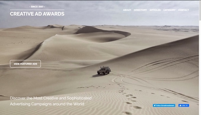
Looking at the homepage of Creative Ad Awards, at first glance you’d think that there is no content below the fold. The large image coupled with a call to action button and social media icons makes the page appear complete, whereas there is a heap of content if you scroll down.
If you’d like to have your visitors engage with content on your site, why make them think that there is nothing to see below the fold?
Break-in content marked by a horizontal line
Even if you have given your visitors visible cues that encourage them to scroll down a bit to view below the fold content, the illusion of completeness can still occur in the middle of the page, especially when there are horizontal lines.
In most websites, horizontal lines signal the end of a section. So, when visitors come across these lines, even in the middle of the page, they assume that the page has ended.
Example: The Onion
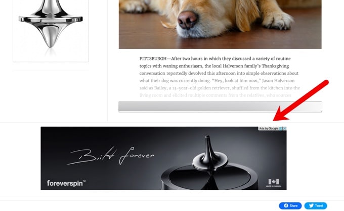
Notice the horizontal lines that cut across the whole page. Considering that there is an advert just below the line, it’s logical to assume that’s the end of the page, right?
But in reality, there are six more blocks of content below that horizontal line…
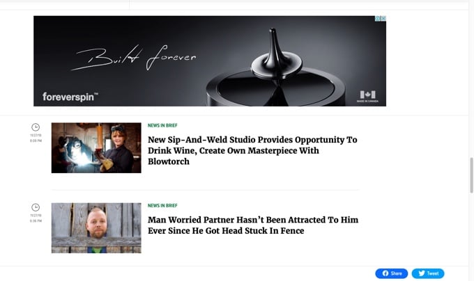
All this shows that you must be careful where you place your horizontal lines, otherwise they may be a visual barrier that works against your site’s usability.
When the content does not fit the whole container
When the container is too large for the content to fill, this results in too much blank space in the areas around the content blocks. Visitors may assume that there is nothing below or on the sides when there see a large gap with no content in it.
You don’t have to fill every nook and cranny on your web page, but my point is, blank space is often uninspiring and visitors will see no need to continue scrolling down or sideways when they see no content there?
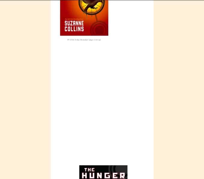
Example: Suzzane Collins
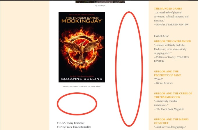
Take note of all the blank spaces on the above website. The larger gap between the image and text can actually make visitors think that there is nothing to see below, especially when they are using mobiles to access the site.
Actually, when you scroll further down the page you will see many huge blank spaces between the images…
Yes, the minimalist design movement advocates for the importance of white space in designs, but minimalism can backfire if used wrongly.
Back to top arrow
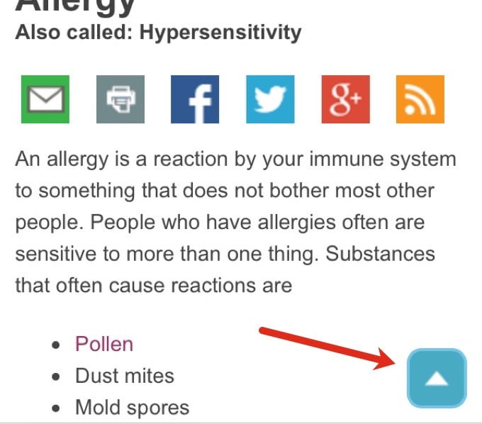
If you just like anyone else, you probably get tempted to press the back to the top arrow that pops up on the page when reading an article. Sometimes when reading pages that are really long, it can become too tedious to scroll all the way to the top, so back to top arrow is a shortcut that allows users to quickly and easily navigate to the top of long pages.
Example: Medline Plus
However, this arrow can be so deceiving sometimes –when it appears somewhere in the middle of the page, it can make users assume that the page has ended. It’s best to have this back to top arrow appear at the end of the page.
Use of Ads and CTAs within the content
You probably have come across dozens of websites that have ads or CTA buttons in between their post content. Many websites consider this as a norm. Although we, at Invesp, don’t necessarily place ads within the content, we typically place short CTA buttons that allow our readers to view the content below.
Example: Invesp
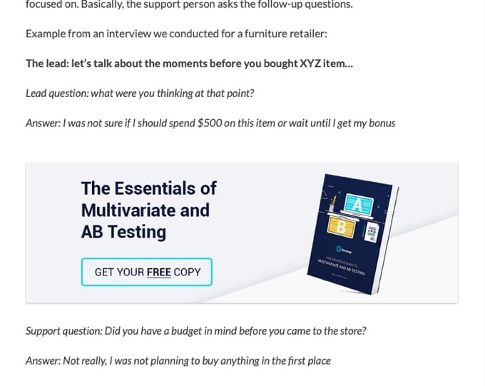
Placing ads or internal promotions is not an issue, as long as you keep it short and easy for your visitors to view the content below. The illusion of completeness occurs when you place large ads and CTA buttons that make the content below barely visible to visitors who use mobile devices with small screen sizes.
How to determine the illusion of completeness on the horizontal dimension
Over the years, designers have been trying to avoid desktop horizontal navigation – it was considered to be one of the biggest faux-pas in web design – but it seems like it made a strong comeback.
Although horizontal scrolling still remains fairly common in mobile and tablet devices, there is now a plethora of websites that require desktop users to scroll sideways to view more information.
Regardless of the device being used, sites that incorporate horizontal navigation can give users an illusion of completeness, especially if there are no strong visual cues that give the direction of interaction to users.
Let’s look at the design styles that may lead to the illusion of completeness on the horizontal dimension of a webpage:
Manual Carousels
Nowadays, it’s rare to see a site using the horizontal scroll bar to view all available content. The belief is that horizontal scroll bars are problematic because they require a great deal of attention and physical effort when controlling the cursor.
This might be the reason behind the use of carousels or slides in most of the websites we come across today. But some of us are still against the use of carousels of any kind. Automatic or manual. Carousels are just so confusing as they require visitors to give attention to different slides.
Automatic carousels, for instance, do not give visitors control over their browsing experience. They tend to force customers to read quickly according to the pace of the slide. If you think of it. this can raise an unnecessary level of anxiety.
Unlike the automatic ones, manual carousels give visitors control on when to change the slides, but if they do not have strong cues that indicate how to interact with the site; they can create a different usability problem; the illusion of completeness.
Example: Themeforest
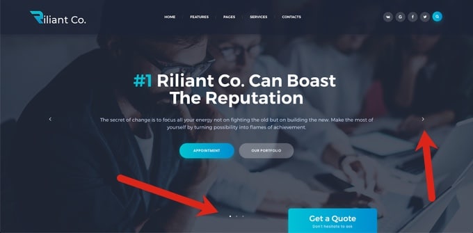
The above WordPress theme shows weak carousel cues: users can easily miss the dots and the arrows are not big enough. If this site has multiple propositions and important content in other slides, visitors may not even identify it.
Implicit or less visible directional cues
This might sound like a bleed over from the previous point but it deserves its own section. As the name suggests, directional cues are instrumental in guiding the gaze of your visitors to the content which is not displayed on your viewable screen.
Bogdan Sandu gives this detailed description of directional cues on websites:
A directional cue is not a particular item – it’s a role that can be performed by almost every element on your site, thanks to shape and size variations. Therefore, you have directional cues that are explicit and obvious; and such which are less visible.
The presence of directional cues in web pages can help improve user experience, and on the other hand, their absence can lead to usability problems such as the illusion of completeness, among others.
For our purposes, we will focus more on implicit or less visible directional cues on web pages because they are guilty of creating the illusion of completeness since they require much attention to notice them.
Here are some of the web elements that can be used as implicit or less visible directional cues:
- View direction
- Color
- Visual weighting
- Repetition of color, size, and shape
- Prioritization
The fact that implicit visual cues are not straightforward, this means that they are far easier to miss. Generally, visitors don’t like to waste time or to take actions whose results they cannot predict. So why not use elements that are obvious in your bid to persuade visitors to fulfill the goal of the site?
Example: Crazy Egg
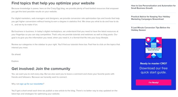
The above picture is a screenshot of Crazy Egg’s About Us page. The whole page has a white background around a royal blue and pink color on that CTA button –this implies that users will notice and click on the CTA button. But it’s not obvious that they will.
How to avoid suggesting completeness on your site
To address the illusion of completeness on your site, you first have to know where it is occurring exactly. Is it on the vertical dimension? Or is it happening on the horizontal dimension?
You can find answers to those questions when you analyze your site’s scroll heatmaps and video recordings (FigPii offers both tools). As you are doing this analysis, keep the following questions in mind:
- Are users seeing all the important content on the site?
- At which point are you using to stopping to scroll?
- What might be stopping visitors from scrolling? Is it the white space around content blocks? Is it the ads or CTAs in the middle of the page?
- What can I do to fix it right away?
- Are visitors trying to scroll horizontally?
- Are users recognizing the manual carousel for what it is? Are they even clicking to view other slides?
Knowing the answers to these questions can give you ideas on where to optimize and encourage scrolling on your site.
Use obvious directional cues
You shouldn’t assume that your visitors are going to notice your implicit directional cues. Visitors often miss the most colored and clearly marked navigational cues. Make it more easy for them, and usher them into taking the desired action by using strong directional cues.
For instance, if your site uses ads or CTA buttons between content, use obvious directional cues that communicate to your visitors that additional information can be found further down the page.
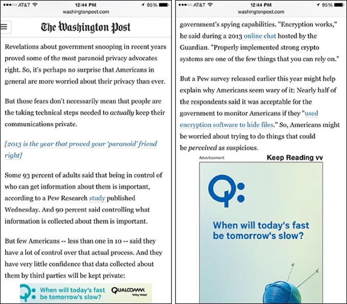
The Washington Post uses an obvious – ”Keep Reading” – cue placed just above the ad so as to suggest that below there is a continuation of the article.
Here is a list of some of the web page elements that can be regarded as explicit or obvious directional cues include:
- Arrows
- Fingers pointing
- Eye direction (when people’s faces are looking at a call to action)
- Lines
- Curves
Help your visitors find their way around a carousel
Forgive me for overemphasizing this, but your site’s most important information should not be placed in a carousel –visitors may not see it. In fact, completely remove carousels. But if you insist on using them, find ways to help your visitors understand the carousel.
In her article entitled “6 Reasons Why Visitors Are Leaving Your E-commerce Website, Ayat gave this shortlist of suggestions as a way of helping your visitors find their way around a carousel:
- Introduce a manual carousel. Give visitors control on when to change the images.
- Use big arrows to easily sign visitors on how to control the feature.
- Choose a maximum of 4 features. Be aware that an average of 1% of visitors clicks on carousels. Of these clicks, 84% goes for images on position 1.
- Add a cycling function to randomize slides, so the banner on the first position varies each time the homepage is visited.
- Don’t use carousels at all. Select a still hero image for your website first fold, calling attention to one main seasonal item, category or promotion.
- Segment your visitors, and transform each slide of your carousel in the still image of targeted homepages. For example, use geo-targeting to focus your offers and take advantage of the growing cross-border shopping.
- Remember manual sliders can work wonders on other pages.
Show additional content bleeding off-screen
If you’re going to stick to large hero graphics or images, do not pin all your trust on the vertical or horizontal scroll bar –users may ignore them. Instead, clearly, communicate that there is additional content offscreen. You can do this by using the cut-off look –this is a web design technique that shows additional content bleeding off-screen.
Netflix, Android App Store, and iTunes are fans of this technique. So are we!

Looking at the above image taken from the Invesp home page, do you think that designers made a mistake by letting those incomplete words peek above the fold?
Well, guess what? That is the cut-off look at play there. Those words were intentionally left to bleed off-screen so that they clearly indicate to visitors that there have to scroll vertically to see more information on the page.
Test on many devices and browsers
Your visitors use a number of browsers, in multiple formats, on various devices to view your website. This means that you have to ensure that all the design elements are working across different viewport sizes.
Yes, I understand that there is an overwhelming combination of devices, screen sizes and browsers to choose from; but it is important to test as many usable variations as possible. Suppose you have limited time and resources, you can restrict testing to the most appropriate variations.
Conclusion
Visitors now understand that they have to scroll up and down or sideways to view additional content – long-scrolling sites are now popular and scrolling seems to have become second nature to most people. But as much as they may be aware of long pages, you still have to give them a compelling reason to scroll or you risk creating an illusion of completeness.

