
When designing an interface or creating a website for the first time, most designers should, but unfortunately don’t always have two primary concerns.
First, to make the design useful for users; which means create an interface that it is easy and fun to use and doesn’t pose complications.
The second concern is, meeting the user’s expectations by creating an interface that adds something to their lives and makes it easier.
Throughout the internet age, there are several success stories of websites and apps dominating the marketplace in spite of the fierce competition.
When we talk about conversion rate optimization, and the benefits of CRO, very often we are faced with a big question: how does usability fit into CRO?
In fact, usability is a part of CRO. You cannot have a high converting site or application without proper usability. It’s an essential piece to the entire process.
And when it comes to usability itself, I find that many people use certain terms interchangeably, namely user experience or UX, customer experience or CX and usability. So what’s the difference?
Ultimately, as you read on, you will find that in order to achieve a better customer experience a system or website must provide a better user experience. User experience is ultimately a part of what paves the way for a great customer experience – which is more comprehensive.
When it comes to usability and user experience, the difference is more subtle – which is why people may use them interchangeably. Usability is concerned with satisfaction, effectiveness and efficiency that specific users (maybe visitors to a site or testers) achieve “specific” goals. UX on the other hand is concerned with users interacting with the product or service and all aspects of that experience.
Usability: defined
Usability as defined in Wikipedia: “Usability is the ease of use and learnability of a human-made object such as a tool or device. In software engineering, usability is the degree to which a software can be used by specified consumers to achieve quantified objectives with effectiveness, efficiency, and satisfaction in a quantified context of use.”
User experience is related to the all aspects of the product and service and the satisfaction that a system provides for all its users. In this respect, user experience is about search design and the development of digital products that meet the users’ expectations whilst engaging them. In other words, usability is a part of a broader user experience. Better usability
It can be measured through metrics like error rate, abandonment rate, clicks to completion, and time duration on the application.
Image source: basicknowledge101
On the other hand, customer experience goes beyond the system and interface itself to include everything across all the multiple touchpoints before, during, and after the interaction with that system; whether that be online, offline or in store.
CX is about the general experience the customer has with your company from the everything leading up to the engagement of the system, to the actually usage of the system, and everything that comes after. Measuring this experience can’t possibly narrowed down to one metric, rather multiple metrics across the different touch points.
UX and CX are used interchangeably because digital experiences are also touch points. The following graph shows how UX represents a small part of CX:
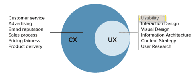
Image source: uxpin
Customer experience professionals are looking for solutions to position their brands as CX leaders in their industry which begins with providing a design that visualizes the customers’ processes, needs and perceptions.
Understanding usability is the first step towards achieving that. Applying usability principles to any system or website will help to assess what is good or bad within a system to reach optimum user experience.
Generating greater levels of usability is, as a matter of fact, conditioned by five quality ingredients that you must fulfill within your interface.
Image source: balsamiq
1. Learnability
When we think about what systems are easy to learn/use, you think about everyday usages. Coffee maker, microwave, smart phone, car. Each is extremely easy to learn with little to no instruction. In the digital world, with the hundreds of thousands of applications out there, you can also distinguish the easy from the difficult.
A great example of this is Facebook. Of course, we can’t narrow down the success of Facebook to one factor, however, the extent in which in takes one to learn and understand how to use Facebook takes very little effort. This learnable system of communication and sharing was what lead to millions of subscribers across the world. Additionally, every time they have gone through an update, people may complain, but the system is so learnable that within the first use after a major update, people are fine and begin preferring the new design.
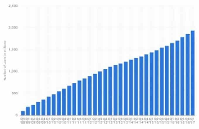
Image source: statista
Learnability is the first user experience factor which refers to the extent in which first time users are able to accomplish basic tasks within the system.
The learnability of your design is based on comprehensibility and the extent of your users’ understanding to the design. It works in two ways, if you were unable to understand it, then it’s less likely that you are going to learn.
When we were searching for a good project management tool, learnability was an important factor.
We could go the traditional product management route and select a tool like Liquid planner, or we could do something more contemporary like Trello.
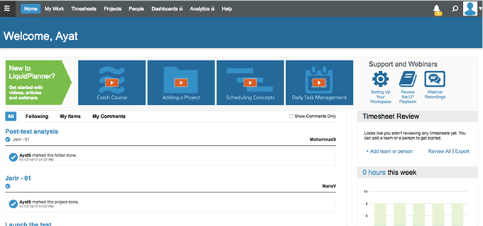
At first glance, liquid planner seems learnable. But as soon as you get started setting up, you need to go back and forth to the folders to understand how to use it. And still, with the time of timelines we had and overlap, it was close to impossible.
Trello on the other hand is very learnable very quickly. It doesn’t have all the bells and whistles that project management software has, but it has enough functionality to still be useful. Learnability and not needing to have to train, and go back and forth to tutorials was a huge factor to moving forward with Trello over Liquid Planner.
Guidelines to Improve your website Learnability
As a designer, you can always maximize the learnability component through minimizing the cognitive loads during the designing process.
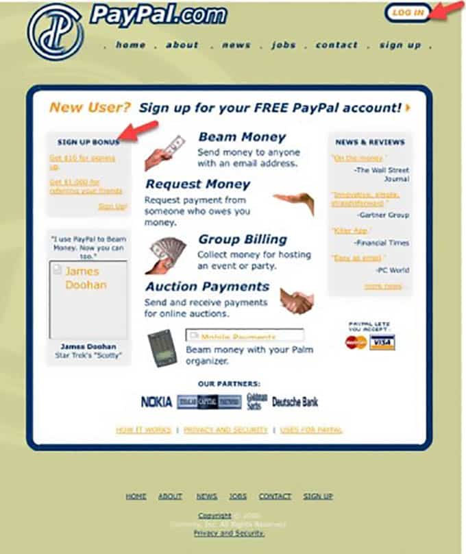
Image source: cssdesignawards
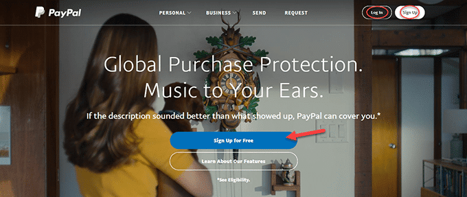
Talk about throwback, but in the early days of Paypal, it took users some time to find the ‘Login’ button or to understand what’s the next step due to cognitive loads that distract the users focus and so many other deficiencies. The new version of the site is simpler and the user can easily recognize the ‘’sign up’’ and ‘’log in’’ buttons and convert.
The simpler the interface is the more it’s easy for the users to intuitively know how the
The system works and accomplish their tasks.
A design might look sophisticated and complex but at the end of the day who’s going to be able to use?
Another way to improve learnability is through finding out the users’ expectations and matching those with the design goals.
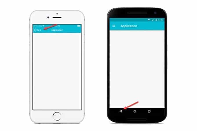
Image Source: maxsnitser
It’s very frequent when the design does not appeal to a users familiarity. Despite the nature of the interface you are designing,
Android users are familiar with having a ‘’back’’ button in the bottom of the device, while IOS devices the same button is located on the upper left of the navigation bar. Creating an interface that doesn’t go in conformity with simple notions, that’s why user-centric designs are the standard approach for conversion-oriented and successful designs.
2. Efficiency
As an essential element in usability, efficiency measures the speed and how quick the users can accomplish the tasks once they have become familiarized with the design of an interface. Think of it as the number of keystrokes or clicks it takes a user to compelte the task.
On an ecommerce website, we often discuss the one page or multiple page checkout? Which is better? Well one page can be argued to be more efficient. However, it doesn’t mean always mean that is the solution.
The level of the efficiency can be also measured by the number of functions learned or the percentage of the users who actually learned and used your product.
A Sneak Beak on how to improve your system efficiency
First, it is fundamental to understand the users and how they prefer to work within an interface and recheck if they spend long periods to complete the tasks and complete their goals.
Naturally, first time users take a lot of time to meet their goals than habitual users and you need to take that into consideration and make the whole design clear and straight forward as much as possible.
Forms are often a great way to measure the efficiency of an interface as they represent a fundamental step in the users’ journey to achieve their goals and convert.
When designing an interface, you should keep in mind, that the less effort the users make the higher your conversions are.
The example below is for two different forms of the same goal to book a flight.
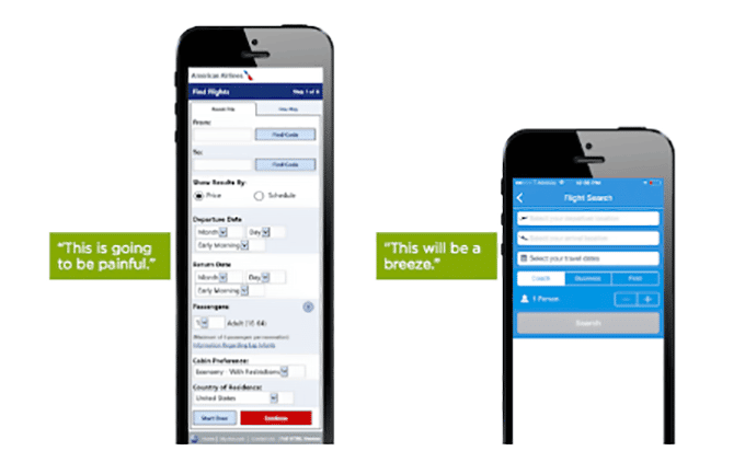
Image source: smashingmagazine
The first form is overloaded with fields to fill which, of course, requires a lot of effort from the users’ part, and make them skeptical and reluctant to convert. On the flip side, the short form is easy and quick to fill and leads to high conversion rates.
3. Memorability
Memorability is about how easy is for the users to reestablish proficiency after a long time of none use.
Guidelines to improve memorability:
How often do you find a design that sticks into your brain? Not very often right?
The key element is to ensure that your design is one of those that give a great impression to the users through creating as much legible design as possible that generates strong mental models and at the same time, facilitate for users to find their ways to meet their goals.
Icons for example generate strong mental model, and even after a long time of non-use, it’s easy for people to recall their functionality and what makes them even hard to forget, is labeling them.
Image source: smashingmagazine
An A/B test has shown the strong relationship between the correct identification of an icon’s function and the age of users -case of Hamburger.
The test has revealed that the elderly users are not familiar with ‘Hamburger icon’’ opposed to young ones, which leads us again to the conclusion that you should know how your user prefer to work and match their expectations for more conversions.
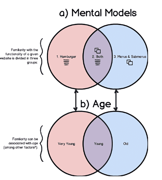
Image source: smashingmagazine
4. Errors Prevention/ Forgiving Design:
It’s crucial to know to how many possible errors a user would make, and was it easy or difficult for them to recover from them? And how much did take to recover from them as well?
How to avoid errors to improve your interface usability?
Finding the right solution for a certain problem, begins with the right diagnosis to it. That’s why it’s highly recommended to know which type of errors your users would when using your interface.
Generally speaking, there are certain error type users fall into when they are using your system.
Slips: usually this type of error is a result of an unintended action where the user usually wants to take a certain action but instead they end up performing another one accidentally.
Making such error indicates one thing that the user is not fully paying intention to the task they are performing.
Examples:
- Mistyping the first name in the surname’s section.
- Mistyping a word or a password.
- Typing the wrong email address.
- Picking the wrong dates when making a reservation or booking a flight.
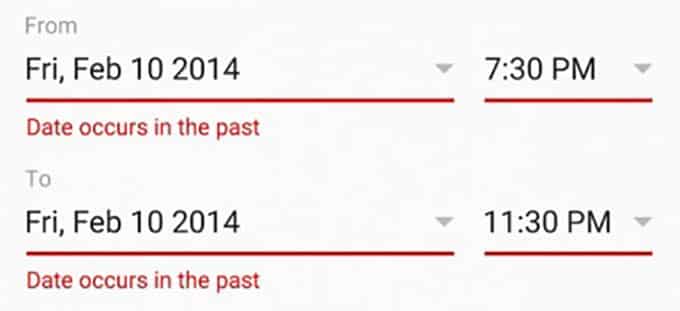
Image source: smashingmagazine
How to prevent slips?

This might sound ironic, but slips are often made by experts thinking that they have reach a point of mastering the task that they are performing and it needs a little attention to its completion.
A great solution to prevent a high number of slips is through assisting and guiding the user in every step of the task.
Communicating to them through offering suggestions, including helpful progress bars, info bubbles or wizards, and encouraging them to check for errors are key solutions at this point to make their actions more precise.
- Mistakes: are conscious errors in the sense that your intentions are clear about the goal you want to achieve but you have the wrong or the incomplete information on how to achieve it. This simply means, that you picked up the procedure to complete a certain task, consequently, the performance goes in the wrong direction.
These typology mistakes occur from forming the wrong mental model about the interface and it’s typically found in rule based behavior or problem solving behavior.
Examples:
- Clicking on an image that’s not clickable
- Double Clicking a button or a link intentionally
How to prevent the occurrence of mistakes?
The more guidance and help users are offered, the less mistakes they are likely to make to meet their goals.
Another possible solution to avoid high rates of mistakes is through trying to bridge the gap between your users’ mental modals and your designs. Getting to know your users more is the only way to avoid mental model misconceptions and mixed ups.
5. Satisfaction
The level of enjoyment and satisfaction of using the design which can be also linked to the perceived value the user associated to the product and what makes users convert and want to come back.
How to satisfy your users?
Generating a great a level of satisfaction for the users is conditioned by achieving and fulfilling the other components to provide a positive experience.
When Usability Tests Are Mostly Needed?
It’s amazing how some Usability subject matter experts are still bewildered with topics of usability and user experience with all these data up to their necks.
Probably that can be attributed to the fact that everyone is trying to have a say about it.
Despite all the downsides, this has helped into the emergence of several methods to improve the usability especially that of a website for particular.
However, usability testing is the most accessible, easiest and cheapest way to have great and actionable insights for better results in the future.
- Test your old design: One frequent mistake designers fall into is when they rush into creating an enhanced version of the existing design without knowing their pitfalls in the old design.
it’s necessary to point out what did you miss in the old design version to have a clear vision about the areas that need enhancement and the ones that need to be erased and eliminated which can be done only through testing.
- Always monitor competitor activities: it’s a great way to gain more data that will help you have more focus on the same goal as your competitors’ and give you an idea about the best practices and show your interface position in the marketplace.
- Conduct field studies: field studies will help to see your users in their natural environment which will enable you to assess their behavior more closely and know them better.
- Make paper prototypes: developing and testing good looking prototypes can help you know your users’ expectations and limit somehow the scope for you.
Image source: blog.proto
- Refine the prototype ideas and retest: this step is as important as the previous ones, because it will help you limit the number of ideas worth being part of the final design.
- Test the Final Design: now that you have decided which design to implement it’s crucial to test it before the implementation stage.
Conclusion
Usability is one piece of the whole customer experience spectrum but a very critical piece, one that is if not fulfilled can damper the entire UX which will lead to a poorer CX. And it’s fundamental to understand that no matter how much your design is good looking and respects all the aesthetic aspects a sophisticated design does, that won’t help you provide a great user experience.
Truth is that usability is the only guaranteed way to do that and being a short-sighted designer will cost you a lot.


