
The “above the fold” content is your chance to make a positive, lasting impression on your website visitors.
Most web designers take special care when designing this front page part.
After all, it is what visitors see without scrolling down, and it plays a massive role in whether they stay or go.
Let’s explore the best practices for your site’s “above the fold” section.
What Does Above the Fold Mean?
The term “above the fold” comes straight from the world of newspapers. Back then, newspapers were folded in half and displayed on newsstands.
The stories and headlines that appeared on the top half, literally above the fold line, were most likely to be seen by passersby.

Newspaper content above the fold (Source)
These headlines must be catchy and informative enough to convince someone to buy the paper.
Fast-forward to today’s digital world, and the concept of “above the fold” translates perfectly to websites. It’s the part of your website that visitors see without having to scroll down.
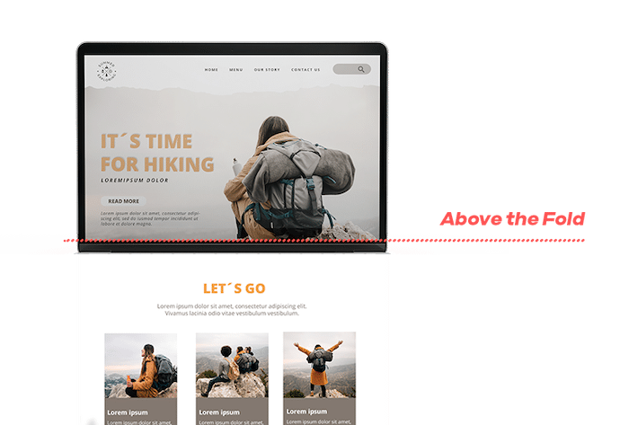
Website above the fold area (Source)
Think of above the fold content as the prime real estate area of your web page—those precious first few seconds that grab attention and convince users to stay and explore further.
Key Elements for Above the Fold in 2025
The above-the-fold section of your online store is like your digital storefront.
Just like Macy’s wouldn’t display mannequins in outdated clothes, your above-the-fold needs to be fresh, engaging, and speak to today’s web users.
But unlike a physical window, you have seconds to grab your audience’s attention.
Here are the key elements you need to prioritize to create a winning above-the-fold in 2024:
Engaging Headline
Your headline is like a book cover—it should grab attention and entice visitors to stay.
Keep it short and sweet. At the same time, use “power words” that evoke emotion or curiosity.
For example, Slack uses “Transform the way you work” above the fold. It’s short, action-oriented, instantly telling you what Slack can do for you.
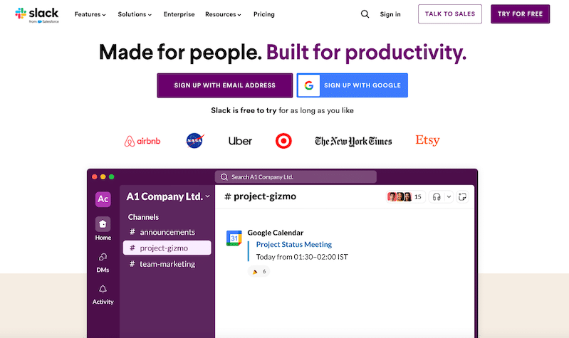
Slack above the fold website design example
Compelling Visuals
A picture is worth a thousand words. In 2024, it might be worth a thousand clicks.
People process visuals faster than text, so leverage high-quality images, videos, or animations to capture attention. Avoid generic stock photos that don’t align with your product or services.
You can take a leaf out of Apple’s book. It is one of the best above the fold website examples.
Apple’s landing pages often feature large, high-resolution images that showcase their products in detail, creating a luxurious and desirable feel.
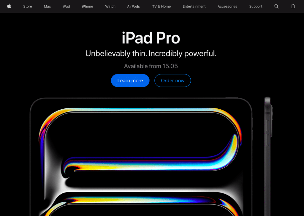
Apple’s above-the-fold visuals
Clear Call-to-Action (CTA)
Your call to action (CTA) bridges your captivating, above-the-fold content and user action.
It should be clear, concise, and directly related to the benefit you’re offering. The color scheme and position should also ensure it’s prominently displayed on your website.
For example, phrases like “Start Your Journey” or “Discover More” can attract users’ attention and nudge them to take the intended action.
Above The Fold Best Practices for Your Website In 2025
Your website’s above-the-fold section is the first thing visitors see, and in just a few seconds, it can shape their perception, spark interest, or send them bouncing. Here are the latest best practices to help you make that first impression count.
Use AI-Powered Dynamic Above-the-Fold Content
The days of one-size-fits-all web pages are over.
In 2025, top-performing websites are leveraging AI and dynamic content rendering to tailor their above-the-fold section based on who’s visiting, where they’re coming from, and what they’ve done before.
In fact, according to the latest online shopping statistics, 45% of online shoppers are more likely to shop on a site offering personalized recommendations.
Your above-the-fold is your first and best chance to offer that relevance.
What does this look like in practice?
AI-powered personalization tools like Mutiny and Dynamic Yield let you dynamically swap out:
- Headlines: Based on whether the visitor is a first-timer or a returning customer.
- Images & CTAs: Tailored to ad source, product interest, or even real-time weather.
- Promos or Offers: Adjusted based on location, cart history, or time-sensitive campaigns.
Take Skandium, a Scandinavian design retailer. Their website uses location-based personalization to adjust the above-the-fold announcement bar depending on where you’re shopping from.
- A UK-based visitor might see: “Use code MIDSEASON10 for 10% off.”
- Meanwhile, US visitors see: “No import duties for orders to the USA under $800.”
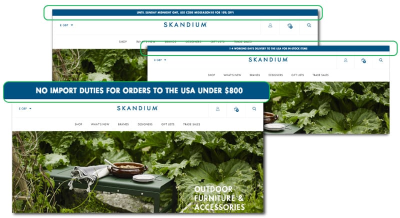
This simple change reflects regional priorities—discounts for local buyers vs. customs relief for international shoppers. This helps create a more relevant and conversion-optimized experience.
Here’s how you can also emulate this above-the-fold dynamic personalization strategy:
- Use location detection tools (built-in via personalization platforms like Mutiny or Dynamic Yield) to adjust messaging by region.
- Create modular content blocks—CTAs, headlines, visuals—that can swap based on traffic source or behavior.
- Tailor offers based on past actions: e.g. “Still thinking about this?” if a product was viewed but not purchased.
- Integrate tools like FigPii for easy A/B testing and data tracking.
Optimize the Above the Fold Section For Mobile Devices
If you look at statistics from Statista, mobile devices accounted for nearly 59% of web traffic in the last quarter of 2023.
Think about it—when was the last time you researched a restaurant or browsed social media on your computer?
This goes to show just how crucial mobile optimization is for your website.
Optimizing your above-the-fold section for mobile browsing is no longer a “nice to have;” it’s a non-negotiable.
Here are some tips to ensure your above-the-fold survives the transition from a desktop to a tiny smartphone screen:
- Use a responsive design: Your web design should adapt to different screen sizes so it can look and function well on all devices.
- Fast Loading Times: Optimize images and reduce server response times to improve loading speed. According to Google, 53% of mobile users abandon sites that load over three seconds.
- Mobile-Friendly Content: Use short paragraphs, bullet points, appropriate font size, and clear headings to make your content easy to read on mobile devices.
- Optimize Images and Videos: Compress your images and videos to reduce load times. Use tools that allow you to minimize size without compromising on quality.
- Minimize Pop-ups: Avoid intrusive pop-ups that can be difficult to close on mobile devices.
- Optimize Forms: Use mobile-friendly forms with fewer input fields to make completing them easier.
Consider Loading Speed
We already discussed loading speed in the context of mobile devices. With everything readily available to internet users these days, their patience is waning.
A slow-loading website means higher bounce and lower conversion rates, eventually affecting your website’s overall success.
No wonder website loading speed continues to be a significant factor in user experience and SEO performance.
Here’s how to optimize your above-the-fold for a speedy experience:
- Minimize image size: There are ways to optimize images without sacrificing quality. Consider compressing images using tools like TinyPNG or opting for lightweight formats like JPEG.
- Minimize HTTP Requests: To do that, reduce the number of elements on your page, such as scripts and stylesheets.
- Use Browser Caching: Enable browser caching to store static files on users’ devices, reducing load times for returning visitors.
- Minify CSS and JavaScript: Remove unnecessary characters and whitespace from your code to reduce file size.
- Use Content Delivery Networks (CDNs): CDNs distribute your website’s files across different servers worldwide. This reduces the physical distance between users and your server, resulting in lower load times.
Enhance User Experience (UX)
Imagine entering a store overflowing with clothes, haphazardly stacked boxes, and no clear path to the checkout. Confusing, right?
That’s what web pages with cluttered above the fold design can feel like for visitors.
In the battle for user attention, a clean and focused website (like the one on the right) will almost always outperform a cluttered one (like the one on the left).
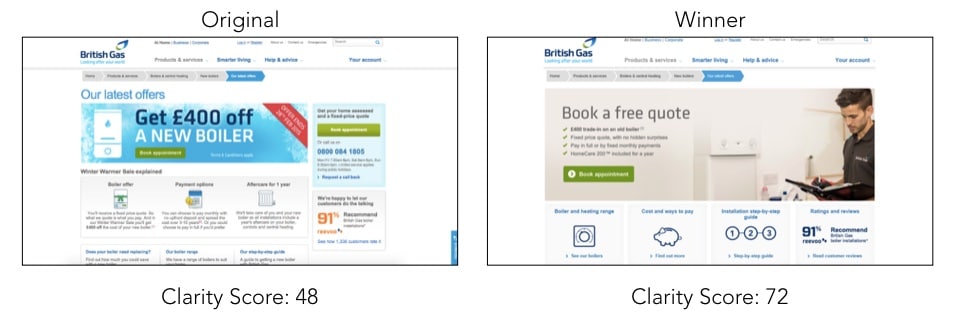
Cluttered vs. uncluttered above the fold website design (Source)
This website revamp resulted in a 72% score and a whopping 50% improvement in conversions compared to the cluttered version.
What did they do to enhance the user experience? Here are some key aspects to consider:
Easy Navigation
Nobody enjoys getting lost in a maze; your website shouldn’t be one.
For instance, Airbnb uses a simple navigation bar at the top of their website with clear categories like “Stays,” “Experiences,” and “Online Experiences.” It’s straightforward and lets users quickly find what they’re looking for.
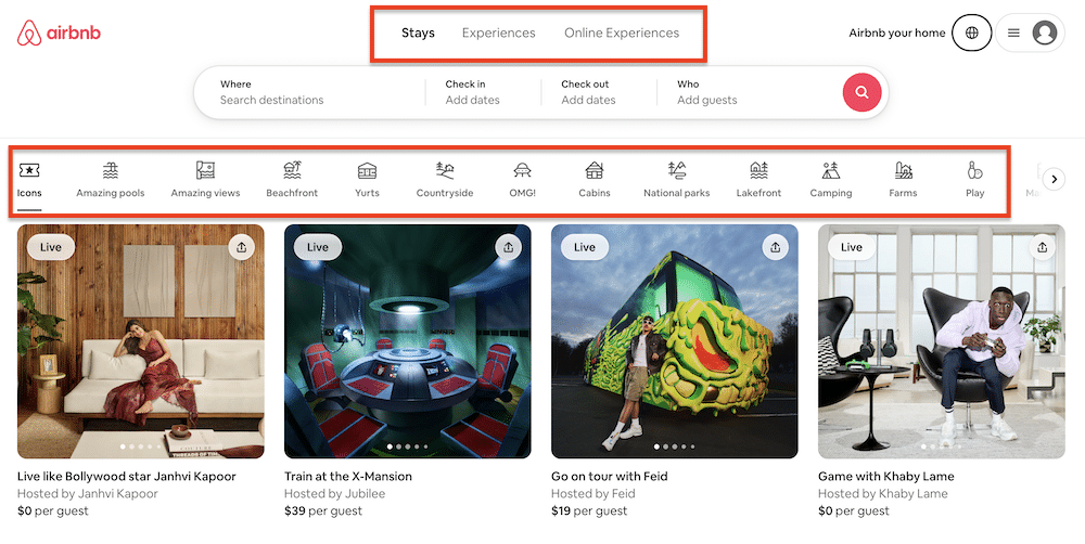
AirBnb above the fold design
Here are some tips to make your above-the-fold section easy to navigate:
- Clear Menu Structure: Use a simple and intuitive menu structure that helps users quickly find what they want.
- Maintain a consistent layout: Keep it consistent across pages to avoid confusion and make navigation easier.
- Breadcrumb Navigation: Implement breadcrumb navigation to show users their location within the site hierarchy.
- Search Functionality: Include a search bar prominently to allow users to search for specific content.
Avoiding Clutter
Avoid overwhelming users with too many elements.
Focus on what matters most:
- A captivating hero image or video
- A clear value proposition that tells users what you do
- A prominent call to action (CTA) like “Shop Now” or “Learn More.”
Accessibility Considerations
Your above-the-fold should be accessible to everyone, regardless of ability.
Here are some easy tips:
- Use alt text to describe images for visually impaired users
- Ensure proper color contrast for those with color blindness
- Make your website keyboard-friendly for users who rely on assistive technologies.
Implement SEO Best Practices
Remember the days when everyone was obsessed with keyword stuffing? Those days are long gone.
Today, search engines like Google are much smarter, and SEO (Search Engine Optimization) is about creating high-quality content that users and algorithms love.
The key is to incorporate relevant keywords without stuffing.
Think of keywords like search terms people use to find what they’re looking for online. While strategically including relevant keywords in your title tags and meta descriptions is important, prioritize natural language that speaks to humans, not robots.
For example, if you’re a bakery, instead of stuffing your title tag with “bread bakery cookies,” opt for something like “[Your Bakery Name]—Freshly Baked Bread, Pastries & More!” It’s informative, uses relevant keywords, and sounds friendly.
Pro Tip: Use tools like Google Keyword Planner to find relevant keywords for your content.
Here are other ways to leverage SEO best practices within your above-the-fold section:
- On-Page Optimization: Optimize your titles, meta descriptions, headers, and content for your target keywords.
- Quality Content: Create high-quality, relevant content that provides value to your audience.
- Mobile Optimization: Your site should be mobile-optimized and provide a seamless experience on mobile devices.
- Site Speed: Improve site speed by optimizing images, using a CDN, and reducing unnecessary code.
- Build high-quality backlinks: Build from reputable websites to improve your site’s authority.
- Local SEO: If applicable, optimize your website for local search. This includes adding your business name, address, and phone number on your website and in online directories.
Conduct A/B Testing for Data-Driven Optimization
We likened your website’s “above the fold” section to prime real estate.
But how do you know what content and styles resonate most with your visitors? Enters A/B testing—your path for data-driven optimization of your website’s above-the-fold.
It’s unarguably the most essential above the fold best practice.
Here’s how to use A/B testing like a pro:
Start by defining your goals.
What do you want visitors to do “above the fold”? Sign up for a newsletter. Download an ebook? Clearly define your Conversion Goal.
Identifying your conversion goal makes picking the element you want to run an A/B test easier.
Once you know your goals, isolate a single variable.
Don’t change everything at once! Test one element at a time, like headline size, button color (remember the infamous blue vs. red button debate?), or image choice. This helps pinpoint what truly drives conversions.
Finally, gather data and analyze your results.
You can use A/B testing tools like FigPii to make the process easier. These website analytics tools will also help you track user behavior and see which design gets more clicks, scrolls, and conversions. Let the data be your guide.
Pro Tip: Run the test for a statistically significant period to ensure reliable results. While the time period depends on your website traffic, a good rule of thumb is 2-4 weeks.
Your Turn to Optimize Above the Fold!
Your website’s “above the fold” section is your chance to capture user attention. By following the best practices outlined above, you can create a visually appealing, informative, and above-the-fold design that drives conversions.
Remember, a positive first impression is paramount, and making your above-the-fold area user-friendly sets the tone for a smooth and enjoyable website experience.

