Disclaimer: This section is a TL;DR of the main article and it’s for you if you’re not interested in reading the whole article. On the other hand, if you want to read the full blog, just scroll down and you’ll see the introduction.
- There are more than a billion websites, and this figure is increasing every day.
- The objective of every website is to attract, retain, engage, and convert visitors, but many fail here because they don’t take design functionality and aesthetics seriously.
- For your website to be able to convert site visitors to become loyal users and customers, it’s important to understand and analyze visitor intents, motivations, needs, and preferences.
How The Human Brain Interprets Design
- As humans, we are wired to want the best and move far away from anything that looks like it’ll be stressful. This attitude is carried online when we visit websites.
- There are several factors we subconsciously look out for when visiting a website or using an App for the first time. Familiarity is first on the list. We look for familiar and similar experiences to the ones we’ve had on previous websites.
- Another factor your site visitors will subconsciously look out for is safety. Safety here simply means social proof, proof of payment security, and other trust indicators.
- The 3rd factor your site visitors expect is clarity and visual appeal. For them this means you making use of visually appealing elements on your website, and also their ability to find what they’re looking for without wasting time navigating through different pages.
- The 4th factor is a sense of urgency. Except the human brain is presented with an opportunity to act, it will not. That push is necessary. In scientific terms, it’s called fight or flight.
- The sense of delight is the final factor. Just like urgency, the human brain also acts to experience a delight. ‘Delight’ is delivered or imparted through mental and emotional appeal. In the real world, not everything can be justified with logic. This holds true even for purchase behavior.
Leveraging Psychological Triggers In Persuasive Design
- Though humans tout themselves to be intellectual and rational people, our brain is affected by a number of external stimuli, visual presentation, motivations, etc. and we later use logic to rationalize the ‘why’ behind our decisions/actions. Listed below are some of the cognitive biases used by marketers to impact user decision-making.
- Choice abundance: As the name implies, when users are faced with a lot of options, they face a sort of paralysis in decision making and fail to analyze options/information. All the noise shuts down its otherwise ‘healthy’ sense of judgment.
- Anticipation: Marketers leverage curiosity and anticipation to keep users hooked and engaged with a brand. We are intrigued to completely know what we just partially know about. That is how you satisfy that old brain’s ego that says ‘I know everything. That is how to keep nudging it to know even more.
- Authority: The brain follows the hero. It has been trained by history and evolution that the herd follows the leader’s command. Chimpanzees follow the leader. Their leader is their hero. For humans as well, an authority figure is a commander. His words and actions can be trusted. This is why you often believe a celebrity endorsing a product in an advertisement.
- Buyers’ Remorse: this happens to many users after buying what they believe is expensive. Marketers, however, try to soothe and calm us down by telling us how wise our purchase is.
- Confirmation bias: users tend to recall easily what they already internally and subconsciously agree with. It’s more like ‘jumping to conclusions based on convenience, preconceived notions, and false judgments. How marketers can use this to their advantage is to research popular hypotheses and beliefs of their intended audience and position their product as the answer.
- Other biases marketers use are disposition, community herd aka bandwagon effect, and foot in the door.
6 Neuromarketing Website Design Hacks Based on Cognitive Bias
- Trust seals, reviews, and testimonials: The idea behind using social proof ‘upfront’, right on the homepage of many websites is to influence the human brain that yes they are ‘safe’. Essentially, marketers leverage ‘trust bias’ to gently persuade users about their quality of services or products. From trust seals to reviews to customer testimonials, different elements are displayed on website homepages to create a sense of security and assurance of service in people.
- Avoid ‘choice abundance’ during checkout: The human brain is averse to confusion and prefers a direct path to decision making. That is why providing limited choice, which is most preferred by users, is the best way to more conversions on checkout.
- FOMO (fear of missing out): Marketers know (Fear of Missing Out) FOMO like the back of their hand. Almost every tactic to increase sales and convince users to buy quickly is based on scarcity to create urgency and other FOMO tactics. These tactics are based on the principle of loss aversion, which we’ve explained earlier in detail in this post.
- Deploy the decoy: This tactic is based on the asymmetric dominance effect, according to which consumers will show a specific change in preference when presented with a third option that is inferior to option one completely; however, when compared to option 2 it is superior in certain respects and inferior in others.
- The power of positive reinforcement: The positive reinforcement hack is based on the cognitive bias popularly known as choice supportive bias. This psychological bias makes people remember their choices as better than they actually are. And, we as humans are naturally inclined to appreciate efforts that positively reinforce the buying experience as well as decisions.
- Emotional Appeal: The belonging bias has been leveraged by brands like Apple to create a sense of complete belonging in their customers. Apple customers vouch and stand by their choice of brand and feel a sense of pride in owning an Apple product. They don’t vouch for any other brand, ever. Such is the ‘emotional appeal’ of the brand. It makes the owner feel rich, class apart, and powerful.
Here’s A Longer And More Detailed Version Of The Article.
There are more than a billion websites and more are spawning every day. The objective of the majority of these is to attract, engage, convert, and retain visitors. Sadly, most fail. The reason is simple – they don’t take design functionality and design aesthetics seriously. The Co-Founder and CMO of Imaginovation, Michael Georgiou says:
“Users grant websites a fraction of that time: less than eight seconds. Those first impressions are about 94 percent design-related. What’s more, about 75 percent of users will judge your brand credibility based on your website design.”
Everyone knows how important making a first impression is. This is true even in the virtual, online world. Your website is the face of your business. But, it is not ‘just’ that. Apart from being able to portray your brand image to an online audience, your website must be able to persuade visitors to become users and loyal customers. For this, it is a must to understand and analyze visitors’ intents, motivation, needs, and preferences. Understanding the ‘how’ and ‘why’ behind ‘what’ users are doing is the key to neuromarketing.
To understand the ‘why’ behind actions marketers, researchers, and academic experts have drilled deep into the human brain and established principles that can be put to use.
To understand the ‘how’ behind human brain, marketers use tools such as eye tracking, visitor recordings, heat maps etc. to analyze patterns that study the logic behind each on-site action that people take.
In a nutshell, the look and feel are without a doubt extremely valuable. However, it doesn’t end there; aesthetics are just the beginning, just the hook. The loop begins with persuasive design functionality.
In this blog post, we will talk about the principles that establish the ‘why’ behind people’s preferences, and how these ‘preferential biases’ can be used in crafting persuasive website design.
So, let’s dive in to figure out how the human brain perceives design and what can be considered as design good enough to win and generate conversions.
How Human Brain Deciphers Design

There are websites that most of us forget about ( or would purposely like to forget about) as soon as we hit ‘close tab’. Maybe the design is horrible, or that the menu is difficult to locate, or that the search functionality is poor. It could also be that the website takes too long to load and you don’t have the patience left to stick around for the page to display. As humans, we are wired to want to the best. And here’s how we define ‘the best’ – instant gratification, easier choices, comfort, choosing the path of least resistance – all the good things in life. So, in context to persuasive website design, what do we term as a great experience? Here are the five elements that lay out our expectations from website design.
- Familiarity – The human brain looks out for ‘familiar’, ‘tried and tested’ patterns. If it encounters something extremely different than what it has been largely exposed to, doubt quickly surfaces. If you want your website or app to attract users quickly, win their trust in no time steer clear of confusions and experimentation. Rather than displaying web elements that trigger confusions, focus on creating a reassuring experience.
Some simple tips – Use languages that your customers understand have a consistent design throughout your website, give pricing options on your page that are popular in the geographical area that you are running your business for.
- Safety – A familiar pattern instills some amount of faith and safety in users. However, the human brain craves for complete trustworthiness when it comes to buying. People purchase from a shop or brand that they feel assures quality and ingenuity. In an online world, people are even more cautious. That is why eCommerce websites focus on displaying social proof on their websites. They also promise complete safety of payment and protection from fraudsters. In the conversion framework, given by Invesp CRO, safety falls under the purview of Trust and Confidence.
- Clarity and visual appeal – It is human instinct to rely on visual stimuli. This is the reason why visually appealing elements on a website can make or break the first impression. Clarity is just as important. Ever walked into a cluttered grocery store and walked out empty-handed because it was taking forever for you to find out where would you find what you needed? Same goes for website design also. Neat, clear navigation is always welcome. And, so is a simple and clear checkout process. Under the conversion framework given by Invesp CRO, clarity and visual appeal fall under the purview of sale complexity, which says, the more complex the sale, the more difficult it is to close. According to Nate McGuire:
“Remember users want a few key things from navigation: knowledge of where they are on the site, a way to go back (or home), and directions (if your site has an unusual or more complicated interface).”
According to the graphic, 76% of users surveyed said that “it’s easy to find what I want” is the most important factor of a website’s design.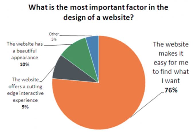
Image Source: business2community
- The sense of urgency – By nature, unless a human brain is presented with a situation to act, it will not. That push is necessary. In scientific terms, it is called ‘fight or flight’. When there is a certain sense of urgency, the human brain prepares itself to either face that situation or run away from it. In most cases, the urgency to act occurs when faced with the possibility of loss. Marketers, both digital and traditional, use the sense of urgency to nudge their users to complete a sale. You might already be familiar with ‘Up to 50% off ONLY till next week’. It’s all neuroscience! In context to conversion framework, Sense of Urgency can be related to FUDs (fears, uncertainties, and doubts).
- The sense of delight – Just like urgency, human brain also acts to experience the delight. ‘Delight’ is delivered or imparted through mental and emotional appeal. In the real world, not everything can be justified with logic. This holds true even for purchase behavior. But why delight, why not just satisfy a customer’s need? Because it does not guarantee repeat purchases. Besides competition mandates customer delight. In website design, newer technologies such as virtual reality are making it big by being able to provide a ‘delightful’ visual experience. Similarly, easy pay mobile optimized wallets have made checkout truly delightful for online buyers.
All the above points on how the human brain perceives design have been derived from McLean’s theory about the reptilian brain. Going by what McLean puts forth, it seems that steering marketing efforts towards the brain’s reptilian part, businesses can manipulate their consumers’ basic instincts and influence decision making. In other words, persuasion is a game of being able to use the five listed elements in the process of website design and functioning. A number of psychological triggers can be derived from the above five elements, which we will be going through in detail now.
Leveraging Psychological Triggers in Persuasive Design

As we’ve pointed above, human beings often divulge from rationality in judgment and may act in an illogical fashion if successfully manipulated by emotional appeal and persuasion. Though humans tout themselves to be intellectual and rational people, our brain is affected by a number of external stimuli, visual presentation, motivations, etc. and we later use logic to rationalize the ‘why’ behind our decisions/actions. Here are a few common cognitive biases that impact our decision making and are widely used by marketers in influencing decision making and in creating a persuasive design.
Choice abundance: When presented with too many options or too much information, our brain goes for a toss. It faces a sort of paralysis in decision making and fails to analyze options/information. All the noise shuts down its otherwise ‘healthy’ sense of judgment. That’s why you have a hard time selecting ‘just one’ from a menu loaded with a variety of pizza options and that’s why marketers have a ‘make your own’ option that simplifies your decision making. We have an excellent piece on the paradox of choice, which you can read about in detail here.
Anticipation: Thomas Hobbes has defined curiosity in the best possible manner. He says ‘Curiosity is the lust of the mind’. Marketers leverage curiosity and anticipation to keep users hooked and engaged with a brand. We are intrigued to completely know what we just partially know about. That is a how you satisfy that old brain’s ego that says ‘I know everything’. That is how to keep nudging it to know even more.
Authority: The brain follows the hero. It has been trained by history and evolution that the herd follows the leader’s command. Chimpanzees follow the leader. Their leader is their hero. For humans as well, an authority figure is a commander. His words and actions can be trusted. This is why you often believe a celebrity endorsing a product in an advertisement.
Buyer’s Remorse: It often happens that we end up regretting ‘splurging’ on expensive purchases that are driven by emotions or desires. This feeling of remorse often shows up when we purchase a car, a house, or even a certain luxury watch on an impulse. Marketers, however, try to soothe and calm us down by telling us how wise our purchase is. They explain how our expenditure is actually an investment and how that impulse watch that we just end up blowing up our entire two month’s salary on is a limited edition.
Confirmation Bias: A series of experiments conducted in the 1960s validate that people have a tendency to favor, and recall information in a manner that it confirms their preexisting beliefs or hypotheses. It’s more like ‘jumping to conclusions’ based on convenience, preconceived notions, and false judgments. When people want to think in a certain manner they magically and end up believing it to be true. So, if your friend didn’t reply instantly to your message, he must be avoiding you, right? That’s a confirmation bias that you hold true without actually knowing the truth.
Community Bias: The herd sticks together and follows the norms of the community. They have an inherent need to feel like a part of a larger group and be accepted as its members. This makes them feel safe and comfortable. Being with people who have a shared agenda makes people feel important and enhances confidence.
Disposition: A bias towards making a decision that is likely to make us ‘gain’. Usually, people tend to make financial decisions based on Disposition bias. High risk-high reward investments are based on the disposition effect when the brain thinks that taking the risk is worth the hefty ‘gain’. Similarly, the idea of gaining ‘safely’ from mutual funds is also based on this bias.
Foot in the Door: Have you heard the phrase ‘ Well begun is half done’? Well, if you’ve taken the first step towards something you are almost close to completion. This goes for everything. Even while buying, if we’ve taken the first action (such as visiting a website) we are likely to take additional steps – browsing the website, adding to cart, liking its Facebook page etc. Foot in the door is like one step closer to sale for marketers!
Above we’ve cited only eight cognitive bias or psychological triggers; however, there are many more. All of these triggers literally give away top secrets on how to influence the old ‘self-centered’ brain. These secrets (or cognitive biases), now out in the open for years for marketers to make the most of, are also vital in persuasive website design. We shall now read how these neuromarketing principles can be used as hacks in website designing.
6 Neuromarketing Website Design Hacks Based on Cognitive Bias

Trust Seals, Reviews, and Testimonials
The idea behind using social proof ‘upfront’, right on the homepage of many websites is to influence the human brain that yes they are ‘safe’. Essentially, marketers leverage ‘trust bias’ to gently persuade users about their quality of services or products. From trust seals to reviews to customer testimonials, different elements are displayed on website homepages to create a sense of security and assurance of service in people.
Using images and testimonials from authority figures in the industry is also a great way of leveraging trust. A number of newer, fresher ideas keep emerging every day on how to use trust bias in persuasive design. For example, a video on product usage can instill confidence in users that they can use the product without much help from customer support. Similarly, video-based testimonials are now being widely used. They are indeed much more powerful in winning users’ trust as compared to written testimonials.
A good example of how a SaaS business leverages trust bias using video testimonials is Hubspot. In this post, they share how they’ve used a happy customer’s video testimonial about their product.
Avoid ‘Choice Abundance’ during checkout
The human brain is averse to confusion and prefers a direct path to decision making. That is why providing limited choice, which is most preferred by users, is the best way to more conversions on checkout.
The cognitive bias being exercised here is ‘choice abundance’, where when presented with a clutter of options people find it difficult to ‘act’ or make a ‘decision’ quickly. There is an extremely popular experiment that explains this phenomenon quite well and establishes that ‘more isn’t always good’. The experiment uses gourmet jams to prove that people who saw more options on display were one-tenth as likely to buy as people who saw the small display.
Practical Tip: Provide one clear and actionable call to action on checkout. You should avoid too many offers and confusing messages. For example, instead of having many payment options – Cash on delivery, Debit Card/Visa, PayTm, Cryptocurrency – give make one or two most famous options prominent and fold the rest under ‘Check other payment options’ hyperlink.
Amazon’s checkout is one of the best examples on how to avoid the paradox of choice and remove any sort of noise that might lead to confusion, diversions, or a sort of paralysis while reaching their ‘goal’, which is to complete checkout. It simply doesn’t overwhelm users with choice and is minimalistic. That’s why we all love shopping at Amazon, right?
Scarcity for Urgency or FOMO
Marketers know (Fear of Missing Out) FOMO like the back of their hand. Almost every tactic to increase sale and convince users to buy quickly is based on scarcity to create urgency and other FOMO tactics. These tactics are based on the principle of loss aversion, which we’ve explained earlier in detail in this post.
eCommerce brands have absolutely nailed FOMO. They have used techniques such as ‘real-time countdown timers’ in website design to imbibe a sense of urgency to buy in users. Onsite push notifications have also been smartly used by website design experts and marketers to instill fear of missing out in users. Consider, ‘stock about to finish’ offers that pop-up when you visit your favorite website.
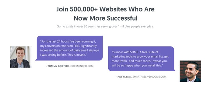
SaaS businesses have also been using FOMO to their advantage. One way how they do it by ‘highlighting the number of happy subscribers to their product’. Obviously, for those who want to buy this is a gentle nudge that if they don’t subscribe, they will miss out being a part of this happy and satisfied user base. One such example is Sumo.me. Check the following image to know how.
Deploy the Decoy
This tactic is based on the asymmetric dominance effect, according to which consumers will show a specific change in preference when presented with a third option that is inferior to option one completely; however, when compared to option 2 it is superior in certain respects and inferior in others.
The decoy principle or tactic is widely used by SaaS businesses while designing pricing pages. The idea is to make users buy a certain/specific option. Consider PersistIQ. They have three payment options displayed on their pricing page. Their Pro Outbound option is priced way less than the third option but only $40 higher than the basic plan. Obviously, they want their users to consider the Pro Outbound option and hence have presented a third option which is extremely high priced.
The Power of Positive Reinforcement
The positive reinforcement hack is based on the cognitive bias popularly known as choice supportive bias. This psychological bias makes people remember their choices as better than they actually are. And, we as humans are naturally inclined to appreciate efforts that positively reinforce the buying experience as well as decision.
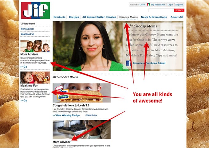
In website design, positive reinforcement is used widely on thank you pages. Using persuasive copy and design elements, you can imbibe a ‘happy experience’ in your customers’ minds. That feeling of happiness while buying from you fuels and feeds choice supportive bias. Jif, a website dedicated to nutrition for kids, does this really well.
Practical Tip for SaaS businesses: SaaS businesses can use positive reinforcement in their website design in the checkout process. While customers are making the ‘selection’ you can reassure customers about their ‘consideration’ by showing them numbers of subscriptions on that particular plan.
Emotional Appeal
The belonging bias has been leveraged by brands like Apple to create a sense of complete belonging in their customers. Apple customers vouch and stand by their choice of brand and feel a sense of pride in owning an Apple product. They don’t vouch for any other brand, ever. Such is the ‘emotional appeal’ of the brand. It makes the owner feel rich, class apart, and powerful. These are the kind of emotions that the brand associates with and so do its customers.
Practical Tip: Have a community forum page on your website that is completely handled by users. Let users generate the content for you on this section. This way they will feel a part of the business.
Here’s how Jonathan Kennedy has built a community of loyal Shopify store users. Take his tips seriously.
From the B2C space, we have an excellent example that nails emotional appeal. Have you ever checked out Dove’s website? They have portrayed real users, real people to project the idea of true beauty. That’s how they’ve formed a connection with the audience and created an unbreakable bond with the customer.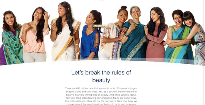
That’s a Wrap – Neuromarketing + Design = Powerful Persuasion
Neuromarketing is not new. However, it is since the past five to six years being more creatively used in persuasive design techniques. Have you used neuromarketing in your website design yet?