
You already know usability is one of the most important conversion-driving factors on a website. That’s why you’re here. And while there are many strategies out there that can help businesses evaluate their site’s learnability and usability, it can be hard to do accurately without the help of real users from your audience.
Cognitive walkthroughs are one proven method to overcome this obstacle and limit bias in your website assessment.
What is a cognitive walkthrough?
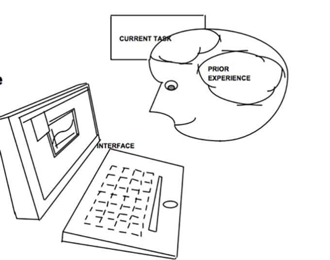
In general, a cognitive walkthrough is a way of evaluating the usability of system. It was first designed to assess walk-up computer systems such as ATMs or postal kiosks, but has since been adapted for use with websites as well.
By conducting a cognitive walkthrough on your website and you can identify user experience issues that require fixing, then take measures to improve your conversion rates. Cognitive walkthroughs are effective because they take into account the site visitor’s specific task. A general user experience evaluation won’t offer as detailed of insights into what factors drive or prevent very specific behaviors. Gokul Suresh explains:
“Cognitive walkthrough helps you understand the user’s perspective of your product. “
With a cognitive walkthrough, you don’t need feedback from your target audience — it’s possible to conduct a fairly unbiased analysis of your site using your internal team. Done right, a cognitive walkthrough can be relevant at any stage of website development, and return actionable suggestions to improve the site for all potential users.
How to Conduct a Cognitive Walkthrough for the Web (CWW)
Your Goal: Evaluate how well your website supports users’ ability to navigate and find the information they need. With a cognitive walkthrough, you can analyze how your site pages impact user behavior when they’re pursuing a specific goal. A cognitive walkthrough is effective in all the following use cases:
- Critiquing individual pages as a site is designed,
- Critiquing the pages in a complete website design,
- Critiquing an implemented, active site.
The cognitive walkthrough involves simulating user behavior when pursuing a specific goal step-by-step, then answering a series of user experience questions at each step. Jeff Sauro explains:
“The idea is basically to identify users’ goals, how they attempt them in the interface, then meticulously identify problems users would have as they learn to use an interface. “
6 Steps to Follow in the Cognitive Walkthrough Process

Step 1: Define your user base
The usability of your site all depends on the specific user. That’s one setback to cognitive walkthroughs — you don’t have the ability to see and understand the site through their eyes.
One way to combat this issue is by first defining your user base. If you already have buyer personas developed for marketing purposes, you know that your users will vary a lot based on demographic factors, experience with your niche, geographic location, etc.
For example, an online marketing tool might target:
- Small business owners with minimal niche knowledge and an average reading level, and/or,
- Advanced marketing professionals who are experts in their niche and understand industry jargon.
You need to conduct your cognitive walkthrough with each of your personas in mind. That’s the best way to ensure your analysis matches the real experience of different users.
Step 2: Define your user goals
Next, you need to compile a list of goals a potential user may have when visiting your website. Cognitive walkthroughs can be used to evaluate the general usability of your site, including tasks such as:
- Logging in
- Commenting on your forums
- Etc.
But they can also be used to test how optimized your site is for conversion-driving behavior. Develop these goals based on your buyer personas. Here are some conversion-related goals:
- Understanding the benefit of your product
- Learning more about your product’s features
- Comparing your product to others like it
- Making a purchase
- Upgrading their subscription
- Etc.
Step 3: Identify the “happy path”
For example, if the user goal is to subscribe to your service, the list of actions could be:
- Navigate to your main page
- Click the “subscribe” button
- Fill out contact information
- Click next
- Choose their desired product version
- Click next
- Fill out payment information
- Click next
- Click the pay button
After you’ve created a detailed “happy path” for a specific goal, you can use the 4 cognitive walkthrough questions to evaluate how well your design helps users stay on that path.
Step 4: Invite the right team members
Next, you’ll invite internal team members to participate in the walkthrough. It’s wise to include industry experts as part of the process, but also less-informed team members who might be more confused by the site setup and jargon.
You may or may not want your designers present during the walkthrough. They might feel the need to defend their design choices, instead of taking a less biased-approach to the walkthrough. Either way, just make sure everyone is prepared to focus on usability factors specifically.
Step 5: Conduct your walkthrough
Designate a facilitator who will go through the “happy path” for each task of your walkthrough. At each step, ask the group participants each of the 4 questions discussed below. Work together to identify any potential issues that could lead a user to stray from the path. Take notes on issues you find.
At the end of the walkthrough, while you still have the team together, brainstorm different ways to fix problems that could lead users away from the “happy path.”
Here’s a detailed explanation of how to conduct the cognitive walkthrough using the 4 test questions:
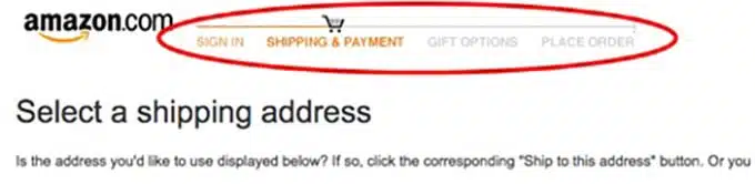
Question 1: Will the user try and achieve the right outcome?
This question examines whether you’re making any assumptions about your users that affect their ability to follow the correct path for a specific goal.

Instead, the user has to look around, click on “Invoices,” and then see another “Report” option:
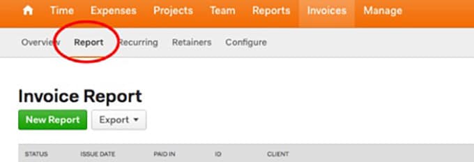
Why aren’t all the reporting features available under the report tab?
From a conversion perspective, you can also look for on-page factors that affect your user’s understanding of your value proposition. This will vary based on which buyer persona you’re using for the cognitive walkthrough.
Look for any page elements that might cause fears, uncertainties, or doubts (FUDs) for specific buyer personas at different stages of the sales funnel. Premature lead capture attempts are a classic example of creating FUDs that can derail the conversion process. If a persona visits a page to gather information about your business/product, prompting them for their contact information could disrupt this. We discuss other examples of FUDs you should look out for in this post.
Question 2: Will the correct action be made sufficiently evident to the user?
This question is about finding hidden, obscured, or confusing options on your web page that could prevent users from making the right choice. A CTA below the fold is a classic example of this. Is the next step in your task visible enough to the user?
There’s also the issue of options. Provide a user with too many options or don’t present options clearly, then they’re less likely to make the choice they want. Look at smartphones compared to desktop computers, for example. On a computer, users have to know how to navigate through files and folders to find what they’re looking for. Smartphones were revolutionary by displaying the most important elements as apps, so the computer illiterate could start using them without the learning curve.
Websites must also make efforts to eliminate overwhelming choices like this. Here’s an example of this potential issue on Lazor Office’s home page:

To showcase their projects, they covered their homepage in photos of the various work sites. The images are clickable hyperlinks, but it’s not at all evident what pages they navigate to (it turns out, they lead to pages that host little more than a jumbo version of the same image).
Buttons/links like this can cause FUDs for site visitors as well. Overwhelming and unclear options like this can prevent the majority of visitors from making the right navigational decision.
Question 3: Will the user associate the correct action with the outcome they want to achieve?
This question is mostly about the language you use on your site. If you use confusing language or industry jargon on your website, it might limit the ability of some users to understand your site and make the right choice.
To answer this question, you need a good understanding of how your audience uses language in your industry. On a popular cryptocurrency exchange, for example, there’s an option to “Buy ETH.” But people new to cryptocurrency might not know that ETH stands for Ethereum, the second most popular coin.

Multi-key actions are another example of a usability issue that should be addressed in question three. Most users would rather hit “Next” 15 times knowing they’re on the right track to achieve their task than engage in multi-key actions to achieve the same results.
Of course, including multiple steps in your navigation can add some clarity for your site visitors as well. Take a look at Tiege Hanley, skin care products for men. They offer a variety of products, but when you click “Order Now,” it takes you straight to checkout with their Level 1 formula in your basket:
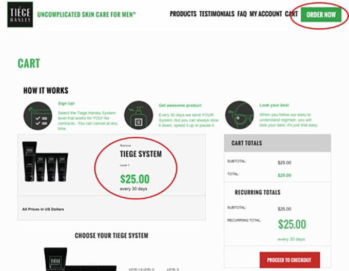
To avoid confusion and assure the Level 1 formula is really what people want, the site should include another step allowing visitors to add different products to their basket. They should also eliminate another confusing factor: a “How it works” section at the top of the shopping cart page. That information is more valuable earlier in the sales funnel.
Question 4: If the user takes the correct action, will they then promptly take the next step in the task?
Good, conversion-driving user experience design affirms that users are on the right track for a task whenever they take the correct action. Ecommerce stores with progress bars in the checkout process do this very well:
Users are assured they’re not about to click on mindlessly without achieving their desired goal: making a purchase.
A site that offers no feedback, or requires unassisted, repetitive behavior would have more user experience issues.
Say for example an online forum user gets email updates whenever someone comments on their topic thread. It offers a helpful link directly to the comment to reply.
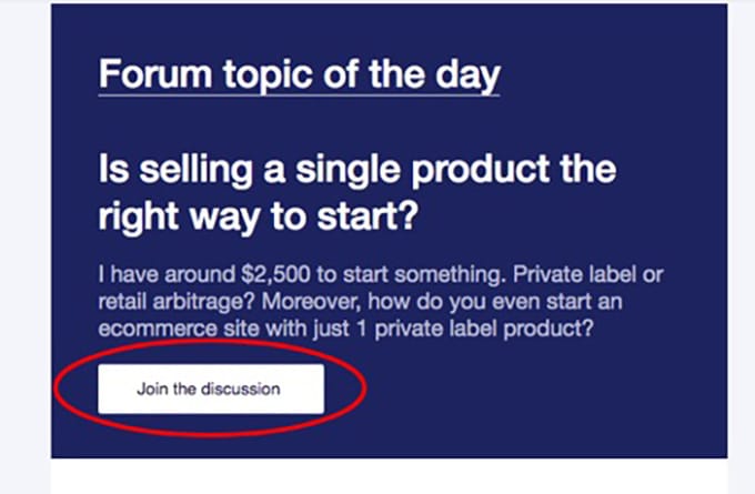
The user clicks the link, then is prompted by a “Please login to comment” page.

Step 6: Implement site improvements
Once you’ve addressed each of the four test questions with your group of evaluators, you should have a good understanding of what problems might lead users away from the “happy path” for each goal. Now you can fix them.
Work with your developers, content writers, and other involved parties to make necessary changes to your site. If your UX design team wasn’t present during the walkthrough, you may want to bring them in for another brainstorming session before deciding on changes to make.
Wrapping up
When you’re evaluating your whole site at once, a cognitive walkthrough can be a huge undertaking. But if you conduct it each time you create a new page or make major changes to an old one, it becomes a much more manageable task.
Evaluating your site from the perspective of a potential user is a valuable strategy for both business owners and web designers. Cognitive walkthroughs can help you identify assumptions and issues that prevent the average user from having a good experience on your website. Follow these steps to conduct a cognitive walkthrough and start seeing the benefits for yourself.


