


Understand Your Visitors
Before you conduct any A/B test, you must understand your visitors.
You should first conduct qualitative and quantitative research, as these are crucial for understanding visitors’ backgrounds and how they interact with your website.
Qualitative Research
Qualitative research helps you to understand the underlying reasons, motivations, and opinions of your customers. From your visitors’ perspective, you can identify the most common obstacles they face on your site or their interests so that you can present a more compelling offer.
This is valuable information. With this data, you can begin optimizing conversions by addressing the most pressing needs first.
Start with polls and surveys to learn more about your site visitors. Other forms of qualitative research include, but are not limited to:
- Usability studies
- Heuristic evaluation
- Focus-groups
- In-depth interviews with website customers
Quantitative Research
When conducting quantitative research, you use the wealth of information provided by analytics software to analyze visitors’ behavior on your site better. Analytics can either validate something you uncovered while conducting qualitative research or uncover a problem or issue for you to investigate further.
Evaluate Google Analytics metrics by setting up goals and funnels on your website to understand visitor navigation paths. Segmenting the data can also provide a wealth of information to understand better how different types of visitors from varying sources, income levels, demographics, genders, etc., behave across your site.
After collecting and combining data from both qualitative and quantitative research, you can compile a list of issues and prioritize them based on severity and impact. This will help you determine which pages and areas across the site you should test.
A/B Tests to Boost Your SaaS Homepage
Building a useful and beautiful homepage is a demanding task.
Even with all the tools, tricks, and techniques available online to guide homepage design, companies still face the challenge of creating a page that truly addresses their customers’ needs.
Your SaaS homepage’s main goal is to meet your website visitors’ expectations.
Your homepage should:
- Clearly state and address your value proposition
- Provide visitors with information and elements to help guide them to their desired destination
We will go through each element of a homepage, breaking down what some of the best SaaS companies do to optimize their homepage, and suggest multiple tests you can start running on your site.
What Elements Can Be Tested on a SaaS Homepage?
If the core elements of your homepage are not user-friendly and they confuse visitors, you are missing a big opportunity to grow your user base.
Your ability to deliver a seamless experience on your homepage sets the expectation for your services when a user becomes a customer. And today’s savvy consumers understand that.
Below, we’ve pointed out some of the crucial elements of a SaaS homepage.
Site Navigation
Navigation is the foundation of any website. It helps site visitors navigate your site based on their priorities and desires.
You can encounter a few different conventions for navigating a website, but on a SaaS page, visitors have a single expectation. In general, they expect the navigation menu to be prominent, at the top, flowing from left to right.
Let’s check three points you should consider if you want to conduct A/B tests on your website after changing navigation:
1. Test the top navigation
Your navigation menu affects how visitors reach your sales-generating, pricing, and contact pages. The way it appears and the contents within the menu should be mapped to the various paths that you know visitors take (having a customer journey map would help). A top navigation should not be designed solely based on what the HIPPO in the office thinks.
2. Remove or add drop-down menus and test your navigation
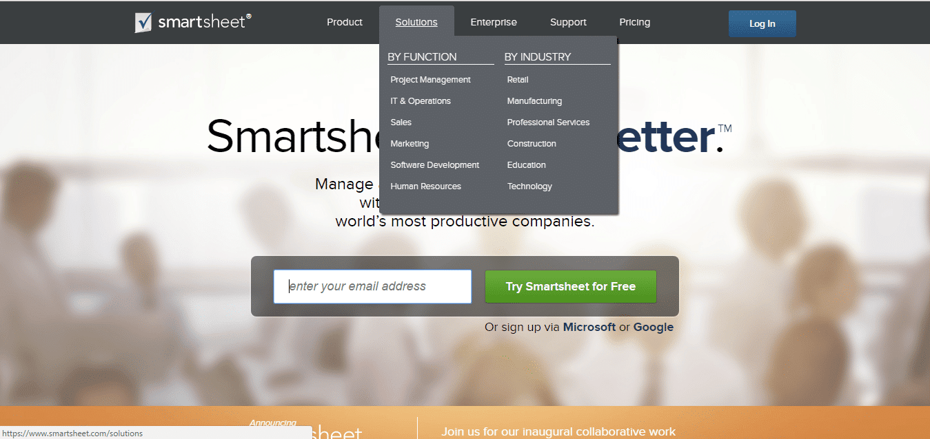
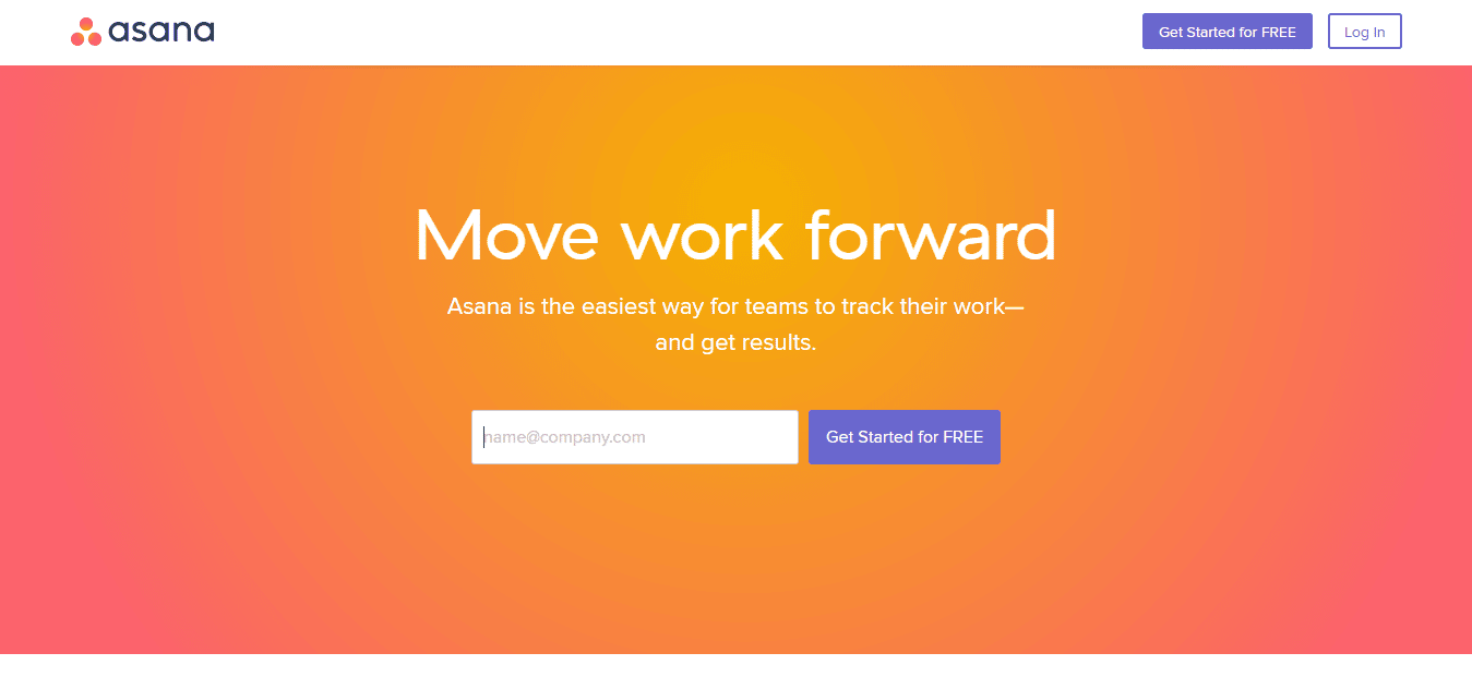
3. Decrease the number of items on your navigation
Above the Fold Value Proposition
Your value proposition answers two main questions for your visitors:
- What makes your business unique?
- What do you do better than everyone else?
So, it makes sense to display the value proposition above the fold in your real estate area. According to a study conducted by Nielsen Norman Group, 80.3% of visitors focus their attention on the top of the site.
If visitors land on your website and bounce off just because they do not understand what service you are providing, what is the point?
Look at this homepage. Can you get it in 5 seconds?
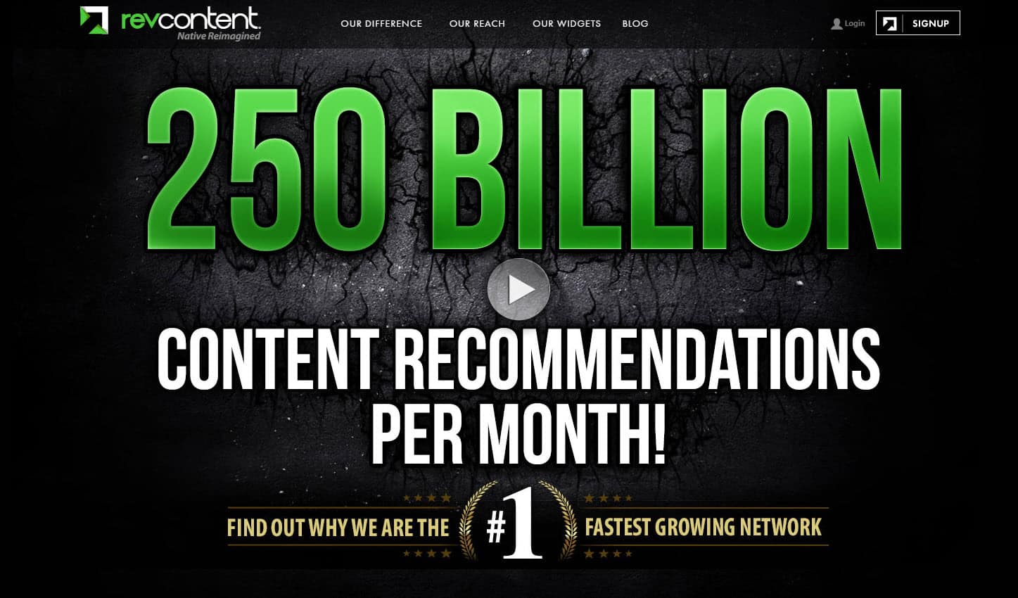
This homepage belongs to Revcontent, a content-discovery platform. They recommend content from other websites based on what visitors have already reviewed. However, the service they offer is not clear in their chosen headline.
The main headline remains the central piece of copy on your homepage. It should stand out and carry your company’s value to the visitors when they land on your homepage.
A headline that doesn’t convey the right message about what your company does can cost you potential customers and increase your bounce rate.
You have just a few seconds to captivate your visitors; make sure you have a clear, effective headline.
To charm visitors with your service, you should have a clear value proposition with a headline, a subheadline, and an image that mentions the service you provide.
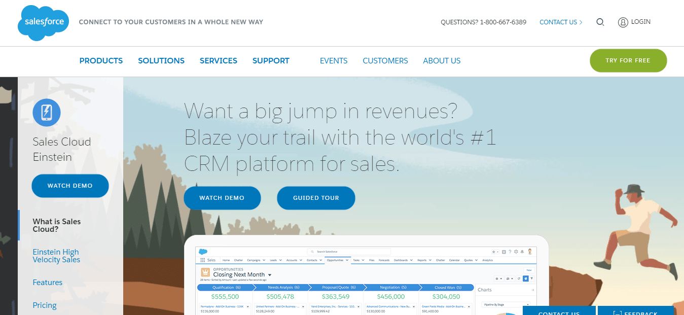
In the example above, Sales Cloud presents its value proposition with a question: “Want a big jump in revenues?” They complete the proposition with “Blaze your trail with the world’s #1 CRM platform for sales.” From this value proposition, visitors can understand the benefits, the big jump in revenue, and the main service provided: a CRM platform for sales. You can even glimpse their dashboard at the bottom.
When in doubt, use the Grandma Approach to validate your value proposition. This approach assumes you are covered if your grandma understands your value proposition. Everyone will understand your offer.
However, just going out and about to ask your grandma will not give you any healthy results. You can find a better approach by A/B testing your proposition with both segments: visitors who are aware of the service you provide and those who are not aware of the value you offer.
4. Test your value proposition
A/B testing your value proposition, via headline or subheadline, is a surefire way of optimizing your homepage. First, determine which aspects of your products or services appeal most to your visitors. Then you A/B test your ideas as headlines and subheadlines to find which ones better convey your value proposition and drive higher conversions.
Hero Image
The hero image is one of the first elements visitors notice when they enter your homepage. As this image represents what you sell, it plays an important role in shaping your visitors’ experience on your website.
The way SaaS companies use hero images has evolved. You can check part of the Basecamp homepage evolution in this case study.
Generally, it is best to make the value you are proposing relevant to your visitors. You want your hero image to evoke the service you offer. A strong, relatable hero image also helps reduce your website’s bounce rate.
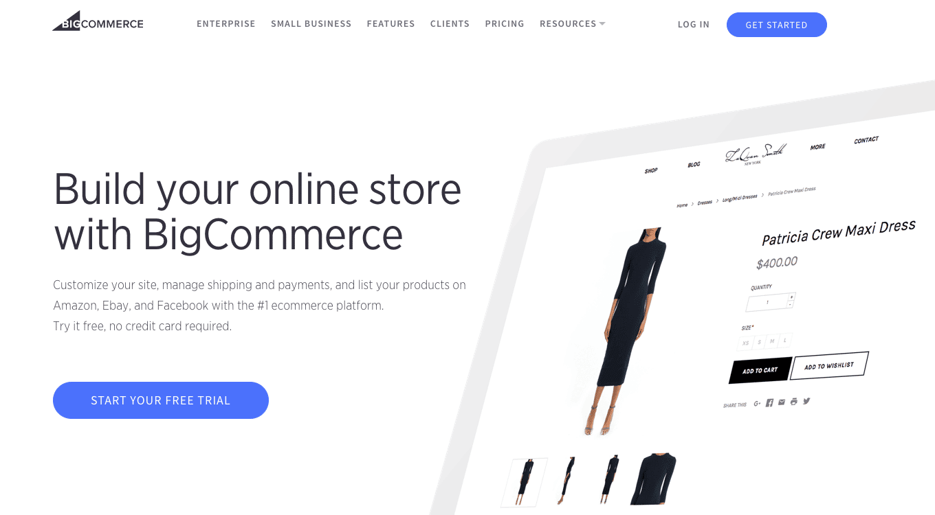
The hero image above is an excellent example in which you clearly visualize the result promised by the headline and strong value proposition: “Build your online store with BigCommerce.”
BigCommerce is a technology company that provides software for e-commerce companies. Companies can either use ready-made templates or build customizable ones for their websites.
In just a few seconds on this homepage, any visitor can understand that the site offers you the convenience of building your e-commerce website professionally and easily.
5. Test a real person as a hero shot
Associating an offer with the image of a real person rather than a stock photo increases conversion by 35%, according to Marketing Experiments.

6. Test product images vs. real person photo (it is best to do so if you fail to achieve high conversions from a real person image)
So, as we learned from Marketing Experiments above, a hero image featuring a real person has a stronger effect on conversion rates.
Not always, though. Check out the example below:
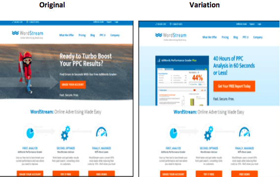
WordStream came up with the idea of using a “Rocket Kid” hero image on their homepage. They ran the test with the variation above for 15 days. In the end, surprisingly, the non-human variation got higher conversions.
You can test many variations of the hero image. You should test real-person photos, stock photos, explainer videos, group photos (of people working together), customer photos, or even illustrations.
7. Test illustrations
As a SaaS business, you are probably already familiar with Dropbox. The company has been using illustration as a hero image for a long time:
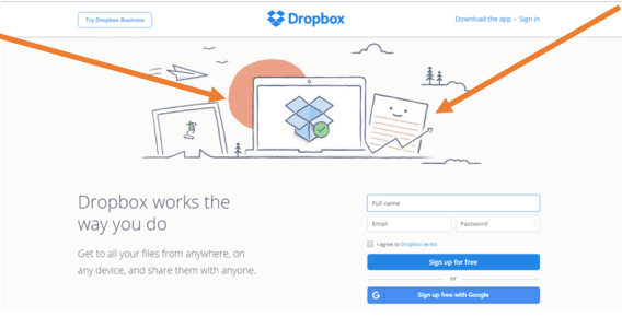
By using illustrations, you can better describe the image choices, including technical details and the content.
8. Test a team (group of people, preferably) as a hero image
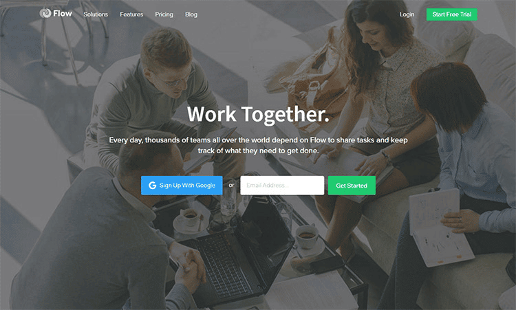
Flow is a company that offers a service to streamline business workflows, as its name suggests. It makes sense that they use a team hero image because their offer is about teamwork.
CTA (Call to Action) button
CTA buttons on your homepage help determine your visitors’ primary action and path. Although optimizing CTA buttons on your homepage or any page is not a priority, CTA location, color, and copy can still have an impact. Having the right balance is important.
You can test the location and microcopy of a button, but it is best to be specific with your changes and to focus on customer-centric solutions.
Here are some important ingredients to test on your homepage CTAs.
9. Test the color of the CTA button
Changing the color of a CTA button is classic A/B testing.
It may seem too simplistic, but color affects your website visitors’ moods. Green represents moving forward, red represents blood and warning, and blue represents trust and calmness. For SaaS companies, this research found that the majority choose green and blue CTAs:
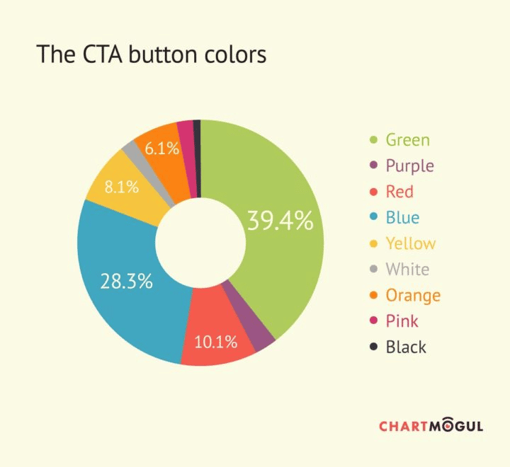
Image source: Chartmogul
Basecamp uses a green, captivating CTA button in its signup process. Below, you can see how the CTA stands out to capture visitors’ attention.
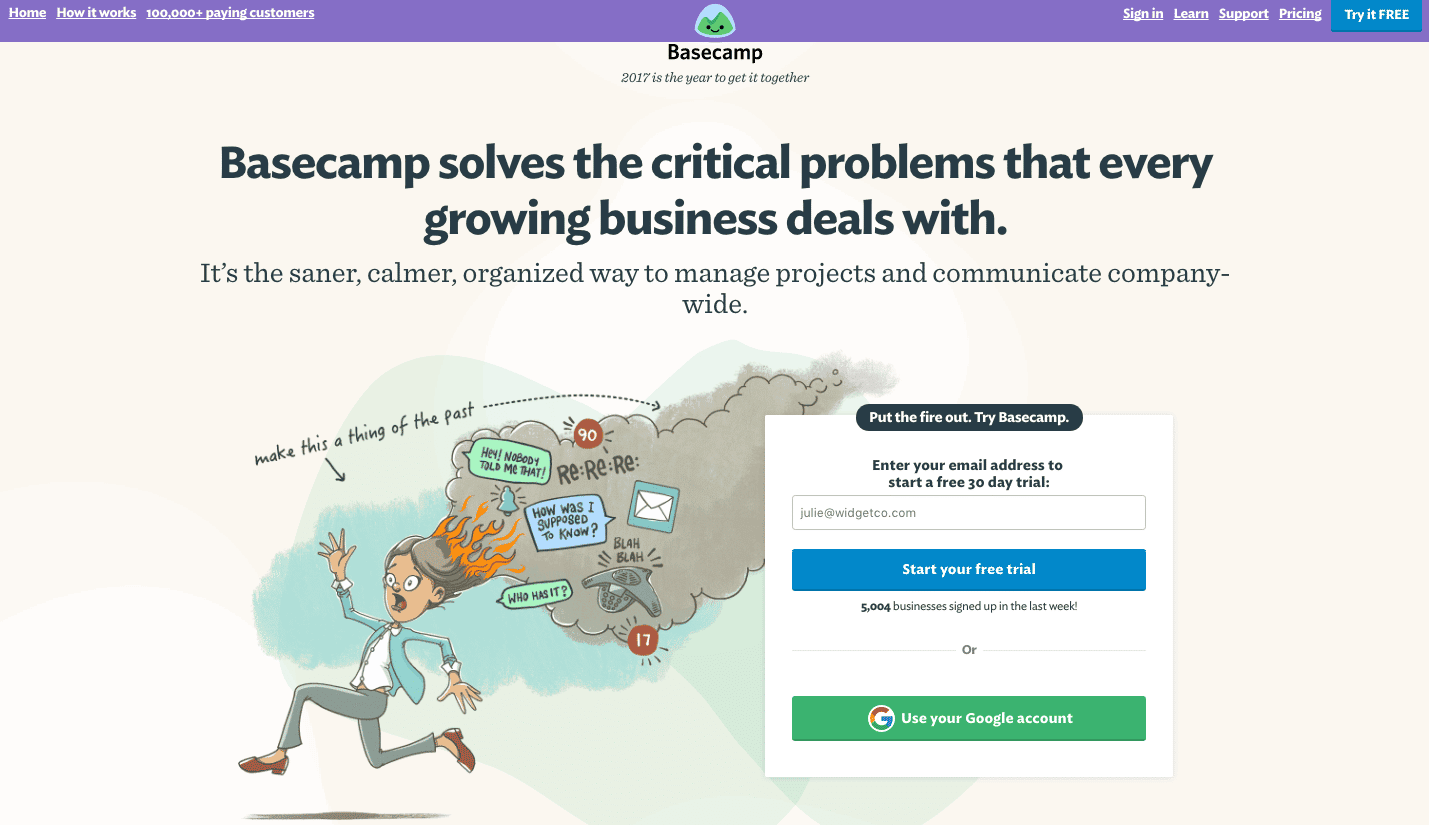
Besides influencing visitors’ moods, colors serve as visual cues. Contrasting colors help to highlight the CTA button and draw visitors’ attention to the desired action.
Consider potential FUDs for your visitors when designing your Call to Action button. In the desktop website below, you can hardly see the CTA button.

If you have a homepage like this one, you should consider switching to a larger, more colorful, and eye-catching CTA button to minimize uncertainty.
Then you should frequently ask yourself this question:
How often am I A/B testing the color of the CTA buttons on my homepage?
10. Test CTA copy
Let’s take a look at a real-life example shared by WhichTestWon.com.
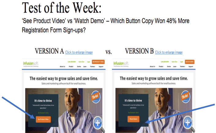
As a conversion optimization company offering the same service as WTW.com, we could easily predict which version would win. Here are the actual results:
Version A is the original page copy, and Version B is the variation. As you can see, simply changing the CTA button’s microcopy increased conversions (form fills) by 48% at a 98.5% Confidence Level. In this case, rather than “Watch Demo,” users are drawn to the “See Product Videos” CTA, which is clearer and more convincing.
11. Test the size of the CTA button
The original page for SAP BusinessObjects had a small blue text link:

To increase conversions, they created a big orange button and changed the headline to FREE CRYSTAL REPORTS 2008, in a larger font:

The result is inspiring: they increased their conversion rate by 32%.
12. Test a sticky CTA
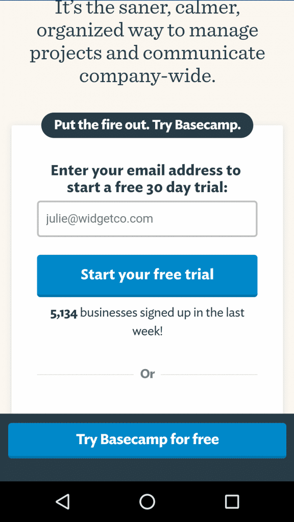
An always-visible CTA is a great recipe for higher conversions. You can choose a sticky sidebar, header, or footer to add your CTA.
Basecamp uses a sticky CTA footer for its mobile homepage:
General Design in a SaaS Homepage
13. Test long-form design vs. short-form
An A/B test conducted by Signal v. Noise on Highrise’s marketing site shows a 37.5% increase in micro-conversions when the company tested a longer page design.
Short form design is not a one-size-fits-all solution.
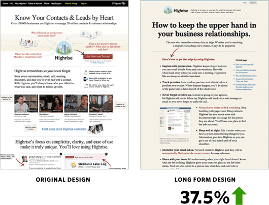
The company then believed it could go further in terms of increasing conversions. So, they tested a totally different variation to see if they got better results.
In this design, they simplified the text: instead of customer testimonials, they used a hero image of a person and highlighted the value proposition in the subheadline.
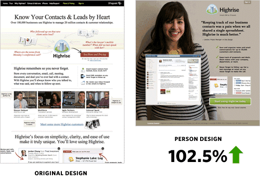
Highrise increased micro conversions by 102.5% and macro conversions by 47%, resulting in a revenue boost for the business.
14. Test a total makeover
CloudSponge had an outdated website design in 2010. They were suffering from low conversions. The design of their homepage looked like this:
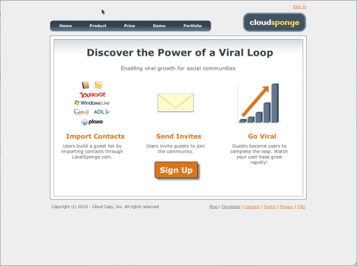
As you can see, the website design was simple but neither clear nor attractive. They needed a better website design.
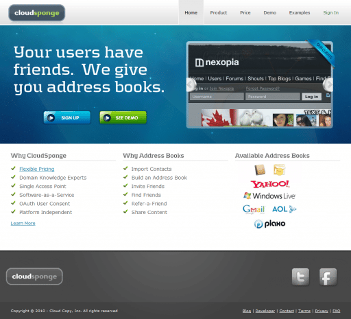
The new design gives visitors reasons to be interested in CloudSponge. They provide a value proposition that explains the company’s offer and present two CTA buttons: “Sign up” and “See Demo.” Visitors can watch the explainer video next to the “See Demo” CTA to learn more about the service. Additionally, features are listed under “Why Cloudsponger.” In the end, the new design achieved a 33% increase in conversion.
15. Test image slider vs. video
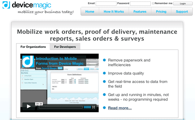
Device Magic tested whether a video or an image slider would convert better on their homepage.
Original:
Variation:
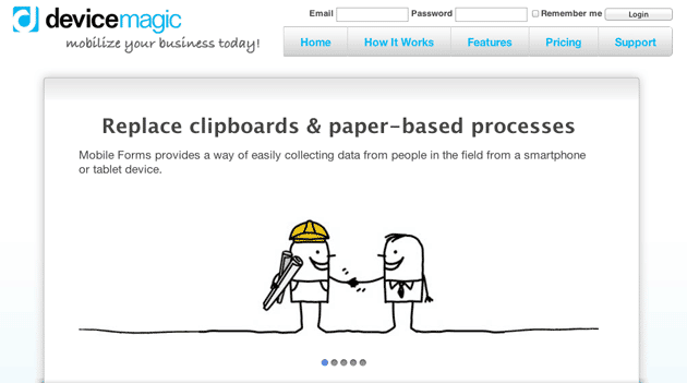
The sliders came in a basic, easy-to-capture format. As a result, conversions from the homepage to the signup page increased by 35%, and subsequent signups by 31%.
Remember that visitors’ time is important; they do not want to waste time trying to understand your offer. In this example, the video was 4 minutes long, and the screen cap did not capture it at all. That’s why the slider converted more than the video.
Now, when you look at Device Magic’s website, you can see they are testing a different homepage. They use neither a long video nor a slider. A short video plays continuously, showing people using the program.
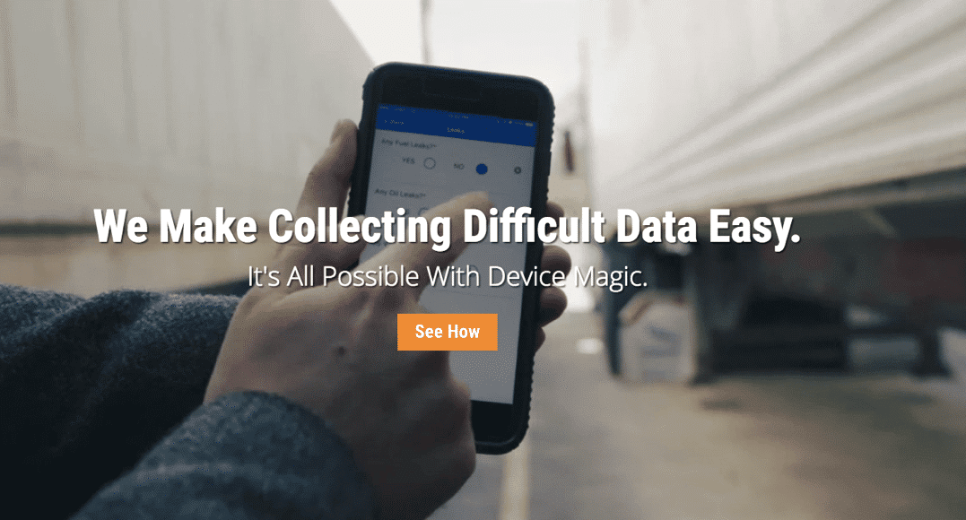
They use a strong, understandable value proposition and a clear CTA button, along with a two-minute video about the service. So, the video playing in the background incites visitors to click on the “See How” button.
16. Test auto-play vs. click-to-play videos
Imagine you are using a click-to-play video on your homepage and then decide to switch to an autoplay video. Would the change impact your conversions? There is only one way to find out.
A/B Tests to Boost Your SaaS Pricing Page
Every page on your website has a unique goal: delivering the value you offer to your customers.
So far, we have discussed how to deliver value on your website pages to increase micro-conversions on your homepage. The next step is to convert these micro-conversions into macro-conversions by selling your product/service to visitors. At this point, you should consider optimizing your SaaS pricing page.
Each marketing and sales funnel leads to your bottom line, and the pricing page is the final stop before visitors become customers and you make revenue.
Let’s see some A/B testing opportunities you should consider.
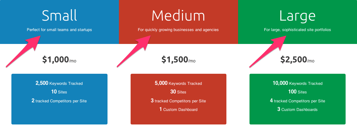
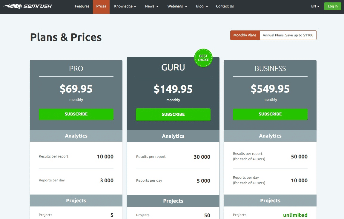
17. Test the position of the lowest and highest prices
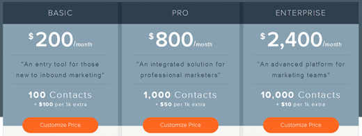
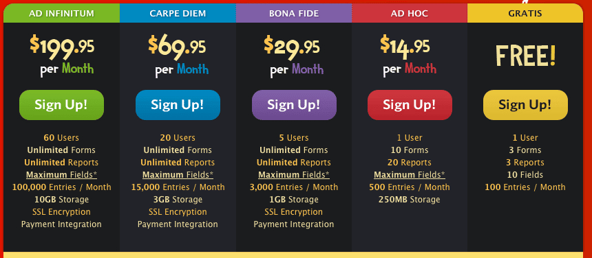
Wufoo uses a high-to-low pricing model.
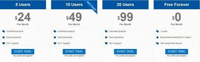
18. Test same colors vs. different colors
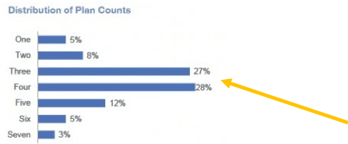
55% of the companies use three or four pricing tiers. So, starting by testing three to four pricing tiers on your pricing page is best.
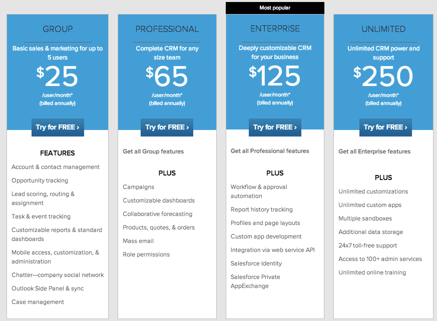
Then, you test two or five pricing tiers, depending on your pricing mechanism.
20. Test a list of all the features on your pricing plan vs. a list of features with checkboxes
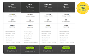
In the pricing plan above, features are listed under each pricing package. This might waste users’ time as they compare the packages.
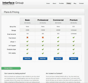
The one above includes checkboxes so users can easily compare packages.
21. Test your most expensive product as “request pricing” format
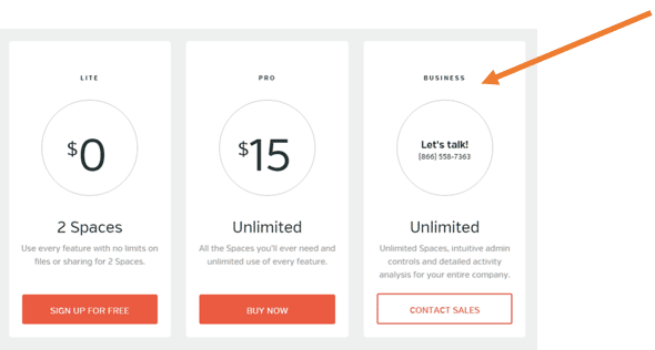
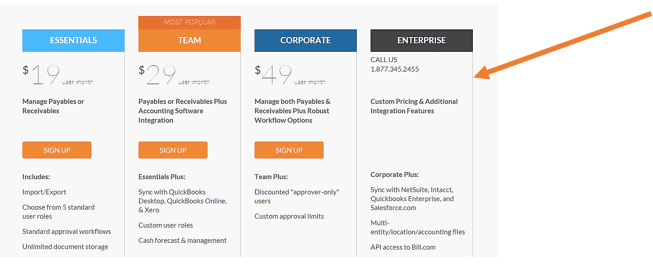
Not all SaaS companies display their pricing tiers on their websites; some ask visitors to contact them for pricing information. This way, they can offer different prices to different customers. In the end, this format might be a win-win situation for both sides.
Jason Lemkin’s SaaS analysis shows that 38% of SaaS companies list their most expensive pricing tier as “contact us.”
22. Test packages as named and unnamed
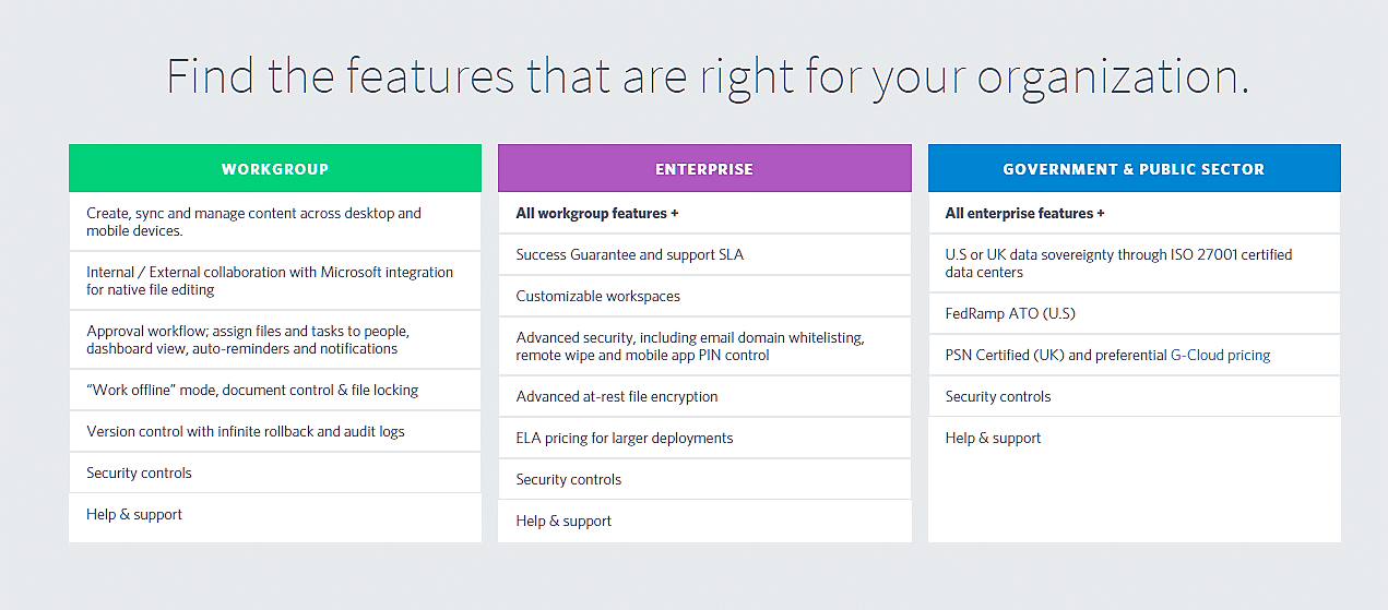
Many SaaS companies think that as long as they create pricing tiers for each persona, they are on the right track. However, one-fifth of the companies use unnamed pricing tiers.
23. Test customizing and relocating the pricing tiers
Here is a good example of pricing page optimization.
Basekit is a mobile site builder company that helps small businesses build their own websites or online stores. The company conducted a successful A/B test on its pricing page to improve macro conversions.
In the example below, Basekit made a significant change to its pricing page. They named the product tiers Basic, Business, and Enterprise. They also reduced CTA buttons to a single green color and changed the CTA name to “Get started.” They also tested anchor pricing, highlighting their “Business” product to compel visitors.
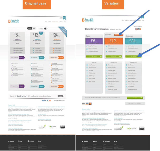
The test resulted in a 25% increase in conversions.
25. Test clear pricing features
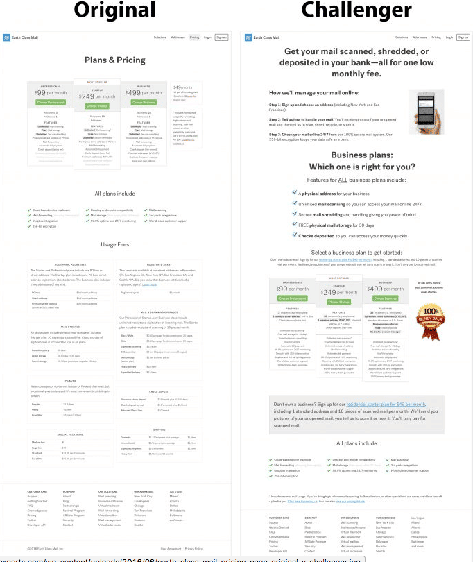
Lyyti’s sales team and Sampsa Vainio, a conversion optimization expert, replaced the original cluttered pricing page with a user-friendly one.
This was the original:
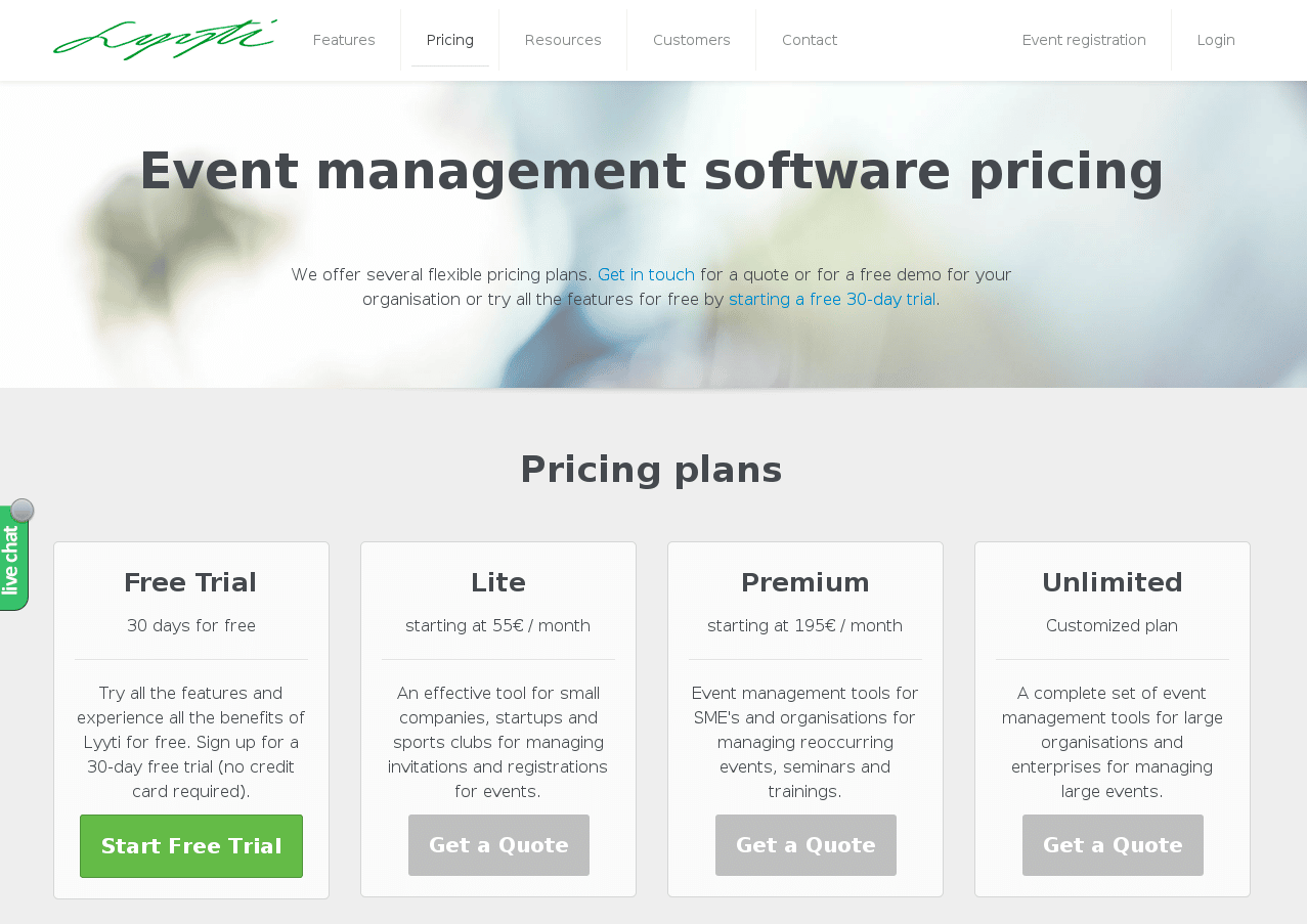
According to the heatmaps and clickmaps reports, users frequently moved between the pricing and the features page. This original page has barely visible CTAs and no information on features. Prospects could not distinguish the features offered in each plan.
Here’s what the successful variation looked like:
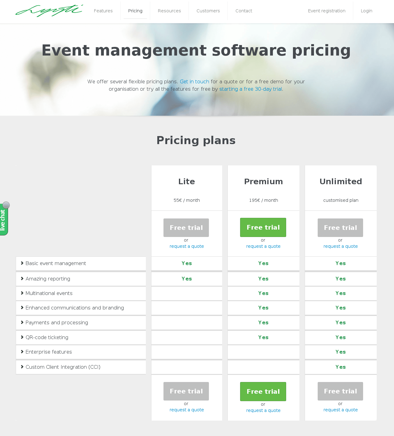
They increased visits to the lead generation page by 93.71% with a statistical significance of 96%.
26. Test long pricing plans vs short pricing plans
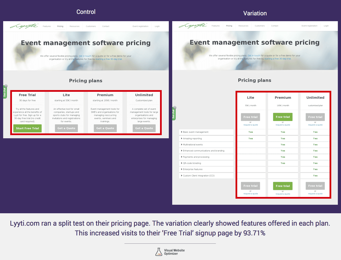
Lyyti’s example also shows that long pricing plans can outperform short ones.
27. Test “useless” pricing plan
Have you ever heard about the Predictably Irrational theory? Based on this theory, you can increase conversions by setting an illogical pricing tier among your offers.
This useless plan has no potential for sale. The sole purpose of this specific offer is to make the next pricing tier much more attractive. People will always choose the most reasonable cost-benefit option.
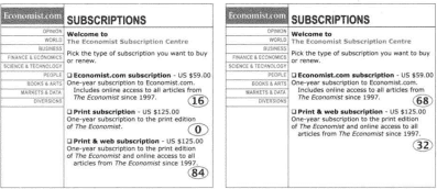
A useless pricing plan is a strong candidate for testing. Are you still not sure whether it works? Then check out this real-life example below.
One company decided to try a useless pricing strategy. This is the original page:
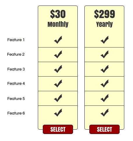
At this price, 40% bought the yearly plan, and 60% bought the monthly plan.
This is the variation:
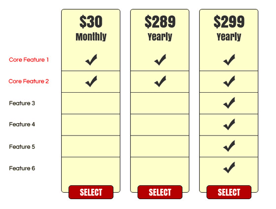
The company knew that customers wanted the first two features, so they included them in all plans. The result was a 233% increase in conversions. 86% purchased the $299 plan, and 14% chose the monthly plan. So, the middle pricing tier ($289) psychologically led people to choose the third tier ($299).
28. Test pricing tiers with discounts
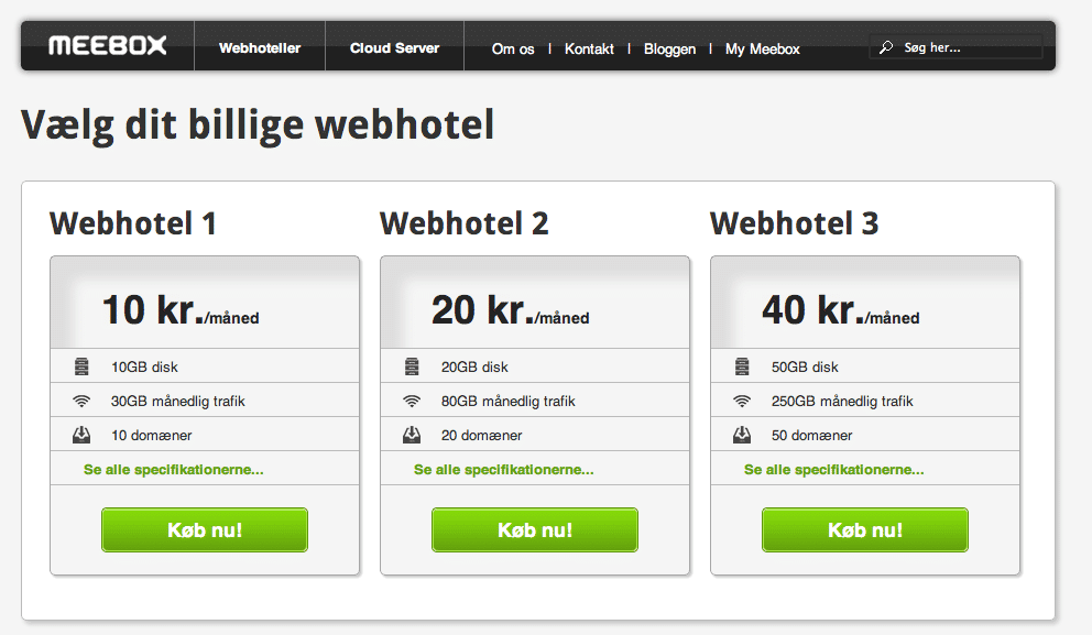
Meebox is a Denmark-based web hosting and cloud hosting company. They ran a test on the pricing page, offering discounts on their plans. While the original offered no discounts, the variation showed a 20% discount on the middle plan and 40% on the highest plan. These discounts applied only if customers locked in for 2 years.
Original:
Variation:
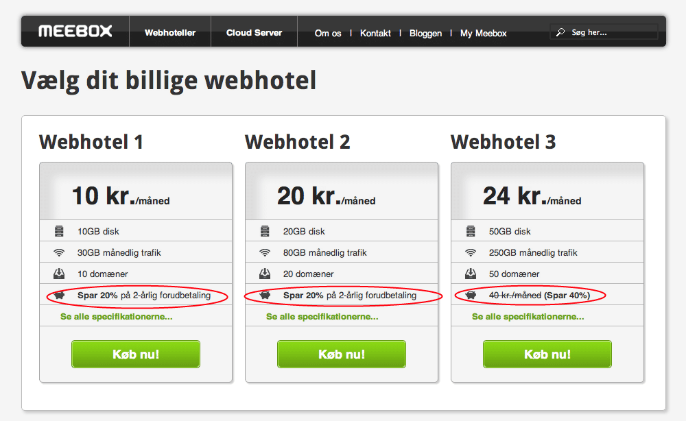
Meebox saw a 121.56% increase in revenue, a 46.24% increase in Average Order Value, and a 51.85% increase in conversions.
When offering discounts to potential customers, make sure it works for your company as well. It may not have been profitable for Meebox to offer a discount if they had not guaranteed that customers would pay for 2 years.
29. Test CTA copy on pricing tiers
Your CTA copy should be simple and persuasive to convince visitors to act. Instead of making drastic changes, starting with small changes to CTA copy would be a meaningful way to see the difference. Never forget that you have only a few words to persuade customers.
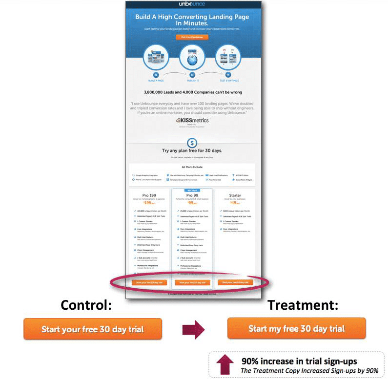
Unbounce, a leading landing page provider, tested CTA copy on its pricing page. Not features, not design, or multiple elements. What Unbounce did was change “your” into “my.” Perhaps the visitors found it more engaging. The company’s conversion rate increased from 30% to 90%.
30. Test a value-based pricing model
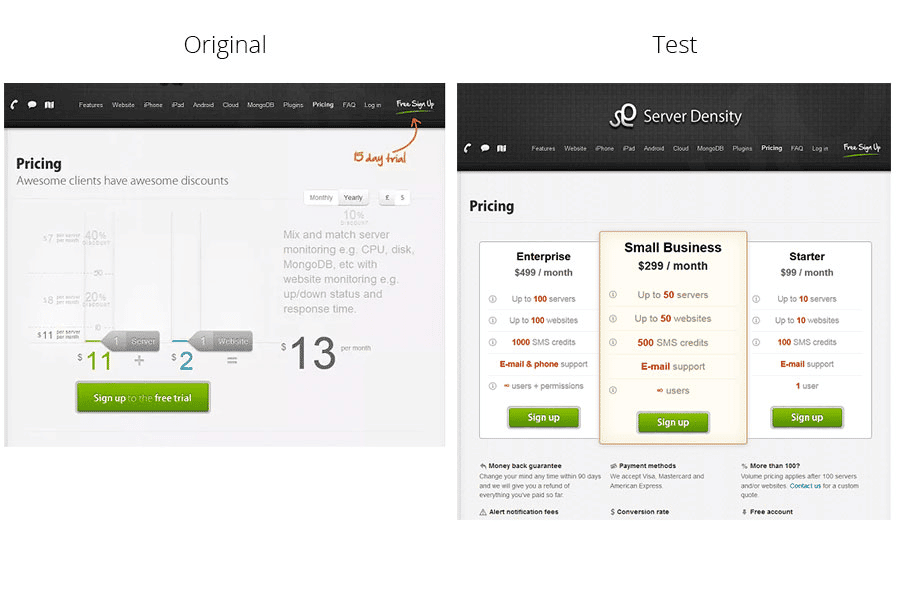
Server Density is a SaaS company that offers hosting and website monitoring. Their initial pricing model was cost-based, as you can see on the original page. They tested it against a separate pricing tier in a value-based pricing model.
As a result, free trial sign-ups decreased, but overall revenue increased. They effectively lowered the costs of the “tire-kickers.” In the end, they increased total revenue by 114% with the newly designed pricing tiers.