
Think back to a time you had a bad experience using a website.
Maybe the site was slow, or it had illegible typography and bad spacing on long landing pages. Or perhaps the navigation was confusing – too many options to choose from.
Do you have a moment in mind?
I’m pretty sure you didn’t take long to recall such memories because, well, they stick.
Now, think back to how you felt after getting that negative vibe from their site. Did you think of looking for an alternative? Or did you go back to take another shot?
Well, according to Toptal, 88% of users would rather stay away from a website after a bad user experience. That’s a huge number of users to lose for something that can be avoided.
Achieving superior user experience involves building a culture committed to continuous improvement, and that means measuring your UX from time to time.
There are several metrics you can focus on when measuring user experience on your website. But in this article, we are going to look at a different way of measuring UX…keep reading!
Two main benefits of measuring UX
“What gets measured can be managed?”
This adage by the American father of management thinking, Peter Drucker, rings true in the world of UX.
You can’t know about the experience of your users unless you track and measure it. Failure to measure UX is killing more conversions and increasing the churn rate of different websites. According to Sandro Meyer, co-founder of Growth Bay:
“It’s amazing how many design decisions are still made today without relying on UX-KPI data. For example, your conversion rate might suffer from the fact that the number of form questions on a login page has increased from six to nine. Without continuously measuring the relevant KPIs, you will find it difficult to identify such problems quickly.”
Having said that, let’s look at some of the important reasons why you should measure UX:
1. Shows you how you doing against competitors
The important thing you should know here is that UX competitor analysis comes after you have measured your site’s user experience first. Once you have done that, then you can enjoy the benefits that come with doing UX competitor analysis. In this context, I mean benefits like:
- Knowing how to solve usability problems on your site.
- Knowing where your product or service stands in the market.
- Making informed decisions when designing or redesigning your site.
- Having a clear understanding of your competitors’ strengths and weaknesses of your competitors.
- Having a clear reference point for any improvements.
Besides doing UX competitor analysis, when you can attach numbers to your site’s user experience, you can also benchmark it with industry standards. According to Kate Moran, NNG’s Senior User Experience Specialist, with benchmarking, you can compare your UX metrics against an earlier version of the product or service.
Come to think of it, benchmarking is the less expensive (quantitative usability testing) way that can help you assess and improve your website.
2. See whether designs improved over time.
Measuring UX allows you to compare your current UX to a future one after you make changes.
Before you deploy that new design, you’d want to know if it improves the completion rates and makes the tasks easy, as compared to previous designs.
How will you know this if you haven’t measured the completion rate and task ease of the previous versions? How will you know if there is an increase or decrease in completion rates? Or if there is an increase in the task-ease score?
Measuring User Experience
Now that you understand the importance of measuring user experience, it’s time to talk about how you can measure it. Measuring user experience requires one to focus on two types of KPIs: behavioral and attitudinal.
For now, let’s start by looking at the Behaviour KPIs ways of measuring user experience:
Behaviour KPIs (what they do)
This type of KPIs tells you what users are doing or how they are interacting with your site in terms of numbers. Kn
According to Kuldeep Kelkar, VP of UX Research at Userzoom:
“Data only shows part of the story. Google Analytics can tell you what’s happening but not why it’s happening. If you’re only going by analytics, you’re essentially guessing. Sure, it can be an educated, highly informed guess – but you won’t know exactly why things are happening on your site until you see real people using it.”
Here are UX behavioral KPIs you should keep an eye on:
1. Task Success Rate (TSR)
As the name suggests, TSR refers to the number of tasks that users on your site correctly completed. You can’t measure the TSR if there’s no well-defined task assigned to users. You need to be clear about the goals you consider as a success before you start gathering data.
Here’s how you calculate TSR:
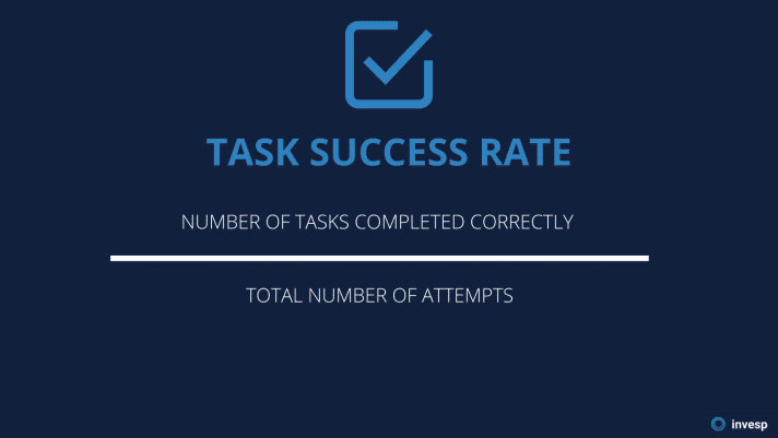
Many organizations tend to skip measuring the TSR because it is expensive, challenging, and time-consuming. But that’s a huge mistake. Ignoring the TSR means that you won’t know if the experience has been improving (or not), and this creates a blind spot for your organization that can cause you to lose a lot of conversions.
2. Time-on-task
How long does it take users to accomplish a given task?
The less the users spend on a task, the better their experience of using your website is. On the other hand, the longer they take to accomplish a given task signals a poor user experience.
The time-on-task KPI can show you areas of friction – where users are struggling to go through. You can use this KPI to reduce the number of steps a user needs to accomplish a given task. The removal of steps can be done in two ways:
- Removing elements – words, colors, and some web elements can distract the user’s attention – and this can cause users to take a lot of time to complete a task.
- Reducing choice – the number of options available can affect the time users take on a specific task.
3. User error rate
How many times does a user make an error when using your website? You can’t afford to ignore the user error rate because it indicates how clear and user-friendly your site is. And besides, it also correlates with two of the above KPIs in the sense that errors are the reason why users take a long time to perform a task, and they’re behind failed tasks.
This is how you calculate user error rate:
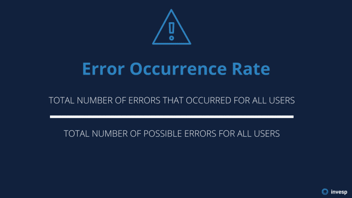
A high user error rate is a reflection of a high number of usability problems on a site. You can’t measure the user error rate if you don’t have a well-defined action that represents an error.
Measuring user error rate is good, but it doesn’t tell the whole story. The other half is to identify the causes of the errors that users make. These usually follow into four sections:
- Mistakes. When users make the mistake of entering the wrong information on a field, it’s usually a good indicator that some field hints are necessary.
- Slips. You shouldn’t ignore typos and fat finger errors, especially if they tend to happen more often. This could be an indication that you should reduce the number of required fields on your forms.
User Interface Problems. User errors that are created by the interface should be stopped right away. Suppose you continue to see users clicking on an unclickable area, then this could be an indication that your design has issues.
4. Abandonment Rate
Many websites are plagued by the occurrence of shopping cart abandonment almost every day.
The shopping cart abandonment rate is the percentage of online shoppers who add items to the cart and leave without checking out. In other words, it shows the rate of interested potential buyers who leave without purchasing anything on your site.
There are several reasons why potential customers abandon their carts. Some of those reasons relate to negative user experience:
- No guest account option
- Complicated checkout process
- Website errors/crashes
- Limited payment options
A high shopping cart abandonment rate is a reflection of a bad user experience. It shows that customers are interested in your product, but something is blocking them from checking out.
Attitudinal KPIs (what they say)
The role of listening to customers in business cannot be overstated. Looking at what customers do on your site is not enough; it’s crucial to actively listen to what they say – before, during, and after interacting with your site – about their experience and analyze their feedback.
There are different ways you can ask your users about the usability of your site. Here are three ways of doing that:
1. System Usability Scale (SUS)
SUS is a reliable tool – devised in 1986 by John Brooke – you can use to measure how usable your site is. It comes with a 10 item questionnaire that has five response options for respondents, from Strongly Agree to Strongly Disagree. Using this tool, you can expect to enjoy some of the following benefits:
- It’s a straightforward scale to administer to participants.
- You can use it on small sample sizes and still get reliable results.
- It can effectively differentiate between usable and unusable websites.
So when you are going to use SUS, keep in mind the following:
- Interpreting the scoring system can be complex.
- The scores are from 0-100, but you shouldn’t interpret them as percentages.
- SUS does not diagnose the problem on your site; it just shows you how usable it is.
Here are the ten items that you can ask your participants when using the SUS tool:
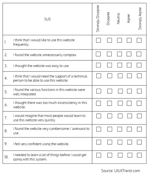
For instance, if you want to measure the usability values of your site, and the final score is anything below the average of 68 – that’s an indication that your website has bottlenecks that need to be fixed right away.
2. Net Promoter Score (NPS)
The NPS is a straightforward way to measure how satisfied users are after interacting with your website. Although the NPS does not reflect what all users think about your site, it can give you some insights.
So how does it work?
Well, you ask users one key question, and they answer using a scale of 0 (very unlikely) to 10 (very likely):
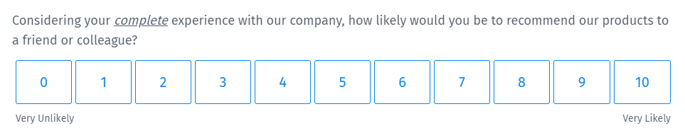
A score between 0 and 3 is not that bad, but it’s an indication that there is still room for improvement. If your NPS is above 3, it is favorable, and anything that is above 8 is world-class.
The best way to get a higher score is to provide a good experience for your customers, making sure that there are no conversion roadblocks on your website and making their purchase journey shot and easy.
According to Perceptive’s Tomas Dickson:
“In our experience, it is often the most simple things letting a business down. Pick up the phone faster, reduce wait times, and, in general, just communicate better. Don’t make your customers come to you. Go to them—this will massively improve your customer satisfaction and, invariably, your NPS too.”
Once you know your score, you can even benchmark NPS to understand better how your UX stands in a competitive landscape. That will help you strive to improve your user experience so that you remain competitive in the market.
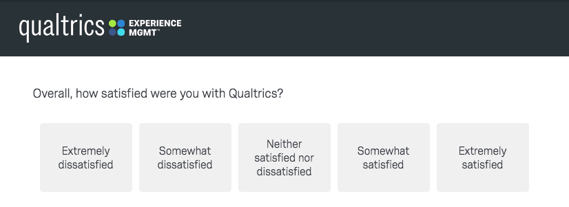
3. Customer Satisfaction (CSAT)
As the name implies, CSAT is another user experience KPI that can help you measure customer satisfaction. It’s ideal to use CSAT surveys after customers have had an experience with a particular area of your website.
For example, you can send a CSAT survey after a customer has just gone through the onboarding process – this can help you see how efficient it is and if there are any improvements needed to the process. The idea here is to record the score while the experience is still fresh in the mind of the user.
Here’s a practical example from Qualtrics:
All major touchpoints that a customer has with your brand are the best places to measure customer satisfaction. Another vital thing to note is that CSAT surveys shouldn’t be limited to one question. You can use several questions, which are either open-ended or closed-ended, in the same survey.
Conclusion
It’s cornerstone knowledge that the difference between the most profitable and unsuccessful websites is a single phrase: user experience (UX). There’s no one-size-fits-all blueprint for delivering an excellent user experience, and sometimes brands fall short when trying to improve their UX. But if you measure your site’s UX, you can always uncover areas that need improvement and make informed decisions. Remember, measuring UX is half of the equation, you still have to interpret the data and understand what it is saying about your website’s user experience.


