For CROs, case studies are as close as you can get to “text books”. Much of conversion rate optimization depends on field testing rather than theory. Keeping an eye on what’s working for others can help you create a more conversion focused website.
Some case studies often bring up surprising results that challenge widely held beliefs about CRO. In this post, I’m going to share 9 such CRO case studies with you.
1. Removing product descriptions and buying options increases conversions by 15.3%
Conventional wisdom says that customers landing on a product page want to know more about the product.
There is also a firm belief – backed by plenty of evidence – that offering more payment or purchasing options increases conversions.
For one website, however, the opposite rang true. This website is a large affiliate store for college textbooks. Nearly all of its users are college students looking for cheap books.
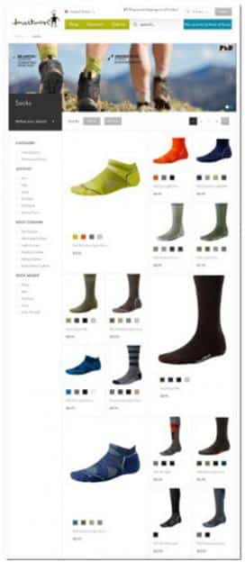
On their original landing page, they had lots of product details as well as multiple buying options:
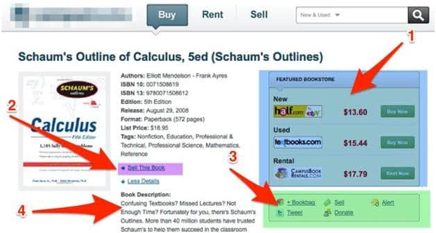
For a student looking to find the cheapest possible textbook, this was too simply way too much information.
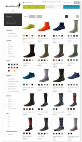
This is what the redesigned page looked like:
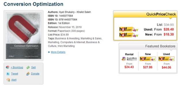
This page goes against convention and actually removes product related information. Some of the major changes include:
- The product description was removed since shoppers are college students who already know about the book.
- The “Buy Now” section listed the retailer with the lowest prices – the only thing college students actually care about.
- Distracting buttons such as the “Sell this book” link were removed.
The Result: The redesigned page led to a 15.3% increase in conversions.
The Lesson:
Instead of focusing on best practices, understand your customers and give them the experience they want. For this website’s users, low price was the biggest priority. It didn’t matter which retailer they got the textbook from as long as it was usable.
Additionally, while things like product descriptions might be necessary when you’re targeting customers at the top of the funnel, they hurt conversions for bottom of the funnel customers. In this case, the website’s users knew everything they needed to know about the product (the textbooks) already from their classes. The only thing they needed was a quick way to buy it, and that is exactly what the redesign delivered.
2. Removing trust elements increases conversion rates
Basecamp is a web application which hosts a variety of tools which help teams communicate and complete projects.
Highrise, their solution for sharing contacts and managing communication was already effective in yielding high sign-up rates through their landing page. Despite this, the team decided to focus on testing an entire design change to monitor outcomes.
Here’s the original landing page:
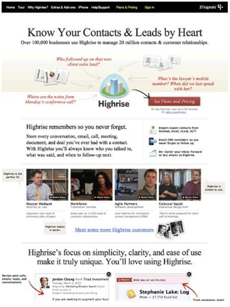
From a “best practices” perspective, this page checks a lot of the right boxes. It has:
- Multiple testimonials from customers – including video testimonials (which acts as powerful social proof).
- Visual cues directing users to important page elements, such as the on-page arrows.
- Strong color contrast, especially in the CTA.
While this was good enough to get strong conversions, the team at Basecamp wanted more. But instead of focusing on small aspects such as color of the background or copy in the headline, they radically changed the design of their website.
Here are 6 of their redesigns along with their conversion rates:
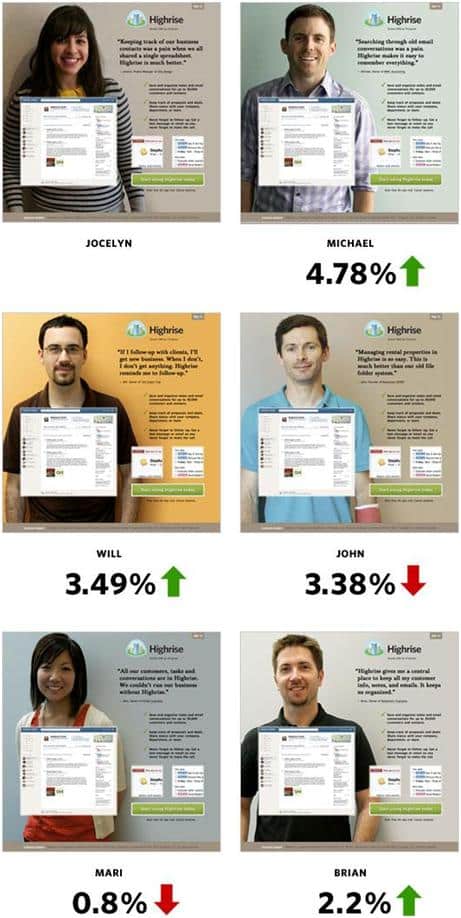
They decided to:
- Include an image of a smiling person. Smiling, according to studies, increases trust level.
- Highlight only one testimonial in large text which not only informs what their service does but also how it provides value.
- Removed visual clutter from their page.
The Result: The design change yielded a 102% increase in conversions
The Lesson:
- Sometimes, less is more. Instead of covering your page in social proof, try limiting to just 1-2 testimonials.
- Many CROs advocate making small incremental changes while testing. Sometimes, however, throwing out an old design and starting from scratch works better.
3. Showing users a “preview” increases newsletter conversion rates by 83%
The World Wildlife Fund wanted to get more subscribers to its monthly newsletters. However, instead of following tried and tested “best practices”, they made a few small tweaks that led to big improvements in results.
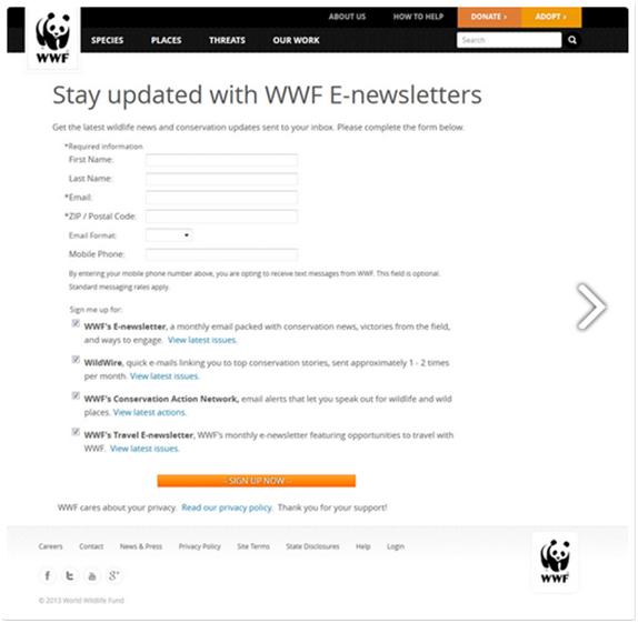
Here is the original layout:
And here is the re-design:
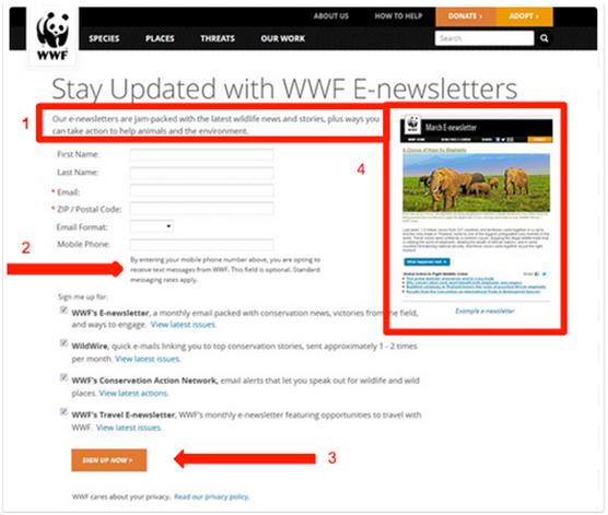
This redesign doesn’t do anything radically different. In fact, it even eschews a few best practices – such as making the “Sign-up Now” CTA larger and removing number of fields.
Yet, this new design was effective because:
- Visitors were told exactly what they can expect from the newsletter before entering any information.
- Altered placement of call-to-action button to the left to align with the reader’s visual reading path from left to right.
- The newsletter image gives readers a visual idea of what they can expect.
- It addressed users’ FUDs about giving away their mobile number.
The Result: As a result of the changes, WWF experienced an 83% increase in sign-ups
The Lesson:
- Show, don’t just tell. Whenever possible, give users a preview of what they can expect after they perform an action.
- Address user FUDs clearly, especially when asking for their contact information or credit card data.
4. Image converts better than a video
Brookdale senior is a company which operates a chain of senior residence facilities.
In an attempt to increase converting visitors searching for a community to live in, the company tested changes which go against conventional wisdom.
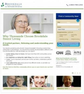
Here is their original page:
The page contains no graphics, testimonials or content which would encourage visitors to convert.
And here is the re-design which included testimonials, content, and credibility logos.
While this redesign converted much better – it checked all the best practices boxes (testimonials, strong CTA, trust markers, etc.) – they tested another variant with a video instead of an image:
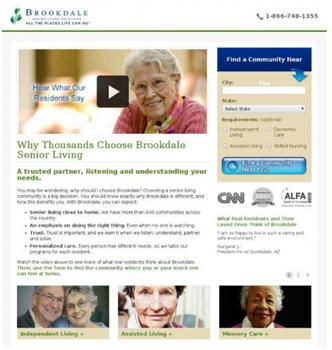
One version contained an image and the other, a playable video.
Studies suggest that videos convert much better than images (80% higher, according to one source).
In this case, however, the image version outperformed all other variants with a 4% increase in conversion as opposed to 1% with video.
Why could this be?
- Brookedale is already an established brand and the video serves as a distraction. People who come to their site have done their research and come knowing what they want
- The demographic browsing the website is likely older and may have slower internet where videos do not load smoothly or they may autoplay confusing visitors and causing them to leave.
The Result: The redesigned landing page (with the image) increased conversion rate by 3.92%, increasing revenue by $108,000.
The Lesson: Don’t blindly follow trends when making design decisions. Video might convert better than text or images on average, but it won’t necessarily do the same for you. Consider your target demographics and the strength of your brand before you jump aboard a trend.
5. Removing social login gets 3% higher conversions
Blivakker is a Norwegian online cosmetics retailer with over NOK 100M in annual sales and 350,000 registered users.
On e-commerce sites people frequently abandon carts during checkout if they are forced to sign-up to proceed for payment. Blivakker wanted to reduce cart abandonment by improving their check-out process by offering a social login option – a popular trend you’ll see across websites and industries.
To do this, Blivakker added Facebook login to its sign-up page. Data from social labs shows that 50% of online shoppers are already signed into Facebook so it serves as an attractive medium to bypass sign-ups.
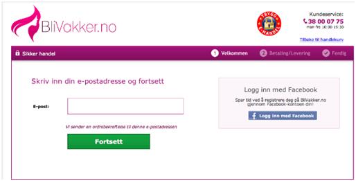
Here’s what their sign-up looked like when they offered Facebook as an option:
And here is the same page without the Facebook login option
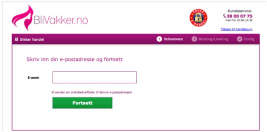
Though that was the only difference between the two landing pages, the results surprised BliVakker
The checkout page without Facebook login as an option increased conversions by 3% – something that goes against conventional wisdom.
What could explain this?
- People may not want their social networks to have access to their shopping data to avoid targeted ads.
- They may fear their friends and family being inadvertently shown their online purchases
Additionally, Norwegians care a lot about privacy. Norway ranks among the top 5 countries when it comes to its citizen’s privacy.
The Lesson: Always carry out your own testing instead of following a popular trend. Offering social login can seem like an easy way to get more people to sign-up, but it might not work for every business.
In the above case, it is also important to keep cultural context in mind. Norwegians care about privacy, perhaps more so than their peers down south. The popular trope of scandinavians being averse to extroversion also means that Norwegian shoppers might not want to share their shopping lists on Facebook.
6. Following a traditional design increases revenue per customer
Sometimes, following tradition can actually work out in your favor.
Take the case of SmartWool, a boutique clothing line which uses Merino wool in its clothing and accessories.
Though their website was already well designed and following best practices, the team wanted to experiment with different page layouts.
A common belief on e-commerce portals is that showing larger images of products and breaking the monotony of aligned equal-sized boxes can increase conversions.
Here’s how SmartWool’s original page with different-sized product images looked like:
Below is the more traditional design which was used as the test.
The redesign is as conventional as it comes. Gone are the varying image sizes and the large “featured” product images.
The Result: After testing for over a week, the results showed that the more traditional category page increased revenue by 17.1% per customer.
The Lesson: Don’t be quick to throw out conventions for the sake of creativity. If customers are used to seeing a format, it is better to stick with it than to try something new.
In SmartWool’s case, some reasons for the better conversions of the traditional layout could be that:
- Increasing product image size may lead to more click-throughs but that does not always translate to paying customers.
- Customers may get distracted by having their attention drawn towards products they actually don’t want.
7. Removing video above the fold increases conversions
There is a ton of data showing that adding video to a page increases conversions and engagement.
- A study of fashion retailers showed that websites that used video on product pages saw a 134% lift in conversions.
- A marketing survey found that 71% of marketers say that video is the best converting form of content.
- One retailer found that people who watched a video on its site were 144% more likely to convert than non-video viewers.
All this data indicates that if you add video to your page, you should see higher conversions.
In one case, however, the opposite happened.
GoSection8.com, which offers rental listing for the Section 8 housing market, used this as its original landing page:
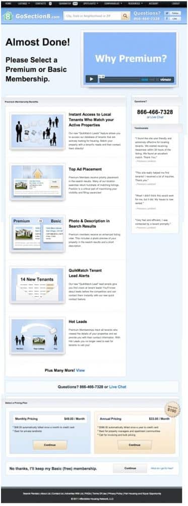
This is very standard design for landing pages. The video is above the fold and helps viewers understand the value proposition (also above the fold) better.
The redesign pushed the video below the fold and replaced it with text instead.
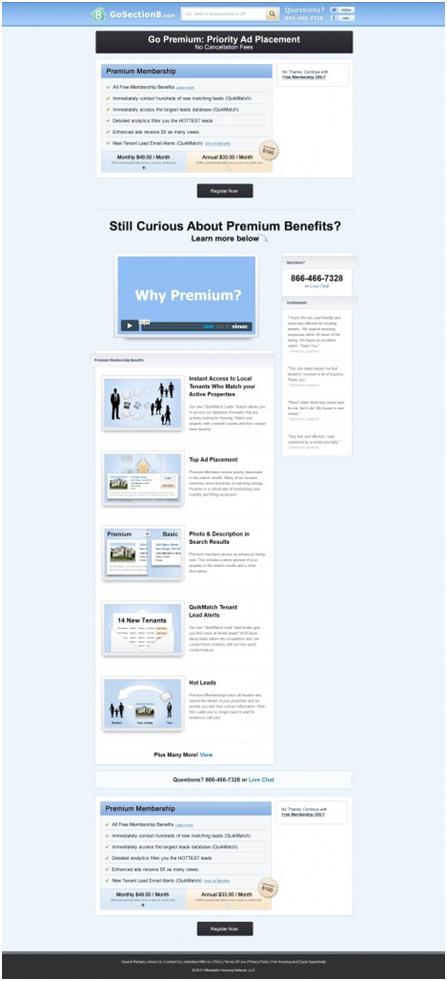
Also, note how the CTA was pushed above the fold.
The Result: The redesigned page increased conversions by 88.46%!
The Lesson: Video is helpful in persuading and engaging people, but only when it actually adds value.
In this case, the video was mostly fluff. Underscoring the value proposition could be done just as well with text instead of video – something the redesign focused on.
More importantly, the video was taking up prime real estate above the fold. The CTA, on the other hand, was much lower down the page, giving users no easy way to take action.
Keep this in mind when you design your landing page’s above the fold area.
8. Removing social sharing buttons increases conversion rates
You can never really have enough shares to your product pages.
For Finnish hardware retailer Taloon, however, this wasn’t quite the case.
Following common consensus, the platform used social sharing buttons on their product pages to boost sales and add social proof to their products.
Here is their product page with social sharing options
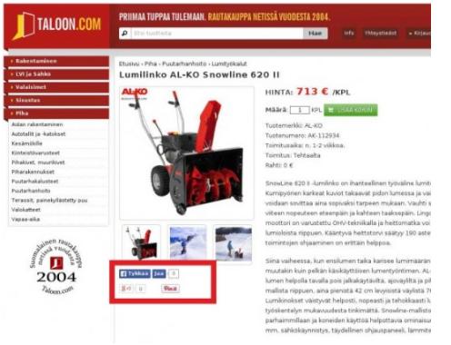
The user has the option to share via Facebook, Google+, and Pinterest
In a bid to increase conversions, the site removed these social sharing buttons from the page.
Here’s what the redesign looks like:
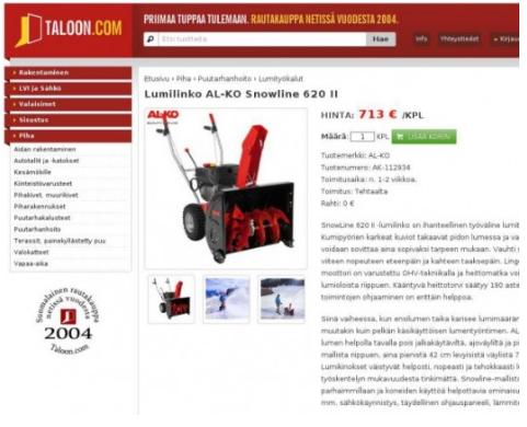
You’ll notice that it’s largely the same, except for the missing share buttons.
The Result: Removing social buttons increased conversion by 11.9%.
The Lesson: Two things:
- Low social share count can act as negative social proof since people might construe poor shares as poor product quality.
- Social sharing options may be helpful on pages which are informative or funny but on product pages they act as a distraction and clutter.
Remember this before you blindly add buttons to a page where they aren’t really needed.
9. Adding clarity to pricing improved conversion rate by 34%
When you have price conscious customers, it makes sense to show as low prices as possible, right?
That’s what one large retailer of Indian ethnic wear used to do. This retailer offers customization options for every product. Selecting an option, however, does not update the shown price.
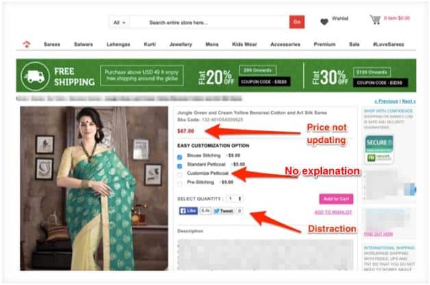
This practice wasn’t specific to the retailer alone, it was done by nearly every retailer in this category.
In a bid to increase conversions, the retailer broke from convention and redesigned its product pages:
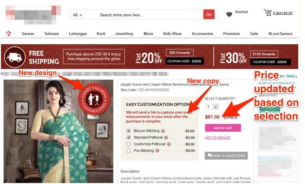
Now, if a customer selected a customization option, the price would update instantly.
This gave the impression that the price was higher and the retailer expected to suffer a loss in conversions.
The results, however, were surprising.
The Results: Adding clarity to the price increased conversions by 34%.
The Lesson: For this retailer, it was common practice in the industry to obscure the price as much as possible. Since its customers were shopping mostly on price, it was expected that updating the price might impact conversions negatively.
Instead, the opposite happened. Customers appreciated the clarity in pricing over the industry convention.
Conclusion
These case studies show the importance of testing every feature and design on your site. Though industry best practices and norms may indicate what works best generally, they are not hard rules that can’t be broken. Every case is unique and following norms blindly may actually drive users and business away from your site.
The best method to achieve maximum results is to continuously analyze, test, refine, implement and repeat. And remember: conversion rate optimization is an ongoing process.