Here’s how to improve you’re your ecommerce results: make your product pages the main focus of your business online.
Your product pages are the final turning point on an online shopper’s journey from initial browsing to paying customer.
If you think in terms of sales funnels, your product page is the pinnacle of the cone without which your funnel is incomplete and obsolete.
So how are your product pages doing?
Conversion rates are the best judge of product page performance. And your conversion rates improve the according to how often customers heed your “Buy Now” or “Add to Cart” call to action.
So, if your product pages should be the ultimate focus of your sales funnel, your purchase call-to-action should be the ultimate focus of your product page.
1. Calls-To-Purchase
It’s the last step, but the primary concern of your page. Every aspect of your call-to-purchase buttons must be carefully considered – even the fact that maybe they shouldn’t look like buttons.
Clarity – By using size, shape, color and positioning, your CTP button must be quickly and easily spotted – distinct from every other element on the page.
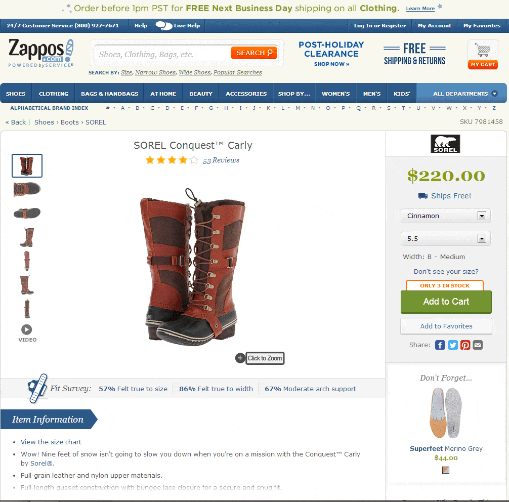
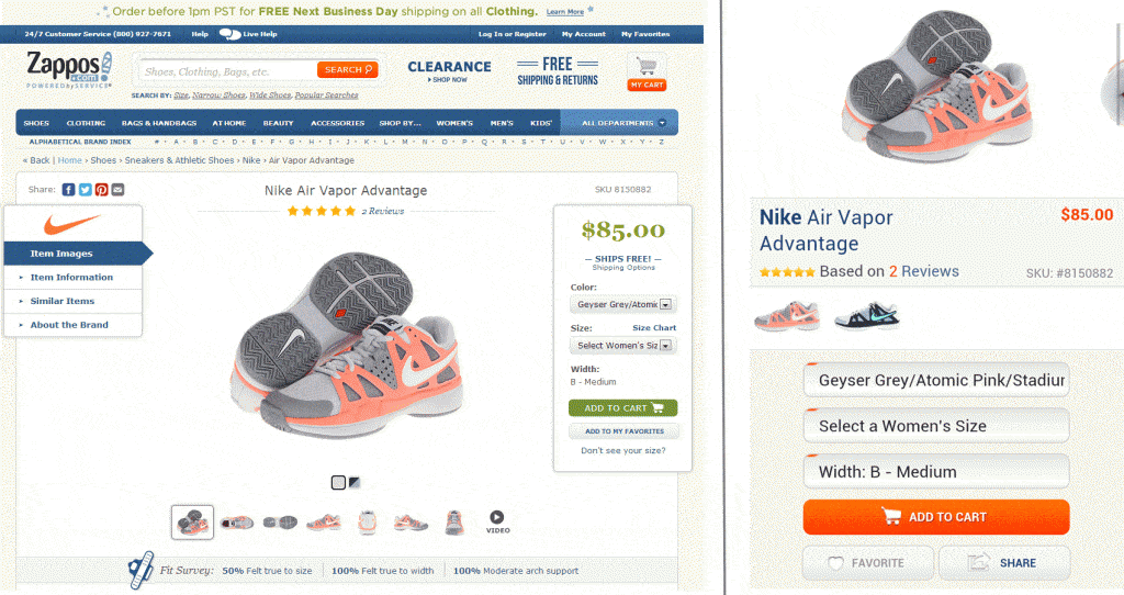
Check the Zappos.com product pages below. On both their desktop and mobile sites, the call-to-purchase button has a unique color among all CTA buttons and it’s the only one with an icon on the button.
In the images below, check the wording on the calls to purchase. While it is clear and distinct, the CTP on the left asks you to “Sign Up”. Ugh! Really?! After all the shopping, reading and comparing, “signing up” is not a particularly inviting call.
By contrast, the call to purchase on the right gives you a benefit for all the work you’ve done to get there. Click that button and you “Get” a free calling feature Of course you will have to sign-up, but by highlighting the benefit of doing so, you are more likely to click the button and complete the process.
2. The Big Picture
Shoppers are touchy/feely. No matter what it is, from apples to zebra-striped pajamas, we all want to pick it up, feel the weight, check the size, get a closer look and generally assess the product.
And it’s perhaps the biggest difference between bricks and mortar shopping and e-commerce. Technology has taken care of almost everything else, including quick answers to your questions, but it has a long way to go before you can reach into your monitor and grab a product.
If they can’t touch and feel, the next best thing is to give them a closer look.
It means big, high-quality images, multiple angle shots and the ability to zoom in.
And if you want to give them the best idea of how your product looks and works, show it in action with a video.
Check the Zappos product page below, including multiple angles on the left, a “Click-to-Zoom” feature and a video link.
So far, we’ve recommended clear, distinct CTAs and big, multi-angle images. But if you designed your page around those two criteria, it might not be very pleasing to the eye.
From headline to footer, your product pages have many elements and each one must have its place and space.
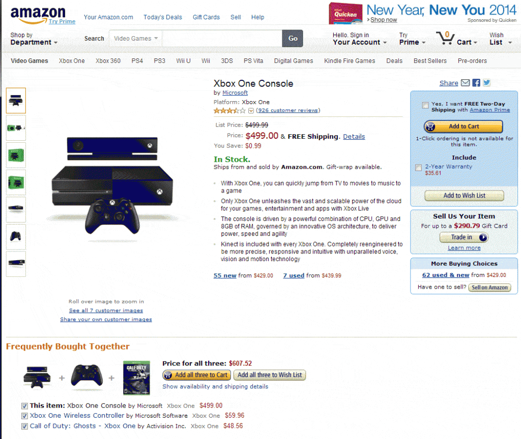
Check the Amazon product page below. I count over 50 (disclosure: I stopped counting at 50) elements on the page, including headers, CTAs, price, stock information, etc.. Yet the page does not feel overly crowded and each element is easily distinguished.
4. Get Your Ship Together
Another thing shoppers can’t do on your ecommerce site is leave with their purchase in hand. That makes shipping info very important.
Indeed, high shipping costs and not clearly mentioning shipping costs are by far the biggest reason for ecommerce shopping cart abandonment.
In other, completely different words, you should offer free shipping whenever possible.
Check any of the Zappos pages we’ve mentioned. “Free Shipping” is mentioned in three different places.
5. Give & Get Social Proof
There’s a reason why, even if you are not a Mac fan, you still go into the Apple store at the mall. It has a lot to do with the almost constant crowds there. No matter how stubborn we are in denying it, we are all interested in what’s popular. Popularity and word-of-mouth sell a lot more customers than the most expensive advertising.
Together, line-ups in a store and word-of-mouth buzz are social proof that shows a product is worthy of purchase – it must be good if so many people like it.
The problem online is that no one can see the crowd in your store. But social sharing lets shoppers tell everyone that they were on your product page and either bought or are thinking of buying. By adding social sharing buttons, you encourage and get social proof from your customers.
RELATED ARTICLE: How To Optimize A Product Page On A Shopify Website
And you can give them the social proof they seek by including authentic customer reviews on your page. This is as close as it gets to real word-of-mouth. Even bad reviews are good because they add authenticity to your reviews, they give you the chance to respond to concerns and they offer great product research information.
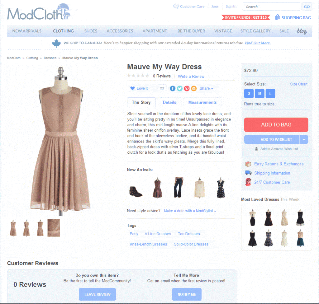
Modcloth puts social sharing and customer reviews above everything except the product header:
6. Provide Answers
Your potential customers are full of questions and concerns about buying from you. We’ve already mentioned some of them, including what the product looks like and it’s shipping details.
By giving your customers a quick way to answer as many questions as possible, you eliminate their concerns and increase the chance that they will buy.
The following are among the common answers your customers want:
- Product specifications
- Sizing
- Options
- Color choices
- Package contents
- Feature list
- Benefits
- Accessories
- Return Policy
Check all the images above to see how each retailer chooses to present certain information to answer customers’ potential questions.


