
Incentives are powerful.
Even if your website is riddled with elements causing fears, uncertainties and doubts (FUDs), we have found that offering great incentives counter FUDs and persuade visitors to convert.
We are not promoting the idea of having a site riddled with FUDs causing elements, however, remember that every visitor loves a bargain.
Incentives come in different shapes and forms.
They could be as simple as a free shipping offer, or a special discount on limited items, to more complex, unique approaches such as scarcity and urgency. Scarcity incentives point customer to the limited number of items available, while urgency incentives point to the limited time left on the offer.
To have incentives work for your site, you need to follow strategies of placing them at the right moments of the sales funnel as well as finding the best suiting designs:
- Some incentives work better at certain points in the funnel. You should also beware of overusing them, and making sure there is an honesty policy behind them (like if time will expire on a cart/offer etc. it really should).
- To the second point, incentives are only effective if the visitor actually sees them. We have been flabbergasted by clients who have the most amazing offers and incentives, however they are hidden or cluttered with other unnecessary copy or elements, so they go unnoticed.
In the following case study, we optimized an incentive that was already offered on the website. We worked on optimizing the moment of the offer, in the sales funnel, as well as the look and feel of the design.
The results we got are inspiring: 13.98% increase in conversion on mobile product pages and 17.75% increase in conversion on mobile cart page.
Company Background
Our client is one of the top e-commerce marketplace in South Asia selling female apparel and accessories.
The majority of their 4 million monthly visitors come from social media and paid traffic.
The website offered its visitors plenty of incentives: constant discounts, a cashback program on every purchase, and free shipping on items over a certain price point (most of the products exceed the price point, so most qualify for free shipping).
Problem Description
After conducting multiple qualitative polls and surveying site visitors, we concluded that about 65% were unaware of the plethora of incentives the site offered.
To begin with, we looked at just the free shipping incentive, which applied to 95% of the purchases of the site. We determined that users’ attention was not effectively directed to this benefit, considering where in the funnel the free shipping appeared, as well as where and how it appeared on the page.
Assessing the page, there were two areas that could attract user attention to the free shipping incentives: either in the form of a banner at the top of the page, or near the CTA, so the visitor would see it upon clicking “Add to Cart.”
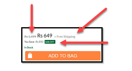
On mobile product pages the free shipping incentive appeared right next to the price. However, because of the discrepancy in font size between the price and free shipping wording, as well as the discount information below, the incentive could be missed by a visitor.
This is how the area between product name and CTA looked in the original:
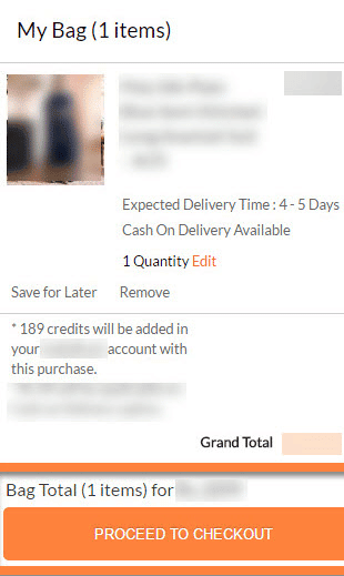
Cart page is also a critical area along the funnel, to include free shipping. But, surprisingly, the cart page did not mention many of the incentives promoted on the product page such as:
- Free shipping
- Discount on price
At the same time, while “free store credit” was listed, it did not match the wording on the product page. The cart page used the word “credits,” rather than “cashback,” as it was on the product page.
Original of the cart page:
Hypothesis
The hypothesis for both the product detail page and cart page revolved around the same idea and elements, specifically, the placement and look and feel of the free shipping incentive.
We hypothesized that, by decluttering, reducing FUDs, and highlighting incentives, visitors would be persuaded to proceed to the next step, which would increase conversions.
The test goals differed slightly since each page was at a different point within the purchase funnel.
For the product page, the goal was to increase the number of visitors adding items to cart. We looked at the macro conversions as well (purchases).
For the cart page, the first goal was to increase the number of visitors proceeding to checkout. We looked at the macro conversion as well.
TESTS
Test 1: Product page
The original product detail page had 6 challengers. The test had two variables:
- Free shipping offer
- Discount percentage badge
Each of the challengers had a combination of the variables.
The free shipping offer either appeared as a top banner on the page:

Or as copy below the CTA:

*Note: the language below the CTA differed depending on whether the item qualified for free shipping or not. If an item did not qualify for free shipping the language would just note that reaching the price limit would allow them to enjoy the incentive.
While the discount percentage element was present on all challengers next to the price, we decided to duplicate it by adding a sales badge on the product image on other challengers.

Besides that, there were overall adjustments and general clean-up which applied to all challengers:
- Social proof (information on the last person who bought the item) was removed from the area around CTA and placed on a pop-up that slid out and then back in. This was going along with our theory of reducing clutter and allowing each incentive to shine on its own.

- Elements located in the area between the product name and CTA were rearranged.
For the placement and design of the free shipping, we tested two placements: banner and below CTA. We wanted to ensure that whatever was at or near the CTA was clearly presented.
Previously the price, free shipping, a discount percentage in a box, and “in stock” elements were located in that area.
As mentioned before “Free shipping” is in smaller font size and a medium grey color which makes it unnoticeable. “In Stock” and discount percentage are both in green which makes them stand out. Questions we needed to answer with this test:
- Can the visitor capture all the main elements (obviously, incentives, not “In Stock”) at a glance?
- Is the order of the information relevant to the visitor?
The video recording and heat map data showed that the visitors were mostly focused on product image and moved their attention below it only when they were in the consideration phase.
That’s why we put “In stock” as the first element, because if the visitor is interested in a product, they would need to be reassured that the item is actually in-stock.
Discount percentage and price before discount were also crucial for the visitors, because the polls we conducted indicated visitors were price sensitive. So, we changed the color of the discount percentage square to red and on other challengers, as discussed above, we placed a badge with discount percentage on the image.
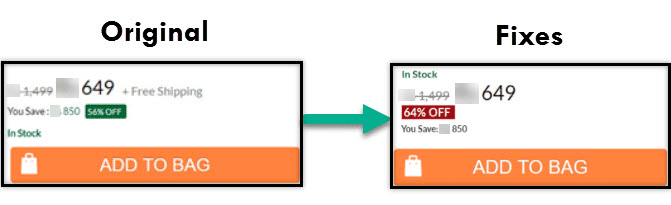
Finally, the “free shipping” offer was removed from the area next to the price. When we suggested to move that particular element and change its look, function, and design, our client was skeptical about our proposal because of the fact that free shipping applied on 95% of products they offered and they thought that it was not a deal breaker for their audience.
We ended up with 6 challengers that looked like this:
| Challenger | Free shipping | Discount badge | |
| Top banner | Text below the CTA | ||
| 1 | Yes | Yes | No |
| 2 | Yes | Yes | Yes |
| 3 | Yes | No | No |
| 4 | Yes | No | Yes |
| 5 | No | Yes | No |
| 6 | No | Yes | Yes |
Test 2: Cart page
A similar process was followed for the cart page, where we tested the same elements (emphasizing free shipping and discount offers) in 6 challengers.
In the original, when you went to cart, you were able to see only the price after discount. We found problematic the lack of continuity between the pricing display on the product page and on the cart page. Emphasizing incentives, and often repeating them on subsequent pages, and in some cases within the same page more than once, is encouraged.
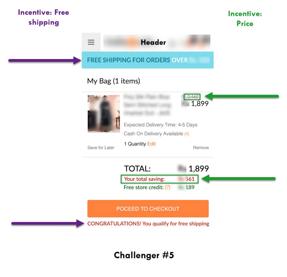
Our team opted to emphasize discounts in two different ways:
- The original price near the price after discount was stroke through (e.g. 569 $)
- The amount saved was underlined as a separate line before the order total (Your total saving: $ 569).
Below you can see free shipping incentives in purple and price incentives in green:
Below is the original page again for your reference and quick comparison.
The complete list of challengers:
| Challenger | Free shipping | Price before the discount | |
| Top banner | Text below the CTA | ||
| 1 | Yes | No | Yes |
| 2 | No | No | Yes |
| 3 | Yes | No | No |
| 4 | No | No | No |
| 5 | Yes | Yes | Yes |
| 6 | No | Yes | Yes |
In addition to highlighting incentives, we tried to reduce the FUDs the visitors could have about “Cash on Delivery” by unifying language throughout the site about the program, and adding (?) marks that, when clicked on, revealed short instructions on what “Cash on Delivery” was.
Results
The test on the product detail page (PDP test) ran at first for one week. All challengers showed improvement in conversions against the original page. This proved our hypothesis that emphasizing the incentives did indeed improve conversions.
Our next step was to determine which challenger had the best impact. Looking at the results, there were two challengers that showed the greatest improvement, challengers 3 and 6. Their results were very close to each other.
| Challenger | Free shipping | Discount badge | |
| Top Banner | Below the CTA | ||
| 1 | Yes | Yes | No |
| 2 | Yes | Yes | Yes |
| 3 | Yes | No | No |
| 4 | Yes | No | Yes |
| 5 | No | Yes | No |
| 6 | No | Yes | Yes |
We relaunched the test after eliminating all the other challengers, and the results came back with a clear winner: Challenger 6!
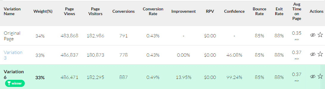
The winning challenger had the free shipping incentive below the CTA and discount badge on the product image. It showed improvement in conversions by almost 14% at 99.24% confidence.This gave us a nudge in the right direction when running the test for the cart page, which we launched right after the conclusion of the PDP test.
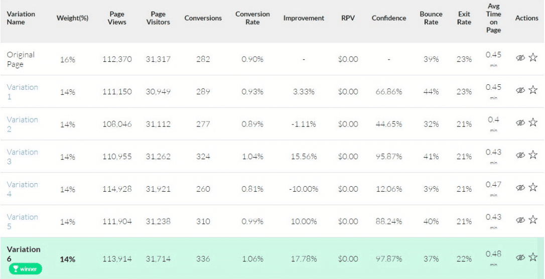
It ran for one week and the results were, as expected, consistent with the first test: almost 18% improvement with a 97% level of confidence.
Analysis
The consistency between the winning challengers on both pages was:
- placing free shipping incentive below the main CTA and
- highlighting price incentive in a highly noticeable area to that respective page
This proved that not only discounts are important for our client’s audience, but also free shipping placement on the page and throughout the funnel are both critical considerations.
At the same time the top banner with free shipping incentive showed the worst results. Banner blindness is a common issue that impacts the effectiveness of that element on major transactional pages.


