

Most online shoppers are goal-oriented.
Even when just browsing, they are trying to accomplish a goal. You must design every page on your website to help visitors succeed in their quest. If your webpage does not serve what the visitor is looking for, or, even worse, if it increases the visitor’s fears, uncertainties, and doubts (FUDs), you can expect the visitor to bounce off or exit your website very quickly.
Even highly motivated visitors tend to lose patience with a website that fails to provide the information they need.
Website navigation serves the critical yet simple goal of helping the visitor know where he is and where to proceed next.
Simple enough!
However, over the last ten years of helping companies design hundreds of websites, we have found that website navigation and search are the two most overlooked elements of website design. Yet most visitors rely on both to guide their journey through a website.
The six rules for creating effective website navigation
Six basic rules you must keep in mind to create website navigation that truly helps your visitor:
1. Keep it consistent
Nothing is more irritating than a site navigation that changes as we move from one section of the website to the next.
You should aim to establish and maintain visitors’ trust in your website. This trust is essential for increasing your website’s conversion rate. What enhances trust for one visitor versus the next varies tremendously, which is also why creating personas for your website is so crucial.
To enhance visitors’ trust in your website, you will find seven areas to focus on:
- Value Proposition
- Design Aspects
- Continuity
- Congruency
- External Reputation
- Social Proof
- Membership/Professional Organization or Affiliation
These seven areas of trust are broken down into 50 impact sub-elements.
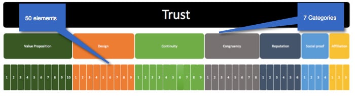
Maintaining consistent navigation falls under two categories of trust: design and continuity. While design seems like an obvious category, some people struggle with continuity. Continuity refers to maintaining relevance and scent at every touchpoint visitors have with your website. Relevance and scent are continuous themes across look, feel, offers, and copy. As visitors navigate your website, the same themes and designs should carry over from one section to the next.
I recall working with a company where the SEO agency decided to change the navigation so visitors would move from one section of the website to the next. It simply got too confusing for visitors. This might have helped drive more visitors to the site. However, our testing showed that visitors became frustrated quickly and left the website after a few clicks.
2. Keep it simple
You do not have to get too fancy when designing your website navigation. Straightforward navigation always wins over complex navigation. Look at the design from LBVD:
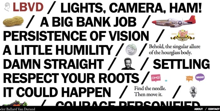
Can you identify website navigation? While many designers would love LBVD’s design, most visitors will think the website is screaming at them. The real question, however, is what the website’s target audience would think of it.
3. Orient your visitors
Only 20% of visitors are in the action buying stage. These visitors are typically highly motivated and know what they are looking for. They have decided to buy, and if you present them with the right information, you can convert them. Another 20% to 30% of your site visitors land there by mistake. There is little you can do about these visitors. The remaining 50% are still early in the buying funnel. This includes visitors in the awareness stage, those researching, and those evaluating alternatives. Your website navigation must meet the needs of visitors in all different stages of the buying funnel. For each buying stage, your website should orient visitors on where they are and where to go next.
4. Match visitors’ expectations
If visitors expect to see certain elements, make sure you anticipate and display them. Site navigation must match the visitor’s cognitive progression. Cognitive progression focuses on the information we predict a visitor needs to convert.
One of our oldest clients sells auto parts online. Most, if not all, visitors to the website are coming to buy parts for a specific car. A visitor who owns a 2014 Honda Accord could not care less about parts for a Honda Pilot, let alone parts for a Nissan or a Toyota. The website homepage asks visitors to identify their car model:
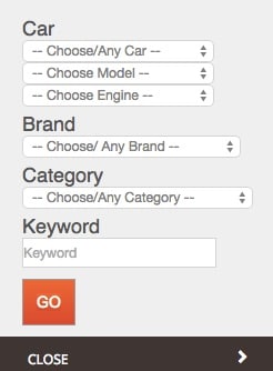
After the visitor identifies their particular car, site navigation is tailored to meet their needs. At the same time, the user can change their selection by returning to the global navigation.
5. Match visitors’ language
If your visitors refer to a product feature using a specific term, then forget about using manufacturer or industry terminology. You should talk directly to the visitors who are surfing your website and whom you are trying to convert. This, of course, will be challenging if different segments of your website visitors use different terms for the same feature. We see this often with websites that serve customers worldwide.
6. Test your website navigation
The approach to testing your website design varies depending on whether you are working on a new or an existing website.
Testing website navigation
There are three approaches to testing website navigation, depending on your specific situation.
1. Testing website navigation for a new website
Since the website does not yet exist, you start by conducting a small focus group with potential website users. Your goal is to understand what language they use when shopping for your product or service and what product features are important to them. This exercise will give you a general understanding of visitors’ expectations when they visit your website. However, it does not tell you how to structure that data.
The next step will be to conduct a card sorting exercise. Card sorting is an excellent way to align your website navigation with what visitors expect to see when they land on your webpage. Here are the general steps to conduct a card sorting exercise:
- Data collected from your focus group should provide a general understanding of the sections and subsections visitors expect to see on your website.
- List each of these sections on a piece of paper (or a card).
- Mix the cards (with the different pieces of content written on them) and present them to a small group of users. The participants’ task is to sort the cards into content groups. The participants will categorize the website’s content for you. While there is software that allows you to conduct this exercise virtually, we recommend doing it in person so you can hear and see participants and get their input.
- The final output of the sorting exercise will give you a clear view of how users think of navigating your website.
You can conduct the card-sorting exercise with multiple groups, both internally and externally. Your goal is to identify consistent themes in categorization to inform your website navigation design. Even cases where users place the same items in different groups provide valuable insights for designing your website.
Card sorting is a long-standing practice in usability and information architecture. It is highly recommended that you begin creating a website navigation. You can consider two variations of card sorting: open and closed.
- Open card sort: you ask participants to create their own groupings and labels.
- Closed card sort: you provide participants with the categories and ask them to sort items into one of your categories.
Both types of card sorting have benefits. However, we generally recommend using an open card sort, as it provides more information from participants.
2. Testing website navigation for an existing website
If your website is already up and running, conducting an A/B test of your navigation is an excellent way to validate its effectiveness. Most split testing for website navigation will be done globally, especially if you maintain consistent navigation across your website.
You can run different types of AB tests on website navigation, including:
1. Testing one type of navigation vs. another. For example, you can test using a horizontal bar vs. a left navigation bar;
2. Testing different designs of the navigation (color and size);
Testing the order of the items that appear in the navigation bar. For example, should the order of the items in the navigation bar be:
- Home
- About us
- Services
- Blog
Or
- Home
- Services
- Blog
- About us
4. Testing the different labels used in the bar. For example, should you use “About us” or “Who are we”?
3. Navigation tree testing
Another approach to testing an existing website design is tree testing. In this type of testing, you present visitors with your existing website navigation (stripping out visual elements) and ask them to determine where an item falls under your categorization scheme.
Let’s take an example from Invesp Global Navigation:

If you are conducting a tree test, you will ask participants to determine where the company’s history is located. As you ask participants to locate the correct category for an item of content, you focus your analysis on task correctness (whether participants can locate the item correctly) and task difficulty (how certain participants are in deciding on a location and how easy it was for them to find the item).
A quick note about card sorting and tree testing
We are frequently asked about the sample size to conduct these two types of tests. Let’s first start by stating that both card sorting and tree testing are usability tests. They are not large-scale split tests. With that in mind, we usually recommend including up to 50 participants. That should get you to a reasonable level of confidence.
Five different types of website navigation
As you start creating a navigation system for your website, you should consider the following five different types of website navigation systems:
- Global Navigation or site-wide navigation
- Local Navigation
- Navigation via Links
- Ad Hoc Navigation
- Wizards
1. Global Navigation or site-wide navigation
This navigation scheme is intended to appear on all pages of the website and should link to all its major sections. When creating a global navigation for your website, remember that it is the primary navigation system for visitors
You can present your site-wide navigation to the visitor in several ways, including:
1. Horizontal bar across the top of the website
In this type of design, you use a single word or label that has a clear meaning for the visitor. The following is an example of horizontal global navigation from Scuba Diving:

This is the horizontal global navigation from the BBC:

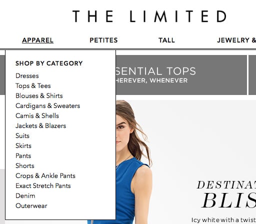
2. Horizontal bar across the top with dropdown menus
This navigation provides links to all major sections of the website, as well as their sub-level categories. An example of this from the Limited:
3. Horizontal bar across the top with dropdown and fly-out menus
In addition to the dropdown menu, this navigation scheme provides fly-out menus for easy access to different parts of the website. While this type of navigation is typical with desktop applications, you must be careful when implementing it on your website.
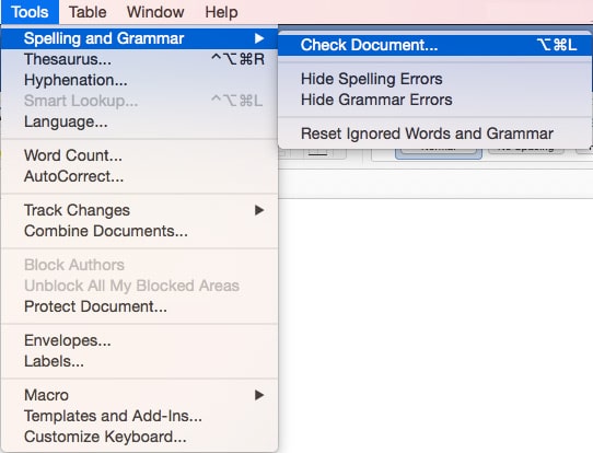
An example of this from our friends at Small Business Trends:
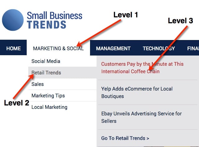
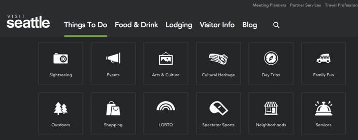
4. Multi-Dimensional Navigation
This navigation is similar to the dropdown navigation; however, these dropdowns expand in a multi-dimensional way, providing users with more access.
5. Speaking Blocks Navigation
In this type of navigational scheme, you use a general term for the labels, but you provide trigger words (short descriptions) below them. The navigation from MIT is a good example of this:
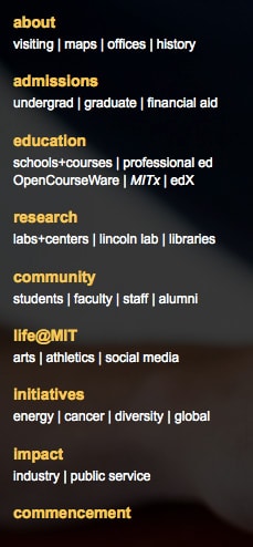
A few years back (I think 2005), building-block navigation was more popular; however, it has been used less in recent years.
6. Left navigation
This trend seems to be gaining significant traction among many e-commerce websites. There are two styles for this:
- Hidden left navigation
- Always-displayed left navigation
Amazon.com uses a hidden left navigation that only appears when a visitor clicks on it:

As of writing this post, Walmart was testing two different methods for the left navigation:
- A hidden left navigation
- Always-displayed left navigation with fly-out sub-navigation
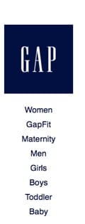
GAP, on the other hand, uses an always-displayed left navigation on its website:
2. Local Navigation
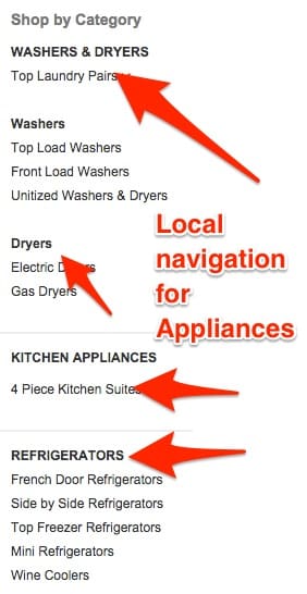
The local navigation scheme is used to navigate visitors to subcomponents or subsections of the website. You can think of these sections as micro-sites. So, while the website’s top navigation might include a link to “Books” as a major section, the local navigation that appears when the user clicks “Books” should show its subcategories (technical books, fiction, science, etc.). Local navigation is typically presented on the website as either left or right navigation. Notice Home Depot global left navigation:
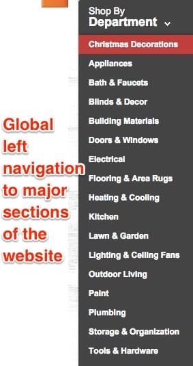
When you click an item, its local navigation is displayed on the left-hand side. For example, clicking on the appliance section opens this local navigation:
In desktop applications, local navigation is typically displayed when the user right-clicks.
Our testing shows that local left navigation works better for most e-commerce websites. However, this is not always the case for content- or lead-generation websites. A quick look at your website heat maps should reveal how often people click on your local navigation.
3. Navigation via Links
This type of navigation system is present on every page of the website. It is typically represented by the different links included in the content. It directs the visitor to different webpages that provide additional information. When designing your links, keep in mind two elements:
- The types of personas (different types of personas require different types of links);
- The SEO benefits of internal linking.
4. Ad Hoc Navigation
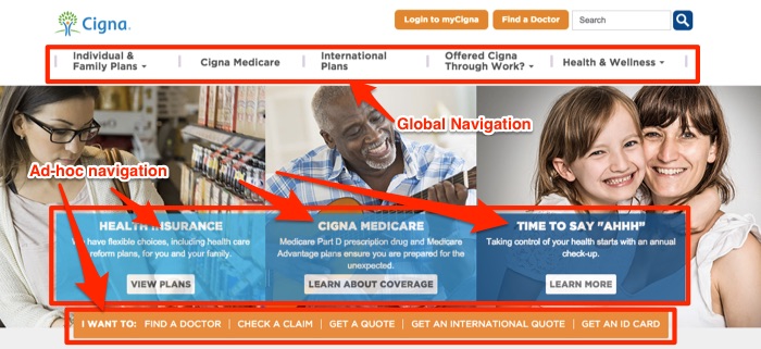
Ad hoc navigation is similar to links in that it appears within the website’s content; however, it typically has a stronger visual presence. With ad hoc navigation, the website presents visitors with large blocks to navigate to specific sections.

Notice how Cigna uses its two different types of ad-hoc navigation:
5. Wizards
When used effectively, wizards will direct visitors to a specific area of the website where they can find the information they are looking for. Here is an example of a wizard used on a clothing retailer:
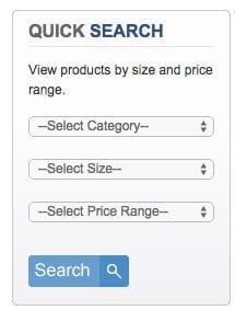
The retailer allows visitors to select the type, size, and price of the apparel they need. When visitors select their information, they are shown clothing that matches their size and budget. There are different types of wizards you can design for your website:
- Product specs wizards: using product specifications to narrow down visitors’ search;
- Need & self-identification wizards: allowing visitors to identify their needs and roles and directing them to the appropriate section of the website.
7 Questions Any Good Navigation System Should Answer
In this section, I’ll use The Good Burger site as an example of a website with great navigation.
1. Where am I?
This refers to users’ ability to understand where they are on the website. This can be achieved by using indicators such as page titles, breadcrumb trails, or highlighted navigation links.
2. Where can I go?
The navigation should provide users with a clear understanding of the website’s main sections or pages and allow them to access them easily. This can be achieved through clear, descriptive labels for navigation links and a well-organized menu structure.
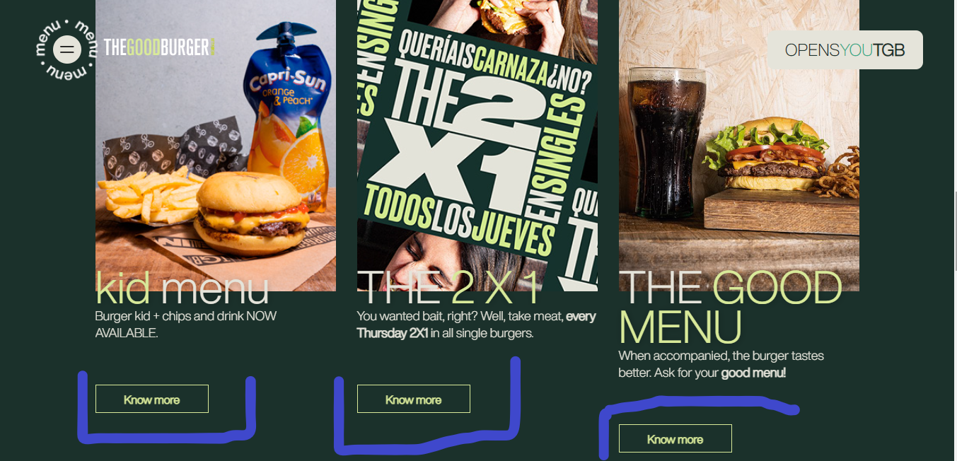
As seen in this image, clicking any of the highlighted links opens a separate page with specific information about the product.
3. How do I get back to where I was?
The navigation should provide users with an easy way to return to previous pages or sections, such as a “back” button or a breadcrumb trail. This helps to reduce frustration and improve the overall user experience.
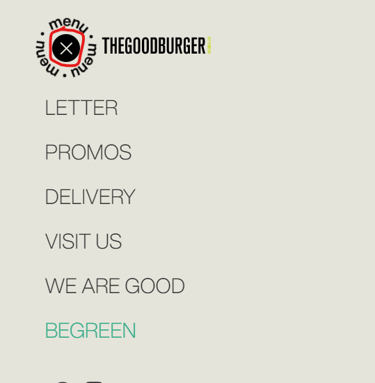
When you click on the menu element to see the site’s categories, it’s easy to get back to the home page by clicking the visible X button.
4. How does this site work?
The navigation should provide an overview of the website’s structure and organization, so users can find what they’re looking for. This can be achieved through clear, descriptive labels for navigation links and a well-organized menu structure.
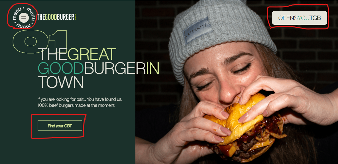
When you get to the homepage, you will see call-to-action buttons like the ones highlighted that take you to other pages easily. These buttons also make it easy to get an overview of the site’s pages.
5. What’s new or changed?
The navigation should allow users to identify new or updated content on the website quickly. This can be achieved by using indicators such as date stamps or new badges next to updated content.
6. What else is related?
The navigation should provide links to related content within the website, so users can easily find more information on a particular topic. This can be achieved through related links or a “related content” section on individual pages.
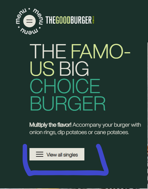
On the menu, if you click on the Letter icon, you get to this page with this copy. You need to click on the highlighted button to see the singles being offered. Many websites don’t offer this easy navigation option or bury such an important call-to-action button elsewhere.
7. Where can I get help?
The navigation should provide access to help resources, such as an FAQ or a contact form, so users can get assistance when needed. This helps to improve the overall user experience and reduce frustration.
How to create the best navigation system for your website?
When creating website navigation, you will probably end up with a mix of the different types of navigation mentioned in this guide. Here are the steps you should follow to create your website navigation:
1. Start with an open sort card exercise to understand how potential customers categorize your products. The card sort should help you identify high-level categorization for the website.
2. Using the data identified in the card sort, determine theglobal-levell navigation for the website.
3. Determine which design you will use for your global navigation.
- For lead generation websites, a horizontal bar across the top is a good option to use;
- For e-commerce websites, decide between a horizontal bar across the top and a left navigation bar. Creating both options is a good approach; then conduct a global website test to see which design works better for your website.
4. For each of the global navigation sections (labels), determine what kind of local navigation is required to support visitors’ movement around the website.
5. Determine what links are needed on each of the pages of your website.
6. Determine if ad hoc navigation is needed on the homepage or any other sections of the website.
7. Determine if wizards are needed to help users get faster access to different sections of the website.
8. Conduct a website navigation tree test to determine the effectiveness of your navigation scheme.
9. Create a list of five to ten AB tests that you can run on the different types of website navigation schemes you created.
What’s A Website Flowchart?
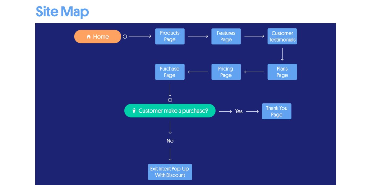
A website flowchart, also known as a site map, is a visual representation of how one page leads to another. It informs an important and complex process design, ultimately providing the framework for a website that offers good user navigation and is easily discoverable on search engines.
Advantages Of A Website FlowChart
Pros
For Website Owners
1. It can act as a web design project tracker
2. Website owners can plan regular content refreshes to maintain their competitive edge.
3. With the flowchart easily accessible, it boosts collaboration and the sharing of ideas.
Cons
1. A flowchart design requires a lot of research and can be time-consuming.
2. If there is a change in the project and the team has to alter another process, they will need to make the chart again, which means the work put into creating the previous one will go to waste.
How To Create A Website Flowchart.
1. Determine your website’s goal.
2. Add the site’s wireframe and decide how each page connects.
3. Find duplicate pages and mark them for review.
4. Simplify the conversion funnel by removing duplicate processes.
5. Share the chart cross-functionally for input from relevant departments.
Here’s an example of a Flowchart;
Additional Resources
1. How Good Is Your UX? Here’s How You Can Measure It.
2. This Is How People Make Decisions (with real-life examples)
3. Infinite Scrolling on eCommerce: Is it for every site?
Updated: 02/13/2023