
Web forms or checkouts are at the sharp end of most acquisition funnels. They are the last hurdle for a prospect to get past before they end up as a paying customer or a new lead.
And yet forms are too often treated as a “black box”; marketers know from their general analytics software (think Google Analytics) the volume of traffic going into their web page and how many made it through to the end.
What they often don’t understand, however, is when, where and why prospects are dropping out of their web forms. By failing to track this, they miss out on the opportunity to identify where the logjams are in their forms, the elements that are unnecessarily causing users to abandon and never come back. Only by truly understanding what is happening inside your form can you make the necessary changes to improve your future conversion rates.
So how do you go about learning what is causing your users to drop out? As with most digital marketing, it all starts with data. Fortunately, there are many good quality form analytics tools available to provide you with the information needed to run this analysis.
Data alone is not enough, though. You need to be aware of what you should be looking for to identify which of your fields are causing problems for users and potentially driving them away from the form. Here are some critical tips from years of form analytics and optimization practice to help you focus on the key metrics to look at.
Look at where users are abandoning
This seems pretty simple, and in many respects, it is. Examine which fields users interacted with immediately before abandoning. The ones with the highest volumes of leavers are the ones you should focus on. Job done, right?
Not quite. You should take these few points into account before jumping to conclusions:
a) Look at rates rather than just absolute numbers
While looking at the fields with the highest abandonment numbers is an excellent place to start, you need to be careful. You will often find that the earliest fields in a form have high abandonment rates (think “Title” or “First Name” fields). This doesn’t necessarily mean they are problematic for the user.
It is typical form behavior for “non-serious” users to arrive at the form page with no intention of completing but click into the first field or so anyway—the digital equivalent of “Tire Kickers” in a car showroom. If you take this data at face value, it can lead to misleading conclusions. The best way to avoid taking the wrong path is to look at abandonment rates in conjunction with volumes.
Take a look at the example data below. Which field seems most problematic?
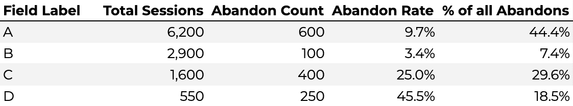
At first glance, you might say Field A is your biggest problem as it makes up the lion’s share of the abandonments, so it has the most significant potential for improvement. While you would be right to study this field, as any reduction in abandonment would have a significant impact, you also need to examine Field D and probably Field C as well. They have comparatively high abandonment rates, which is a strong indicator that something is putting users off completing the form.
b) Be careful if you have a particularly long or involved field
Form Analytics data will typically track the last field interacted with before abandonment. Generally, this will be the field that is causing the user frustration and has provoked them into leaving the form before completing it.
This isn’t always the case. A scenario where your form has a particularly long or complex field puts the user off before they even start it. In this case, the “abandon” may be allocated to the field preceding it as that was the last one the user interacted with. This will artificially inflate its abandonment rate and potentially lead to the erroneous conclusion that it needs to be changed when, in fact, it was the following field that caused the problem.
This phenomenon is particularly noticeable in forms from the education sector, where long-form text questions are often sprung on the form user without warning. You also see it on financial forms where a particular dropdown or radio option is selected, which unleashes a barrage of previously unseen questions about the user’s financial circumstances, scaring them off.
The below example is a deliberately exaggerated one, but it makes the point. You would expect “Name” to have an inflated abandonment rate even though it was the following long-form question causing the issue.
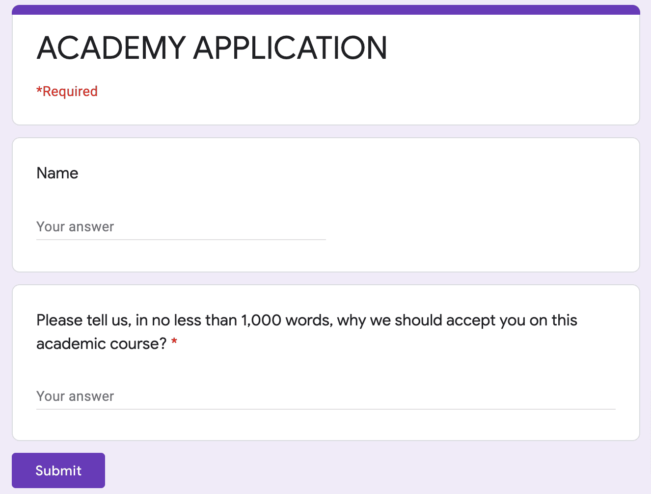
If your form data is showing an unexpectedly high abandonment rate for a usually “simple” field, always check whether the following field may be putting them off due to the complexity of its requirements.
c) Beware of the “SUBMIT” button trap
When looking at form abandonment data, it is common to see the “Submit” button having a high abandonment rate. Users are trying to submit the form but not succeeding. This does not generally mean that the button itself is causing problems to the user (technical issues notwithstanding).
Rather, they have entered invalid data in one or more of the required fields so are being sent back to try again. The below flowchart shows a relatively typical post-submit pattern; although a large portion of users complete after submitting, around 50% of them go back to fields they have previously interacted with.
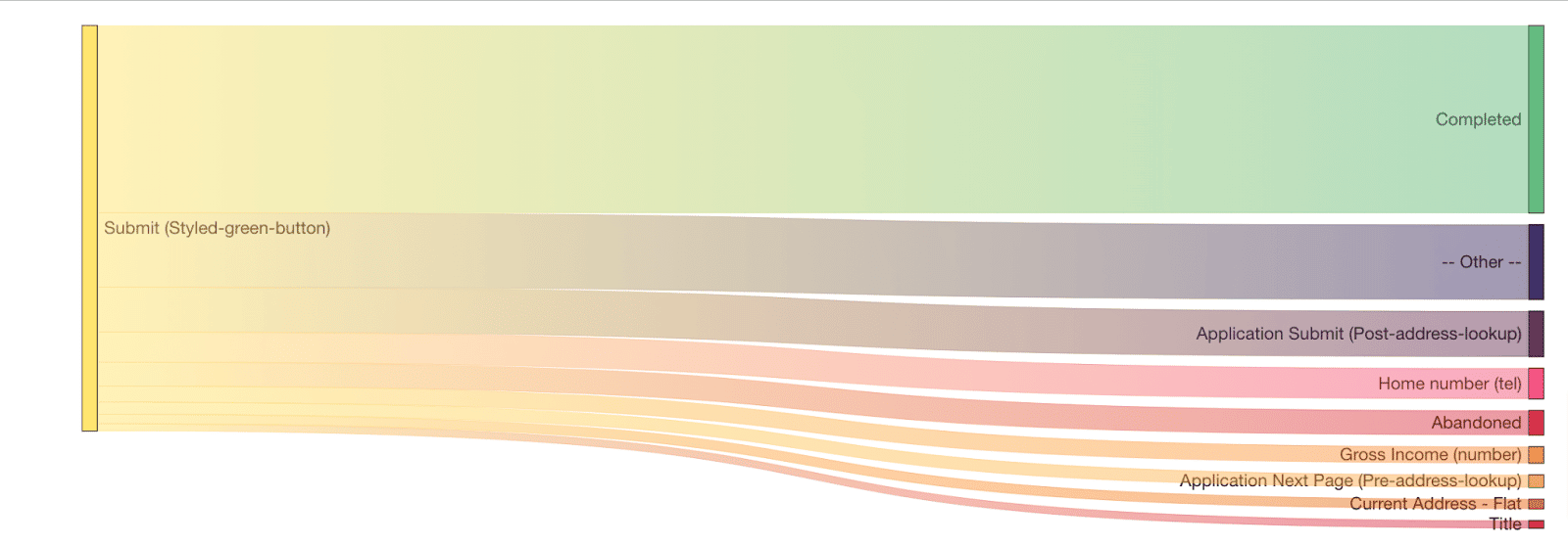
The behavior pattern will often see the user trying to correct their errors before returning to the submit button. If they cannot successfully do this due to a form usability issue, they will receive the same error message again. If this loop repeats itself enough times, the user will inevitably quit after their final submit, meaning your form analytics tool will log the abandon against the submit button rather than the actual offending field.
If you see such a pattern, you will need to dig deeper to find the truth about which fields are indeed causing user friction. You can do this through a few methods:
Individual session analysis – Your form analytics tool may have functionality allowing you to look at individual user sessions and track their form journey. If you have access to this, you will want to isolate sessions where the user tried to submit multiple times but ended up abandoning it. You should then be able to see which fields they had to return to when their submit failed.
Error messages – Again, your software may allow you to track which error messages have been shown to users and correlate them against abandoned and completed sessions. This will give you an idea of which fields are triggering errors and causing user frustration.
Aggregated flow visualization – The flow chart shared above is an excellent example of this method. It essentially aggregates the individual session analysis to create a Sankey chart (or similar). This enables you to quickly pick out the fields that users are bouncing back to after the submit.
2. Do users return to particular fields?
One of the metrics that can indicate user frustration is field returns, a user completing a field, moving on, and returning to that field. This can be due to various factors – misspellings, accidental click-throughs, as well as full-blown “errors” – but, in general, the more users return to a particular field, the more you will want to focus on it.
3. How long do users take to complete a field?
This one is certainly not a be-all and end-all. You generally want users to progress smoothly through a form and not have to take too long on particular fields – that can be an indication of confusion due to unclear guidance. However, this is not iron law.
There are many types of fields that require a lot of focus from the user, so they naturally take longer to complete (think personal statement questions in university applications). You’ll want to dig a little deeper before concluding that longer time spent on a field correlates to frustration and abandonment.
This brings us nicely to the next point…
4. Split your analysis between abandoned and completed sessions
As noted above, field returns and time taken to complete can indicate user friction but are not necessarily so. To determine if they genuinely indicate a problem, you should examine how the data differs between abandoned and completed sessions. Suppose users who ultimately leave the form return to a field significantly more than those who complete it.
In that case, you can be pretty sure that field is causing issues correlated to dropout. Similarly, suppose abandoners spend more time in a field than those who complete. In that case, they are likely to be having usability problems or don’t know how to enter the information required validly.
For example, look at the data table below, which shows the percentage of sessions where users return to individual fields and the average time spent in each field, split between abandoned and completed sessions.
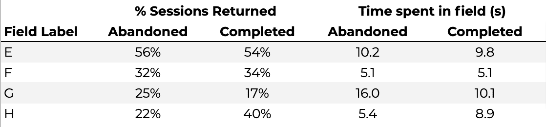
If you look at the raw numbers, you might conclude that Field E is the most problematic as it has the highest proportion of sessions where users have to return to it, and also, users spend a relatively long time completing it. However, the figures are pretty similar across abandoned and completed sessions, so there is no evidence that this directly drives abandonment.
If you look at Field G, though, you can see that, despite having a lower return rate, the difference in the figure for abandoned and completed sessions is significant. As the proportion returning to the field in abandoned sessions is significantly higher than that for completed sessions, you can reasonably conclude that something about the field is linked to dropouts. A similar pattern further reinforces this in the time spent data with abandoners spending more time interacting with the field than those who complete the form.
Interestingly, Field H has the reverse situation, with users who complete the form more likely to return and spend more time than those who abandon. This pattern is generally seen when there is a reasonably complex question (or one that requires the user to go away and find some information – such as a social security number). Those who are highly motivated to complete the form are prepared to spend more time and return to the field, whereas those who are less motivated give up and do not return to amend their answer.
5. Collate your list and start to build hypotheses
If you have followed the processes outlined above, you should now have a pretty good idea of which fields are causing your users issues and reducing your form conversion rate. What should you do next? That’s a whole ‘another blog post in itself, but, as a starter, you definitely need to take a look at those fields in their natural environment. Complete your form through the eyes of a new customer. Why might these particular fields be causing an issue? Look for:
Guidance – Does the microcopy around the question unambiguously let the user know what information they need to enter? Is there an information button if the field is particularly complicated? Are the error messages helpful and precise in how to solve the issue?
User Interface – Is every element easy to interact with? Is any part of the field obscured (e.g., dropdown menus going off-page)? Are there any elements that may be more difficult for mobile users to navigate?
Expectations – Would the user expect to be giving you this information. For example, if you are selling them a digital product, why do you need their phone number?
From here, you can define hypotheses on how to amend and improve the form.
6. Make changes and test.
Once your theories have been set and agreed upon, you’ll need to take a data-driven approach to test whether they are valid. You should make a specific change to the form and then see if that has a positive or negative effect on overall form conversion and the individual field metrics.
You could change the form and then compare it to the period immediately before the change. However, you can be more confident of the results if you use an A/B testing tool to test the “new” version of the form versus a control version of the “old” layout.
Quotes to pick out
“Be careful with long or involved fields.”
“Beware the submit button trap – look what happens after a failed submit.”
“Always segment and compare completed and abandoned sessions.”
Conclusion
Forms are tricky beasts. At first glance, they may look like sausage machines – audience in the top, some of the audience out of the bottom. However, in reality, they are more like complex ecosystems with individual elements affecting the performance of the whole. By following these guidelines, you should identify which are the problem fields on your web form, make a start on determining why they are causing these issues, and test solutions to improve your web form conversion rates.


