The meaning of “best practices” has become blurred to me, in my over a decade tenure as a CRO expert.The term misleads us to believe we’ll successfully apply a one-size-fits-all solution across verticals and markets.
Websites need different solutions and implementations.The promise of magical elements raising conversions only holds true after thorough research and careful implementation of specific,new aspects to a site.
Websites do not share common conversion optimization solutions; they share common problems.
Find out below the 10 most common CRO problems we have identified affecting visitors’ trust on a site.
Identifying common CRO problems
From our experience working with large and small companies, we’ve collected amazing data on specific common CRO problems addressed by unique solutions we’ve implemented across our clients’ sites.
To identify problems and find solutions, we create tests at:
Solutions within these levels consider:
- Copy
- Location
- Design (look and feel)
What are some common problems we’ve seen?
In our new series of posts, we’ll talk about the common problems we see under each component of our Conversion Framework.
The Framework was developed in 2007, at the early days of Invesp. To meet our goal of helping clients create more usable, profitable, and visitor-captivating websites, we knew we had to establish a process and follow a methodology that would generate consistent results.
Seven components sustain our Conversion Framework. Each component is part of a process for understanding human behavior on the web, to recognize factors that convert visitors into customers as well as to identify features that scare people away from a website.
These are the seven main areas our Conversion Framework covers:
- Understanding website visitors through personas creation
- Understanding the impact of the buying stages
- Designing for the sale complexity
- Creating confidence and trust
- Dealing with FUDs (fears, uncertainties and doubts)
- Using incentives
- Engagement
Creating Confidence and Trust
In this post we’ll address common trust problems we’ve identified in a selected body of clients’ websites we analyzed and tested.
Trust plays a huge role on visitors’ decision to convert. This makes sense. If visitors do not trust the website, they will not buy from it. Visitors do not want to be ripped off or have their personal details stolen. They wish to accomplish a goal through an enjoyable, simple shopping or browsing experience.
As a website-centric factor, trust relates to how information is presented on a site through design, layout, copy, and flow.Keep in mind that some factors of trustworthiness remained the same over the years, even with the change in web design trends. You can work on enhancing visitors’ trust on your website by focusing on seven areas, broken down into 50 sub-elements of impact. The lack of a compelling, well-designed message might hurt your conversion rate by decreasing trust and confidence of visitors.
Our new tool FigPii (which is still in private beta), the first all-in-one, enterprise-grade growth hacking platform; has all the sub, and sub-sub elements of the Conversion Framework available within a tool called Panorama. Users of FigPii can go into the Panorama tool, upload a desired page for a problem analysis, and go through the panorama list to see what is applicable for the type of page you are evaluating. Within FigPii Panorama, you are presented a number of suggestions that can simply be implemented into an AB or Split URL test by using the Figpii Testing tool (within the same platform!).
But back to the crux of the matter, what are some of the more common Trust problems we have seen, and by addressing the, what type of a result have we seen?
10 most common trust problems and the uplift associated with them:
1. Lack of continuity in the design
Visual continuity in website organization and design assures visitors that the site offers accurate, useful information and helps them in understanding the system they are using. Lack of continuity might affect home pages, category pages, and landing pages, ranging from major navigation sequences to minor details, as the size and look of “continue shopping” buttons. Among the top 200 e-commerce websites, 21% fail to provide buttons of the same size and look.
For instance, this website failed to ensure that “call to action” buttons have the same look and feel on all product pages. On some pages it has more round CTAs…
…while on other pages they are more rectangular
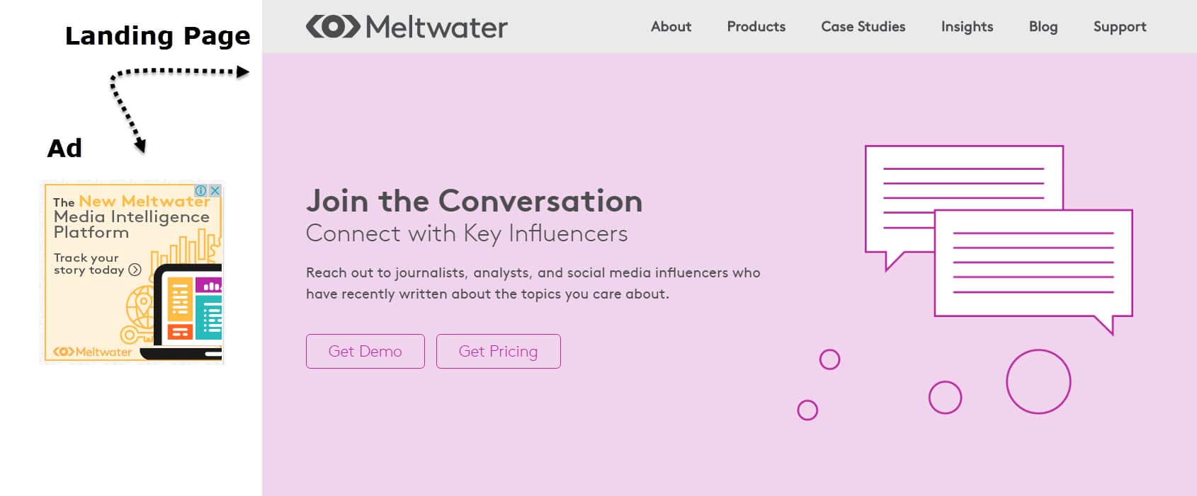
The most important aspect to continuity however is not CTA buttons but rather the continuity between organic listing, PPC Ad, retargeting ad, and email to the landing page. Based on our review and analysis more than 60% of the top retailers still suffer from a lack of continuity between what the visitor initially sees, to the landing page, which results in a very high bounce rate.
Look at the Meltwater ad on the left and the landing page it leads to. The ad and landing page are disconnected: the ad promises one thing while the landing page says something completely different.
The second important aspect is site continuity. We recently worked with a billion dollar, publicly traded company. Their internet presence showed no continuity from page to page. Each page had a different style and layout. Even common pages such as category or product pages did not have continuity. The checkout was done through a 3rd party, which meant that entire experience did not have the look and feel of the rest of the site.
In our own research, among our group of a 100 websites, we’ve identified lack of continuity as a CRO problem 50 times, and provided solutions that resulted in an average uplift of 32.5%, the lowest uplift being 5.34%.
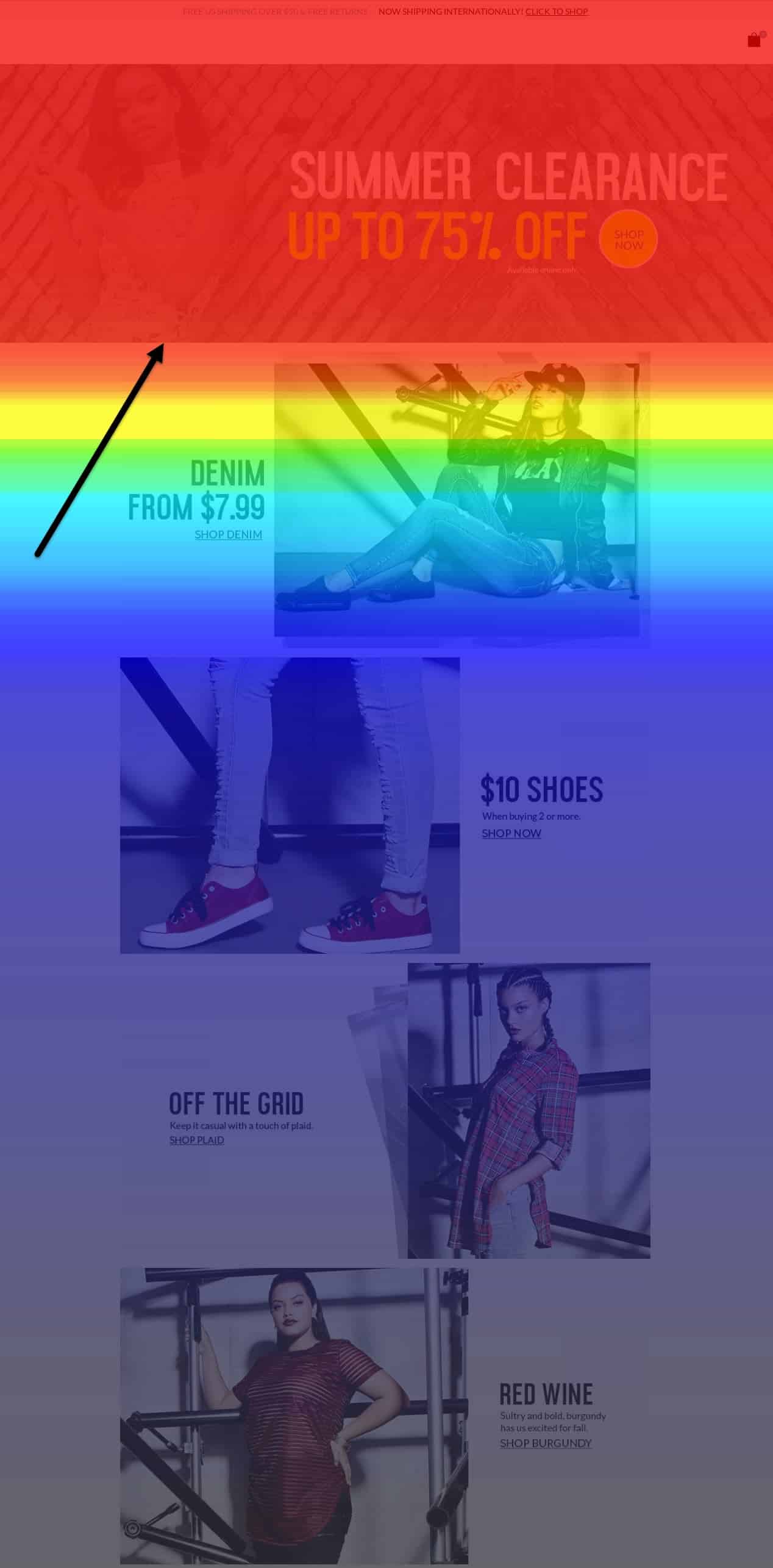
2. No benefits visible above the fold
Where and what is most important on a page? Certainly, the top portion of the page which we call “the prime real estate area.” This area is where visitors will get hooked, and if a hook is not available, they will click out faster than they made it in on the page.
Below you can see a scroll depth report from a homepage of an apparel retailer. It simply means that 50% of webpage visitors don’t scroll deeper than above the fold area and 75% don’t check out the remaining two thirds of the page.
But with the need for speed that most visitors have, adding content, especially to that “prime real estate area” has been a tricky predicament for most websites. Content on the mobile site is even more difficult to include.
But does content still even convert?
Content displayed above the fold grabs 80% of visitors’ attention. Even content in the 100 pixels just above the fold is viewed 102% more than the following content in the 100 pixels just below the fold.
Of course, not all content is created equal. We’ve seen sites that put long paragraphs detailing the product, but they must be aware that most visitors online simply don’t ready content in that format. On mobile the stats are even worse. In order to get visitors to read the content, include the top features transformed into benefits. The top portion of the page is prime area to display optimized benefits. Of course, depending on the device, the benefits are optimized to serve users on multiple devices accordingly.
Whenever content is considered, we think about the logical persona and their need to dig deep and understand more, but that does not mean we include all that copy above the fold. It’s important to just take into consideration the performance of long copy compared to short copy on a page, and how to place that strategically throughout the page to target that specific type of visitor.
However, ultimately the lack of benefits above the fold affected conversions 65 times in the tests performed at our selected 100 sites. We could generate an average uplift of 15.7% with our solutions, with a lowest uplift of 0.34%.
3. Multiple competing call-to-action buttons
This is one area that still shocks me.
When it comes to CRO and Calls to Action buttons, many think it’s a trivial matter, and the effect is so little. However, there are too many sites, desktop and even worse on mobile, that are sloppy when it comes to CTAs.
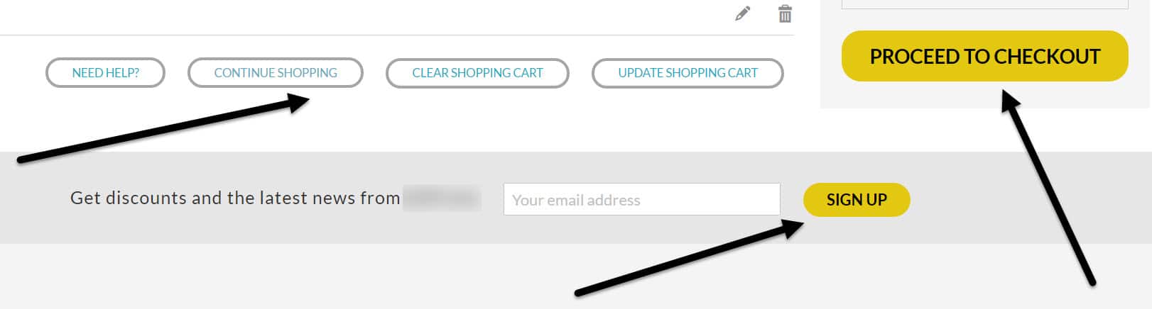
In this example, a cart page is buried under multiple competing CTAs. Interestıng that “Proceed to Checkout”, the main CTA, competes with e-mail sign up button, because they have the same color, only the size is different. Of course, this shouldn’t be the case. Also the main action is muddled among the secondary CTAs which draw too much of unintended attention to themselves.
There are many areas to consider when thinking about CTA:
- The copy on the CTA is too often overlooked
- The size of the primary CTA as compared to other CTAs on the page
- The proximity of the primary CTA to other CTAs on the page
- And I’ve gotta say, but the color of the CTA.
So ultimately, whenever I evaluate any page, I need to understand what is the main objective and action that I can take on the page. Is it to “add to cart,” “subscribe,” “read more,” etc.
The objective can be muddled with a lot of other actions I present within a small space, so I need to be weary that my primary objective action button stands out in terms of design, color, copy, and placement on the page.
Visitors have a hard time building confidence in a website when they don’t know what to do or where to click. Multiple call-to-action buttons make it hard for the visitor to figure out the priority of actions he is supposed to take. What’s worse is when buttons are so close, the visitor accidentally clicks on the wrong button that either clears their cart or takes them to the first step of the process.
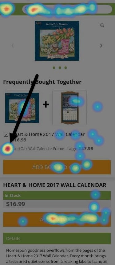
If you carefully study the heat map below, you will notice that two competing CTAs, the upper one “Add Both to Cart” and the lower one “Add to Cart”, a creating real confusion for the users because the former one is the first CTA they see. So, instead of pressing on the lower one to get an item to the cart, as one may assume should happen, they untick an upsell item (frame) and push “Add Both to Cart”.
As you see, effective call to action buttons play a major role on conversion optimization. On the 15 times we identified multiple call-to-action buttons interfering in conversions in our pool of a 100 sites, we provided an average uplift of 72.2%, from 25.3% up. And this area, although I’d venture to say is a CRO 101 issue, it remains to be one of the most prevalent problems across most desktop and mobile sites.
4. Element obstructing scent
Whenever I say the word “site scent” to someone unfamiliar with CRO I get a bewildered look. But the reality is, a website is like a trail. And in order to get visitors to a certain goal, you have to place the right signs and markers so they can follow the trail. Or like Hansel and Gretel, bread crumbs to get them to a conversion. That is how the term was born. And considering all types of visitors, in different buying stages, site scent has a clear path for each visitor to follow.
Information scent guides the actions of web users. What happens is that site scent might sometimes be covered by clutter that prevents visitors from proceeding. In these cases, it is important to investigate the obstacle that is stopping visitors. Elements that do not meet visitors’ needs should be eliminated to allow visitors to recognize their clear trail.
So what are elements that can be eliminated? This goes back to identifying the primary objectives and goals for a site and page. When those are identified, all elements should be pointing to the goals in some way shape or form. Of course, as emphasized above, you need to make sure you give actions priority, i.e. there should be one primary one and it should stand out.
This is a bookstore product page:
The page has overall cluttered look. The CTA and has text that is not conducive to conversion and social media icons take major parts of the real estate.
And this is how the winning variation looked like. Here the Scent was increased by reducing clutter and enhancing copy and design to match visitor expectations.
A few ways to find out if there is obstruction is:
- Through analytics of course, and adding events to certain actions thus measuring the actual clicks.
- Through heatmap analysis, you can see if people are finding what you want them to find.
- Through video recordings, set aside 1 – 2 hours a week to watch how visitors are interacting with your site.
I’ve seen obstruction anywhere from too much copy on a page, to untargeted images, to placing other unrelated images and elements next to the main CTA. Our tests identified elements obstructing site scent 20 times among the sites of a 100 of our clients. The average uplift when eliminating the clutter was 24.3%. The lowest uplift was 10.2%.
5. Lack of compelling headline
Headlines sometimes don’t have to be compelling per say. The most important aspect when it comes to headlines is having them clarify the contents of the page.
Vague, untargeted headlines or page titles backfires every single time. But let’s say we are talking about a blog post. A compelling headline should grab visitors’ attention as well as gain their trust by conveying the main benefit they can expect from services and products of that site. Testing headlines and improving web copy helps raise visitors’ confidence.
So if I’m talking about a content heavy site, I would argue it is more about the compelling nature of that headline. But compelling is never enough if it’s just plain confusing and unclear. So while Upworthy is known for it’s outrageous headlines, after a year in business, people got sick of content that didn’t live up to the headline.

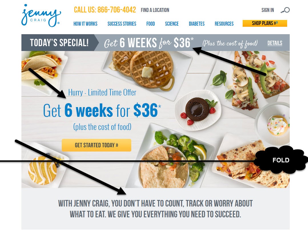
But even when it comes to page titles and less dramatic headlines on sites where people are trying to buy something, there is a lack of clarity. The headline is often in the midst of a lot of other unnecessary details. Ultimately, all people want to know/see is what the page is about, so have clearly stated. Look at Jenny Craig website. When you land on it, it happens that the main headline, explaining what is the website about, is below the fold. So, the only thing you see is the banner with promotion campaign copy.
We’ve tested this on content, ecommerce, and lead generation websites alike and have found consistently, when done right, these titles can have a 24.89 – 53.4% increase in conversions, and 90% improvement in click-throughs to the next step, page, or following piece of content.
6. Lack of clear process
A persuasive and clear process lays out primary actions from one page to the next. Visitors’ trust level raises as they feel confident they are on the right track of fulfilling their goal in a website. You see processes laid out especially on sites that require some sort of set-up or on-boarding (like SAAS), or on checkouts. Having the process clearly defined has helped us raise conversions for clients between 65.9 – 230% increases in conversion.
Clear processes are critical to help meet visitors’ cognitive progression on sites. They have expectations, but identifying that we are aware of their expectations the visitors’ mind will be put at ease and they will proceed more confidently on the site. They also eliminate the possibility of any surprises along the way prompted visitors to abandon the process.
7. Cluttered design
Sometimes the scent is clearly defined, but still, the clutter on the site is overwhelming. Some sites just need to be cleaned up in order to help visitors get on with the page. Clutter confuses visitors. Websites should strive for an optimal balance between visual sensation and graphic information. Less clutter meansmore focus on the page.
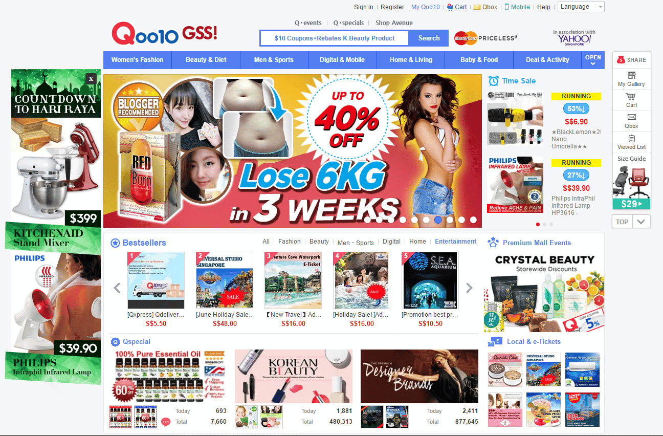
Qoo10 is a website selling beauty product with very overwhelming home page. Would it be easy for you to locate what you are looking for?
Clutter is one of the top 5 problems websites have. Why? Basically, website developers and front-end designers often respond to the needs and wants of multiple stakeholders within an organization. So when each stakeholder makes a request for a modification, suddenly you end up with a very cluttered design.
This is where CRO is critical. It provides stakeholders the data that impacts decisions and helps you modify the design accordingly. This particular problem has been evaluated on almost every site that we have optimized on a certain page, and modified accordingly giving anywhere between 3.62 – 35.89% improvement in conversions.
8. Too many columns
Too many columns produce an unbalanced visual organization that might decrease users’ confidence in a site. Look at the page carefully before determining how many columns you would have on the page. Too often sites want to increase AOV so they may add for instance a cross-sell option which is manifested as a column on the right side of the page. Now, this can often be a wonderful addition. But too many times it causes the page to look more cluttered and unorganized.
Some sites use a 3rd column on the page to promote UGC (user generated content). Again, an important element for engagement on the site. However, it can be cluttering the page and losing the emphasis of the primary goal
So what to do. Rework these additional elements somewhere else on the page. Incorporate them into smaller design elements so they can still be present where you want them, without taking away from the page.
When I talk about measuring this, I’m talking about just the reduction a column. In rare cases we’ve added a column to a page. We’ve adding for instance filtration columns to sites that had nothing on the left or right of a category page relied heavily on top filtration mechanisms that visitor’s never clicked on). The results for solving this problem on sites has helped us achieve anywhere between 9.32 – 46.89% increases in conversions.
9. Elements unbalanced, priority elements lost
Visual hierarchy in web design helps visitors build trust by making the site’s overall message clear.The hierarchy showcases priority of elements and gives balance to all visual elements on page. I’ve talked about this already. The prime real estate of the page is critical. But you have to decide what is an item that qualifies to be a part of that prime real estate part of the page?
In this article, I’ve already addressed the importance of the benefits, and the prime CTA, both to critical elements that need to be placed within that area. But there are other elements that are as equally important that need to be displayed.
After conducting qualitative analysis for a client we found that their site visitors were looking for specific pieces of information tucked away below the fold.
Even though the compatibility of the phone was stated in the product name, they still had doubts if a case fits their phone. They also wanted to know more about the features the product has. The original, actually, had a very detailed description of each item, but apparently no one noticed it on the page.
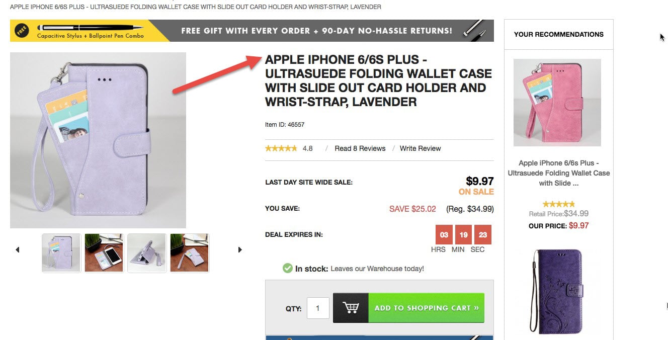
So, for the test we decided to move top four product features in the above the fold area to make them more noticeable for the visitors and point out the case compatibility one more time by providing a link to this information in the above the fold area.
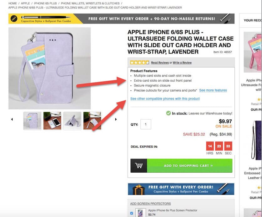
Once we enhanced the presentation of those elements and provided users access to that piece of information, conversions increased 36.3%.
But we’ve conducted this type of analysis across multiple sites, and have found consistently that some pieces of information important to the visitors is simply missing from the primary area. But mitigating this problem across our sample sites, we saw increases that range from 14.32 – 95.99%.
10. Value proposition not enforced enough on page
A strong headline should present a compelling value proposition, explaining how services or products of the website solve target audience’s problems. The value proposition is a promise that enhances trust and confidence with the visitor.But some sites, like retail, don’t have a place for compelling headlines. So where is their value proposition present? Well ultimately, it’s important to present the value on as many elements as possible. For example, if your value is with the unique artistic pieces you provide, unlike anywhere in the market, this should be flaunted on the site, on the images (by an original to XXX brand badge), in the copy, through the discounts, through the taglines, etc.
This is how H&M does it for its collaboration with Kenzo underlining that H&M is the place to find clothes designed by famous brands, but at a very affordable price:
Value proposition for most ecommerce sites starts and ends on the About Us page. But what’s the point of crafting a good value proposition that isn’t transcending through all elements on the site?
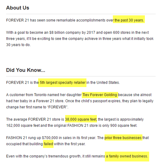
For instance, the value proposition of Forever 21 communicates that it is a well-established but highly competitive brad whose clients are so loyal so that they even call their children after it.
For many of our clients, it was initially about identifying the value proposition, because they didn’t have a very well-defined distinguishing feature. But for others, it was about having that value proposition clearly stated on the site through multiple elements. Focusing on this latter area alone helped us increase conversions rates for clients anywhere between 15.39 – 55.83%.
Conclusion
It’s critical to understand that copying competitor sites does not guarantee great results. Competitor sites are important to monitor, but never copy blindly. First, justify a change through qualitative and quantitative research. Second, identify the problem areas based on the research results. Third, prioritize based on (again) research.
I am not alone in my suspicion of best practices.Because it’s not about what another site does or doesn’t do.I’m not alone in this concern. Many top CRO experts agree.
But problems are similar from one site to the next, and through the years, I’ve seen the patterns and consistencies.
We’ve written about optimization best practices that might not be best for you, surprising CRO studies, and that time when multiple call-to-actions actually increased conversions.
So, after reading this, please keep in mind that the 10 most common trust problems we’ve identified might be addressed in many different ways.eventhough you may be within the same vertical, what works for one client, doesn’t necessarily work for all. And it isn’t because the element or the solution doesn’t work, it could be the way you implemented the solution.
Learn more on How to Increase Your Website Conversion Rate Through Confidence and Trust.