
You click on a link, but instead of landing on the site page you want, a 404 error page pops up, indicating that the requested page does not exist.
We all have been there before…and it can be so annoying sometimes.
As someone who takes a stroll on the web every day, I run out of fingers when I try to count the number of times I found myself on a website’s 404 error page.
In fact, I recently visited over 30 websites to see how they designed their 404 error pages.
Although some brands seemed to have figured out a way to make their error pages work to their advantage, I was shocked by the number of brands that let this opportunity go to waste.
I mean, if a visitor lands on your 404 pages, isn’t that an indication that they were interested in your offer?
Why not turn that negative experience around?
Remember, succeeding online and driving more sales comes down to one critical factor:
Positive customer experience.
With that said, allow me to show you a few examples of 404 pages that can turn a moment of frustration into an opportunity to make the brand stand out.
What is a 404 page and why should it be optimized?
So, what exactly is a 404 error page and why does it matter for your visitors?
To give a brief definition, a 404 error page is an HTTP status code that means the server couldn’t find the page you were trying to view.
The typical trigger for an error 404 message is when website content has been removed or moved to another URL. But there are many other reasons that could trigger the appearance of a 404 page:
- The URL or its content (such as files or images) was either deleted or moved (without adjusting any internal links accordingly)
- The URL was written incorrectly (during the creation process or a redesign), linked incorrectly, or typed into the browser incorrectly
- The server responsible for the website is not running or the connection is broken
- The requested domain name can’t be converted to an IP by the domain name system (DNS)
- The entered domain name doesn’t exist (anymore).
- Sometimes if the user types in or clicks on an old link it can result in a 404 (user error)
Having said that, now let’s try to answer the second part of the question: Why should it be optimized?
Sometimes you never know the gateway used by your visitors to enter your website. So, think about it. A 404 page can be your visitor’s introduction to your entire business.
Someone can receive an email with a link to your site before a URL structure is changed. And when they try to visit that particular page on your site, they may find themselves on a 404 page.
Suppose that happens, you don’t want your visitor to exit immediately without getting a sense of your company’s personality, offerings, values, or mission.
It goes without saying that the best 404 pages are optimized in accordance with the brand strategy and they continue to tell the story of the business. This means that optimized 404 pages are consistent in imagery, voice, colors, font, and message of the brand.
Optimizing a 404 error page starts with knowing what brought the visitor to your site. This then takes us back to the Jobs-to-be-done customer interviews that can really help you know deeper insights about your customers:
- What are they trying to accomplish?
- What are they looking for?
- What does your company solve?
Uncovering the customers’ intent, through JTBD interviews, will help you tailor or rather optimize your 404 pages best in a way that doesn’t frustrate customers.
8 Ideas on How to Increase Conversions on 404 Error Pages
There are a lot of exciting and different ideas I’d present to you in the following section. But always remember that your 404 error page experience should be unique to you and your brand –and it has to be informed by the customer interviews.
Doing so will help address the negative forces (customers’ anxieties and habits) that might be pulling your customers away from the conversion path.
With that said, now let’s take a look at the examples of the 404 error pages:
1. Display Some Of Your Products
If a visitor ends up landing on an error page of an e-commerce site, chances are they were looking for a particular product to buy.
Such a potential sale shouldn’t just go down the drain. There’s something that can be done to turn that frustrated visitor into a customer.
Display your most popular searches or products. This is exactly what Steve Madden does:
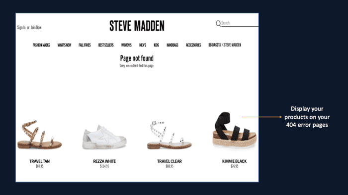
This is a neat way to draw customers’ attention to your products and help influence their purchase decisions.
Not having any of your products displayed on your 404 pages is the digital equivalent of ignoring customers when they come in the store.
According to Search Engine Journal, high-resolution photos and videos are part of the elements that an eCommerce site should have in order to stay relevant and competitive.
This also applies to the site’s 404 error pages.
But I was shocked to see this from Soft Surroundings:
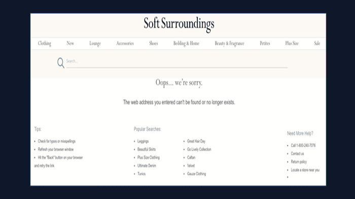
This is a wasted opportunity by Soft Surroundings. I mean one of the unwritten laws in the world of eCommerce is that: images sell, not text. Mentioning the products is not enough. People want to see the real thing. They want to zoom in and get a feel of the product.
Chances are high that they are losing a lot of sales because of that mistake.
Another example of an eCommerce site that repeats the same mistake of not having engaging content on their 404 error pages is Next:
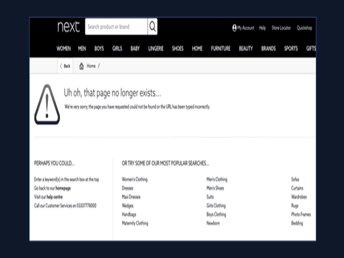
Displaying even just a cross-section of the products you have available could be the difference between a potential customer making a purchase or going elsewhere.
Make it an easy choice for your customers by showcasing what you have on offer when people land on your 404 error page.
In fact, it would be even better if you display your best or most popular products.
2. Turn it into a search box
The importance of a search box in an eCommerce site goes without saying.
If your eCommerce store has hundreds of pages categorized, it could be very difficult for users to find what they’re looking for just by scrolling or clicking around.
But having a search box will allow customers to accomplish their goals faster.
Tell you what, it works the same for a 404 page.
Giving your visitors the option to search the product they have in mind is (almost) a guaranteed way to help them find exactly what they’re interested in.
And that means a higher likelihood of conversion.
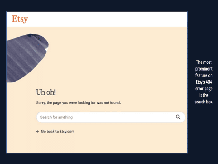
Etsy is a good example of a site that turned their site into a search bar:
3. Add user reviews of your products
As I was looking into 404 pages of different sites, I didn’t come across any site that has user reviews on their error pages.
Considering the power of user reviews, I think that’s a missed opportunity.
In one of our own research studies – The importance of customer reviews – about user reviews, we discovered that:
- 88% of consumers trust online reviews as much as personal recommendations.
- 72% of customers say that positive reviews make them trust a business more.
- 92% of consumers will make a purchase if a product has 4 or more stars.
As you can see from the above stats, there’s a high chance of increasing your conversion rate when you include user reviews in your 404 error pages.
And again, user-generated reviews can also convince prospects that land on your error page that your products or services are worth it. Try them.
4. Use it as a lead magnet
From a conversion rate optimization perspective, every page on your site should push a visitor further down the funnel so that they make a purchase.
This is something that should be engraved in your mind as you think about designing your 404 error pages.
One way of increasing your conversion rate using your 404 error pages is to include a lead magnet on the page. A lead magnet is simply an incentive that you give website visitors so that they give you their name and email address.
You may be wondering why you should add a lead magnet?
The reality is people don’t always convert on their first visit, especially when they land on the wrong page. They prefer to learn more about you before committing to make a purchase from your website.
You’ll need to use a lead magnet to capture their email addresses. Hubspot uses this tactic:
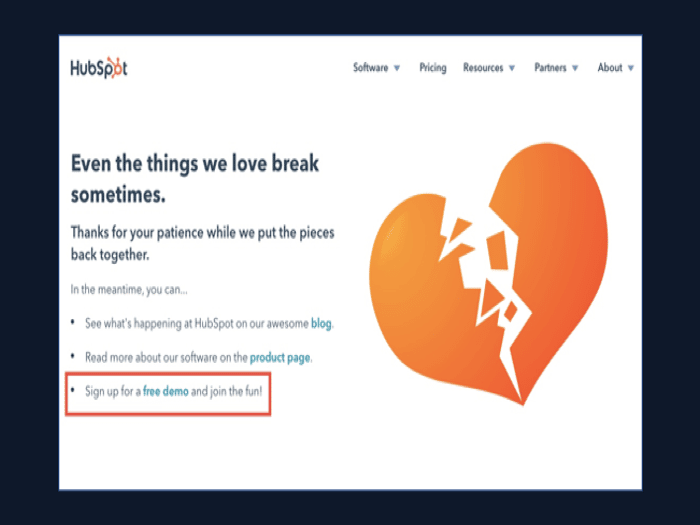
The best thing about lead magnets is that they all come in different shapes, sizes, and formats. It can be an ebook, checklist, or video recording of a previous webinar recording.
But what happens when you don’t have anything to use as a lead magnet. Does that mean you should forego the opportunity of capturing prospects’ emails?
Not at all. You can simply ask for your customers’ email addresses just like Ban.do does:
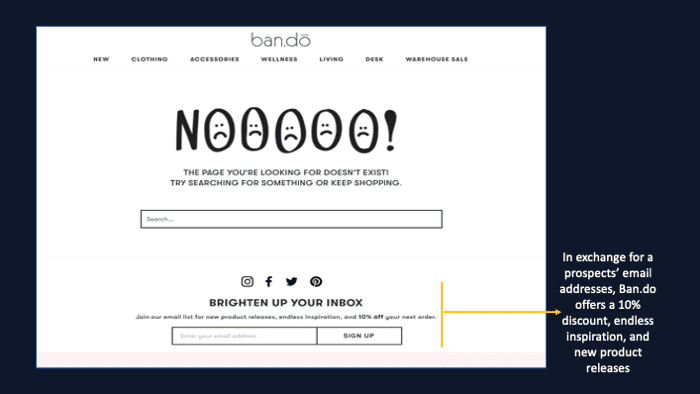
Considering that the prospect will be in a state of frustration, it’s always best to offer something in exchange for a prospect’s email addresses. Ban.do offers a 10% discount, endless inspiration, and new product releases in exchange for the customer’s email.
Generally, people will need to be motivated if they are to offer you their personal information.
5. Leave an impression
Sometimes it’s okay to take a less marketing approach, especially when you are a well-established brand.
Sprinkling some little humor on your 404 error pages can leave a great impression of your brand on your users.
Trying to get users to laugh in a frustrating moment can make them forget about the annoyance of landing on the wrong page.
In a bid to leave an impression on their 404 error pages, Amazon went for the more personal touch:
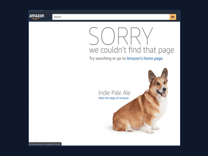
The giant eCommerce company showcases random employee dogs on their 404 error pages, and it also links to a page called “Meet the dogs of Amazon”.
Another site with a humorous 404 page I liked is Gong:

Although the video has nothing to do with Unsplash as a brand, it will give you that positive vibe and leave you laughing out loud.
Instead of leveraging their products or services, Unsplash uses positive emotions and humor to build relationships with users and provide an enjoyable experience that makes the brand stand out.
The idea of adding humor to your 404 error pages is to make them memorable so that they consider giving you a chance again.
According to various studies, it only takes two to three seconds for someone to form an impression online.
So when a visitor lands on your error page, make it count.
6. Guide your visitors
When you want to help a lost person, the logical thing to do is to guide them to where they want to go.
If yours is an eCommerce site that deals with multiple products, instead of curating products its best that you suggest a list of top category pages to visitors.
This gives them a good starting point.
If the visitor was looking for men or kids’ clothes before landing on a 404 page, they can easily move forward by clicking on a category section.
Here’s an example by Toms:
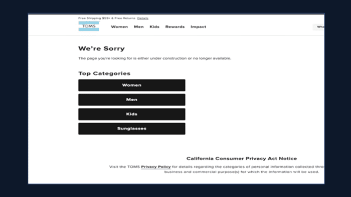
When you visit a page that doesn’t exist anymore, Toms gets you back on track by suggesting you start with one of the top categories.
This makes the transition from error to shopping smoother for the visitor.
Another way of guiding your visitors back to where you’d want them to be is to add helpful links to other pages. Airbnb does this well:
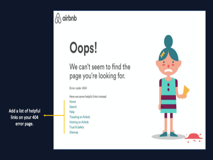
There’s nothing exciting about the 404 error page, but I like the idea of including various helpful links that can make the prospect find their way to the right page they are looking for on the site.
7. Add a human touch
Any website page that doesn’t have a human touch won’t build relationships.
This includes your 404 error pages.
If you want to build better relationships with visitors who land on your error page, you need to inject kindness and consideration into that page.
The more human your error page is, the more likely it will make visitors more understanding and forgiving of the error.
There’s no harm in putting a human face, your name, and what you do in the business on your 404 pages. In fact, this can engage the user with a little more information on you and your business while distracting from the immediate frustration.
Check out this great example from Mint:
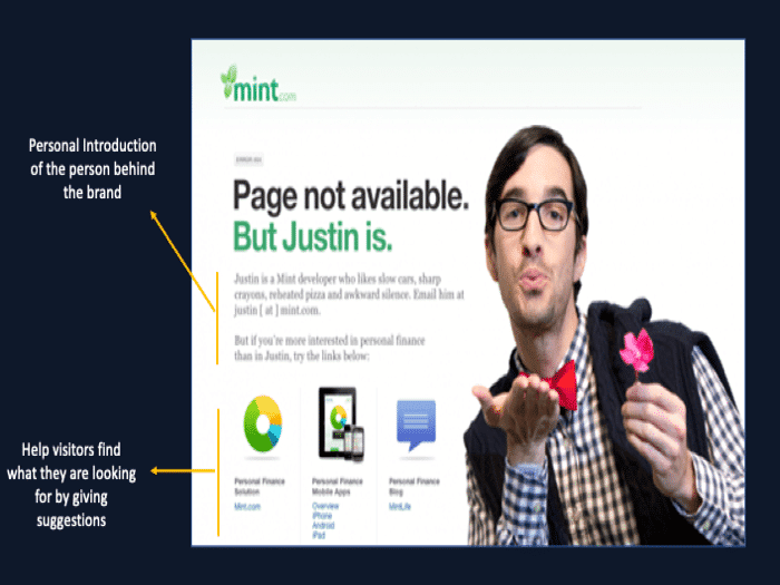
Visitors who land on the Mint error page will get an introduction to Justin, the man behind the brand.
They also give visitors links to things they might be looking for.
Another great example of a 404 error page with an interesting human touch is that of Email Center UK:
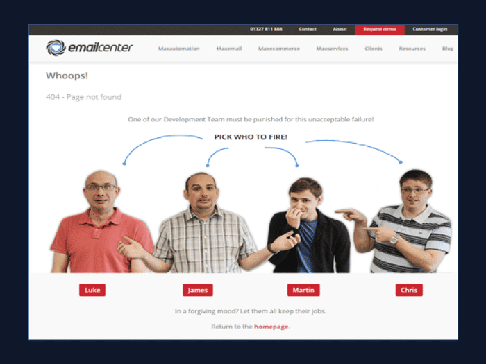
Email Center UK added a human touch to their 404 in quite an enjoyable and fun way. They take the blame for the unavailability of the page, but they make visitors engage in “the firing game” of one of their co-workers.
Adding such a personality will significantly hold the users’ attention and reduce the site’s bounce rate.
8. Use exit-intent popups
When a visitor is about to leave your site after landing on a wrong page, something can be done to stop them in their tracks.
Create an exit-intent popup.
A well-designed exit-intent popup on a 404 error page can provide value and give visitors a reason to stay on a website.
Although it’s often said that people, in general, don’t like pop-ups – I think it depends on what you are saying on that pop-up.
There are many ways you can use exit-intent popups on error pages. One of the ways is to offer a voucher or a discount.
It goes without saying that discounts can be an effective way to directly improve conversion rates on a 404 page.
Electric Family uses an exit-intent pop up to offer a 10% discount on their 404 error page:
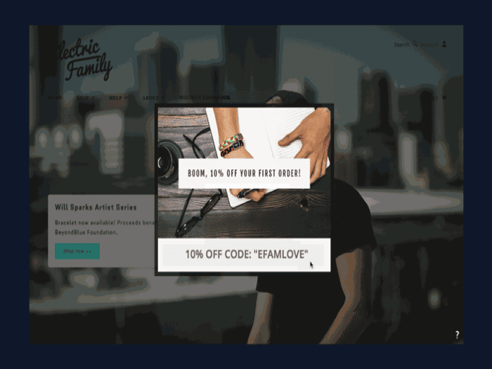
Knowing how vouchers and discounts create happiness, it’s safe to say that the Electric Family might have prevented losing more visitors and high bounce rates through this tactic.
Although discounts are a tried-and-tested way of improving conversions on 404 error pages, they can be problematic sometimes. Don’t get me wrong, I like the idea of exit-intent popups on 404 pages –but my only worry is using a discount as a first impression.
Discounts are sticky. Once your customers taste your discounts, they might not ever expect to buy a product on a full price again. And this will end up affecting your bottom line margins as a brand.
The other way you can use an exit-intent pop up on your 404 error pages is to offer something that will propel users into adding their emails. I know we have covered this under the lead magnet section, but it’s worth a mention under this section.
Checkout how SEO Copywriting employs this tactic:
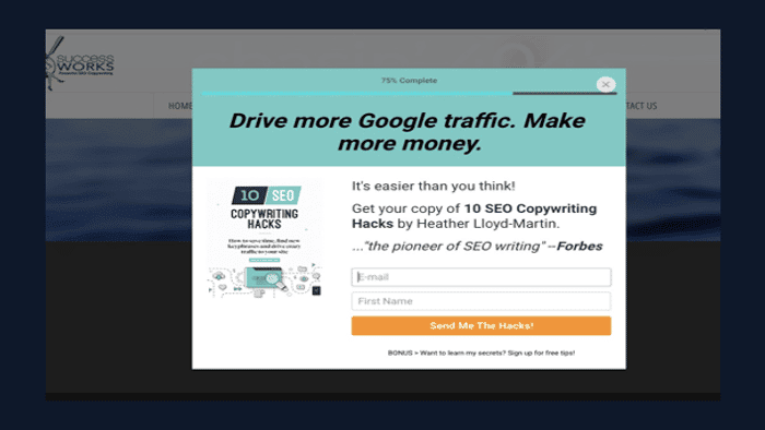
They also use a progress bar that alludes to visitors that they are 25% away from receiving a copy of the “10 SEO Copywriting Hacks.’
Conclusion
Your 404 page is part of your website, this means that it should be optimized as it can also contribute to the increase in conversions and a decrease in the bounce rate. There are many things you can do to avoid making the visitor walk away after landing on your 404 error page. If you make sure that your page offers a solution that can help visitors out of this dead-end, you will never go wrong.
